What Happens When You Create A Flexbox Flex Container?

Email Newsletter
Weekly tips on front-end & UX.
Trusted by 182,000+ folks.

 Custom Web Forms for Angular, React, & Vue. Your backend.
 Celebrating 10 million developers


In a short series of articles, I’m going to spend some time in detailed unpacking of Flexbox — in the same way I have done in the past with grid. We’ll have a look at the things Flexbox was designed for, what it really does well, and why we might not choose it as a layout method. In this article, we will take a detailed look at what actually happens when you add display: flex to your stylesheet.
A Flex Container, Please!
In order to use Flexbox, you need an element that will be the flex container. In your CSS, you use display: flex:
See the Pen Smashing Flexbox Series 1: display: flex; by Rachel Andrew (@rachelandrew) on CodePen.
Let us spend a little while thinking about what display: flex really means. In the Display Module Level 3, each value of display is described as actually being a combination of two things: an inner display model, and an outer display model. When we add display: flex, we are really defining display: block flex. The outer display type of our flex container is block; it acts like a block level element in normal flow. The inner display type is flex, so items directly inside our container will participate in flex layout.
This is something you might never have really thought about but probably understand anyway. The flex container acts like any other block on your page. If you have a paragraph followed by a flex container, both of these things behave as we have become accustomed to block elements behaving.
We can also define our container with a value of inline-flex which is like using display: inline flex, i.e. a flex container that acts like an inline level element, with children that participate in flex layout. The children of our inline flex container behave in the same way that children of our block flex container behave; the difference is how the container itself behaves in the overall layout.
See the Pen Smashing Flexbox Series 1: display: inline-flex; by Rachel Andrew (@rachelandrew) on CodePen.
This concept of elements having an outer display type, which defines how they behave as a box on the page (plus an inner display type) dictating how their children behave is quite useful. You can apply this thinking to any box in CSS. How does this element act? How do the children of this element act? The answers relate to their outer and inner display models.
Rows Or Columns?
Once we have defined our flex container, some initial values come into play. Without our adding any extra properties, the flex items display as a row. This happens because the initial value of the flex-direction property is row. If you don’t set it, you get a row.
The flex-direction property is how we set the direction of the main axis. Other values for flex-direction are:
columnrow-reversecolumn-reverse
With our items in a row, the items are placed with the first item at the start edge of the inline dimension and display in the order that they appear in the source. In the specification, this edge is described as main-start:
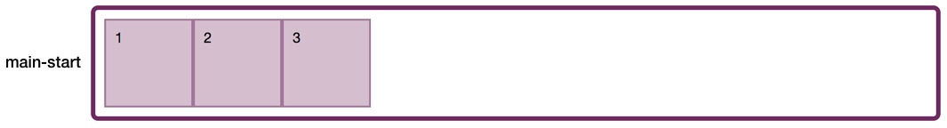
main-start is at the start of the inline dimension (Large preview)If we use the value column, the items begin to lay out from the start edge of the block dimension and therefore form a column.
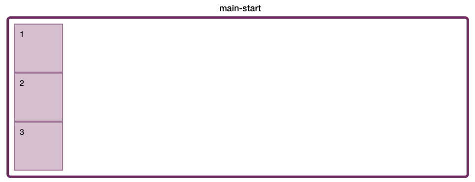
main-start is the start of the block dimension (Large preview)When we use row-reverse, the location of main-start and main-end are switched; therefore, the items lay themselves out one after the other ending up in reverse order.
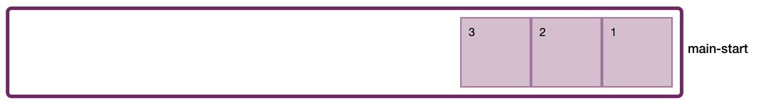
main-start is at the end of the inline dimension (Large preview)The value column-reverse does the same thing. It’s important to remember that these values don’t “switch the order of items” although this is what we see happening, they change the place where the flow of items starts: by switching where main-start is. So our items do display in reverse order, but that is because they start laying out at the other end of the container.
It is also important to remember that when this happens, the effect is purely visual. We are asking the items to display themselves starting at the end edge; they are still flowing in the same order and this is the order that your screen reader uses and also the order they can be tabbed through. You should never use row-reverse when what you really want to do is change the order of the items. Make that change in your document source.
The Two Axes Of Flexbox
We have already exposed an important feature of flexbox: the ability to switch the main axis from row to column. This axis switching is why I think that often it is easier to understand things like alignment in Grid Layout first. With Grid, working in two dimensions, you can align on both axes in pretty much the same way. Flexbox is a little trickier because different things happen depending on whether you are working with the main axis, or the cross axis.
We have already encountered the main axis, i.e. the axis that you define as the value of flex-direction. The cross axis is the other dimension. If you have set flex-direction: row, your main axis is along the row, and your cross axis is down the columns. With flex-direction: column, the main axis is down the column and your cross axis along the rows. It is here where we need to explore another important feature of Flexbox, and that is the fact that it is not tied to the physical dimensions of the screen. We don’t talk about a row running from left to right, or a column from top to bottom, because that is not always the case.
Writing Modes
When I described row and column above, I mentioned the block and inline dimensions. This article is written in English, which is a horizontal writing mode. This means that when you ask Flexbox to give you a row, you get a horizontal display of your flex items. In this case, main-start is on the left — the place in which sentences start in English.
If I were working in a right-to-left language such as Arabic, then the start edge would be on the right:
See the Pen Smashing Flexbox Series 1: row with rtl text by Rachel Andrew (@rachelandrew) on CodePen.
The initial values of flexbox mean that if all I do is create a flex container, my items would start on the right and be displayed moving towards the left. The start edge in the inline direction is the place where sentences start in the writing mode you are using.
If you happen to be in a vertical writing mode and ask for a row, your row will run vertically, because that is the way in which rows of text run in a vertical language. You can try this by adding the writing-mode property to your flex container and setting it to the value vertical-lr. Now, when you set flex-direction to row, you get a vertical column of items.
See the Pen Smashing Flexbox Series 1: row with a vertical writing mode by Rachel Andrew (@rachelandrew) on CodePen.
So a row can run horizontally, with a main-start of the left or the right, and also run vertically with main-start at the top. It’s still a flex-direction of row even if our horizontal text accustomed minds find it hard to think of a row running vertically!
To cause the items to lay themselves out in the block dimension, we set the value of flex-direction to column or column-reverse. In English (or in Arabic), we then see the items displaying one on top of the other down the page, starting at the top of the container.
In a Vertical Writing Mode, the Block dimension runs across the page, as this is the direction blocks are laid out in those writing modes. If you ask for a column in vertical-lr, your blocks will run left to right vertically:
See the Pen Smashing Flexbox Series 1: column in vertical-lr writing mode by Rachel Andrew (@rachelandrew) on CodePen.
However, no matter in which direction the blocks are displayed, if you are working with a column then you are working in the block dimension.
Understanding the fact that a row or a column can run in different physical directions is helpful in understanding some of the terminology being used for Grid and Flexbox. We don’t refer to ‘left and right’ or ‘top and bottom’ in Flexbox and Grid because we don’t make any assumption as to the writing mode of our document. All of CSS is becoming more writing mode aware; if you are interested in some other properties and values being implemented to make the rest of CSS behave in this same way, read my article on Logical Properties and Values.
As a summary, remember that:
- flex-direction: row
- main axis = inline dimension
main-startwill be where sentences begin in that writing mode- cross axis = block dimension
- flex-direction: column
- main axis = block dimension
main-startwill be where blocks start to lay out in that writing mode- cross axis = inline dimension
Initial Alignment
Some other things happen when we apply display: flex. Some initial alignment happens. In a future article in this series, we will take a good look at alignment; however, in our exploration of display: flex, we should look at the initial values that are applied.
Note: It is worth noting that while these alignment properties started life in the Flexbox specification, the Box Alignment specification will ultimately supersede those defined in the Flexbox specification, as explained in the Flexbox specification.
Main-Axis Alignment
The initial value of justify-content is set to flex-start. It is as if our CSS was:
.container {
    display: flex;
    justify-content: flex-start;
}
This is the reason that our flex items line up at the start edge of the flex container. It’s also the reason why when we set row-reverse they switch to the end edge because that edge then becomes the start of the main axis.
When you see an alignment property which begins with justify-, then it applies to the main axis in Flexbox. So justify-content performs main-axis alignment and aligns our items to the start.
The other possible values for justify-content are:
flex-endcenterspace-aroundspace-betweenspace-evenly(added in Box Alignment)
These values deal with the distribution of available space in the flex container. This is why the items are moved around, or spaced out. If you add justify-content: space-between, then any available space is shared out between the items. However, this can only happen if there is free space to start with. If you had a tightly packed flex container (with no extra space after all the items had been laid out), then justify-content would do nothing at all.
You can see this if you switch your flex-direction to column. Without a height on the flex container there is no free space, so setting justify-content: space-between won’t achieve anything. If you add a height and make it so that the container is taller than is required to display the items, then the property has an effect:
See the Pen Smashing Flexbox Series 1: column with a height by Rachel Andrew (@rachelandrew) on CodePen.
Cross-Axis Alignment
Items are also aligned on the cross axis with a single line flex container; the alignment that we are performing is to align the boxes against each other in the line. In the next example, one of our boxes has more content in than all the others. Something is telling the other boxes to stretch to the same height. That something is the align-items property, which has an initial value of stretch:
See the Pen Smashing Guide to Layout: clearfix by Rachel Andrew (@rachelandrew) on CodePen.
When you see an alignment property which begins with align- and you are in flexbox, then you are dealing with cross-axis alignment, and align-items aligns the items within the flex line. The other possible values are:
flex-startflex-endcenterbaseline
If you do not want the boxes to all stretch to the height of the tallest, then setting align-items: flex-start will cause them all to align to the start edge of the cross axis.
See the Pen Smashing Flexbox Series 1: align-items: flex-start by Rachel Andrew (@rachelandrew) on CodePen.
Initial Values For The Flex Items
Finally, the flex items themselves also have initial values, they are set to:
flex-grow: 0flex-shrink: 1flex-basis: auto
This means that our items will not grow by default to fill the available space on the main axis. If flex-grow were set to a positive value, this would cause the items to grow and take up any available space.
The items can shrink, however, as flex-shrink is set to the positive value of 1. This means that if we have a very narrow flex container, then the items will get as small as they can before any overflow happens. This is sensible behavior; in general, we want things to stay inside their boxes and not overflow if there is space to display them.
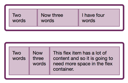
In order to get the best possible layout by default, flex-basis is set to auto. We will have a proper look at what that means in a future article in this series, however, most of the time you can think of auto as “big enough to fit the content”. What you will see happen, when you have flex items that fill the container, and one of those items has a larger amount of content than the others, the larger item will be given more space.
See the Pen Smashing Flexbox Series 1: initial values of flex items by Rachel Andrew (@rachelandrew) on CodePen.
This is Flexbox’s flexibility in action. With a flex-basis of auto and no sizing applied to the items, the flex items have a base size of the max-content size. This would be the size they would be if they stretched out and did no wrapping whatsoever. Then, space is taken away from each item in proportion, detailed in the following note in the flexbox specification.
“Note: The flex shrink factor is multiplied by the flex base size when distributing negative space. This distributes negative space in proportion to how much the item is able to shrink, so that e.g. a small item won’t shrink to zero before a larger item has been noticeably reduced.”
The larger item has less space taken away and so we get the final layout. You can compare the two screenshots below, both taken using the example above. However, in the first screenshot, the third box has a smaller amount of content, and therefore our columns have a more equal distribution of space.
Flexbox here is helping us to end up with a reasonable end result given no other input from the person writing the CSS. Rather than reduce the space evenly and end up with a very tall item with a couple words on each line, it assigns that item more space to lay itself out. Within this kind of behavior is the key to the real use cases for Flexbox. Flexbox is at its best when used to lay sets of things out — along one axis — in a flexible and content aware way. I’m touching on a little of the detail here, but we will take a proper look at these algorithms later in this series.
Summary
In this article, I’ve taken the initial values of Flexbox, in order to explain what actually happens when you say display: flex. It’s a surprising amount once you begin to unpack it, and contained within these few properties are many of the key features of flex layouts.
Flex layouts are flexible: they try to make good choices by default about your content — squishing and stretching to get the best readability. Flex layouts are writing mode aware: the directions of row and column relate to the writing mode being used. Flex layouts allow alignment of the items as a group on the main axis, by choosing how space is distributed. They allow alignment of items within their flex line, moving the items on the cross axis in relationship to each other. Importantly, flex layouts understand how big your content is, and try to make good basic decisions in order to display it. In future articles, we will explore these areas in more depth, and consider further exactly when and why we might choose to use Flexbox.
Further Reading
- The Complex But Awesome CSS border-image Property
- A Guide To Hover And Pointer Media Queries
- How To Build A Magazine Layout With CSS Grid Areas
- A Primer On CSS Container Queries
 (il, mrn)

