Introduction To Animation And The iMessage App Store With Shruggie

Email Newsletter
Weekly tips on front-end & UX.
Trusted by 182,000+ folks.


 Custom Web Forms for Angular, React, & Vue. Your backend.
 Celebrating 10 million developers
When the App Store for iMessage in late 2016 went live, I released Kaomotion, a sticker app with animated kaomoji inside. Ever since the release of this app, I wanted to write up a tutorial about how a simple text character like shruggie (i.e. ¯\_(ツ)_/¯) can be animated to give it life-like features:
What you are going to read in this article is a step-by-step guide of setting up a canvas in After Effects and then going through with the animation. You’ll also read about how well the app containing more than 30 animated stickers worked and what some of the specific issues are you might be having on the App Store for iMessage:
- Canvas Setup
- Working With A (Text) Layer
- Working With Rulers
- Understanding The Puppet Pin Tool
- Animation And Timeline
- Further Reading And Tools
- Bonus Reading: Life On The App Store For iMessage
Without further ado, let’s jump right in.
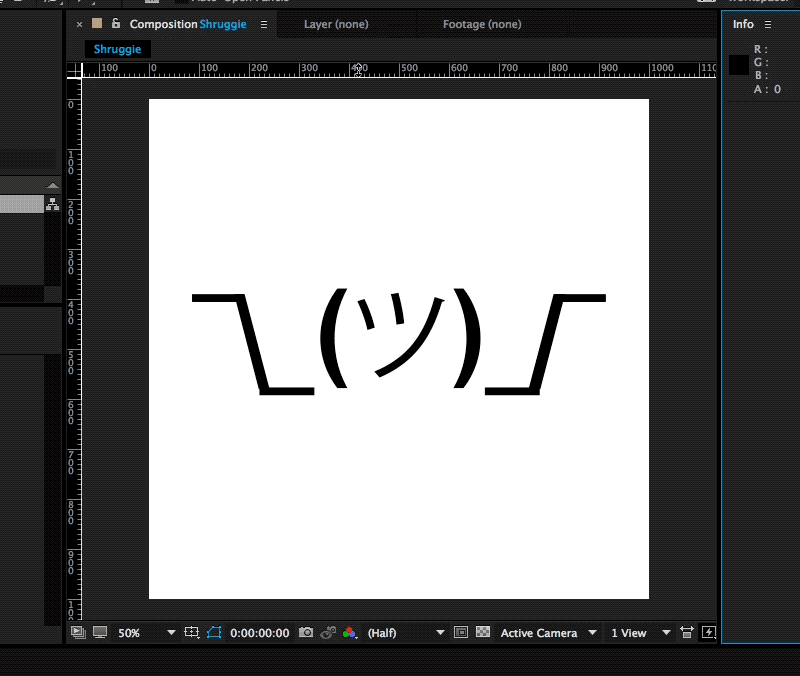
1. Canvas Setup
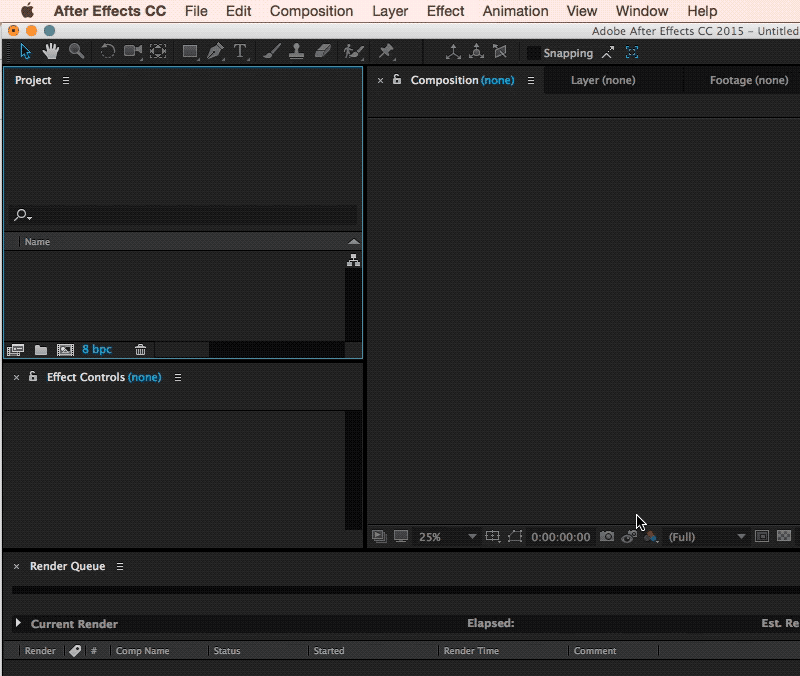
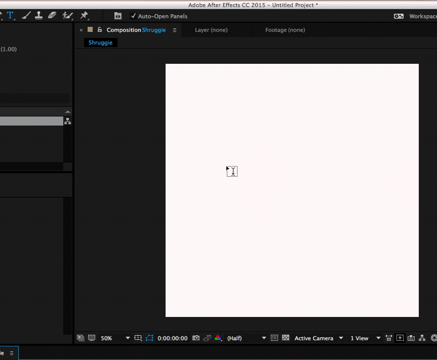
We’re starting with setting up a new composition (⌘ + N) within After Effects with the following settings:
- 1000px × 1000px;
- a frame rate of 30 frames per second;
- a quarter on resolution;
- a run time of 2 seconds.
This is going to be the basic canvas we’re going to work with during the animation. We’re choosing a square since that is what you have to deal with within iMessage and Apple’s sticker implementation.
2. Working With A (Text) Layer
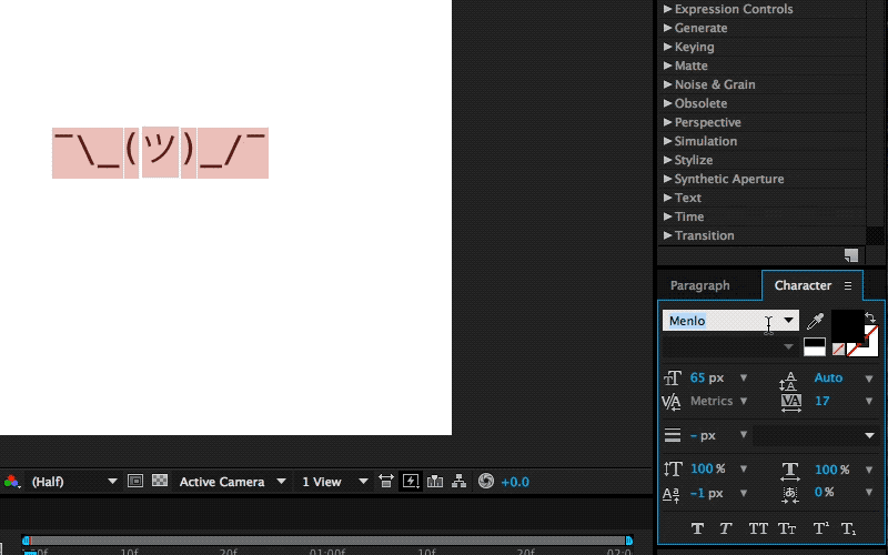
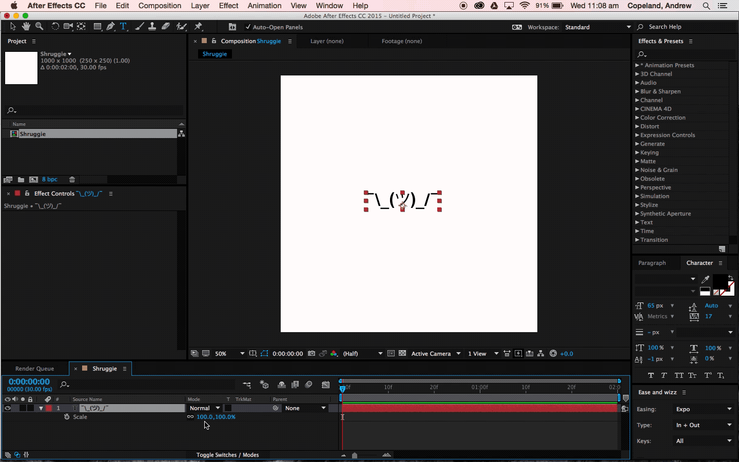
Since kaomoji are simple text-based emoticons we’re going to copy-paste a a Shruggie “¯\_(ツ)_/¯” from the first source we can find being Jeremy Burge’s Emojipedia via Google.
After having found it on Emojipedia we’re pasting it as a text layer into After Effects. It’s time to utilise the text tool.
The Text Tool
Copy ⌘ + T in with ⌘ + V:
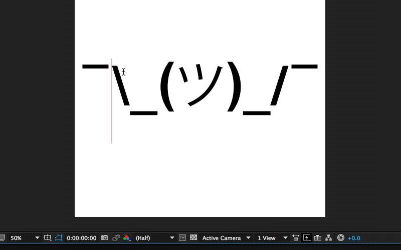
The Shruggie inside your canvas might not look exactly the way you’ve found him on Google, or on Emojipedia for that matter, that’s because of differences in font types. We’ve chosen a font that makes Shruggie look decent and made him stretch across the canvas to prepare him for his facelift: double-click on the Source Name to select all characters.
The Character Menu
Double click Name Source and then get the font type in your Character menu.
Scaling A Layer
Select Layer, then S + Scale (by sliding right for example).
To position the layer properly, we’re scaling it up to fill the canvas by selecting the layer by pressing S, then Scale and then finally moving the scale until it fits.
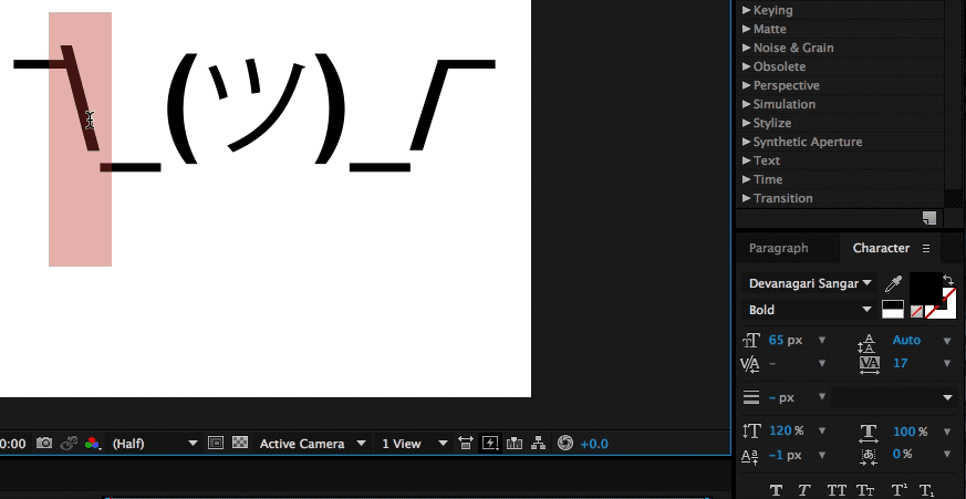
To further explore some smaller tweaks let’s look into making our Shruggie a little more connected. For that we’re looking into some kerning and height options. To adjust the gap between Shruggie’s arm and hand, we’ll use the kerning tool (V/A) either manually in the menu or with another keyboard shortcut:
Kerning
Select Space + ALT + ← →. When we’re happy with the kerning gaps, we’ll adjust the height of the arms and make it look like the arms are actually connected. To join up the slashes with the underscore we’re going to play around with increasing the height of the slash/vertical scale, moving it vertically and potentially adjusting the baseline. In our case we’ve increased the height of the slash character to 120% and then adjusted vertically:
Moving Vertically
Make selection + ALT + SHIFT + ↑ ↓
If you repeat the steps above on the other side we’ll by now have a pretty looking Shruggie, but what’s that, we don’t like how it aligns at all, do we?
Let’s further align this sorry looking Shruggie.
That’s what rulers are for.
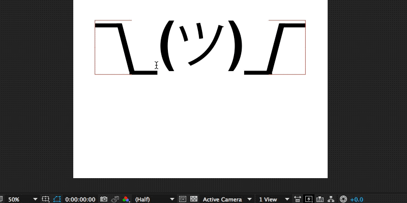
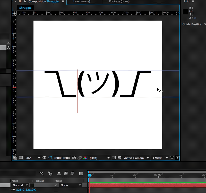
3. Working With Rulers
To conjure up rulers we’re going to use another keyboard shortcut:
Display Rulers
⌘ + R
This gives you the ruler view, from which you can practically drag rulers as visual cues into your canvas.
The next steps are a repetition of what we’ve done before: we’re selecting the middle part and moving it down vertically to align with Shruggie’s arms, shoulders, and hands. It looks pretty good, but let’s double-check on that first impression by zooming in!
Zoom In
You can zoom in by pressing ⌘ + +, and also by pressing on the , + . keys. In our case, we found we need to change it to properly align Shruggie’s face with his arms, which is another repetition of the above resizing and realigning skills.
Guess what? We’re now ready to animate! 🎊🎉🎈🚀🚀🚀🚀
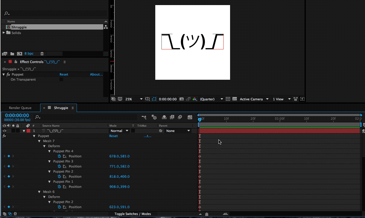
4. Understanding The Puppet Pin Tool
In order to animate our base Shruggie, we’re going to use the Puppet Pin Tool. Essentially it lets us work on any vector elements within After Effects, which includes our text assets. Let’s start:
The Puppet Pin Tool
Now what we’ll want to do is put pins where we want the joints to be: hands, elbows, shoulders, and so on. Press on ⌘ + P to do the trick:
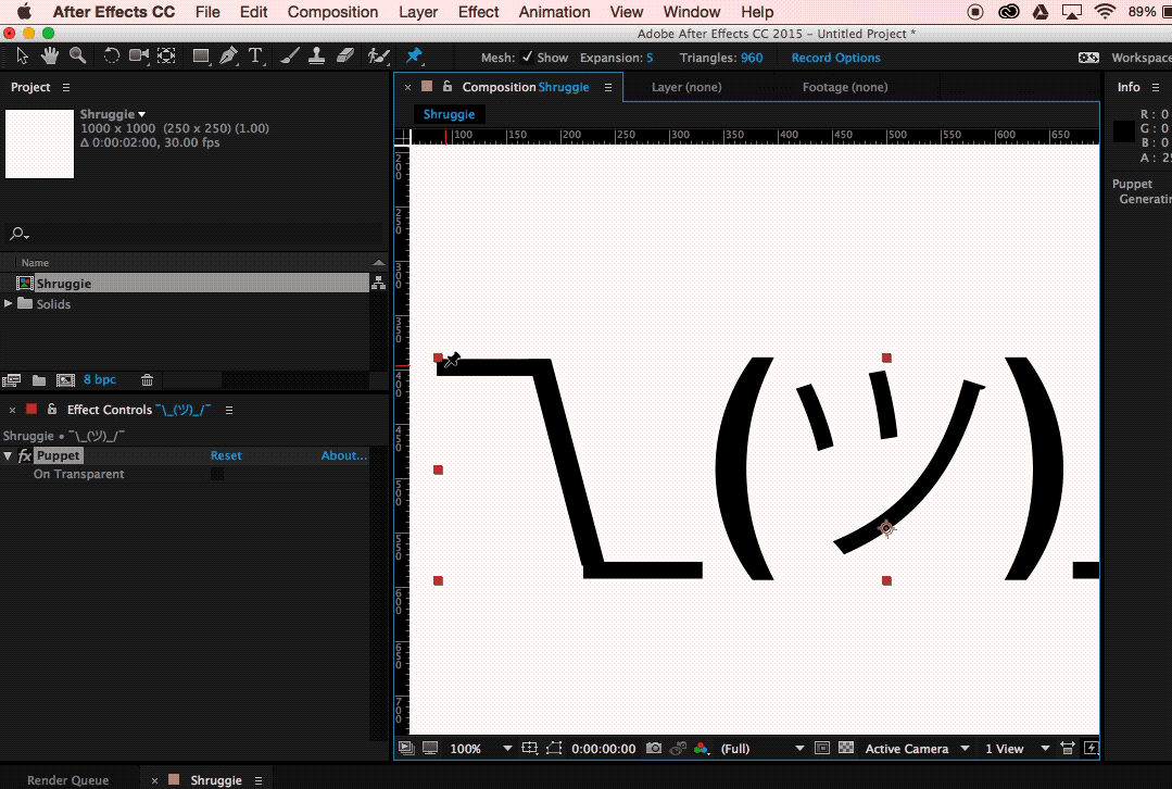
Keep adding joints until we have him fully pinned up and gotten a fully functional human torso:
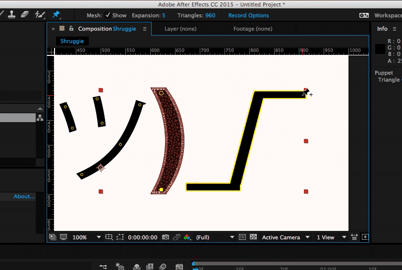
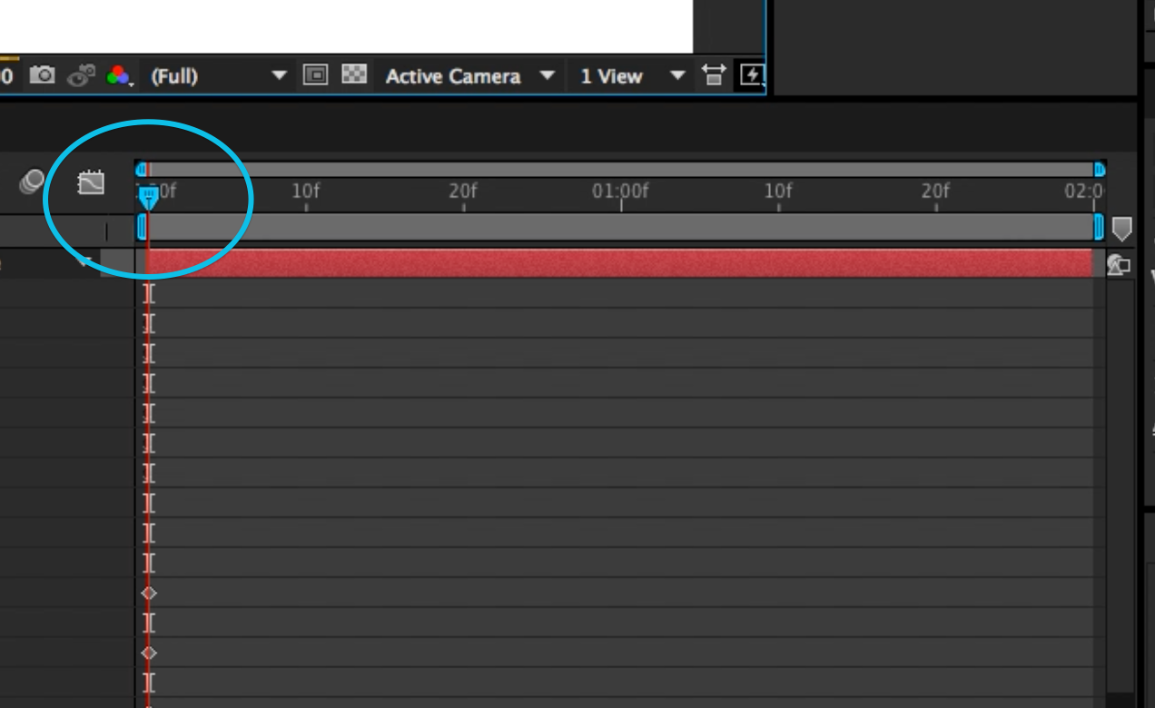
When you get a yellow highlight, that means that everything has been well done and After Effects recognizes the element as a vector and therefore you can place your pins. One thing that’s worth looking out for is to make sure that your pins/keyframes are at time 0 in your timeline at this stage:
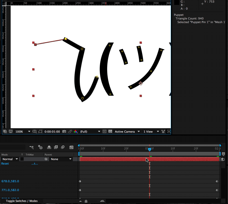
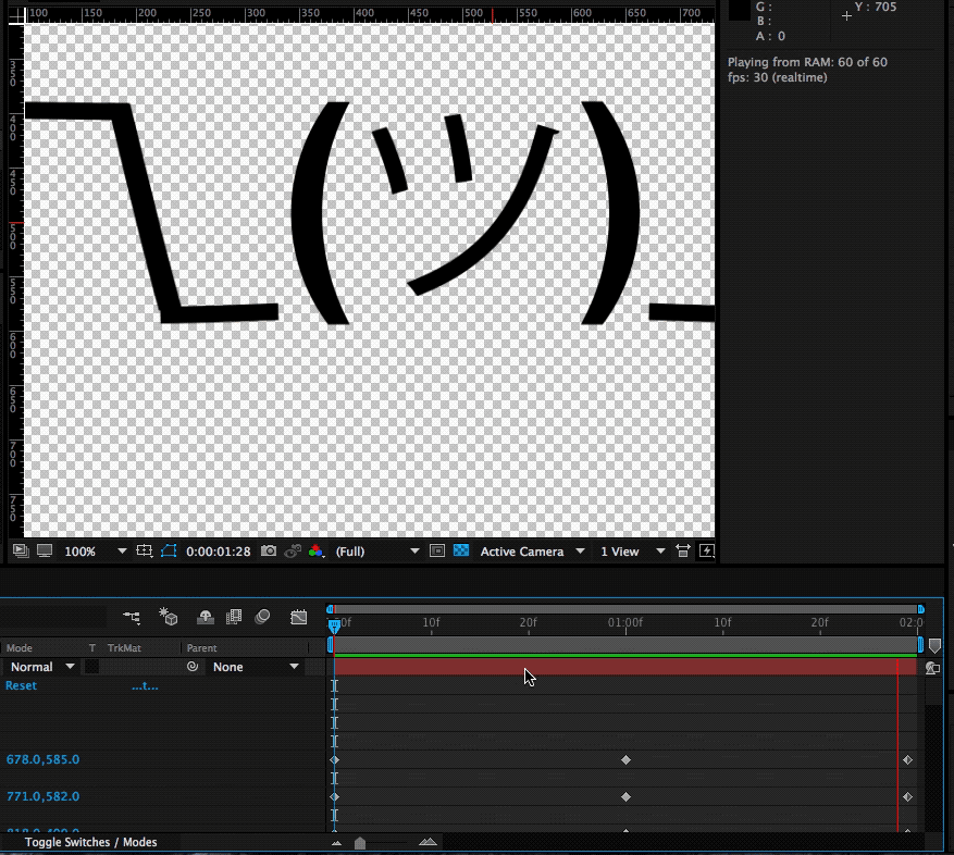
5. Animation And Timeline
The key to doing this effectively is to start with your main poses. We’re going to start with our start and end poses in place. We can do that by copying the keyframes that have been set up by our puppet pins in the beginning to our end state. The reason for this is simple: this is the start and our default pose, that’s the pose we want to return to in order to get a coherent animation.
Set Up Start And End Point
Select the layout and press U, then copy-paste to the end state.
As you can see it in in the gif above selecting the layout and pressing U returns every property of a layer that has keyframes as little diamonds. These little 💠 now also constitute your end state.
Setting The Middle Stage
In order to have a stage that we want to animate to and from, we’ll put that right in the middle:
Now that we’re in the middle of our animation we’re going to make changes to our default state in such a way that we want to constitute our middle state:
This means we’re going to raise the shoulder puppet pin, get the elbow and arms a little closer to your body and give the hand a proper “shrug” movement. This will automatically create those keyframes at that point in time, which will then animate our two default stages between each other.
Here’s the demonstration of the animation we get when we manually move the timeline with our cursor:
We’re following the exact same process for the right part of Shruggie’s shoulder and then add a bit of movement to Shruggies face which gives him a distinct look smirking over his shoulders and giving us the impression of: “Meh, you know, nothing to do about that”.
Space Bar To Play
Select layer + Space. When you hit the Space key you can get a first impression of our animation:
What you’ll notice immediately is that the character seems to miss character. That is mostly due to the fact that our animation plays at the same speed for the entire two seconds. That is the hallmark of mostly dodgy animation — you’ll want it to not just evenly move between two points.
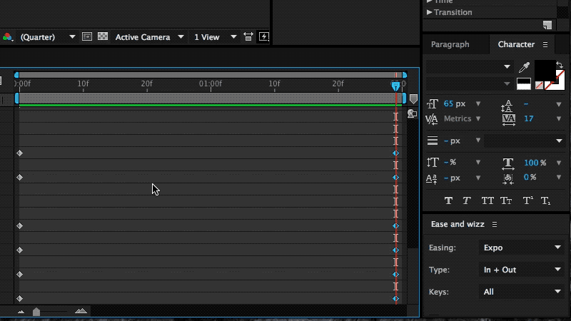
The easiest way to fix it up and give Shruggie a bit more realism, believability is to use a technique called ease-in and ease-out (or cushioning or a number of other ways). It’s basically speeding up the animation and then speeding it down again before reaching the end of the animation timeline.
It’s a cheap way of breathing some more life into our Shruggie. To do that we’re using a great little After Effects plugin called Ease and wiz that lets us apply some easing without much work:
Select all keyframes and then apply Ease and wizz with the options most suitable for your animation.
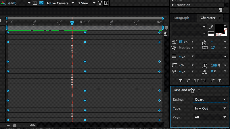
In our case we’ve chosen to go with the following settings:
- Easing: Quart
- Type: In and Out
- Keys: All
- Curvaceous: no
If we now run our animation again with the space bar, you’ll notice you’ll get something very close to the animation embedded at the beginning of this post. This means that we’re done, and we can be very proud of our work.
6. Further Reading About The Motion Basics
The tutorial you’ve just read introduces only the very basics of animation by way of making Shruggie move. In order to progress in animation, you’ll need to dig in further into the basics of motion. Further reading on some of those basics will help you improve further.
Below you’ll find an article describing the basics of motion and then some that relate to motion/animation with UX and software to come back full circle on the web:
- “Dear Ueno: How Do I Use After Effects To Create Motion Studies?,” Kwok Yin Mak, Medium
- “Creating Usability With Motion: The UX In Motion Manifesto,” Issara Willenskomer, Medium
- “Sculpting Software Animation,” Pasquale D’Silva, Medium
7. Bonus Reading: Life On The App Store For iMessage
The above tactics were applied to a whole bunch of kaomoji for the already mentioned as stated in the introduction.
I’ve launched the sticker app to some early support on Product Hunt, however, the app itself failed to be picked up by Apple or any audience on the App Store at large. I’d like to point out two realities on the App Store that anyone trying to make a sticker app needs to face:
- Competition by big brands;
- The wrath of users who don’t get the concept of stickers.
Problem: Prevalence Of Brands
If you want a shot at being consistently in the top 50 of the top paid iMessage stickers, then it helps to be a big brand or a notoriously known character. I’m not going to attach much meaning to this, just state it as a fact and provide the evidence below of screenshots collected in April 2018 (when I first wrote the draft on this article) on the Swiss App Store for iMessage.
Of the top 40 (that’s the top paid category), around 18 are likely to be well known characters turning that fact into downloads:
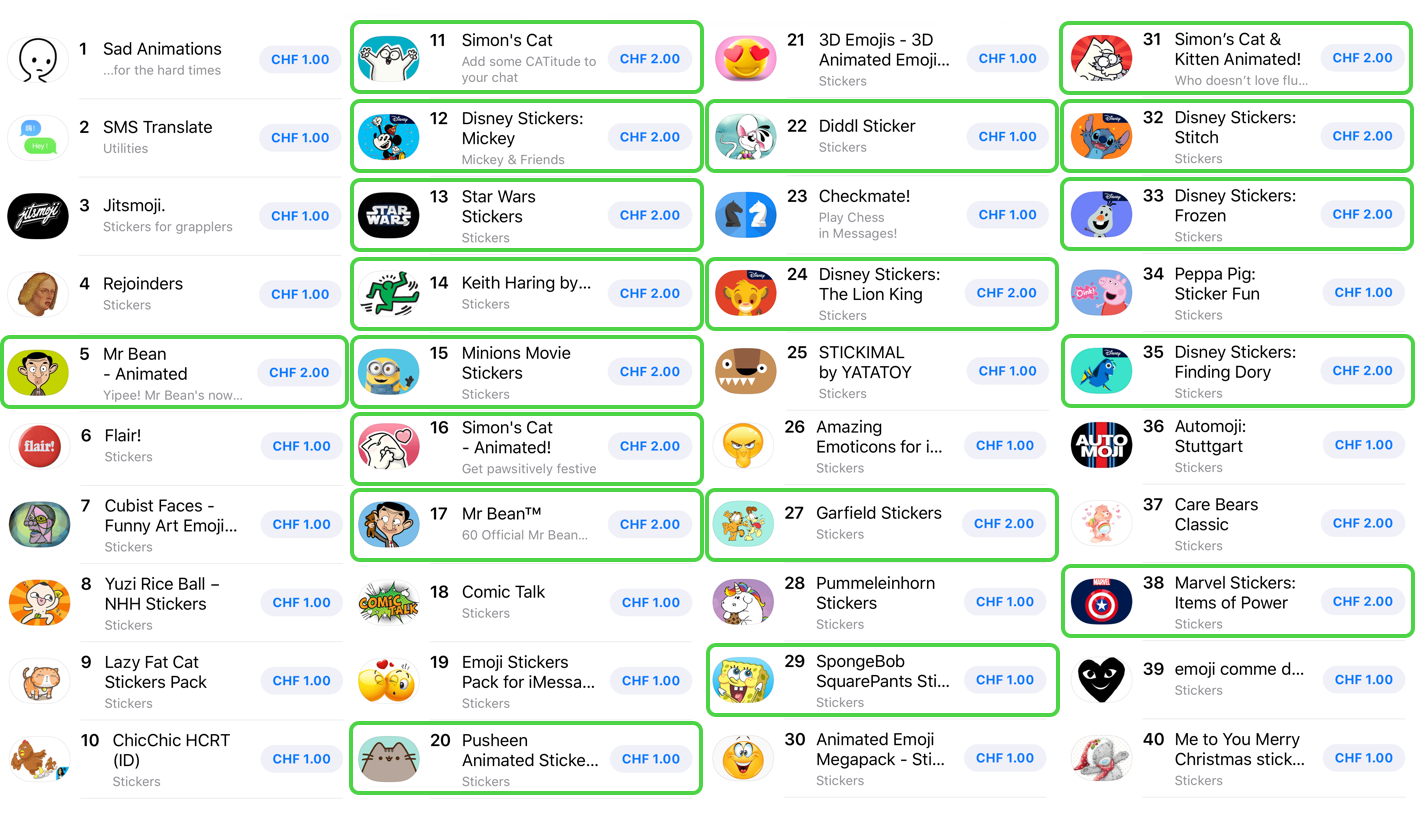
Top Paid Sticker Apps
The subtitle of this section is somewhat provocatively chosen, as there is no intrinsic problem with this as these characters are uniquely suited for stickers, though it’s an issue as this is just what you’re up against. Of course, the economic reality also shows around curation:
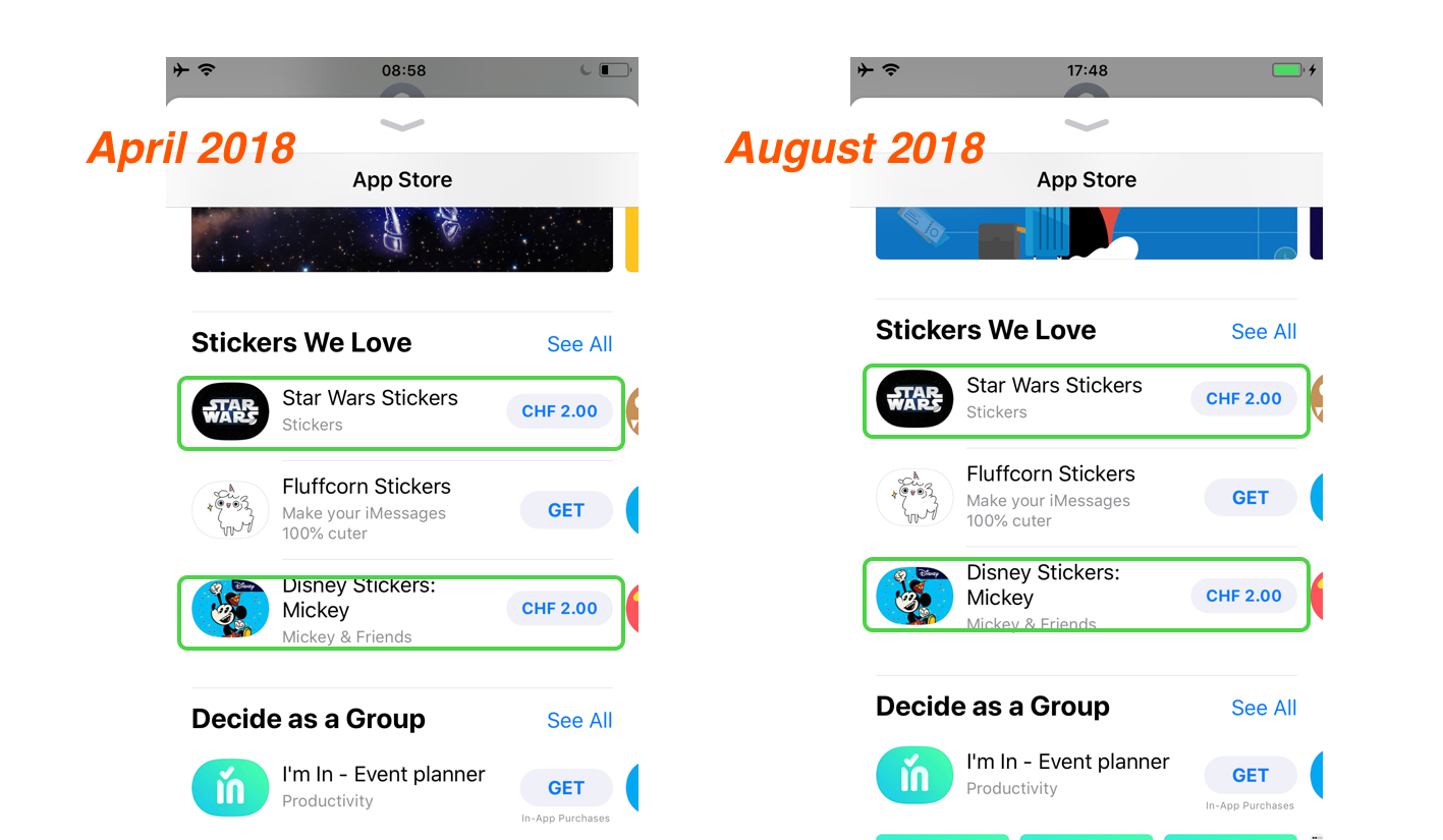
The left shows a screenshot of the first batch of curated stickers (66% big brand) in April of 2018, the right shows a screenshot of late August of 2018, where I encountered the exact same setup.
Again, this is not to pass judgment at Apple as I think they’ve become much better at curation in the App Store in general. As a summary of this situation, I think it is fair to say that other sticker ecosystems such as LINE’s have allowed more creativity to flourish and that the sticker ecosystem on the App Store is hard to advance into successfully.
Users still don’t get (or do not want?) stickers and the next point is a testament to this:
Problem: Facing The Wrath Of Users
The most annoying problem with the App Store for iMessage is still the fact that users do not know how to use them (i.e. stickers). That results in an abundance of one-star reviews.
In the case of Korea, Kaomotion got 80 one-star reviews in a matter of a few days by users complaining about the app not being there on their phone.
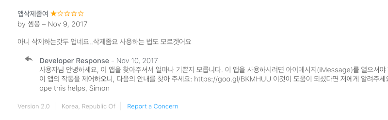
This can then look like the next screenshot fast, and Apple doesn’t seem to care to help clean out the mess, even after trying to address the users in Korean:
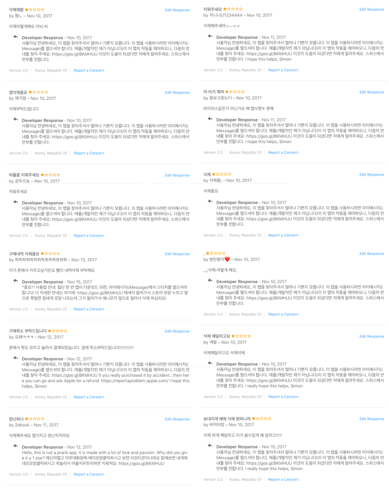
They’re essentially all saying the same: “The App isn’t on our phone.” Any one-star reviews are essentially also going to stay forever as no-one seems to care about what you have to say.
Solutions To The Discoverability Problem Of Stickers In The Interface
I’m not the first one or the only one to write about this problem, however I’d like to offer some possible remedies below.
18 months after the introduction of the App Store for iMessage users still don’t know how to send and receive stickers (though I must say that Apple tried to stitch the interface up within iMessage).
In this regard, you can only try to fix these problems by attacking the problem head-on and giving as much information as possible to users.
- Writing guides on the App Store page
Use the (text) screen real estate Apple gives you to write a step to step guide about how stickers are sent. - Writing more in-depth guides elsewhere
Do a blog post or something similar about the same topic with screenshots, gifs, or a video (I’ve made one here for Kaomotion). - Use a screenshot or app preview
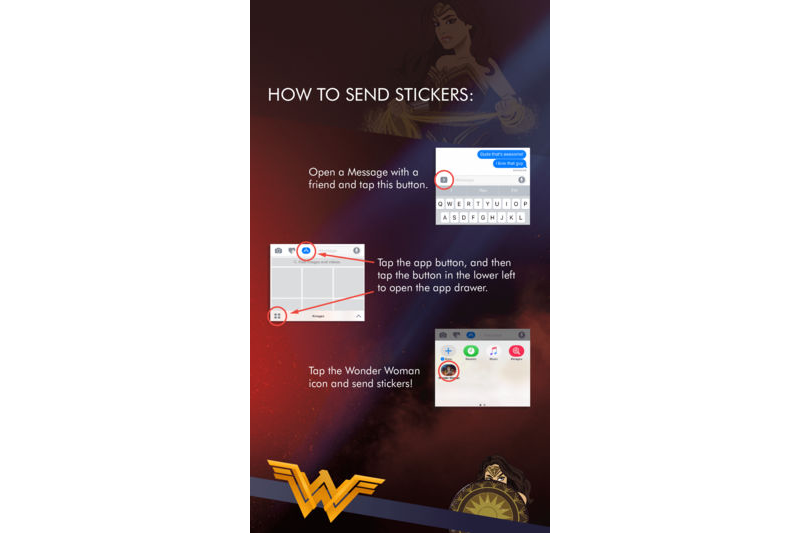
Finally, you may want to be explicit even on your screenshots about how your app is used. Even Wonder Woman seems to have been experiencing the same problem and used a screenshot to offer remedy:
You will likely still get users complaining, this way you’ll have an easy way to describe to them what needs to be done in order to use your stickers.
Were I to go back to the launch of the sticker store, I probably wouldn’t go through the hardship of creating Kaomotion once again, however, I’m glad I got to write about animation basics for After Effects!
I hope this tutorial gave you an interesting glimpse at both After Effects and the iMessage App Store.
ᕕ( ᐛ )ᕗ
Further Reading
- Creating Accessible UI Animations
- The Path To Awesome CSS Easing With The linear() Function
- Five-Second Testing: Taking A Closer Look At First Impressions (Case Study)
- CSS Scroll Snapping Aligned With Global Page Layout: A Full-Width Slider Case Study


