Fixed Elements And Overlays In XD: Incredibly Easy And Fun Methods For Your Prototypes

Email Newsletter
Weekly tips on front-end & UX.
Trusted by 182,000+ folks.
(This article is kindly sponsored by Adobe.) A fixed element is an object you set to a fixed position on the artboard, allowing other items to scroll underneath. This way, you get a realistic simulation of scrolling on desktop and mobile. With the new overlay feature, you can simulate interactions such as lightbox effects and submenus.
How do famous brands use fixed elements and overlays? Well, let’s take a look at some examples to get some inspiration first.

In this tutorial, we will learn how to set a menu bar as a fixed element and how to apply an overlay transition in a prototype, to simulate a menu opening from the click of a button. Both examples will be done in a mobile template, so that we can see our simulation in action directly on our mobile device. I’ve also included an Illustrator file with icons, which you can use to set up your examples quickly.
Let’s get started.
Preparing The Mobile Template
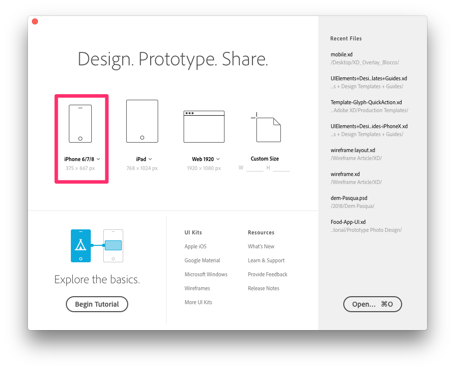
Open Adobe Xd, and choose the “iPhone 6/7/8 Plus” template. Then, go to File → Save As and choose a name to save your file (mine is mobile.xd).
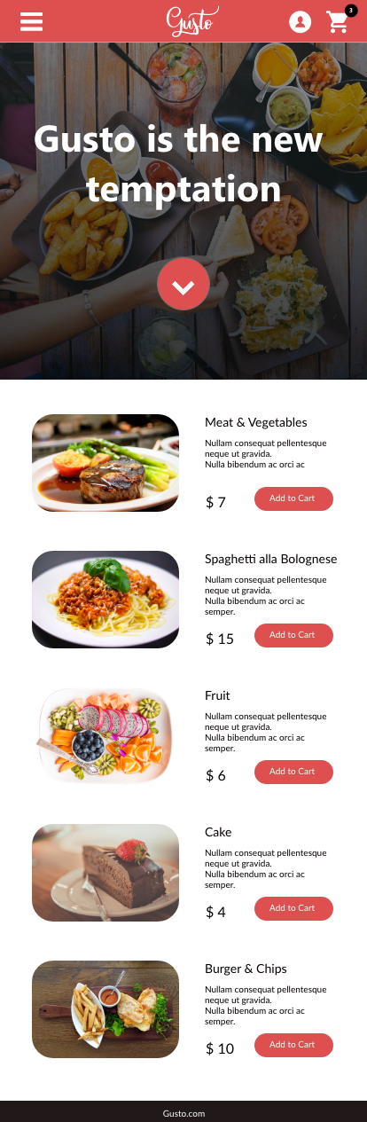
Let’s create a restaurant app in which people can select what to order from a list of food.
We will create two home layouts. The first one will be a long page, which we will use to see how fixed navigation works. The second will have a full-screen image, and the user will be able to click and open a menu bar that overlays the home screen.
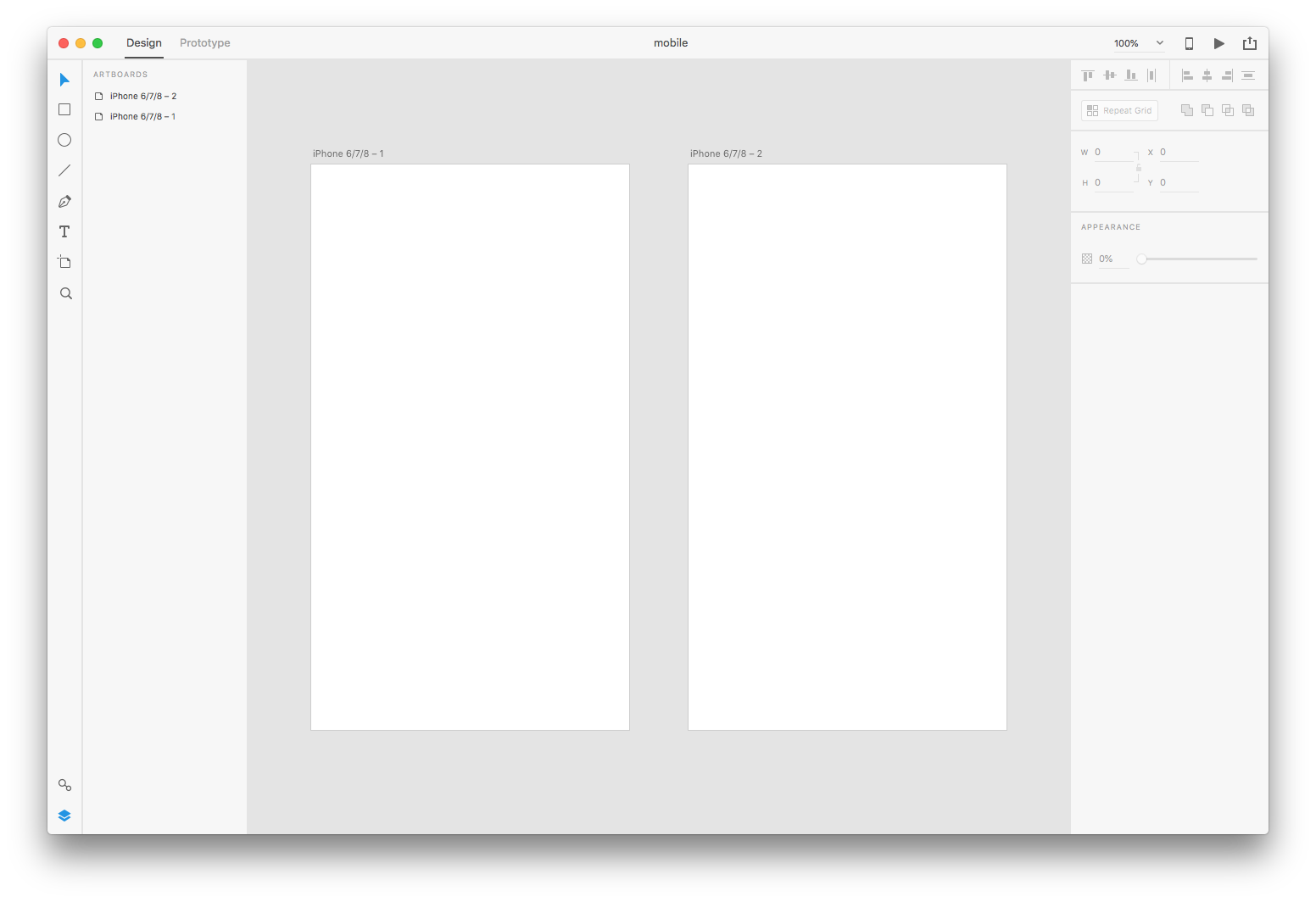
To get started, click on the artboard icon on the left side, and click to the right of your current artboard. This will create a second identical artboard, near the first one.
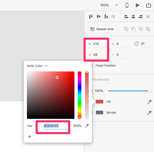
Let’s begin to design our elements, starting with the navigation bar. Click on the Rectangle tool (R) and draw a shape 414 pixels wide and 48 pixels tall. Set its color as #DE4F4F.
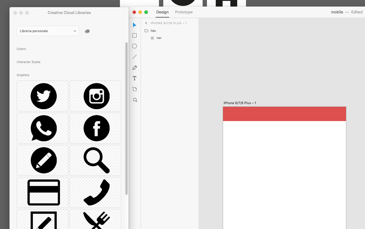
I’ve prepared some icons in Illustrator to use in our layout. Just open the Illustrator file I’ve provided, and drag and drop the icons in your library, as shown below:
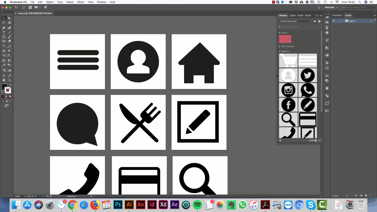
In doing so, your icons will be automatically uploaded to your Adobe XD library, too.
To learn more about how to use libraries in different apps, read my earlier article, in which I go over some examples of how to add icons and elements to a library (in Illustrator, for instance) and then access them by opening that library in other apps (XD, in this case).
Once you have added the icons, open your XD library. You should see the icons in place:
Drag and drop the icons on your artboard, as shown below. Position them, and make sure they are all about 25 pixels wide.
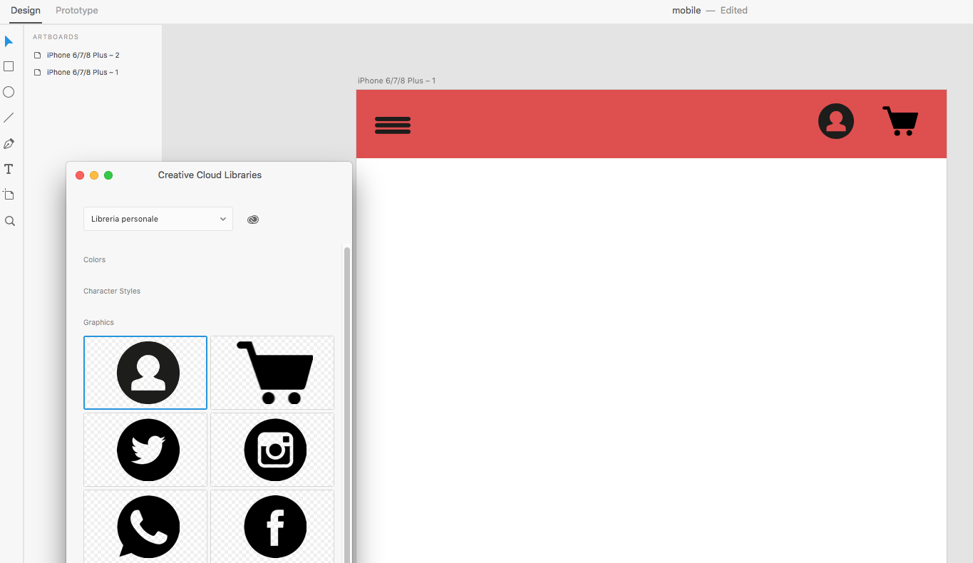
Because we need our icons to be white, we have to modify these. We can directly modify them in the library, as demonstrated in my previous tutorial. With that done, we’ll see them updated in XD directly, without having to drag them from the library again.

Now that the icons we want are in place, let’s create a logo. Let’s call this app “Gusto”. We’ll simply use the Text tool to add it. (I’m using the Leckerli One font here, but feel free to use whichever you like.) Align the logo to the middle of the navigation bar by clicking “Align center (horizontally)” in the right sidebar.
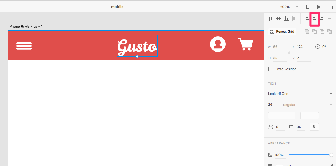
Group all of the navigation elements together, and call the group “Menu”. To do this, select all elements in the left panel, right-click and choose “Group”.


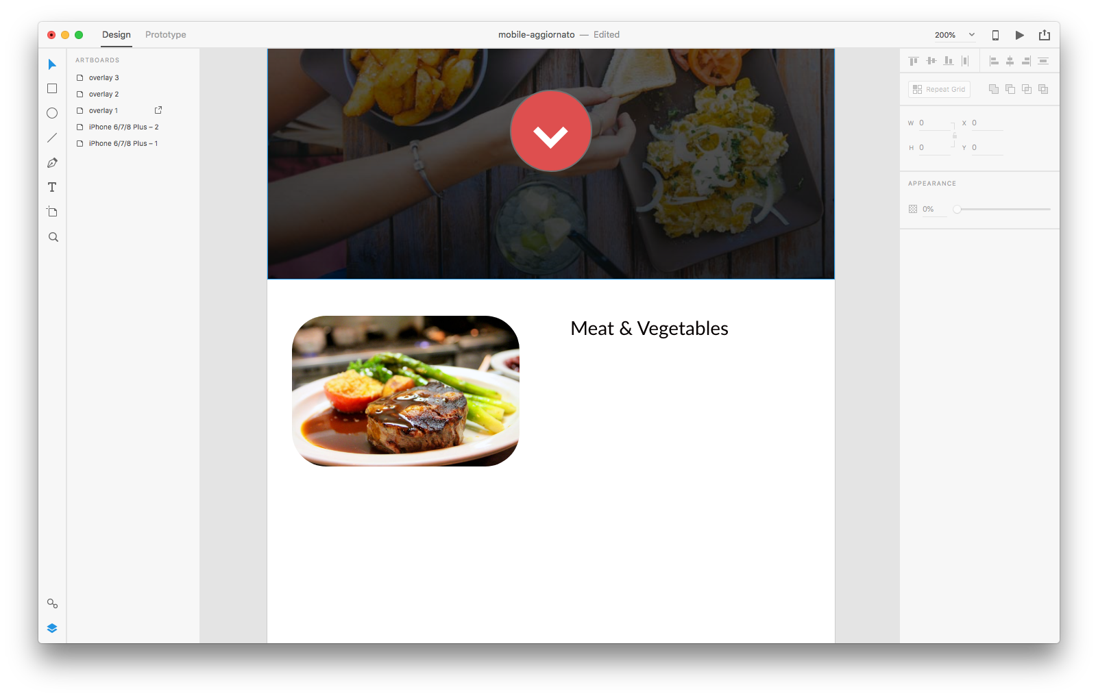
Let’s add a beautiful hero image. I selected one from Pexels. Drag it on your artboard, and resize its height to 380 pixels.
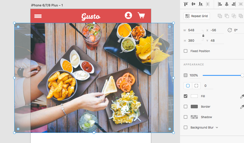
Now, click on Rectangle tool (R), and draw a rectangle the same size as the hero image, and place it on the image. Set a gradient for the rectangle’s color, using the values shown in the image below.
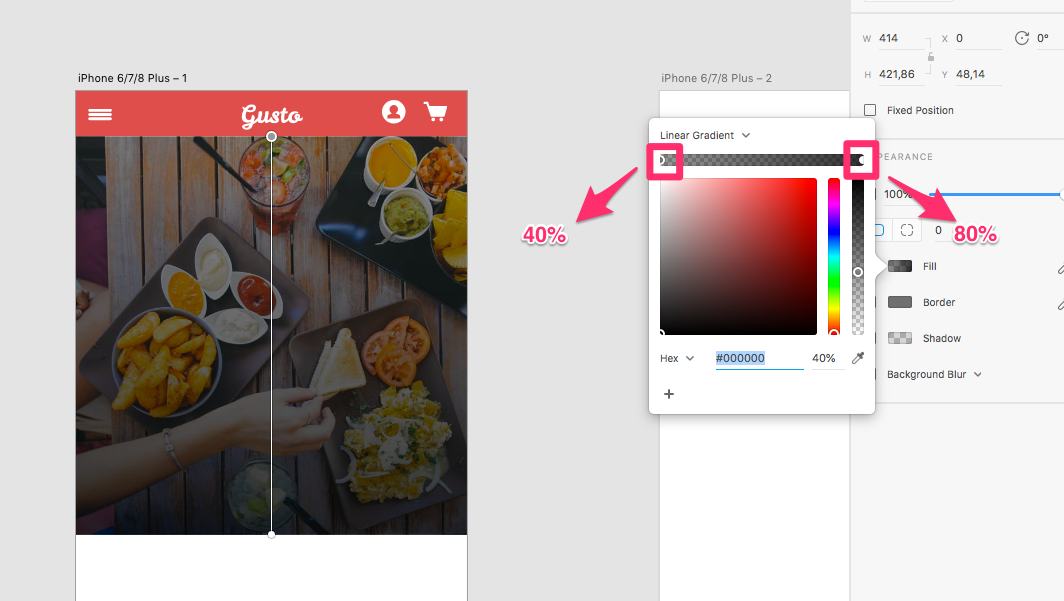
(If you’d like more information about gradients, feel free to see my previous tutorial on how to apply them in XD.)
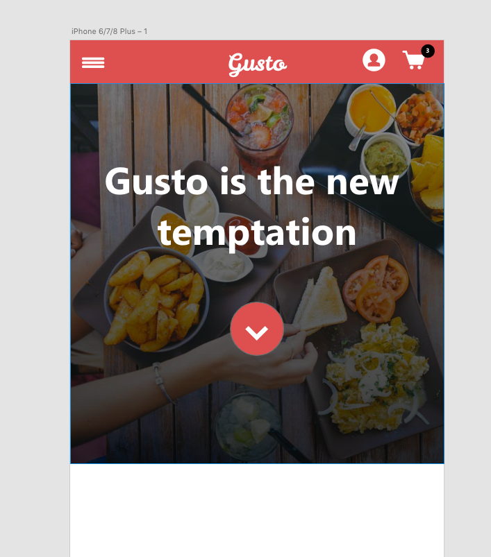
Insert some white text on the hero image and a circle for a button. Place a little circle with a number on the cart icon as well; we will need it later.
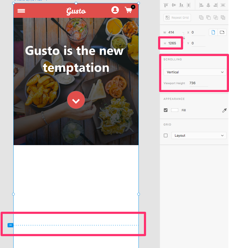
Next, let’s increase the artboard’s height. We have to do that in order to insert new elements and to create the scrolling simulation.
After double-clicking on the artboard, set its height to 1265 pixels. Be sure that “Scrolling” is set to “Vertical” and that the “Viewport Height” is set to 736 pixels. A little blue marker will allow you to set the scrolling boundary towards the bottom of the artboard, as seen below:
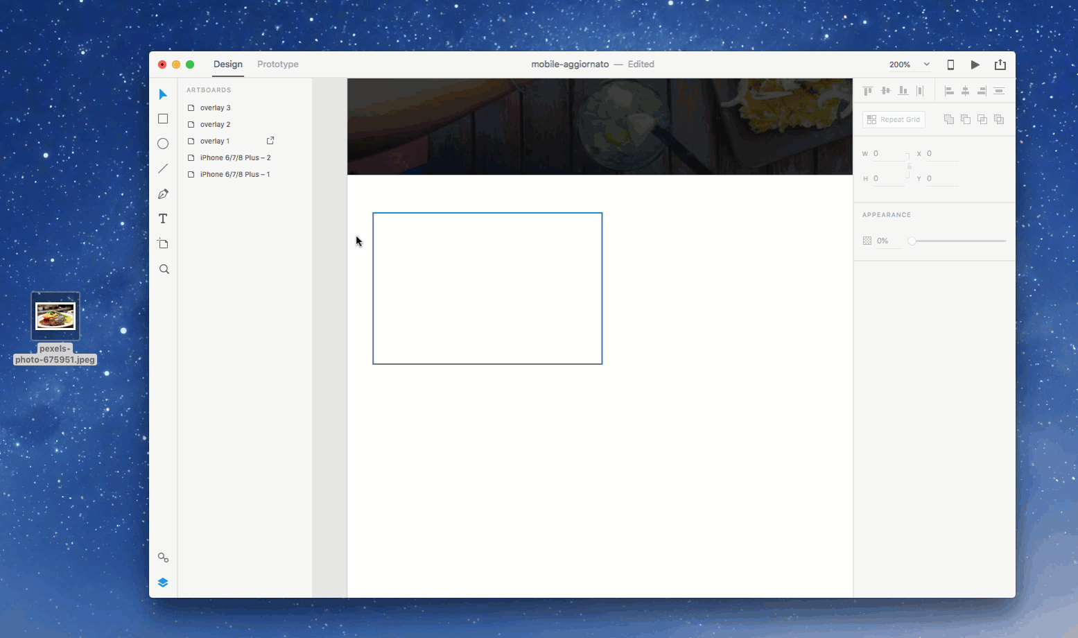
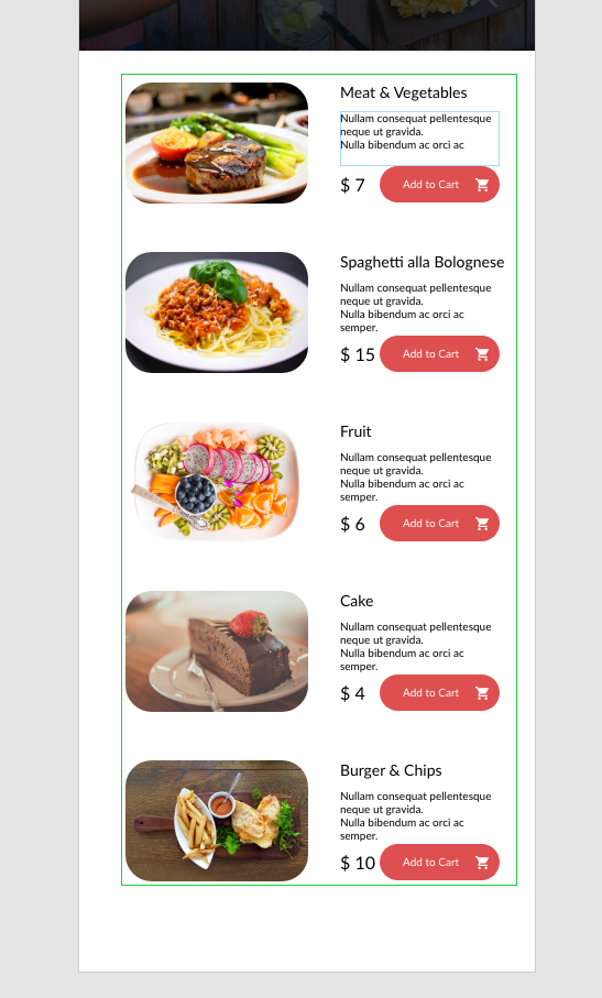
Let’s add in our content: Gusto’s mouthwatering menu. Click on the Rectangle tool (R) to create a rectangle for the picture that we will add.
Drag and drop a picture directly into the box we just created; the image will automatically fit in it. Click on it once, and drag the little white circle from an angle inwards, in order to round all of the angles. Their values should be around 25, as shown in the picture below. Get rid of the border by unchecking the border value in the right sidebar.
Click on the Text tool (T), and write a title on the right side of the image. I chose Lato as the font, at 14 pixels. Feel free to use another font, but maintain the 14-pixel size.
Grab the Text tool (T) again, and write some lines for the description (Lato, 10 pixels) and for the price (Lato, 16 pixels).
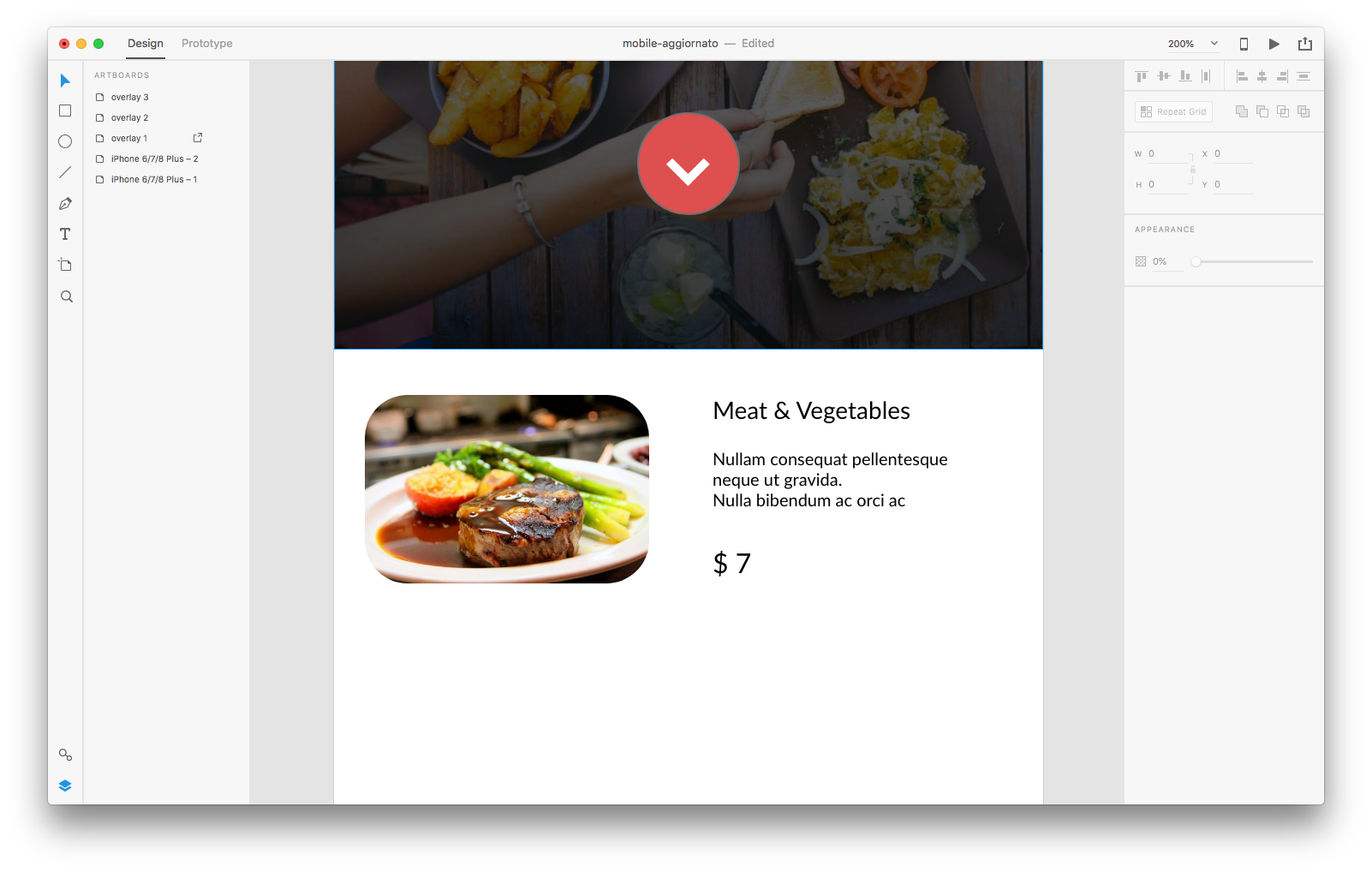
Take the Rectangle tool (R) and draw a rectangle of 100 by 30 pixels. Color it with the same orange we used on the button for the hero image; add the text “Add to Cart” with the Text tool (T); and add the cart icon from the library. All of these steps are covered in the short video below:
Finally, click on “Repeat Grid” to create a grid for this section. Once that’s done, we can change images and text easily, as shown in the video below:
If you want to learn more about how to create grids, follow my tutorial.
I used the following pictures from Pexels:
- https://www.pexels.com/photo/close-up-of-food-247685/
- https://www.pexels.com/photo/food-dinner-pasta-spaghetti-8500/
- https://www.pexels.com/photo/selective-focus-photography-of-beef-steak-with-sauce-675951/
- https://www.pexels.com/photo/food-plate-chocolate-dessert-132694/
- https://www.pexels.com/photo/bread-food-sandwich-wood-62097/
Add some titles, descriptions and buttons.
Finally, let’s add a rectangle for the footer, with the text “Gusto” in the center. Set the rectangle’s fill color to #211919.
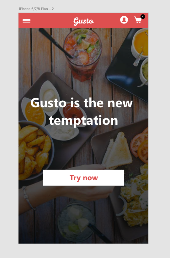
Yes! We’ve completed the first template design. Let’s set up our second template before we begin prototyping.
For our second mobile layout, just copy and paste the navigation and hero section from the first layout, and size the hero image to be full screen. Then, add a “Try Now” button to it.
In the short video below, I show you how to copy and paste elements into the second artboard, create a new button with the Rectangle tool (R) and write text on it with the Text tool (T).
Excellent! Let’s move on and create our prototypes.
Setting Fixed Elements
We want to make the top navigation of our layout fixed, making it stick to its position as we scroll the artboard.
Click on your “Menu” group to select it, and select “Fixed Position” in the right sidebar.
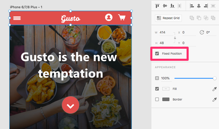
Important: In order for all elements to scroll under the menu, the menu should be on top of all other elements. Simply place the menu folder at the top, in the left sidebar.

Now, to see your fixed navigation in action, simply click on the “Desktop Preview” button and try scrolling. You should see this:

Tremendously simple, isn’t it?
Setting Overlay Elements
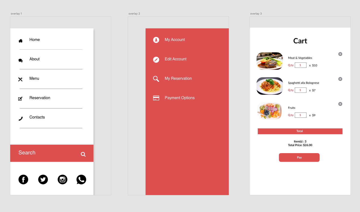
To see how overlays work in XD, we first need to create the elements that will be overlaid. When you click an item in the menu, what would you expect to happen? Exactly: A submenu should appear.
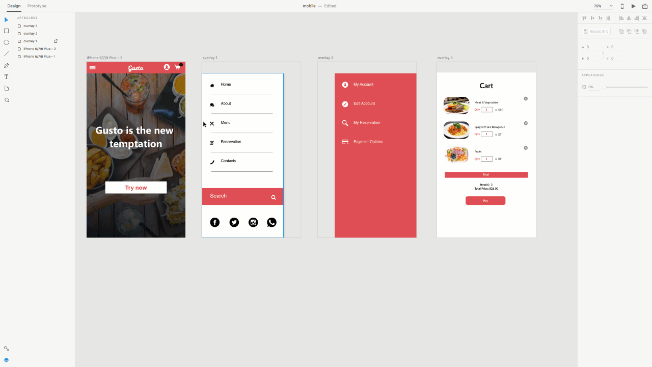
Let’s create three different submenus, like the ones in the image below, using the Rectangle tool (R). I chose a rectangle because the menu will overlay the screen, so it will cover not the whole artboard but just a part of it.
Follow the video below to see how I created the three overlay menus. You will see that I used the Rectangle tool (R), Line tool (L) and Text tool (T). We’re using rectangles to create the menu backgrounds because we need an object to overlay the screen. I’ve included the icons in the Adobe Illustrator file which you can directly download over here.
Below, you’ll see how I use “Repeat Grid” and how I modify elements inside of it.
Here is the final result:
We will work on the second home layout at this point.
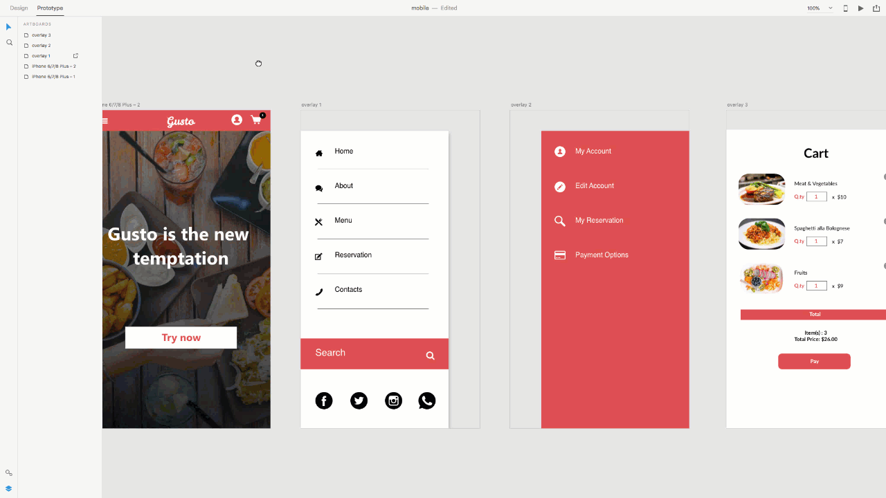
Set the visual mode to “Prototype”, selecting it from the top left of the screen.

Next, double-click on the little hamburger menu icon, and drag and drop the little blue arrow onto the “Overlay 1” artboard. When the popup window appears, choose “Overlay” and “Slide right”. Then, click the “Desktop Preview” button to see it in action.
Let’s do the same thing with the user icon and cart icon. Double-click on the user icon in Prototype mode, and drag and drop the little blue arrow onto the “Overlay 2” artboard. When the popup window appears, choose “Overlay” and “Slide left”. Then, click the “Desktop Preview” button to see it in action.

Now, double-click on the cart icon in Prototype mode, and drag and drop the little blue arrow onto the “Overlay 3” artboard. When the popup windows appears, choose “Overlay” and “Slide left”. Click the “Desktop Preview” button again to see it work.
We’re done! These great new features are super-easy to learn, and they’ll add a new level of interactivity simulation to your prototypes.
Quick tip: Want to preview the layout on your phone? Just upload your XD file to Creative Cloud, download the XD app for mobile, and open your document.
Here’s what we have learned in this tutorial:
- set and create mobile layouts and elements,
- set fixed elements,
- use overlays to simulate a click-to-open submenu.
Where would you use fixed elements or overlays? Feel free to share your examples in the comments below!
This article is part of the UX design series sponsored by Adobe. Adobe XD is made for a fast and fluid UX design process, as it lets you go from idea to prototype faster. Design, prototype and share — all in one app. You can check out more inspiring projects created with Adobe XD on Behance, and also sign up for the Adobe experience design newsletter to stay updated and informed on the latest trends and insights for UX/UI design.
Further Reading
- Enhancing Grid Design With GuideGuide, A Plugin For Photoshop And Illustrator
- Illustrating Animals With 13 Circles: A Drawing Challenge And Tutorial
- How To Succeed In Wireframe Design
- When You Find A Good Idea, Look For A Better One
 (il, yk, mrn)