Flexbox: How Big Is That Flexible Box?

Email Newsletter
Weekly tips on front-end & UX.
Trusted by 182,000+ folks.
 Register for Free

 Celebrating 10 million developers
 Custom Web Forms for Angular, React, & Vue. Your backend.

This is the third part of my series on Flexbox. In the past two articles, we have looked at what happens when you create a flex container and explored alignment as it works in Flexbox. This time we are going to take a look at sizing. How do we control the size of our flex items, and what choices is the browser making when it controls the size?
Initial Display Of Flex Items
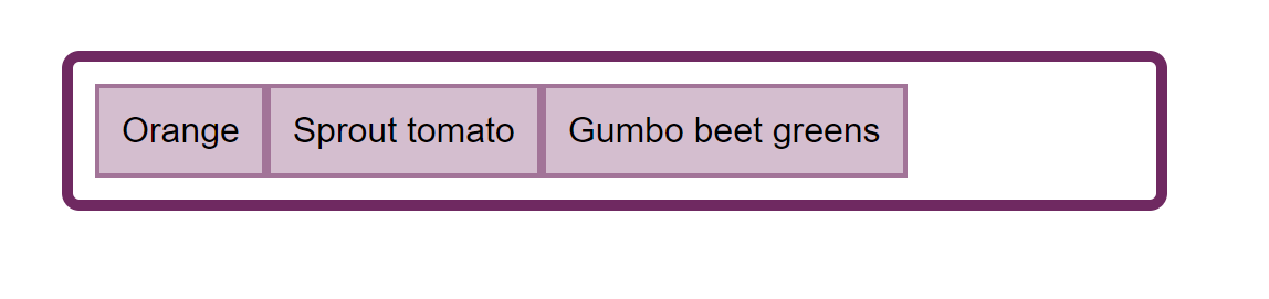
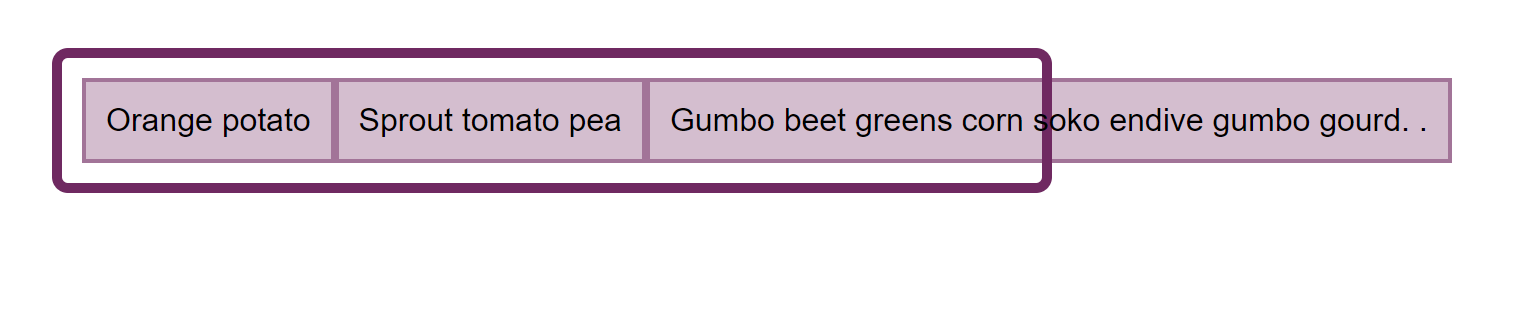
If I have a set of items, which have variable lengths of content inside, and set their parent to display: flex, the items will display as a row and line up at the start of that axis. In the example below my three items have a small amount of content and are able to display the content of each item as an unbroken line. There is space at the end of the flex container which the items do not grow into because the initial value of flex-grow is 0, do not grow.
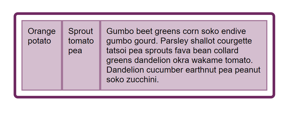
If I add more text to these items, they eventually fill the container, and the text begins to wrap. The boxes are assigned a portion of the space in the container which corresponds to how much text is in each box — an item with a longer string of text is assigned more space. This means that we don’t end up with a tall skinny column with a lot of text when the next door item only contains a single word.
This behavior is likely to be familiar to you if you have ever used Flexbox, but perhaps you have wondered how the browser is working that sizing out, as if you look in multiple modern browsers you will see that they all do the same thing. This is down to the fact that detail such as this is worked out in the specification, making sure that anyone implementing Flexbox in a new browser or other user agent is aware of how this calculation is supposed to work. We can use the spec to find this information out for ourselves.
The CSS Intrinsic And Extrinsic Sizing Specification
You fairly quickly discover when looking at anything about sizing in the Flexbox specification, that a lot of the information you need is in another spec — CSS Intrisnic and Extrinsic Sizing. This is because the sizing concepts we are using aren’t unique to Flexbox, in the same way that alignment properties aren’t unique to Flexbox. However, for how these sizing constructs are used in Flexbox, you need to look in the Flexbox spec. It can feel a little like you are jumping back and forth, so I’ll round up a few key definitions here, which I’ll be using in the rest of the article.
Preferred Size
The preferred size of a box is the size defined by a width or a height, or the logical aliases for these properties of inline-size and block-size. By using:
.box {
    width: 500px;
}
Or the logical alias inline-size:
.box {
    inline-size: 500px;
}
You are stating that you want your box to be 500 pixels wide, or 500 pixels in the inline direction.
min-content Size
The min-content size is the smallest size that a box can be without causing overflow. If your box contains text then all possible soft-wrapping opportunities will be taken.
max-content Size
The max-content size is the largest size the box can be to contain the contents. If the box contains text with no formatting to break it up, then it will display as one long unbroken string.
Flex Item Main Size
The main size of a flex item is the size it has in the main dimension. If you are working in a row — in English — then the main size is the width. In a column in English, the main size is the height.
Items also have a minimum and maximum main size as defined by their min-width or min-height on the main dimension.
Working Out The Size Of A Flex Item
Now that we have some terms defined, we can have a look at how our flex items are sized. The initial value of the flex properties are as follows:
flex-grow: 0flex-shrink: 1flex-basis: auto
The flex-basis is the thing that sizing is calculated from. If we set flex-basis to 0 and flex-grow to 1 then all of our boxes have no starting width, so the space in the flex container is shared out evenly, assigning the same amount of space to each item.
See the Pen Smashing Flexbox Series 3: flex: 1 1 0; by Rachel Andrew (@rachelandrew) on CodePen.
Whereas if flex-basis is auto and flex-grow: 1, only the spare space is distributed, taking the size of the content into account.
See the Pen Smashing Flexbox Series 3: flex: 1 1 auto short text by Rachel Andrew (@rachelandrew) on CodePen.
In situations where there is no spare space, for example when we have more content than can fit in a single line, then there is no space to distribute.
See the Pen Smashing Flexbox Series 3: flex: 1 1 auto long text by Rachel Andrew (@rachelandrew) on CodePen.
This shows us that figuring out what auto means is pretty important if we want to know how Flexbox works out the size of our boxes. The value of auto is going to be our starting point.
Defining Auto
When auto is defined as a value for something in CSS, it will have a very specific meaning in that context, one that is worth taking a look at. The CSS Working Group spend a lot of time figuring out what auto means in any context, as this talk for spec editor Fantasai explains.
We can find the information about what auto means when used as a flex-basis in the specification. The terms defined above should help us dissect this statement.
“When specified on a flex item, the auto keyword retrieves the value of the main size property as the used `flex-basis`. If that value is itself auto, then the used value is `content`.”
So if our flex-basis is auto, Flexbox has a look at the defined main size property. We would have a main size if we had given any of our flex items a width. In the below example, the items all have a width of 110px, so this is being used as the main size as the initial value for flex-basis is auto.
See the Pen Smashing Flexbox Series 3: flex items with a width by Rachel Andrew (@rachelandrew) on CodePen.
However, our initial example has items which have no width, this means that their main size is auto and so we need to move onto the next sentence, “If that value is itself auto, then the used value is content.”
We now need to look at what the spec says about the content keyword. This is another value that you can use (in supporting browsers) for your flex-basis, for example:
.item {
    flex: 1 1 content;
}
The specification defines content as follows:
“Indicates an automatic size based on the flex item's content. (It is typically equivalent to the max-content size, but with adjustments to handle aspect ratios, intrinsic sizing constraints, and orthogonal flows”
In our example, with flex items that contain text, then we can ignore some of the more complicated adjustments and treat content as being the max-content size.
So this explains why, when we have a small amount of text in each item, the text doesn’t wrap. The flex items are auto-sized, so Flexbox is looking at their max-content size, the items fit in their container at that size, and the job is done!
The story doesn’t end here, as when we add more content the boxes don’t stay at max-content size. If they did they would break out of the flex container and cause overflow. Once they fill the container, the content begins to wrap and the items become different sizes based on the content inside them.
Resolving Flexible Lengths
It’s at this point where the specification becomes reasonably complex looking, however, the steps that need to happen are as follows:
First, add up the main size of all the items and see if it is bigger or smaller than the available space in the container.
If the container size is bigger than the total, we are going to care about the flex-grow factor, as we have space to grow.
If the container size is smaller than the total then we are going to care about the flex-shrink factor as we need to shrink.
Freeze any inflexible items, which means that we can decide on a size for certain items already. If we are using flex-grow this would include any items which have flex-grow: 0. This is the scenario we have when our flex items have space left in the container. The initial value of flex-grow is 0, so they get as big as their max-width and then they don’t grow any more from their main size.
If we are using flex-shrink then this would include any items with flex-shrink: 0. We can see what happens in this step if we give our set of flex items a flex-shrink factor of 0. The items become frozen in their max-content state and so do not flex and arrange themselves to fit in the container.
See the Pen Smashing Flexbox Series 3: flex: 0 0 auto by Rachel Andrew (@rachelandrew) on CodePen.
In our case — with the initial values of flex items — our items can shrink. So the steps continue and the algorithm enters a loop in which it works out how much space to assign or take away. In our case we are using flex-shrink as the total size of our items is bigger than the container, so we need to take away space.
The flex-shrink factor is multiplied by the items inner base size, in our case that is the max-content size. This gives a value with which to reduce space. If items removed space only according to the flex-shrink factor then small items could essentially vanish, having had all of their space removed, while the larger item still has space to shrink.
There is an additional step in this loop to check for items which would become smaller or larger than their target main size, in which case the item stops growing or shrinking. Again, this is to avoid certain items becoming tiny, or massive in comparison to the rest of the items.
All that was simplified in terms of the spec as I’ve not looked at some of the more edge-casey scenarios, and you can generally simply further in your mind, assuming you are happy to let Flexbox do its thing and are not after pixel perfection. Remembering the following two facts will work in most cases.
If you are growing from auto then the flex-basis will either be treated as any width or height on the item or the max-content size. Space will then be assigned according to the flex-grow factor using that size as a starting point.
If you are shrinking from auto then the flex-basis will either be treated as any width or height on the item or the max-content size. Space will then be removed according to the flex-basis size multiplied by the flex-shrink factor, and therefore removed in proportion to the max-content size of the items.
Controlling Growing And Shrinking
I’ve spent most of this article describing what Flexbox does when left to its own devices. You can, of course, exercise greater control over your flex items by using the flex properties. They will hopefully seem more predictable with an understanding of what is happening behind the scenes.
By setting your own flex-basis, or given the item itself a size which is then used as the flex-basis you take back control from the algorithm, telling Flexbox that you want to grow or shrink from this particular size. You can turn off growing or shrinking altogether by setting flex-grow or flex-shrink to 0. On this point, however, it is worth using a desire to control flex items as a time to check whether you are using the right layout method. If you find yourself trying to line up flex items in two dimensions then you might be better choosing Grid Layout.
Debugging Size Related Issues
If your flex items are ending up an unexpected size, then this is usually because your flex-basis is auto and there is something giving that item a width, which is then being used as the flex-basis. Inspecting the item in DevTools may help identify where the size is coming from. You can also try setting a flex-basis of 0 which will force Flexbox to treat the item as having zero width. Even if this isn’t the outcome that you want, it will help to identify the flex-basis value in use as being the culprit for your sizing issues.
Flex Gaps
A much-requested feature of Flexbox is the ability to specify gaps or gutters between flex items in the same way that we can specify gaps in grid layout and multi-column layout. This feature is specified for Flexbox as part of Box Alignment, and the first browser implementation is on the way. Firefox expects to ship the gap properties for Flexbox in Firefox 63. The following example can be viewed in Firefox Nightly.
See the Pen Smashing Flexbox Series 3: flex-gaps by Rachel Andrew (@rachelandrew) on CodePen.

As with grid layout, the length of the gap is taken into account before space is distributed to flex items.
Wrapping Up
In this article, I’ve tried to explain some of the finer points of how Flexbox works out how big the flex items are. It can seem a little academic, however, taking some time to understand the way this works can save you huge amounts of time when using Flexbox in your layouts. I find it really helpful to come back to the fact that, by default, Flexbox is trying to give you the most sensible layout of a bunch of items with varying sizes. If an item has more content, it is given more space. If you and your design don’t agree with what Flexbox thinks is best then you can take control back by setting your own flex-basis.
Further Reading
- 55 Free High Quality Icon Sets
- The Ultimate Guide To Cloning In Photoshop
- Hand-Sketching: Things You Didn’t Know Your Doodles Could Accomplish
- Switching From Adobe Fireworks To Sketch: Ten Tips And Tricks
 (il, mrn)

