A Guide To Embracing Challenges And Excelling At Your UX Design Internship

Email Newsletter
Weekly tips on front-end & UX.
Trusted by 182,000+ folks.


 Custom Web Forms for Angular, React, & Vue. Your backend.
 Celebrating 10 million developers

This is the story about my user design internship. I’m not saying that your internship is going to be anything like mine. In fact, if there’s one thing I can say to shape your expectations, it would be this: be ready to put them all aside. Above all else, remember to give yourself space and time to learn. I share my story as a reminder of how much I struggled and how well everything went despite my difficulties so that I’ll never stop trying and you won’t either.
It all started in May 2018, when I stepped off the plane in Granada, Spain, with a luggage at my side, laptop on my back, and some very rusty Spanish in my head. It was my first time in Europe and I would be here for the next three months doing an internship in UX design at Badger Maps. I was still pretty green in UX, having been learning about it for a barely a year at this point but I felt ready and eager to gain experience in a professional setting.
Follow along as I learned how to apply technical knowledge to complete the practical design tasks assigned to me:
- Create a design system for our iOS app using Sketch;
- Design a new feature that would display errors occurring in data imports;
- Learn the basics HTML, CSS, and Flexbox to implement my design;
- Create animations with Adobe Illustrator and After Effects.
This article is intended for beginners like me. If you are new to UX design looking to explore the field — read on to learn if a UX design internship is the right thing for you! For me, the work I ended up completing went well beyond my expectations. I learned how to a design system, how to compromise design with user needs, the challenges of implementing a new design, and how to create some “moments of delight.” Every day at the internship presented something new and unpredictable. At the conclusion of my internship, I realized I had created something real, something tangible, and it was like everything I had struggled with suddenly fell into place.
Recommended reading: How To Land A First-Rate Graphic Design Internship
Chapter 1: Legos
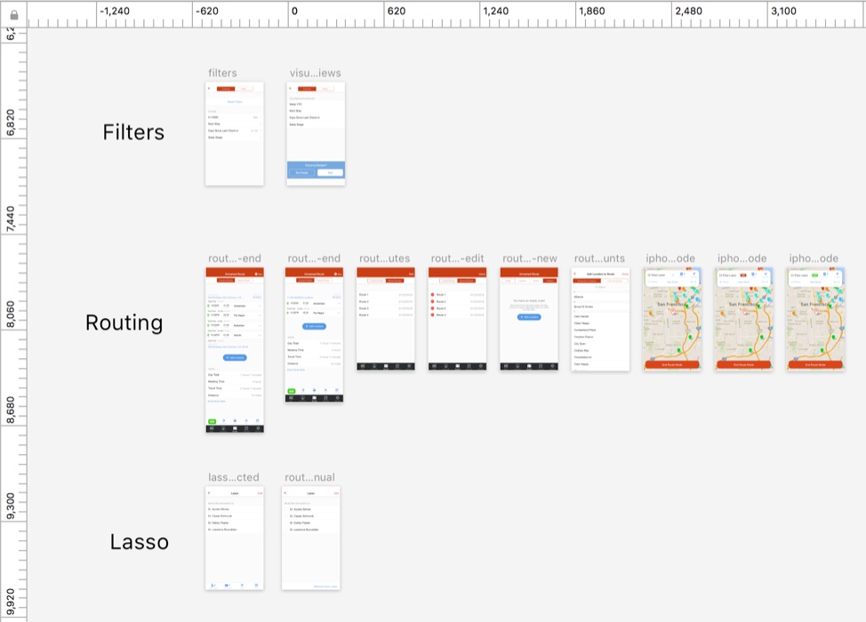
My first task was to create a design system for our existing iOS app. I had created design systems in the past for my own projects and applications, but I had never done them retrospectively and never for a design that wasn’t my own. To complete the assignment, I needed to reverse engineer the mockups in Sketch; I would first need to update and optimize the file in order to create the design system.
It was also at this opportune moment when I learned the Sketch program on my computer had been outdated for about a year and a half. I didn’t know about any of the symbols, overrides and other features in the newer versions. Lesson learned: keep your software updated.
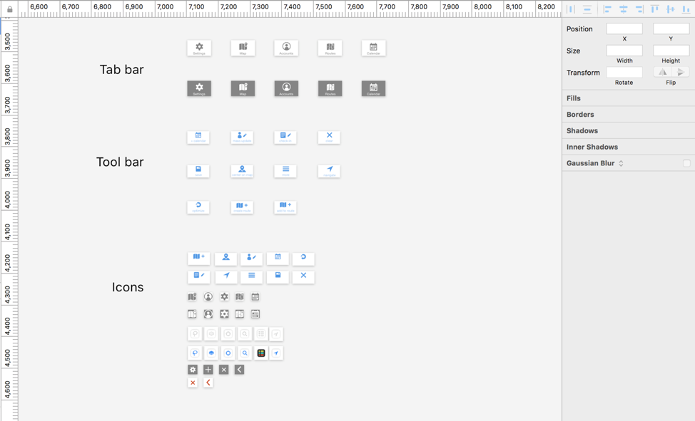
Before worrying about the symbols page, I went through the mockups artboard by artboard, making sure they were updated and true to the current released version of the application. Once that was done, I began creating symbols and overrides for different elements. I started with the header and footer and moved on from there.
As a rule of thumb, if an element showed up in more than one page, I would make it a symbol. I added different icons to the design system as I went, building up the library. However, it quickly became clear that the design system was evolving and changing faster than I could try to organize it. Halfway through, I stopped trying to keep the symbols organized, opting instead to go back and reorganize them once I had finished recreating each page. When I stopped going back and forth between mockups and symbols and worrying about the organization for both, I could work more efficiently.
It was easy to come to appreciate the overrides and symbols in Sketch. The features made the program much more powerful than what I was used to and increased the workability of the file for future designs. The task of creating the design system itself challenged me to dive deep into the program as well as understand all the details of the design of our application. I began to notice small inconsistencies in spacing, icon size, or font sizes that I was able to correct as I worked.
The final step was to go back into the symbols page and organize everything. I weeded through all the symbols, deleted those not in use and any replicas. Despite being a little tedious, this was a very valuable step in the process. Going through the symbols after working through the document gave me a chance to reevaluate how I had created the symbols for each page. Grouping them together forced me to consider how they were related throughout the app.
By going through this thought process, I realized how challenging it was to create a naming system. I needed to create a system broad enough to encompass enough elements, specific enough to avoid being vague, and that could easily be understood by another designer. It took me a few tries before I landed upon a workable system that I was happy with. Ultimately, I organized elements according to where they were used in the application, grouping pieces like lists together. It worked well for an application like Badger that had distinct designs for different features in the app. The final product was a more organized file that would be a lot easier to work with for any future design iterations.
As a capstone to this project, I experimented with modernizing the design. I redesigned the headers throughout the app, drawing on native apple apps for inspiration. Happily, the team was excited about it as well and are considering implementing the changes in future updates to the app.
Overall, working a Sketch file to such detail was an unexpectedly helpful experience. I left with a much greater fundamental understanding of things like font size, color, and spacing by virtue of redoing every page. The exercise of copying existing design required a minute attention to detail that was very satisfying. It was like putting together a Lego model: I had all the pieces and knew what the end product needed to look like. I just needed to organize everything and put them together to create the finished product. This is one of the reasons why I enjoy doing UX design. It’s about the problem solving and piecing together a puzzle to create something that everyone can appreciate.
Chapter 2: The Design
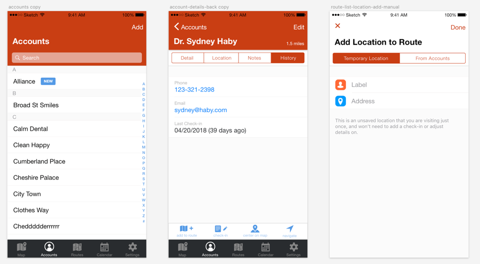
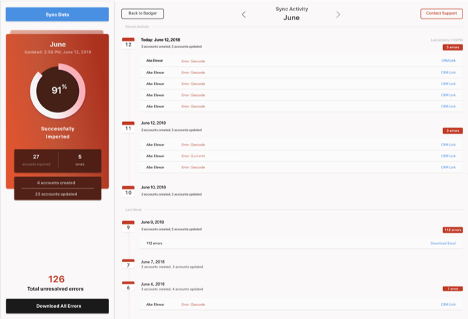
The next part of my internship allowed me to get into the weeds with some design work. The task: to design a new import page for the Badger web application.
The team was working on redesigning the badger to CRM integration to create a system that allowed users to view any data syncs and manage their accounts themselves. The current connection involves a lot of hands-on work from badger CSAs and AEs to set up and maintain. By providing an interface for users to directly interact with the data imports, we wanted to improve the user experience for our CRM integration.
My goal was to design a page that would display errors occurring in any data imports that also communicated to users how and where to make the necessary changes to their data. If there were more errors associated with a single import or users would like to view all errors at once, they should be able to download an excel file of all that information.
Objectives
- Create an import page that informs the user on the status of an import in process;
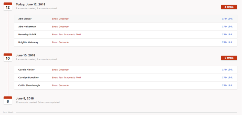
- Provide a historical record of account syncs between Badger and the CRM with detailed errors associated with each import;
- Provide links to the CRM for each account that has an import error in Badger;
- Allow users to download an excel file of all outstanding errors.
User Stories
Badger customer with CRM account:
As a customer with a CRM, I want to be able to connect my CRM to my badger and visualize all data syncs so that I’m aware of all errors in the process and can make changes as necessary.
Badger:
As a badger, I want users to be able to manage and view the status of their CRM integration so that I can save time and manual work helping and troubleshooting users syncing their badger to their CRM accounts.
Before I really delved into the design, we needed to go through some thinking to decide what information to show and how:
- Bulk versus continuous imports
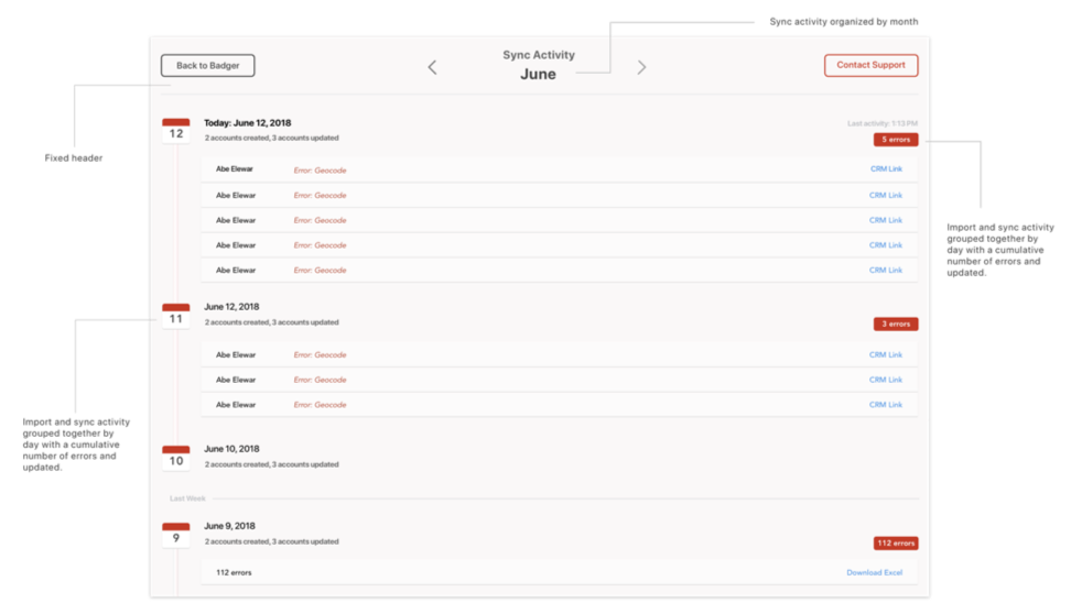
Depending on the type of user, there are two ways to import data to Badger. If done through spreadsheets, the imports would be batched and we would be able to visualize the imports in groups. Users integrated with their CRMs, however, would need to have their Badger data updated constantly as they made changes within their CRM. The design needed to be able to handle both use cases. - Import records
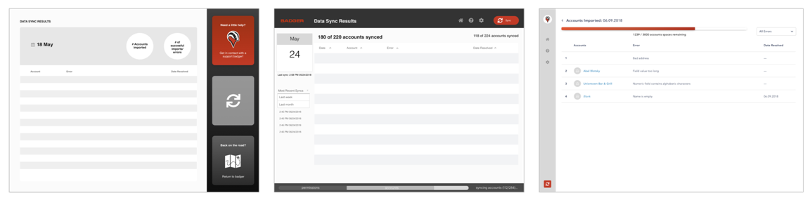
Because this was a new feature, we weren’t absolutely sure of the user behavior. Thus, deciding how to organize the information was challenging. Should we allow users to go for an infinity scroll in a list of their history? How would they search for a specific import? Should they be able to? Should we show the activity day-by-day or month by month?
Ultimately, we were only able to make a best guess for each of these issues — knowing that we could make appropriate adjustments in the future once users began using the feature. After thinking these issues out, I moved into wireframing. I had the opportunity to design something completely different and this was both liberating and challenging. The final design was a culmination of individual elements from various designs that were created along the way.
Design Process
The hardest part of this process was learning to start over. I eventually learned that forcing something into my design for solely aesthetic purposes was not ideal. Understanding this and letting my ideas go was key to arriving at a better design. I needed to learn how to go start over again and again to explore different ideas.
Challenges
1. Using White Space
Right off the bat, I needed to explore what information we wanted to show on the page. There were many details we could include — and definitely the room to do it.
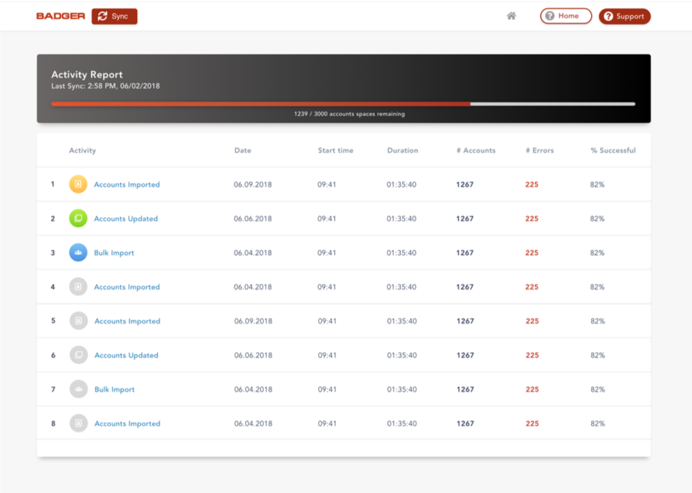
All the unnecessary information added way too much cognitive load and took away from what the user was actually concerned about. Instead of trying to get rid of all the white space, I needed to work with it. With this in mind, I eventually chucked out all the irrelevant information to show only what we expect our users to be most concerned about: the errors associated with data imports.
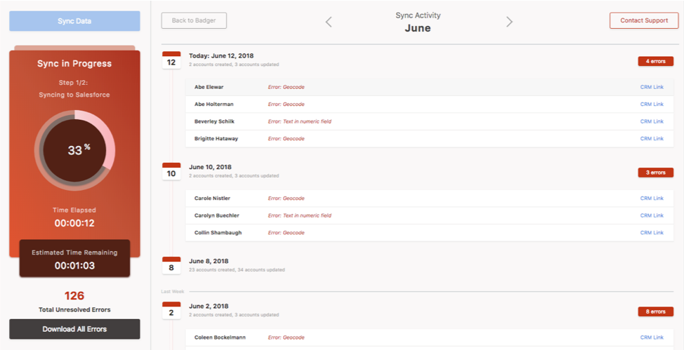
This was the final version:
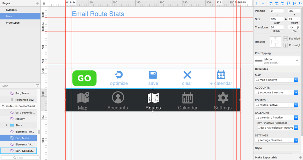
2. Navigation
The next challenge was deciding between a sidebar versus a header for displaying information. The advantages to the sidebar was that the information would be consistently visible as the user scrolled. But we also had to ensure that the information contained in the sidebar was logically related to what was going on in the rest of the page.
The header offered the advantage of a clean, single column design. The downside was that it took up a lot of vertical real estate depending on how much information was contained in the header. It also visually prioritized the contents of the header over what was below it for the user.
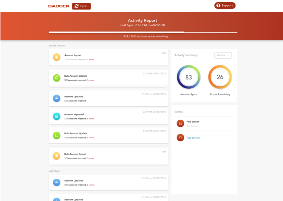
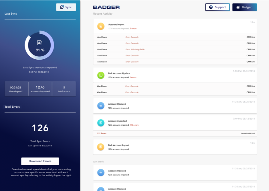
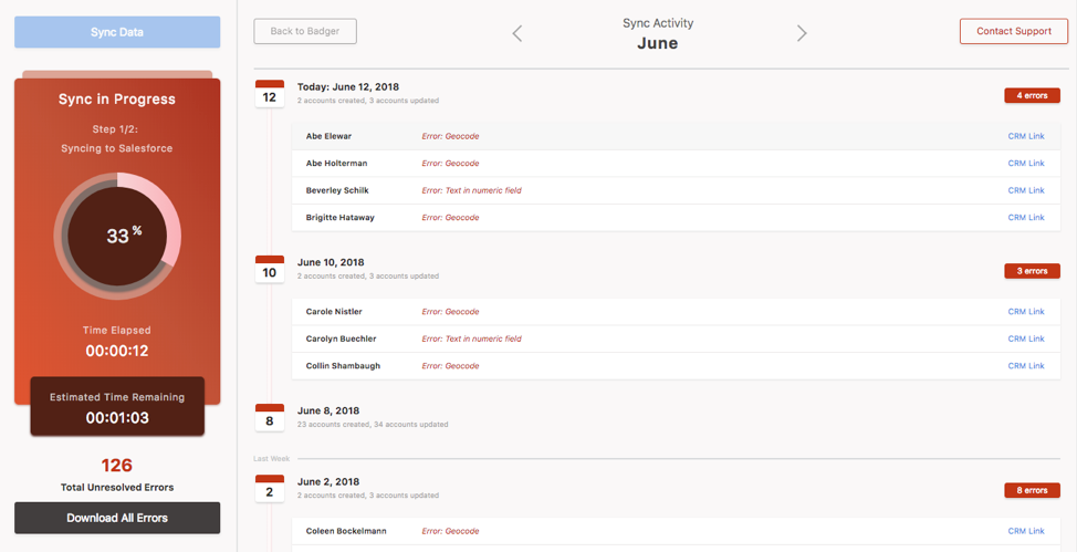
Once I worked out what information to display where, the sidebar navigation became the more logical decision. We expect users to be primarily concerned with the errors associated with their imports and with a large header, too much of that information would fall below the fold. The sidebar could then be a container for an import and activity summary that would be visible as the user scrolled.
Sidebar design: After I decided on having a sidebar, it came down to deciding what information to include and how to display it.
I struggled to create a design that was visually interesting because there was little information to show. For this reason, I once again found myself adding in unnecessary elements to fill up the space although I wanted to prioritize the user. I experimented with different content and color combinations, trying to find the compromise between design and usability. The more I worked with it, the more I was able to parse down the design to the bare bones. It became easier to differentiate useful information from fillers. The final product is a streamlined design with just a few summary statistics. It also offers great flexibility to include more information in the future.
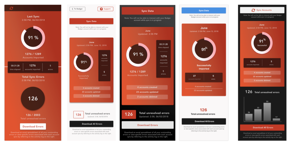
Import process: The import progress page was created after the design for the import page was finalized. The biggest design challenge here was deciding how to display the in-progress import sync. I tried different solutions from pop-ups and overlays but ultimately settled with showing the progress in the sidebar. This way, users can still resolve any errors and see the historical record of their account data while an import is in progress. To prevent any interruptions to the import, the ‘Sync data’ and ‘Back to Badger’ buttons are disabled so users can’t leave the page.
With the designs done, I moved onto HTML and CSS.
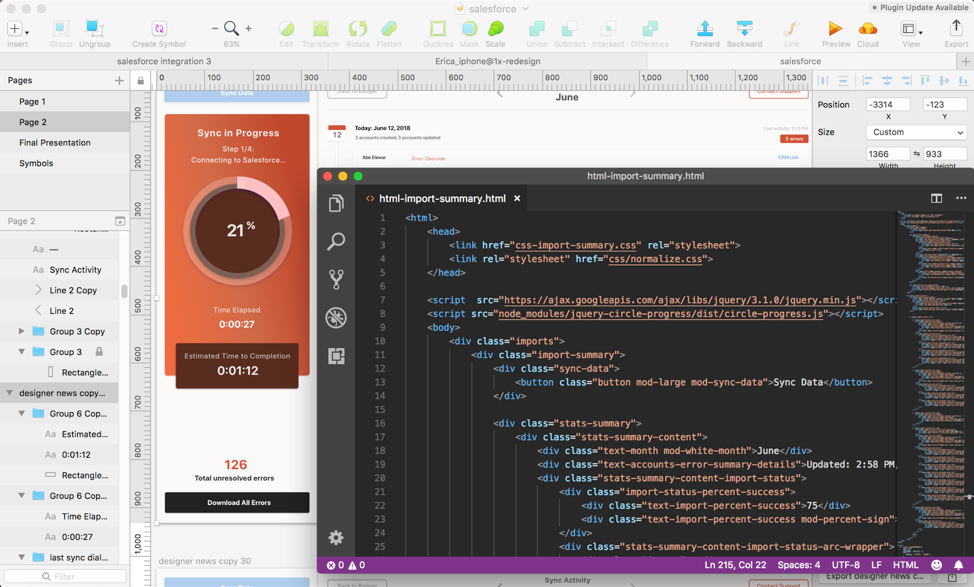
Chapter 3: HTML/CSS
This project was my first experience with any type of coding. Although I had tried to learn HTML and CSS before, I had never reached any level of proficiency. And what better way to start than with a mockup of one's own design?
Understanding the logic of organizing an HTML document reminded me of organizing the Sketch document with symbols and overrides. However, the similarities ended there. Coding felt like a very alien thing that I was consistently trying to wrap my head around. As my mentor would say, “You’re flexing very different muscles in programming than you are in design.” With the final product in hand now, I’m fully convinced that learning to code is the coolest thing I’ve learned to do since being potty trained.
The first challenge, after setting up a document and understanding the basics, was working with Flexbox. The design I had created involved two columns side by side. The right portion was meant to scroll while the left remained static. Flexbox seemed like a clean solution for this purpose, assuming I could get it to work.
Implementing Flexbox consisted of a lot of trial and error and blind copying of code while I scrambled through various websites, reading tutorials and inspecting code. With guidance from my mentor through this whole process, we eventually got it to work. I will never forget the moment when I finally understood that by using flex-direction: column I would get all of the elements into a single column, and flex-direction: row helped placed them in one row.
It makes so much sense now, although my initial understanding of it was the exact opposite (I thought flex-direction: column would put elements in columns next to each other). Surprisingly, I didn’t even come to this realization until after the code was working. I was reviewing my code and realized I didn’t understand it at all. What tipped me off? In my CSS, I had coded flex-direction: row into the class I named column. This scenario was pretty indicative of how the rest of my first coding experience went. My mental model was rarely aligned with the logic of the code, and they often clashed and went separate ways. When this happened, I had to go back, find my misconceptions, and correct the code.
After setting up Flexbox, I needed to figure out how to get the left column to stay fixed while the right portion scrolled. Turns out this couldn’t be achieved with a single line of code as I had hoped. But working through this helped me understand the parent-child relationship that aided me immensely with the rest of the process.
Coding the vertical timeline and the dial was also a process. The timeline was simpler than I had originally anticipated. I was able to create a thin rectangle, set an inner shadow and a gradient filling to it, and assign it to the width of each activity log.
The dial was tricky. I tried implementing it with pure CSS with very little success. There were a few times I considered changing the design for something simpler (like a progress bar) but I’m quite happy I stuck with it.
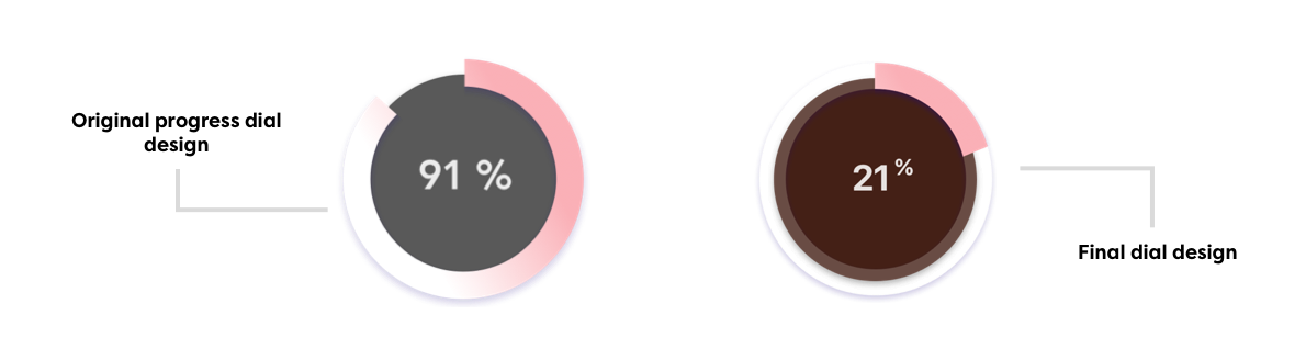
A major struggle was getting outside progress dial to overlap the background circle along the border. This was where I changed the design a little bit — instead of having the unloaded portion of the progress dial cut out, it overlaps all around. It was a compromise between my design and code that I was initially unwilling to make. As it turns out, however, I was satisfied with the final result and once I realized this, I was happy to make that compromise. The final dial was implemented via JavaScript.
There was a moment in my coding process where I threw every line of code I’d ever written into every class to try to make it work. To make up for this lack of hindsight, I needed to spend quite a while going through and inspecting all the elements to remove useless code. I felt like a landlord kicking out the tenants who weren’t paying rent. It was most definitely a lesson learned in maintaining a level of housekeeping and being judicious and thoughtful with code.
The majority of the experience felt like blind traversing and retrospective learning. However, nothing was more satisfying than seeing the finished product. Going through the process made me interact with my work in a way I had never done before and gave me insight into how design is implemented. In all of my expectations for the internship, I never anticipated being able to code and create one of my own designs. Even after being told I would be able to do so on my first day, I didn’t believe it until after seeing this page completed.
Chapter 4: Working With Baby Badgers
As part of the process integrating Badger users with their CRM accounts, we needed our users to sign into their CRM — requiring us to redirect them out of badger to the native CRM website. To prevent a sudden, jarring switch from one website to another, I needed to design intermediate loading pages.
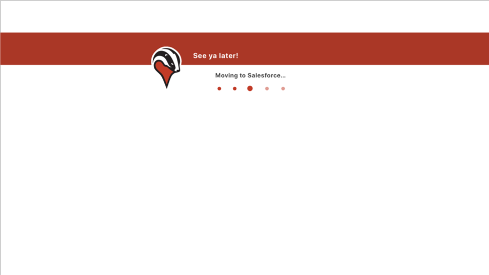
I started out with your run-of-the-mill static redirection page. They were simple and definitely fulfilled their purpose, but we weren’t quite happy with them.
The challenge was to create something simple and interesting that informed the user they were leaving our website in just a few seconds it was visible. The design would need to introduce itself, explain why it was there, and leave before anyone got tired of looking at it. It was essentially an exercise in speed dating. With that in mind, I decided to try animations — specifically that of a cheeky little badger, inspired by the existing logo.
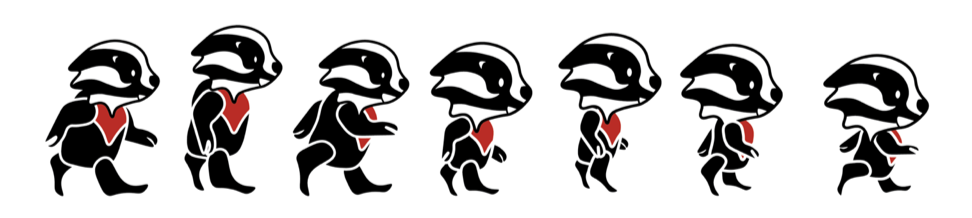
Using the badger logo as a starting reference point, I created different badger characters in Adobe Illustrator. The original logo felt a little too severe for a loading animation, so I opted for something a little cuter. I kept the red chest and facial features from the original logo for consistency and worked away at creating a body and head around these elements. The head and stripes took a while to massage into shapes that I was happy with. The body took the form a little easier, but it took a little longer to find the right proportion between the size of the head and the body. Once I nailed that down, I was ready to move onto animating.

My first instinct was to try a stop-motion animation. I figured it was going to be great — a lá Wallace and Gromit. But after the first attempt and then the second, and all the ensuing ones, it became clear that watching that show as a child had not fully equipped me with the skills required to do a stop-motion animation.
I just wasn't able to achieve the smoothness I wanted, and there were small inconsistencies that felt too jarring for a very short loading animation. Animation typically runs at 23 frames per second, and my badger animation only had about 15 frames per second. I considered adding more frames, but upon suggestion from my mentor, decided to try character animation instead.
This was the first time I had animated anything that was more than 5 moving parts and there was definitely a learning curve to understanding how to animate a two-dimensional character in a visually satisfying way. I needed to animate the individual elements to move by themselves independent of the whole in order to make the motion believable. As I worked on the animation, the layers I imported became increasingly granular. The head went from being one layer to five as I learned the behavior of the program and how to make the badger move.
I anchored each limb of the body and set each body part as a child to the parent layer of the body. I set the anchor points accordingly at the top of the thighs and shoulders to make sure they moved appropriately and then, using rotations and easing, simulated the movement of the body parts. The head was a tad bit tricky and required some vertical movement independent of the body. To make the jump seem more realistic, I wanted the head to hang in space a little before being pushed up by the rest of the body, and to come down just slightly after the rest of him. I also adjusted the angle I tried to make him seems as if he were leading with his nose, pointing up during the jump, and straightforward while he ran.
The animation featured on the page redirecting the user back to badger displayed the baby badger running back to badger with a knapsack full of information from the CRM.
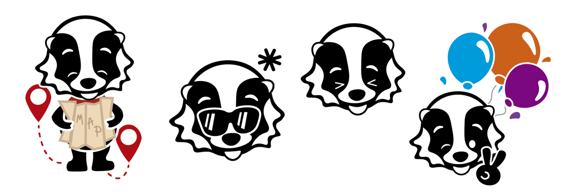
And finally: the confused badger. This was done for the last page I needed to create: an error page notifying the user of unexpected complications in the integration process. And what better way to do that then a sympathetic, confused badger?

The tricky part here was combining the side profile of the existing cartoon badger and the logo to create a front-facing head shape. Before beginning this project, I had never once seen a real live badger. Needless to say, Badger has found its way into my google image searches this month. I was surprised to see how flat the head of a badger actually is. In my first few designs, I tried to mimic this but wasn’t satisfied with the result. I worked with the shape some more, adjusting the placement of the nose, the stripes, and the ears to achieve the final result:
This animation process has forced me to take my preexisting knowledge to a higher level. I needed to push myself beyond what I knew rather than limiting myself with what I thought I could do. I originally started with the stop-motion animation because I didn’t trust myself to do character animation. By giving myself the chance to try something new and different, I was able to achieve something that exceeded my own expectations.
Conclusion
The three months I spent at my internship were incredibly gratifying. Every single day was about learning and trying something new. There were challenges to everything I did — even with tasks I was more familiar with such as design. Every time I created something, I was very insecure and apprehensive about how it would be received. There was a lot of self-doubt and lots of discarded ideas.
For that reason, it was incredible to be part of a team and to have a mentor to lead me in the right direction. Being told to try something else was often the only encouragement I needed to try something else and achieve something bigger and better. I like to picture myself as a rodent in a whack-a-mole game, being hit on the head over and over but always popping up again and again. Now the struggles and challenges have come to an end, I only want to do it all over again.
I appreciate what I’ve learned and how I was pushed to go beyond what I thought I could do. It’s crazy to see how far I’ve come in a few months. My understanding of being a UX designer has grown immensely, from figuring out the features, to hammering out the design, and then writing front-end code to implement it. This internship has taught me how much more I have to learn and has motivated me to keep working. I’ve come to understand that what I can do should never be limited by what I know how to do.

Further Reading
- How To Land A First-Rate Graphic Design Internship
- Internship At Smashing Magazine: A Challenge I Would Not Trade A Second Of
- What I Wish I Knew About Working In Development Right Out Of School
- How To Become A Better Speaker At Conferences
 (mb, ra, yk, il, mrn)

