Designing Experiences To Improve Mental Health

Email Newsletter
Weekly tips on front-end & UX.
Trusted by 182,000+ folks.
 Register for Free


 Custom Web Forms for Angular, React, & Vue. Your backend.
 Celebrating 10 million developers
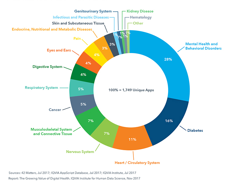
Did you know that a simple search for “depression” on the iPhone App Store brings up 198 results? In the Android Play Store, it brings up 239. The categories range from “Medical” to “Health & Fitness” to “Lifestyle.” The apps themselves offer everything from “depressing wallpaper” to “mood tracker” to “life coach.” We are approaching a golden age of digital therapeutics and design for mental health — if we as UX practitioners do our jobs well.
Given the plethora of apps available, you might assume that there are already dozens of wonderful digital therapies available for people struggling with mental health disorders. But — according to initial studies by clinical psychologists — you would be wrong. Most apps are useless at best, and harmful at worst, due primarily to a disconnect between the designers building the apps and the patients and providers in the field of mental health.
Some apps (mostly within the Lifestyle category) are harmless but useless. Emo Wallpaper, for example, is appropriately named and makes no claims to treat mental illness. It is intended as entertainment for people who are having a tough day. But there are more dangerous examples. One of the worst (since removed from the App Store) was iBipolar, which recommended that people in the middle of a manic episode drink hard liquor to help them sleep. Not only is this bad advice — alcohol does not lead to healthy sleep — but alcoholism is a problem for many people with bipolar disorder. The app was actively harmful.
Prescription drugs are regulated by the FDA, while mobile apps are not. How can we as UX designers create better apps to improve mental health treatment?
Are Apps The Answer?
Approximately one in five American adults experience mental illness each year. For some people, this can refer to a temporary depressive episode brought on by grief, such as the death of a loved one, or severe anxiety caused by external factors like a stressful job. For nearly 1 in 25 Americans (about 10 million people) it’s a chronic condition, such as bipolar disorder, chronic depression, or schizophrenia. Yet only about 40% of people experiencing mental illness are receiving treatment.
Recommended reading: Mental Health: Let’s Talk About It
The reasons vary. For some, they are undiagnosed or may refuse treatment. They may struggle with the stigma attached to mental illness. But for many, there is a lack of access. The association Mental Health America has studied and reported on what “limited access” means, and identified four systemic barriers:
- Lack of insurance or inadequate insurance;
- Lack of available treatment providers:
- Lack of available treatment types (inpatient treatment, individual therapy, intensive community services);
- Insufficient finances to cover costs — including, copays, uncovered treatment types, or when providers do not take insurance.
With that in mind, it would appear that a mobile-based solution is the obvious answer. And yet there are plenty of inherent challenges. Key among them is the gap between the clinicians treating patients and the UX practitioners working on mental health design.
Bridge The Gap Between Clinicians And Designers
About two years ago, I began research in the mental health design space. As a UX practitioner who focuses in health care, I wanted to learn how people struggling with mental health issues differed from people struggling with other chronic illnesses. I thought the work would entail an audit of the App Store and Play Store, a few weeks of interviewing clinicians to learn about the space, and then perhaps building an app with my team.
Instead, the work has continued ever since. At the time I interviewed ten clinicians, four behavior change designers, and five UX designers who had designed apps in the mental health space. But from these interviews I learned that there are two reasons why the design for mental health is lagging behind design for other healthcare needs. Those two reasons have changed my entire perspective on what we need to do to improve design in the space. It resulted in the creation of a few guidelines which I now hope to popularize.
Here is an overview of the research I conducted, and the two themes that emerged.
The Research
I initially assumed there were no apps available. And yet my audit of the App Store and Play Store uncovered hundreds of existing apps. Obviously, building an app was not the problem. But I began to wonder: why aren’t these apps used? (Few were downloaded, and I had never heard of any of them — for all that I work in the healthcare space!) And why are those that are used unsuccessful? To find that out, I needed more research.
Over the course of a few months, I interviewed therapists, psychiatrists, psychologists, and social workers. On the design side, I interviewed behavior change analysts, UX designers, and anyone I could find who had been involved in designing an app to improve mental health.
Some questions I asked the designers included:
- What do you feel is missing from the field of mental health, if anything?
- What are some of the top challenges you face when designing for people with mental health challenges?
- What examples exist of poorly designed interventions for mental health? What examples exist of well-designed interventions?
- If they had designed an app: What was the goal of the intervention you designed?
- How did you test it?
- Who did you test it with?
- Was it successful? Why/why not?
Meanwhile, some of the questions I asked clinicians were:
- How do you diagnose a patient’s mental health?
- What barriers exist to patients’ improving their mental health?
- What technology currently helps patients improve or deal with their mental health/illness?
- How can technology benefit your patients?
- What are one or two important pieces of advice you wish more people knew when creating applications/tools to help improve mental health from afar?
After the interviews, I came away with two new understandings:
Problem 1: Designers Don’t Know What Clinicians Know
Many designers told me they were starting from scratch. They did research with patients and learned what patients thought they needed from an app. But very few spoke with healthcare providers. As a result, the designers were missing the clinical expertise.
For example, a clinician shared with me that:
“What people say they want is not often what they want.”
Broadly, patients want to feel better. In a user interview, they might say they want to take their medication, or follow a meal plan, or meet some other goal. So the designer builds an app that allows them to set goals and deadlines. But as the clinician explained it:
“Change is scary, so when [patients] find out that feeling better requires change, that is a barrier.”
The app was designed to meet what patients said they needed, not what clinical expertise shows they will respond to.
When I asked one psychiatrist what apps she might recommend to her patients, she said:
“I wish I knew what I could recommend. Nothing is clearly safe, evidence-based, and tested.”
She explained to me that she once recommended a suicide hotline, but that it made people wait on hold for 20 minutes. After that experience, she said, “never again.”
When it comes to mobile apps, the risk is even greater — she worries that an app may have good intentions, but it might not be right for a particular patient. Or it may have the right elements, but the language could be inadvertently guilt-inducing or triggering.
In short, the mental health world does not need more apps, or more technology. As psychiatrist and Digital Psychiatry Director John Torous said in a recent article:
“Digital tools like fitness trackers present great opportunity to improve care [...but…] they need to be utilized in the right way.”
In other words, patients need apps their providers have helped to build, and validate as useful.
Recommended reading: Dealing With Loud And Silent Burnout
Problem 2: Design Moves Fast
I already knew that designers move fast. It’s part of the tech world’s MO — just think of Facebook’s motto, “move fast and break things.” The catch is that second part: when we move fast, we break things. This is great when we’re breaking through assumptions, or breaking features that would otherwise cause issues post-launch. But it’s very bad when the things we might break are people.
To quote Sara Holoubek, founder and CEO of Luminary Labs:
“[I]t’s one thing to move fast and break things with a consumer internet app. It’s another thing when tech is used to improve human life.”
Designers are often up against deadlines. Some work for large healthcare companies that want to launch in time for a specific trade show, or before a competitor gets to market. This is very different from the world of health care, which tends to move very slowly, waiting for compliance or FDA approval, clinical trials, and multiple rounds of validation.
The challenge is adding the clinical expertise and knowledge to the design process, without hampering designers’ ability to move quickly.
Mental Health Design Guidelines
To that end, my team determined that we did not need to build a new app. After all, the mental health field is broad, and there is no one app that will reach everyone. What we need is to popularize the guidelines and communication methodologies that health providers know and use. We need to share that knowledge with designers.
During our clinical interviews, I noticed patterns. For example, though not every therapist said it the same way, they all mentioned how important friends, family, or community are for someone struggling with mental health issues. From this, we created a guideline called “Human.”
Thus, we created a set of six guidelines. Clinicians, researchers, behavior change analysts, and health writers have weighed in on the guidelines, and continue to refine them. They draw attention to six steps that any designer needs to follow in order to create an app that will live up to any provider’s standards.
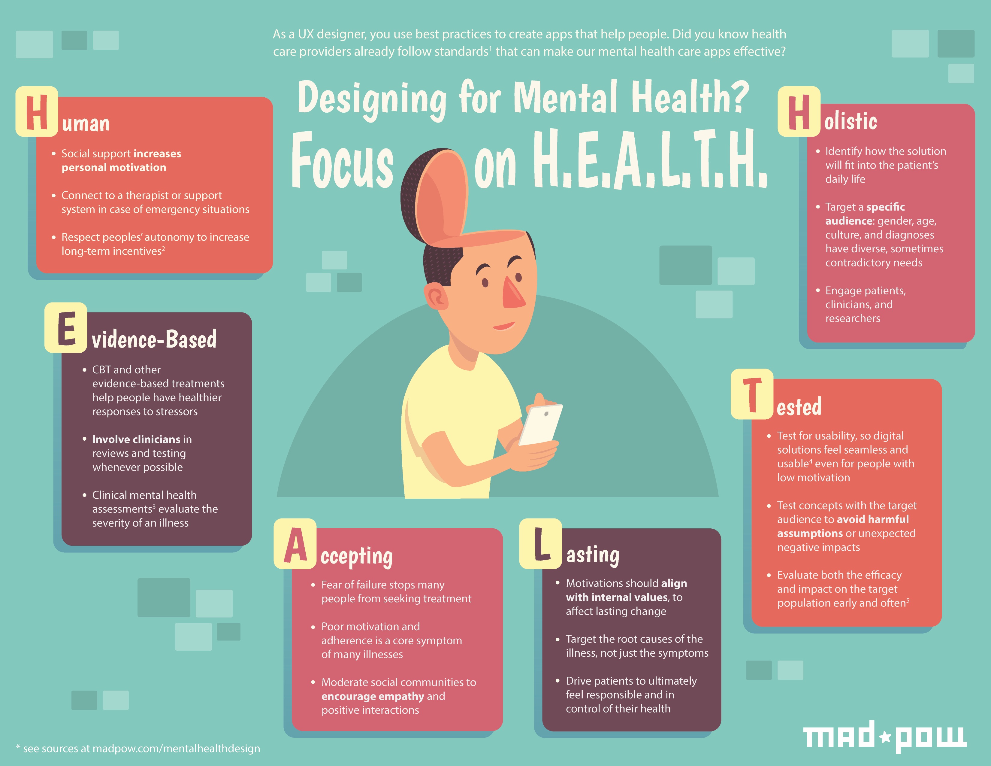
1. Human
As I noted above, there are systemic barriers to mental health care. For the many people who can’t afford or can’t find a therapist, mobile apps seem like a magical solution. 95% of Americans now own a cell phone! That means mobile apps could ostensibly make mental health care accessible to 95% of the population.
But technology is not the same as a human therapist, family member, or friend. As one behavior change specialist I interviewed shared, “The human-to-human connection is very important. In mental health, it is important to have a person who you can talk to and understand the other person is there for you.” Social support increases motivation, and people are vital for crises — although algorithms are working to identify a risk of suicide, the device alone is not enough to overcome the urge.
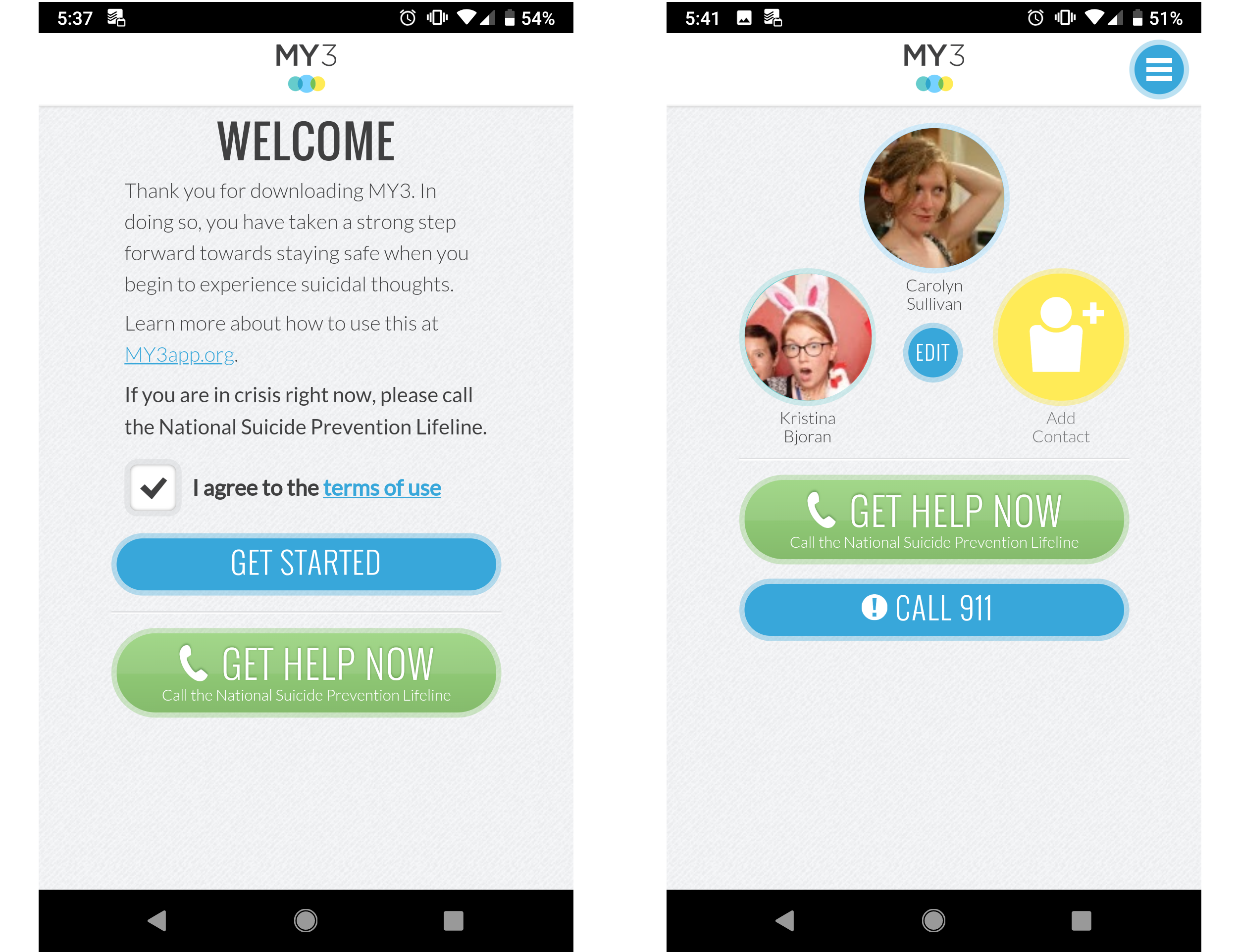
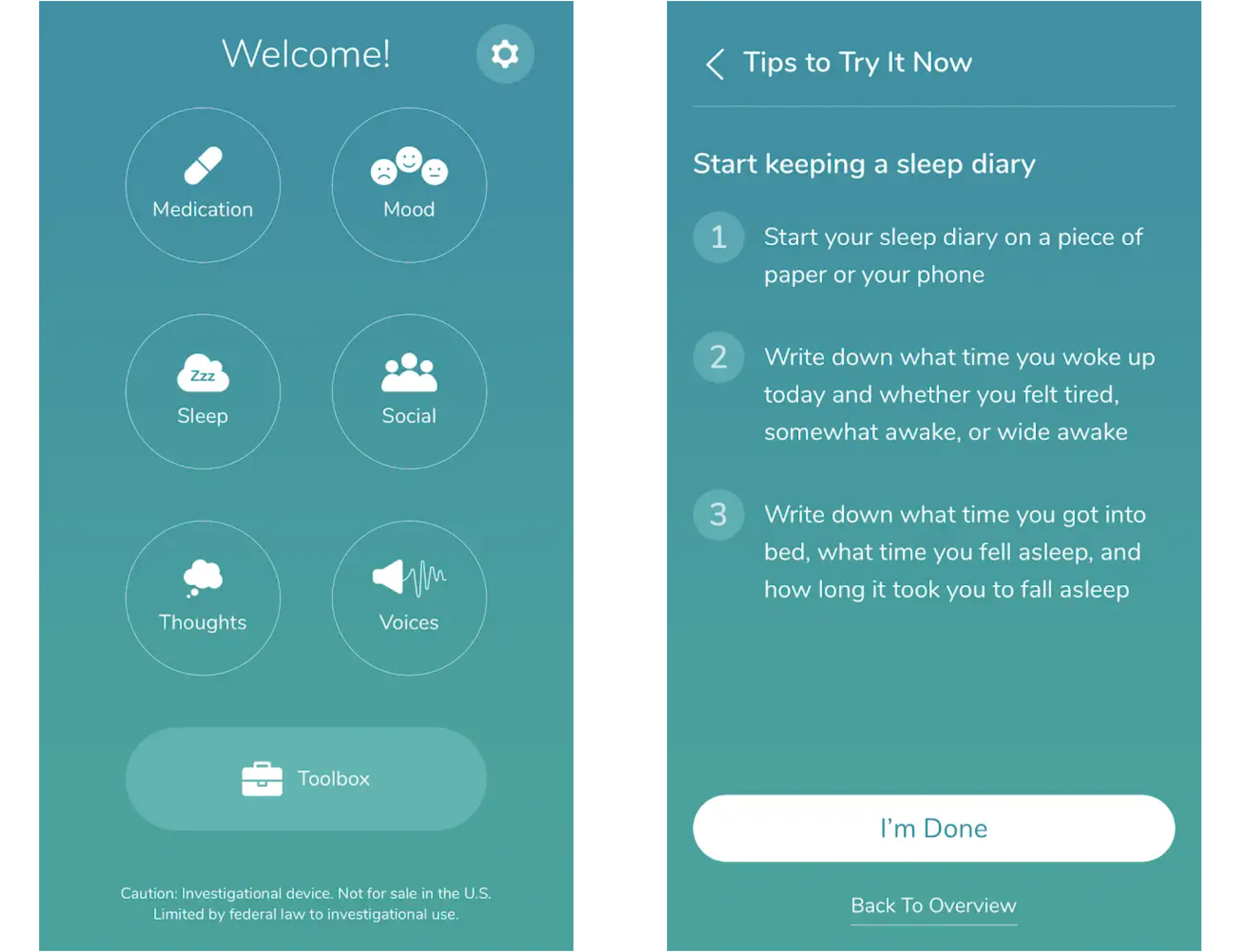
With that in mind, our first guideline is to be human. Encourage connection to external supports in addition to providing value in the app. And provide the ability to connect to a therapist or 9-1-1, as MY3 does.
2. Evidence-Based
Mental health professionals spend years training to treat mental health illnesses. Many professionals specialize in one or two specific types of treatment, such as talk therapy, Cognitive Behavioral Therapy (CBT), Dialectical Behavioral Therapy (DBT), or other treatment frameworks.
These therapies have specific activities associated with them; they encourage patients to develop certain skills, and they even make specific language choices. Any designer building a mental health app needs to begin by choosing one of these evidence-based therapy styles to follow. What’s more, other designers and users can help evaluate UI and short-term efficacy, but make sure to also bring in clinicians to ensure the app is properly representing the therapy.
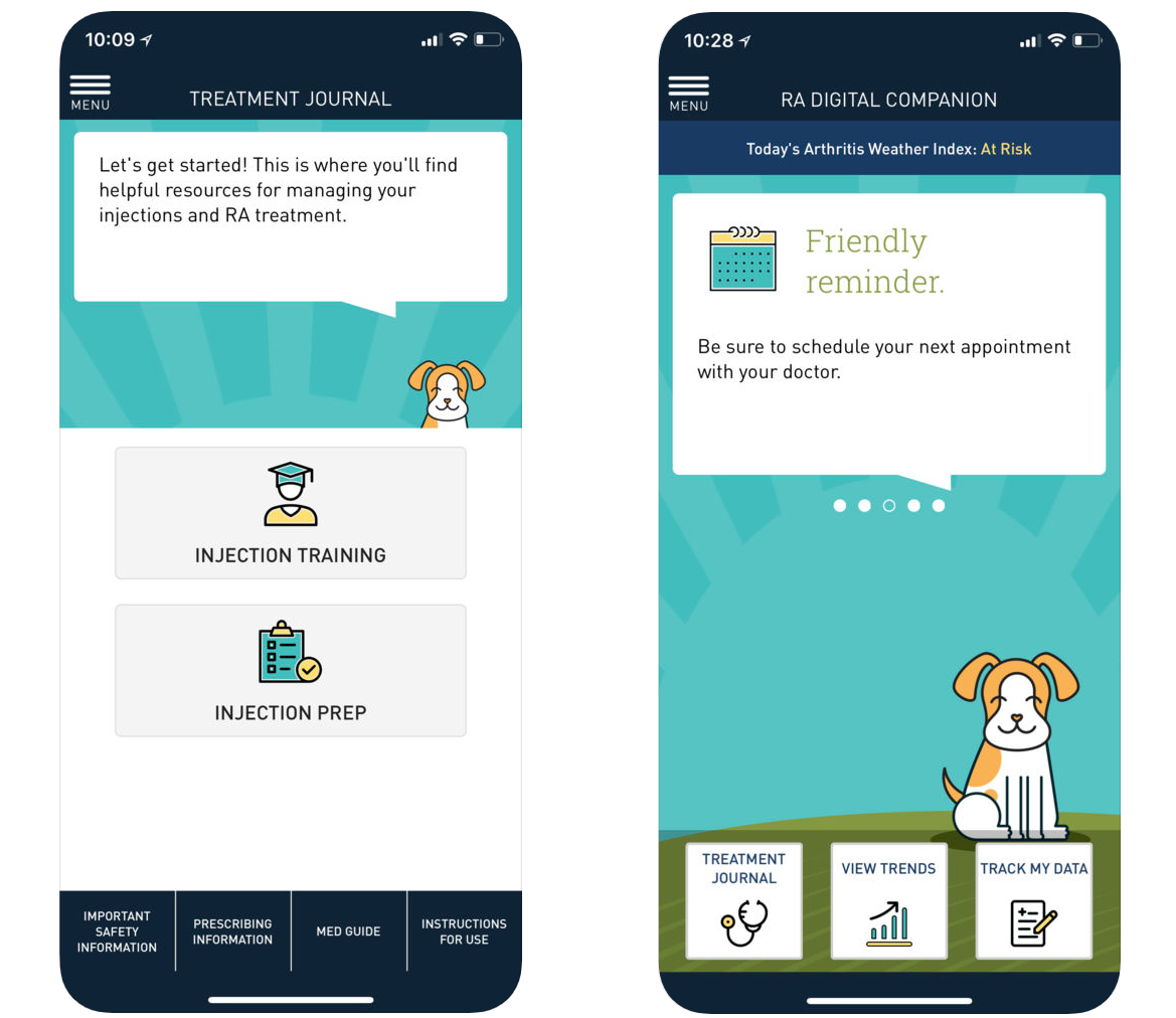
Our second guideline is: to be evidence-based. Keep problem #1 in mind: the clinicians know how to treat their patients. We as designers can’t simply replace clinical knowledge with effective UI. The two need to work hand in hand, as Pear Therapeutics THRIVETM app does.
3. Accepting
I frequently hear people talk about a favorite coach or friend who gave them “tough love.” Many people seem to see tough love as a way of accusing someone of failure, and thus prompting them to do better. (Perhaps our fictional film coaches are to blame.)
In reality, fear of failure is exactly what stops many people from trying something new. This includes seeking mental health treatment. To make matters worse, low motivation is a core symptom of many mental health illnesses. Thus, angry or accusatory language can truly harm people. Instead, our third guideline is to be accepting. Reinforce how capable a person is, and show empathy in how you communicate.
Sanofi’s RA Digital Companion is designed for people with Rheumatoid Arthritis (RA). The app understands that many people with RA suffer from depression, and focuses on acceptance.
4. Lasting
When Pokémon Go launched, it became a nationwide craze just seven days later with an estimate of more than 65 million users. Yet the craze passed in only two months. The problem? Pokémon Go focused on short-term motivators, such as badges and gamification (as many apps do). To create a successful app that people use consistently, the motivation needs to become internal.
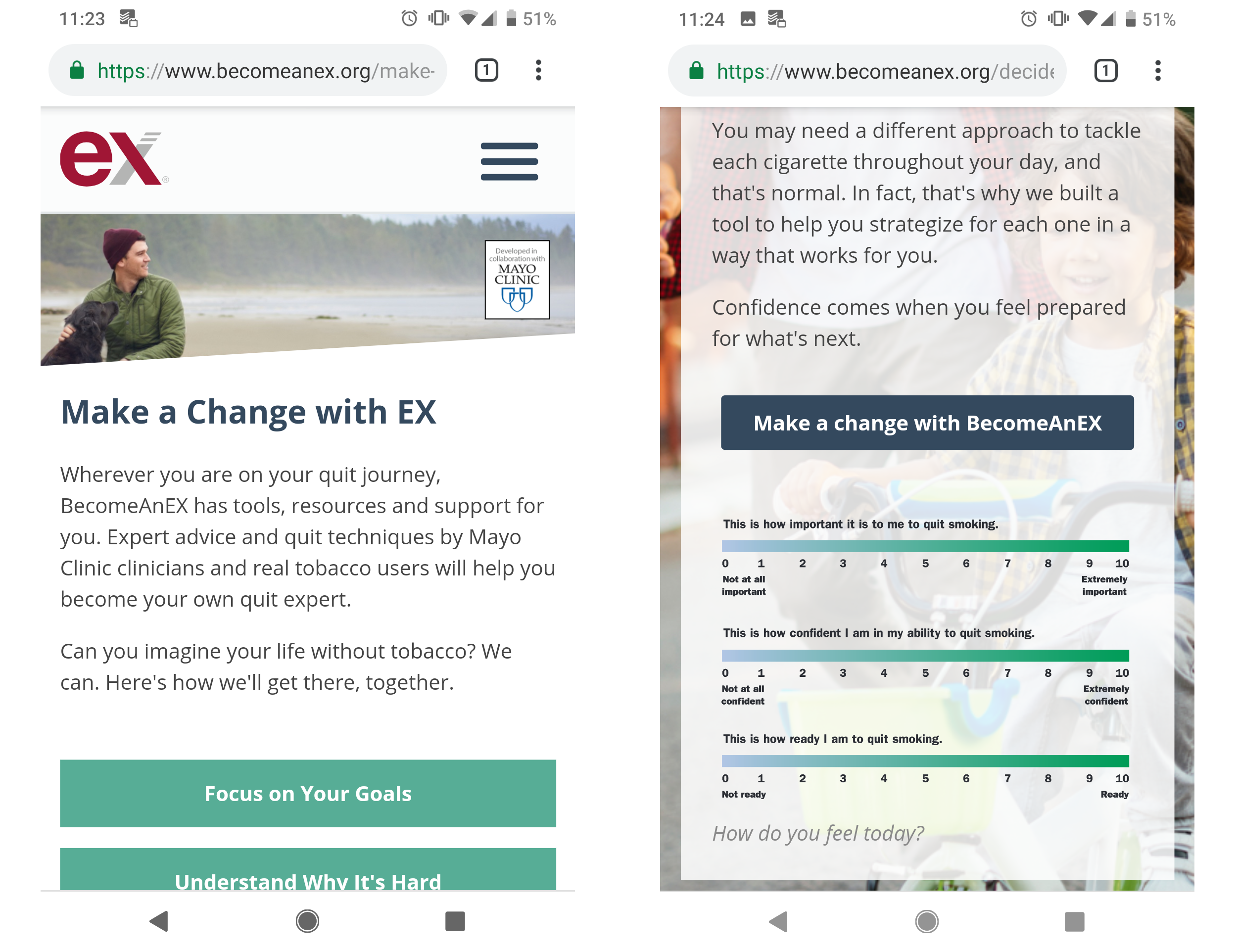
What does that mean? External motivators come from outside sources. Internal motivators connect to core values, such as “I want to succeed in my career” or “I care about my children.” These motivators can’t be taken away by another person, but they are not always clear. Our fourth guideline is to be lasting. This means that you should connect to an individual’s internal motivations, and help them feel responsible and in control, as Truth Initiative’s BecomeAnEX program does.
5. Tested
This should come as no surprise to any UX practitioner: testing is key! Clinicians and patients can and should be a part of the design process. Usability testing will help identify things you may not have considered, for example, someone having an anxiety attack may have trouble pressing small buttons. Or someone with schizophrenia having an auditory hallucination may struggle to focus on a busy page of text.
Obviously, our fifth guideline is: Be Tested. Ideally, clinical testing can become a part of more mental health apps, but even if it’s not an option usability testing should be. As noted above, design moves fast. Don’t let design move so fast that you make poor assumptions.
Recommended reading: How To Deliver A Successful UX Project In The Healthcare Sector
6. Holistic
Lastly, we found that many apps are isolated to accomplishing a single task. And that’s fine for something like Instagram — you post photos, or you look at photos. But mental health is intrinsically linked to how people see themselves. With that in mind, a successful intervention has to fit into a person’s daily life.
This is our sixth and final guideline: be holistic. One example of this is the app Happify. While it’s far from perfect, it does an excellent job of offering options. A gratitude journal may help for one time, and the community is helpful at other times.
For any designer working on an app, it’s important to note how an app becomes holistic: the key is to learn about the target audience. Be specific: gender, age, culture, and diagnoses all impact the way a person deals with a mental illness. That’s why researchers like Dr. Michael Addis focus on specific segments of the population, as he does in his book Invisible Men: Men’s Inner Lives and Consequences of Silence.
Moving Forward
There is an overarching theme to these guidelines: what works for you as a designer may not work for your end-user. Of course, that’s the tenant of UX! Yet somehow, when it comes to health care, we as UX professionals tend to forget this. We are not healthcare providers. And even those of us who have experience as patients have only our own experiences to draw on.
These guidelines are not perfect, but they are a start. Over time I hope to finesse them with additional insight from providers, as well as from the designers beginning to use them. We are on the cusp of a new world of digital health care, where designers and providers and patients must work hand-in-hand to create seamless experiences to promote health and well being.
For anyone interested in getting involved, I am continuing to work on new initiatives to continually improve design for mental health. Feel free to share your experiences in the comments, or learn more at Mad*Pow.
Further Reading
- How Developers Can Strengthen Their Mental Health Amidst High-Pressure Projects
- Design For Developers
- A Simple But Effective Mental Health Routine For Programmers
- It’s Good To Talk: Thoughts And Feelings On Creative Wellness


