Practical Suggestions To Improve Usability Of Landing Pages With Animation From Slides

Email Newsletter
Weekly tips on front-end & UX.
Trusted by 182,000+ folks.
(This is a sponsored post.) For a long time, UI animation was an afterthought for designers. Even today, many designers think of animation as something that brings delight but does not necessarily improve usability. If you share this point of view, then this article is for you. I will discuss how animation can improve the user experience of landing pages, and I’ll provide the best examples of animation created using the Slides framework.
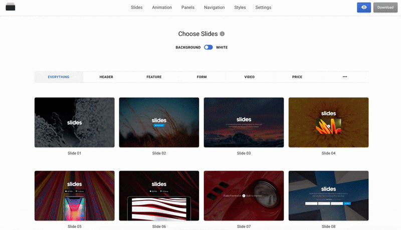
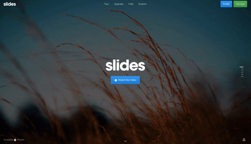
The Slides framework is an easy-to-use tool for creating websites. It allows anyone to create a sleek landing page in a few minutes. All you need to do is choose an appropriate design from the list of predefined slides.
Four Ways Animation Supports Usability Of Landing Pages
Landing page design is more than just about visual presentation; it’s about interaction. Details of interaction design make a fundamental difference on modern websites. And animated effects can reinforce interactions. To improve the usability of a landing page, an animation must be a functional element, not just decoration. It should serve a clear functional purpose. Below are a few common ways that animation can improve usability.
1. Create A Narrative
Every designer is a storyteller. When we create a website, we are telling a story to our visitors. And it’s possible to tell a much more engaging story by using animation.
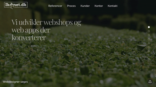
Animation can help bring content to life. One good example of such animation can be found on Ikonet. The animation there keeps users engaged as they scroll the page and learn about the company.
Animation can also be used to call the visitor’s attention to something they should notice and act upon. For example, if you have an important text section or a call to action, sliding them in (instead of having them just appear) can help visitors understand where they should focus. Take a look at the Preston Zeller example below. The way elements appear on the pages drives the user’s focus to those areas. The great thing about this animation is that it draws attention to important information without being disruptive.

2. Provide Feedback
Human-computer interaction is based on two fundamentals: user input and system feedback. All interactive objects should react to user input with appropriate visual or audio feedback.
Below you can see the Custom Checkbox effect created using the Slides framework. The subtle bouncing animation the user sees when they change the state of the toggle reinforces the feeling of interactivity.
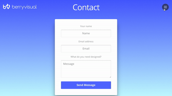
With Slides, you can create nice hover animations and encourage users to interact with objects. Take a look at Berry Visual. When you hover the mouse on “Send Message” or on the hamburger menu in the top-right corner, a nice animated effect occurs. It creates a sense that these elements are interactive.
Buf Antwerp is another excellent example of how on-hover animated feedback can improve the user experience. When visitors hover over a tile, a semi-transparent overlay appears, and text provides additional information about the item.

3. Create Relationships
A great place to add animation to a landing page is at moments of change. All too often, moments of change are abrupt &mdahs; for example, when users click on a link, a new screen suddenly appears. Because sudden changes are hard for users to process, such changes usually result in a loss of context — the brain has to scan the new page to understand how the new context is connected to the previous one.
Consider this example of an abrupt change:

Compare that to the following example, in which a smooth animated transition guides the user to the different parts of the screen:
It’s clear that in the second example, animation prevents abrupt change — it fills the gap and connects two stages. As a result, visitors understand that the two stages belong together. This principle applies equally when you have a parent-to-child relationship between two objects:
It also applies when you create a transition between stages. The smooth transitions between slides in the example below create a sense of sequence, rather than separate unrelated parts of the page.
4. Making Boring Tasks Fun
It might be difficult to imagine how to introduce playful elements into everyday experiences. But by adding a bit of surprise where it’s most unexpected, we can turn a familiar interaction into something unexpected and, thus, memorable.
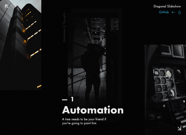
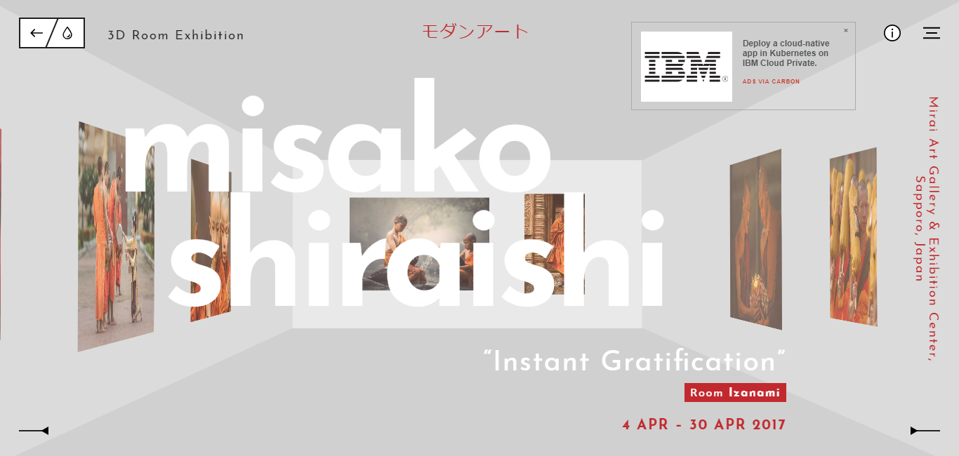
When you visit Tympanus’ 3D Room Exhibition, it looks like any other gallery website that you’ve visited before. But your impression of the website changes immediately once you interact with a page. As you move the cursor, the page moves, and this effect creates a sense of 3D space. This feeling is reinforced when you go from one page to another; it looks like you’re traveling from one room to another within a 3D space.

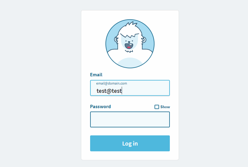
Now let’s talk about something much more familiar than 3D effects: web forms. Who loves filling out forms? Probably nobody. Still, filling out forms is one of the most common tasks on the web. And it is possible to turn this dull activity into a fun exercise. Take a look Darin Senneff’s Yeti character, which is used in a form. When the user starts typing their password, the mascot covers its eyes. Such an animated effect brings a lot of delight when you see it for the first time.
Last but not least, it’s possible to make the scrolling experience not just more visually interesting, but also helpful for readers. Below is Storytelling Map, an interactive journey in which a path along a map is animated according to the content being scrolled through on the page. The idea ties the text, visuals and locations together; visitors read the information and see it in the context of the map).
Six Best Practices For Landing Page Animation
Identifying the places where animation has utility is only half the story. Designers also need to implement animation properly. In this section, we’ll find out how to animate like a pro.
1. Don’t Animate Several Elements At Once
When a few objects are animated simultaneously, it becomes distracting for users. Because the human brain and eye are hardwired to pay attention to moving objects, the user’s focus will jump from one element to another, and the brain will need extra time to figure out what just happened (especially if the movement happens very quickly). Thus, it’s important to schedule animations properly.
It’s vital to understand the concept of transition choreography: the coordinated sequence of motions that maintain the visitor’s focus as the interface changes. Minimize the number of elements that move independently; only a few things should happen at the same time (typically, no more than two or three). Thus, if you want to move more than three objects, group some objects together and transform them as a single unit, rather than animating them independently.
Slides offers an excellent benefit to web designers: It prevents them from overusing motion in design. Each animated effect available in Slides has been carefully designed to deliver content in the best possible way.
2. Animation Shouldn’t Conflict With Landing Page’s Personality
Each time you add animation to a design, you introduce personality. This personality will largely depend on the animated effect you choose to use.
When people interact with a product, they have certain expectations. Imagine designing a landing page for a banking service, and you decide to use a bouncing animation to introduce a form that collects the user’s personal information. Many users will hesitate to provide their details because the form conflicts with their expectations.
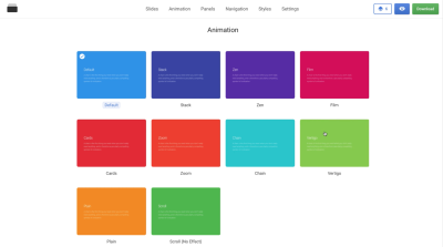
The Slides framework allows you to choose from 10 animated styles, such as Stack, Zen, Film, Cards and Zoom. Experiment with different effects, and choose what’s best for your case.
3. Watch The Time
When it comes to designing animation, timing is everything. The timing of your animation can mean the difference between a good interaction and a bad one. When working on animation, you’ll usually spend a third of your time finding the right animated effects and the other two thirds finding the right timing to make the animation feel smooth.
Generally, keep the animation short. Animation should never get in the way of the user completing a task, because even the most beautifully executed animation would be really annoying if it slows down users. The optimal speed for a UI animation is between 200 and 500 milliseconds. An animation that lasts less than 1 second is considered as instant, whereas an animation longer than 5 seconds can convey a feeling of delay.
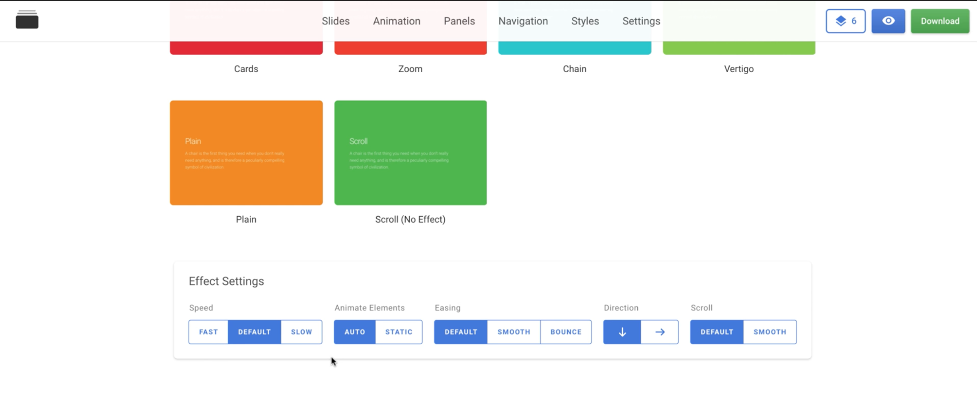
When it comes to creating an animated effect, one parameter has a direct impact on how the animation is perceived: easing, or timing function in CSS terms. Easing helps designers make movement more natural.
The Slides framework enables web designers to customize easing. You’ll find easing along with other effects in the section “Effect Settings”.

4. Think About Accessibility
Animation is a double-edged sword. It can improve usability for one group of users, while causing problems for another group. Apple’s release of iOS 7 was a recent example of the latter. iOS 7 was full of animated effects, and shortly after its release, iPhone users reported that the animated transitions were making them feel dizzy.
Your responsibility as a designer is to think about how people with visual disorders will interact with your design. Check the WCAG’s guidelines on animation, and be sure that your design aligns with them. Track whether a user wants to minimize the amount of animation or motion. A special CSS media feature, "prefers-reduced-motion", detects whether the user has requested that the system minimize the amount of animation or motion used. When it is set to "reduce", then it’s better to minimize the amount of movement and animation (for example, by removing all non-essential movement).
Also, conduct usability testing to check that users will all abilities, including people with visual disorders, won’t have any problem interacting with your design.
5. Prototype And Test Your Design Decisions
Animation is fun to play with. It’s easy to go overboard and end up with a design that overwhelms users with too much motion. Unfortunately, there is no silver bullet for great animation; it’s hard to set clear criteria of what is “just enough”. Be ready to spend time on prototyping, testing and optimizing animated effects.
Here are a few tips worth taking into account during testing:
- Test on different hardware.
Many hardware factors can drastically affect animation performance: screen size, screen density, GPU performance, to name just a few. As a result, a user on a high-definition screen might have a completely different experience than a user on an older screen. Consider such factors when designing animation to prevent performance bottlenecks. Don’t blame slow hardware; optimize your animation to work great on all sort of devices. - Test on mobile.
Most websites are built and tested on a desktop; the mobile experience and animation performance is often treated as an afterthought. Lack of testing on mobile could cause a lot of problems for mobile users, because some animated techniques work great on desktop but not as well on mobile. To avoid a negative experience, confirm that your design works fine on both desktop and mobile. Test on mobile early and often. - Watch animation at a slow speed.
It might be hard to notice problems when an animation (especially a complex one) runs at full speed. When you slow the animation down (say, at one tenth the speed), such issues become evident. You can also record slow-motion video of your animations and show them to other people to get other perspectives.
With the Slides framework, you can create a high-fidelity interactive prototype in minutes. You can use a WYSIWYG editor to create animated effects, publish the design, and see how it works on both desktop and mobile devices.
6. Animation Shouldn’t Be An Afterthought
There’s a reason why so many designers think of animation as an unnecessary feature that overloads the user interface and makes it more complicated. In most cases, that’s true when designers introduce animation at the end of the design process, as lipstick for the design — in other words, animation for the sake of animation. Random motion without any purpose won’t benefit visitors much, and it can easily distract and annoy.
To make meaningful animation, take time at the beginning of the project to think about areas where animation would naturally fit. Only in this way will animation be natural to the user flow.
Conclusion
Good functional animation makes a landing page not just more appealing, but also more usable. When done correctly, animation can turn a landing page from a sequence of sections into a carefully choreographed, memorable experience. The Slides framework helps web designers use animation to communicate clearly.
Further Reading
- The Path To Awesome CSS Easing With The linear() Function
- Infinite-Scrolling Logos In Flat HTML And Pure CSS
- Creating Accessible UI Animations
- The Things Users Would Appreciate In Mobile Apps