The Importance Of Macro And Micro-Moment Design

Email Newsletter
Weekly tips on front-end & UX.
Trusted by 182,000+ folks.
(This article is kindly sponsored by Adobe.) When you design the information architecture, the navigation bars of an application, or the overall layout and visual design of a product, then you are focusing on macro design. When you design (one part of a page, one form, or one single task and interaction), then you are focusing on micro-moment design.
In my experience, designers often spend a lot of time on macro design issues, and sometimes less so on critical micro-moment design issues. That might be a mistake.
Here’s an example of how critical micro-moment design can be.
I read a lot of books. We are talking over a hundred books a year. I don’t even know for sure how many books I read, and because I read so many books, I am a committed library patron. Mainly for reading fiction for fun (and even sometimes for reading non-fiction), I rely on my library to keep my Kindle full of interesting things to read.
Luckily for me, the library system in my county and in my state is pretty good in terms of having books available for my Kindle. Unluckily, this statewide library website and app need serious UX improvements.
I was thrilled when my library announced that instead of using a (poorly designed) website (that did not have a mobile responsive design), the library was rolling out a brand new mobile app, designed specifically to optimize the experience on a mobile phone. “Yay!” I thought. “This will be great!”
Perhaps I spoke too soon.
Let me walk you through the experience of signing into the app. First, I downloaded the app and then went to log in:
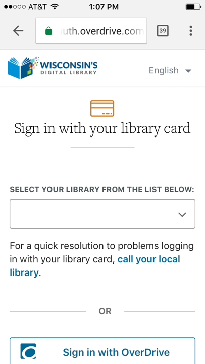
I didn’t have my library card with me (I was traveling), and I wasn’t sure what “Sign in with OverDrive” was about, but I figured I could select my library from the list, so I pressed on the down arrow.
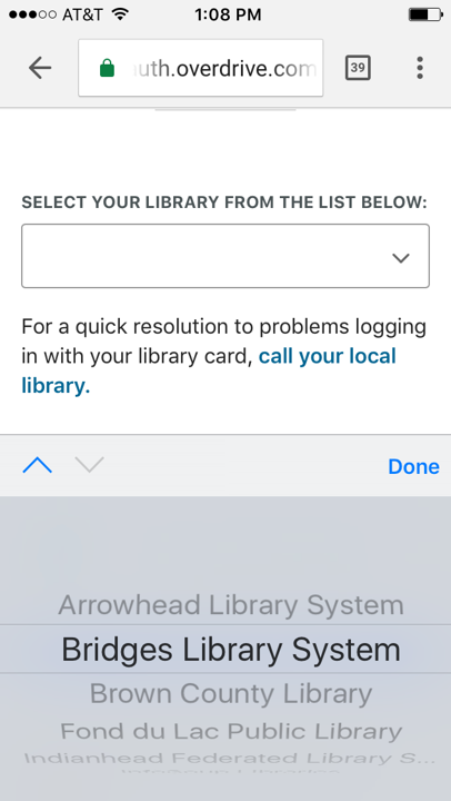
“Great,” I thought. Now I can just scroll to get to my library. I know that my library is in Marathon County here in Wisconsin. In fact, I know from using the website that they call my library: “Marathon County, Edgar Branch” or something similar, since I live in a village called Edgar, so I figured that would be what I should look for especially since I could see that the list went from B (Brown County) to F (Fond du Lac Public Library) with no E for Edgar showing. So I proceeded to scroll.
I scrolled for a while, looking for M (in hope of finding Marathon).

Hmmm. I see Lone Rock, and then the next one on the list is McCoy. I know that I am in Marathon County, and that in fact, there are several Marathon County libraries. Yet, we seem to have skipped Marathon in the list.
I keep scrolling.
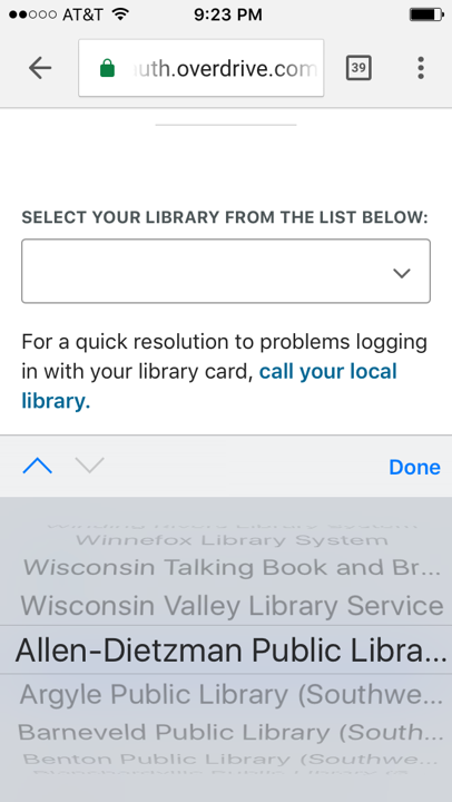
Uh oh. We got to the end of the list (to the W’s), but now we seem to be starting with A again. Well, then, perhaps Marathon will now appear if I keep scrolling.
You know how many libraries there are in Wisconsin and are on this list? I know because as I started to document this user experience I decided to count the number of entries on this list (only a crazy UX professional would take time to do this, I think).
There are 458 libraries on this list, and the list kept getting to the end of the alphabet and then for some reason starting over. I never did figure out why.
Finally, though, I did get to Marathon!
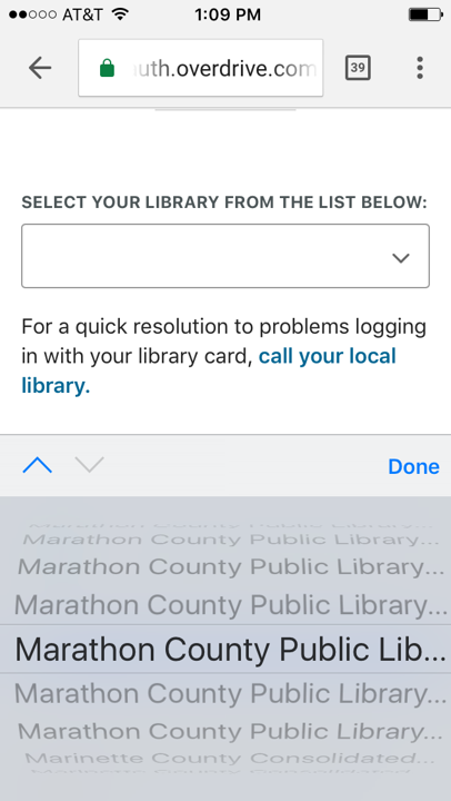
And then I discovered I was really in trouble since several libraries start with “Marathon County Public Library”. Since the app only shows the first 27 or so characters, I don’t know which one is mine.
You know what I did at this point?
I decided to give up. And right after I decided that, I got this screen (as “icing on the cake” so to speak):
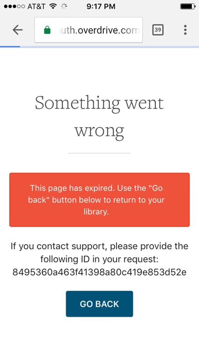
Did you catch the “ID” that I’m supposed to reference if I contact support? Seriously?
This is a classic case of micro-moment design problems.
I can guess that by now some of you are thinking, “Well, that wouldn’t happen to (me, my team, an experienced UX person).” And you might be right. Especially this particular type of micro-moment design fail.
However, I can tell you that I see micro-moment design failures in all kinds of apps, software, digital products, websites, and from all kinds of companies and teams. I’ve seen micro-moment design failures from organizations with and without experienced UX teams, tech-savvy organizations, customer-centric organizations, large established companies and teams, and new start-ups.
Let’s pause for a moment and contrast micro-moment design with macro design.
Let’s say that you are hired to evaluate the user experience of a product. You gather data about the app, the users, the context, and then you start walking through the app. You notice a lot of issues that you want to raise with the team — some large, some small:
- There are some inconsistencies from page-to-page/screen-to-screen in the app. You would like to see whether they have laid out pages on a grid and if that can be improved;
- You have questions about whether the color scheme meets branding guidelines;
- You suspect there are some information architecture issues. The organization of items in menus and the use of icons seems not quite intuitive;
- One of the forms that users are supposed to fill out and submit is confusing, and you think people may not be able to complete the form and submit the information because it isn’t clear what the user is supposed to enter.
There are many ways to categorize user experience design factors, issues, and/or problems. Ask any UX professional and you will probably get a similar, but slightly different list. For example, UX people might think about the conceptual model, visual design, information architecture, navigation, content, typography, context of use, and more. Sometimes, though, it might be useful to think about UX factors, issues, and design in terms of just two main categories: macro design and micro-moment design.
In the example above, most of the factors on the list were macro design issues: inconsistencies in layout, color schemes, and information architecture. Some people talk about macro design issues as “high-level design” or “conceptual model design”. These are UX design elements that cross different screens and pages. These are UX design elements that give hints and cues about what the user can do with the app, and where to go next.
Macro design is critical if you want to design a product that people want to use. If the product doesn’t match the user’s mental model, if the product is not “intuitive” — these are often (not always, but often) macro design issues.
Which means, of course, that macro design is very important.
It’s not just micro-moment design problems that cause trouble. Macro design issues can result in massive UX problems, too. But macro design issues are more easily spotted by an experienced UX professional because they can be more obvious, and macro design usually gets time devoted to it relatively early in the design process.
If you want to make sure you don’t have macro design problems then do the following:
- Do the UX research upfront that you need to do in order to have a good idea of the users’ mental models. What does the user expect to do with this product? What do they expect things to be called? Where do they expect to find information?
- For each task that the user is going to do, make sure you have picked one or two “objects” and made them obvious. For instance, when the user opens an app for looking for apartments to rent the objects should be apartments, and the views of the objects should be what they expect: List, detail, photo, and map. If the user opens an app for paying an insurance bill, then the objects should be policy, bill, clinic visit, while the views should be a list, detail, history, and so on.
- The reason you do all the UX-research-related things UXers do (such as personas, scenarios, task analyses, and so on) is so that you can design an effective, intuitive macro design experience.
It’s been my experience, however, that teams can get caught up in designing, evaluating, or fixing macro design problems, and not spend enough time on micro-moment design.
In the example earlier, the last issue is a micro-moment design issue:
- One of the forms that users are supposed to fill out and submit is confusing, and you think people may not be able to complete the form and submit the information because it isn’t clear what the user is supposed to enter.
And the library example at the start of the article is also an example of micro-moment design gone awry.
Micro-moment design refers to problems with one very specific page/form/task that someone is trying to accomplish. It’s that “make-or-break” moment that decides not just whether someone wants to use the app, but whether they can even use the app at all, or whether they give up and abandon, or end up committing errors that are difficult to correct. Not being able to choose my library is a micro-moment design flaw. It means I can’t continue. I can’t use the app anymore. It’s a make-or-break moment for the app.
When we are designing a new product, we often focus on the macro design. We focus on the overall layout, information architecture, conceptual model, navigation model, and so on. That’s because we haven’t yet designed any micro-moments.
The danger is that we will forget to pay close attention to micro-moment design.
So, going back to our library example, and your possible disbelief that such a micro-moment design fail could happen on your watch. It can. Micro-moment design failures can happen for many reasons.
Here are a few common ones I’ve seen:
- A technical change (for example, how many characters can be displayed in a field) is made after a prototype has been reviewed and tested. So the prototype worked well and did not have a UX problem, but the technical change occurred later, thereby causing a UX problem without anyone noticing.
- Patterns and standards that worked well in one form or app are re-used in a different context/form/app, and something about the particular field for form in the new context means there is a UX issue.
- Features are added later by a different person or team who does not realize the impact that particular feature, field, form has on another micro-moment earlier or later in the process.
- User testing is not done, or it’s done on only a small part of the app, or it’s done early and not re-done later when changes are made.
If you want to make sure you don’t have micro-moment design problems then do the following:
- Decide what are the critical make-or-break moments in the interface.
- At each of these moments, decide what is it exactly that the user wants to do.
- At each of these moments, decide what is it exactly that the product owner wants users to do.
- Figure out exactly what you can do with design to make sure both of the above can be satisfied.
- Make that something the highest priority of the interface.
Takeaways
Both macro and micro-moment design are critical to the user experience success of a product. Make sure you have a process for designing both, and that you are giving equal time and resources to both.
Identify the critical make-or-break micro-design moments when they finally do get designed, and do user testing on those as soon as you can. Re-test when changes are made.
Try talking about micro-moment design and macro design with your team. You may find that this categorization of design issues makes sense to them, perhaps more than whichever categorization scheme you’ve been using.
This article is part of the UX design series sponsored by Adobe. Adobe XD tool is made for a fast and fluid UX design process, as it lets you go from idea to prototype faster. Design, prototype and share — all in one app. You can check out more inspiring projects created with Adobe XD on Behance, and also sign up for the Adobe experience design newsletter to stay updated and informed on the latest trends and insights for UX/UI design.
Further Reading
- 55 Free High Quality Icon Sets
- The Ultimate Guide To Cloning In Photoshop
- Hand-Sketching: Things You Didn’t Know Your Doodles Could Accomplish
- Switching From Adobe Fireworks To Sketch: Ten Tips And Tricks