I Used The Web For A Day Using A Screen Reader

Email Newsletter
Weekly tips on front-end & UX.
Trusted by 182,000+ folks.
 Custom Web Forms for Angular, React, & Vue. Your backend.


 Celebrating 10 million developers
This article is part of a series in which I attempt to use the web under various constraints, representing a given demographic of user. I hope to raise the profile of difficulties faced by real people, which are avoidable if we design and develop in a way that is sympathetic to their needs. Last time, I navigated the web for a day with just my keyboard. This time around, I’m avoiding the screen and am using the web with a screen reader.
What Is A Screen Reader?
A screen reader is a software application that interprets things on the screen (text, images, links, and so on) and converts these to a format that visually impaired people are able to consume and interact with. Two-thirds of screen reader users choose speech as their screen reader output, and one-third of screen reader users choose braille.
Screen readers can be used with programs such as word processors, email clients, and web browsers. They work by mapping the contents and interface of the application to an accessibility tree that can then be read by the screen reader. Some screen readers have to manually map specific programs to the tree, whereas others are more generic and should work with most programs.
Accessibility Originates With UX
You need to ensure that your products are inclusive and usable for disabled people. A BBC iPlayer case study, by Henny Swan. Read a related article →
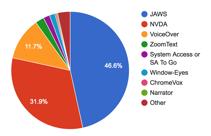
On Windows, the most popular screen reader is JAWS, with almost half of the overall screen reader market. It is commercial software, costing around a thousand dollars for the home edition. An open-source alternative for Windows is NVDA, which is used by just under a third of all screen reader users on desktop.
There are other alternatives, including Microsoft Narrator, System Access, Window-Eyes and ZoomText (not a full-screen reader, but a screen magnifier that has reading abilities); the combined sum of these equates to about 6% of screen reader usage. On Linux, Orca is bundled by default on a number of distributions.
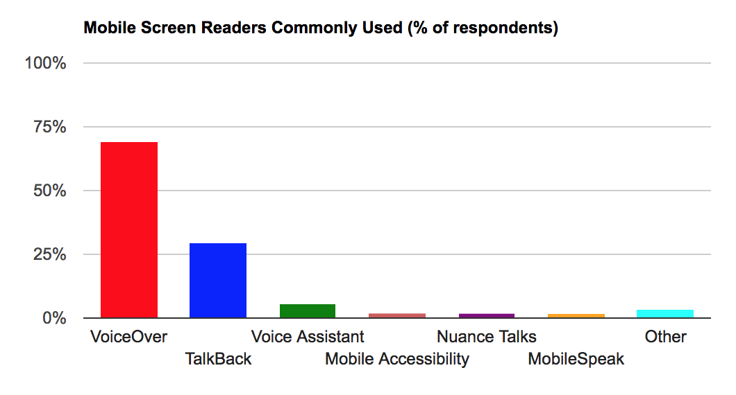
The screen reader bundled into macOS, iOS and tvOS is VoiceOver. VoiceOver makes up 11.7% of desktop screen reader users and rises to 69% of screen reader users on mobile. The other major screen readers in the mobile space are Talkback on Android (29.5%) and Voice Assistant on Samsung (5.2%), which is itself based on Talkback, but with additional gestures.
I have a MacBook and an iPhone, so will be using VoiceOver and Safari for this article. Safari is the recommended browser to use with VoiceOver, since both are maintained by Apple and should work well together. Using VoiceOver with a different browser can lead to unexpected behaviors.
How To Enable And Use Your Screen Reader
My instructions are for VoiceOver, but there should be equivalent commands for your screen reader of choice.
VoiceOver On Desktop
If you’ve never used a screen reader before, it can be a daunting experience. It’s a major culture shock going to an auditory-only experience, and not knowing how to control the onslaught of noise is unnerving. For this reason, the first thing you’ll want to learn is how to turn it off.
The shortcut for turning VoiceOver off is the same as the shortcut for turning it on: ⌘ + F5 (⌘ is also known as the Cmd key). On newer Macs with a touch bar, the shortcut is to hold the command key and triple-press the Touch ID button. Is VoiceOver speaking too fast? Open VoiceOver Utility, hit the ‘Speech’ tab, and adjust the rate accordingly.
Once you’ve mastered turning it on and off, you’ll need to learn to use the “VoiceOver key” (which is actually two keys pressed at the same time): Ctrl and ⌥ (the latter key is also known as “Option” or the Alt key). Using the VO key in combination with other keys, you can navigate the web.
For example, you can use VO + A to read out the web page from the current position; in practice, this means holding Ctrl + ⌥ + A. Remembering what VO corresponds to is confusing at first, but the VO notation is for brevity and consistency. It is possible to configure the VO key to be something else, so it makes sense to have a standard notation that everyone can follow.
You may use VO and arrow keys (VO + → and VO + ←) to go through each element in the DOM in sequence. When you come across a link, you can use VO + Space to click it — you’ll use these keys to interact with form elements too.
Huzzah! You now know enough about VoiceOver to navigate the web.
VoiceOver On Mobile
The mobile/tablet shortcut for turning on VoiceOver varies according to the device, but is generally a ‘triple click’ of the home button (after enabling the shortcut in settings).
You can read everything from the current position with a Two-Finger Swipe Down command, and you can select each element in the DOM in sequence with a Swipe Right or Left.
You now know as much about iOS VoiceOver as you do desktop!
Navigating By Content Type
Think about how you use the web as a sighted user. Do you read every word carefully, in sequence, from top to bottom? No. Humans are lazy by design and have learned to ‘scan’ pages for interesting information as fast as possible.
Screen reader users have this same need for efficiency, so most will navigate the page by content type, e.g. headings, links, or form controls. One way to do this is to open the shortcuts menu with VO + U, navigate to the content type you want with the ← and → arrow keys, then navigate through those elements with the ↑↓ keys.
Another way to do this is to enable ‘Quick Nav’ (by holding ← along with → at the same time). With Quick Nav enabled, you can select the content type by holding the ↑ arrow alongside ← or →. On iOS, you do this with a Two-Finger Rotate gesture.
Once you’ve selected your content type, you can skip through each rotor item with the ↑↓ keys (or Swipe Up or Down on iOS). If that feels like a lot to remember, it’s worth bookmarking this super handy VoiceOver cheatsheet for reference.
A third way of navigating via content types is to use trackpad gestures. This brings the experience closer to how you might use VoiceOver on iOS on an iPad/iPhone, which means having to remember only one set of screen reader commands!
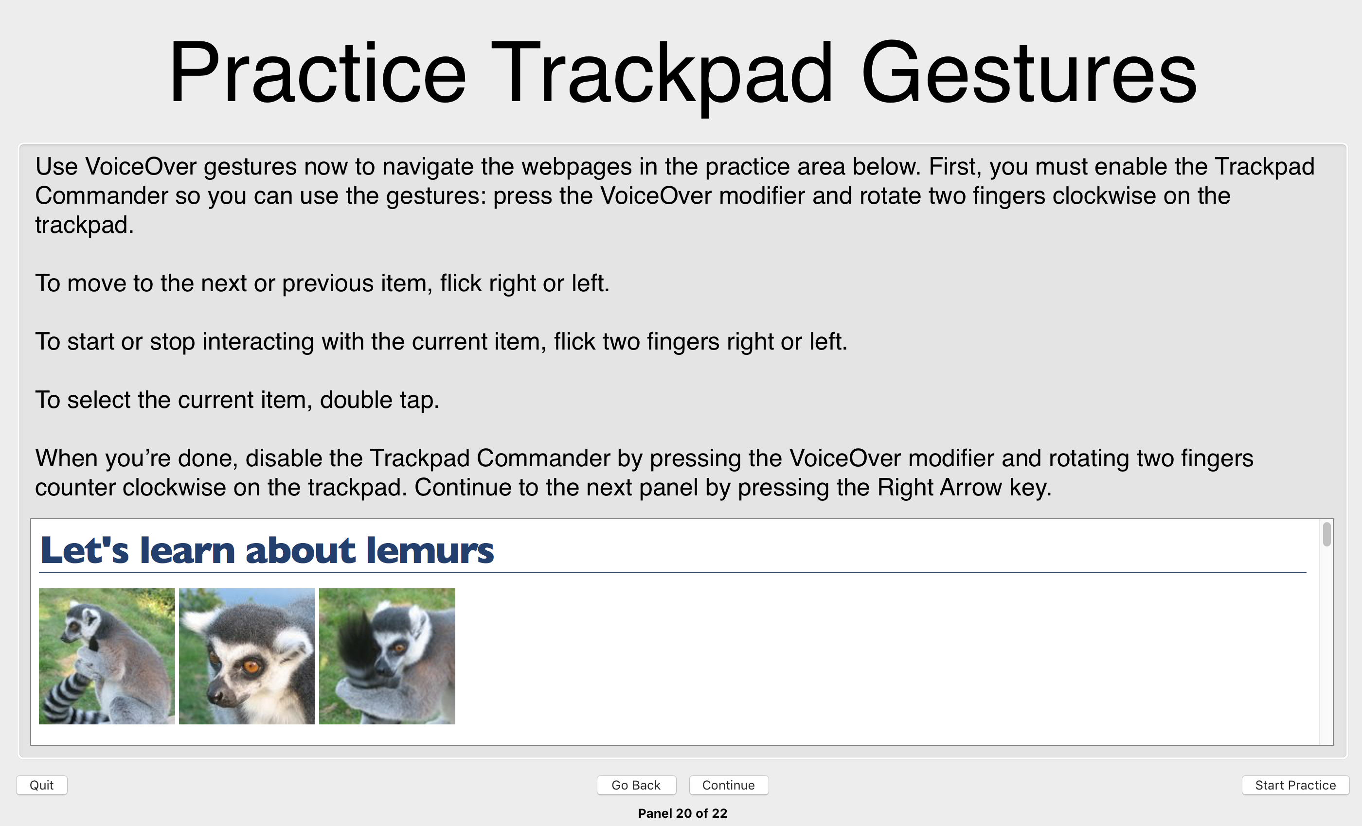
You can practice the gesture-based navigation and many other VoiceOver techniques in the built-in training program on OSX. You can access it through System Preferences → Accessibility → VoiceOver → Open VoiceOver Training.
After completing the tutorial, I was raring to go!
Case Study 1: YouTube
Searching On YouTube
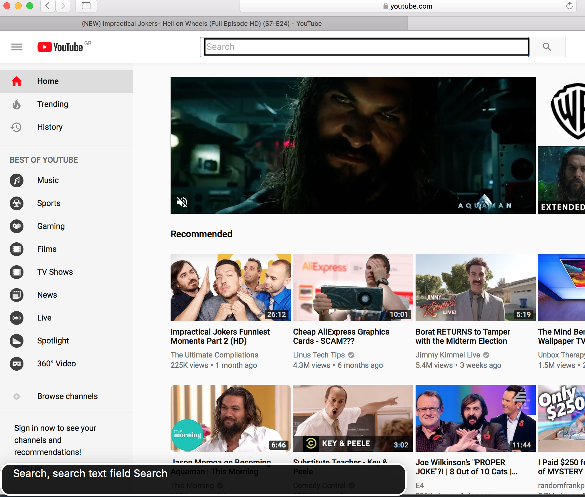
I navigated to the YouTube homepage in the Safari toolbar, upon which VoiceOver told me to “step in” to the web content with Ctrl + ⌥ + Shift + ↓. I’d soon get used to stepping into web content, as the same mechanism applies for embedded content and some form controls.
Using Quick Nav, I was able to navigate via form controls to easily skip to the search section at the top of the page.
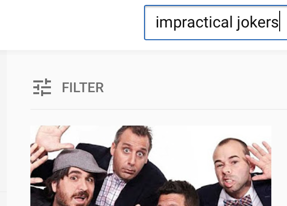
I searched for some quality content:
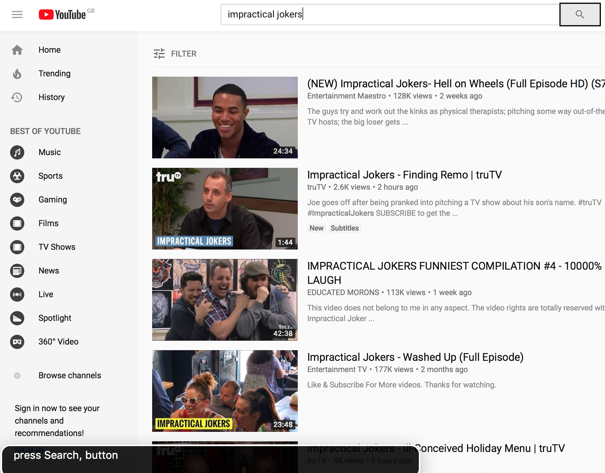
And I navigated to the search button:
However, when I activated the button with VO + Space, nothing was announced.
I opened my eyes and the search had happened and the page had populated with results, but I had no way of knowing through audio alone.
Puzzled, I reproduced my actions with devtools open, and kept an eye on the network tab.
As suspected, YouTube is making use of a performance technique called “client-side rendering” which means that JavaScript intercepts the form submission and renders the search results in-place, to avoid having to repaint the entire page. Had the search results loaded in a new page like a normal link, VoiceOver would have announced the new page for me to navigate.
There are entire articles dedicated to accessibility for client-rendered applications; in this case, I would recommend YouTube implements an aria-live region which would announce when the search submission is successful.
Tip #1: Use aria-live regions to announce client-side changes to the DOM.
<div role="region" aria-live="polite" class="off-screen" id="search-status"></div>

<form id="search-form">
  <label>
    <span class="off-screen">Search for a video</span>
    <input type="text" />
  </label>
  <input type="submit" value="Search" />
</form>

<script>
  document.getElementById('search-form').addEventListener('submit', function (e) {
    e.preventDefault();
    ajaxSearchResults(); // not defined here, for brevity
    document.getElementById('search-status').textContent = 'Search submitted. Navigate to results below.'; // announce to screen reader
  });
</script>
Now that I’d cheated and knew there were search results to look at, I closed my eyes and navigated to the first video of the results, by switching to Quick Nav’s “headings” mode and then stepping through the results from there.
Playing Video On YouTube
As soon as you load a YouTube video page, the video autoplays. This is something I value in everyday usage, but this was a painful experience when mixed with VoiceOver talking over it. I couldn’t find a way of disabling the autoplay for subsequent videos. All I could really do was load my next video and quickly hit CTRL to stop the screen reader announcements.
Tip #2: Always provide a way to suppress autoplay, and remember the user’s choice.
The video itself is treated as a “group” you have to step into to interact with. I could navigate each of the options in the video player, which I was pleasantly surprised by — I doubt that was the case back in the days of Flash!
However, I found that some of the controls in the player had no label, so ‘Cinema mode’ was simply read out as “button”.
Tip #3: Always label your form controls.
Whilst screen reader users are predominantly blind, about 20% are classed as “low vision”, so can see some of the page. Therefore, a screen reader user may still appreciate being able to activate “Cinema mode”.
These tips aren’t listed in order of importance, but if they were, this would be my number one:
Tip #4: Screen reader users should have functional parity with sighted users.
By neglecting to label the “cinema mode” option, we’re excluding screen reader users from a feature they might otherwise use.
That said, there are cases where a feature won’t be applicable to a screen reader — for example, a detailed SVG line chart which would read as a gobbledygook of contextless numbers. In cases such as these, we can apply the special aria-hidden="true" attribute to the element so that it is ignored by screen readers altogether. Note that we would still need to provide some off-screen alternative text or data table as a fallback.
Tip #5: Use aria-hidden to hide content that is not applicable to screen reader users.
It took me a long time to figure out how to adjust the playback position so that I could rewind some content. Once you’ve “stepped in” to the slider (VO + Shift + ↓), you hold ⌥ + ↑↓ to adjust. It seems unintuitive to me but then again it’s not the first time Apple have made some controversial keyboard shortcut decisions.
Autoplay At End Of YouTube Video
At the end of the video I was automatically redirected to a new video, which was confusing — no announcement happened.
I soon learned to navigate to the Autoplay controls and disable them:
This doesn’t prevent a video from autoplaying when I load a video page, but it does prevent that video page from auto-redirecting to the next video.
Case Study 2: BBC
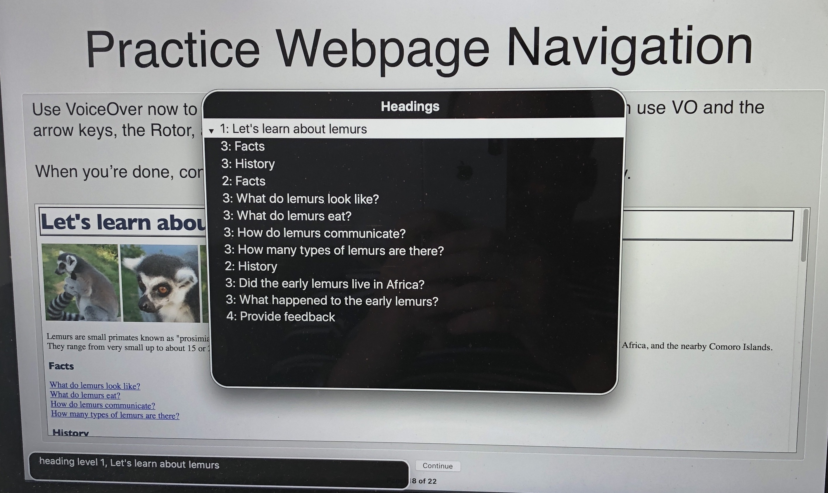
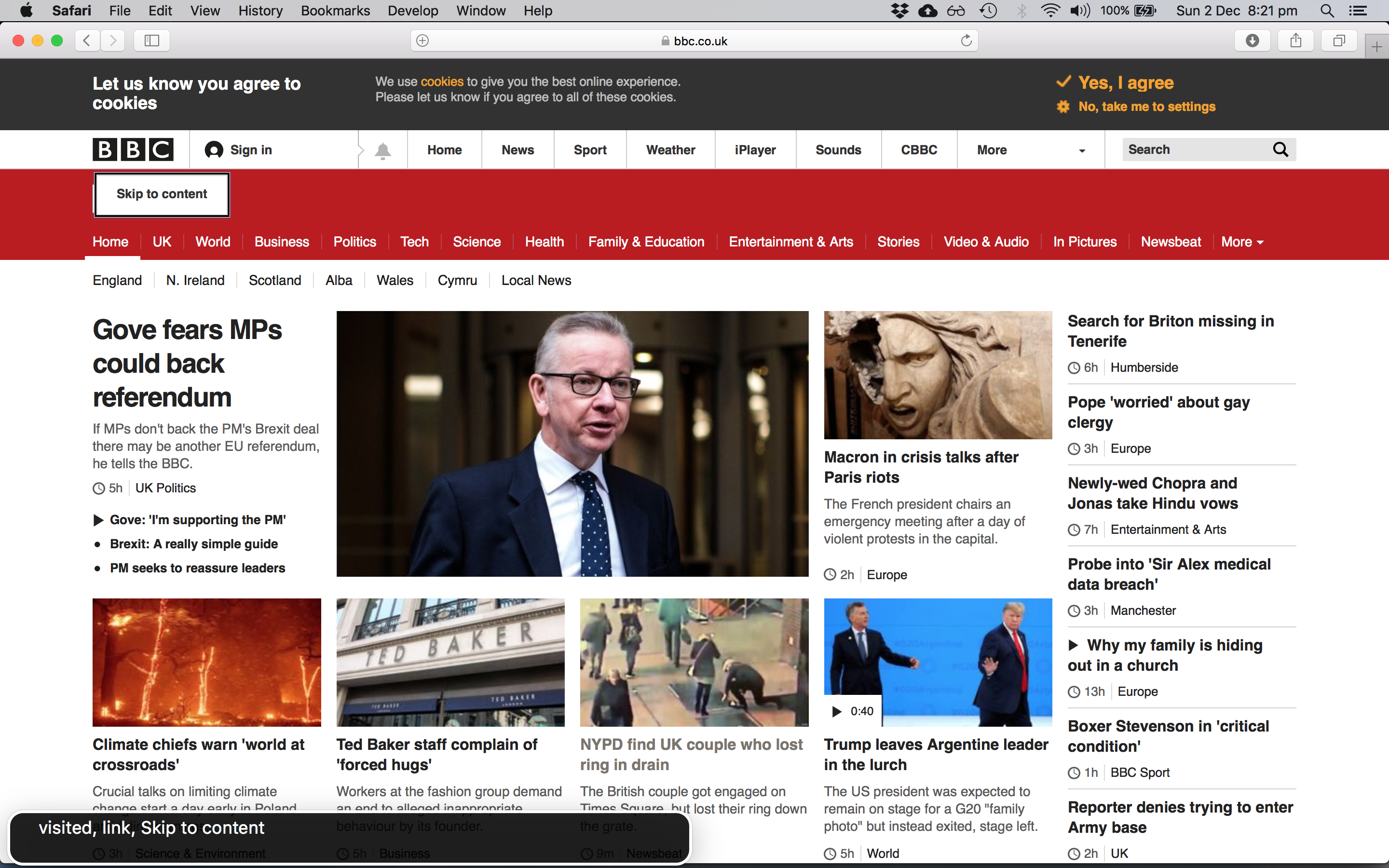
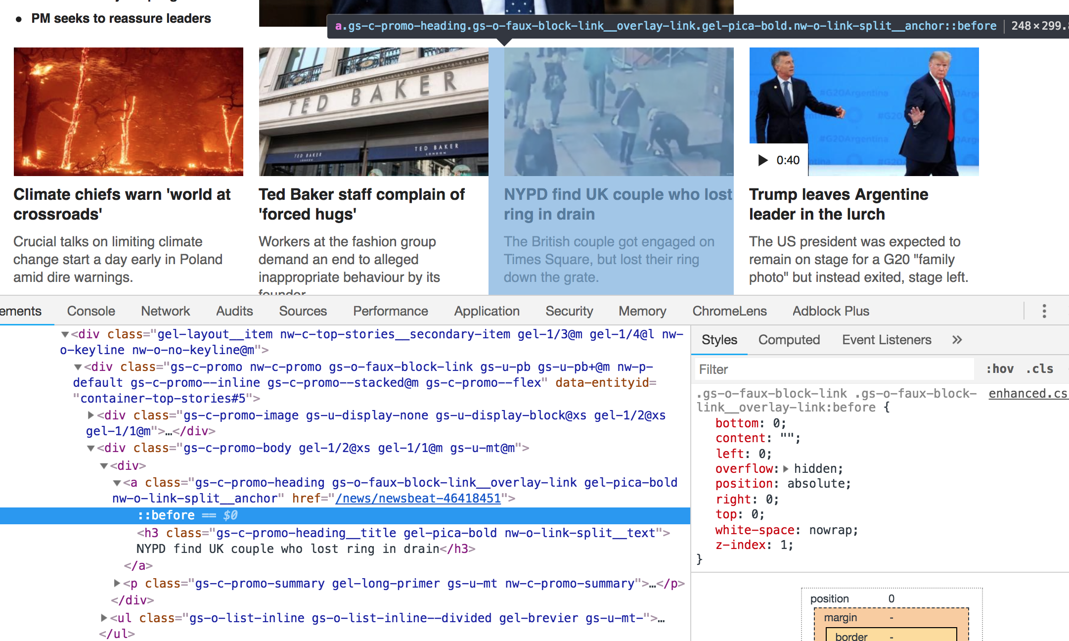
As news is something consumed passively rather than by searching for something specific, I decided to navigate BBC News by headings. It’s worth noting that you don’t need to use Quick Nav for this: VoiceOver provides element search commands that can save time for the power user. In this case, I could navigate headings with the VO + ⌘ + H keys.
The first heading was the cookie notice, and the second heading was a <h2> entitled ‘Accessibility links’. Under that second heading, the first link was a “Skip to content” link which enabled me to skip past all of the other navigation.
‘Skip to content’ links are very useful, and not just for screen reader users; see my previous article “I used the web for a day with just a keyboard”.
Tip #6: Provide ‘skip to content’ links for your keyboard and screen reader users.
Navigating by headings was a good approach: each news item has its own heading, so I could hear the headline before deciding whether to read more about a given story. And as the heading itself was wrapped inside an anchor tag, I didn’t even have to switch navigation modes when I wanted to click; I could just VO + Space to load my current article choice.
Whereas the homepage skip-to-content shortcut linked nicely to a #skip-to-content-link-target anchor (which then read out the top news story headline), the article page skip link was broken. It linked to a different ID (#page) which took me to the group surrounding the article content, rather than reading out the headline.
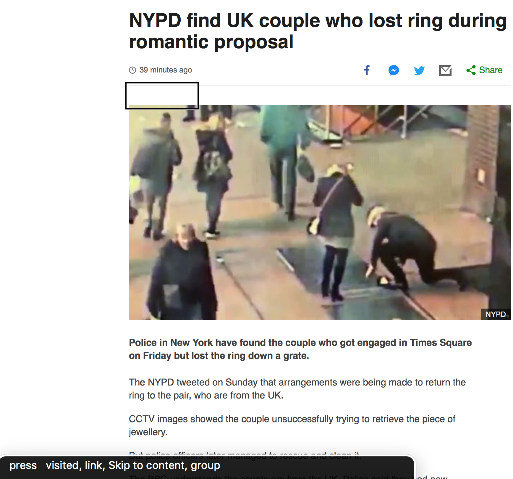
At this point, I hit VO + A to have VoiceOver read out the entire article to me.
It coped pretty well until it hit the Twitter embed, where it started to get quite verbose. At one point, it unhelpfully read out “Link: 1068987739478130688”.
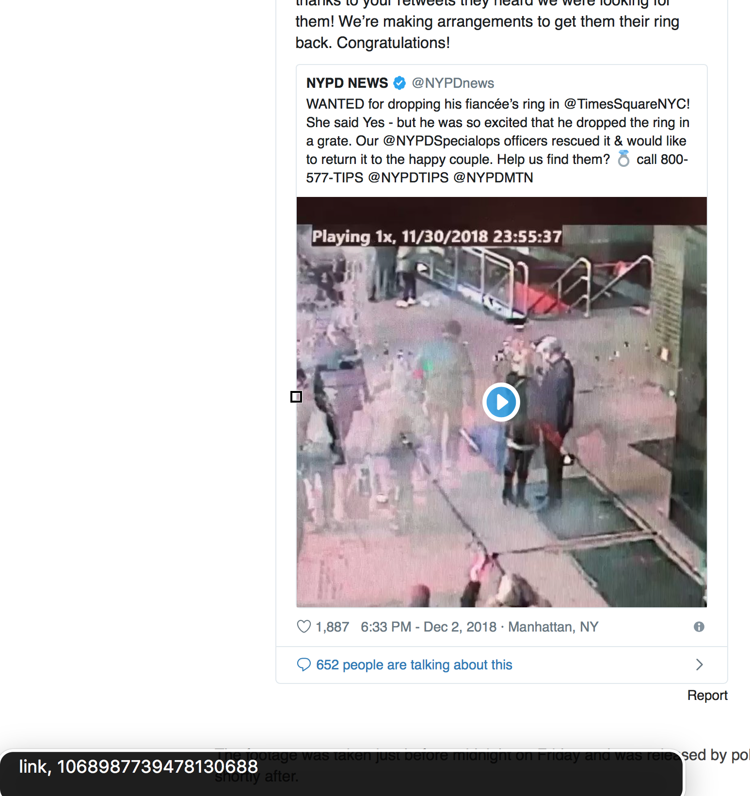
This appears to be down to some slightly dodgy markup in the video embed portion of the tweet:
div, then an img with an alt attribute with the value: “Embedded video”. (Large preview)It appears that VoiceOver doesn’t read out the alt attribute of the nested image, and there is no other text inside the anchor, so VoiceOver does the most useful thing it knows how: to read out a portion of the URL itself.
Other screen readers may work fine with this markup — your mileage may vary. But a safer implementation would be the anchor tag having an aria-label, or some off-screen visually hidden text, to carry the alternative text. Whilst we’re here, I’d probably change “Embedded video” to something a bit more helpful, e.g. “Embedded video: click to play”).
The link troubles weren’t over there:
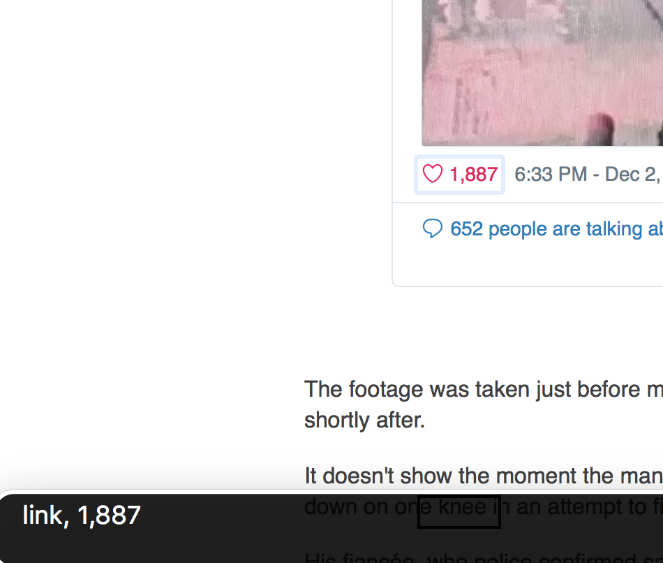
Under the main tweet content, there is a ‘like’ button which doubles up as a ‘likes’ counter. Visually it makes sense, but from a screen reader perspective, there’s no context here. This screen reader experience is bad for two reasons:
- I don’t know what the “1,887” means.
- I don’t know that by clicking the link, I’ll be liking the tweet.
Screen reader users should be given more context, e.g. “1,887 users liked this tweet. Click to like.” This could be achieved with some considerate off-screen text:
<style>
  .off-screen {
    clip: rect(0 0 0 0);
    clip-path: inset(100%);
    height: 1px;
    overflow: hidden;
    position: absolute;
    white-space: nowrap;
    width: 1px;
  }
</style>

<a href="/tweets/123/like">
  <span class="off-screen">1,887 users like this tweet. Click to like</span>
  <span aria-hidden="true">1,887</span>
</a>
Tip #7: Ensure that every link makes sense when read in isolation.
I read a few more articles on the BBC, including a feature ‘long form’ piece.
Reading The Longer Articles
Look at the following screenshot from another BBC long-form article — how many different images can you see, and what should their alt attributes be?
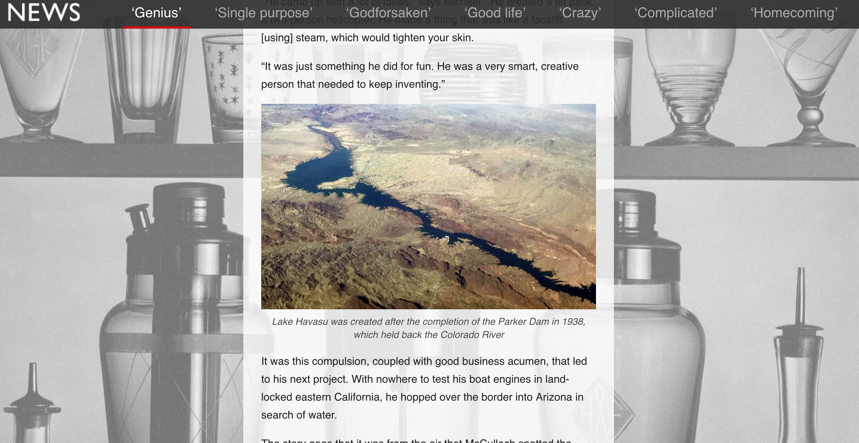
Firstly, let’s look at the foreground image of Lake Havasu in the center of the picture. It has a caption below it: “Lake Havasu was created after the completion of the Parker Dam in 1938, which held back the Colorado River”.
It’s best practice to provide an alt attribute even if a caption is provided. The alt text should describe the image, whereas the caption should provide the context. In this case, the alt attribute might be something like “Aerial view of Lake Havasu on a sunny day.”
Note that we shouldn’t prefix our alt text with “Image: ”, or “Picture of” or anything like that. Screen readers already provide that context by announcing the word “image” before our alt text. Also, keep alt text short (under 16 words). If a longer alt text is needed, e.g. an image has a lot of text on it that needs copying, look into the longdesc attribute.
Tip #8: Write descriptive but efficient alt texts.
Semantically, the screenshot example should be marked up with <figure> and <figcaption> elements:
<figure>
  <img src="/havasu.jpg" alt="Aerial view of Lake Havasu on a sunny day" />
  <figcaption>Lake Havasu was created after the completion of the Parker Dam in 1938, which held back the Colorado River</figcaption>
</figure>
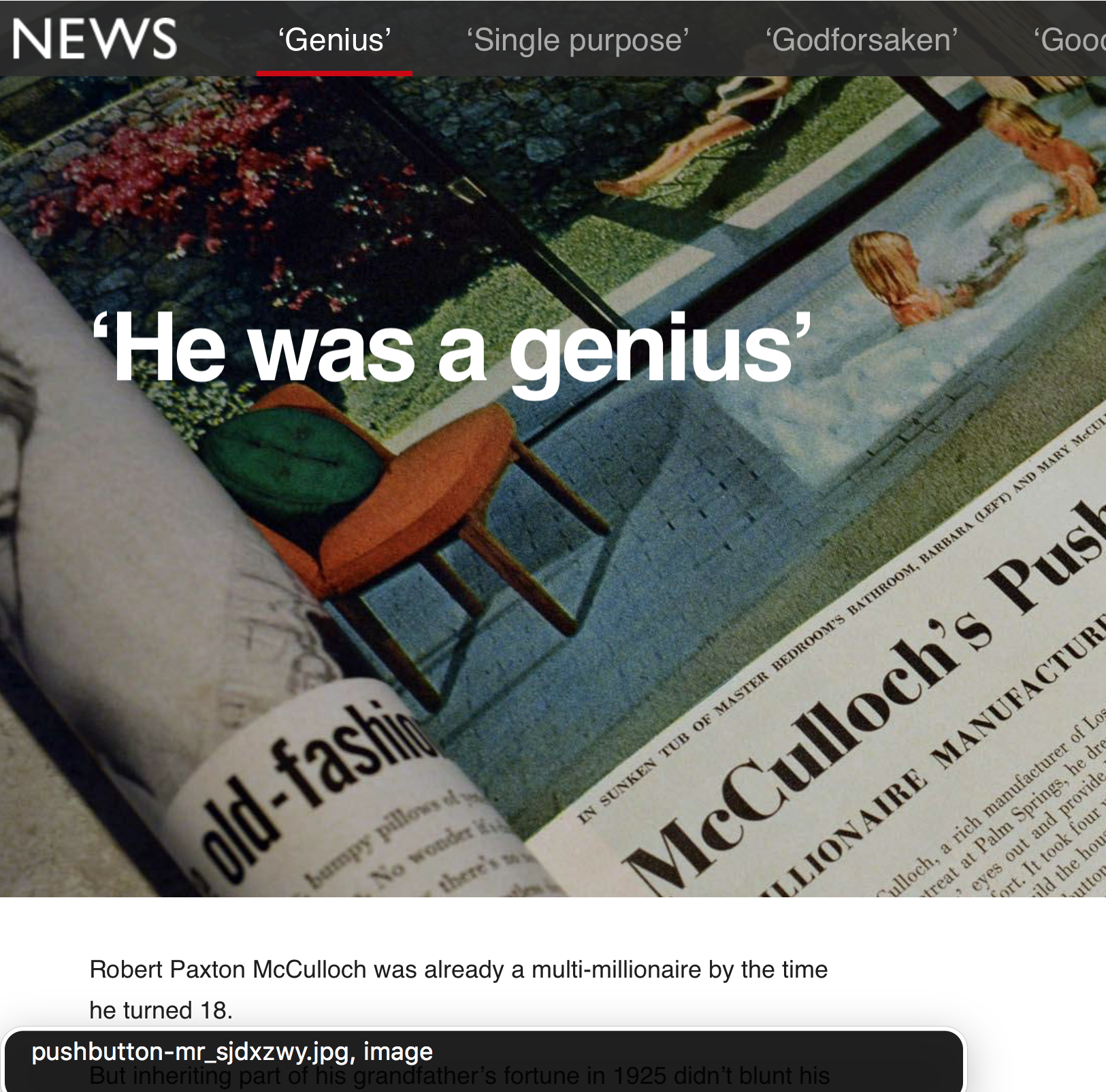
Now let’s look at the background image in that screenshot (the one conveying various drinking glasses and equipment). As a general rule, background or presentational images such as these should have an empty alt attribute (alt=""), so that VoiceOver is explicitly told there is no alternative text and it doesn’t attempt to read it.
Note that an empty alt="" is NOT the same as having no alt attribute, which is a big no-no. If an alt attribute is missing, screen readers will read out the image filenames instead, which are often not very useful!
Tip #9: Don’t be afraid to use empty alt attributes for presentational content.
Case Study 3: Facebook
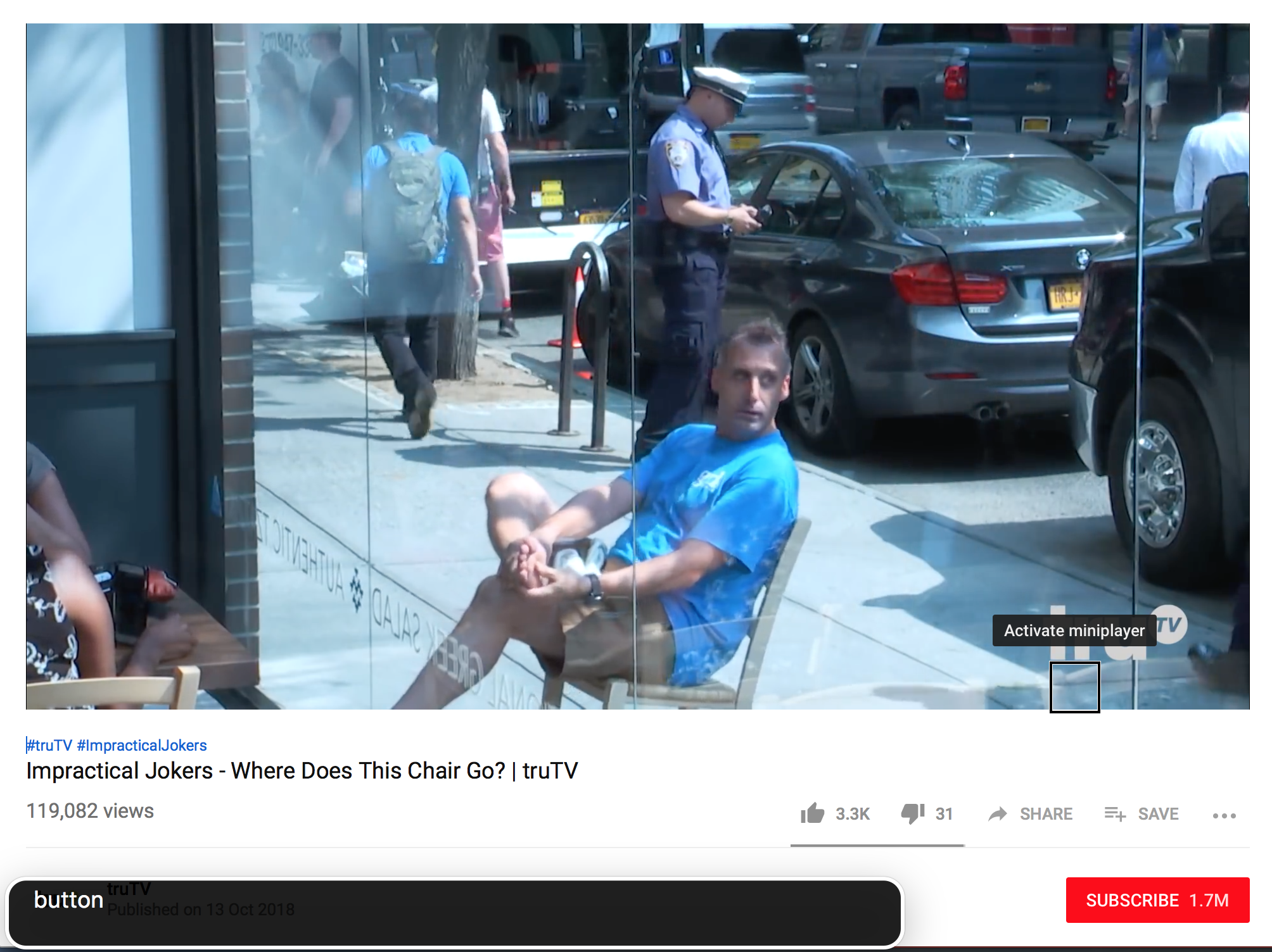
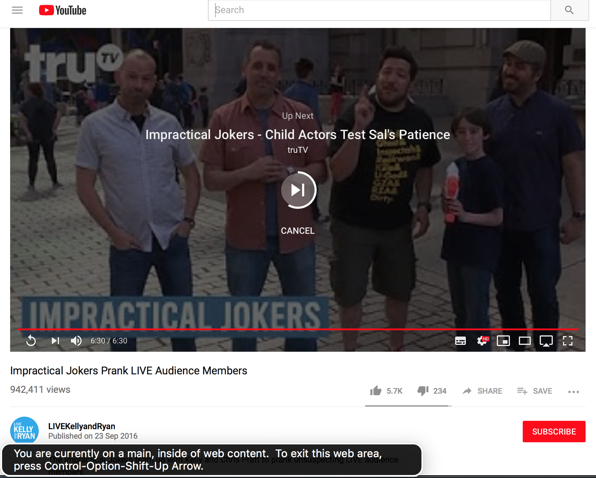
Heading over to Facebook now, and I was having withdrawal symptoms from earlier, so went searching for some more Impractical Jokers.
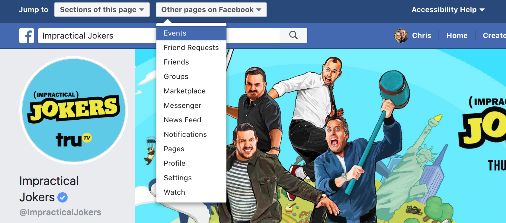
Facebook takes things a step or two further than the other sites I’ve tried so far, and instead of a ‘Skip to content’ link, we have no less than two dropdowns that link to pages or sections of pages respectively.
Facebook also defines a number of keys as shortcut keys that can be used from anywhere in the page:
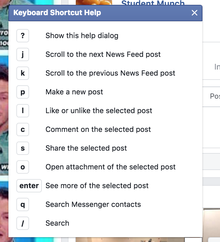
I had a play with these, and they work quite well with VoiceOver — once you know they’re there. The only problem I see is that they’re proprietary (I can’t expect these same shortcuts to work outside of Facebook), but it’s nice that Facebook is really trying hard here.
Whilst my first impression of Facebook accessibility was a good one, I soon spotted little oddities that made the site harder to navigate.
For example, I got very confused when trying to navigate this page via headings:
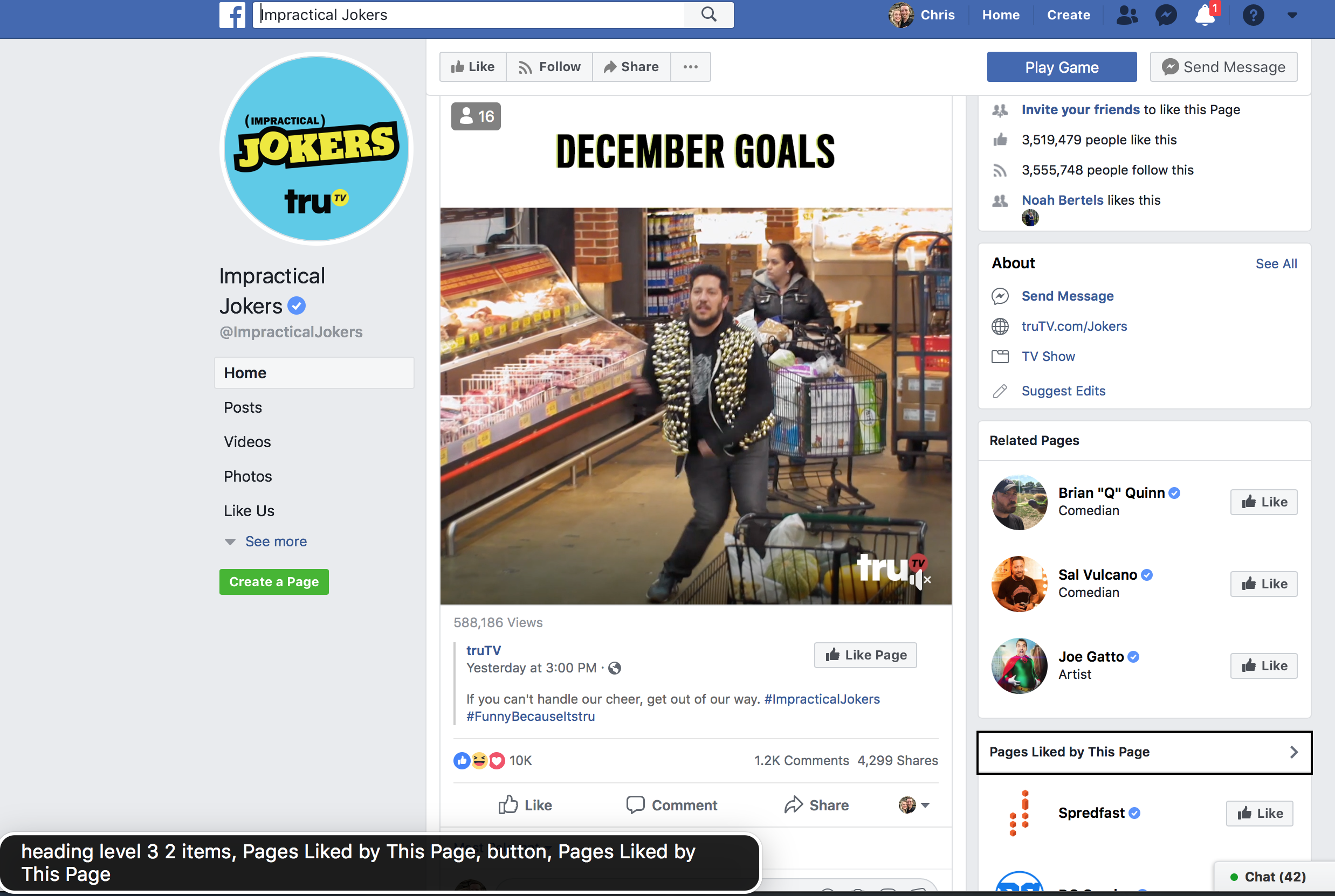
The very first heading in the page is a heading level 3, tucked away in the sidebar. This is immediately followed by heading level SIX in the main content column, which corresponds to a status that was shared by the Page.
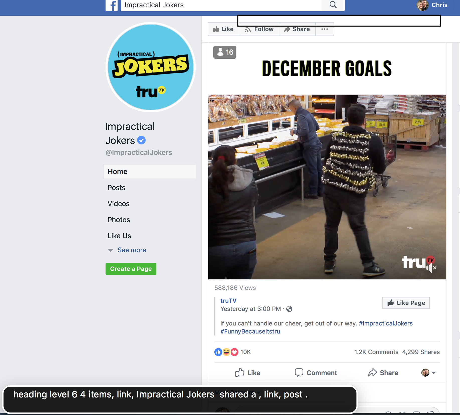
This can be visualized with the Web Developer plugin for Chrome/Firefox.
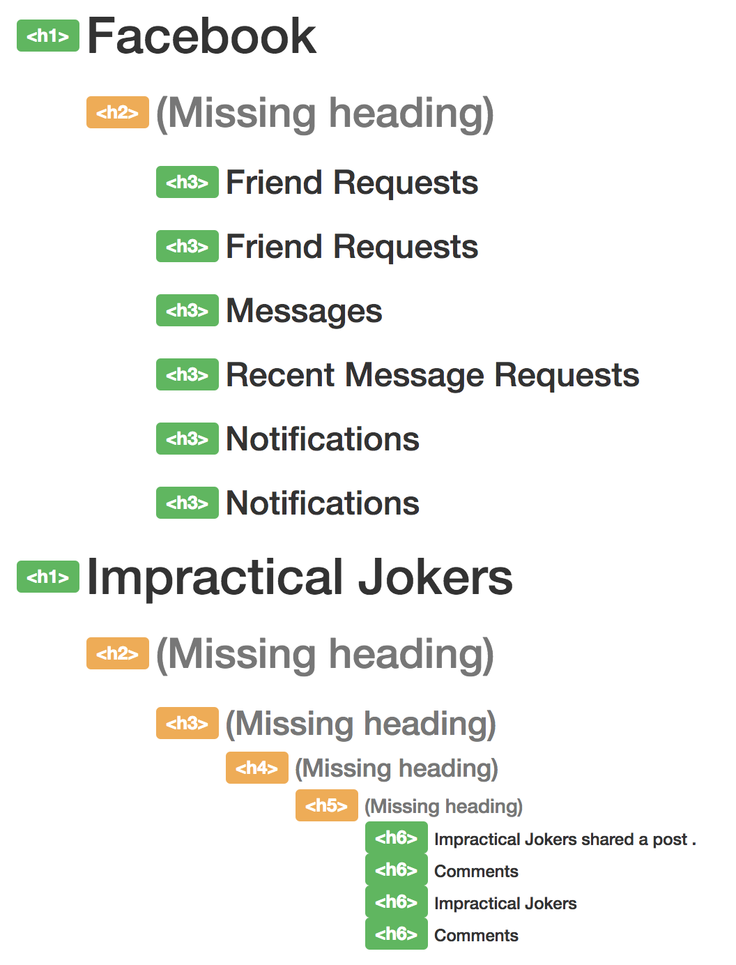
h1 goes to multiple h6s, skipping h2, h3, h4, h5. (Large preview)As a general rule, it’s a good idea to have sequential headings with a difference no higher than 1. It’s not a deal-breaker if you don’t, but it’s certainly confusing coming to it from a screen reader perspective and worrying that you’ve accidentally skipped some important information because you jumped from a h1 to a h6.
Tip #10: Validate your heading structure.
Now, onto the meat of the website: the posts. Facebook is all about staying in touch with people and seeing what they’re up to. But we live in a world where alt text is an unknown concept to most users, so how does Facebook translate those smug selfies and dog pictures to a screen reader audience?
Facebook has an Automatic Alt Text generator which uses object recognition technology to analyze what (or who) is in a photo and generate a textual description of it. So, how well does it work?

The alt text for this image was “Image may contain: sky, grass and outdoor.” It’s a long way off recognizing “Cambridge Cathedral at dusk”, but it’s definitely a step in the right direction.
I was incredibly impressed with the accuracy of some descriptions. Another image I tried came out as “Image may contain: 3 people, including John Smith, Jane Doe and Chris Ashton, people smiling, closeup and indoor” — very descriptive, and absolutely right!
But it does bother me that memes and jokes that go viral on social media are inherently inaccessible; Facebook treats the following as “Image may contain: bird and text”, which whilst true is a long way off the true depiction!
alt text does not stretch to images-with-text-on. (Large preview)Luckily, users can write their own alt text if they wish.
Case Study 4: Amazon
Something I noticed on Facebook, happens on Amazon, too. The search button appears before the search input field in the DOM. That’s despite the fact that the button appears after the input field visually.
Your website is likely to be in a logical order visually. What if somebody randomly moved parts of your webpage around — would it continue to make sense?
Probably not. That’s what can happen to your screen reader experience if you aren’t disciplined about keeping your DOM structure in sync with your visual design. Sometimes it’s easier to move content with CSS, but it’s usually better to move it in the DOM.
Tip #11: Make the DOM order match the visual order.
Why these two high profile sites choose not to adopt this best practice guideline with their search navigation baffles me. However, the button and input text are not so far apart that their ordering causes a big accessibility issue.
Headings On Amazon
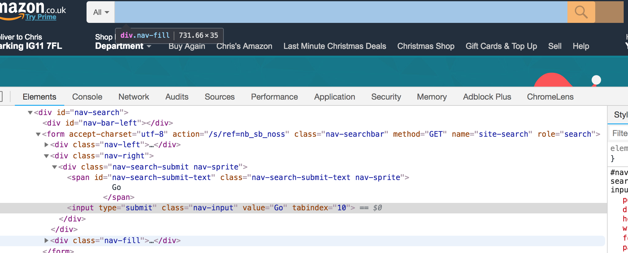
Again, like Facebook, Amazon has a strange headings order. I searched via headings and was most confused that the first heading in the page was a heading level 5 in the “Other Sellers on Amazon” section:
I thought this must be a bug with the screen reader, so I dug into Amazon’s source code to check:
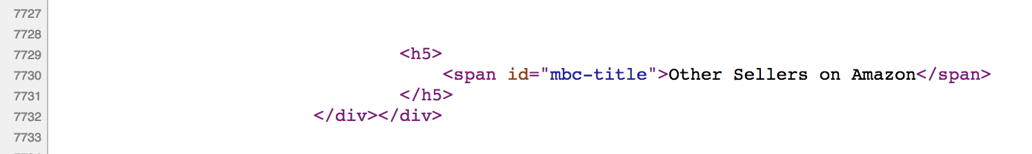
The h1 of the page appears almost 10,000 lines down in the source code.
Not only is this poor semantically and poor for accessibility, but this is also poor for SEO. Poor SEO means fewer conversions (sales) — something I’d expect Amazon to be very on top of!
Tip #12: Accessibility and SEO are two sides of the same coin.
A lot of what we do to improve the screen reader experience will also improve the SEO. Semantically valid headings and detailed alt text are great for search engine crawlers, which should mean your site ranks more highly in search, which should mean you’ll bring in a wider audience.
If you’re ever struggling to convince your business manager that creating accessible sites is important, try a different angle and point out the SEO benefits instead.
Miscellaneous
It’s hard to condense a day’s worth of browsing and experiences into a single article. Here are some highlights and lowlights that made the cut.
You’ll Notice The Slow Sites
Screen readers cannot parse the page and create their accessibility tree until the DOM has loaded. Sighted users can scan a page while it’s loading, quickly determining if it’s worth their while and hitting the back button if not. Screen reader users have no choice but to wait for 100% of the page to load.
It’s interesting to note that whilst making a performant website benefits all, it’s especially beneficial for screen reader users.
Do I Agree To What?
Form controls like this one from NatWest can be highly dependent on spacial closeness to denote relationships. In screen reader land, there is no spacial closeness — only siblings and parents — and guesswork is required to know what you’re ticking ‘yes’ to.
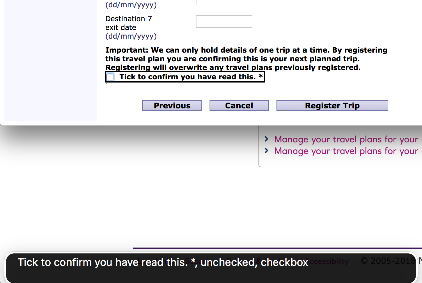
I would have known what I was agreeing to if the disclaimer had been part of the label:
<label>
  Important: We can only hold details of one trip at a time.
  <input type="checkbox" /> Tick to confirm you have read this. *
</label>
Following Code Is A Nightmare
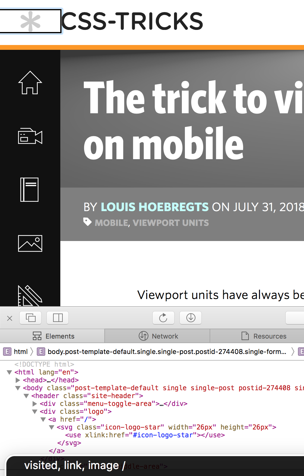
I tried reading a technical article on CSS Tricks using my screen reader, but honestly, found the experience totally impossible to follow. This isn’t the fault of the CSS Tricks website — I think it’s incredibly complex to explain technical ideas and code samples in a fully auditory way. How many times have you tried debugging with a partner and rather than explaining the exact syntax you need, you give them something to copy and paste or you fill it in yourself?
Look how easily you can read this code sample from the article:
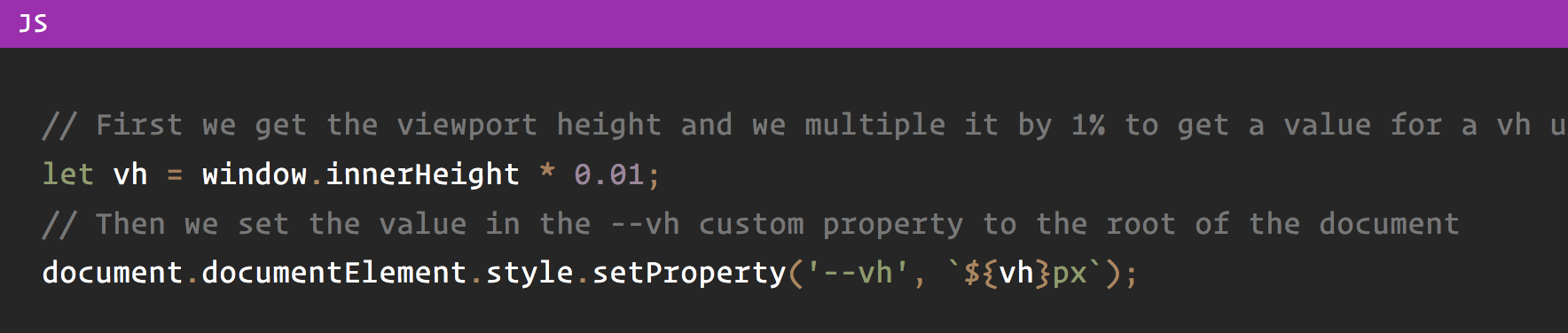
But here is the screen reader version:
"slash slash first we get the viewport height and we multiple it by one [pause] percent to get a value for a vh unit let vh equals window inner height star [pause] zero zero one slash slash then we set the value in the [pause] vh custom property to the root of the document document document element style set property [pause] vh dollar left brace vh right brace px"
It’s totally unreadable in the soundscape. We tend not to have punctuation in comments, and in this case, one line flows seamlessly into the next in screen reader land. camelCase text is read out as separate words as if they’d been written in a sentence. Periods such as window.innerHeight are ignored and treated as “window inner height”. The only ‘code’ read out is the curly brackets at the end.
The code is marked up using standard <pre> and <code> HTML elements, so I don’t know how this could be made better for screen reader users. Any who do persevere with coding have my total admiration.
Otherwise, the only fault I could find was that the logo of the site had a link to the homepage, but no alt text, so all I heard was “link: slash”. It’s only in my capacity as a web developer that I know if you have a link with an attribute href="/" then it takes you to the website homepage, so I figured out what the link was for — but “link: CSS Tricks homepage” would have been better!
VoiceOver On iOS Is Trickier Than OSX
Using VoiceOver on my phone was an experience!
I gave myself the challenge of navigating the Twitter app and writing a Tweet, with the screen off and using the mobile keyboard. It was harder than expected and I made a number of spelling mistakes.
If I were a regular screen reader user, I think I’d have to join the 41% of mobile screen reader users who use an external keyboard and invest in a Bluetooth keyboard. Clara Van Gerven came to the same conclusion when she used a screen reader for forty days in 2015.
It was pretty cool to activate Screen Curtain mode with a triple-tap using three fingers. This turned the screen off but kept the phone unlocked, so I could continue to browse my phone without anyone watching. This feature is essential for blind users who might otherwise be unwittingly giving their passwords to the person watching over their shoulder, but it also has a side benefit of being great for saving the battery.
Summary
This was an interesting and challenging experience, and the hardest article of the series to write so far.
I was taken aback by little things that are obvious when you stop and think about them. For instance, when using a screen reader, it’s almost impossible to listen to music at the same time as browsing the web! Keeping the context of the page can also be difficult, especially if you get interrupted by a phone call or something; by the time you get back to the screen reader you’ve kind of lost your place.
My biggest takeaway is that there’s a big cultural shock in going to an audio-only experience. It’s a totally different way to navigate the web, and because there is such a contrast, it is difficult to even know what constitutes a ‘good’ or ‘bad’ screen reader experience. It can be quite overwhelming, and it’s no wonder a lot of developers avoid testing on them.
But we shouldn’t avoid doing it just because it’s hard. As Charlie Owen said in her talk, Dear Developer, the Web Isn’t About You: This. Is. Your. Job. Whilst it’s fun to build beautiful, responsive web applications with all the latest cutting-edge technologies, we can’t just pick and choose what we want to do and neglect other areas. We are the ones at the coal face. We are the only people in the organization capable of providing a good experience for these users. What we choose to prioritize working on today might mean the difference between a person being able to use our site, and them not being able to.
Let us do our jobs responsibly, and let’s make life a little easier for ourselves, with my last tip of the article:
Tip #13: Test on a screen reader, little and often.
I’ve tested on screen readers before, yet I was very ropey trying to remember my way around, which made the day more difficult than it needed to be. I’d have been much more comfortable using a screen reader for the day if I had been regularly using one beforehand, even for just a few minutes per week.
Test a little, test often, and ideally, test on more than one screen reader. Every screen reader is different and will read content out in different ways. Not every screen reader will read “23/10/18” as a date; some will read out “two three slash one zero slash one eight.” Get to know the difference between application bugs and screen reader quirks, by exposing yourself to both.
Did you enjoy this article? This was the third one in a series; read how I Used The Web For A Day With JavaScript Turned Off and how I Used The Web For A Day With Just A Keyboard.
Further Reading
- A High-Level Overview Of Large Language Model Concepts, Use Cases, And Tools
- Penpot’s CSS Grid Layout: Designing With Superpowers
- Mobile Accessibility Barriers For Assistive Technology Users
- A Web Designer’s Accessibility Advocacy Toolkit


