Designing A Font Based On Old Handwriting

Email Newsletter
Weekly tips on front-end & UX.
Trusted by 182,000+ folks.

 Custom Web Forms for Angular, React, & Vue. Your backend.
 Celebrating 10 million developers


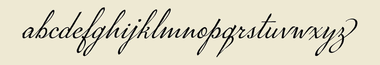
Designers create handwriting-based connected cursive fonts for a variety of reasons: to immortalize the loops and swirls of a loved one’s handwriting, to digitize the penmanship of a person or document of historic significance, or to transform charming handwriting into a creative asset that can be licensed.
Let’s say you found a beautiful old handwriting specimen you want to digitize. You might presume you can trace individual letters, then seamlessly convert those tracings into a font. I will confess that was my assumption before I began to work on my first font. I had not taken into account the myriad of thoughtful and intentional decisions required to transform the specimen into an artful and functional font.
Before you begin the process of digitizing your specimen, it would be worthwhile to ask yourself a few questions about your goals and intent. Think of it as writing a creative brief for your project. Begin by assessing the importance of historical accuracy. Then conduct a close examination of the specimen: look at the idiosyncrasies in the handwriting, the variation in shape and position of individual letters, the method for connecting letters, and the texture. Possessing a keen familiarity of your specimen will allow you to make informed decisions about aesthetics as you design your font.
Recommended reading: Hands On The Sigmund Freud Typeface: Making A Font For Your Shrink
How Important Is Historical Accuracy?
One of the biggest decisions you will need to make is whether you want to capture every nuance of your handwriting specimen, or if you want to design something inspired by that handwriting. It is like watching a movie “based on a true story” versus one “inspired by real events.” In the first scenario, you can expect the movie (or font) maintains a higher degree of factual integrity than the second option, where the director (or designer) may take wide-ranging creative liberties.
If you choose to replicate your specimen with utmost precision, be aware that rigorously honoring accuracy may mean compromising legibility. “Old scripts, in particular, include letterforms that are less legible — even virtually illegible, like the old-style long s — than in modern handwriting,” notes Brian Willson, who has designed more than two dozen fonts based on the handwriting of notable figures such as Abigail Adams, Frederick Douglass, and Sam Houston.
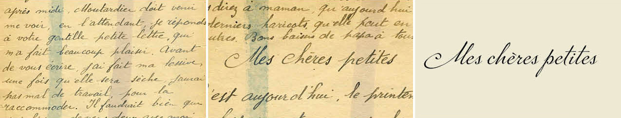
You may find you want to make thoughtful revisions to strike a balance between historical accuracy and optimized legibility. As I designed the P22 Marcel Script, which is a connected cursive font based on handwritten WWII love letters, I chose to make small revisions to improve legibility.
The font retains the essential character of the original writing, but it is not a precise replica. Many of the original j’s, for example, did not have a tittle (a dot), and the original lowercase p did not have a closed curve on the bottom of the bowl. It looked like a hybrid between a p and an n. Knowing some people struggle to read cursive writing, I chose to dot the j and revise the shape of the p.
Does Your Source Document Include Enough Material To Work With?
John Hancock had a fantastic signature, but designing an entire font based on the eight letters in his name — J, o, h, n, H, a, c, and k — would be a challenge. Assess whether your specimen is complete enough to support an entire font. Does it include both upper and lowercase letters? How about numbers?
When designing the font based on the handwriting of Jane Austen, designer Pia Frauss discovered she did not have a handwritten letter X to reference. If, like Frauss, you have a specimen that is mostly complete, you should be able to extrapolate what a specific letter might have looked like. That skill will also be necessary when it comes time to design new glyphs — the term for a specific character in a font file — like the Euro, which has only existed since 1999.
If your specimen only has a limited set of characters, gauge whether you feel comfortable designing the missing letters. If not, consider finding a handwritten specimen that is similar in style, then pulling the missing letters from the supplementary specimen.
What Idiosyncrasies Make The Handwriting Special?
Are crossbars unusually high, low, or angled? Are ascenders or descenders abnormally long or short? Are letters strikingly narrow or wide? Do specific letters extend above or below the baseline? Do letters loop in unusual ways?
If your goal is to create a historically accurate font, you will want to take care to ensure those idiosyncrasies are not lost as you digitize individual glyphs. If you are comfortable taking creative liberties, you might exaggerate those points of differentiation.
In the font Marydale, Brian Willson included quirky glyphs such as the loopy, two-story serif g found in the original handwriting. Brian thought it added friendly charm. But a risk of embracing idiosyncrasies is that some users may not like those letterforms — and indeed some users complained to Brian that the g was too unusual. Nevertheless, Marydale is one of Brian’s best-selling fonts.
To help you decode shapes and understand the mechanics behind some of your specimen’s idiosyncrasies, it may be helpful to identify the type of writing utensil that was used. A ballpoint pen will create uniform-width strokes; a split-nib pen can create graceful thicks and thins; a dip pen may carry evidence of ink being reapplied; a brush can create dramatic variation in thickness. You may also consider how the writing utensil had been held or if the writer had been in a hurry, since hand position and speed can influence the shape and style of the handwriting, too.
Assess Variations In Axis, Letter Height, Alignment To Baseline, And Stroke Width
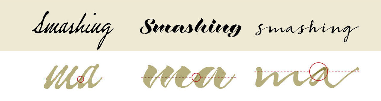
Within any single handwriting specimen, you will likely see variation in axis, letter height, alignment to baseline, and stroke width. These irregularities enhance the individuality of handwriting — but transferring those irregularities to a digital font can be a challenge. If your font includes too many variations in axis, letter height, alignment to baseline, or stroke width, it may not reflect the visual unity of the original specimen. If your font does not include enough variation, it may lack the charm of the original writing.
Take time to assess which elements in the original specimen are consistent and which vary, then plan how you could incorporate those variations into your font. If you employ a consistent axis, consider varying alignment to baseline or stroke width. If you standardize stroke widths, consider varying axes and letter heights.
When I began working on the P22 Marcel Script, I sourced favorite individual letters from five separate handwritten pages. The first time I pieced glyphs into words, I could see that the axes, letter heights, and stroke thicknesses were too variable. Even though each glyph had been a careful re-creation of one man’s handwriting, the resulting look was haphazard. I decided on a standard for axis and stroke thickness, then adjusted every glyph to that standard. Varying letter heights and alignment to baseline prevented the font from looking too mechanical.
Where And How Do Individual Letters Connect?
Are the connecting lines that sweep from one letter to the next high or low? Are the connecting lines thick or thin? Are there some letters that do not connect?
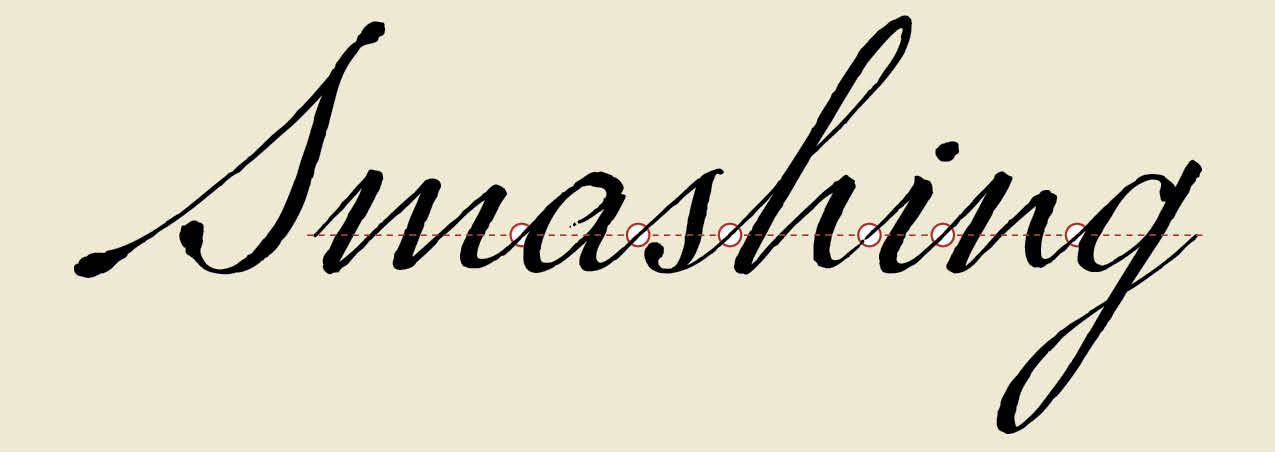
The key to designing a successfully connected cursive script font is to create an overlap so individual letters appear to seamlessly flow from one into the next. The trick is to identify one location for that overlap, then to start and end every glyph in that precise position. Some designers place those overlaps along the left-hand edge of a glyph, other designers place the overlap in the space between the glyphs. Some designers place the overlap low, others place the overlap high. There is no right or wrong answer; choose the location and method that makes sense for you.
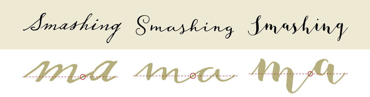
You may also discover that not all letters in your specimen connect. In that case, you will still need to identify one location and implement a consistent strategy for the overlaps, though you will only create the overlap on those glyphs that connect.* *
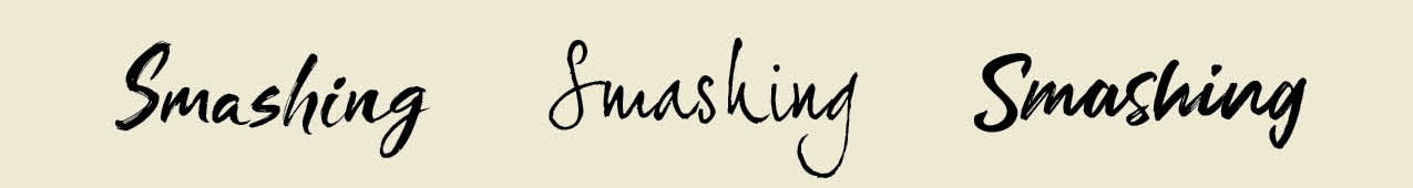
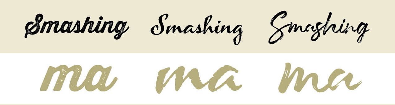
Do You Want Your Font To Include A Texture Effect?
Adding texture can enhance a feeling of antiquity or nostalgia, but this treatment adds time, complexity, and increases file size. And it may influence whether or not someone will want to license and use your font, since they may or may not be looking for that specific effect.
Examine your original specimen to determine where the texture came from. Was it caused by the paper surface? Was variation caused by the writing tool or writing speed? Are irregularities clustered on curves? Does one side of the letter include more texture than the other? Do brush strokes or splatters of ink extend into the space surrounding each letter?
Once you’ve made high-level decisions on the importance of historical accuracy, identified what idiosyncrasies make the handwriting special, considered how to add variation in axis, letter height, alignment to baseline, or stroke width, assessed how to connect glyphs, and decided if you want to include texture, it’s time to forge ahead with the design of your font.
Pick Your Letters
Make a copy of your specimen, and go through it line by line, flagging the specific characters you want to incorporate into your font. When designer Brian Willson begins a new font, it is not unusual for him to spend hours poring over the source material to select the individual letters he plans to include.
Consider flagging two types of letters:
- Favorite “workhorse” letters
Workhorse letters will make up your basic glyph set. They might not be the fanciest option, but workhorse characters will make for a reliable and legible glyph set. - Favorite swash letters
Swash letters might include extra loops or flourishes, more or less texture, greater variation in position above or below the baseline, or exaggerated features such as extra-long crossbars.
Swash letters may be less legible, or may only be appropriate for use in specific instances, but can add variety, beauty, and personality. (Swash glyphs will be added later in the process; focus first on designing the workhorse glyph set.)
Ideally, at the end of your review, you will have flagged a complete set of upper and lowercase workhorse letters, numbers, punctuation marks, and an array of swash characters.
Scan Individual Letters And Prepare To Vectorize
Create high-resolution bitmap images of all letters you plan to include in your font. I have always used a flatbed scanner to capture those images, but I have heard of people exporting sketches from Procreate or taking high-resolution photos on their phones. If you take a photo, be sure your phone is parallel to your specimen to avoid distortion.
Once you have assembled a collection of bitmap images, you will need to choose between vectorizing the letterforms using Adobe Illustrator’s Image Trace feature or importing the scans directly into font editing software then vectorizing them by hand.
Using Illustrator’s Image Trace feature may be preferred if your specimen includes lots of texture since Illustrator can capture that texture for you. To create a vector outline, import a bitmap image into Illustrator, then using advanced Image Trace menu options, test combinations of Paths, Corners, and Noise to get the tracing result you prefer. Expand to get your vector outline.
Importing scans directly into font editing software may be preferred if your font is not going to include texture, if you are comfortable generating Bezier lines, or if you intend to make significant revisions to letter shapes.
Recommended reading: How New Font Technologies Will Improve The Web
Establish A New Font File
Popular font editing software options include FontLab Studio VI (Mac or Windows OS, $459), Glyphs (Mac OS, €249.90), Robofont (Mac OS, $490), Font Creator (Windows, $79–199), and Font Forge (free). There is also an extension for Illustrator and Photoshop CC called FontSelf which allows you to convert lettering into a font ($49–$98).
Establish a new font file. If you created vector outlines using Illustrator, import each outline into the applicable glyph cell (that is, place the vector outline of the letter a in the a glyph cell so that an a appears when you hit the a key on your keyboard).
If you chose to vectorize the glyphs within the font editing software, import each bitmap scan as a background sketch, then trace.
Identify Archetype Letters
Some font designers begin by designing or refining the letters n, b, o, v, A, H and O since those letters contain clues to the shape of many other letters. The n, for example, holds clues to the shape of the i and h; the b holds clues to the shape of d, p, and q; the O holds clues to C and G. Other designers begin with the most frequently used letters of the alphabet: e, t, a, o, i, and n. In the fantastic book Designing Type, which is chock full of images that compare variations in letter shapes, Karen Cheng notes some designers begin with the letters a, e, g, n, and o.
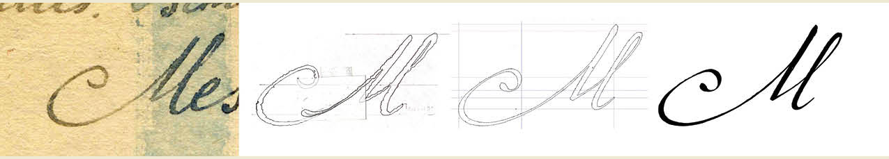
You may begin with one of those glyph sets, but if you’ve identified a few letters that quintessentially represent the aesthetic of your font, consider starting by refining those glyphs. When I began to work on the P22 Marcel Script, I began by working on the capital M for no other reason than the swoop of the original handwritten M was exquisite, and it brought joy to see that letter come to life as a glyph. (After working on the M, I focused on refining archetype letters n and e.)
No matter which glyphs you begin with, you will quickly want to establish standards for the axis, letter heights, alignment to baseline, and stroke widths. Ensure all glyphs meet those standards while simultaneously keeping in mind incorporating variability to achieve an organic look.
In order to introduce variability in an intentional way, it might be helpful to add guidelines to your workspace to define the lower and upper ranges of variability. Use these guidelines to introduce variation in ascender height, descender length, or in alignment to the baseline.
Do you want your font to have more variability? Increase the distance between the guidelines. Do you want your font to have less variability? Decrease the distance between the guidelines. Add variability to stroke widths in a similar way.
You will also want to establish a standard position for the overlap. Since there is not one correct place for these overlaps, experiment with a limited number of glyphs until the overlaps appear as natural as if the letters had been written with a pen without lifting the pen off the page. Then, test the position of the overlap on tricky letters such as r, o, s, f, v and w to confirm the overlap works. You’ll know if there are issues because glyphs won’t connect, or the connection won’t appear smooth. (If you see white where two black letters overlap, check for a Postscript path direction error.)
The good news is that once you have established the successful position for your overlaps you should be able to cut, copy, and paste the connecting line to replicate the position of the overlap on all remaining letters.
Test As You Go
As soon as you have a collection of glyphs — even if it isn’t the entire alphabet — generate a test file and preview your font. If your goal was to replicate your specimen with accuracy, assess whether the font reflects the rhythm and character of the original handwriting. Evaluate whether the “color” — the overall darkness or lightness — matches the original. Refine glyphs as necessary to achieve the right rhythm, character, and color.
If you have chosen to take liberties with the shapes of letters or to introduce variability, your goal should still be to achieve an overall cohesive aesthetic. It is up to you as the designer to define precisely what that means.
As you test, it will be helpful to print blocks of sample text at a range of sizes. Reverse letters out of black. Look at the spaces between letters. Look at the spaces inside of letters. Look at strings of glyphs backwards, then upside down. Look at the font both when printed on paper and on a computer monitor. Testing under different conditions will help you notice glyphs that need additional refinement. I found that when I tested sample text set in a foreign language the unfamiliar letter combinations would help me see individual glyphs that were too heavy, too light, too narrow or too wide, along with individual curves that seemed too rounded or too flat.
For the first-time type designer, I recommend the book Inside Paragraphs: Typographic Fundamentals by Cyrus Highsmith (see list of references below). The book provides an invaluable primer on learning how to look at shapes and spaces in and around letters.
Continue testing and revising glyphs until your font includes a–z lowercase, A–Z uppercase, numbers, fractions, punctuation marks, and diacritics (marks such as the umlaut, acute, or tilde added to letters to indicate stress or change in pronunciation).
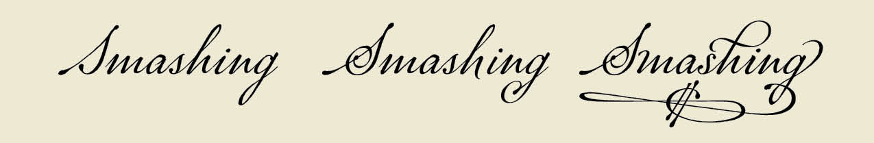
Add Swashes And Alternate Characters
Once your workhorse glyph set is complete, consider adding the swash characters you flagged when you picked your initial letters. A digital font can never offer the infinite variability found in handwriting, but by writing lines of OpenType code and incorporating swashes, ligatures (two or more letters that are combined into a single glyph), and alternate characters, you can begin to close the gap between the mechanical nature of a font and organic variation of handwriting. OpenType code allows you to do things like ensure two of the same glyphs never appear next to each other, or replace a workhorses glyph with a fancy swash or with a glyph that has more (or less) texture.
This work can be time-consuming, but you just might find it is addictive. You might discover every word you test could benefit from some custom flourish. The font Suomi, designed by Tomi Haaparanta, includes more than 700 ligatures. The font Hipster Script, designed by Ale Paul has 1,066. Syys Script by Julia Sysmäläinen for Art. Lebedev Studio has more than 2,000 glyphs. And between the Latin and Cyrillic versions, the font NIVEA Care Type by Juliasys has more than 4,000 glyphs.
Between swashes, ornaments, and alternate characters, the Pro version of the P22 Marcel Script includes more than 1,300 glyphs. Many of the alternate glyphs were inspired by flourishes in the original specimen; other glyphs were of my own invention, but were made in the style of the original writing. In my experience, incorporating swashes, ligatures, and alternate characters is the most exciting part about designing a connected cursive script font. In fact, it is what brings a connected cursive script font to life.
Final Steps
Once all your glyphs have been designed and the font has been thoroughly tested for technical performance and aesthetics, it is time to name the font and release it into the world.
Ensure no other font is already using the name you are considering. You can do a preliminary search on aggregator websites such as MyFonts, Fonts.com, FontShop, or Creative Market. Fonts are also distributed by individual font foundries and designers. Because there are so many distribution channels, the only way to guarantee availability and protect a name is to apply for a copyright with the U.S. Patent and Trademark Office (for U.S. designers). Consider hiring a lawyer to help with the filing process.
Finally, when it is time to release the font, if this is your first font it may be easiest to distribute your font through an established foundry or aggregator website. They should offer technical support, and will track licensing and sales tax. Consider working with one of the websites listed above; each website will have a different process to submit a font for consideration.
Other Resources
- “The Elements Of Typographic Style,” Robert Bringhurst
- “Designing Type,” Karen Cheng
- “Inside Paragraphs: Typographic Fundamentals,” Cyrus Highsmith
- “Script Fonts,” Geum-hee Hong
- “Shaping Text: Type, Typography And The Reader,” Jan Middendorp
- “Theory Of Type Design,” Gerard Unger
- Diacritics (a project by TYPO and Designiq)
- The Unofficial OpenType Cookbook, OpenType
- Character Design Standards, Microsoft
Further Reading
- Addressing Accessibility Concerns With Using Fluid Type
- The AI Dilemma In Graphic Design: Steering Towards Excellence In Typography And Beyond
- Sliding 3D Image Frames In CSS
- A New Way To Reduce Font Loading Impact: CSS Font Descriptors


