Table Design Patterns On The Web

Email Newsletter
Weekly tips on front-end & UX.
Trusted by 182,000+ folks.
 Register for Free
 Custom Web Forms for Angular, React, & Vue. Your backend.


 Celebrating 10 million developers
Tables are a design pattern for displaying large amounts of data in rows and columns, making them efficient for doing comparative analysis on categorical objects. Tables have been used for this purpose as early as the 2nd century and when the world started to go digital, tables came along with us.
It was inevitable that the web would support the display of data in a tabular format. HTML tables present tabular data in a semantic and structurally appropriate manner. However, the default styles on HTML tables are not exactly the most aesthetically pleasing thing you’ve ever seen. Depending on the desired visual design, some effort was required on the CSS front to prettify those tables. A decade ago, an article with the “Top 10 CSS Table Designs” was published on Smashing Magazine, and it still continues to get a lot of traffic to this day.
The web has evolved a lot over the past decade, and it’s more convenient than ever to make your site or application adapt to the viewport it is viewed in. That being said, we have to continue to make considered design choices that do not compromise on accessibility. Since tables don’t seem to be falling out of favor anytime soon, let’s see how tables can be created on the web in 2019.
CSS-Only Options
If your dataset isn’t that large, and features like pagination and sorting are not necessary, then consider a JavaScript-free option. You can get some pretty nice results that work well on a whole gamut of screen sizes without the added weight of a large library.
Unfortunately, without the help of JavaScript for some DOM manipulation on the accessibility front, we only have a handful of CSS-only options. But for small data sets, they are often sufficient.
Option 1: Do Nothing
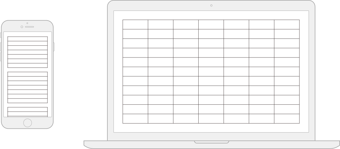
We’re going to start off with a low-effort scenario. If your data fits in a table with only a few columns and lots of rows, then such a table is pretty much mobile-ready to begin with.

The issue you’d have is probably having too much room on wider screens, so it might be advisable to “cap” the maximum width of the table with a max-width while letting it shrink as necessary on a narrow screen.
See the Pen Table #1: Few columns, many rows by (Chen Hui Jing) on CodePen.
This sort of a pattern works best if your data itself isn’t lines and lines of text. If they are numeric, or short phrases, you can probably get away with not doing much.
Option 2: Style The Scroll
David Bushell wrote up his technique for responsive tables back in 2012, which involved invoking overflow and allowing users to scroll to see more data. One could argue that this isn’t exactly a responsive solution, but technically, the container is responding to the width of the viewport.

Let’s look at the “basic” overflow first. Imagine me using air-quotes around basic, because the styling for the scrolling shadows is anything but. Still, in this instance, “basic” refers to the fact that the table does not transform in any way.
See the Pen Table #3: Style the scroll (basic) by Chen Hui Jing on CodePen.
This technique for doing scrolling shadows comes from Roma Komarov and Lea Verou riffing off each other’s ideas to create magic. It hinges on using multiple gradients (linear and radial) as background images on the containing element, and using background-attachment: local to position the background relative to its contents.
What’s nice about this technique is that for browsers that don’t support scrolling shadows, you can still scroll the table as per normal. It doesn’t break the layout at all.
Another scrolling option would be to flip the table headers from a row configuration to a column configuration, while applying a horizontal scroll onto the <tbody> element’s contents. This technique leverages Flexbox behavior to transform the table’s rows into columns.
See the Pen Table #3: Style the scroll (flipped headers) by Chen Hui Jing on CodePen.
By applying display: flex to the table, it makes the <thead> and <tbody> both flex children, which are by default laid out next to each other on the same flex line.
We also make the <tbody> element a flex container, thus making all the <tr> elements within it flex children laid out in a single flex line as well. Lastly, every table cell has to have their display set to block instead of the default table-cell.
The advantage of this technique is that the headers are always in view, like a fixed header effect, so users don’t lose context as they scroll through the columns of data. One thing to take note of is that this technique results in a discrepancy of the visual and source order, and this makes things slightly unintuitive.
Sprinkle On Some JavaScript
As mentioned earlier, layout options that involving morphing the table by modifying display values sometimes have negative implications for accessibility, which require some minor DOM manipulation to rectify.
In addition, there are a number of user experience tips when it comes to designing data tables from Andrew Coyle, including features like pagination, sorting, filtering, and so on (features that do require some JavaScript to enable).
If you’re working with a relatively simpler dataset, perhaps you would like to write your own functions for some of these features.
Rows To Blocks, With Accessibility Fix
As far as I know of, this responsive data table technique came about from the CSS-Tricks article “Responsive Data Tables” by Chris Coyier back in 2011. It has since been adapted and expanded upon by many others.
The gist of this technique is to make use of a media query to switch the display property of the table element and its children to block on a narrow viewport.
On a narrow screen, the table headers are visually hidden, but still exist in the accessibility tree. By applying data attributes to the table cells, we can then display labels for the data via CSS, while keeping the content of the label in the HTML. Please refer to the CodePen below for how the mark-up and styles look like:
See the Pen Table #2: Rows to blocks by Chen Hui Jing on CodePen.
The original method applies a width on the pseudo-element displaying the label text, but that means you’d need to know the amount of space your label needed to begin with. The above example uses a slightly different approach, whereby the label and data are each on opposite sides of their containing block.
We can achieve such an effect via auto-margins in a flex formatting context. If we set the display property for each <td> element to flex, because pseudo-elements generate boxes as if they were immediate children of their originating element, they become flex children of the <td>.
After that, it’s a matter of setting margin-right: auto on the pseudo-element to push the cell’s content to the far end edge of the cell.
Another approach doing the narrow viewport layout is using a combination of Grid and display: contents. Please note that display: contents in supporting browsers has issues with accessibility at the moment, and this method shouldn’t be used in production until those bugs are fixed.
But maybe you’re reading this after those bugs have been resolved, in that case, here’s an alternative layout option.
See the Pen Table #2: Rows to blocks (alt) by Chen Hui Jing on CodePen.
Each <tr> element is set to display: grid, and each <td> element is set to display: contents. Only the immediate children of a grid container participate in a grid formatting context; in this case, it’s the <td> element.
When display: contents is applied to the <td>, it gets “replaced” by its contents, in this case, the pseudo-element and the <span> within the <td> become the grid children instead.
What I like about this approach is the ability to use max-content to size the column of pseudo-elements, ensuring that the column will always be the width of the longest label, without us having to manually assign a width value for it.
In future, when the sizing values of min-content, max-content and fit-content (covered by the CSS Intrinsic & Extrinsic Sizing Module Level 3) are supported as general width and height values, we’ll have even more options for laying things out.
The downside to this approach is you do need that additional <span> or <p> around the content in your table cell if it didn’t have one already, otherwise, there’d be no way to apply styles to it.
Simple Pagination
This example shows a basic pagination implementation that was modified off a CodePen by Gjore Milevski to paginate on table rows instead of divs. It is an extension of the “style the scroll” example discussed in the previous section.
See the Pen Table #4: Simple pagination by Chen Hui Jing on CodePen.
From a layout perspective, Flexbox comes in very handy for positioning the pagination elements across various viewport sizes. Different project designs will have different requirements, but the versatility of Flexbox should allow you to cater for these differences accordingly.
In this case, the pagination is centred on the page and above the table. The controls for navigating backward and forward are placed on either side of the page indicators on wider screens, but all four appear above the page indicators on narrow screens.
We can do this by levaraging the order property. Visual reordering of content should always be done with consideration because this property does not change the source order — only how it appears on screens.
Simple Sorting
This example shows a basic sorting implementation modified off this code snippet by Peter Noble to cater for both text and numerals:
See the Pen #Table 5: Simple sorting by Chen Hui Jing on CodePen.
It would be useful to have some sort of indicator of which column is currently being sorted and in what order. We can do that with the addition of CSS classes which can then be styled however you want. In this case, the indicator symbols are pseudo-elements that are toggled when the target header is clicked.
Simple Search
This example is a basic filtering functionality that iterates through all the textual content of each table cell and applies a CSS class to hide all rows that do not match the search input field.
See the Pen Table #6: Simple filtering by Chen Hui Jing on CodePen.
Such an implementation is relatively naive, and if your use case calls for it, it might make sense to search per column instead. In that scenario, it might be a good idea to have each input field as part of the table in their respective columns.
Let A Library Handle It
The above JavaScript snippets serve to demonstrate how tables with larger amounts of data can be enhanced to make life easier for users of those tables. But with really large datasets, it might probably make sense to use an existing library to manage your large tables.
The column toggle pattern is one whereby non-essential columns are hidden on smaller screens. Normally, I’m not a fan of hiding content simply because the viewport is narrow, but this approach by Maggie Costello Wachs of Filament Group resolves that qualm of mine by providing a drop-down menu which allows users to toggle the hidden columns back into view.
The above article was published back in 2011, but Filament Group has since developed a full suite of responsive table plugins known as Tablesaw, which includes features like sorting, row selection, internationalization and so on.
The column toggle feature in TableSaw also no longer depends on jQuery, unlike the examples from the original article. Tablesaw is one of the only libraries I could find that does not have a dependency on jQuery at the moment.
Wrapping Up
There is a myriad of table design patterns out there, and which approach you pick depends heavily on the type of data you have and the target audience for that data. At the end of the day, tables are a method for the organization and presentation of data. It is important to figure out which information matters most to your users and decide on an approach that best serves their needs.
Further Reading
- “CSS-Only Responsive Tables,” David Bushell
- “Accessible, Simple, Responsive Tables,” Davide Rizzo, CSS-Tricks
- “Responsive Table Layout,” Matt Smith
- “Responsive Patterns: Tables,” Brad Frost
- “Hey, It’s Still OK To Use Tables,” Adrian Roselli
- “Tables, CSS Display Properties, And ARIA,” Adrian Roselli
- “Data Tables,” Heydon Pickering
Further Reading
- 55 Free High Quality Icon Sets
- The Ultimate Guide To Cloning In Photoshop
- Hand-Sketching: Things You Didn’t Know Your Doodles Could Accomplish
- Switching From Adobe Fireworks To Sketch: Ten Tips And Tricks
 (ra, il, mrn)

