Including Animation In Your Design System

Email Newsletter
Weekly tips on front-end & UX.
Trusted by 182,000+ folks.
(This article is sponsored by Adobe.) Design systems come in all shapes and sizes, but as Sparkbox’s design system survey noted, not all of them include guidelines for animation. Sure, some teams may have decided that motion wasn’t something their product needed guidance on, but I suspect that in some cases motion was left out because they weren’t sure what to include.
In the past few years, I’ve talked with many teams and designers who admit they think motion is something they should address, but they just aren’t sure how. If you’re in that boat, you’re in luck. This article is all about what to include in a set of motion guidelines for your design system and how to pull it off.
Why Animation?
Animation is an important design tool for both UX and brand messaging. Just like typography and color, the animation you use says something about your product and its personality. So, when it’s not addressed in a design system, that system essentially leaves that area of UI design tooling unaccounted for. Then people following the design system either do whatever they want with animation — which can lead to a strange mish-mash of animation execution across the experience — or, they just don’t use animation at all because they don’t have time to figure out all the details themselves. Neither case is ideal.
Having a clear stance on how animation is used (or not used) in your design system can help ensure your brand is using animation consistently and effectively while also helping your team work faster. Let’s dig in to get started on a set of motion guidelines for your design system.
The Groundwork: Defining What You Need To Cover
First, Talk To People
As Jina Anne says, “Design systems are for people.” I’ve often heard the advice that talking to the people who will be using the design system you’re creating is key to making a design system people will actually use. That holds true for the guidelines you create around animation too. The biggest thing you can gain from this is finding out what they need and what to focus on. This helps you set an appropriate scope for what you need to cover in your guidelines. No one wants to spend hours on extensive guidelines that address more than your team will ever actually need. That wouldn’t be any fun (or use).
“
Set up some user interviews (the users of your design system) and ask them about where they get stuck with animation. Ask them how/if they use animation, and where animation falls in their design process. Ask them about what they wish they had to help with the pain points they encounter. Most importantly, listen to how they talk about using animation in their work and what goes well or not so well.
While every team is different, the concerns and questions I’ve heard most often when doing this research are things like: “How do I know an animation is good, or fits with our brand?”, “How can I convey the animation details to our engineers effectively?”,or “Our developers always say there’s no time to implement the animations we design.”
You’ve probably guessed where I’m going with this, but all of those concerns are things you can help provide answers to in your motion guidelines. And you can use the questions and pain points that come up most often to guide and focus your motion guideline efforts.
Reference Other Systems
Not every design system has to be public, but it’s great that so many of them are. They make for a helpful resource when planning your design system, and they can be useful research for your design system’s motion guidelines too. (In fact, we’ll be referencing a few them in this very article.)
Using other motion sections as reference for your own design system is very helpful, but I don’t recommend adopting another brand’s motion guidelines wholesale in place of your own. No, not even if it’s Material Design’s motion guidelines.
Material Design’s motion section is Google’s take on motion guidelines. A good one, yes, but its aim is to show you how to animate the Google way. That’s perfect if you’re making something for the Google ecosystem (or intentionally wanting to seem like you are). But it’s not a good fit when that’s not your goal. You wouldn’t use another brand’s colors or typeface on your product, so don’t just follow another brand’s motion guidelines either.
The most effective design systems contain a branded point of view unique to them — things that make their design system more specific to the product they’re for — along with common design best practices. Spend a little time researching and reading through other systems’ motion guidelines, and you start to get a feel for which parts are best practices and which parts are customized to that brand or product’s point of view. Then you can decide which best practices you might also like to include in your guidelines, as well as where to customize the guidelines for your product.
For example, using ease-ins for exits and ease-outs for entrances is a common best practice for UI animation. But the exact ease-in or ease-out curve is usually customized to a brand’s intended message and personality.
To quote Dan Mall:
“This is the kind of thing a design system should have guidelines for: perspective, point of view, extending creative direction to everyone that decides to build something with the design system. That stuff should be baked in.”
I totally agree.
The Two Main Sections Of A Design System’s Motion Guidelines
There’s no specific rule out there stating that you must have these two sections, but I’ve found this breakdown to be an effective way to approach the motion guidelines I’ve worked on. And I’ve also noticed that most design systems out there that address motion have these two categories as well, so it seems to be an approach that works for others too.
The two main sections are:
- Motion Principles
Principles are typically high-level statements that explain how that brand uses motion. They’re the big picture point of view or design intention behind why the brand uses animation and their perspective on it. - Implementation
This section focuses on how to carry out those principles practically in design and/or code. It serves as the building blocks of animation for the design system, and the amount of detail they cover varies based on brand needs.
Motion Principles
The principles section is where to state your brand values around animation. They’re the high-level principles to measure design decisions against, and a place to state some specific definitions or values around animation. Principles often tend to focus on the “why” of using animation within a particular design system and the UX-driven purpose they serve. In many cases, design systems list these under the heading of Principles in their motion section. However, you can see the concept of principles present in ones that don’t include a specific section for them as well.
Your motion principles can be modeled after existing global design principles that your brand might have, extrapolated from things like voice and tone guidelines, or even be inferred from looking at your product’s existing UI animations in a motion audit.
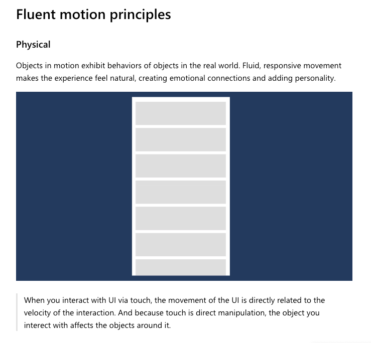
Let’s look at some examples to get a better idea of how these play out. Microsoft’s Fluent design system lists their motion principles as being physical, functional, continuous, and contextual. They include a short description and illustration of each to explain how it applies to UI animation.
Audi doesn’t have a separate principles section, but they start off their animation section with a declaration of why they use animation, which is setting the stage for what sort of motion is to be used in the design system, just like a principle would. They state:
“We stand for dynamic premium mobility. As such, movements in the Audi look have a typically dynamic character.”
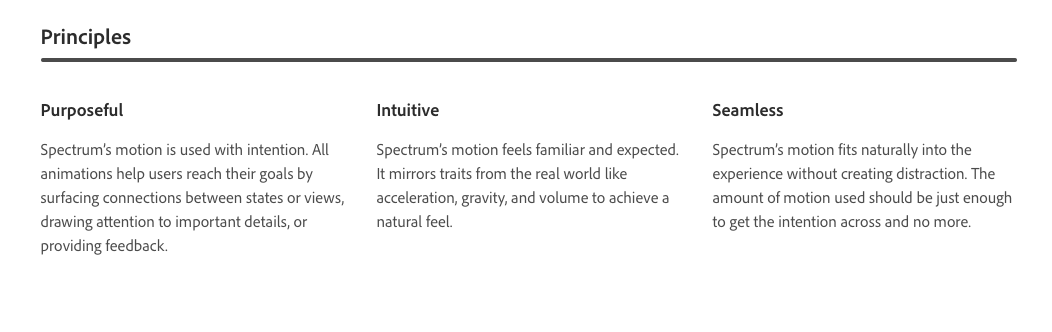
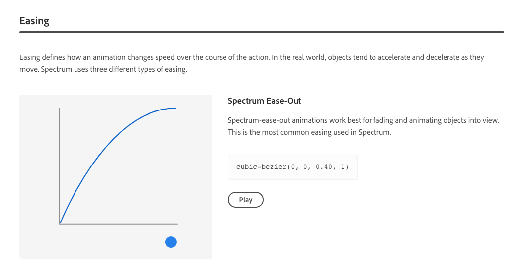
While developing the motion section for Spectrum, Adobe’s design system, we opted for a principles section to match the pattern used in other sections of the system. Within Spectrum, animation aims to be purposeful, intuitive, and seamless.
Note: Spectrum does not have a publicly available site at the time of writing.
No matter how you decide to present them, your design system’s animation principles can be used to both establish the system’s expectation around animation and to evaluate potential future UI animation for the product(s) the design system is applied to. For example, if a designer following the Fluent design system wanted to introduce a large bouncing animation into a component, there could be discussion around whether that meets the motion principles. (Does it fit the principles of functional and continuous?) Then a decision could be made as to whether or not that particular animation warranted breaking from the stated principles, or if the animation should be redesigned to fit the principles.
This helps to keep the design discussions away from the “do you like it?” or personal opinion realm and gives a structure for evaluating animation in a more pragmatic design-oriented way. That’s my favorite advantage of having declared motion principles; they make discussing animation meaningfully so much easier, even for people who don’t have a lot of animation experience.
Quick Tip: For more motion principles references, check out Photon’s motion principles, Material Design motion principles and Carbon’s motion principles. There are also others out there, but these are a good start.
Implementation
Motion principles are great for some high-level guidance, but without some details on exactly how to implement them, you’ll be missing the biggest time-saving benefits of including animation in your design system. The implementation section (though rarely actually titled as such) helps to answer many of the “how” and “what” questions your team has around animation. The objective is to provide smart defaults for anyone following the design system. That way, instead of spending ages playing around with durations and easing for every animation, they can use the smart defaults you’ve provided in the guidelines and be on their way. It’s a huge timesaver that also makes your UI animation much more consistent across the board.
The implementation guidelines are where a lot of design systems diverge in their approach and coverage. The amount of detail you include and the topics you cover in these guidelines will depend on how big of a role animation plays in your design efforts and what your team needs. For example, Photon’s implementation section includes just one duration and one easing curve, while Material Design’s includes individual sections on duration and easing as well as additional pages full of implementation details.
There’s no perfect length for a motion section; it’s more about covering the details your team needs than hitting a specific number of pages or rules. Some of the animation building blocks to consider including in your motion guidelines are:
The first three in the list are the main ways we customize or style animation. Variations in the properties, durations, and easings used for animation can drastically affect how animations come across. (And the last one is a way of packing up the first three.)
Let’s dig into each in more detail, and for each of these I’ll point out some of the common best practices and where there’s room for your own customized interpretation.
Durations, Ranges, And Rhythm
Duration has to do with how long animations should be, and when we’re talking about UI animation, these values tend to be very short. It’s amazing how much information we can convey in fractions of a second! This is a key aspect of animation, so every design system with motion guidelines covers it, but they do it in a variety of ways.
Some of the best practices around duration that you’ll see addressed in most motion guidelines include:
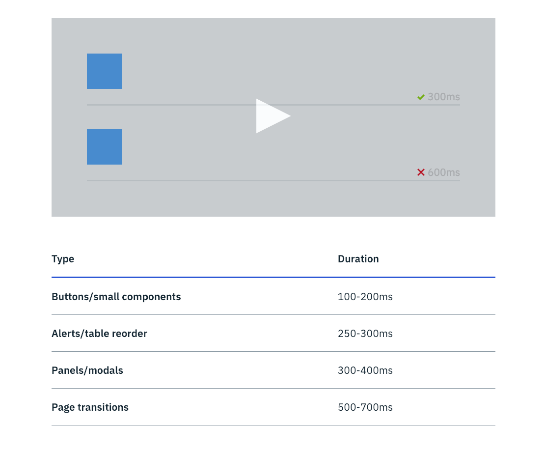
- Shorter durations should be used for simpler effects and animations of relatively small-sized (such as fades or color changes);
- Longer durations should be used for more complex effects and animations of larger relative scale (such as page transitions or moving objects on and offscreen);
- Optimal timing can change based on viewport size. While the specifics of each set of guidelines varies — sometimes even greatly — you’ll see these common best practices in almost all of them. Different systems have different definitions of exactly what “short” or “long” durations are, and go into varying amounts of detail on the difference between the two. Also, while it’s more of a design system thing than an animation best practice, providing design tokens for your specified duration values is a useful thing to consider here as well.
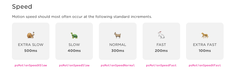
Carbon provides a short table of ranges of duration values based on the type of animation in question. While Material Design breaks down recommendations on duration speed in categories based on the complexity of the animation, as well as by the relative area covered by the animation. Pluralsight takes a different approach and provides a set of keywords for different durations paired with cute animals.
Easing Values
My number one advice for easing guidelines is to create your own customized curves and don’t just use the CSS defaults. This is the most effective way to build some consistent motion association for your brand and as Sarah Drasner puts it: build “motion equity.” You’ll be on solid ground with just three curves: a custom eas-out, ease-in, and ease-in-out. And there’s always the option to add more if needed.
Quick Tip: If you’re totally stumped on where to start on easing curves, check out the Penner Easing equations on easings.net. These are designed to give you some nice looking motion and are grouped in threes for easy use. They’re much more expressive and flexible than the CSS defaults. Using a set of these in your motion guidelines can be a great place to start.

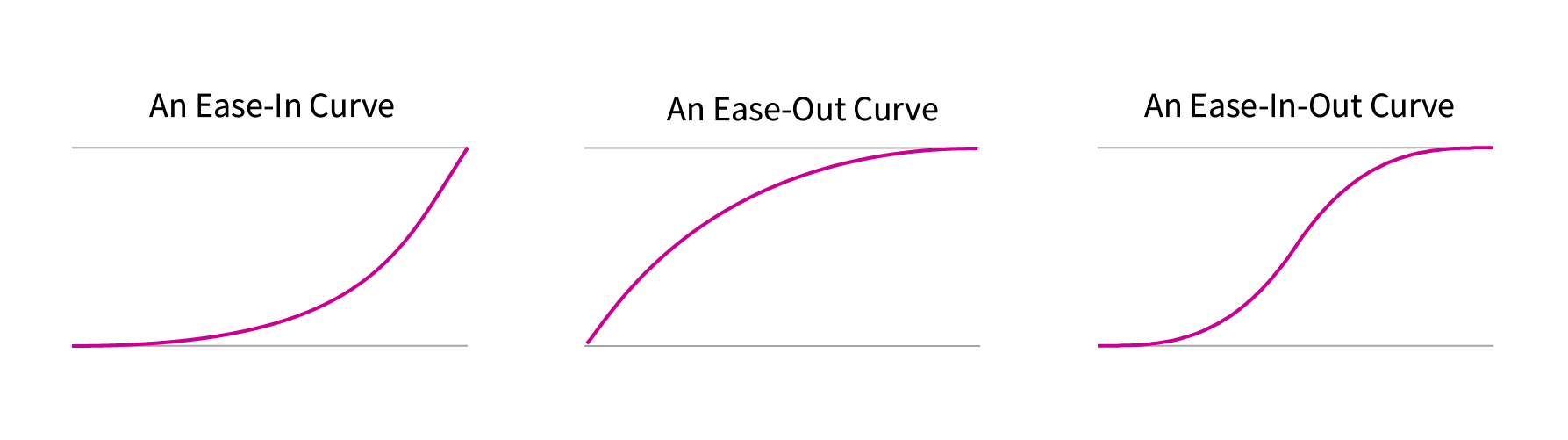
Essential Easing Functions
I recommend defining the three core easing curves because that will cover all your main easing needs for various animations.
- Ease-in
This curve is the one that accelerates as it begins any movement which reads well for moving an object out of view. - Ease-out
This curve causes objects to decelerate before stopping which makes for a more natural feeling way to bring objects into view. - Ease-in-out
As the name suggests, this curve combines the features of the first two and is best for moving elements from point to point.
With these three custom curves, you’ll have almost all your animation needs covered.
For Spectrum, we did exactly that and created three custom easing curves along with recommendations on which kinds of animation to use each for. (We came up with these curves through looking at existing animation and experimenting with some motion studies.)
Carbon and Pluralsight take a similar approach, designating three curves with suggested uses, as well as designating one as the default curve to use when in doubt. In some cases, you might only feel the need to have one custom easing curve (like Photon does) defining one curve for use across all animations.
Along with the easing curves, it’s helpful to provide some supporting information like associated design tokens, language-specific code (for CSS, JS, iOS and/or Android), or After Effects keyframe velocities depending on which tools your team uses. This adds to the ease of use and helps make following the smart defaults in your motion guidelines the path of least resistance.
A visual illustration of the curve and interactive examples of the curve are also a big plus for quickly demonstrating how the easing curves work and what they look like. Never underestimate the power of showing instead of telling. (Or showing along with telling!)
Easing Hierarchy
Including a hierarchy of easing is one way you can take things a little further than the three core custom curves. This can be especially useful for brands that use motion as a core method of conveying their design message. Just like with type, you may want a way to make certain animation stand out more than others. Animations that stand out more strongly can be used to emphasize a particular point or interaction. In these cases, structuring your easing curves so that you have one that is more dramatic to stand out from the others can be a useful technique.
Off To A Good Start
At this point, armed with principles plus your durations and easing sections, you have a solid set of motion guidelines. That might be all you need for a version one of your motion guidelines, or for a brand that doesn’t rely heavily on motion in its design. If you’re pressed for time, establishing smart defaults for durations and easing will get far enough to see the benefits of establishing motion guidelines and save your team time.
Named Effects
Providing a listing of named effects or a library of animations to use can be a useful thing to have in your motion guidelines. Not all design system’s motion guidelines have these, some opt to bake the animation guidelines into their components instead (or as well), and some just don’t need this level of detail.
One word of caution on these though: more isn’t always better. It might look cool to have a huge library of animations as part of your design system, but the more effects you list, the more time and effort it will take to maintain those effects. To avoid creating a huge time sink for you and your team, I’d suggest making any collection of named effects as small as you possibly can.
There tend to be two approaches to providing a library of effects in motion guidelines. One approach is the way the Lightning design system does it, providing a library of small animation effects (molecules of animation, if you will) that can be used individually or composed together to build up more complex animations.
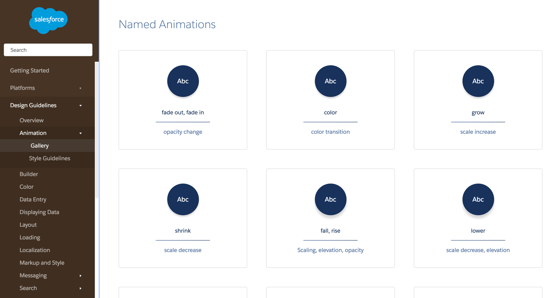
The other approach is to provide more comprehensive and purpose-specific effects like Audi does for its show and hide, transform, shift, and superimposing effects and Fluent does for its page transition effects. For either approach, providing the design rationale and specific code implementations for each is useful.
Quick Tip: If you’re looking for additional motion guidelines for research, Adele is a design system collection that lets you filter by topics like motion, and styleguides.io is always a great resource for finding public design systems too.
Other Places Motion Might Come Up In Your Design System
Design systems come in all shapes and sizes. And in many cases these animation guidelines are also baked into the DNA or components of your design systems. Digging into how to do that is beyond the scope of what we’re covering here, but I do want to note that can also be useful to include animation information on component-specific pages instead of in a named effects section. It all depends on what works best for your team and your design system.
Additionally, it might be useful to call out performance and accessibility considerations for animation either in those sections of your design system, in guidelines for components, or in the motion section itself. Performance and accessibility goals affect all aspects of our design work, and animation is no exception there.
Some Parting Thoughts
I hope this article has helped to show that including motion guidelines in your design system can be incredibly useful, and helped to demystify the process of creating one. Addressing animation in your design system can be beneficial to the consistency of your product’s design and doesn’t have to be an overly time-consuming effort.
As you’re working on your motion guidelines, I encourage you to work in stages instead of waiting for your motion guidelines to be perfect. Shipping a version one with the intention of adding to it and updating it is much easier on you, the person or people authoring the guidelines, and can help you make sure you’re creating guidelines that are useful.
As hard as it can be to share something that you know is missing some detail, it can be hugely useful to ship a version one of your motion guidelines then talk to your team again to see how the first version of the guidelines has helped them and which pain points are still a factor. This iterative approach can go far towards making your guidelines cover the most relevant topics, and lets you adapt them to your team’s needs. Both are good for having a system that’s useful and avoiding unnecessary extra effort.
This article is part of the UX design series sponsored by Adobe. Adobe XD is made for a fast and fluid UX design process, as it lets you go from idea to prototype faster. Design, prototype and share — all in one app. You can check out more inspiring projects created with Adobe XD on Behance, and also sign up for the Adobe experience design newsletter to stay updated and informed on the latest trends and insights for UX/UI design.
Further Reading
- The View Transitions API And Delightful UI Animations (Part 1)
- Infinite-Scrolling Logos In Flat HTML And Pure CSS
- Iconography In Design Systems: Easy Troubleshooting And Maintenance
- The Path To Awesome CSS Easing With The linear() Function
 (il, mrn)