How To Architect A Complex Web Table

Email Newsletter
Weekly tips on front-end & UX.
Trusted by 182,000+ folks.


 Celebrating 10 million developers
 Custom Web Forms for Angular, React, & Vue. Your backend.
Imagine you design a system for data researchers. Or an application for energy management. Or a dashboard for corn traders. Maybe you’re designing something like that right now. In all the mentioned cases, people will expect tables. Not those fancy ones from design inspiration sites but Excel-looking monsters with hundreds of cells and complex interaction.
In this case, a designer faces many challenges. For instance, matching design with existing frontend frameworks or struggling with “uncomfortable” data that smashes the layout. We’ll overcome these problems by means of the following steps: systematize needs, go atomic, and define interaction.
1. Systematize Needs
So, you’ve interviewed the target audience and figured out their needs and wants. Now it’s time to piece together findings and transform them into an interface structure. For example, one user said, “I need to see how my data affects other parts of the application.” Or while watching another person work with old software you noticed he uses shortcuts and doesn’t touch a mouse at all. What does it mean?
The first user’s words are about input validation and hints. You’ll need to consider attaching alert or help information to a table. Or develop a system of meaningful colors. It depends on the domain and the mental model. The observation of the second user’s work might be a sign you need to design all actions keyboard-accessible. And you’ll probably need to think about shortcuts more profound than just “Cmd + C” and “Cmd + V”.
Here are some observation-assumption pairs.
- “I need to operate dozens of items at a time easily.”
Allow cell multi-selecting? Add checkboxes to select many rows? - “Now we do all the calculations this way.” [Shows Microsoft Excel]
Is Excel effective for this purpose? What features can we borrow? - “Can we somehow know beforehand if this name is already on the server.”
Data validation on the fly? Error messages or auto-correction? - “Usually I enter this information. It’s pretty generic.”
Suggest default values, defaults or templates?
As a result, you’ll have a list of people’s needs and wants. Open questions are helpful for figuring out real needs and filtering out whims:
“What helps you to work faster? What can make your choice easier? How is this feature affecting the efficiency of your work? What will change if you aren’t able to do X?”
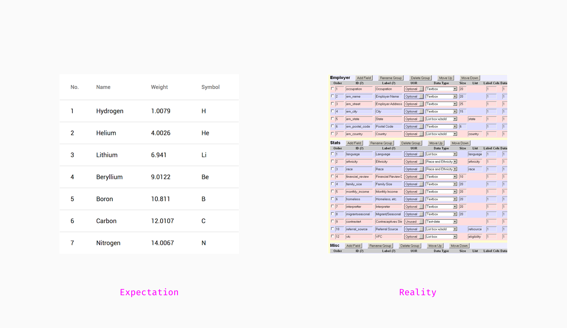
So, what’s next? Now it’s time to build a logical skeleton for your table. A scheme of what it contains and is able to do. If you go directly to wireframing or prototyping, you step on the evil path of endless re-drawing and fighting with legacy.
Below is an example of what you might start with. It’s the tree of features. And the basic building block of any table is a cell. Cells unite into rows and columns, which can have specific features different from those of separate cells. And finally, we go to such important supplements of a table as a top bar with buttons, keyboard commands, and handling errors.
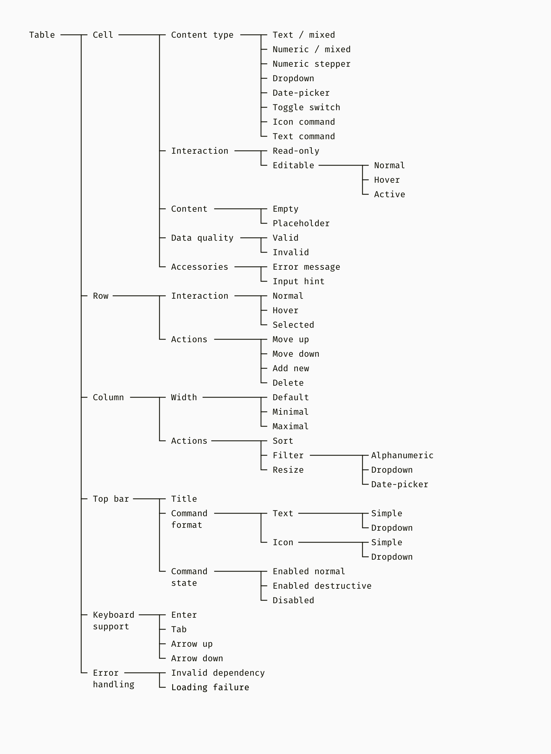
The tree of features prevents you from making extra work and helps to focus on what is important. A well-organized feature tree is also helpful for the development team. They can match planned features with available frontend libraries and find the best way to turn designs into code.
On one of my projects, we used Angular Material framework. Unfortunately, Angular tables were too simple. We found an ag-Grid library that supported our functionality but had one limitation. It had no ability to expand a row and put children rows inside. We had revealed this issue before we put any effort into it and adjusted the design.
In A Nutshell
- Start building a complex table with collecting and prioritizing user needs. Consider a non-table solution, for example, a chart.
- Draw a tree diagram that systematizes all the needed features. Use it as a plan for producing visuals.
Recommended reading: Table Design Patterns On The Web by Chen Hui Jing
2. Go Atomic
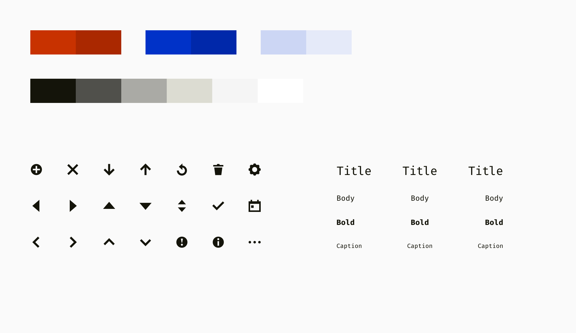
So, the needs and functionality are defined, and you know technical limitations. It’s time to mockup your table. Basically, the atomic approach is designing small UI components first and then assembling bigger ones. We’ll gradually move from elementary particles like fonts and colors to such large modules like a header or column. I deliberately chose the strict brutalist style for mockups so that we can concentrate on function, not appearance.
Fonts, Colors, Icons
These parts can be already defined by the design system or UI framework you use. If you create a table for an existing product, check whether its color palette, fonts, and icons meet the table needs. On the picture below, I showed some of the shades of gray needed for table frames, lines, fills and text. Red and blue tints stand for warning-error-destructive and active-enabled-selected stuff. Text styles are to distinguish between primary and secondary information, titles and body text.
Cells And Accessories
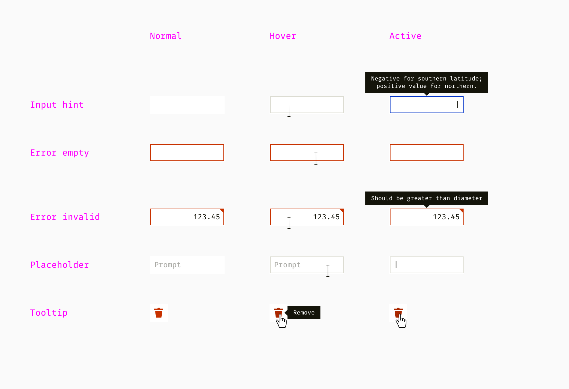
When the table atoms are ready, we can proceed with molecules — different types of cells. In the first place, it’s important to think about normal, hover and active states of each element beforehand. Then go clicked, disabled and other states.
On one of my projects, we had eight types of cells with their own interaction. The simplest ones are text and numeric cells. In our case, it was allowed to populate numeric cells with non-numeric content, such as “N/A” (not applied) and “N/C” (no control). It was the peculiarity of the domain. Dropdowns and date pickers are more complex and have child elements. Finally, we had table cells that represented in-row commands.
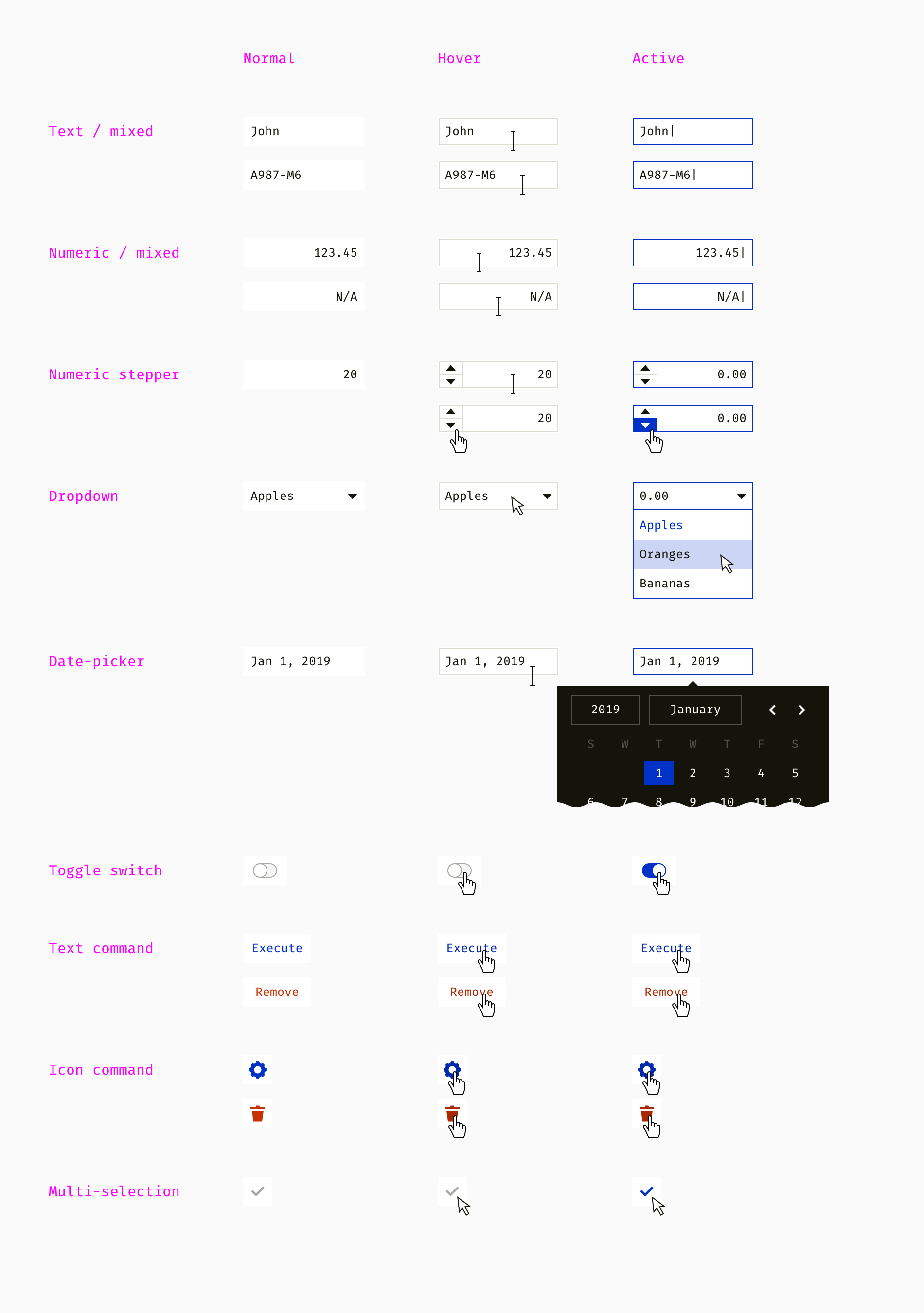
Cells can have such accessories as tooltips, input hints, error messages, placeholders, etc. At this stage, they are static, but a designer should later specify the logic of how they show up (animation, delay, etc.).
Rows And Headers
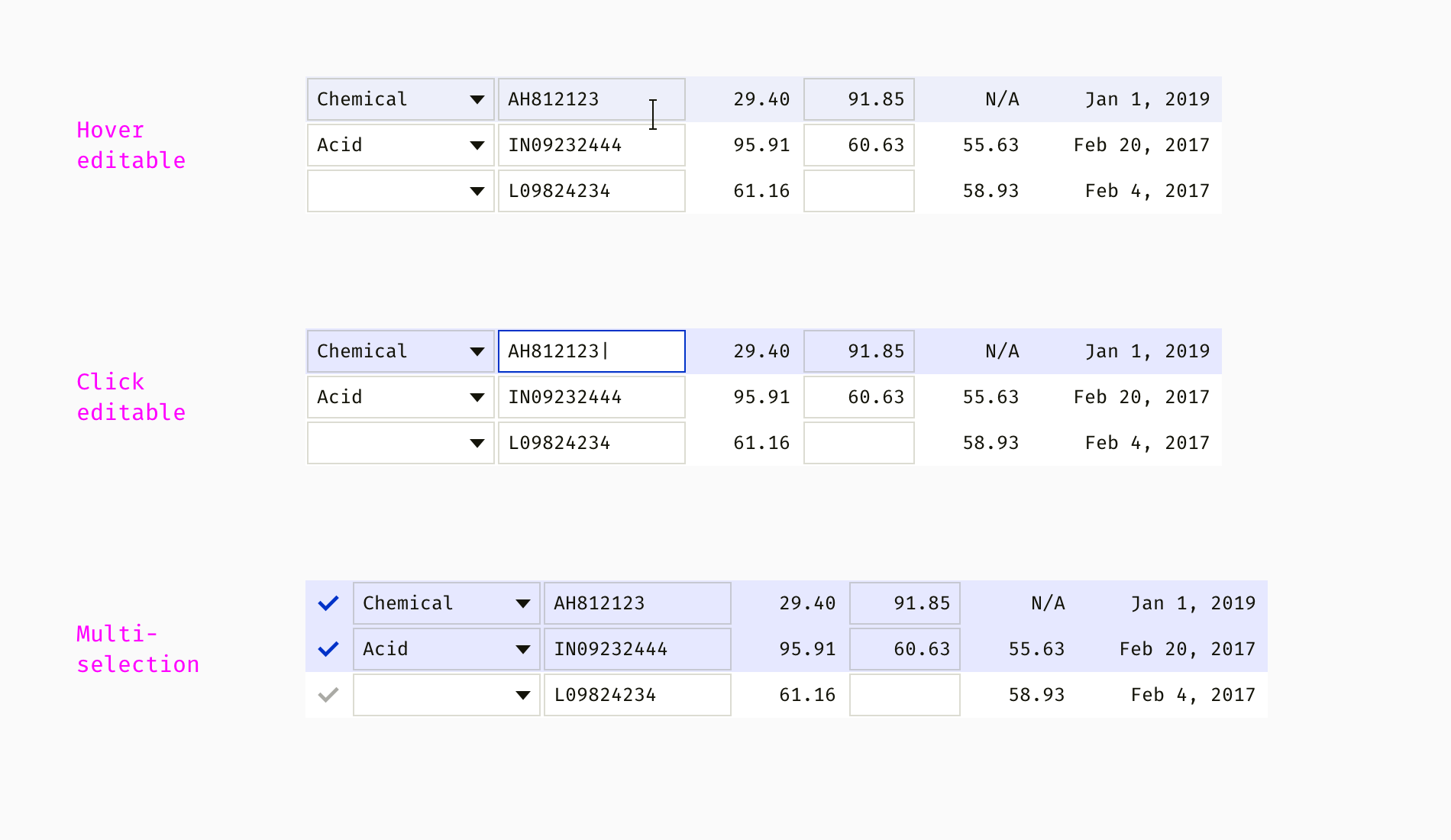
When cells are designed, you can make rows and see if various combinations work well together. Once I designed a table that had complex editing logic. Some of the properties were provided by users, whereas others were automatically calculated or populated with default values. Below is a mix of read-only and editable cells within one row.
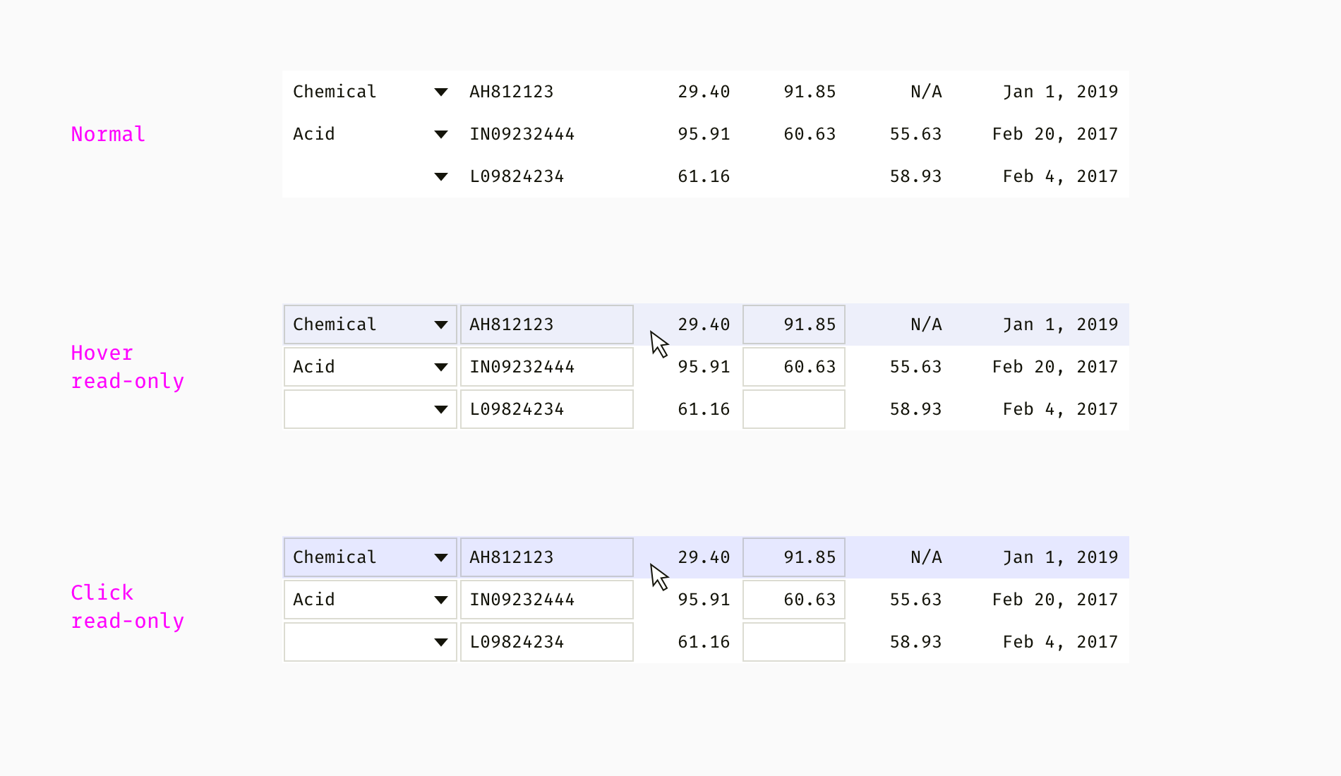
Note that the cursor is different when hovering over read-only and editable cells. Clicking on them triggers either selection of a row or going to the editing mode of the editable cell.
In the next image, you can see that people can select one or multiple rows:
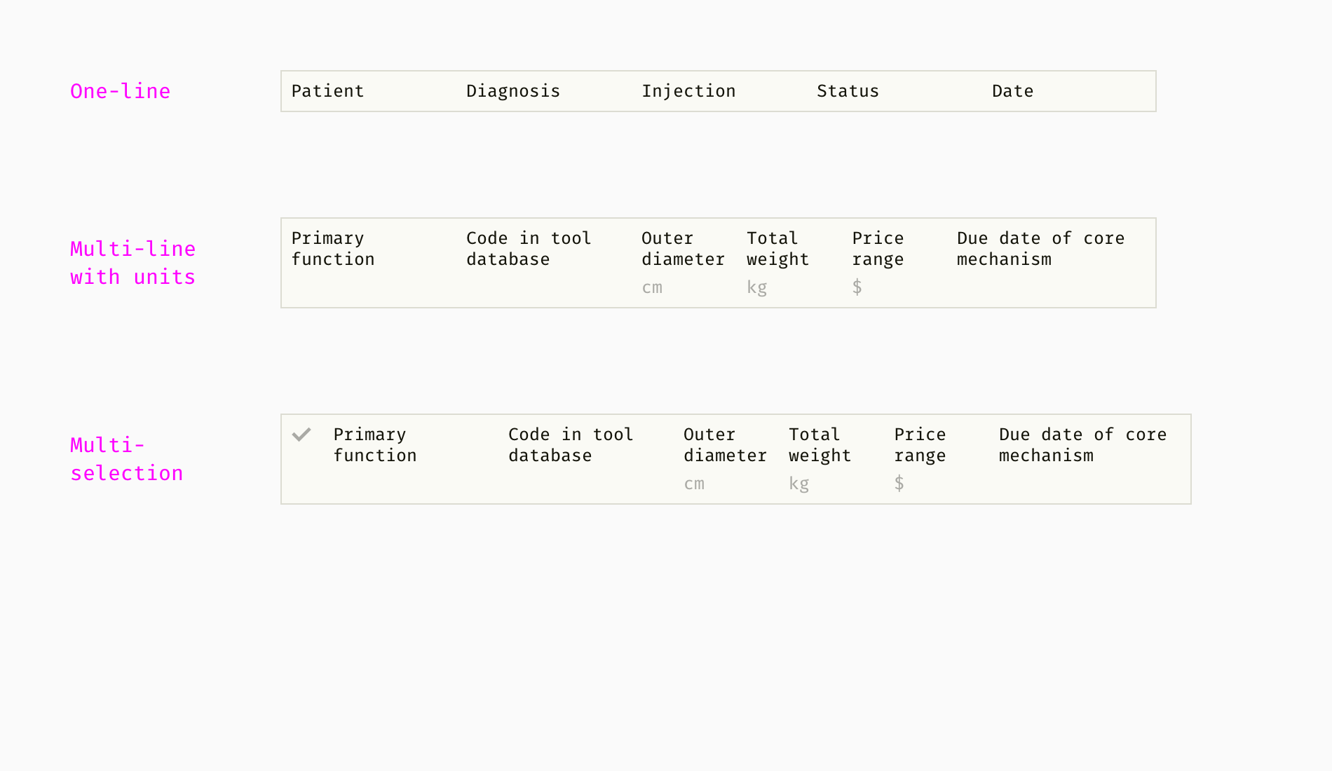
Now it’s time to think about the table header. From my experience, it’s often impossible to control column title length and stick to one line. Even with a good writer on a team, you won’t keep all the texts short. Some of the tables require long technical titles or localization. Phrases, which were one-line in English, might become two- or three-line in Greek, German or Hungarian. Therefore, I showed different variants:
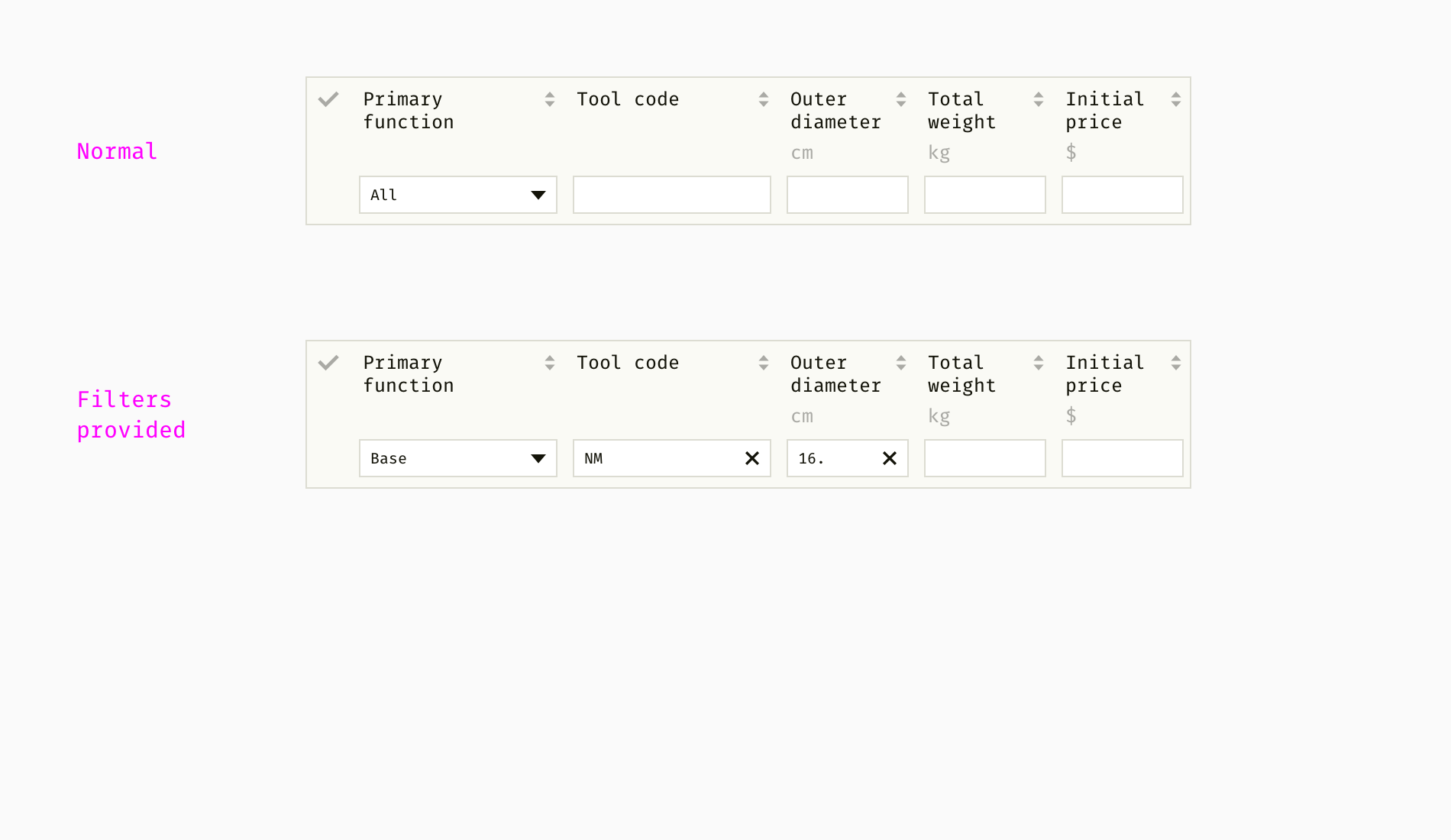
Users of data-based software often need sorting and filtering. It helps them to find valuable information in the large chunks of data. The challenge with sorting and filtering is to combine sorting controls and filtering boxes with other header elements — column titles, measurement units, etc.
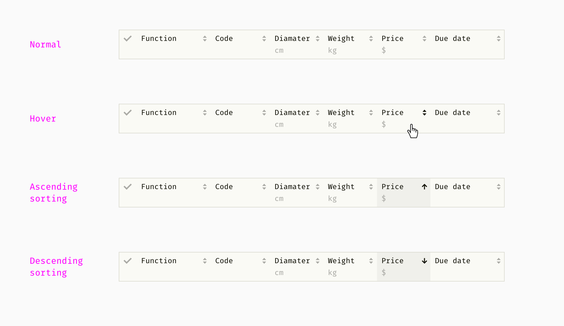
Unlike table cells, filter boxes usually have “reset” icon on the right so that users can explicitly disable them and see unfiltered content.
In my example, there are three types of filter boxes. The alphanumeric filter enables search by letters and numbers. It supports wildcards — unknown number of unknown characters. For instance, if I type 45*A1, it might result in showing the rows with such values as 45A1, 45982A1B, 45A109B and 096445-A1.
Wildcards are a tricky feature since they depend on people’s habits. When I designed tables for technical specialists, we assigned the asterisk sign (*) to the unknown number of unknown symbols. For insurance analysts, I chose traditional SQL symbol — the percentage sign (%) — because they were used to it. As for the dropdown filter, it switches between a certain number of mutually exclusive text options, numbers or numeric ranges.
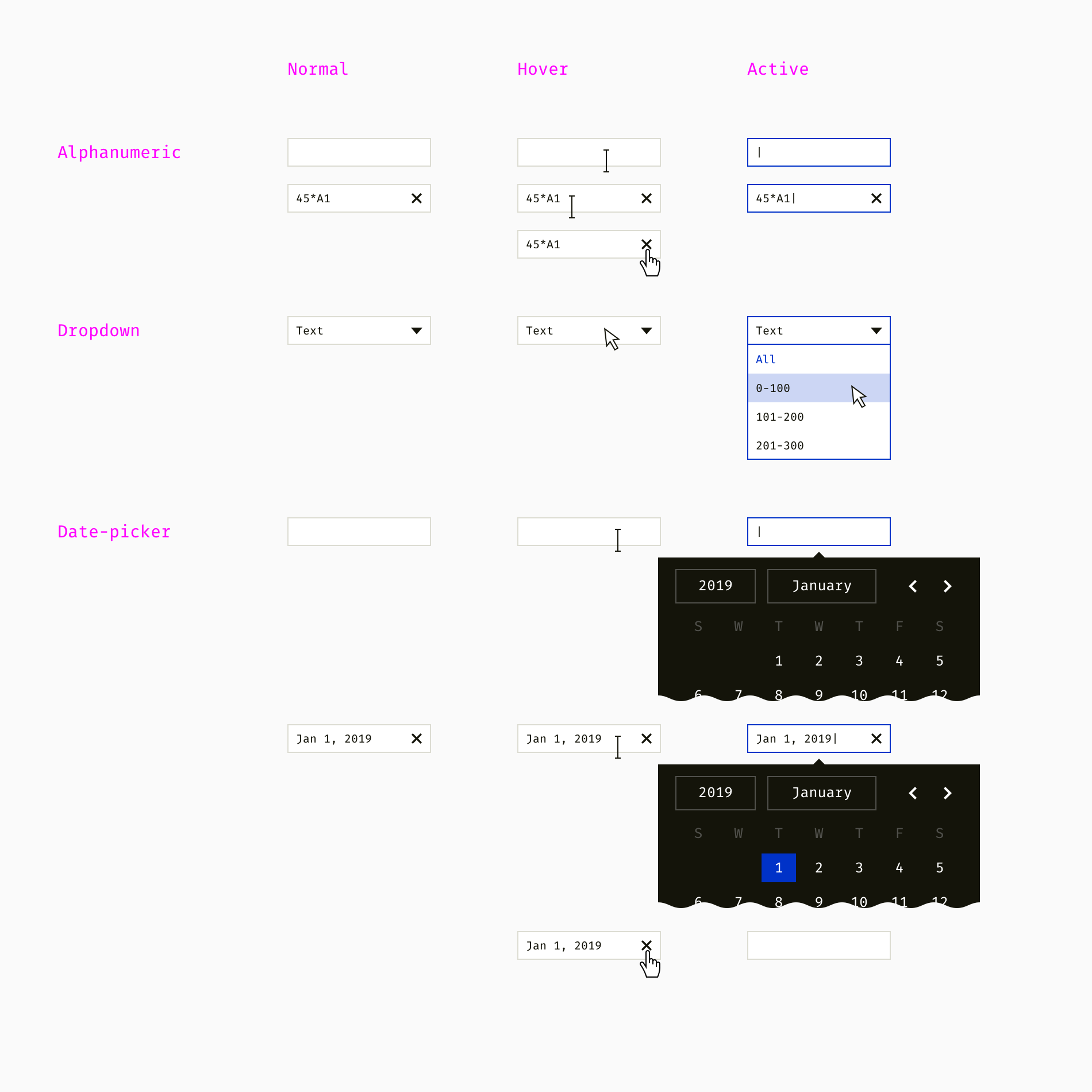
The date picker filter has a calendar and works like its cell equivalent. It’s good to allow users both enter the date manually and pick from the calendar. If they know what they are searching for, it’s much easier to type than click.
One more important thing is to format any meaningful input automatically and not to bother people with “invalid format” errors. On one of my projects, we allowed entering such dates as 01/25/2017, 6.12.17 and September 4 2016, and also filter by a month or year only.
Columns
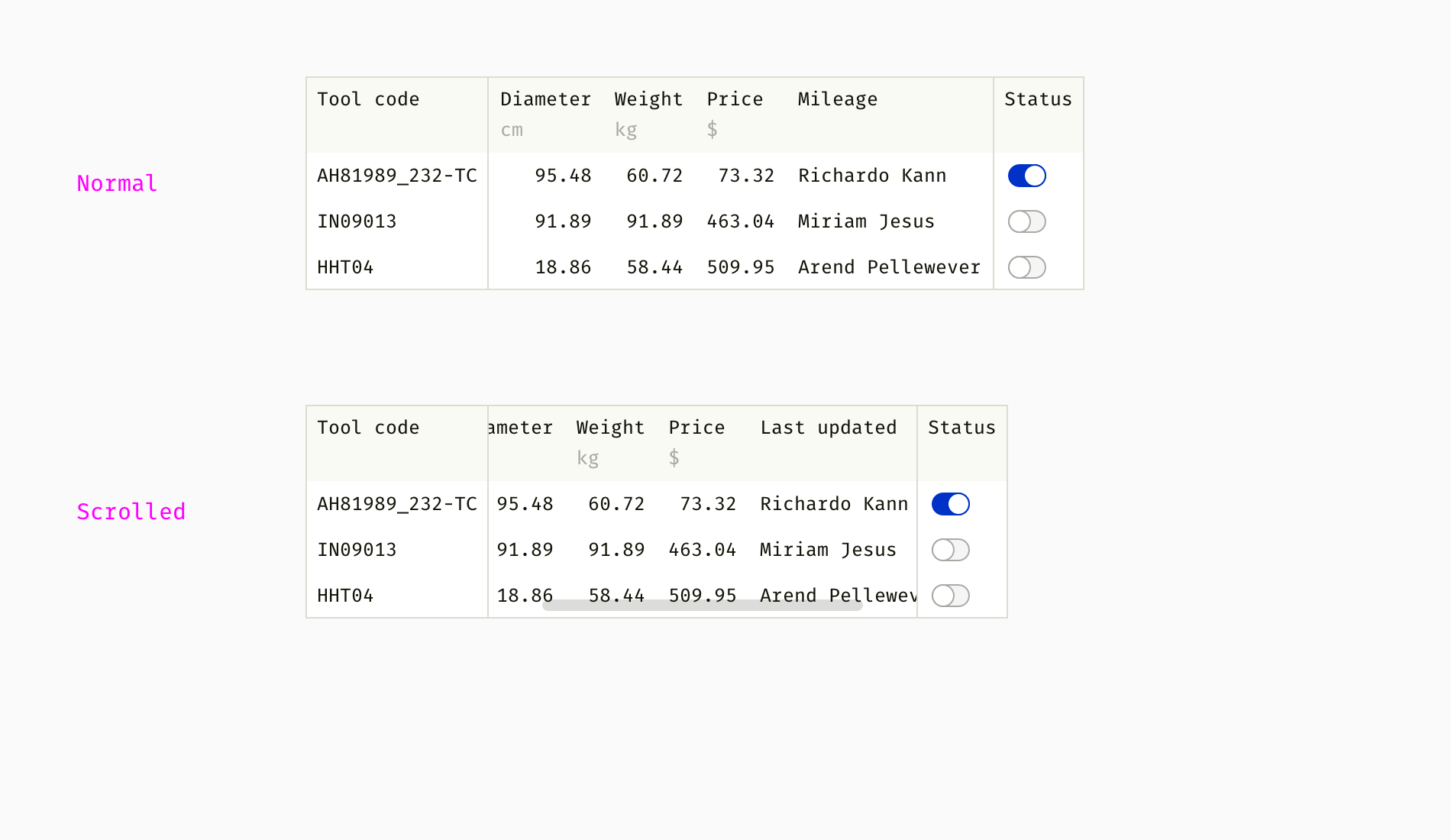
One of the frequent features of complex tables is pinned columns. Usually, columns that contain key information, for instance, element names or statuses, are not scrollable.
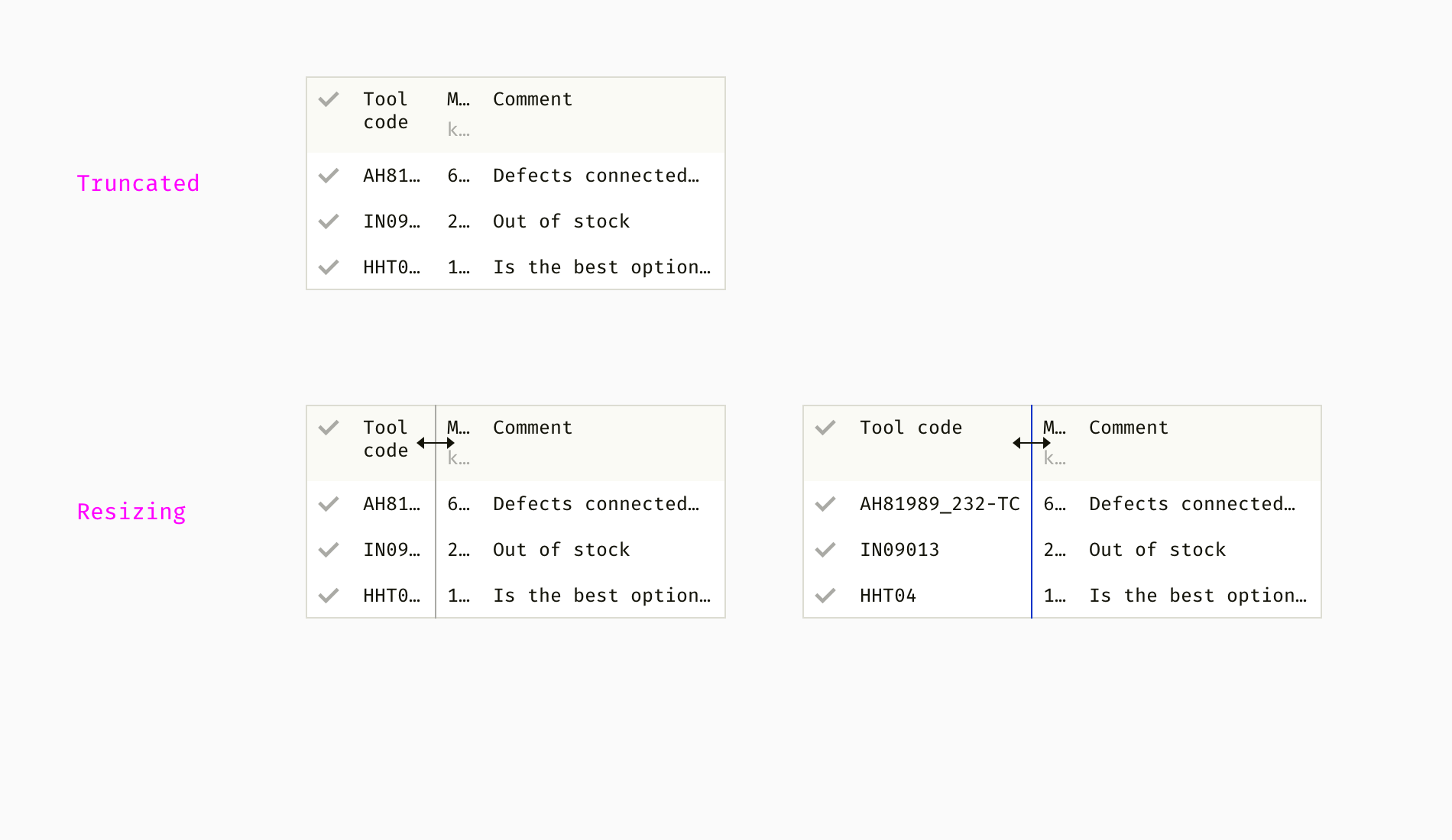
Although table columns should smartly adjust to content size, it happens when text is truncated. In this case, column resizing is helpful. Users can drag the column edge and see long content. They might also need to squeeze an unimportant column or the one with a short text.
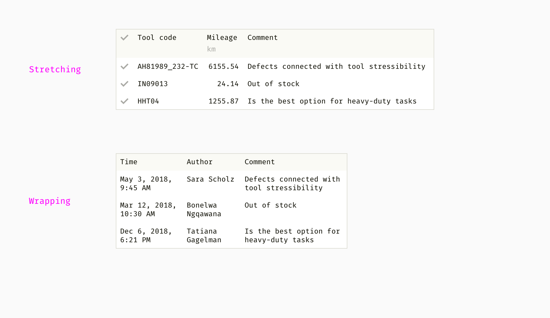
Another way to handle long text strings is either to stretch a column by the longest content or wrap it and put on multiple lines. The first approach works better for more or less similar text strings. The second one works better if seeing the full content is more important for people than keeping the table vertically compact.

On one of my projects, we defined the minimal widths of columns to prevent tables from ungraceful resizing. We disabled squeezing columns behind a certain width depending on the content type.
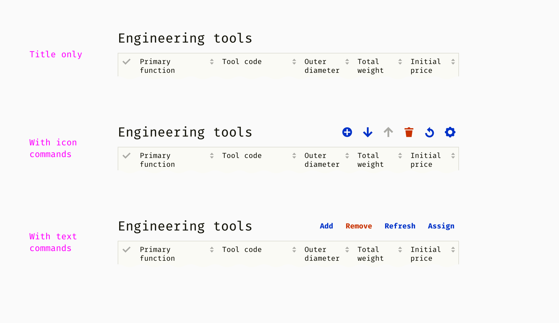
Top Bar
What constitutes a table? Cells, columns, rows. In addition, complex tables often have a top bar. Like the rest of the components, the top bar is built of smaller elements — a title and commands.
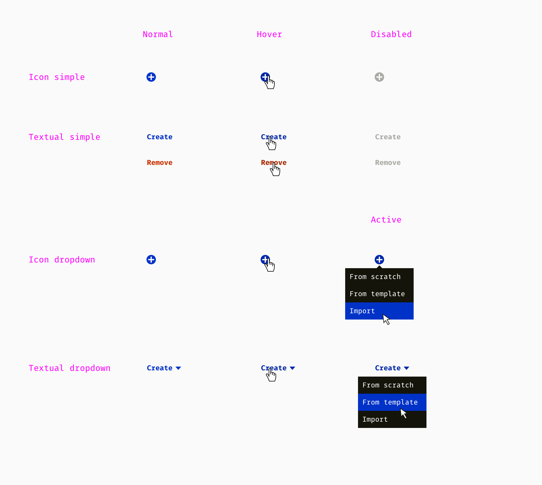
Below, I collected the list of commands with all the variety of states, which we used in one of the products. We had icon commands for obvious metaphors like plus = add / create, trash bin = remove, arrow = move. Non-generic commands (e.g., assign, archive, balance) needed explicit textual naming. Moreover, some of the commands were accompanied by a dropdown menu.
Now we can try to combine different elements and see if it works. Here are some examples.
Of course, this is not the ultimate list of features and elements. It differs from one project to another and may include other things, for example:
- Sorting by more than one column;
- Customizable set of columns (ability to toggle them);
- Expandable rows (a parent row can have child rows);
- Logical operators for filtering and search (“and”, “or”, “else”, etc.).
If you hesitate which features to design and which not, here is a good principle. It’s Occam’s razor, or the law of parsimony. A designer should not create new instances if the existing ones satisfy the needs. You should “cut” the geeky features, which users might theoretically need in undefined future. The same story for the features that ideally fit one of a hundred situations but are useless in the remaining ninety-nine cases.
Whole Table
When all building blocks are ready, you can assemble a couple of tables for various purposes. This is a chance to spot inconsistencies. Most frequently I dealt with the following three types.
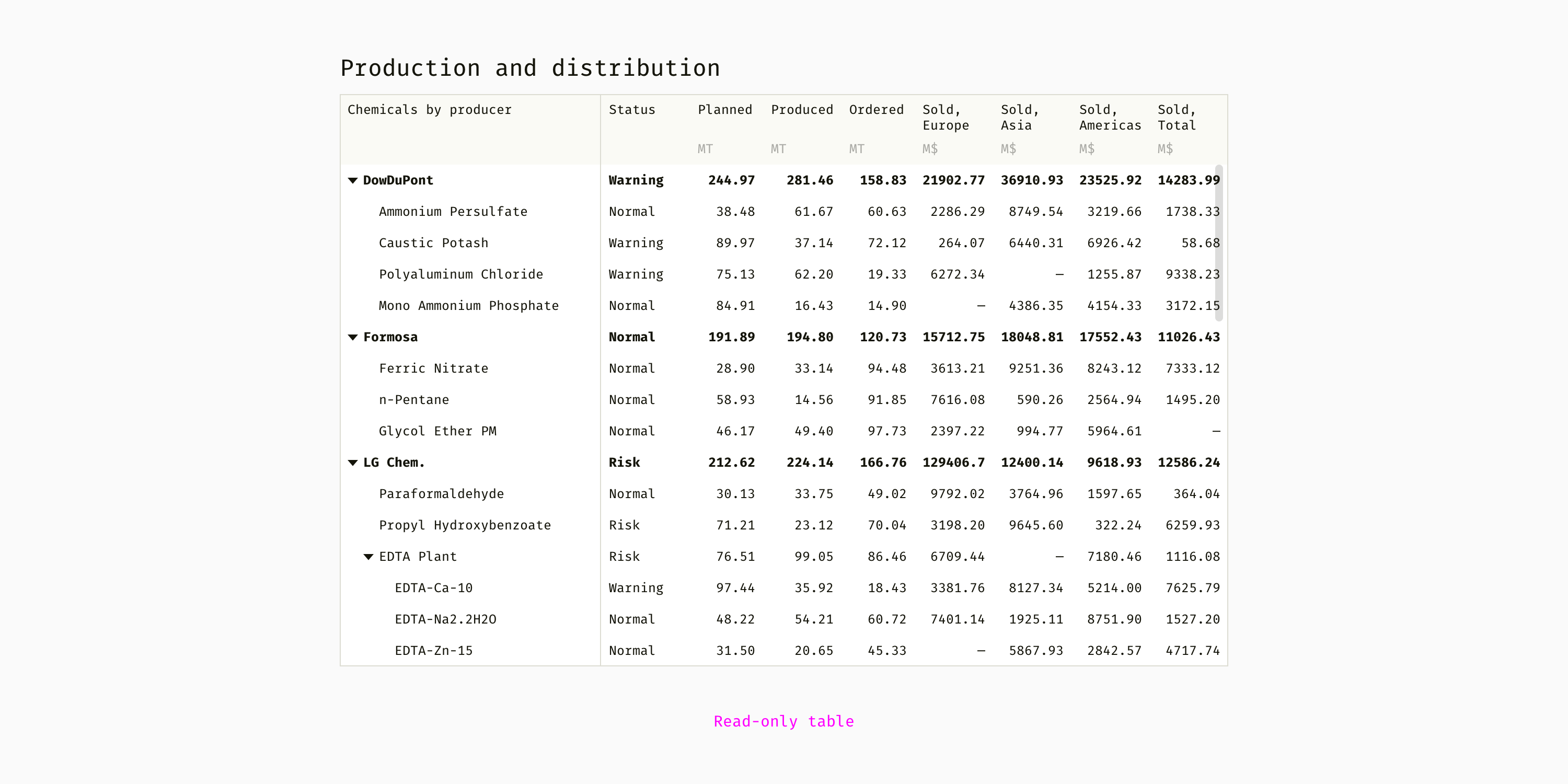
Read-Only Table
The simplest table type to build since it only shows as-is data. There are no filtering or editing options. Sorting or row hierarchy might help to analyze large chunks of data. Such a table is used for showing data, informing people about something.
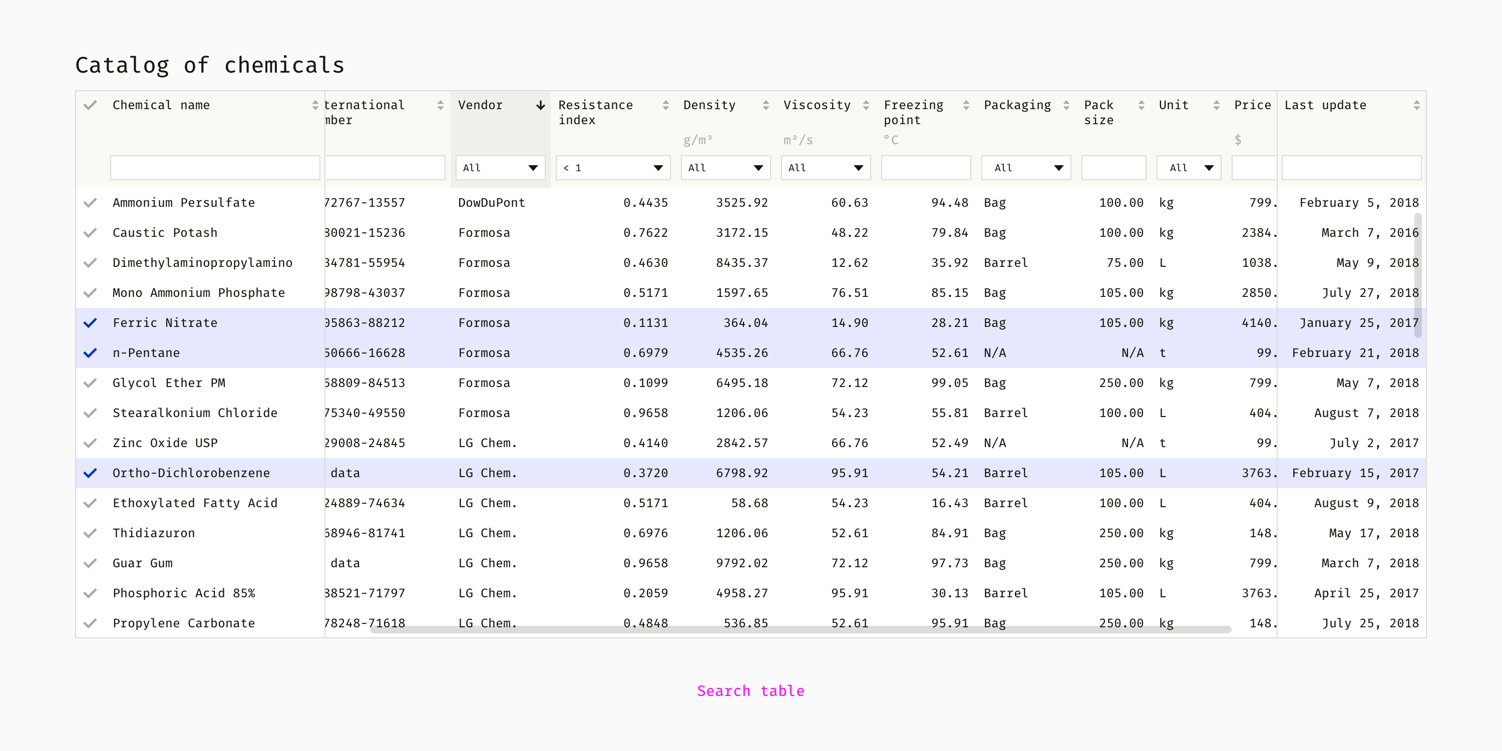
Search Table
The cells are not editable, the header has filter boxes and sorting controls, it’s possible to select rows. From my practice, such tables help to find, compare and select an item or several items out of a large range. For instance, filter out five of six thousand irrelevant tools from a catalog and then choose one needed tool.
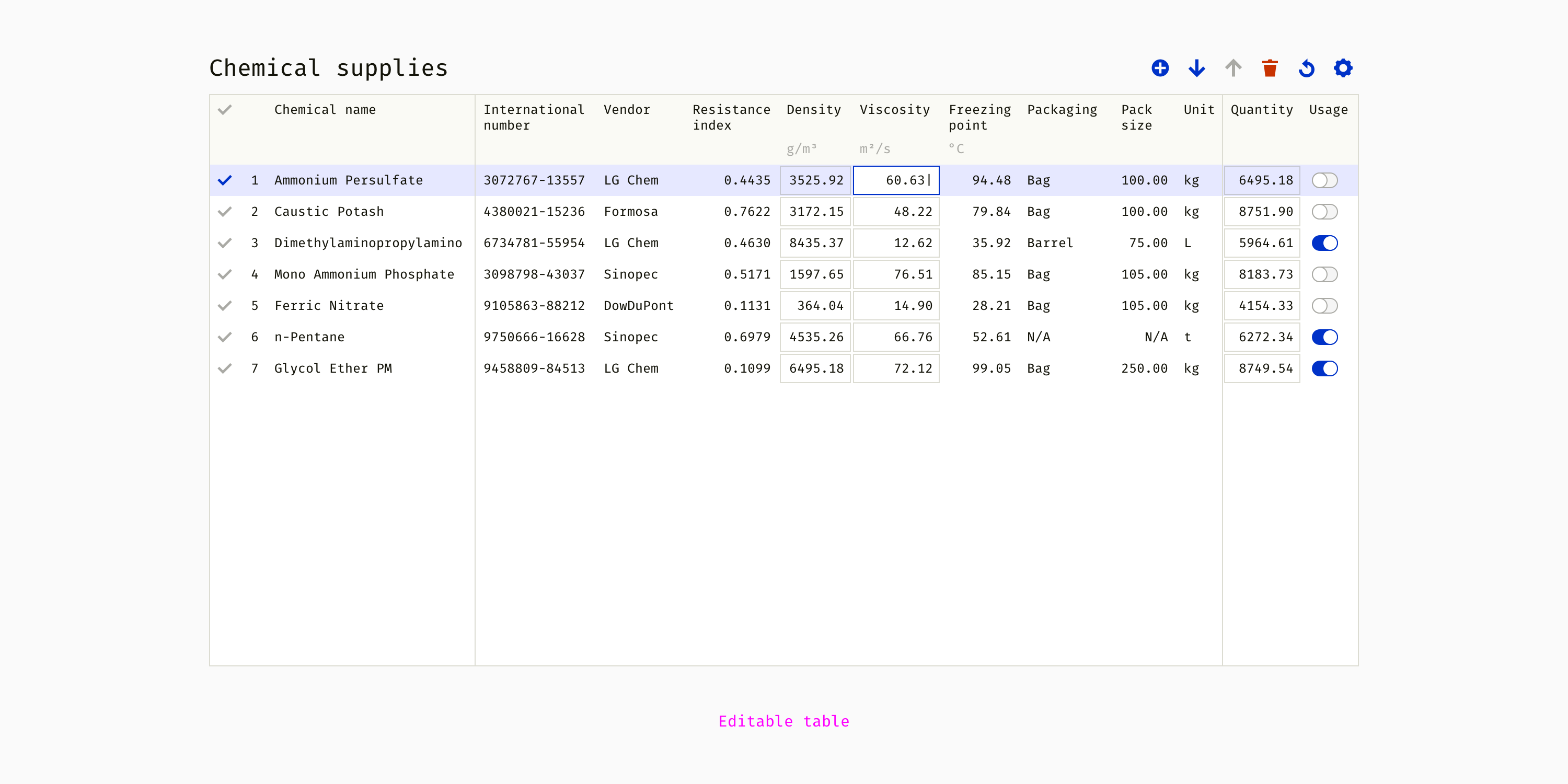
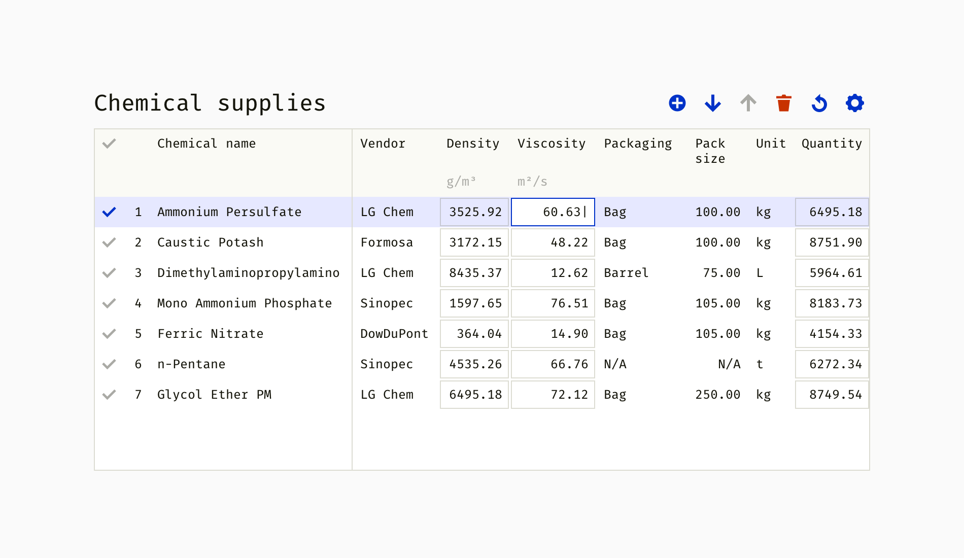
Editable Table
All or some cells are editable. Usually, there is no filtering because the order of rows might be customized. Such tables typically are accompanied by a toolbar and allow performing actions with rows.
In A Nutshell
- Start with the smallest components, then gradually move towards bigger ones . Finally, mock up the whole thing.
- Think about all of the possible states for each component beforehand.
- Use Occam’s razor principle to keep the number of elements minimal yet sufficient.
Recommended reading: Design Systems by Alla Kholmatova
3. Define Interaction
Building blocks aren’t enough for such a complex interface piece as a table. A designer should think about “the rules of the game” and design logical principles and conventions behind the visual part. I’ll describe some typical things you’ll need to consider.
Numeric Data
How many decimals should numbers have in your table? One, two, five? What is the optimal precision level? I decide based on the accuracy users need for making the right decision. In some professions, fluctuation between 10932.01 and 10932.23 matters, whereas in other areas numbers 14 and 15 don’t really make a difference.
This is an example of numeric data rules my team used in a sophisticated engineering product.
- Length
Two decimals (57.53 m, 3.16 km); spaces are used as thousand separators (403 456.56 m). - Weight
Two decimals (225.08 kg, 108.75 t); spaces are used as thousand separators (12 032.17 kg). - Money
Two decimals ($9.45); commas are used as thousand separators ($16,408,989.00). - Diameter
Three decimals (10.375 cm); no separators needed. - Latitude and longitude
Eight decimals (26.4321121); minus sign used for the western longitude and southern longitude (-78.05640132). - Default
For units not listed above — two decimals (32.05 g/m³, 86.13 C°).
One more thing we considered was the difference between the “true” data saved on servers and “approximated” data in the interface. The system used extremely accurate numbers with dozens of decimals in all calculations but people didn’t need to see it all the time. So we decided to show the number of decimals described above and expose the full number only when a table cell is active. For example, an engineer could enter 134432.97662301, and once he pressed Enter, the table showed 134 432.98. After clicking one more time, the engineer would see 134432.97662301 again.
Input Validation
Unlike the previous item about numbers, validation is important only for editable tables. It has two aspects. Firstly, the rules that qualify the entered data as valid or invalid. Secondly, either the messages that help to correct invalid data or mechanisms that fix it automatically. Usually, validation rules are too complex to reflect them in mockups or prototypes. So, designers can document them textually or in the format of flowcharts.
This is an example of message templates I once used. Text in angle brackets is dynamic and comes from the calculation engine or database.
- Should be greater than
numbermeasurement unit.Optional explanation. - Should be less than
numbermeasurement unit.Optional explanation. - Should be between
number 1andnumber 2measurement unit.Optional explanation. - Min value should be less than max value.
- Max value should be greater than min value.
- Min and max values should not be equal.
Commands
Editable tables with toolbars usually need a set of rules when toolbar commands are enabled and when disabled. These states can depend on the fact that a row is selected, on the number of selected rows, on the position or content of the selected row or rows, and other conditions. Below is one of the numerous ways to document such logical rules.
So, we have a table with some chemicals. It has such commands as “Add a row”, “Move up”, “Move down”, Delete”, “Recalculate”, and “Settings”.
And here is the description of command states. It turns out their availability depends on one or several conditions.
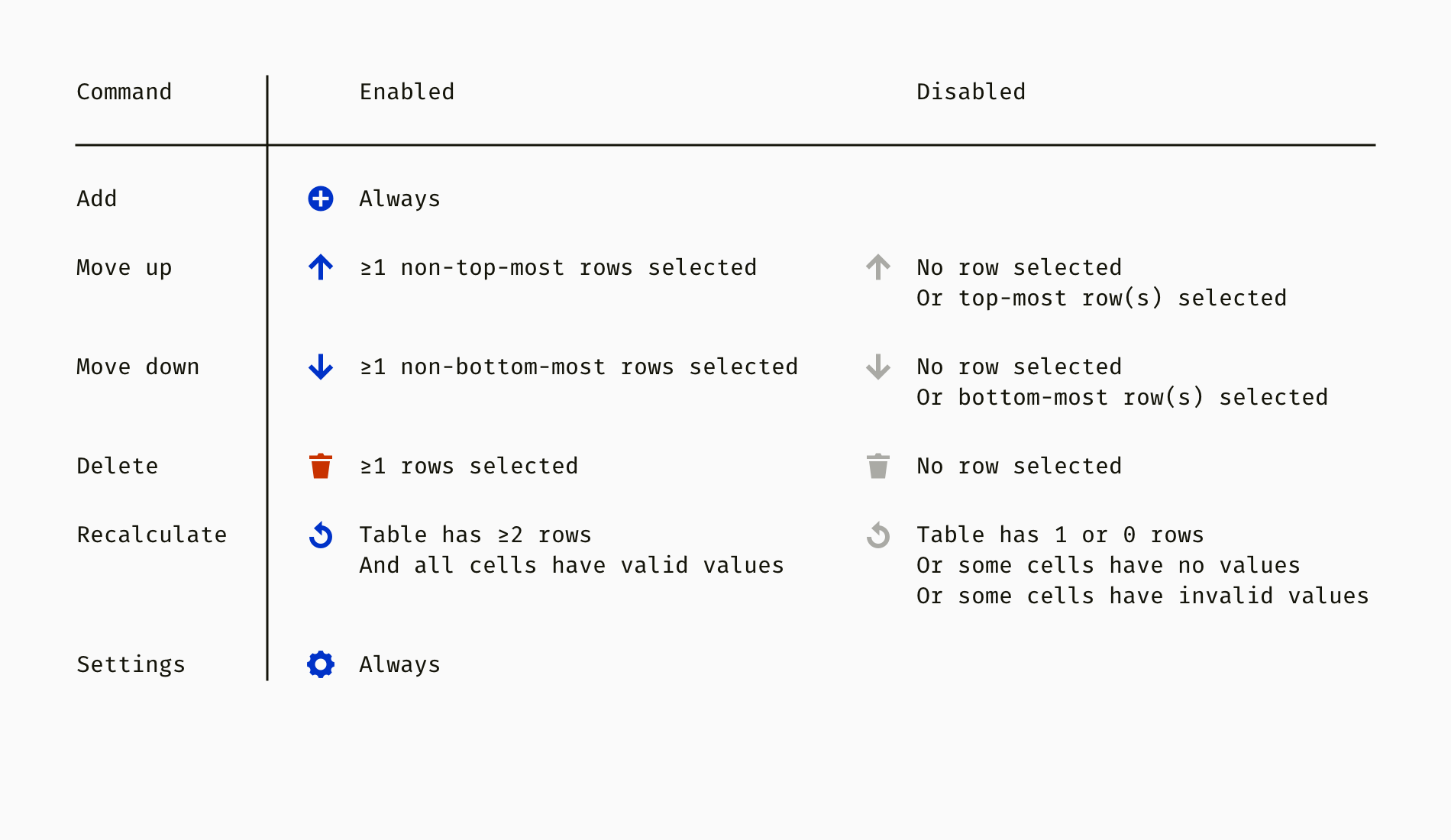
The next step is defining the result of each command. For example, what happens when I select two remote rows and click “Move up”? Or what is the result of clicking “Recalculate”? All these questions should be answered or at least considered beforehand.
Container And Responsiveness
How will the table be placed in the interface? For example, will it occupy some space within an existing container or be a separate module? The answers to these questions totally depend on a product and it’s better to foresee possible issues and thoroughly define the principles.
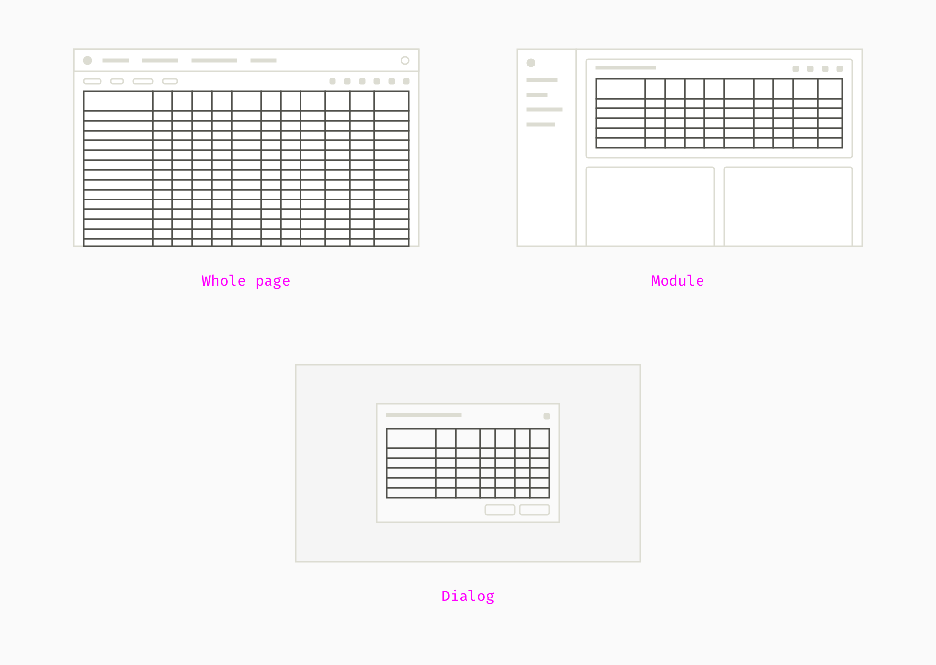
When I design web applications, I usually think about at least three types of containers for tables. The most typical case is when a large table is the center of a screen and occupies as much space as possible. Such a table might not have its own title since the whole screen is devoted to working with the table. Small and medium tables can become autonomous modules of a dashboard as well as other items like graphs, diagrams, schemes. In this case, the top bar of a table plays the role of the card header. And finally, in large enterprise applications, tables often exist inside of popup dialogs. There should be wise guidelines so that dialogs don’t blow up because of too much content.
Another aspect of placing a table in the UI environment is the available screen area. The majority of enterprise applications are meant to be used primarily on the desktop. Table responsiveness is limited to simple stretching and squeezing behavior. Typically, tables with lots of rows and few columns occupy 100% of the available width. As a result, cells are evenly distributed on the screen, and more text can be shown without truncation of wrapping. On the other hand, huge gaps usually appear between columns, which contradicts the design law of proximity. That’s why some applications use lines between the rows or white-end-gray zebra coloring to make information better readable.
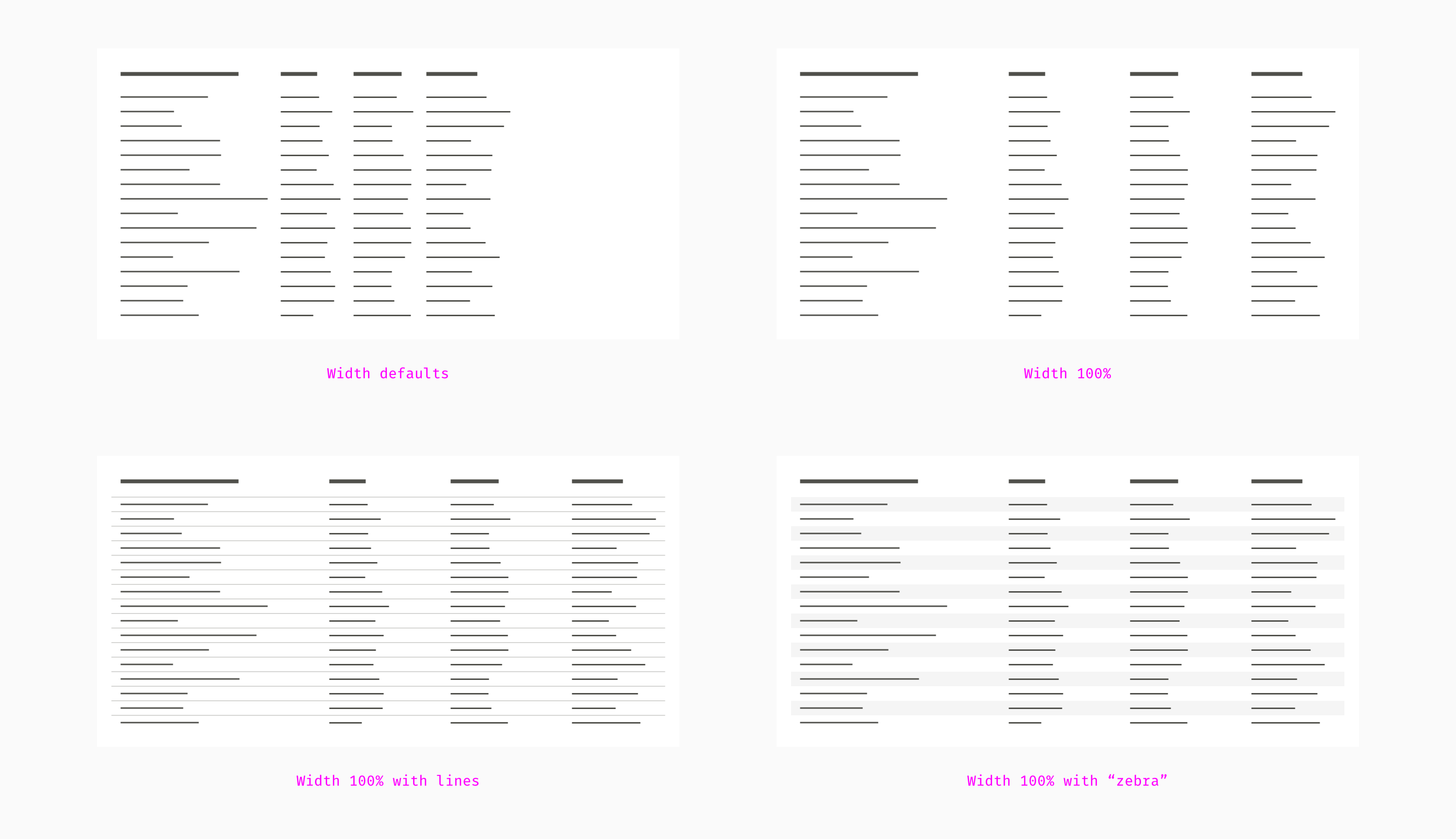
A better way is to define rational default widths and allow manual resizing if needed. For reading a table, it’s better to have some empty space on the right than gaps between the columns.
If a table contains both many rows and columns, horizontal and vertical scrolls are unavoidable.
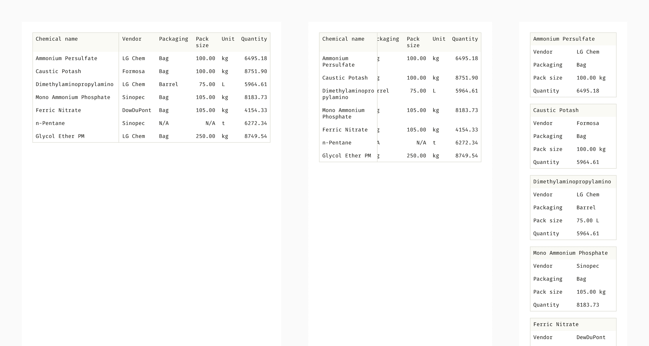
The key essence of a complex table is being large, thus giving the bird-eye view of data. Unfortunately, I cannot name a really good method of using large tables on smartphone screens. Excel and Google spreadsheets lose their power on small screens, although there are effective ways to handle small tables. For instance, converting a table to a set of cards.
Accessibility
Even an exceptionally smooth and nice table might become a nightmare for users. Therefore, it’s so important to follow accessibility principles. Web Content Accessibility Guidelines (WCAG 2.0) has a chapter about tables. Most of the material is about proper coding; however, a designer has a lot to think about too.
Here are major design considerations in terms of accessibility.
- Give a title and prepare a concise summary.
A visually impaired user should be able to get the idea of a table without voice-processing all its cells. - Mind the font size.
Although there is no official minimal size for the web, 16 px (12 pt) is considered to be optimal. Additionally, a user should be able to increase it up to 200% without breaking the whole layout. - Test colors for people with color blindness.
Text and controls should have enough contrast with their background. Color ratio 3:1 is minimally required (the more, the better). Also, color shouldn’t be the only way of marking things. For example, error messages shouldn’t rely on red text only, a warning icon will give additional clues to color-blind users. - Avoid small and ambiguous controls.
Clickable components are considered to be touch-friendly if they are at least 40×40 px. Commands represented by icons should either be labeled or have tooltips and alternative text. Designers shouldn’t overuse icons because users might not understand complex metaphors correctly.
You can also utilize online tools for checking accessibility, for instance, Wave. Not only does it find accessibility issues and features, but also highlights them directly on a page and explains how to fix them.
In A Nutshell
- Content unification and formatting is the designer’s work too.
- Think beyond “things”, elements of your interface, and consider use cases and frequent patterns.
- When everything inside is consistent and compatible, it’s time to think about how it fits the rest of the interface.
Conclusion
We’ve just walked through the process of constructing a complex table. Different projects require different approaches, but there is one universal principle. A designer should make all elements work together in any combination. That’s why it’s good to start with collecting needs and making small blocks first. And, of course, testing with users as soon as you have something clickable and realistic.
Other Reading
- “Atomic Design,” Brad Frost
- “Design Better Data Tables,” Andrew Coyle
- “Refactoring UI,” Adam Wathan & Steve Schoger
Further Reading
- Sliding 3D Image Frames In CSS
- Converting Plain Text To Encoded HTML With Vanilla JavaScript
- F-Shape Pattern And How Users Read
- There Is No Such Thing As A CSS Absolute Unit
 (dm, ra, il, mrn)

