A/B Testing For Mobile-First Experiences

Email Newsletter
Weekly tips on front-end & UX.
Trusted by 182,000+ folks.
 Custom Web Forms for Angular, React, & Vue. Your backend.

 Celebrating 10 million developers

Your client’s website is done. They’re thrilled with it. You and your team are satisfied with the results. And visitor reception looks good so far.
While I recognize that a lot of research, experimentation, analysis and review went into the creation of the website, is that all there is to building a winning website these days? I’d argue that the mobile-first web has added a layer of complexity that few are fully prepared for.
Which is why your work shouldn’t stop when you hit the “Publish” button.
If you’re not yet performing post-launch A/B testing for your website clients, that’s a big mistake. Although we have a massive amount of case studies and other research at our disposal that confirm how to design for conversion on desktop, the mobile experience is still relatively new. At least the mobile-first experience as we know it today.
The following guide includes tips for A/B testing for mobile websites and will get you thinking about conversion rate optimization in other ways than just “Buy This Now”.
A Brief Introduction To A/B Testing For Mobile
Once a website has gone live, Google Analytics and any conversion rate optimization (CRO) tools you hook up to the site will start feeding you data about your users. If you choose to do something with these valuable insights, you have two options:
- Identify obstacles in the experience and implement changes to the site to resolve them.
- Identify a single obstacle in the experience, hypothesize why it occurred and create an alternative version of the site to test the resolution.
The first option seems cut-and-dried. The data tells you there is an issue; you create a solution for it. But like I mentioned already, the chances of succeeding when shooting from the hip like that only work with tried and true desktop design techniques. Even then, it can still be risky if your audience doesn’t align with the average online user’s behavior.
The second option, on the other hand, allows designers to more safely implement changes to a mobile website. Until you have a clear picture of the mobile user’s journey through your website (which, realistically, could involve them jumping from a mobile device to desktop at some point), mobile A/B testing must be an essential part of your job as a web designer.
This is how A/B testing works:
- Identify a part of the website that you believe needs a change. (This should be based on findings in your data or direct reports from users about problematic experiences.)
- Hypothesize why there is friction and how you think it can be resolved.
- Choose just one element to change.
- Using A/B testing software, set up your test variables. You should pit the control (i.e. original version of the site) against a variation of the element.
- Run the test against equal parts of mobile visitors.
- Let the test run for two to four weeks.
- Monitor results to make sure you’re generating sufficient data and take note of any anomalies along the way.
- End the test and review the results.
- If there’s a significant margin between the control and variation results, use your mobile A/B testing tool (like VWO) to implement the winner.
It’s okay if you find that the control is the winner. Take what you’ve learned and apply it to your A/B testing efforts going forward.
Recommended reading: How To Conduct Usability Studies With Participants With Disabilities
Tips For A/B Testing For Mobile-First Experiences
You’re here because you want to know how to increase conversions on the websites you build for clients. The tips below will force you to step outside typical conversion rate optimization planning and think outside the box as you test your theories.
Tip 1: Stop Thinking About Mobile Vs. Desktop A/B Testing
With traditional A/B testing, you typically have verifiable proof of what works and what doesn’t. You tweak the wording on a call-to-action and more users click to buy the product. You change the color of the shirt in a photo and sales go up by 25%. You move the placement of the CTA to the bottom of the post and more readers subscribe.
In other words, you know that a change you made will directly impact the business’s bottom line.
However, when it comes to mobile, it’s not that easy.
Qubit published a report called The Influence of Mobile Discovery in 2018.
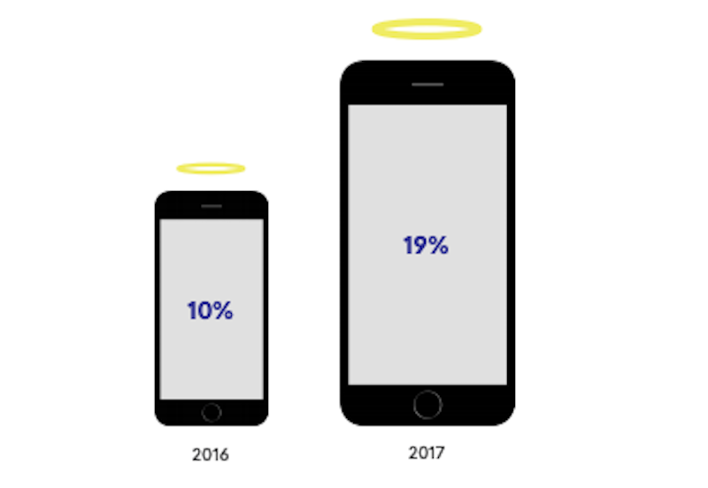
The above image depicts the differences in the mobile halo effect from 2016 to 2017.
The mobile halo effect is a term Qubit uses to describe how the activity that takes place on mobile directly influences what happens on desktop. Qubit’s research of over 1.2 billion customer interactions with the web found:
"Analyzing the cohort of users in our dataset who logged into their accounts on more than one type of device shows that mobile activity directly influences an average of 19% of computer revenue. In some sub-verticals, this influence is much higher, with Fashion seeing an average of 24%, while some retailers receive as many as 1 in 3 of their computer transactions as a result of mobile-browsing."
What’s more, this information only accounts for mobile users who logged into a website from multiple devices. Qubit suspects that people who simply discover a website through mobile also lead to this halo effect. This, in turn, drives up the value of desktop conversions because of how helpful mobile is during the discovery phase of the customer journey.
This is why you can’t just look at mobile-only results on a mobile-first A/B test.
Instead, conduct your tests in the following manner:
- Run your test with mobile visitors.
- Review the results from your A/B testing tool to see if you were able to remove the obstacle from the mobile experience.
- Then, look at your Google Analytics results from the same time period. Even if mobile traffic continued to drop off at the same point, you may find that desktop traffic and engagement increased as a result.
In sum, don’t go into mobile A/B testing thinking that everything you do must result in a greater amount of sales, subscribers or members on mobile. Instead, focus on how to improve the experience as a whole so that it improves your overall conversion rate.
Tip 2: Start With The Header
Remember that there are four micro-moments (or motivations) that drive mobile users to a website:
With such a clear purpose driving their journey to and hopefully through your mobile site, don’t force them to wait for what they’re asking for. In terms of design, this translates to shortening their pathway — either to conversion or to completing the mobile experience before moving to desktop.
When you begin mobile-first A/B testing, look at elements that provide an answer to the micro-moments that are most relevant to your website.
Is there a way to place them in the header of the website or within the first scroll or two of the home page? Or can you at least design a one-click shortcut in the navigation to take them to it?
Here are some ideas:
1. I Want To Know.
Websites with lots of content would do well to test whether or not rearranging the navigation and putting emphasis on relevant and timely categories helps with conversion.
BuzzFeed takes this theory a step further:
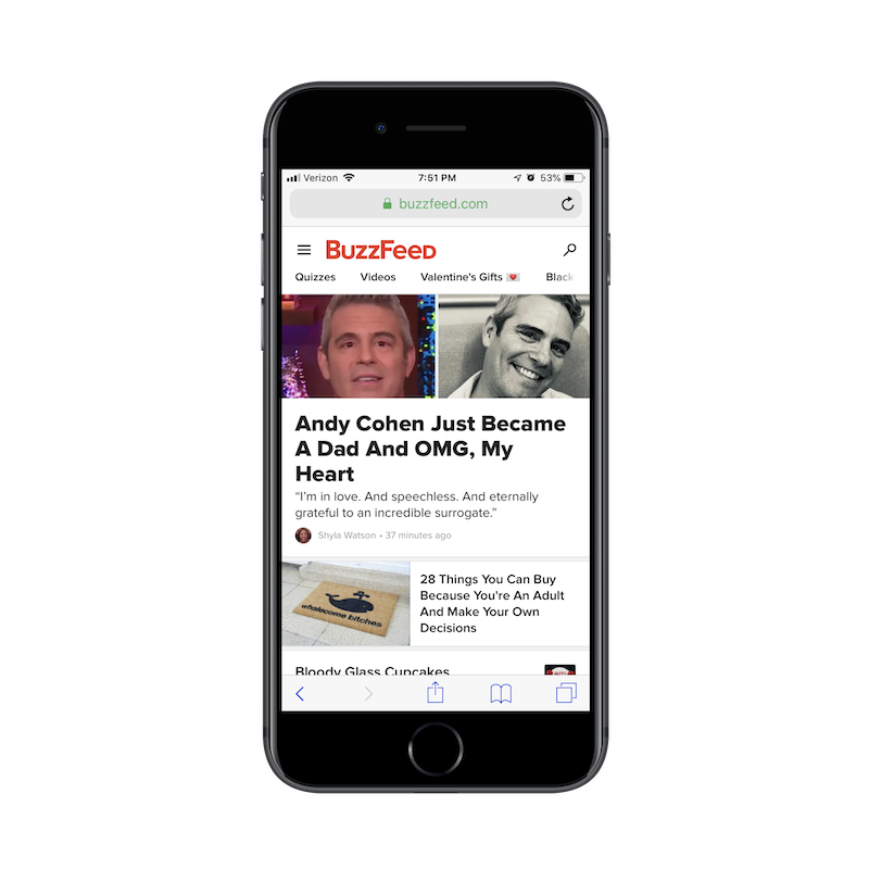
In addition to customizing the navigation regularly, BuzzFeed has chosen to leave the main navigation out in the open on mobile, with a fun selection of emojis to draw attention to the timeliest of categories.
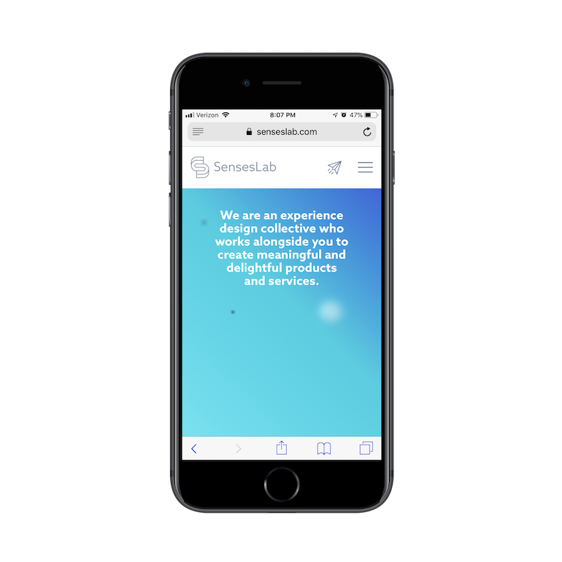
Another way to answer the “I want to know” search is by providing a point of contact in as streamlined a fashion as possible as SensesLab has done:
The “Mail” icon in the top-right corner takes mobile visitors to the Contact page. However, this is no ordinary contact page. While an introduction to their point of contact and email address is given, it’s the contact form below that really shines:
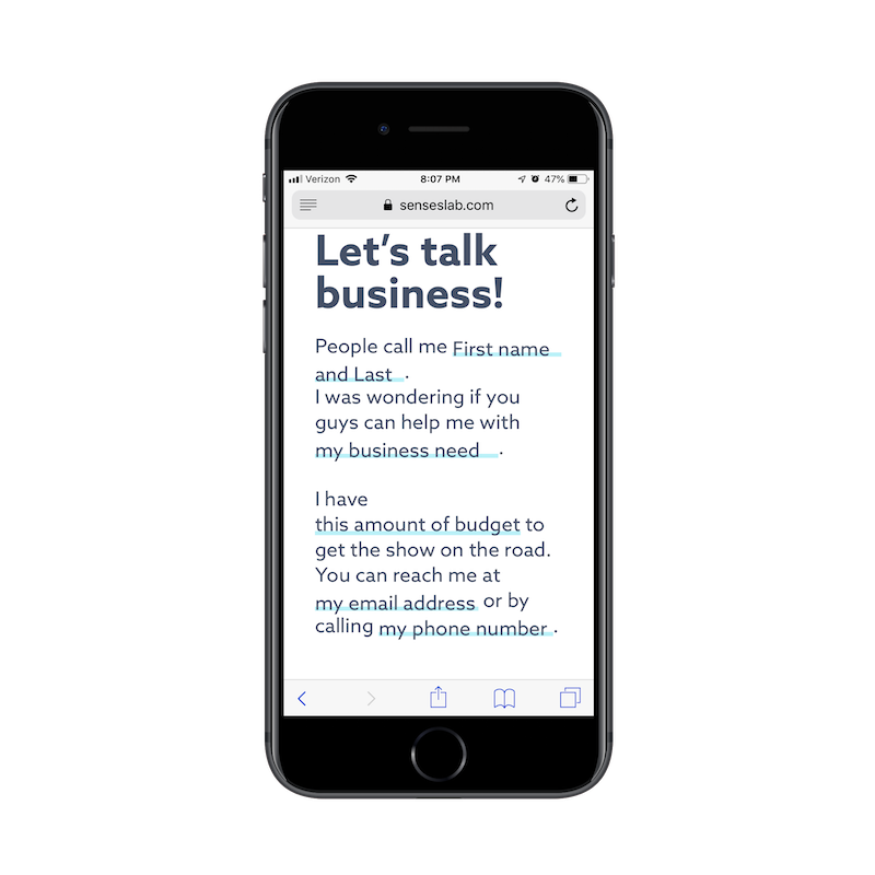
The entire form fits within an entire screen-grab on my iPhone above. There’s no wasting of time by providing instructions on how to fill out the form or anything like that. Users just need to click on the highlighted fields to personalize their responses.
Even better:
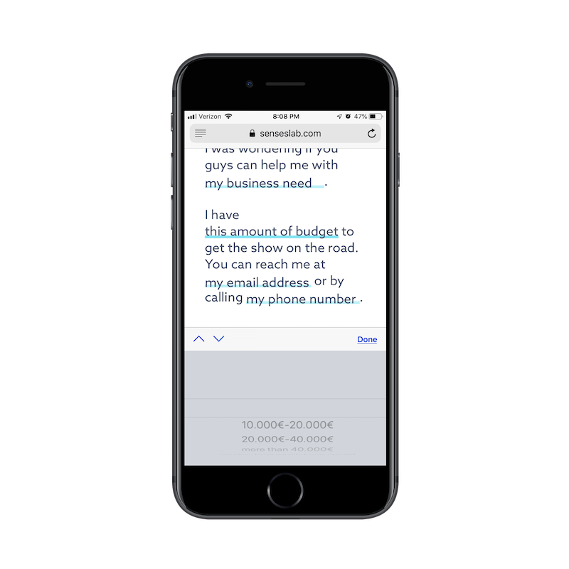
SensesLab has anticipated their responses and provided pre-populated answers along with custom keyboards to shorten the amount of time anyone has to spend filling this out.
2. I Want To Go.
I think the solution to test for with this one is obvious. In other words:
"Where in the header or above the fold do you place the reservation buttons?"
Just don’t be afraid to think outside the box with this. For example, this is The Assemblage website:
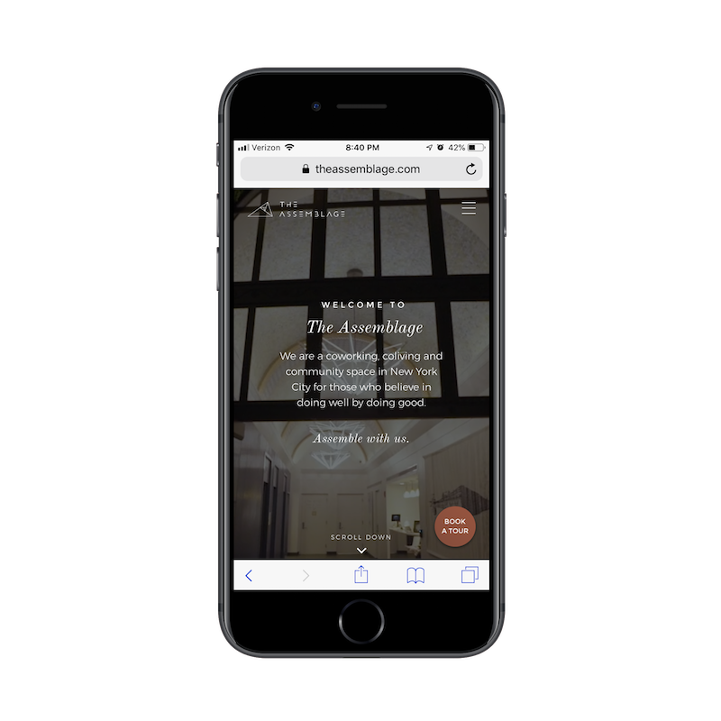
The Assemblage is a coworking space located in New York City. While the mobile site could’ve easily prioritized conversions up top (i.e. “Get your membership now!”), it instead provides a shortcut that makes more sense.
With the focus on booking a tour, mobile visitors can easily claim a date and time. Then, worry about learning all about and seeing the workspace in person later.
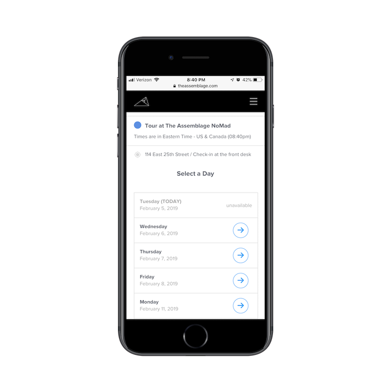
Completing the booking process is incredibly easy on mobile, too.
There are other ways to think outside the box when it comes to designing and testing for “I want to go”. This next example combines two micro-moments and does so in a really unique way, in my opinion.
This is Visit California:
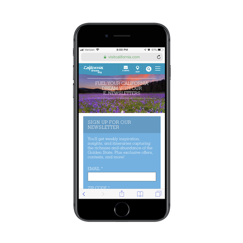
Among the well-chosen icons its placed in the header of the site, Visit California also includes a “Map” icon. After all, what is one of the main reasons why someone would visit this site?
“I want to go to California and need suggestions!”
Now, behind this map icon is not a reservation system, enabling users to book their trip to California. With a site promoting travel to such an expansive location, users are more likely to use this site to gather information to decide where to go. The Map icon, then, is their key to drilling down deeper into those answers:
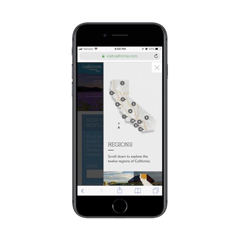
This is a unique and visually stimulating way to get research topics and answers into the hands of people who want it.
3. I Want To Do.
This question is an interesting one to design and A/B test for.
On the one hand, you’d assume that “I want to do” would be answered by articles that provide a how-to for the desired task. When that’s the case, the abundantly sized search bar from Kitchn is a good idea to test for:
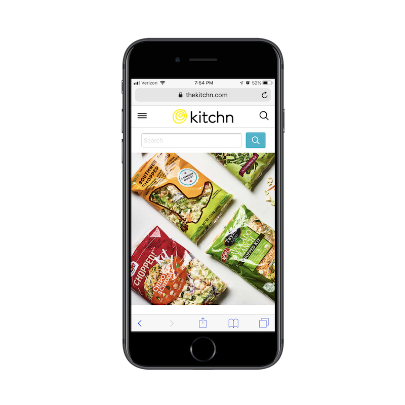
It’s clear what Kitchn users want to do when they get here: search for recipes. And with a magazine of Kitchn’s size, that could be a difficult task to accomplish by using the traditional navigation. Instead, this search bar that’s nearly comparable in size to the entire header bar provides a faster solution.
But then you have the other kind of “I want to do” situation to design for — the one where the visitor of your mobile site wants to go out in the real world and get something done. This is similar to the “I want to go” solution from The Assemblage.
ReShape is a fitness center in Poland:
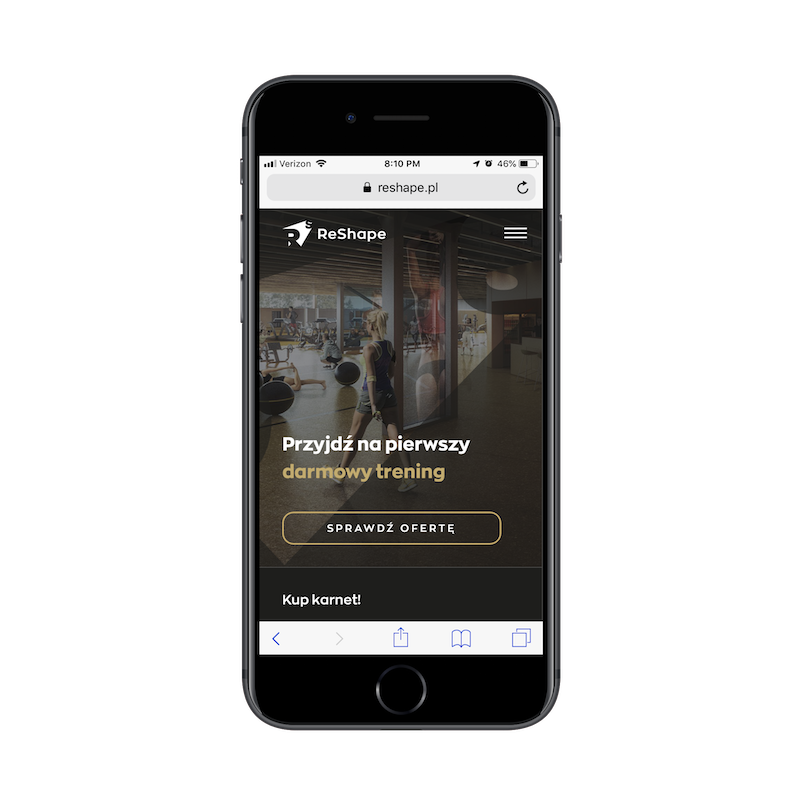
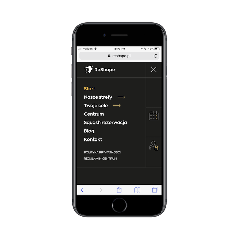
Once you open the navigation on this website, users encounter a number of options to learn about the fitness center and its services.
What’s nice about this, however, is that the website allows current customers to cut the line and schedule a class right away through the calendar icon. There’s no need to download and use a separate mobile app. It’s all right on the mobile website and it’s easy to do, too:
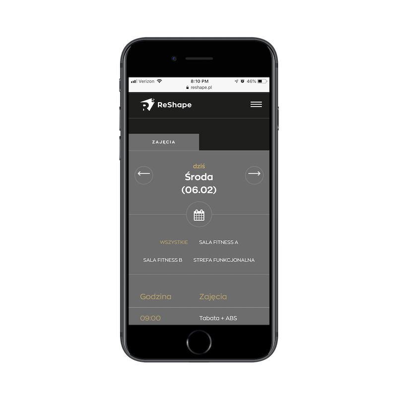
When the success of the website and business is contingent upon getting customers to actually do something, don’t bury it in the mobile experience.
4. I Want To Buy.
Lastly, there’s the “I want to buy” scenario you have to test for.
While the hypothesis for this kind of test is going to be easy enough to figure out — “I want to get more mobile customers to make a purchase” — it’s how you use your design to compel them to do so that’s going to be difficult. Because, again, you have to remember that mobile conversion isn’t simple.
One example I really like of this comes from The Bark, a magazine for dog owners.
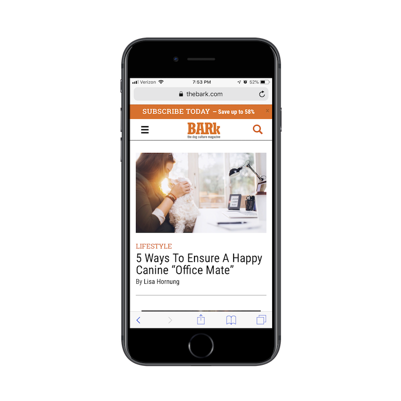
What’s nice about this design is that there are two actions competing against one another:
- The content of the website that allows visitors to peruse articles for free.
- The unobtrusive yet boldly designed sticky bar with an attractive offer to convert.
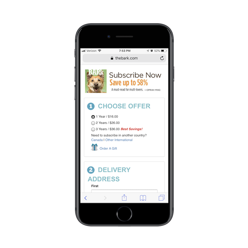
As more and more we move away from pop-ups and with the sidebar having little to no place on mobile, we’re running out of options for ways to jump into the experience and say:
"Hey! Buy this now!"
You could place banners in-line with the content, but that may be too disruptive for your users. While I’d assume that a sticky bar that can easily be dismissed is the better way to compel mobile visitors to convert, this is why we have A/B testing. To let us know what exactly our specific audience will do when confronted with a Buy (Subscribe) CTA on mobile.
And if they don’t want to convert there, that’s fine. At least you’ve done your due diligence in testing alternative scenarios to see if you can improve your success rate.
Tip 3: Encourage Users To Save Instead
This last point is a good segue into what I’m going to talk about next:
"There are just some websites that won’t convert well on mobile."
Although research on Generation Z as consumers is still relatively new, many suggest that they are going to be true multichannel shoppers. Most of their research will be done on mobile devices, but the preferred shopping experience will be from a computer or in person.
Whether or not that’s true for Gen Z, millennials or any other generation of consumer, I think it’s a smart idea to test for this hypothesis. Until your mobile conversion rates are consistently and significantly higher than desktop and in-person conversion, encouraging mobile users to “Save” their progress on your site might be the better design choice.
As you work on designing and redesigning websites this year, you might want to save yourself the trouble of committing solely to a conversion funnel. Instead, build in shortcuts to “Save” on the mobile experience like:
- Sign up for an account.
- Save products to your cart or wish list.
- Save an article or feed for future reading.
- Share your email address for future updates.
- Sign up for a free demo and we’ll take care of the rest.
Then, when the site is live, test how the conversion rates are affected with or without them.
Here are some neat examples of websites that use “Save” features well on mobile.
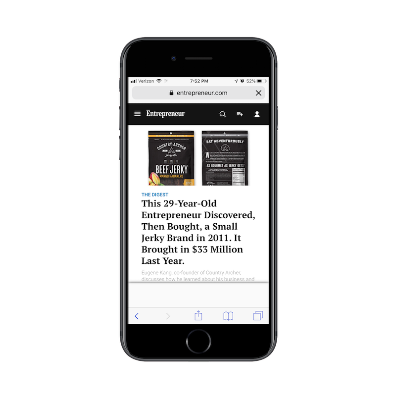
This is Entrepreneur magazine:
See that icon in the header between the search magnifying glass and account settings? This is where Entrepreneur enables regular readers to save content for future consumption:
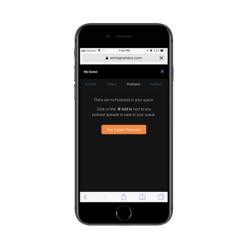
As you can see, readers can save all sorts of content under this Save feature, making it easy to return to Entrepreneur articles any time, any place and from any device.
Then, there’s the example of Zendesk:
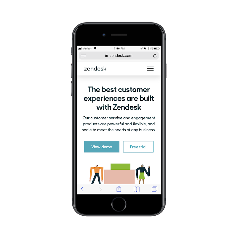
For those of you designing websites for service providers and SaaS companies, this is an excellent way to help your users “Save” their progress. I know it might not look that way at first glance, but let me explain:
Zendesk isn’t wasting anyone’s time with an overlong description of what it does and why people need to purchase its help desk software. Instead, it’s clearly summarized what users can expect and then provides two appealing calls-to-action. Regardless of which option the mobile user chooses, Zendesk requires them to provide contact information.
So, let’s say a mobile user fills out the form to enter the demo. They get inside it, but then realize they’re short on time or just don’t want to interact with it on mobile. Fine. Zendesk now has their information and will be in touch soon to follow up about the experience. The mobile user can then re-enter the experience from their preferred device when the inevitable follow-up email reminds them to do so.
Tip 4: A/B Test Your Page And Post Length
Another suggestion I’m going to make for mobile-first A/B testing is content length.
I actually touched on the subject of brevity in my previous article, How Web Designers Can Contribute to Mobile-First Marketing. However, I didn’t talk about how you can use A/B testing to confirm whether or not that’s the right path for your website.
There are case studies and research reports galore that discuss the subject of ideal content length for both desktop and mobile. Some are emphatic that shorter is always better, which is why I think we’ve seen such a huge push for video over written content in past years.
But then there are some who suggest that length should be determined on a case-by-case basis.
Take the Neil Patel blog, for instance. If I had to guess, I’d say that his articles are between 2,000 and 5,000 words on average — even on mobile. Considering Patel is a multi-millionaire, I don’t suspect that his lengthy posts have hurt the success of his brand in the least bit.
So, again, this is why we need A/B testing — just to confirm our suspicions and put any fears we might have about the efficacy of a site’s design or content to rest.
Unless your client comes to you as a well-known brand and they’ve already proved they can produce successful 2K-word posts like Patel, you have to test this.
Talk to your writers and marketers and ask them to create two different versions of your content for the first month or two. This includes the home page, blog posts, product pages and any other key pages in the user’s journey. Run a test to see if the length of the page on mobile affects readability as well as conversions.
You can then use these results to refine the rest of the content on your site, making sure you’re providing mobile users with the ideal reading experience wherever they go.
Wrapping Up
The goal in mobile-first A/B testing is to inspire mobile visitors to keep moving through the experience. Even if the element you’ve chosen to test doesn’t directly lead to conversion, the improvements you make should eventually trickle down to that final step, no matter which device it takes place on.
Just don’t forget to study your desktop analytics while running mobile-first A/B tests. While test results might not show you what you were hoping to see, looking at the overall picture might.
Further Reading
- Testing Sites And Apps With Blind Users: A Cheat Sheet
- Long Live The Test Pyramid
- Using AI For Neurodiversity And Building Inclusive Tools
- Picture Perfect: Meet Pixo, A Photo Editor For Your End Users
 (ra, yk, il, mrn)

