How To Align Things In CSS

Email Newsletter
Weekly tips on front-end & UX.
Trusted by 182,000+ folks.
 Celebrating 10 million developers
 Custom Web Forms for Angular, React, & Vue. Your backend.


We have a whole selection of ways to align things in CSS today, and it isn’t always an obvious decision which to use. However, knowing what is available means that you can always try a few tactics if you come across a particular alignment problem.
In this article, I will take a look at the different alignment methods. Instead of providing a comprehensive guide to each, I’ll explain a few of the sticking points people have and point to more complete references for the properties and values. As with much of CSS, you can go a long way by understanding the fundamental things about how the methods behave, and then need a place to go look up the finer details in terms of how you achieve the precise layout that you want.
Aligning Text And Inline Elements
When we have some text and other inline elements on a page, each line of content is treated as a line box. The property text-align will align that content on the page, for example, if you want your text centered, or justified. Sometimes, however, you may want to align things inside that line box against other things, for example, if you have an icon displayed alongside text, or text of different sizes.
In the example below, I have some text with a larger inline image. I am using vertical-align: middle on the image to align the text to the middle of the image.
See the Pen Vertical Alignment example by Rachel Andrew.
The line-height Property And Alignment
Remember that the line-height property will change the size of the line-box and therefore can change your alignment. The following example uses a large line-height value of 150px, and I have aligned the image to top. The image is aligned to the top of the line box and not the top of the text, remove that line-height or make it less than the size of the image and the image and text will line up at the top of the text.
See the Pen Vertical Alignment and line-height by Rachel Andrew.
It turns out that line-height and indeed the size of text is pretty complicated, and I’m not going to head down that rabbit hole in this article. If you are trying to precisely align inline elements and want to really understand what is going on, I recommend reading “Deep Dive CSS: Font Metrics, line-height And vertical-align.”
When Can I Use The vertical-align Property?
The vertical-align property is useful if you are aligning any inline element. This includes elements with display: inline-block. The content of table cells can also be aligned with the vertical-align property.
The vertical-align property has no effect on flex or grid items, and therefore if used as part of a fallback strategy, will cease to apply the minute the parent element is turned into a grid or flex Container. For example, in the next pen, I have a set of items laid out with display: inline-block and this means that I get the ability to align the items even if the browser does not have Flexbox:
See the Pen inline-block and vertical-align by Rachel Andrew.
In this next pen, I have treated the inline-block as a fallback for Flex layout. The alignment properties no longer apply, and I can add align-items to align the items in Flexbox. You can tell that the Flexbox method is in play because the gap between items that you will get when using display: inline-block is gone.
See the Pen inline-block flex fallback by Rachel Andrew.
The fact that vertical-align works on table cells is the reason that the trick to vertically center an item using display: table-cell works.
Now that we do have better ways to align boxes in CSS (as we will look at in the next section), we don’t need to employ the vertical-align and text-align properties in places other than the inline and text elements for which they were designed. However, they are still completely valid to use in those text and inline formats, and so remember if you are trying to align something inline, it is these properties and not the Box Alignment ones that you need to reach for.
Box Alignment
The Box Alignment Specification deals with how we align everything else. The specification details the following alignment properties:
justify-contentalign-contentjustify-selfalign-selfjustify-itemsalign-items
You might already think of these properties as being part of the Flexbox Specification, or perhaps Grid. The history of the properties is that they originated as part of Flexbox, and still exist in the Level 1 specification; however, they were moved into their own specification when it became apparent that they were more generally useful. We now also use them in Grid Layout, and they are specified for other layout methods too, although current browser support means that you won’t be able to use them just yet.
Therefore, next time someone on the Internet tells you that vertical alignment is the hardest part of CSS, you can tell them this (which even fits into a tweet):
.container {
  display: flex;
  align-items: center;
  justify-content: center;
}
In the future, we may even be able to dispense with display: flex, once the Box Alignment properties are implemented for Block Layout. At the moment, however, making the parent of the thing you want centering a flex container is the way to get alignment horizontally and vertically.
The Two Types Of Alignment
When aligning flex and grid items, you have two possible things to align:
- You have the spare space in the grid or flex container (once the items or tracks have been laid out).
- You also have the item itself inside the grid area you placed it in, or on the cross axis inside the flex container.
I showed you a set of properties above, and the alignment properties can be thought of as two groups. Those which deal with distribution of spare space, and those which align the item itself.
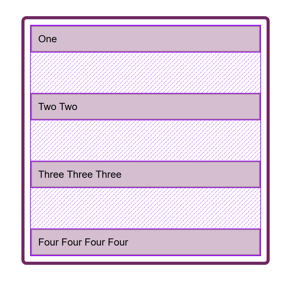
Dealing With Spare Space: align-content And justify-content
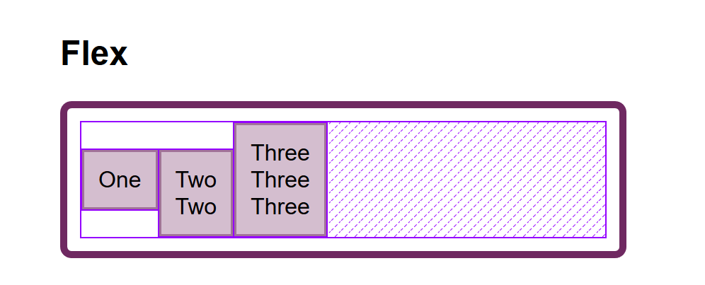
The properties which end in -content are about space distribution, so when you choose to use align-content or justify-content you are distributing available space between grid tracks or flex items. They don’t change the size of the flex or grid items themselves; they move them around because they change where the spare space goes.
Below, I have a flex example and a grid example. Both have a container which is larger than required to display the flex items or grid tracks, so I can use align-content and justify-content to distribute that space.
See the Pen justify-content and align-content by Rachel Andrew.
Moving Items Around: justify-self, align-self, justify-items And align-items
We then have align-self and justify-self as applied to individual flex or grid items; you can also use align-items and justify-items on the container to set all the properties at once. These properties deal with the actual flex or grid item, i.e. moving the content around inside the Grid Area or flex line.
- Grid Layout
You get both properties as you can shift the item on the block and inline axis as we have a defined Grid Area in which it sits. - Flex Layout
You can only align on the cross axis as the main axis is controlled by space distribution alone. So if your items are a row, you can usealign-selfto shift them up and down inside the flex line, aligning them against each other.
In my example below, I have a flex and a grid container, and am using align-items and align-self in Flexbox to move the items up and down against each other on the cross axis. If you use Firefox, and inspect the element using the Firefox Flexbox Inspector, you can see the size of the flex container and how the items are being moved vertically inside of that.
In grid, I can use all four properties to move the items around inside their grid area. Once again, the Firefox DevTools Grid Inspector will be useful when playing with alignment. With the grid lines overlaid, you can see the area inside which the content is being moved:
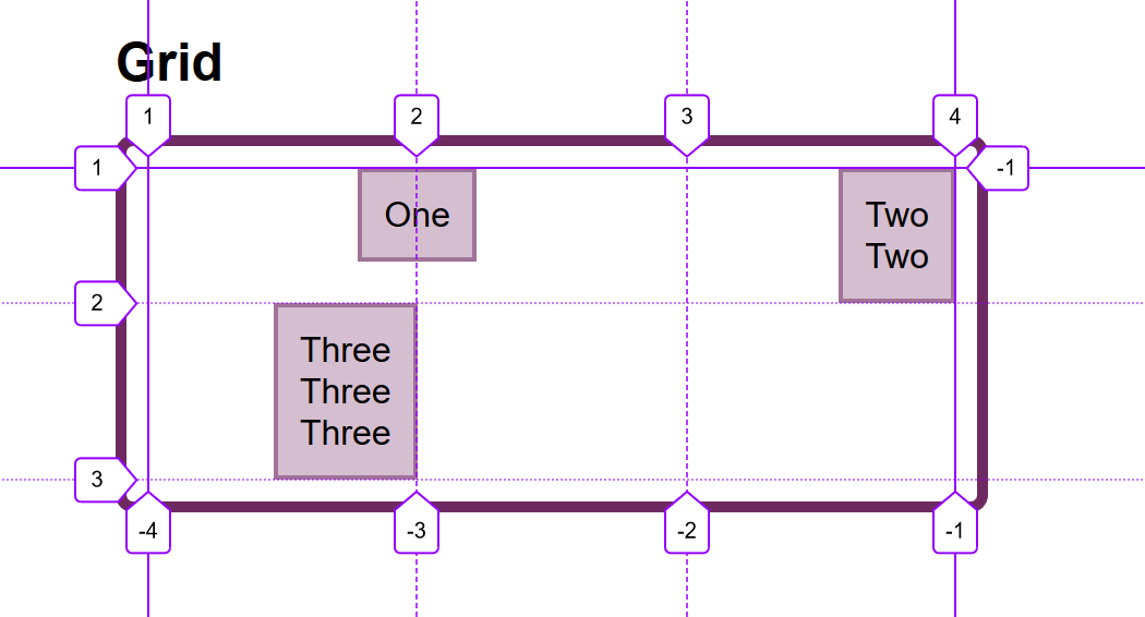
Play around with the values in the CodePen demo to see how you can shift content around in each layout method:
See the Pen justify-self, align-self, justify-items, align-items by Rachel Andrew.
Confused By align And justify
One of the cited issues with people remembering the alignment properties in Grid and Flexbox, is that no one can remember whether to align or to justify. Which direction is which?
For Grid Layout, you need to know if you are aligning in the Block or Inline Direction. The Block direction is the direction blocks lay out on your page (in your writing mode), i.e. for English that is vertically. The Inline direction is the direction in which sentences run (so for English that is left to right horizontally).
To align things in the Block Direction, you will use the properties which start with align-. You use align-content to distribute space between grid tracks, if there is free space in the grid container, and align-items or align-self to move an item around inside the grid area it has been placed in.
The below example has two grid layouts. One has writing-mode: horizontal-tb (which is the default for English) and the other writing-mode: vertical-rl. This is the only difference between them. You can see that the alignment properties which I have applied work in exactly the same way on the block axis in both modes.
See the Pen Grid Block Axis Alignment by Rachel Andrew.
To align things in the inline direction, use the properties which begin with justify-. Use justify-content to distribute space between grid tracks, and justify-items or justify-self to align items inside their grid area in the inline direction.
Once again, I have two grid layout examples so that you can see that inline is always inline — no matter which writing mode you are using.
See the Pen Grid Inline Alignment by Rachel Andrew.
Flexbox is a little trickier due to the fact that we have a main axis which can be changed to row or column. So, let’s first think about that main axis. It is set with the flex-direction property. The initial (or default) value of this property is row which will lay the flex items out as a row in the writing mode currently in use — this is why when working in English, we end up with items laid out horizontally when we create a flex container. You can then change the main axis to flex-direction: column and the items will be laid out as a column which means they are laid out in the block direction for that writing mode.
As we can do this axis switching, the most important factor in Flexbox is asking, “Which axis is my main axis?” Once you know that, then for alignment (when on your main axis) you simply use justify-content. It doesn’t matter if your main axis is row or column. You control space between the flex items with justify-content.
See the Pen justfy-content in Flexbox by Rachel Andrew.
On the cross axis, you can use align-items which will align the items inside the flex container or flex line in a multi-line flex container. If you have a multi-line container using flex-wrap: wrap and have space in that container, you can use align-content to distribute the space on the cross axis.
In the example below, we are doing both with a flex container displayed as a row and a column:
See the Pen Cross axis alignment in Flexbox by Rachel Andrew.
When justify-content Or align-content Do Not Work
The justify-content and align-content properties in Grid and Flexbox are about distributing extra space. So the thing to check is that you have extra space.
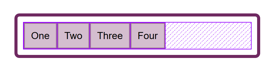
Here is a Flex example: I have set flex-direction: row and I have three items. They don’t take up all of the space in the flex container, so I have spare space on the main axis, the initial value for justify-content is flex-start and so my items all line up at the start and the extra space is at the end. I am using the Firefox Flex Inspector to highlight the space.
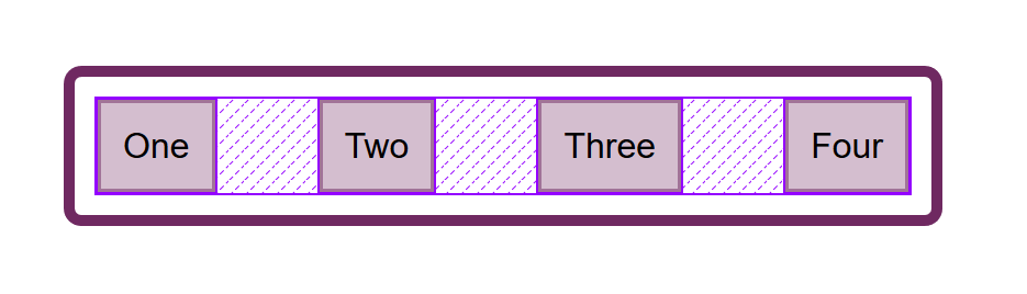
If I change flex-direction to space-between, that extra space is now distributed between the items:
If I now add more content to my items so they become larger and there is no longer any additional space, then justify-content does nothing — simply because there is no space to distribute.
A common question I’m asked is why justify-content isn’t working when flex-direction is column. This is generally because there is no space to distribute. If you take the above example and make it flex-direction: column, the items will display as a column, but there will be no additional space below the items as there is when you do flex-direction: row. This is because when you make a Flex Container with display: flex you have a block level flex container; this will take up all possible space in the inline direction. In CSS, things do not stretch in the block direction, so no extra space.
Add a height to the container and — as long as that is more than is required to display the items — you have extra space and therefore justify-content will work on your column.
Why Is There No justify-self In Flexbox?
Grid Layout implements all of the properties for both axes because we always have two axes to deal with in Grid Layout. We create tracks (which may leave additional space in the grid container in either dimension,) and so we can distribute that space with align-content or justify-content. We also have Grid Areas, and the element in that area may not take up the full space of the area, so we can use align-self or justify-self to move the content around the area (or align-items, justify-items to change the alignment of all items).
Flexbox does not have tracks in the way that Grid layout does. On the main axis, all we have to play with is the distribution of space between the items. There is no concept of a track into which a flex item is placed. So there is no area created in which to move the item around in. This is why there is no justify-self property on the main axes in Flexbox.
Sometimes, however, you do want to be able to align one item or part of the group of items in a different way. A common pattern would be a split navigation bar with one item being separated out from the group. In that situation, the specification advises the use of auto margins.
An auto margin will take up all of the space in the direction it is applied, which is why we can center a block (such as our main page layout) using a left and right margin of auto. With an auto margin on both sides, each margin tries to take up all the space and so pushes the block into the middle. With our row of flex items, we can add margin-left: auto to the item we want the split to happen on, and as long as there is available space in the flex container, you get a split. This plays nicely with Flexbox because as soon as there is no available space, the items behave as regular flex items do.
See the Pen Alignment with auto margins by Rachel Andrew.
Flexbox And Micro-Components
One of the things I think is often overlooked is how useful Flexbox is for doing tiny layout jobs, where you might think that using vertical-align is the way to go. I often use Flexbox to get neat alignment of small patterns; for example, aligning an icon next to text, baseline aligning two things with different font sizes, or making form fields and buttons line up properly. If you are struggling to get something to line up nicely with vertical-align, then perhaps try doing the job with Flexbox. Remember that you can also create an inline flex container if you want with display: inline-flex.
See the Pen inline-flex example by Rachel Andrew.
There is no reason not to use Flexbox, or even Grid for tiny layout jobs. They aren’t just for big chunks of layout. Try the different things available to you, and see what works best.
People are often very keen to know what the right or wrong way to do things is. In reality, there often is no right or wrong; a small difference in your pattern might mean the difference between Flexbox working best, where otherwise you would use vertical-align.
Wrapping Up
To wrap up, I have a quick summary of the basics of alignment. If you remember these few rules, you should be able to align most things with CSS:
- Are you aligning text or an inline element? If so, you need to use
text-align,vertical-align, andline-height. - Do you have an item or items you want to align in the center of the page or container? If so, make the container a flex container then set
align-items: centerandjustify-content: center. - For Grid Layouts, the properties that start with
align-work in the Block direction; those which start withjustify-work in the inline direction. - For Flex Layouts, the properties that start with
align-work on the Cross Axis; those which start withjustify-work on the main axis. - The
justify-contentandalign-contentproperties distribute extra space. If you have no extra space in your flex or grid container, they will do nothing. - If you think you need
justify-selfin Flexbox, then using an auto margin will probably give you the pattern you are after. - You can use Grid and Flexbox along with the alignment properties for tiny layout jobs as well as main components — experiment!
For more information about alignment, see these resources:
- CSS Box Alignment (MDN web docs)
- Everything You Need To Know About Alignment In Flexbox
- Box Alignment Cheatsheet
Further Reading
- Infinite-Scrolling Logos In Flat HTML And Pure CSS
- Useful DevTools Tips and Tricks
- How To Choose Typefaces For Fintech Products: Our Best Practices Guide (Part 1)
- Getting Started With Neon Branching
 (il, mrn)

