How To Find And Make The Most Of The Unplanned User Journey

Email Newsletter
Weekly tips on front-end & UX.
Trusted by 182,000+ folks.


 Custom Web Forms for Angular, React, & Vue. Your backend.
 Celebrating 10 million developers
Fallbacks can be defined as an alternative plan that may be used, and in the context of user journeys, they would be an alternative path to the expected or planned user behavior. So, when we think about our sites and apps, we build them with a particular plan in mind to achieve a particular goal by taking a particular route and to experience a particular experience.
If you are experienced in building products, you will know that users have a tendency to do things you didn’t plan for, and that’s alright because we can’t possibly understand all of their needs and intention. This is why fallbacks are so valuable.
Over the years, we have tried and tested many tools at Venture Harbour to help us get better feedback loops. Our products have needs which require different types of tools to reveal all kinds of insights. From heatmaps and visitor recording tools (like Hotjar and Fullstory) to analytics platforms like Google Analytics and Amplitude.
These tools are great and help us accomplish a lot, but they only go so far. We now need to get deeper insights that can only be achieved by implementing fallbacks to your user journeys.
To start, we need to be thinking about what alternative behaviors or routes our users might experience that we didn’t see coming. Here are three common fallbacks:
- Dead Ends
The user’s journey has come to an end, and there are no clear or onward steps. The goal would be to offer the next steps to the user and track those choices. - Grey Areas
The user is interacting with your site or app, but we have little or no understanding of what is going on, or why they are doing what they are doing. The goal is to shed light on those areas to learn about what might be happening. - Errors
The user is presented with an error message that gives insufficient context. The goal here is to offer context by interacting with the user to gain feedback from them.
Let’s dive into some examples from the wild in which feedback loops are missing from popular fallbacks. Then, I will follow up with ideas of how that feedback loop might look and work in those fallbacks.
Note: Just so you know, these are mockups based on real-world scenarios.
Turning Dead Ends Into Feedback Goldmines
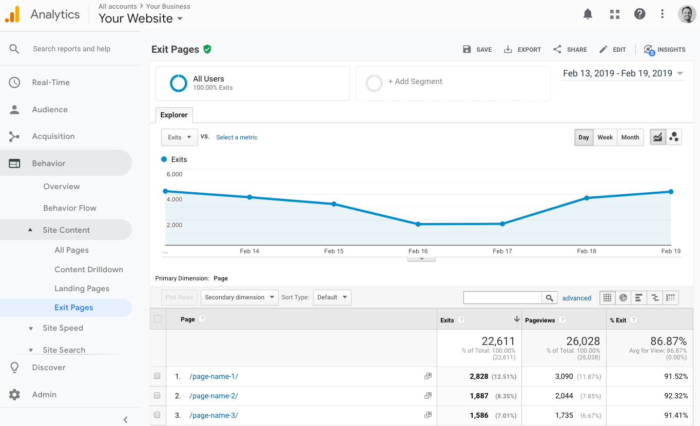
Dead ends in a user flow are common. One way of discovering them is by analyzing your Exit Pages in your analytics tracking tool, like Google Analytics. This will highlight common exit pages on your site or app and give you a starting point to start investigating.
Now we need to be asking the simple question:
“Why are users leaving at these points?”
Take a look at the actual pages these exits are happening on and start considering at what point in the process of using your app or site the user is at when they hit this dead end. Are they just getting started, are they mid-flow, or are they close to achieving a particular goal in the journey? These considerations will help you paint a better picture of the user’s situation and possible reasons.
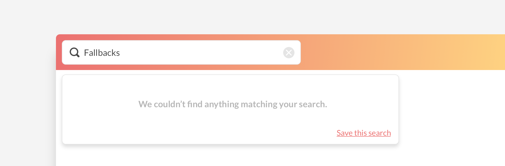
Example: Dead Ends In Search
A very common dead end is with search when you are searching for something and you are shown that “No Results” page. Businesses are starting to really invest in these pages, and you will find that you would normally be shown some sort of a result — especially on e-commerce sites.
When searching for anything, we should at least return some sort of result. When we don’t have an actual result to show, then we need to creatively think about how to capitalize on these scenarios. This can take the form of a question or a common action that could have possibly been the intention of the user’s search in the first place.
Below is an example of a dead-end search:
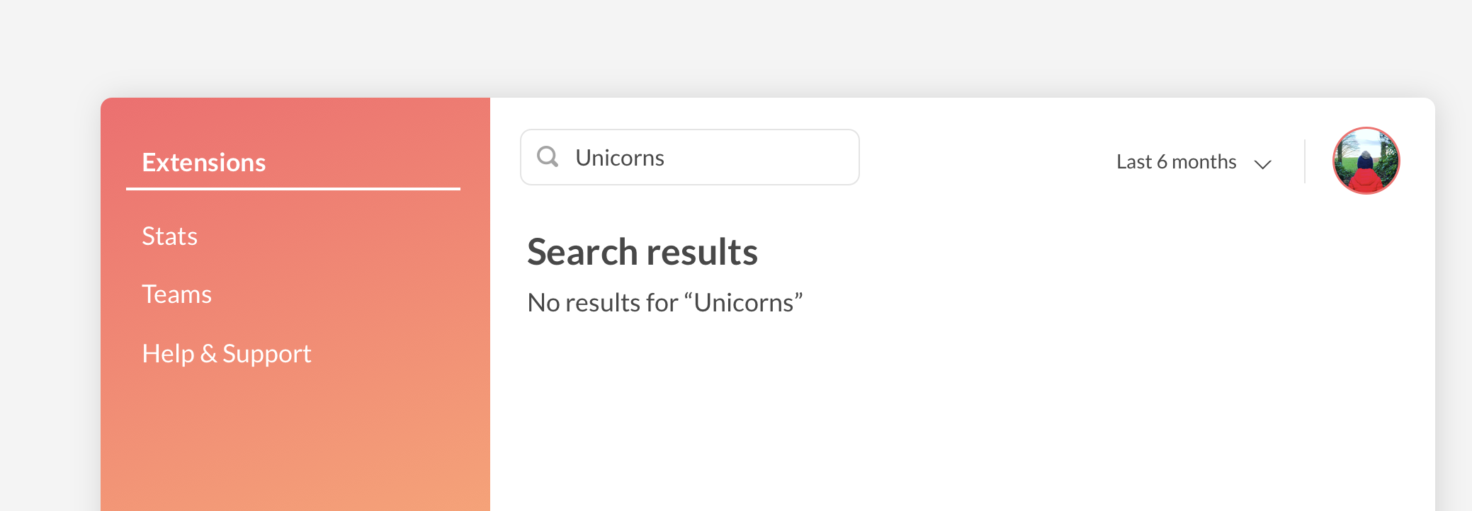
In this case, what can we find out from the user that we don’t already know to help us improve their experience and help us learn? What questions could we be asking them? What could we provide the user at this point, now that they haven’t found what they are after?
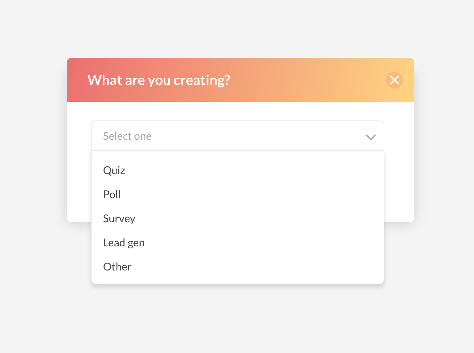
This particular scenario is interesting, and I thought of a couple of ideas on how to get information from the user to help us improve our app and provide them with the next step.
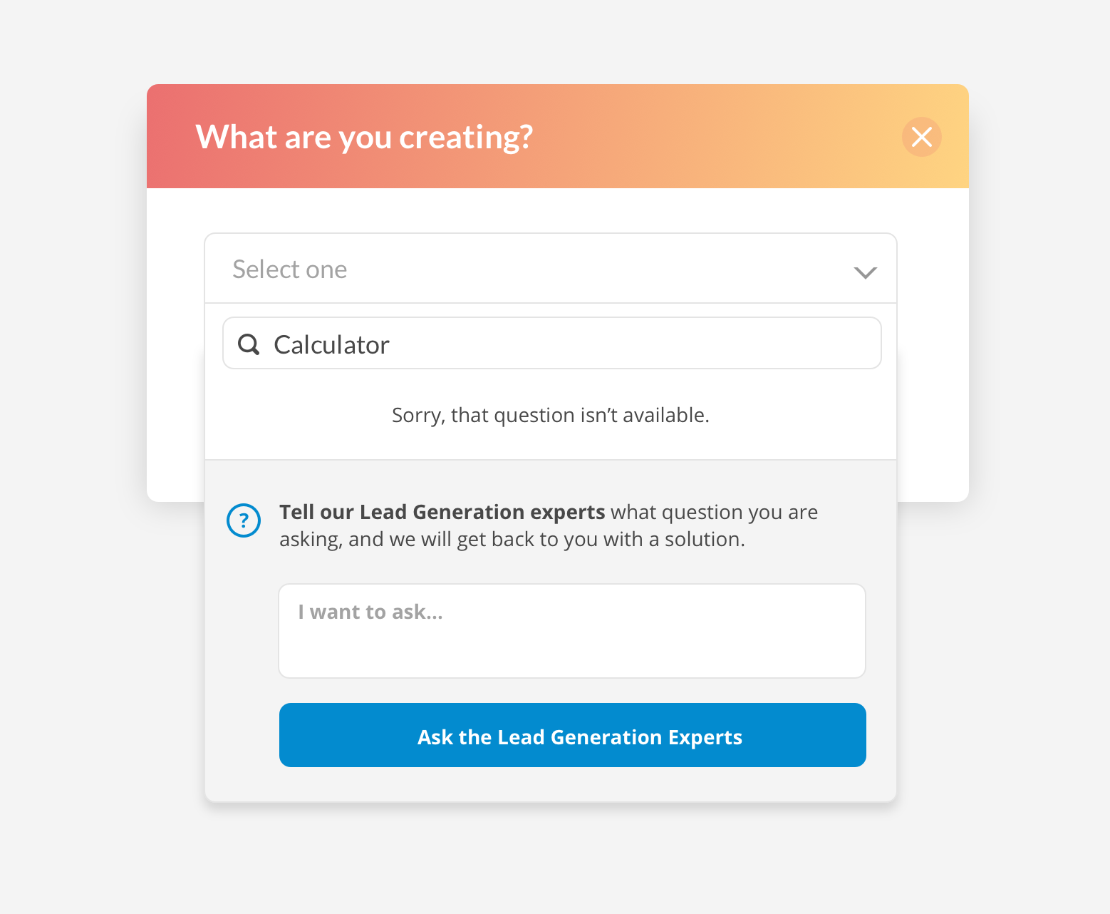
As shown below, we start off by telling the user that what they are looking for isn’t available now, but could be in the future. In return, we can get some feedback on what they had hoped to do or find instead:
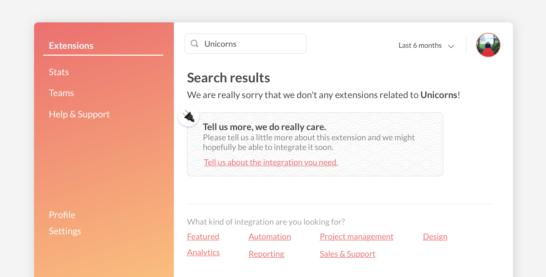
We could then provide the user with a next step by offering them a filter that will help them find an alternative and subsequently inform us of what category of extension they were searching for, which we could then review and work out what categories we should be investing time in. With this information collated from the user, we can start to build up a knowledge base of what users might expect in these scenarios and begin to suggest smarter categories and suggestions to the end user in the future. That way, we can provide them with a much better user experience.
Example: Natural Dead Ends
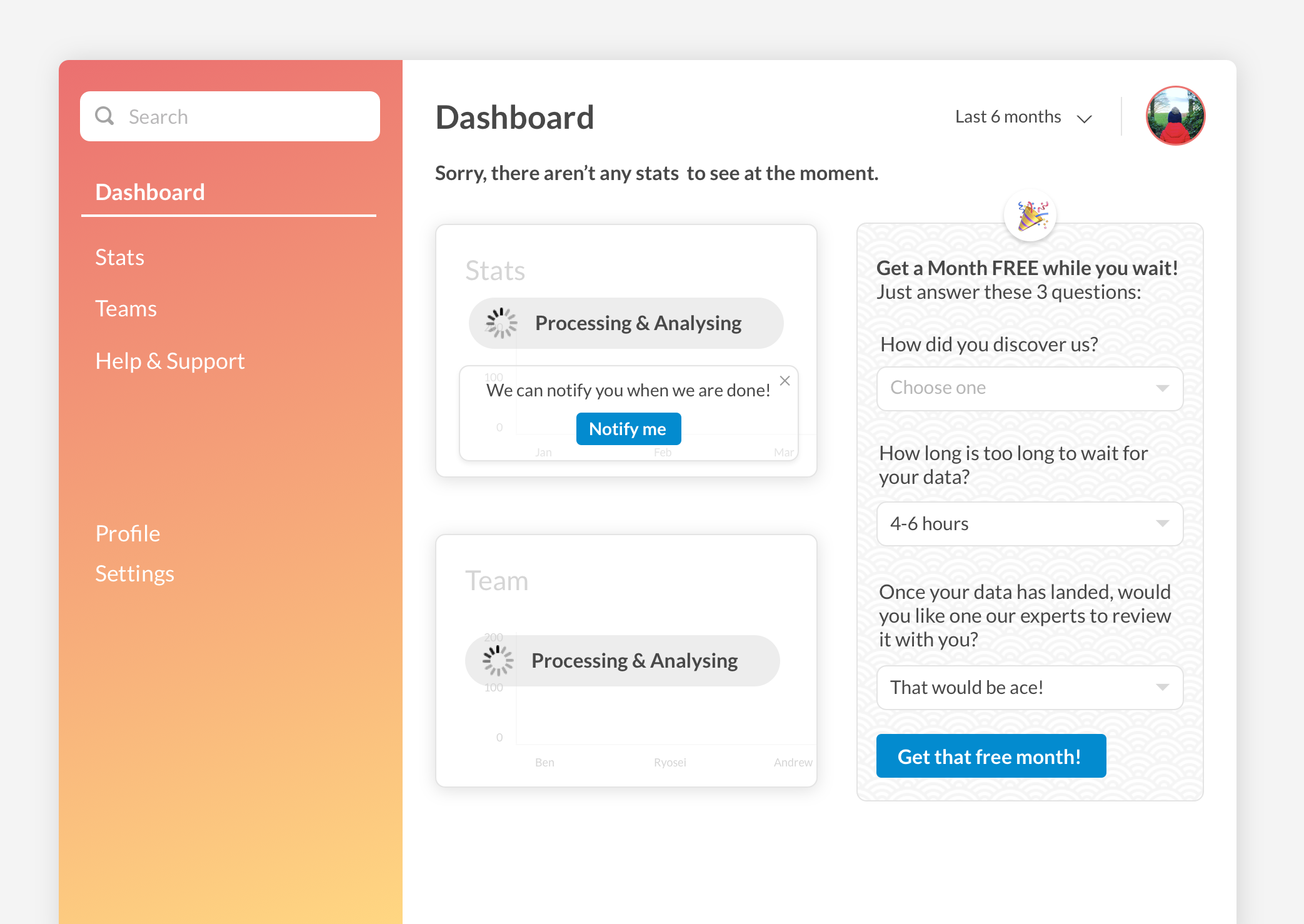
Dead ends can also happen as a natural order of your site or app. There might be scenarios in which users are met with a page that lacks content and no onward step due to the system not having had time to process data. Or maybe the data has not been created yet, as illustrated below:

So now what we want to do is make sure of two things:
- The user should understand why and what’s going on;
- Engage the user while they wait for the data.
Below is a friendly, valuable and useful fallback for both the user and for ourselves. The user is offered notifications to be sent to their email address — along with a month’s subscription free of charge! In return, we get to inform users when to come back to the app: happy users with a free month, and extra data on the users themselves. It’s always best when everyone wins!
Over time, we can start to understand if the majority of users do or do not want to have certain features, and whether they prefer to start turning them on by default or removing them completely. Also, information from surveys can help grow our understanding of users’ expectations of the app, and help us shape it to fit users’ needs.
Recommended reading: How To Improve Your Design Process With Data-Based Personas
Convert Grey Areas Into Insights
What I mean by ‘grey areas’ are areas that lack insight and clarity on what users might be doing or why users are making particular decisions. These are normally areas that aren’t of high priority to the site/app but are part of the key user journey. The more data we have through the user journey, the better we can understand the whats, whys and hows of users’ actions.
Example: Understanding Your “Other”
It is quite common practice to label something as ‘other’ when there isn’t a clear fit. Below is an example of this kind of UI, and as we analyze this scenario, it is clear that the only insight we have is that we know that the user is labeling this as a ‘other’ type, and that leaves us with little understanding of what it is or what they intended it to be.
Of course, we could investigate a little more about what is being labelled as ‘other’ and find some common lines, but we wouldn’t know what the user might have intended by labelling it that.
So, how can we change this scenario from being just another ‘other’ answer to something that is informative and useful to both user and us? An approach I would suggest is a little more complex but will make the experience a lot more engaging.
We want to allow users to either choose their option by clicking on the option that they know they want or by searching for what they think they are looking for. Why is this helpful? Well, when it comes to naming options, we might name them in quite a different way compared to how the user might have in mind. But if we still can’t offer the user an answer they’re looking for, then we should start a conversation with them by showing them a question and a text box, and ask them what it is that they are looking for and why. (Perhaps also add a line that we will follow up with them and find a solution to their needs.)
As we start to find common threads in the searches and responses we get, we can start to adjust the search to serve the user the option the most likely need, and we can also build new features as demand increases, too.
Example: Understand You Instant Search
Another grey area below is one example of myself using an instant search while looking for some keywords that are not associated with anything I have in my account.
From this experience, I asked myself the following questions:
- What’s the takeaway from this scenario?
- Can I find out how common this scenario is?
- What is the user trying to achieve?
- How can we help them get to where they want?
Below is the ‘No Results’ results window with a feedback loop to help us learn about the users’ needs. The search results are populated in a way which can bring insights into the users’ needs, and provide us with at least some clarity into what exactly it is that they are searching for with the ‘search in’ option.
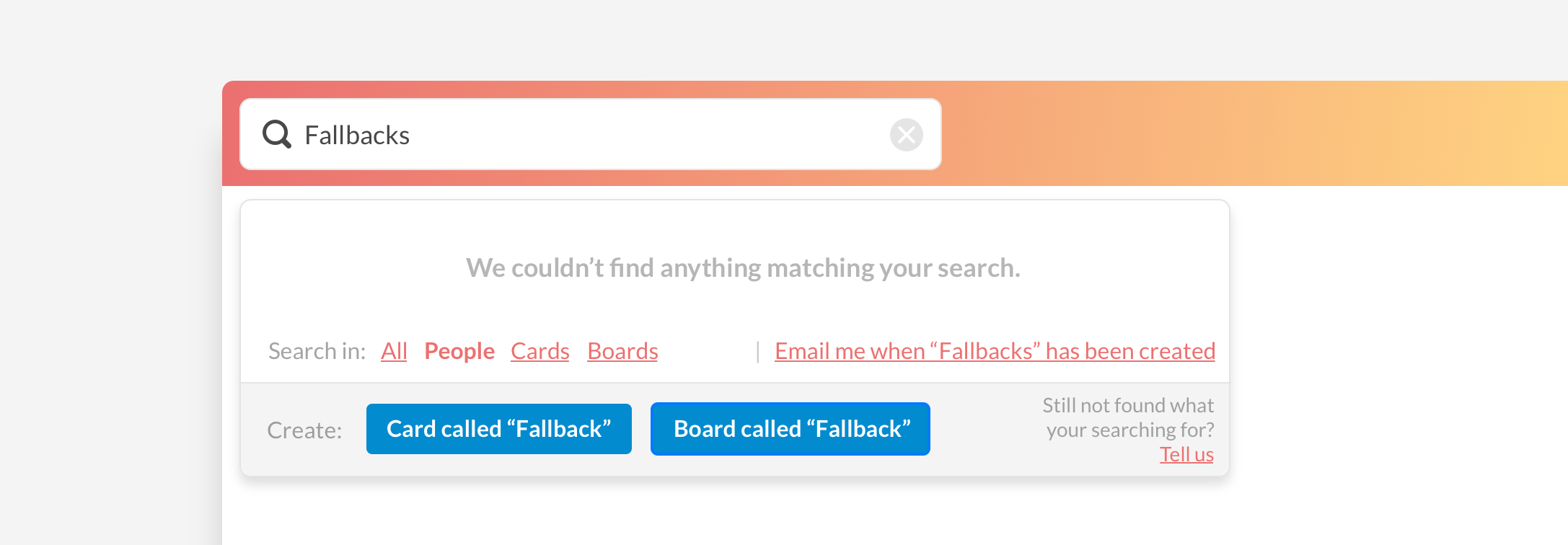
A few ways to engage your users would be:
- Offer common actions on your site or app for the user to create the content that they are looking for;
- Provide the option of them receiving a notification once the thing they had been looking for becomes available (this is a nice way to bring the user back at a later stage);
- Allow them to give straightforward feedback because sometimes talking to someone will solve everything (and a conversation is the best source of feedback).
We can learn and get smarter with the results we get from this feedback loop, as long as we start providing smarter category suggestiony to our users. Over time, personalized habits can be learned for individual users and we can start to suggest options that are more likely to resonate with that user because of their past actions and searches.
Make Your Errors Messages A Strength
Whether we choose to accept it or not, errors do happen. When they happen, we should know about them, but sometimes we can cater for errors in a generic way which doesn’t help us or the user.
An example of this is when the user could be interacting with your site or app where they are saving some sort of data to your system, but for some reason, the connection is lost and the process fails. There is little to diagnose what is going on or what has happened but we know there was an error. Standard procedure is to inform the user that an error has occurred and possibly to try again.
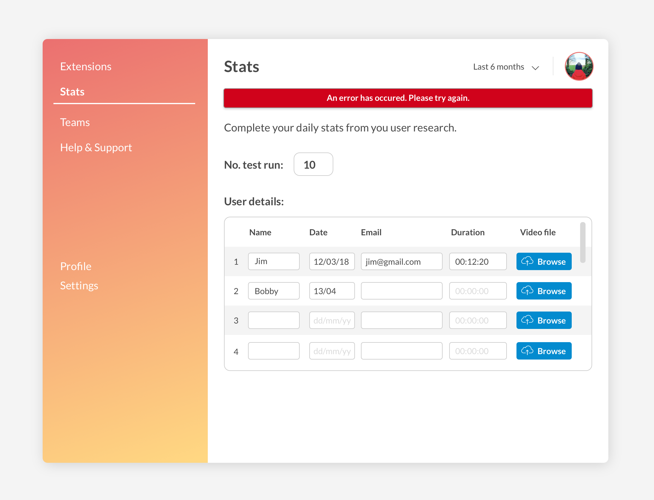
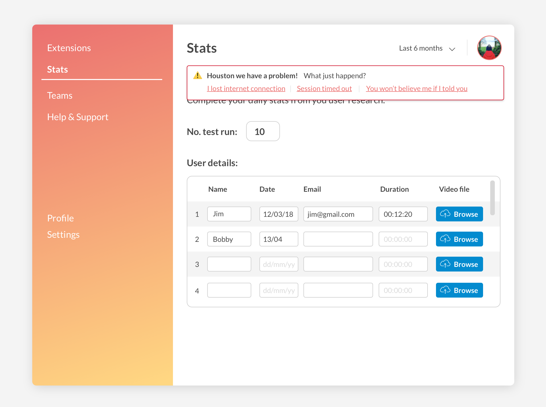
When we know little about the issue on our end, or that it could have been caused by a handful of things, then this is a great opportunity to get back some feedback from the user about what’s going on. I think this is the most simple fallback to implement, but one that I see the least of.
A typical scenario would be when something is being automatically saved while you are using the site or app. This is a growing scenario especially with mobile connections; understanding that your site is used by users on-the-go or on a mobile connection is a great insight, and we should try to gather that information as much as possible.
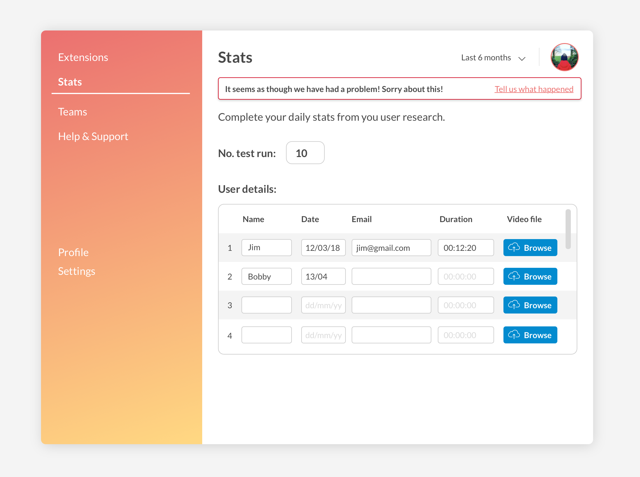
Or you could make it even simpler for the user. If you already have an idea of what the issue may be and would like to get a better idea of how often it has happened to the user, then serve them with options but still allow them to tell you what they’ve experienced. Once you have that information, you can then start investing your time in possible new features to help resolve those given issues and hopefully find yourself not having to show an error message at all.
Something important to remember is that a fallback doesn’t have to be a permanent feature, but it can be a temporary one to help you figure out what to ask or what to build next. It requires a little bit of investment and time to collect data, but these can be seen as test running in areas of your user journey that you have never looked into before, and will only add to the understanding of your users and their needs.
With all of this said, fallbacks in an ideal world would never exist. If you are working on a brand new project or reworking your user flow, set yourself the challenge of creating a flow where a user would never encounter scenarios like these. Consider how to prevent a user from ever searching for something that doesn’t exist. Track and analyze all areas of your user journey to understand each of their steps and formulate ways where an error message would never be shown.
Recommended reading: A/B Testing For Mobile-First Experiences
Where Are Fallbacks Costing You?
Fallbacks will look different depending on your product, as you will be asking different questions and offering different options, but they will all play a valuable role in exposing yourself and the users to better options and understanding.
What Next?
Why not take a few hours to look at your user journeys and document where the grey areas are, as well as look for dead ends and error messages that (still) exist in your product.
Here are some guides to get you started:
- Dead Ends
Start exploring your analytics and — if you aren’t already — get comfortable in there. The exit pages are normally tracked by default and will provide you with great insights to what stage your users are leaving the site. Think about where your users will be in their journey and consider the kind of needs they might have at those points. - Grey Areas
If you haven’t already, map out your user journey and start highlighting areas that you might have questions about. Consider the points in which your users are making decisions and think about the options you are giving them. Remember the “Other” option and think about where there might be any that are quite generic. Start tracking those options to see how often they are chosen, then start exploring the ways to get feedback from the users on what they want. - Errors
You can quickly work out where an error might be shown on your app. With a site/app that is saving, updating and working in real time, errors are possibly a key part to your system. Start by figuring out which area is most used, which could result in where errors are most frequently seen. Invest in the error messages there and start gathering feedback on why those are being shown — both from your system but also the user. I would also recommend creating a default error message with a feedback loop that would be used across the site for any new feature so that you will start learning from those errors from day one.
Happy fallback building!
Further Reading
- Modern Technology And The Future Of Language Translation
- Using AI For Neurodiversity And Building Inclusive Tools
- Mobile Accessibility Barriers For Assistive Technology Users
- Five-Second Testing: Taking A Closer Look At First Impressions (Case Study)


