Design At Scale: One Year With Figma

Email Newsletter
Weekly tips on front-end & UX.
Trusted by 182,000+ folks.
 Register for Free

 Celebrating 10 million developers
 Custom Web Forms for Angular, React, & Vue. Your backend.

This article will be about how large teams can benefit from using more open, collaborative tooling and how to make adoption and migration feasible and pleasant. Also, in case you didn’t guess from the title of the article just yet, a lot of it will be about Figma and how we succeeded at adopting this design tool in our team.
The intended audience is experienced designers working in larger teams with design systems, developers or product managers looking to improve the way cross-functional teams work in their organization.
I’ve been using design tools in a professional setting for over ten years and am always trying to make teams I’m serving work more efficiently and more effectively. From scripting and actions in Photoshop, to widget libraries in Axure, to Sketch plugins, and now with Figma — I’ve helped design teams stay on the cutting edge without leaving developers or product managers behind.
Basic knowledge of design systems and tools will be helpful, but not necessary as I hope to share specific examples and also “high level” concepts and methods that you can adapt for your team or context.
Our Design Workflow Circa 2015
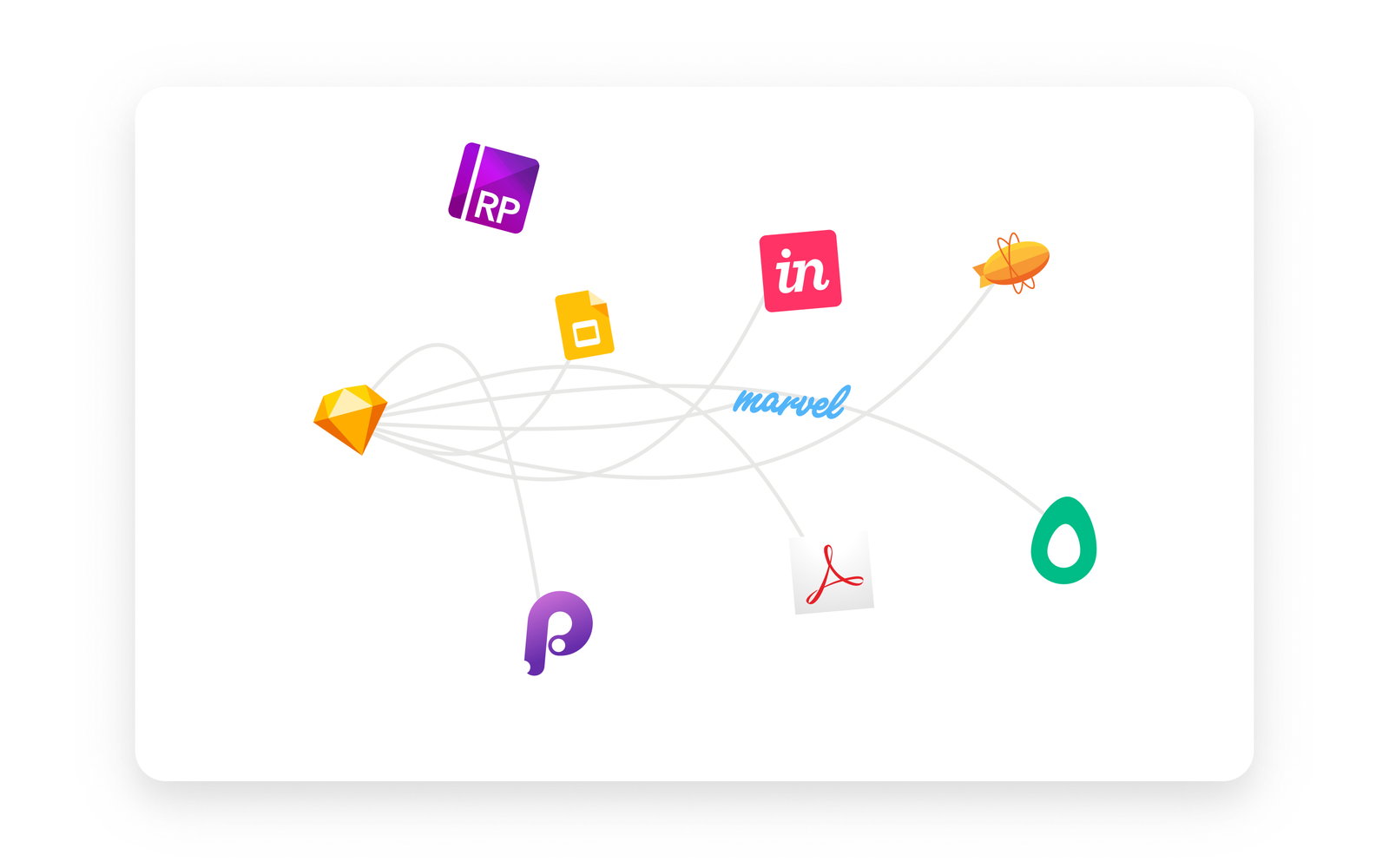
Our primary tool in 2015 was Sketch, and that’s pretty much where the commonalities stopped. We all had different methods of prototyping, exporting, and sharing designs with stakeholders (InVision, Axure, Marvel, Google Slides, and even the antiquated Adobe PDF) and developers (Avocode, Zeplin, plugins without standalone apps like Measure). On rare occasions, we could send files directly to the engineers who were lucky enough to have the rare combination of a MacBook and a Sketch license.
When InVision released the Craft plugin, we were overjoyed — being able to prototype and upload screens from Sketch into InVision, sharing components and styles in nascent libraries across files — it was the designer’s dream come true.
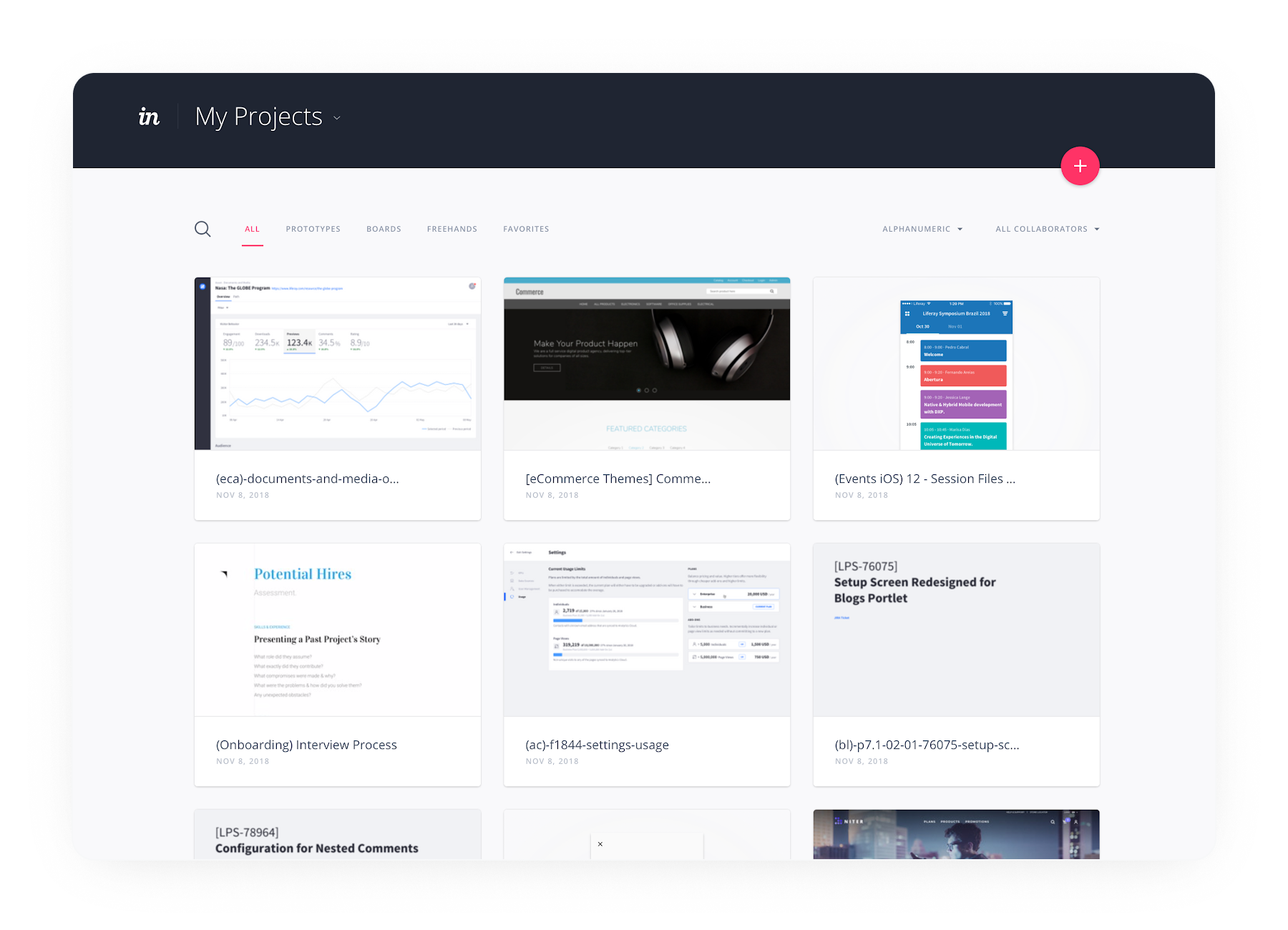
Eventually, we all converged on the InVision platform. We created and documented the processes that helped reduce much of the friction in stakeholder collaboration and developer handoff. Yet, due to the complex permissions structure, InVision remained a closed ecosystem — if you weren’t a designer, there was an approval chain that made it difficult to get an InVision account, and once you got an account, you had to be added to the right groups.
Manually managing versions and files, storing and organizing them in a shared drive, and dealing with sync conflicts were just a few of the things that caused us many headaches.
Could we really have an all-in-one tool that had all the best features of Sketch and InVision, with the real-time collaboration and communication features found in Google Docs? In addition to reducing overhead from context switching, we could also potentially simplify from three tool subscriptions (for mockups, prototyping, and developer handoff), to only one.
The Process
The first designers from our team to adopt Figma started experimenting with it when the first Figma beta was released in 2016. The features were limited but covered 80% of what we needed. Sketch import was buggy, but we still found immense value in being able to collaborate in real-time and most importantly, we could do 90% of the design work for a project inside a single tool. Stakeholder feedback, revisions, and developer handoff improved exponentially.
By 2017, we had a few designers using it for most of their work, and one of the Lexicon designers (Liferay’s design system), Emiliano Cicero, was quickly becoming an evangelist — which turned out to be a key factor in convincing the rest of the team to make the switch.
When Figma 2.0 debuted in the summer of 2017 with prototyping features added and huge improvements to the developer handoff capabilities, we knew this could be a viable tool for our global team. But how do you convince 20+ designers to abandon tools and workflows they love and have used comfortably for years?
I could write a series on that subject, but I’ll summarize by saying the two biggest things were: starting small, and creating a solid infrastructure.
Starting Small
In the fall of 2017, we started our first trial of Figma with a product team distributed between the United States and Brazil. We were fortunate to have a week-long kickoff together in our Los Angeles office. Designing flows and wireframes together in Figma was so much faster and more efficient. We were able to divide up tasks and share files and components without having to worry about constantly syncing a folder or a library.
At our [global gathering]() in January 2018, we formulated a plan to slowly adopt Figma, using this team’s experiences to help form the infrastructure we’d need for the rest of the organization so that migration would be as seamless as possible.
The biggest challenge we faced was a tight deadline — it didn’t make any sense for us to rework our review and handoff process due to the scale of the project with multiple engineering teams and product managers distributed around the world. Even though the end result would have been better, the timing wasn’t right. Another factor was Figma’s lack of a reliable offline design experience (more on that later), and for these reasons, the team decided to use Sketch and Figma for wireframes and mockups, but any prototyping or review had to be done in InVision.
Creating A Solid Figma Structure
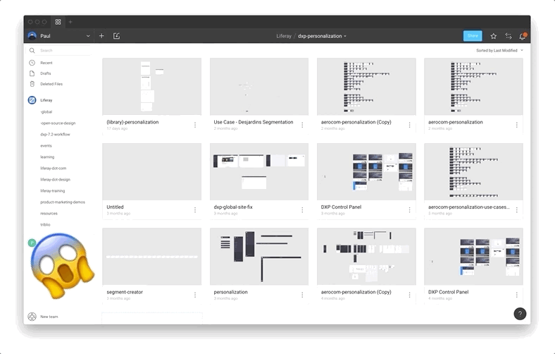
One of the first steps was formulating rough guidelines for the project, file, and component organization. The foundation for these things was started by two junior (at the time) designers, Abel Hancock and Naoki Hisamoto, who never developed the bad layer-naming habits that seem to come from designers who cut their teeth in Photoshop. This method for organization, coupled with a year spent developing a small library of components for Liferay.com properties, was critical to setting the rest of the global team up for success.
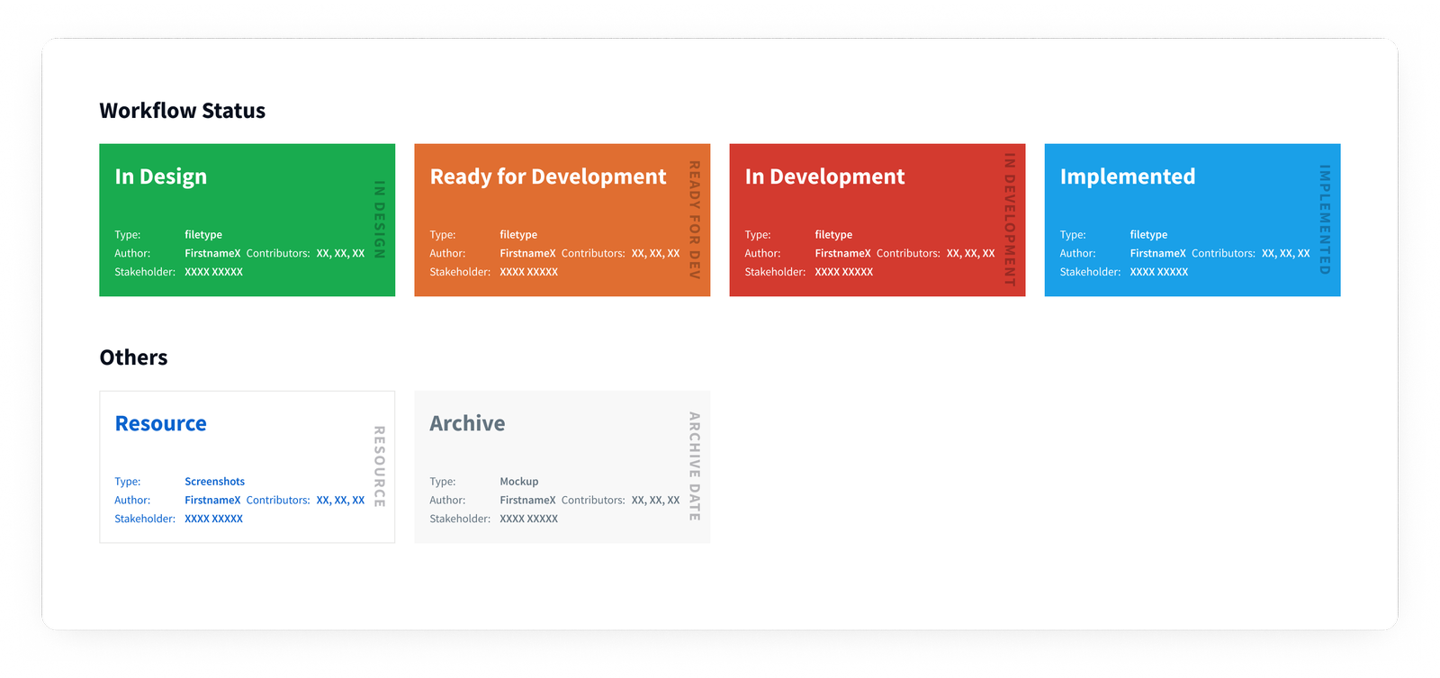
An early organizational improvement created by one of our Liferay.com designers, inspired by Ben’s tweet, was our system of covers.
We’ve made this file available if you’d like to copy it, otherwise it’s a pretty straightforward hack:
- Create a single frame in the first page of your file that’s 620×320.
- Add your design. If you have text, we found that the minimum size is ~24, the titles in our examples are set at 48.
- Enjoy!
Note: There will always be a slight margin around your cover, but if you set the page canvas the same color as the card, it will reduce the appearance of this margin.
This helped transform our library, not just for designers, but for project and product managers and engineers who are trying to find things quickly. The search functionality was already really good, but the covers helped people narrow things down even faster, plus it allowed us to instantly communicate the status of any given file.
Prior to using Figma, in addition to a ‘Master’ design system Sketch file, most designers had base files they had developed over time with things like wireframing elements and basic components. As we coalesced into a single pattern, we started to combine everything and refined them into a single library. Since we were doing wireframes, mockups, and prototypes in Figma, we also started to abandon flow apps like Lucidchart, instead of making our own task flow components in Figma.
Other utilities that we developed over time were redline components for making precise handoff specs, sticky notes for affinity diagrams (and just about anything), and flow nodes.
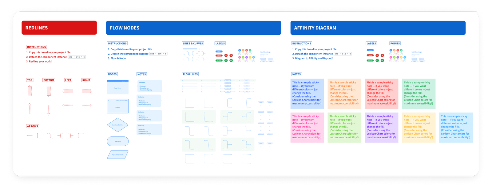
One of the biggest benefits of doing this in Figma, was that improvements to any of these components that any designer made could easily be pulled into the library and then pushed out to all instances. Having this in a centralized place also makes maintenance a lot easier, as anyone on the team can contribute to improvements with a relatively simple process.
A redline document is for making it easier for the developer to know the dimensions, visual specs, and other properties of a UI component or a set of components. If you’re interested in the topic, you can also check Dmitriy Fabrikant’s article about design blueprints.
Some recommendations to keep in mind when creating components:
- Use of overrides and masters for powerful base components (more on that here);
- Establish a consistent pattern for naming (we use the atomic model);
- Document and label everything — especially layers.
With the advanced styling features released at the beginning of June 2017, the systems team finished a complete version of our Lexicon library in between our big product releases in July and the ramp-up in August. This was the final piece we needed to support the global team. Designers working in Marketing and other departments had already been using Figma for some time, but by last Fall almost all of the other product teams had finalized the move over to Figma.
As of today, most of the product designers are only using Figma, there are also a couple of designers that are working in legacy systems with lots of existing, complicated Sketch prototypes that aren’t worth importing to Figma. Another exception is a few designers that occasionally use apps like Principle or Adobe After Effects for more advanced animation that wouldn’t make sense to do in Figma. We even have a few designers exploring Framer X for even more robust prototypes, especially with work that requires leveraging any kind of data at scale. While there are some designers using multiple tools on a semi-regular basis, 80% of our product designers are using Figma for all of their design and prototyping work.
Continuous Improvements
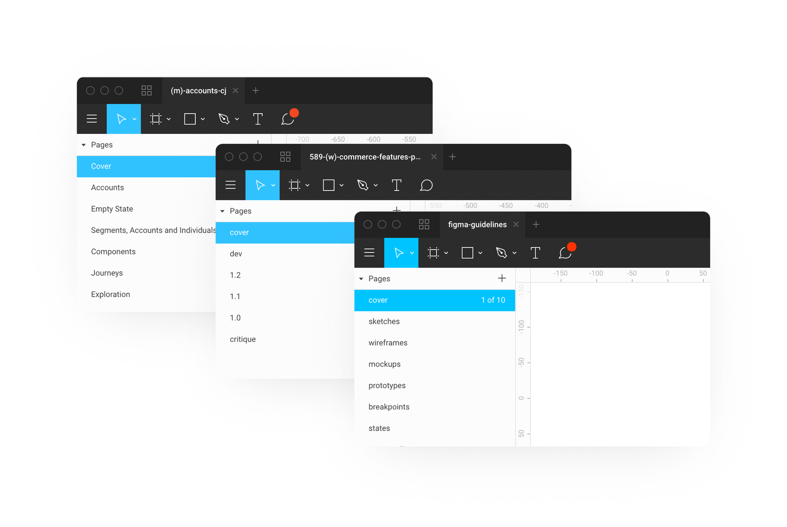
We’re always working on ways to work more effectively, and one of the current things we’re iterating is best practices for naming pages. At first, we named pages according to the page name, but that proved problematic, plus, as we improved our libraries, the need for larger files with multiple pages was reduced.
Currently, we’re using a numbering system within files, with the top-most page being what’s delivered to the developers. The next phase we’re discussing nowadays is making the versions more meaningful with explicit labels (wireframes, mockups, breakpoints, etc.) and making better use of Figma’s built-in versioning, establishing best practices for when and how to save versions.
Final_Final_Last_2 — No More!
I generally hate to use the term ‘game-changer’, but when Figma released naming/annotating to the version history last March, it dramatically changed the way we organized our files. Previously, we all had different ways of saving iterations and versions.
Usually we would create new pages within a single file, sometimes with large files we would duplicate them and add a letter at the end of the filename to signal an iteration. If you were going to make drastic changes, then you might create a new file and append a version number. This was very natural, coming from the Photoshop/Sketch paradigm of managing multiple files for everything.
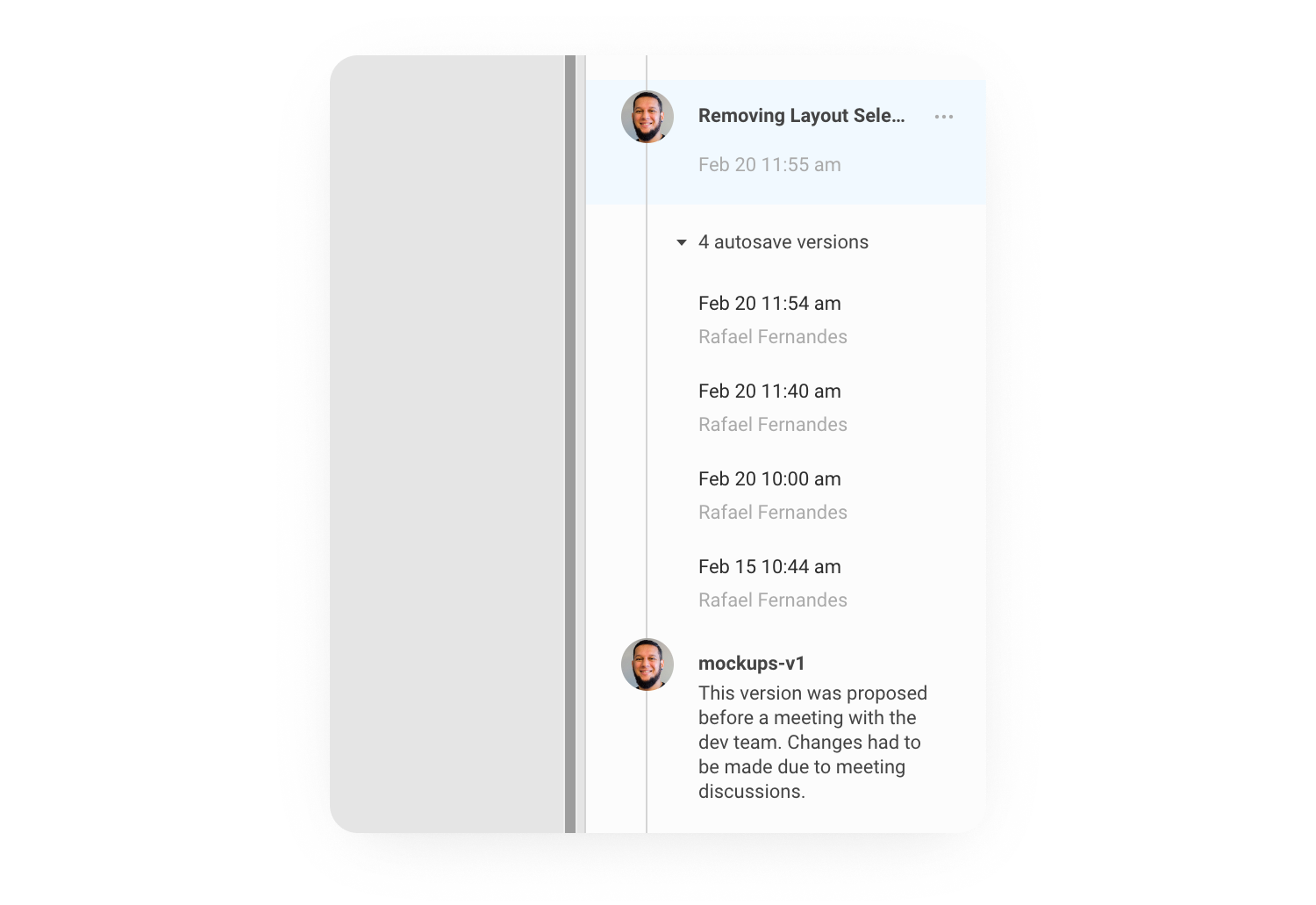
The ability to work, periodically pausing to name and annotate a point in time will be very familiar for anyone who has used a version control like Git before. You can even look at the whole file history, and go into past snapshots, pick one out and name and annotate it.
If you want to go back and revert to a past version, you can restore it and work on that file from that point in the history. The best part is that you didn’t lose any of the work because the version you ‘restored’ wasn’t deleting anything; it was simply copying that state and pasting it at the top.
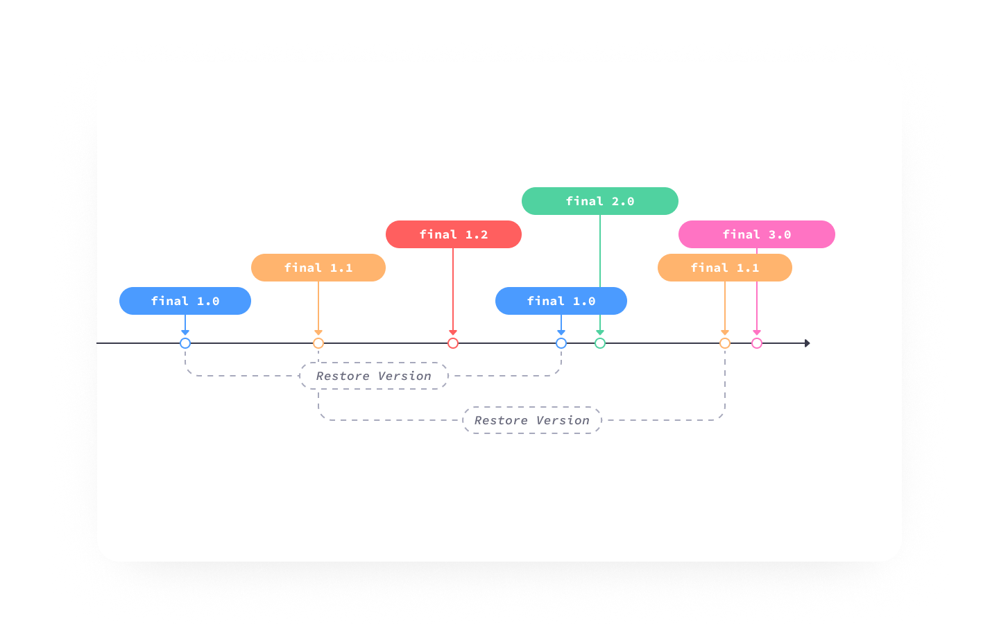
In this illustration, the designer arrives at final 3.0 after restoring final 1.1, but the file version history is still completely visible and accessible.
In cases where you’re starting a new project, or want to make some really dramatic changes to the file, it can be necessary for you to ‘fork’ the file. Figma allows you to duplicate a file at any given point in the history, but it’s important to note that the file history will not be copied.
We’ve found that a good way to work in this versioned system is to use your file history in a similar way to how a developer uses git — think of a Figma version as a commit or pull-request, and name and annotate them as such. For more, smarter thoughts on this, I recommend Seth Robertson’s Commit Often, Perfect Later, Publish Once: Git Best Practices — this is a good general philosophy for how to work in a version-controlled ecosystem. Also, Chris Beams’s How to Write a Git Commit Message is a great guide to writing meaningful and useful notes as you work.
Some practical tips we’ve discovered:
- Keep titles to 25 characters or less.
Longer titles are clipped and you have to double-click on the note in the version history to open up the ‘Edit Version Information’ modal to read it. - Keep your description to 140 characters or less.
The full description is always shown, so keeping it to the point helps keep the history readable. - Use the imperative mood for the title.
This gives the future you a clearer idea of what will happen when you click on that point in time, e.g. “changing button colors to blue” vs. “change buttons to blue.” - Use the description to explain ‘what’ and ‘why’ versus ‘how’.
Answering the ‘why’ is a critical part of any designers job, so this helps you focus on what’s important as you’re working as well as provide better information for you in the future.
Working Offline
Disclaimer: This is based on our own experience, and a lot of it is our best guess as to how it works.
As I mentioned before, offline support in Figma is tenuous. If you already have a file open before going offline, you can continue working on the file. It seems like each change you make is timestamped. In the case of someone else working on the same file while you were offline, then the latest change will be the one rendered once you do come back online.
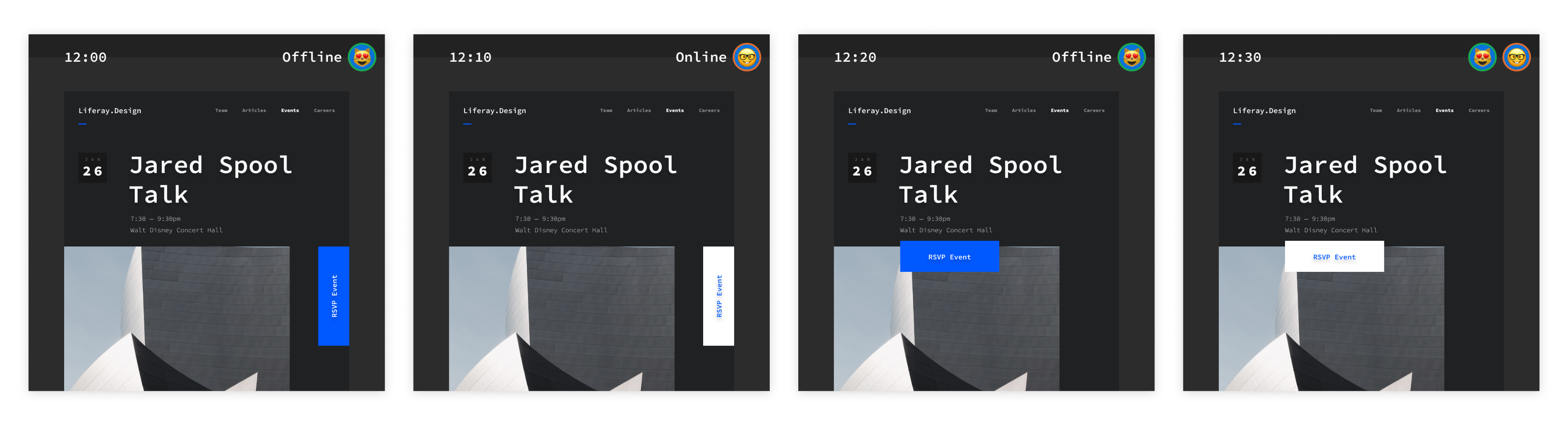
In this simple example, it doesn’t seem like too big of a deal — but in real life, this can get really messy, really fast. In addition to the high possibility of someone overriding your work, frames and groups could get stacked on top of one another.
Our workflow is to duplicate the page before (or after) going offline, and then do your work in that copy. That way it will be untouched when you come back online, and you can do any necessary merges manually.
“F” Is For Future
Adopting a new tool is never easy, but in the end, the benefits may far outweigh the costs.
The biggest areas of improvement our team has experienced are:
- Collaboration
It’s much easier to share our work and improvements with the team and community. - Transparency
A system that is open by default is naturally more inclusive to people outside of the field of design. - Evolution
Removing the “layers” between designers and engineers, enabling us to take the next step in design maturity. - Operations
Adopting a single tool for wireframes, mockups, prototypes, and developer handoffs makes life easier for accounting, IT, and management.
Reducing the overall number of subscriptions was really helpful for our team, but as costs can vary from ‘free’ to over $500 per year this might not make sense for your specific context and needs. For a full breakdown, see Figma’s pricing page.
Grow And Get Better
Of course, no tool is perfect, and there’s always room for improvements. Some things that were missing from previous tools we used are:
- No plugin ecosystem.
Sketch’s extensibility was a huge factor in making the switch from Photoshop a no-brainer. Figma does have a web API, but currently, there is no ‘write’ functionality. For now, Sketch remains the market leader with its vibrant community of extensions and plugins. (Of course, things might change in the future in case Figma opens the stage for plugin development as well.) - Importing web, or JSON data in prototypes.
It would be a lot easier for us to design with real data. Sketch recently introduced a “Data” feature in v.52, InVision’s Craft plugin is still very much the gold standard when it comes to easily addxing large amounts of different data — and for now, we’re stuck manually populating text fields. - More motion.
The Principle integration is nice (if you have Principle), but having basic animation and advanced prototyping features in Figma would be a lot better. - A smoother offline experience
As mentioned previously, as long as you have the Figma file open before going offline, you’re fine. This is probably OK for most people — but if you like to shut down your computer every night, it can be painful when you open it in the morning on a train or airplane and realize you forgot to leave Figma open.
Open-Source Design
A few months ago, the always controversial Dann Petty recently tweeted about developers having GitHub, photographers having Unsplash — but designers not having a platform for sharing things for free. Design Twitter™️ swooped in and he deleted his tweet before I could get a screengrab, but one thing I’d like to mention is that what we’re very passionate about at Liferay, is open source. To that end, we’ve created a Figma project for resources to share with the design community.
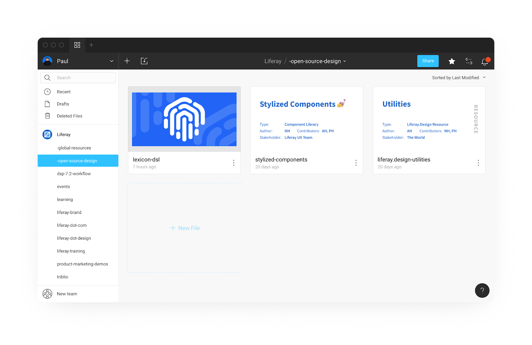
To access any of these files, check out liferay.design/resources/figma, and stay tuned as we grow and share more!
Other Resources
- “Our First 6 Months With Figma,” Danny Saltaren
- “Waiting For A Sign To Start Building Your Design Team’s Component Library?,” William Newton
- “How To Streamline Your UI/UX Workflow With Figma,” Nicole Saidy
- “Getting Started With Teams In Figma Organization,” Thomas Lowry
- “5 Ways To Structure Your Workflow With Pages In Figma,” Josh Dunsterville
- “Best Practices: Components, Styles, And Shared Libraries,” Thomas Lowry
- “Figma: A Fluid And Modular Design Approach To Typography With Components,” Mirko Santangelo
- Figma Community on Spectrum
- Figma Design Handbook by David Ukauwa
Further Reading
- Unexpected Learnings From Coding Artwork Every Day For Five Years
- An Efficient Design-to-Code Handoff Process Using Uno Platform For Figma
- How Developers Can Strengthen Their Mental Health Amidst High-Pressure Projects
- Moving From Sketch To Figma: A Case Study Of Migrating Design Systems
 (mb, yk, il, mrn)

