Privacy UX: Common Concerns And Privacy In Web Forms

Email Newsletter
Weekly tips on front-end & UX.
Trusted by 182,000+ folks.


 Custom Web Forms for Angular, React, & Vue. Your backend.
 Celebrating 10 million developers
Many conversations in our industry tend to circle around strong opinions and universal answers. Choosing a shiny new technical stack or sticking to an old-school paradigm; betting on a trendy framework or building a custom light framework of your own; using an attention-grabbing pop-up or sticking to calmer, less annoying solutions. We tend to have strong opinions about design and development, and so we agree and disagree, and argue endlessly, trying to protect and explain our views. Sometimes (and maybe a bit too often) to the point that conversations escalate and result in annoyingly disgruntled camps not agreeing on anything.
It’s not the stubbornness that brings us there, though. It’s the simple fact that we all have different backgrounds, expectations, and experiences. But sometimes we end up debating answers that are all acceptable and seeking the ultimate truth in a place where it really can’t exist. This pattern shows up for the usual suspects: accessibility, performance, tooling, workflows, and naming conventions. It also repeats itself with topics that are often considered to be ephemeral: ethics and privacy.
In the past, these topics could be spotted sporadically on the remote fringes of Twitter threads and blog posts. These days we’ve become very aware of the frightening dimensions that collection and use of personal data have gradually and silently gained. So we’ve started fighting back. Fighting back by publicly complaining about privacy-related dark patterns, unsolicited emails, shady practices, strict legal regulations, and ad-blocker wars against disruptive ads from hell. Of course, these are all important conversations to have and raising awareness is important; but we also need an applicable, pragmatic approach for designing and building ethical and respectful interfaces within our existing, well-established processes. We could use a few established patterns to bake in privacy-aware design decisions into our interfaces by default.
As a part of Smashing consultancy and teaching at universities and schools, over the last several months I was privileged to run interviews with 62 customers of various ages and experiences in Belgium, the Netherlands, Germany, Ukraine, USA, Serbia, Bosnia-Herzegovina, Austria, and Canada. My objective was to ascertain the role privacy plays for users these days, and how the interfaces we so thoroughly craft are perceived when it comes to various touchpoints. The findings from these interviews are the foundation of this article series.
In this four-part series, we’ll explore some of the respectful ways to approach privacy and data collection, and how to deal with notorious GDPR cookie consent prompts, intrusive push notifications, glorious permission requests, malicious third-party tracking, and offboarding experience:
- Part 1: Privacy Concerns And Privacy In Web Forms
- Part 2: Better Cookie Consent Experiences
- Part 3: Better Notifications UX And Permission Requests
- Part 4: Privacy-Aware Design Framework
Why Aren’t Privacy-Aware Interfaces A Default?
Imagine a beautiful, authentic historical street, paved with half-broken cobble stones, tiny vintage stores, and flourishing flowers randomly placed across the pathway. Sauntering along such charming streets is a wonderful experience, full of smells and sounds of the city that aren’t easy to capture in the daily stream of mundane tasks.
Now imagine the very same street packed with lookalike merchandise farms stacked right next to each other, plastered with promotional posters, blinking advertising, loud music, and repeating marketing messages fighting for your attention over and over and over again. Compared with the previous experience, that’s very different, and most likely much less enjoyable.
Unfortunately, in both of the scenarios above, the more often we walk down that same street, the more we become accustomed to what’s happening, and in the end these experiences become normal — and even expected — along that path. Over time, we tend to get used to the way things appear and function, and especially when it comes to advertising, over time we’ve learned fairly well how to dismiss the marketing messages streaming endlessly and loudly our way.
Not all marketing messages are ineffective, of course; in fact, most people are receptive to them, mostly because they are literally everywhere, often heavily personalized and hence relevant. We see them as an unnecessary evil that enables and finances our experience, be it reading an article, playing a game or watching a video. What came along with it, though, isn’t just visual noise and a substantial performance footprint of adverts, but also ever-increasing tracking, collection, and ongoing evaluation of private data.
“
As a result, many of the online experiences we attend to on a daily basis feel more broken and frustrating than refreshing and inspiring. Over years of daily training on the websites we love and hate so much, we’ve got used to it — and many of us no longer notice how distracting, invasive, and disrespectful the websites have become.
While boring pop-ups and annoying blinking ads might be easy to ignore or dismiss, sneaky push notifications, ambiguous copywriting, shady backdoors in seemingly friendly apps, and deceptive ads camouflaged as parts of the UI are nothing but a notorious, well-executed hustle. Not many website owners would willingly impose this kind of experience on their customers, and not many customers would knowingly return to a website that shared their private data for retargeting or reuse. With such experiences, trust and loyalty are at stake, and these days they are extremely rare and precious values that are hard to reacquire once they are lost.
If we ask ourselves why honest interfaces haven’t made a breakthrough yet, bypassing and pushing away all the culprits out there, it’s not easy to find an answer at first. It’s not that designers want to manipulate customers, or that developers want to make experiences slower, or that marketeers are happy to endlessly frustrate and confuse users’ experience for the sake of one-off campaigns.
In a world where every brand demands immediate and uninterrupted attention, attention has become incredibly scarce, and so competing against loud guerrilla campaigns with a subtle, humble marketing message might feel remarkably inferior. Clever, subtle campaigns can be effective, but they need to be constantly invented anew to remain interesting — and there is no guarantee they actually will work. On the other hand, it’s much easier to rely on solutions that worked well in the past — they are predictable, easy to measure, and not too difficult to sell to clients.
In fact, we tend to rely on predictable A/B tests that give us clear answers for measurable, quantifiable insights. But when it comes to ethics and the long-term impact of an interface on loyalty and trust, we are out there in the blue. What we are missing is a clear, affordable strategy for meeting business requirements without resorting to questionable practices that proved to be effective in the past.
In most conversations I’ve had with marketing teams over the years, the main backlash against all the UX-focused, customer-protective changes in marketing was the simple fact that marketing teams didn’t believe for a second that they could be as competitive as good ol’ workhorse techniques. So while, of course, calm, ethical, and privacy-aware interfaces would benefit the user, moving away from the status quo would massively hurt business and make companies less competitive.
Sadly enough, they might be right. Most of us use well-known services and websites that have all the despicable practices we so love to hate. Tracking, and collection and manipulation of data are at the very core of their business models, which allow them to capitalize on it for advertising and selling purposes. In fact, they succeed, and for many users, trading privacy is an acceptable cost for all the wonderful benefits that all those giants provide for nothing. Beyond that, moving away from these benefits is remarkably hard, time-consuming, and just plain painful, so unless a company hurts its users on a level that goes way beyond harvesting and selling data, they are very unlikely to leave.

Many of you might remember the golden days when the first mobile interfaces were clunky and weird and slow, and when everything seemed to be out of place, and we were desperately trying to fill all those magical rectangles on shiny new mobile phones with adaptive and pixel-perfect layouts.
Despite good intentions and wondrous ideas, many of our first interfaces weren’t great — they just weren’t good executions of potentially great ideas. As time passed, these interfaces slowly disappeared, replaced by solutions that were designed better, slowly carved out of thorough efforts in research and testing, and gradual, ongoing refinements. It’s rare we see and regularly use some of those old interfaces today. Sometimes they remain locked up in app ecosystems, never updated or redesigned, but the competition pushed them away hastily. They just aren’t competitive enough, because they weren’t comfortable enough to enable users to reach their goals.
I wonder if the same will happen with the new wave of privacy- and ethics-aware applications. Well-designed, small applications that do simple tasks very well, with a strong focus on ethical, respectful, and honest pixels, without shady backdoors and psychological tricks. We can’t expect giants to change overnight, but once these alternative solutions start succeeding, they might be forced to refine their models in response. I strongly believe that taking good care of users’ data can be a competitive advantage and a unique selling proposition that no other company in your niche has.
For that to happen, though, we need to understand common pain points that users have, and establish interface patterns that designers and developers could easily use. We’ll start with common privacy concerns and seemingly obvious interface components: privacy-related issues often raised in web forms.
Eliminating Privacy Concerns
So you designed a wonderful new feature: an option to connect your customers with their friends by importing contacts from Facebook, LinkedIn, Twitter, or perhaps even their contact list. Imagine the huge impact on your sign-ups if only a fraction of your existing customers choose to use the feature, connecting with dozens and hundreds of their friends on your wonderful platform! Unfortunately, the feature is likely to have difficulties taking off, not because it isn’t designed well, but because of the massive abuse of privacy that users have been exposed to over the years.
Remember that awkward conversation with a few friends wondering about an unusual invitation they received from you the other day? You didn’t mean to annoy your friends, of course, but the service you’ve just signed up to was happy to notify your friends on your behalf, without your explicit permission. Perhaps recommended default settings during installation contained a few too many checkboxes with ambiguous labels, or perhaps the app just wouldn’t work correctly otherwise. You didn’t think anything at the time, but you’ll definitely think twice next time, before leaving all of those checkboxes opted-in.
In general, when asked about what kinds of privacy issues customers seem to be worried about, the following concerns have been raised, in order of magnitude or severeness:
- Tracking and evaluating user preferences, location, etc.
- Convoluted privacy policy changes
- Lack of trust for free or freemium services
- Disturbing and annoying advertising in apps or on websites
- Targeting with commercial and political messages
- Unwanted notifications and marketing emails
- No proper control of personal data
- Exposing personal preferences to third parties
- Difficulty to delete personal details
- Difficulty to cancel or close account
- Safety of stored data on servers
- Uploading a photo of a credit card or passport scan
- Use of personal data for commercial purposes
- Exposing private messages and emails publicly
- Exposing search history publicly
- Social profiling by potential employers
- An app posting on user’s behalf
- Difficulty to export personal data
- Difficulty to cancel a subscription
- Hidden fees and costs not explicitly mentioned
- Importing contact details of friends
- Trolling and stalking online
- Data breach of login, password, and credit card details
- Hacked Gmail, Facebook, Twitter, or Instagram accounts
It’s quite astonishing to see how many concerns our humble interfaces raise, producing doubt, uncertainty, and skepticism in our customers.
They don’t come out of nowhere, though. In fact, conversations about privacy often share a common thread: dreadful previous experiences that users had to learn from — the hard way. Usually it’s not those password input nightmares or frustrating CAPTCHAs; instead, it’s credit card fraud after an online purchase, and never-ending emails from companies trying to lure you in; and unsolicited posts, check-ins, and recommendations graciously posted on user’s behalf. So it shouldn’t be very surprising that for most customers the default behavior and response for pretty much any request of personal data is “Block,” unless the app makes a strong, comprehensible case of why the permission should be granted.
This goes for importing contacts as much as for signing in with a social login: nobody wants to spam their friends with random invitations or have an app polluting their profile with automated check-in messages. On the other hand, anonymous data collection always wins. Whenever the word “anonymous” made its appearance in privacy policies, security updates, or web forms, customers were much less reluctant to share their personal data. They understood that the data is collected for marketing purposes, and wouldn’t be used to target them specifically, so they had no issues with it at all across the board. So if you need to gather some data, but don’t need to target every individual customer, you are likely to cause fewer concerns with your customers.
In our interviews, users often spoke about “being burned in the past,” which is why they tend to be careful when granting permissions for any kind of data or activities online. Some users would have a dedicated credit card for online purchases, heavily protected with 2-factor authorization via their phone; others would have dedicated spam or throwaway email address for new accounts and registration, and yet others would never share very personal information in social networks. However, all these users were in a small minority, and most of them changed their attitude after they had experienced major privacy issues in the past.
We have to design our interfaces to relieve or eliminate these concerns. Obviously, this goes very much against dubious practices for tricking customers into posting, sharing, engaging, and adding value to our platforms, hence exposing their personal data. This might also work against the business goals of the company that is heavily dependent on advertising and maximizing customer fees. However, there is a fine line between techniques used to keep users on the site and exploiting their privacy. We need to eliminate privacy concerns, and there are a few straightforward ways of doing so.
Privacy In Web Forms
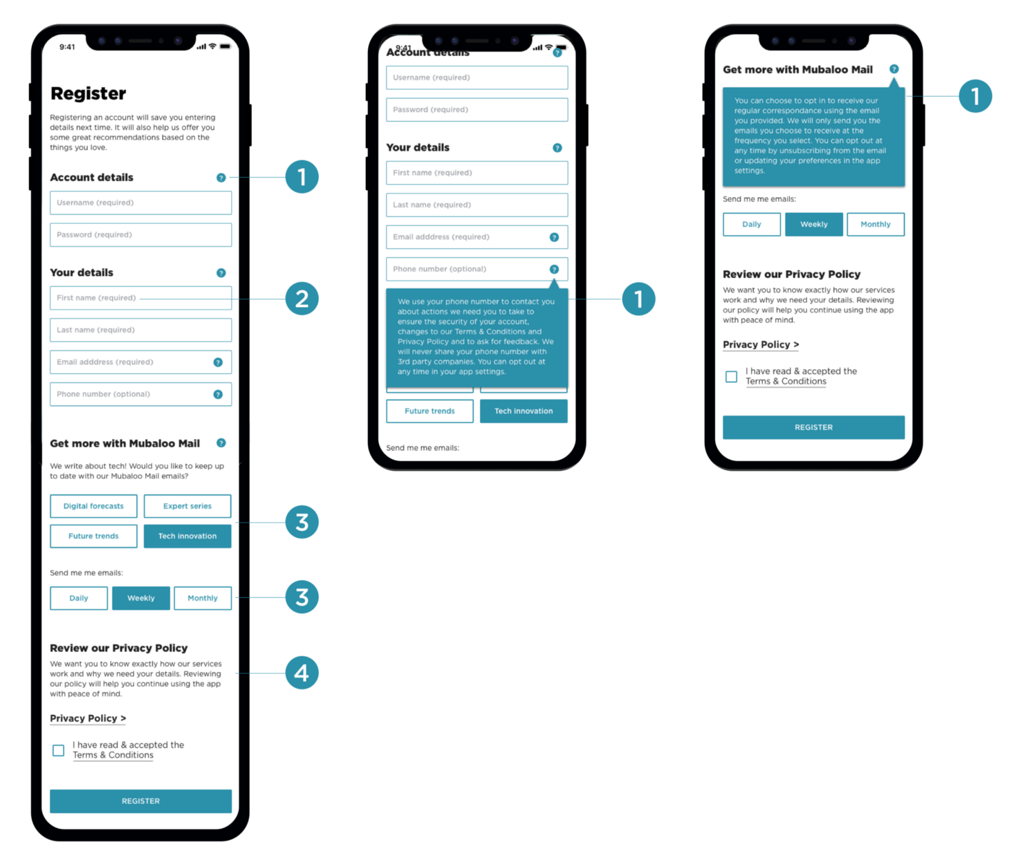
While it’s been a good practice to avoid optional input fields and ask only for the information required to complete the form, in the real world web forms are often poisoned with seemingly random questions that appear absolutely irrelevant in the user’s context.
The reason for this isn’t necessarily malicious in intent, but rather technical debt, as the site might be using a site-wide component for all forms, and it simply doesn’t allow for enough flexibility to fine-tune the forms appropriately. For example, when asking the user for their name, we’ve become accustomed to breaking a full name into first name and family name in our forms, sometimes with a middle name in between.
From a technical perspective, it’s much easier to save structured data this way, but when asking for a person’s name in a real-life conversation we hardly ever ask specifically for their first name or last name — instead we ask for their name. In some countries, such as Indonesia, the last name is very uncommon, and in others a middle name is extremely rare. Hence, combining the input into a single “Full name” input field seems most plausible, yet in most web forms out there, it’s rarely the case.
That means that in practice, seemingly random questions have to be asked at times, even though they aren’t really required. On the other hand, marketing teams often need personal information about their customers to be able to capture and present the reach and specifics of the audience to their potential advertisers. Gender, age, preferences, habits, purchasing behavior and everything in between falls under this category. And that’s not the kind of data that users are happy to willingly hand over without a legitimate reason.
When running interviews with users, we’ve identified a few common privacy-related data points that were considered to be of a “too private, too intrusive” nature. Obviously, it heavily depends on the context too. Shipping address is perfectly acceptable at a checkout, but would be out of place in an account sign-up form. Gender would be inappropriate in an anonymous donation form, but would make perfect sense on a dating website.
In general, users tend to raise concerns when asked about the following details (in order of magnitude or severeness):
- Title
- Gender
- Age
- Birthday
- Phone number
- Personal photo
- Credit card or bank details
- Signature
- Passport details
- Social security number
Admittedly, only a few users would abandon a form just because it’s asking for their title or gender. However, if the questions are framed in an inappropriate way, or many of the questions seem to be irrelevant, all these disturbances start to add up, raising doubt and uncertainty at the point when we, as designers, want to ensure clarity and get all potential disturbances out of the way. To avoid that, we need to explain why we need a user’s data, and provide a way out should the customer want to keep the data private.
Explain Why You Need A User’s Data
With numerous data breaches, scam mails, and phishing websites permanently reminding users of the potential implications of data misuse, they rightfully have doubts and concerns about sharing private information online. We rarely have second thoughts when asked to add a few seemingly harmless radio buttons and input fields to a form, but the result is often not only a decrease in conversion, but a long-lasting mistrust of customers towards the brand and its products.
As a result, you might end up with people submitting random data just to “pass through the gates,” as one interviewer called it. Some people would creatively fight back by providing random answers to “mess up the results.” When asked for a phone number, some would type in the correct number first (mostly because they expect the input to be validating the correct format of the phone number), and then modify a few digits to avoid spam calls. In fact, the more personal data a website is attempting to gather, the more likely the input is to be purposefully incorrect.

However, customers rarely have concerns when they fully understand why particular private information is required; the doubts occur when private information is required without an adequate explanation. While it might be obvious to the company why it needs particular details about its users, it might not be obvious to users at all. Instead, it might appear suspicious and confusing — mostly owing to the simple lack of understanding of why it’s actually needed and if it might be misused.
As a rule of thumb, it’s always a good idea to explain exactly why the private data is required. For example, a phone number might be required to contact the customer in case a package can’t be delivered. Their birthday might be required to customize a special gift for a loyal customer. Passport details might be required for identity verification when setting up a new bank account.
All these reasons have to be explicitly stated as a hint next to the input field; for instance, revealed on tap or click behind an info icon, to avoid confusion and misunderstanding. For the same reason, if you’re aware that some questions might feel weird for a particular set of customers, make them optional and indicate they can be skipped if they seem to be not applicable.
It’s also a good idea to reassure the user that you take their privacy seriously, and that their data will be protected and, most importantly, will not be used for any targeted marketing purposes nor shared with third parties. Surprisingly, the latter seemed to be even more important to a large number of users than the former, as they didn’t want their data to “end up in random, inconvenient, places.”
Always Provide A Way Out
We have all been there: the reality is rarely a set of straightforward binary choices, and more often than not, it’s a spectrum of possibilities, without an obvious set of predefined options. Yet isn’t it ironic that our interfaces usually expect a single, unambiguous answer for reasonably ambiguous questions?
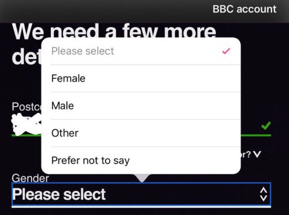
When designing the options for title and gender, we tend to think in common patterns, providing a strict set of predictable options, basically deciding how a person should identify themselves. It’s not our place to do so, though. Not surprising, then, that for some users the options felt “patronizing and disrespectful.” A common area where this problem occurs frequently is the framing and wording of questions. Gender-neutral wording is less intrusive and more respectful. Instead of referring to a specific gender, you could keep the tone more general; for instance, asking for the age of a spouse rather than wife or husband.

To avoid lock-in, it’s a good strategy to always provide a way out should the customer want to specify input on their own, or not want to share that data. For title and gender it might be as easy as providing an additional input field that would allow customers to specify a custom input. A checkbox with “I’d rather not say” or “I’d like to skip this question” would be a simple way out if customers prefer to avoid the question altogether.
Always Ask For Exactly What You Need, Never More
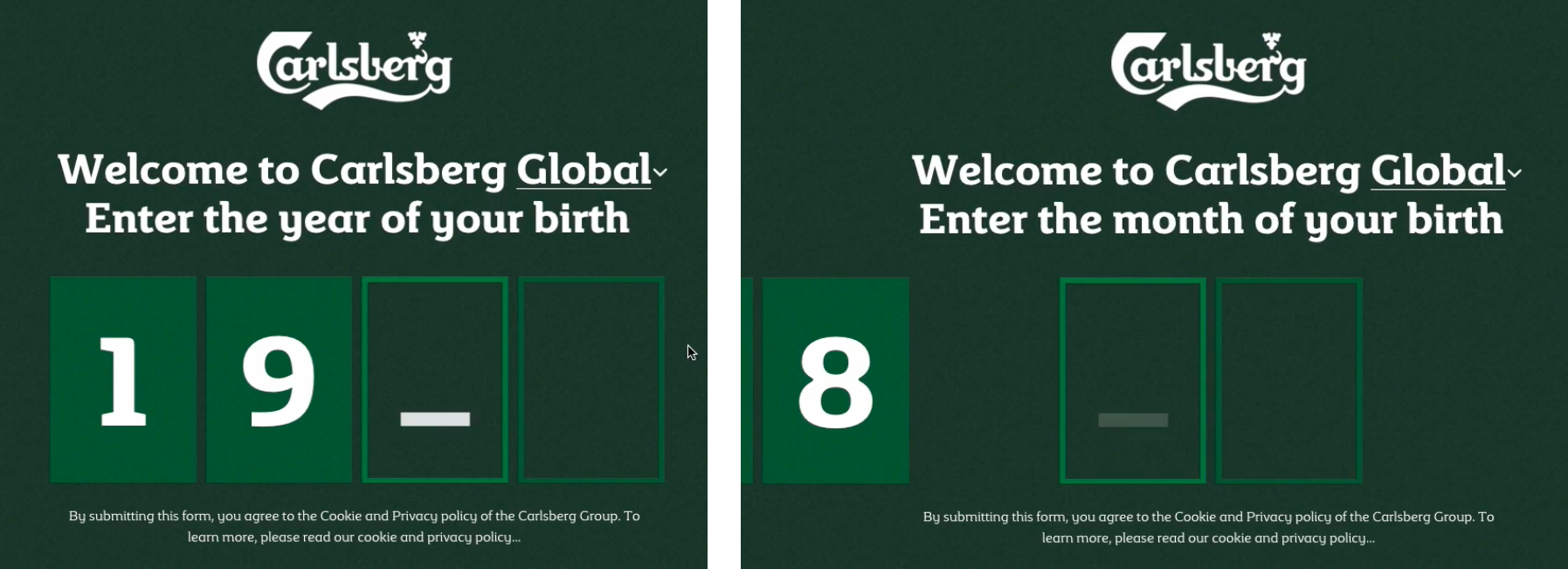
What question seems to be more personal to you: your age or your birthday? In conversations with users, the former was perceived much less personal than the date of birth, mostly because the former is more broad and general. In reality, although companies rarely need a specific date of birth, the required input contains masks for the day, month, and year.
There are usually three reasons for that. On the one side, marketing teams often want to know the age of the customer to understand the demographics of the service — for them, a specific date of birth isn’t really necessary. On the other side, when a company wants to send out custom gifts to a customer on their birthday, they do need the day and the month — but not necessarily the year.

Finally, depending on local regulations, it might be a legal requirement to verify that a website visitor is over a certain age threshold. In that case, it might be enough to ask the customer if they are over 18 rather than asking them for their date of birth, or ask them only for the year of birth first. If they are definitely younger than 18, they might not be able to access the site. If they are definitely older than 18, they can access the site. The prompts for the month should appear only if the user might be just below or just above 18 (born 18 years ago). Finally, the day input would appear only if it’s absolutely necessary to check if the user is old enough to enter the site.
When designing an input for age or date of birth, consider the specific data points that you need and design the form accordingly. Try to minimize the amount of input required, and (again) explain why for what purpose you need that input.
When Asking For Sensitive Details, Prepare Customers Ahead Of Time
While users can find a way to “pass through the gates” with title, gender, age, birthday, and even phone number input, they will have a very difficult time finding a way out when asked for their photo, signature, credit card, passport details, or social security number. These details are very personal and customers tend to spend a disproportionate amount of time filling in these input fields, slowing down massively as they do so. Often this area would be where the users would spend most of their time, and also where they abandon most frequently.
When asked to type in this kind of data, customers would often linger around the interface, scanning it from top to bottom and right to left or scrolling up and down — almost hoping to detect a reassuring confirmation that their data will be processed securely. Almost nobody would mindlessly load their personal photo or type in their passport details without a brief reassurance phase, both on mobile and on desktop.
There are a few strategies to alleviate the concerns users might have at this point. Because users slow down significantly in their progress, always provide an option to save and finish later, as some users might not have the details to hand. You could ask for their phone number or email to send a reminder a few hours or days later. Additionally, consider reassuring users with a noticeable hint or even pop-up that you take their privacy seriously and that you would never share details with third party.
It might also be a good idea to prepare the customer for the required input ahead of time. You could ask them to prepare their passport and bank account details before they even start filling in the form, just to set the right expectations.
The more sensitive private details are, the less room for amusing remarks there should be. The voice and tone of accompanying copywriting matter a lot, just like the copy of error messages, which should be adaptive and concise, informing the user about a problem and how it could be fixed.
Don’t Expect Accurate Data For Temporary Accounts
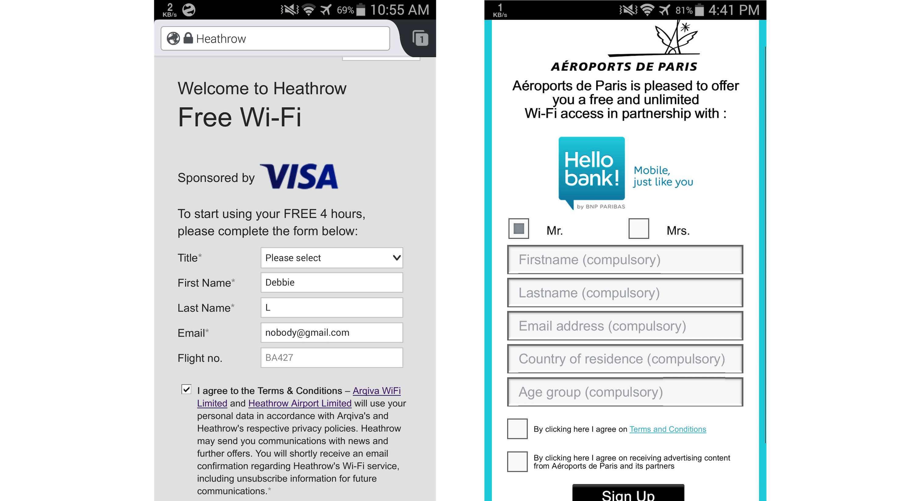
You’ve been here before: you might be having a quick bite in a coffee shop, or waiting for your spouse in a shopping mall, or spending a few layover hours at an airport. It probably won’t take you long to discover a free Wi-Fi hotspot and connect to it. Suddenly, a gracious pop-up window makes its glorious appearance, informing you about 15 free minutes of Wi-Fi, along with a versatile repertoire of lengthy text passages, auto-playing video adverts, painfully small buttons, tiny checkboxes, and miniature legal notices. Your gaze goes straight to where it matters most: the sign-up area prompting you to sign in with Facebook, Twitter, Instagram, SMS, or email. Which option would you choose, and why?
Throughout our interviews, we’ve noticed the same behavior over and over again: whenever customers felt that they were in a temporary place or state (that is, they didn’t feel they might be returning any time soon), they were very unlikely to provide accurate personal data. This goes for Wi-Fi in airports as much as in restaurants and shopping malls. Required sign-ups were usually associated with unsolicited marketing emails, mostly annoyingly irrelevant. After all, who’d love to receive notifications from Schiphol Airport if they’ve only flown from it once?
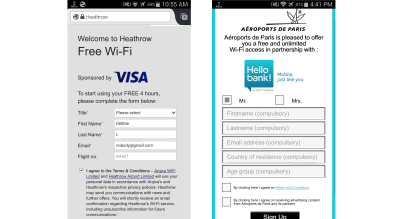
In fact, users were most unlikely to log in with Facebook, Twitter, or Instagram, because they were worried about third-party services posting on their behalf (we’ll cover these issues in a bit more detail later in this series). Many customers just didn’t feel comfortable letting an unknown third party into what they consider to be their “private personal sphere.” Both SMS and email were perfectly acceptable, yet especially when traveling, many customers didn’t know for sure if they’d be charged for text messages or not, and referred email instead. Hence, it’s critical to never enforce a social sign-in and provide a way out with an SMS confirmation or an email sign-up.
With the email option chosen, however, only a few people would actually provide their active personal or business emails when signing up. Some people keep a trash email, used for new accounts, quick confirmations, random newsletters and printing documents in a print shop around the corner. That email is hardly ever checked, and often full of spam, random newsletters, and irrelevant marketing emails. Chances are high that your carefully crafted messages will be enjoying the good company of these messages, usually unopened and unread.
Other people, when prompted to type in their email, provide a random non-existent @gmail.com account, hoping that no verification will be required. If it is required after all, they usually return and provide the least important email account, often a trash email.
What happens if the service tries to ensure the validity of the email by requiring user to retype their email one more time? A good number will try to copy-paste their input into the email verification input field, unless the website blocks copy-paste or the email input is split into two inputs, one for the segment before the @ symbol, and one after it. It shouldn’t be too surprising that not a single customer was particularly thrilled about these options.
Users seem to highly value a very strict separation between things that matter to them and things that don’t matter to them — especially in their email inbox. Being burned with annoying marketing emails in the past, they are more cautious of letting brands into their private sphere. To get their attention, we need to give customers a good reason to sign up with an active email account; for example, to qualify for free shipping, or auto-applied discounts for loyal customers, or an immediate discount for next purchases, or a free coffee for the next visit. One way or another, we need to deserve their trust, which is not granted by default most of the time.
Don’t Store Private Data By Default
When setting up an account, it’s common to see interfaces asking for permission to store personal data for future use. Of course, sometimes the reason for it comes from the objective to nudge customers into easy repurchasing on future visits. Often it’s a helpful feature that allows customers to avoid retyping and save time with the next order. However, not every customer will ever have a second order, and nobody will be amused by an unexpected call from the marketing department about a brand new offering.
Customers have no issues with storing gender and date of birth once they’ve provided it, and seem to be likely to allow phone numbers to be stored, but they are less likely to store credit card details and signature and passport details.
“
Hence, it’s plausible to never store private data by default, and always ask users for permission, unchecking the checkbox by default. Also, consider storing details temporarily — for a few weeks, for example — and inform the user about this behavior as they are signing up.
In general, the more private the required information is, the more effort should be spent to clearly explain how this information will be processed and secured. While a subtle text hint might be enough when asking for a phone number, passport details might need a larger section, highlighting why they are required along with all the efforts put into protecting user’s privacy.
Users Watch Out For Privacy Traps
The more your interface is trying to get silent consent from customers — be it a subscription to email, use of personal data, or pretty much anything else — the more customers seem to be focused on getting this done, their way. It might seem like a tiny mischievous checkbox (opted-in by default) might be overlooked, yet in practice customers go to extremes hitting that checkbox, sometimes as far as tapping it with a pinky finger on their mobile phones.
With a fundamental mistrust of our interfaces, customers have become accustomed to being cautious online. So they watch out for privacy traps, and have built up their own strategies to deal with malicious and inquisitive web forms. As such, on a daily basis, they resort to temporary email providers, fake names and email addresses, invalid phone numbers, and random postal codes. In that light, being respectful and humble when asking for personal data can be a remarkably refreshing experience, which many customers don’t expect. This also goes for a pattern that has become quite a nuisance recently: the omnipresent cookie settings prompt.
In the next article of the series, we’ll look into these notorious GDPR cookie consent prompts, and how we can design the experience around them better, and with our users’ privacy in mind.
- Part 1: Privacy Concerns And Privacy In Web Forms
- Part 2: Better Cookie Consent Experiences
- Part 3: Better Notifications UX And Permission Requests
- Part 4: Privacy-Aware Design Framework
Further Reading
- The Potentially Dangerous Non-Accessibility Of Cookie Notices
- Connecting With Users: Applying Principles Of Communication To UX Research
- Using AI For Neurodiversity And Building Inclusive Tools
- Everything I Know About UX Research I First Learned From Lt. Columbo


