Privacy UX: Privacy-Aware Design Framework
- Part 1: Privacy Concerns And Privacy In Web Forms
- Part 2: Better Cookie Consent Experiences
- Part 3: Better Notifications UX And Permission Requests
- Part 4: Privacy-Aware Design Framework
We’ve already explored approaches for better cookie consent prompts, permission requests, and notifications UX, but how do they fit into an overall design strategy as we make design decisions in our design tools?
In her article “What does GDPR mean for UX?”, Claire Barrett, a UX and UI designer at Mubaloo in Bristol, UK, has shared a very practical, actionable set of UX guidelines that the design agency has been following in respect to GDPR. While these guidelines specifically target GDPR, they are applicable to a much wider scope of user-friendly and privacy-aware interactions, and could therefore be applicable to any kind of project:
- Users must actively opt in to having their data collected and used.
- Users must give consent to every type of data-processing activity.
- Users should have the right to easily withdraw their consent at any time.
- Users should be able to check every organization and all third parties that will handle the data.
- Consent isn’t the same as agreeing to the terms and conditions, so they shouldn’t be bundled together; they are separate, and should have separate forms.
- While asking for consent at the right times is good, it’s even better to clearly explain why consent will benefit their experience.
One of the interesting things that Claire recommends in her article is to focus on “just-in-time” data collection (mentioned in part 3 of this series); that is, explain why data is required, and how it will and will not be used — but only when the app or website actually needs it. Obviously, this could be done by including an “info” icon next to the more personal bits of information collected, and showing the tooltip with the benefits and rationale behind data collection on request.
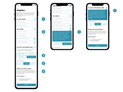
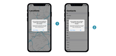
Many mobile applications require access to location, photos, and even the camera during installation, which isn’t something most customers would be happy to consent to. A more effective way of getting permission is to explain the need for data at the point of collection by using “just-in-time” prompts, so users can give consent only when they understand the purpose of it, very much like we’ve seen with permissions earlier in this series.
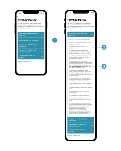
The explanations should also inform customers how to withdraw consent where applicable, and provide a link to the privacy policy. These have been a matter of ongoing complaints for years, as lengthy privacy policies written in perfectly obscure legalese are almost impossible to comprehend without a dedicated review session. (In fact, a 2008 study showed it would take the average person roughly 244 hours per year to read all of the privacy policies for the sites they use, which translates to about 40 minutes per day.)
Rather than presenting the privacy policy as a wall of convoluted text, it could be chunked and grouped into clearly labelled sections and expandable text, optimized for scanning, locating, and understanding.
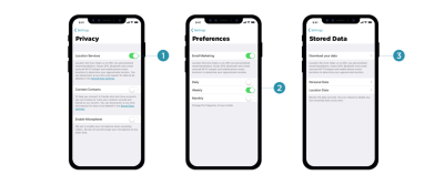
Once consent is granted, customers should have full control over their data; that is, the ability to browse, change, and delete any of the data our applications hold. That means data settings in our mobile applications need to provide granular options to revoke consent, and opt out from marketing preferences, as well as the option to download and delete any data without wandering around the convoluted maze of help sections and ambiguous setting panels.
The main issue with privacy-aware design decisions is that it’s difficult to assess the impact of data collection and all the interface challenges it poses on design and development. Being humble and subtle isn’t just a matter of respect, but also about reducing technical debt and avoiding legal battles down the road. For that, the following general guidelines could help as well.
Save As Little Data As Possible
If you choose to store credit card data, you have to be upfront about the security measures you take to store them confidentially. The less data you require and store, the less of an impact a potential breach would have.
Treat Personal Data Well
Not all data is created equal. When users provide personal information, distinguish between different strata of data, as private information is probably more sensitive than public information. Treat personal data well, and never publish it by default. For example, as a user completes their profile, provide an option to review all the input before publishing it. Be humble, and always ask for permission first; proactively protect users and don’t store sensitive data. That might help prevent uncomfortable situations down the line.
This goes not only for the procedure of storing and publishing user data on your servers, but also when it comes to password recovery or using customer data for any kind of affiliate partnerships. In fact, handing over a customer’s email to somebody else without explicit consent is a breach of trust and privacy, and often results in emails marked as spam because customers are suddenly confronted with an unfamiliar brand they don’t trust. In fact, the latter is almost like a defence mechanism against rapacious websites that continuously harvest emails in exchange for a free goodie, access to videos, and freemium offerings.
Explain Early What Kind Of User Data Third Parties Will Receive
When providing an option for social sign-in, be specific about what will happen to the user’s data and what permissions third parties will have. Usually a subtle note appears when social sign-in is prompted, but it’s a good idea to be explicit straightaway about how data will be treated, and specifically what will not happen to a user’s data.
It’s common to see user interactions coming to a halt once customers are forced into connecting their brand new accounts with already existing ones, or when they are encouraged to use their social profiles to make progress with the app. That’s never a straightforward step to take, and requires some explanation and assurance that revoking access is easy.
Prepare Customer Data For Export
It’s not trivial to get a complete picture of the collected data, especially if third parties are involved. Make sure that whenever personal data is collected, it’s structured in a way that’s optimized for export and deletion later on. Bonus points if it’s also digestible for the end user, so they can find the bits and pieces they need once they are interested in something very specific. That also means tracking what types of data are collected and where data flows, as we can use this structure later to provide granular control over data settings and privacy preferences in our UI.
You might have heard of a few friendly companies that make importing personal data remarkably seamless, yet exporting user data is painfully difficult, or close to impossible. Unsurprisingly, this practice isn’t perceived well by customers; and especially at times when they are thinking about deleting their account, such a pervasive lock-in will lead to customer support complaints, call centre calls, and angry outbursts in social channels. That’s not a delightful feature that will keep them loyal long-term.
While some companies can take public blaming because of their sheer size, for many small and mid-sized companies, reputation is the most precious asset they have, and so it’s wise not to gamble with it. You could even think of partnering with similar services and make user data seamlessly portable and transferrable to each of them, while expecting the same feature to be supported by partners as well.
Making It Difficult To Close Or Delete An Account Fails In The Long Term
Corporate behemoths have excelled in making it remarkably difficult for customers to close or delete their accounts. And this technique works when when moving away is painfully difficult — that’s the case for Amazon and Facebook.
However, if you are working on a relatively small website which strives for its loyal customers, you might not be able to pull it off successfully, at least not long-term. The overall impact is even more harmful if you make it difficult to cancel a recurring payment, as is often the case with subscriptions. (In fact, that’s why subscriptions are also difficult to sell — it’s not just the commitment to monthly payments, but rather the difficulty of cancelling the subscription at a later time without extra charge due to early cancellation.)
In fact, just as designers are getting better at hiding notorious profile settings for deleting an account, so too are customers at finding ways to navigate through the maze, often supported by the infinite wisdom of easily discoverable tutorials in blogs. If it’s not the case, customers resort to the tools they know work best: turning their back on the service that shows no respect towards their intentions — usually by marking emails as spam, blocking notifications, and using the service less. It doesn’t happen overnight; but slowly and gradually, and as interviews showed, these customers are guaranteed to not recommend the service to their friends or colleagues.
Surprisingly, it’s the other way around when it’s remarkably easy to close the account. Just like with notifications, there might be good reasons why the user has chosen to move on, and very often it has nothing to do with the quality of service at all. Trying to convince the customer to stay, with a detailed overview of all the wonderful benefits that you provide, might be hitting the wrong targets: in corporate settings especially, the decision will have been made already, so the person closing the account literally can’t do much about changing the direction.
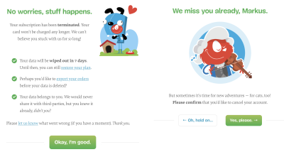
For Smashing Membership, we’ve tried to keep the voice respectful and humble, while also showing a bit of our personality during offboarding. We explain what happens to the data and when it will be irrevocably deleted (seven days), provide an option to restore the plan, allow customers to export their orders and guarantee no sharing of data with third parties. It was surprising to see that a good number of people who canceled their Membership subscription, ended up recommending it to their friends and colleagues, because they felt there was some value in it for them even though they didn’t use it for themselves.
Postpone Importing Contacts Until The User Feels Comfortable With The Service
Of course, many of our applications aren’t particularly useful without integrating the user’s social circle, so it seems plausible to ask customers to invite their friends to not feel lonely or abandoned early on. However, before doing so, think of ways of encouraging customers to use the service for a while and postpone importing contacts until the point when users are more inclined to do so. By default, many customers would block an early request as they haven’t yet developed trust for the app.
Save User Data For A Limited Amount Of Time After Account Closure
Mistakes happen, and it holds true for accidental mis-taps as much as deleting all personal data after a remarkably bad day. So while we need to provide an option to download and delete data, also provide an option to restore an account within a short amount of time. That means that data will be saved after the account is deleted, but will be irrevocably removed after that grace period has passed. Usually, 7–14 days is more than enough.
However, you could also provide an option for users to request the immediate deletion of data via email request, or even with a click on a button. Should users be informed about the ultimate deletion of their files? Maybe. The final decision will probably depend on how sensitive the data is: the more sensitive it is, the more likely users will want to know the data is gone for good. The exception is anonymized data: most of the time, customers won’t care about it at all.
Provide User-Friendly Summaries Of Privacy Policy Changes
Nothing is set in stone, and so your privacy policy and default privacy settings might need to adjust because of new personalization features or a change of the tracking script. Whenever this happens, rather than highlighting the importance of privacy in lengthy passages of text, provide clear, user-friendly summaries of changes. You could structure the summary by highlighting how things used to be and how they are different now. Don’t forget to translate legalese into something more human-readable, explaining what the change actually means for the user.
Frankly, most users didn’t seem to care much about privacy policy changes. After the never-ending stream of policy update notifications in 2018, the default reaction is usually immediate consent. Once they’ve noticed anything related to privacy policy in the subject line or the email body, they immediately accept changes before even scrolling to the bottom of the email. However, the more personal the data stored is, the more time was spent reviewing the changes, which often were remarkably confusing and unclear.
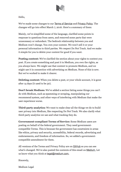
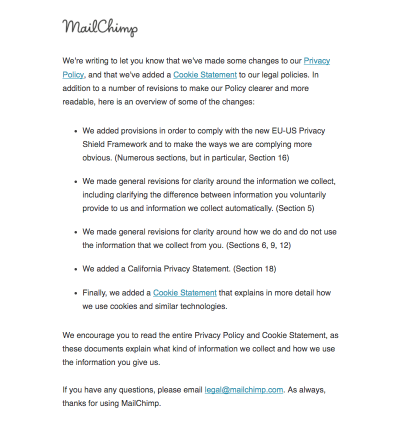
Note: The folks at Really Good Emails have collected some great examples of email design related to GDPR if you’re looking for more inspiration on how to share privacy policy changes with your users and subscribers.
Set Up A Communication Strategy In Case Of A Breach
Nobody wants havoc after user data is compromised. In such situations, it’s critical to have a clear and strong communication strategy. Have an explanation prepared in case some user data is compromised. Mandy Brown published a fantastic article, “Fire Drills: Communications Strategy in a Crisis”, on A List Apart, explaining how to set one up, and a few things to consider when doing it.
Privacy By Design
It might sound like visiting websites is a quite ordinary activity, and users should feel comfortable and familiar with features such as social sign-in, importing contacts, and cookie prompts. As we’ve seen in this series, there are many non-trivial privacy considerations, and more often than not, customers have concerns, doubts, and worries about sharing their personal data.
Of course, the scope of this series could stretch out much further, and we haven’t even looked into password recovery, in-app privacy settings design, floating chat windows and pop-ups, performance and accessibility considerations, or designing privacy experiences for the most vulnerable users — children, older people, and those with disadvantages. The critical point when making design decisions around privacy is always the same, though: we need to find a balance between strict business requirements and respectful design that helps users control their data and keep track of it, instead of harvesting all the information we can and locking customers into our service.
A good roadmap for finding that balance is adopting a privacy-first best-practice framework, known as Privacy by Design (PbD). Emerging in Canada back in the 1990s, it’s about anticipating, managing, and preventing privacy issues before a single line of code is written. With the EU’s data protection policy in place, privacy by design and data protection have become a default across all uses and applications. And that means many of its principles can be applied to ensure both GDPR-compliance and better privacy UX of your website or application.
In essence, the framework expects privacy to be a default setting, and a proactive (not reactive) measure that would be embedded into a design in its initial stage and throughout the life cycle of the product. It encourages offering users granular privacy options, respectful privacy defaults, detailed privacy information notices, user-friendly options, and clear notification of changes. As such, it works well with the guidelines we’ve outlined in this series.
I highly recommend reading one of Heather Burns’ articles, “How To Protect Your Users With The Privacy By Design Framework,” in which she provides a detailed guide to implementing the Privacy by Design framework in digital services.
Where to start, then? Big changes start with small steps. Include privacy in the initial research and ideation during the design stage, and decide on defaults, privacy settings, and sensitive touchpoints, from filling in a web form to onboarding and offboarding. Minimize the amount of collected data if possible, and track what data third parties might be collecting. If you can anonymize personal data, that’s a bonus, too.
Every time a user submits their personal information, keep track of how the questions are framed and how data is collected. Display notifications and permission requests just in time, when you are almost certain that the customer would accept. And in the end, inform users in digestible summaries about privacy policy changes, and make it easy to export and delete data, or close an account.
And most importantly: next time you are thinking of adding just a checkbox, or providing binary options, think about the beautifully fuzzy and non-binary world we live in. There are often more than two available options, so always provide a way out, no matter how obvious a choice might appear. Your customers will appreciate it.
Further Reading
- The Potentially Dangerous Non-Accessibility Of Cookie Notices
- Everything I Know About UX Research I First Learned From Lt. Columbo
- The Things Users Would Appreciate In Mobile Apps
- A Web Designer’s Accessibility Advocacy Toolkit


