Privacy UX: Better Cookie Consent Experiences

Email Newsletter
Weekly tips on front-end & UX.
Trusted by 182,000+ folks.


 Celebrating 10 million developers
 Custom Web Forms for Angular, React, & Vue. Your backend.
- Part 1: Common Concerns And Privacy In Web Forms
- Part 2: Better Cookie Consent Experiences
- Part 3: Better Notifications UX And Permission Requests
- Part 4: Privacy-Aware Design Framework
With the advent of the EU General Data Protection Regulation (GDPR) in May 2018, the web has turned into a vast exhibition of consent pop-ups, notifications, toolbars, and modals. While the intent of most cookie-related prompts is the same — to get a user’s consent to keep collecting and evaluating their behavior the same ol’ way they’ve been doing for years — implementations differ significantly, often making it ridiculously difficult or simply impossible for customers to opt out from tracking.
On top of that, many implementations don’t even respect users’ decisions anyway and set cookies despite their choices, assuming that most people will grant consent regardless.
Admittedly, they aren’t entirely wrong. In our research, the vast majority of users willingly provide consent without reading the cookie notice at all. The reason is obvious and understandable: many customers expect that a website “probably wouldn’t work, or the content wouldn’t be accessible otherwise.” Of course, that’s not necessarily true, but users can’t know for sure unless they try it out. In reality, though, nobody wants to play ping-pong with the cookie consent prompt, and so they click the consent away by choosing the most obvious option: “OK.”
Note: It’s important to understand that cookies and consent mechanisms discussed in this article go beyond GDPR. In Europe, they are addressed by a separate piece of legislation, the ePrivacy Directive, which is currently in draft for a revamp (as of April 2019). It may be finalized by summer 2019. We do not know what its final form will take, but it will determine the future of cookie consent prompts.
Now, with this common behavior online, what might come across is that cookie prompts aren’t particularly useful, and that’s partly true. But they certainly helped raise awareness about privacy and data collection on the web. In fact, users now know that websites track their data, which they weren’t aware of a few years ago. But they often see it as a necessary evil in exchange for accessing the content “for free.”
It’s not that users always happily share their personal data, but they don’t really feel that revoking consent is a viable alternative. To many of them, the only reasonable option is to provide consent while opting in for an ad-blocker extension or any other tracking blocker in their browser.
Since cookie consent prompts always stand in the way of the content, they are often dismissed almost instinctively, not unlike carousels during onboarding. Hence, from the designer’s perspective, spending weeks refining that one-of-a-kind prompt might be a waste of time. (Sorry for crushing your dreams at this point.)
Since many websites heavily rely on collecting data, running A/B tests, and serving users with targeted advertising, often the design of the cookie consent notice is heavily influenced by business requirements and business goals. Is it acceptable for the business to allow users to quickly dismiss all tracking? Which cookies are (apparently) required for the site to work, and which ones are optional? Which cookies should be selected for approval by default, and which ones would require a manual opt-in? Should the customer be able to easily revoke the consent once it’s provided, and if so, how exactly would it be done if they don’t have an account on the site?
These business decisions have a major impact on design decisions, although from the user’s side, the optimal design would be quite obvious: no cookie consent at all. That would mean, for example, that users could define privacy settings in their browsers, and choose what cookies they’d like to provide consent to. The browser would then send a hint to each website a user chooses to visit and automatically opt-in or opt-out cookie settings, depending on the provided preferences.
“
In fact, a Do Not Track (DNT) header is already implemented and widely supported by browsers (although it was removed from Safari to prevent potential use for fingerprinting), yet there is no established mechanism for transforming this preference into a granular selection of accepted cookie groups. It shouldn’t be very surprising that most advertisers wouldn’t be particularly happy about this pattern gaining traction either, but perhaps it could be a slightly better way forward, as preferred by users, to no cookie consent at all.
Admittedly, users sometimes find a way around anyway. Some users who already use an ad-blocker are using a cookie prompt blocker as well. The latter, however, usually grants full consent on user’s behalf by default. Obviously, it goes against the very purpose of the cookie prompt in the first place, and ideally such extensions would automatically opt in only for essential cookies while opting out for everything else (if it’s possible at all).
As designers, though, we have a legal obligation to explain what happens to a user’s data and how it will be stored within the mandate of provided business requirements. As Geoffrey Keating mentioned in his article, “The Cookie Law and UX,” focusing specifically on legislation in Ireland, according to the Office of the Data Protection Commissioner, “the minimum requirement is clear communication to the user as to what he/she is being asked to consent to in terms of cookies usage and a means of giving or refusing consent.”
It’s worth noting that consent has to be “unambiguous” and “freely given,” as it must “leave no doubt as to the data subject’s intention, should be an active indication of the user’s wishes and can only be valid if the data subject is able to exercise a real choice.” Hence, silent, pre-ticked checkboxes or inactivity shouldn’t constitute consent.
This might sound obvious, but some solutions explore the uncharted legal territory that’s left for interpretation. For instance, sometimes the website visitor “automatically submits a cookie consent by clicking a link on the website”, and sometimes you can choose which actions are “obvious enough” for you to perceive them as a silent consent. Obviously, this isn’t an informed decision and such technique rightly belongs to the realm of mischievous culprits that should be avoided at all costs.
With this in mind, there are a couple of options we could consider:
Avoid Optional Cookies And Keep Only Functional Ones: No Prompt Required
It might appear that every single website needs to display a cookie consent notice to their European visitors, but if your website doesn’t collect, track, and evaluate any personal data from users, or it collects only anonymous data, you may not need one. In fact, one of the fundamental principles of the Privacy by Design framework is that non-essential cookies should be off by default and the user needs to actively opt in.
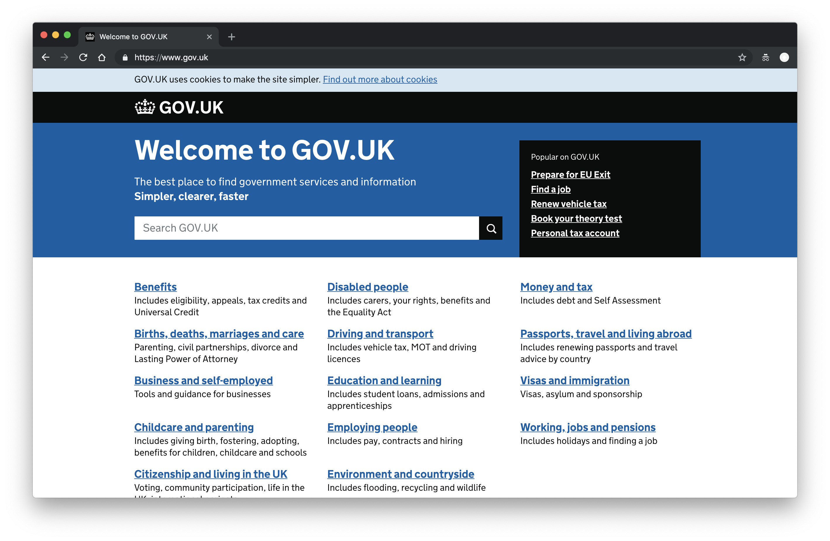
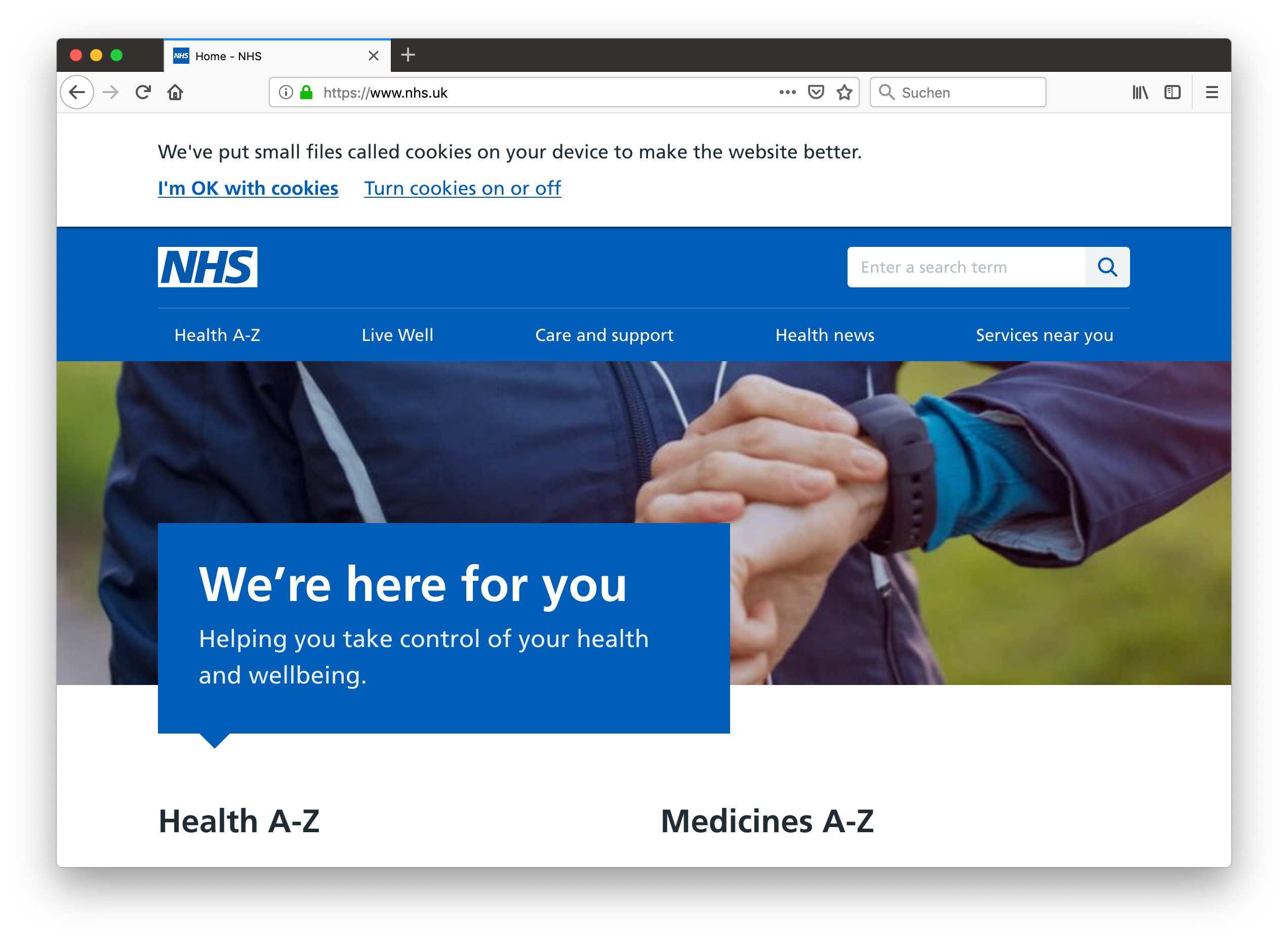
Now, cookies might be required for maintaining the logged-in state or user preferences, for example, and according to EU regulations you don’t need explicit consent for that. That’s also why many prompts have functional cookies enabled by default, without an option to disable them. And some sites, like GOV.UK, merely inform users about cookies, not requiring any input at all, but also not providing a choice to opt out from the optional Google Analytics cookie.

Nudging Users Towards Implicit Consent
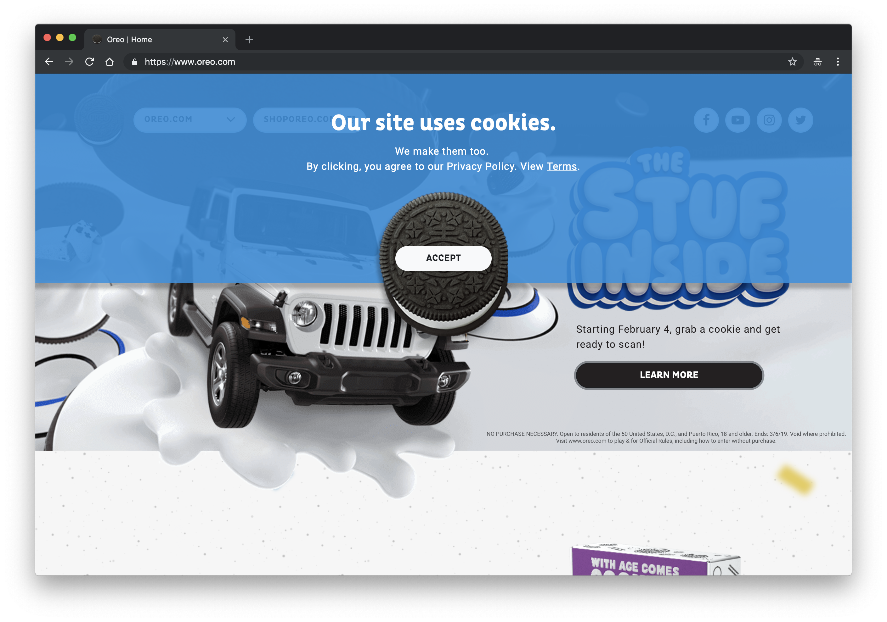
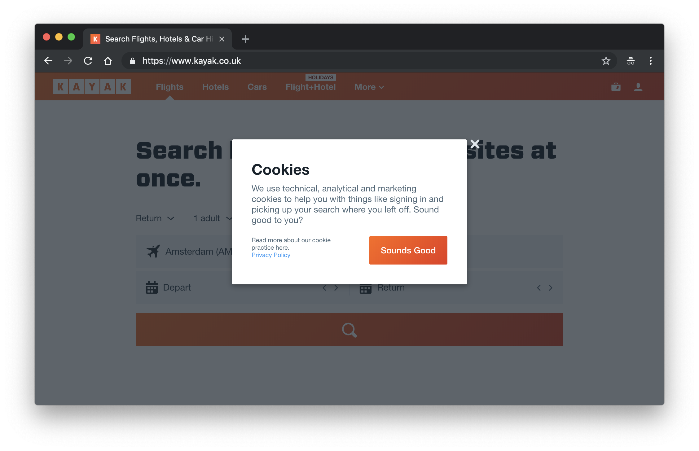
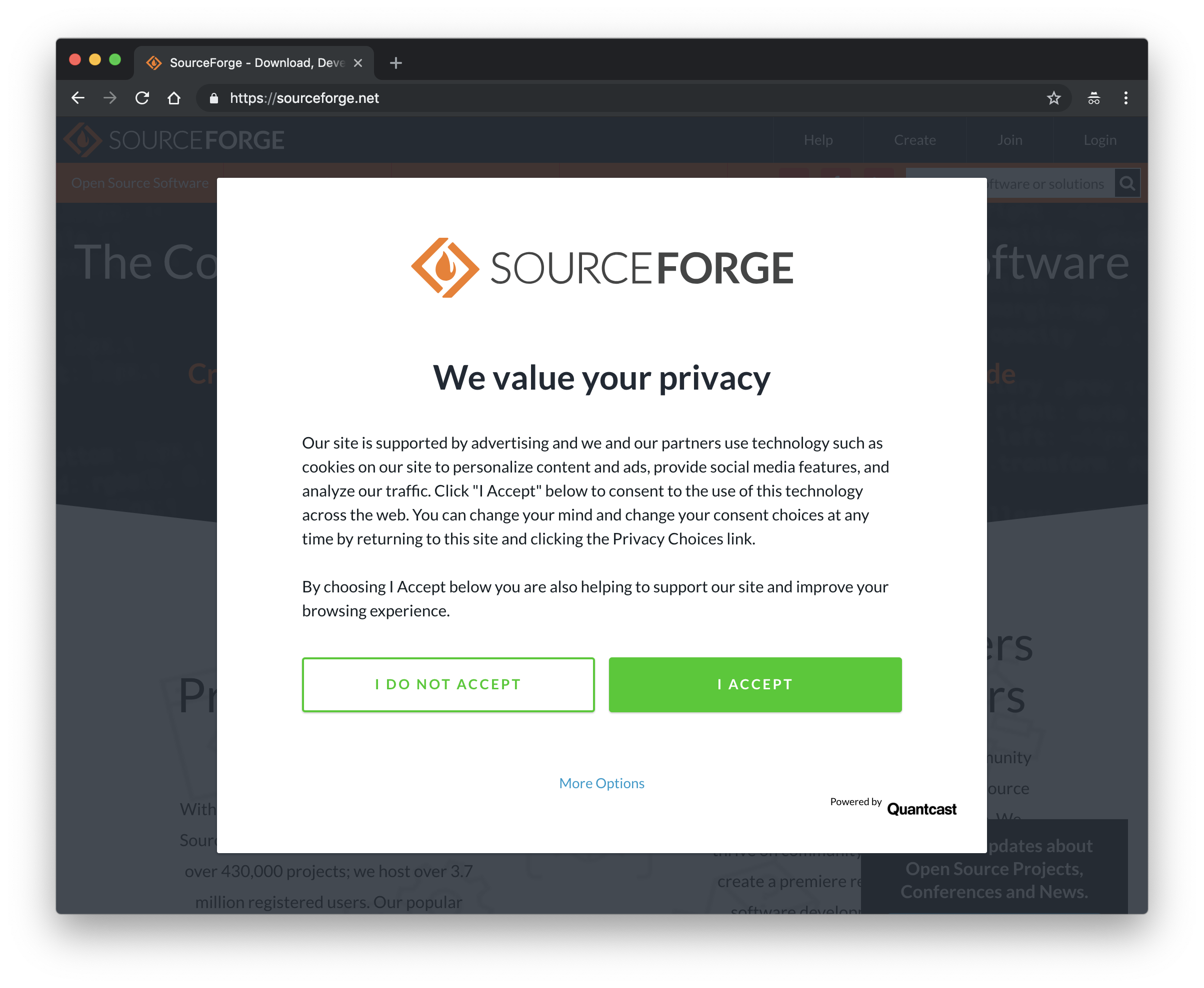
Not every website can get away without ad-related third-party cookies, though. One seemingly light way out would be to add a plain notification such as “By using our website, you are consenting to our use of cookies.” But this alone isn’t enough. As we need an active indication of the user’s consent, we have to require some sort of unambiguous action. For that reason, some sites add a “close” icon, making the consent box appear as a notification that can be dismissed. To ensure a more obvious acknowledgement, it’s a good idea to replace the “close” icon with a button. In many implementations, the button would simply say “Close” or “Save” or “Continue,” although “Accept and continue” is more clear.
In most cases, the notification doesn’t disappear until it is acted upon, hence being the very first thing that users see when visiting any page on the website. Do you need user consent on every page, though? You could be more selective and ask for the cookie consent only when it’s actually required; for example, when the user is setting up an account or wants to save their settings.


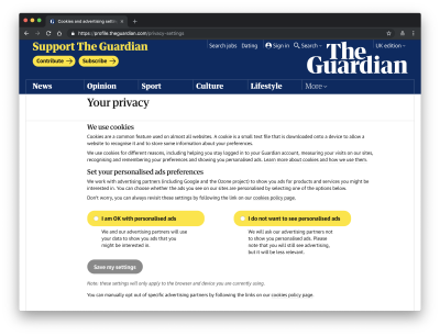
Allowing Users To Adjust Privacy Settings
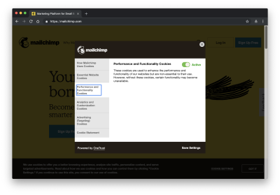
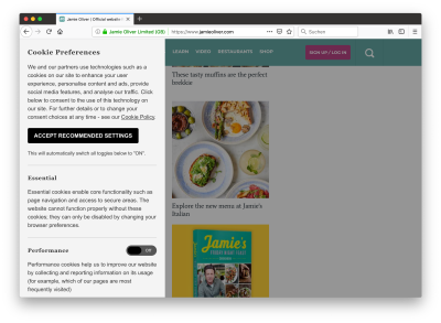
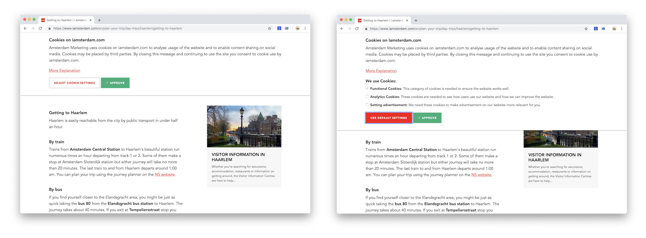
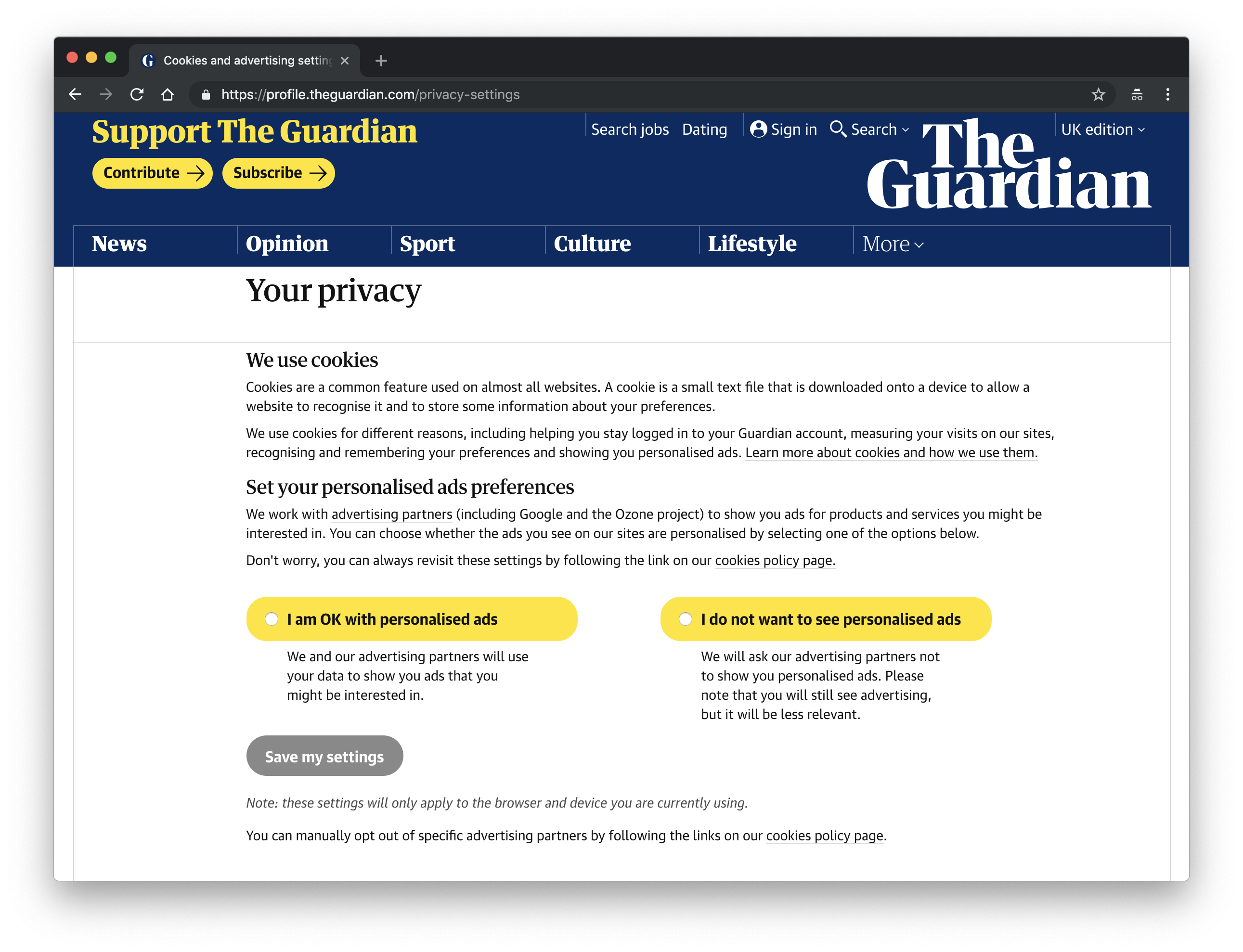
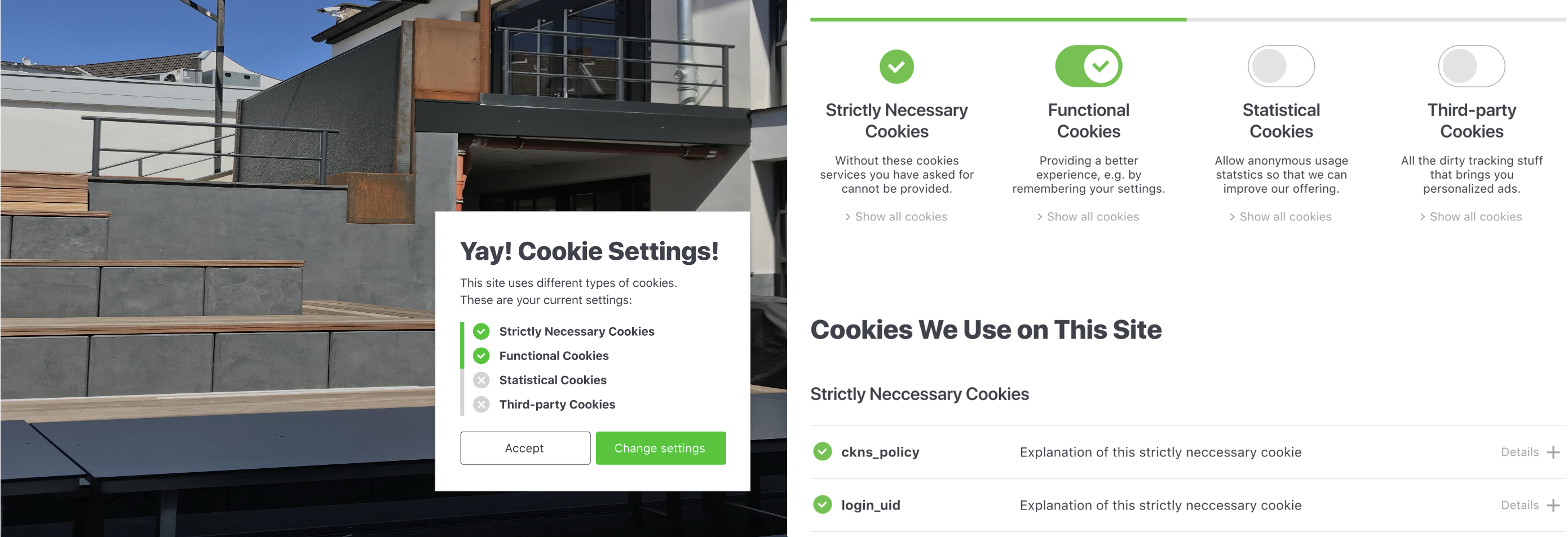
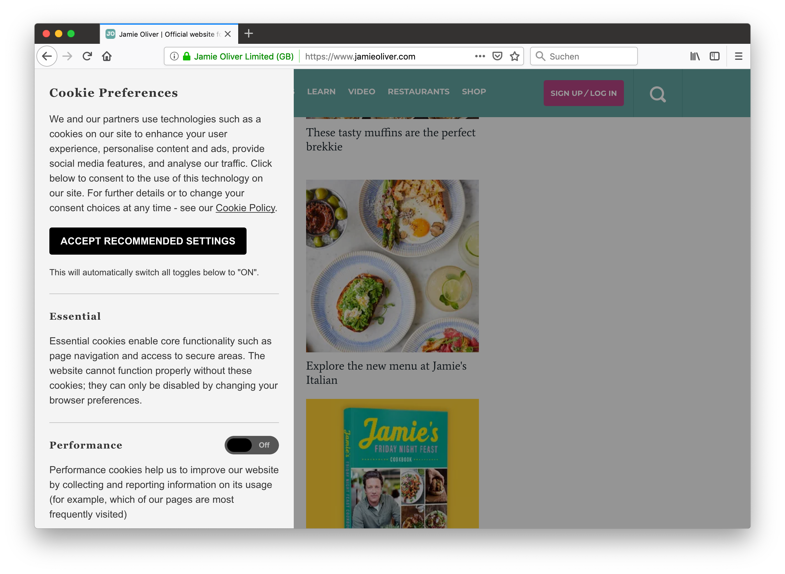
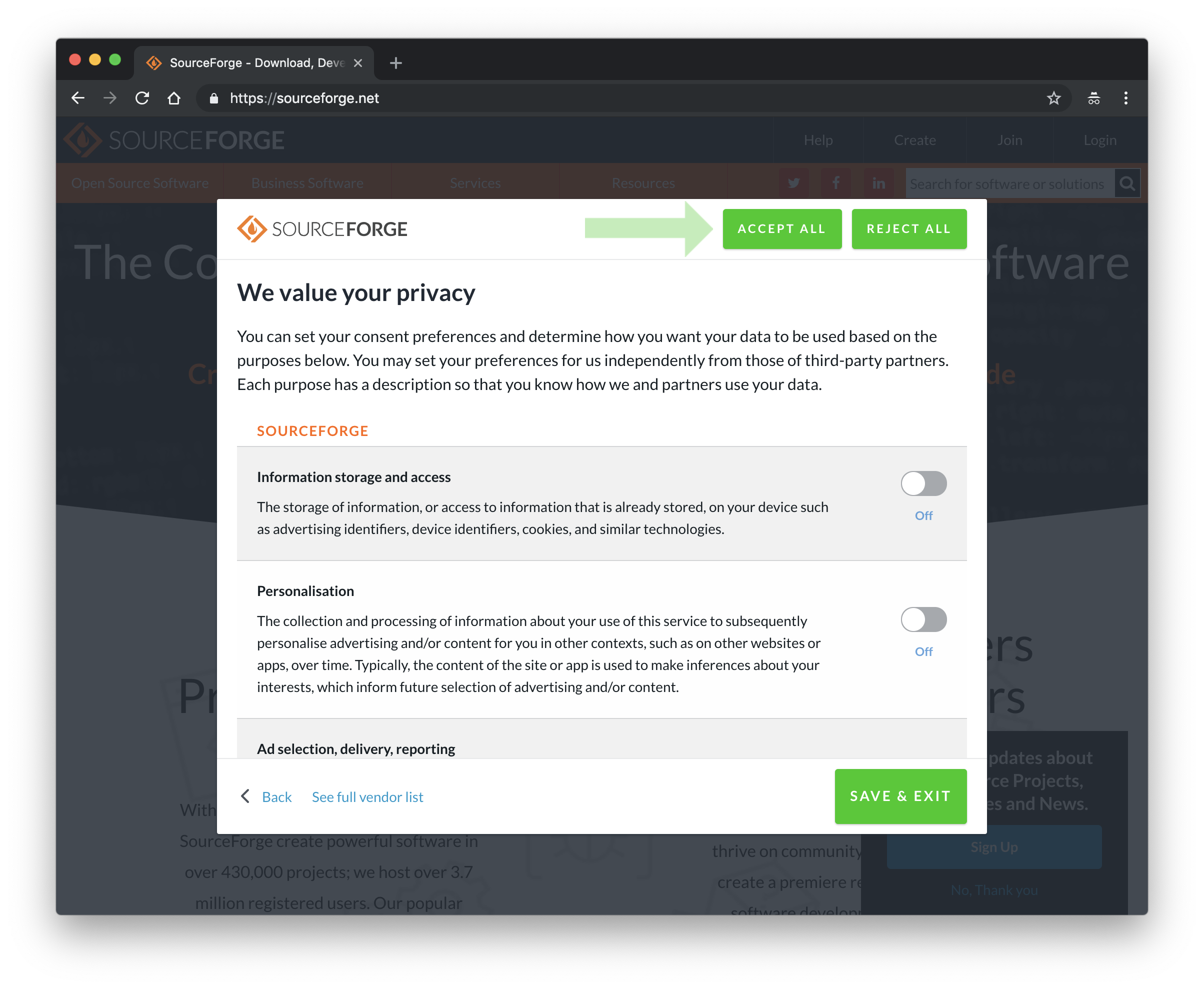
While the previous option dictates complete obedience or complete lock-out, you could be more empathetic to the user’s intent. The user might have strong feelings about the exposure of their personal data, so providing a way out — not dissimilar to the personal questions we mentioned earlier — could keep them on the site. To achieve that, we could add an option to change settings, followed by an overview of different groups of cookies, with some of them being required for the site to function flawlessly, and others being optional.
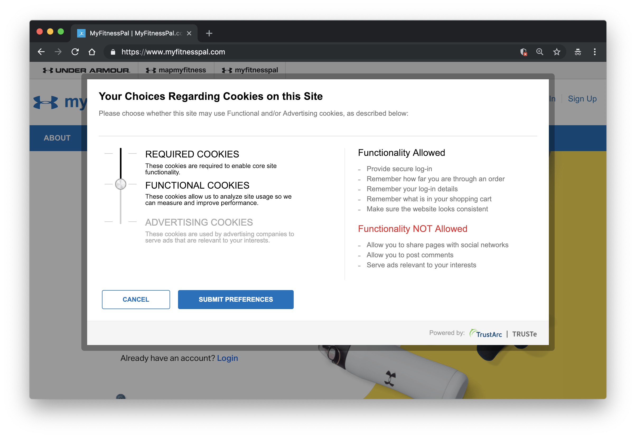
The grouping could relate to the purpose of cookies such as advertising, analytics and statistics, or testing. It could also be much broader, allowing users to choose between “I am OK with personalized ads” or “I do not want to see personalized ads”. It’s also a good idea to explain to the user which features on the site will be unavailable once a certain group of cookies is blocked. TrustArc does that with a slider, allowing for a number of privacy levels, from allowing only required cookies to functional cookies to advertising cookies, while also showing its impact on the overall functionality of the site.

A Subtle Or Prominent Display Of The Request For Consent
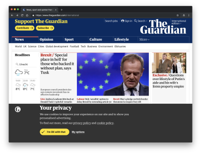
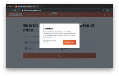
In terms of layout, the prompt could be subtle and hardly noticeable, or obvious and difficult to ignore. We could place it in the header of the page, or at the bottom of the viewport, or we could also position it in the center of the page as a modal. All of these options could be floating and persistent as the user scrolls the page, thereby blocking access to a portion of the content (or entire content) until consent is granted.
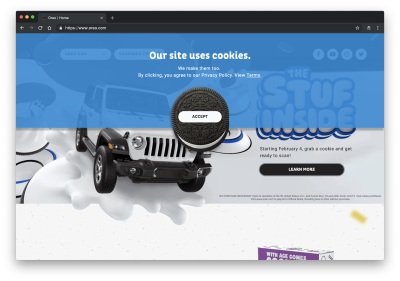
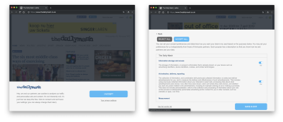
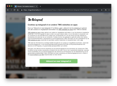
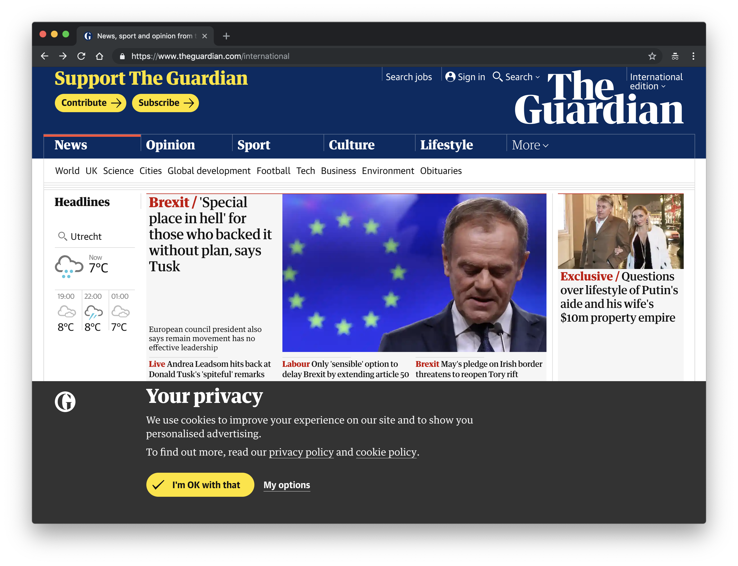
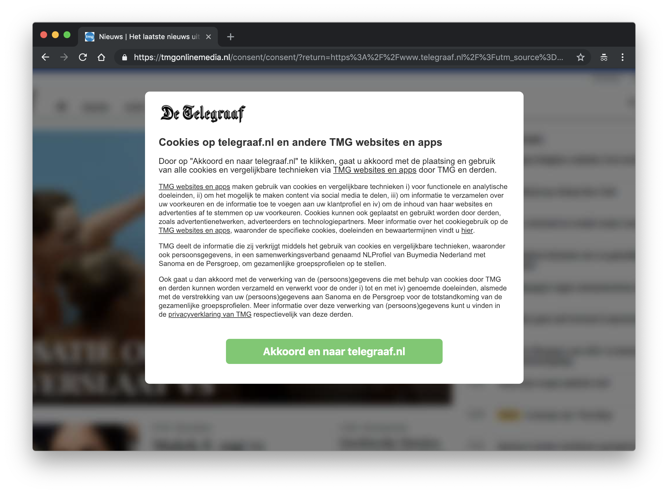
De Telegraaf, for example, places a verbose cookie consent in the middle of the page, blurring out the content underneath, literally hijacking the page and standing in the way. It shouldn’t be a big revelation that from all the options we’ve tested, this one seems to be the most annoying one to users. In general, subtle prompts should be preferred, and the less space they need to be displayed, the better the overall user’s reaction has been.


Appearance And Wording On Buttons
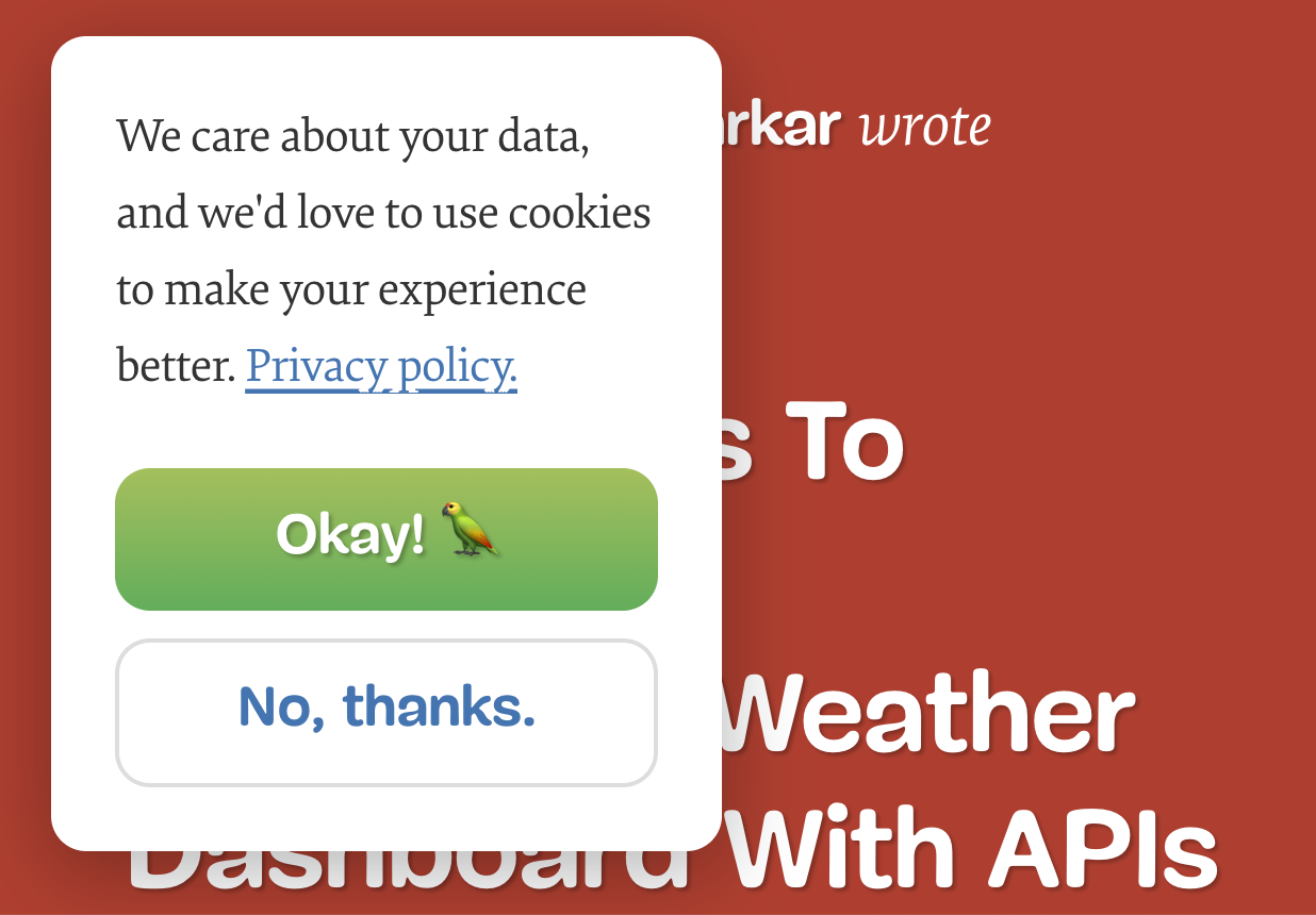
We also need to give some thought to the appearance of the consent form, especially to the design of buttons and the wording on those buttons. Wording such as “Just proceed” or “Save and Exit” or “Continue using the site” nudges users to move on with a default option, and in fact, many users are likely to do just that. It’s more respectful to have two buttons, a primary one for granting consent, and a secondary one for adjusting settings, with both buttons having neutral microcopy such as “Accept” and “Reject,” or “Okay” and “No, thanks.” That’s the path we’ve chosen with Smashing Magazine.


It shouldn’t be surprising that of all the options, users feel surprisingly pleased and appreciative of the option to reject all cookies with a single click on a button. Some users were surprised that this option was even provided, and while a majority chose to grant consent, every fifth user refused consent. By doing so, they assumed the website would be fully functional without cookies, and rightfully so.
Adjusting Cookie Preferences
Not many users would consider revoking or adjusting cookie settings after granting consent, but when asked to do so, they expected to find the options in the header or the footer of the website, either in the privacy policy or in the cookie policy. It’s not very surprising, and of course that’s where we need to place the options to adjust settings should the user wish to do so.
Users Understand When They Are Being Tricked
So far, the entire experience should be quite straightforward, right? Well, if a business model heavily relies on collecting and tracking data, you might be forced into shady areas when selecting anything but the easiest option is confusing and generates a lot of work. In our interviews, users could easily see through the companies’ agendas, even saying something along the lines of “Ah, I see what you did there.” Some things were less obvious than others, though.
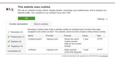
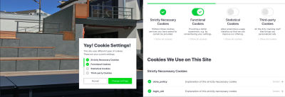
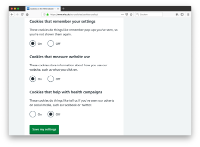
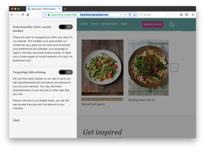
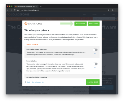
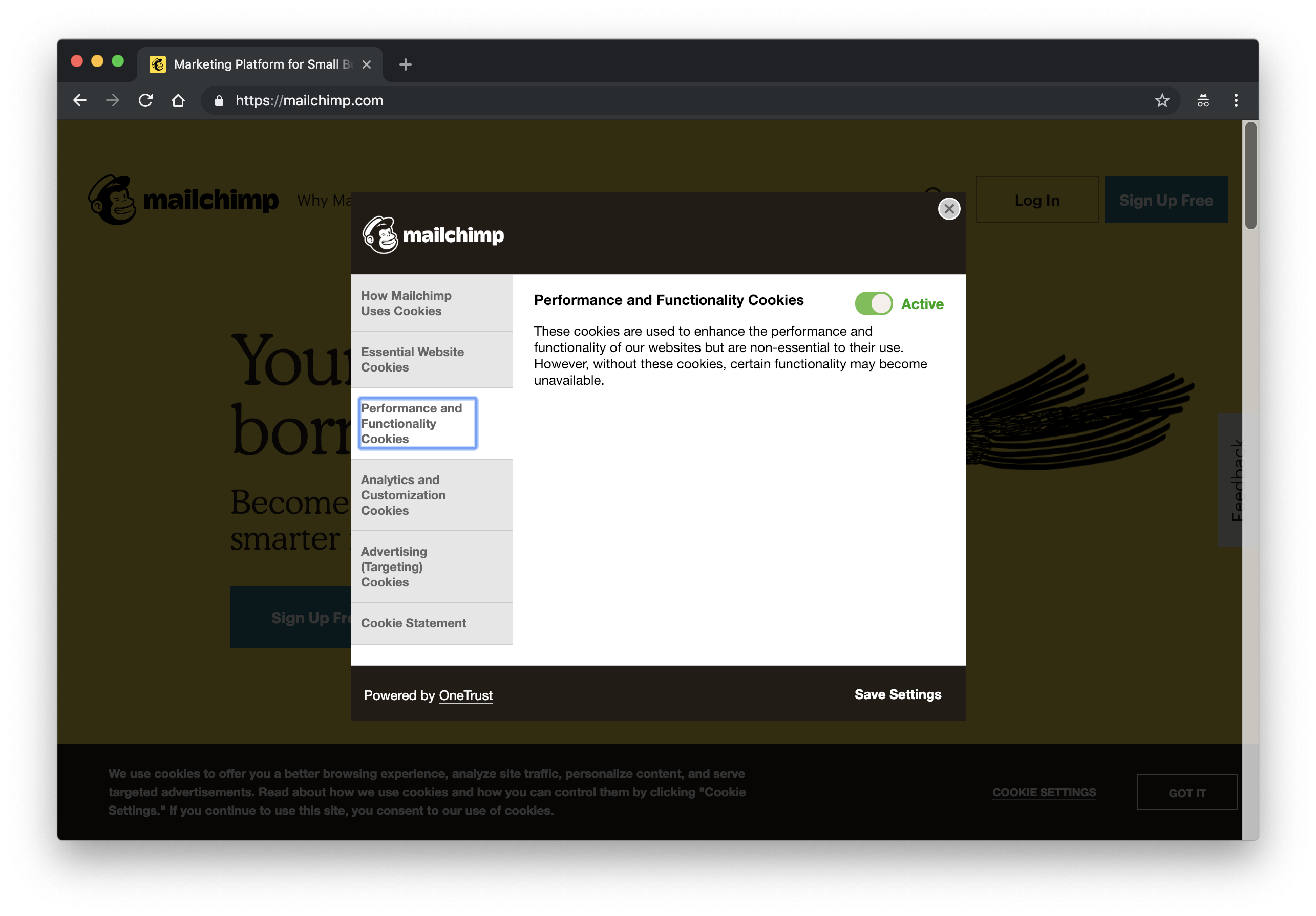
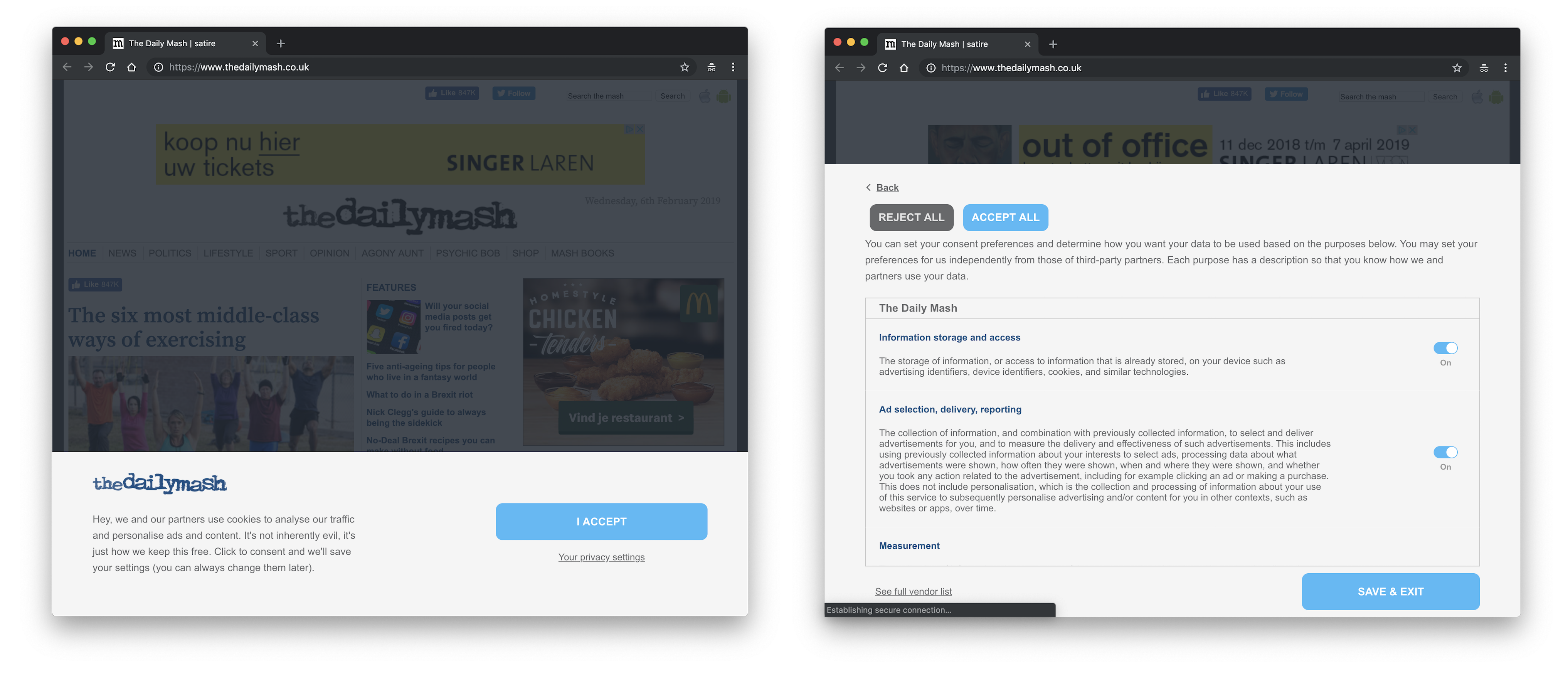
Whenever the cookie consent suggested an option to review cookies or adjust cookie settings, users expected to see an overview of all cookies and be able to adjust which cookies should be allowed to be set and which not. In terms of interface design, usually it’s done with tabbed sections within a cookie consent widget, with some groups selected by default. It’s common to see functional cookies, analytics cookies, advertising cookies, and website settings cookies. This level of granular control isn’t often expected but it’s considered to be helpful and friendly, and as such preferred — however, only if the entire category of cookies could be unselected at once, with a single tap on a single checkbox.
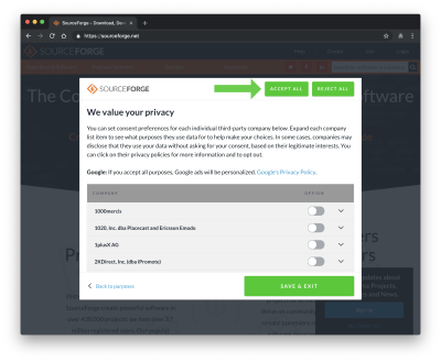
Oddly enough, some implementations go to extremes, providing users with an overwhelming overview of every single cookie set by third parties. It’s not uncommon for all of them to be opted in by default, and opting out requires a tap on every single one of them, one by one. It might not seem like a big deal with five cookies, but it’s a monstrosity with over 250 cookies generously provided by dozens of trackers on the site. In such cases, many users gave up after a few opt-outs, providing full access to their data and moving on.
Unfortunately, that’s just scratching the surface. Imagine a cookie settings prompt with a “Close ×” button. What behavior would you expect from clicking “Close”? Would you expect the prompt to be dismissed and then eventually reappear? Or would you expect all tracking scripts to be opted out by default? Opted in? Unsurprisingly, most users weren’t even thinking that far — they just wanted the pop-up to disappear. Nobody expected the trackers to be opted out by default, yet many users felt that it was a “temporary thing” that would show up again “at some point.” In practice, almost all of the time, closing the prompt was perceived by website owners as user consent and, in fact, all cookies were stored to their full extent. That’s not necessarily what the user was expecting.

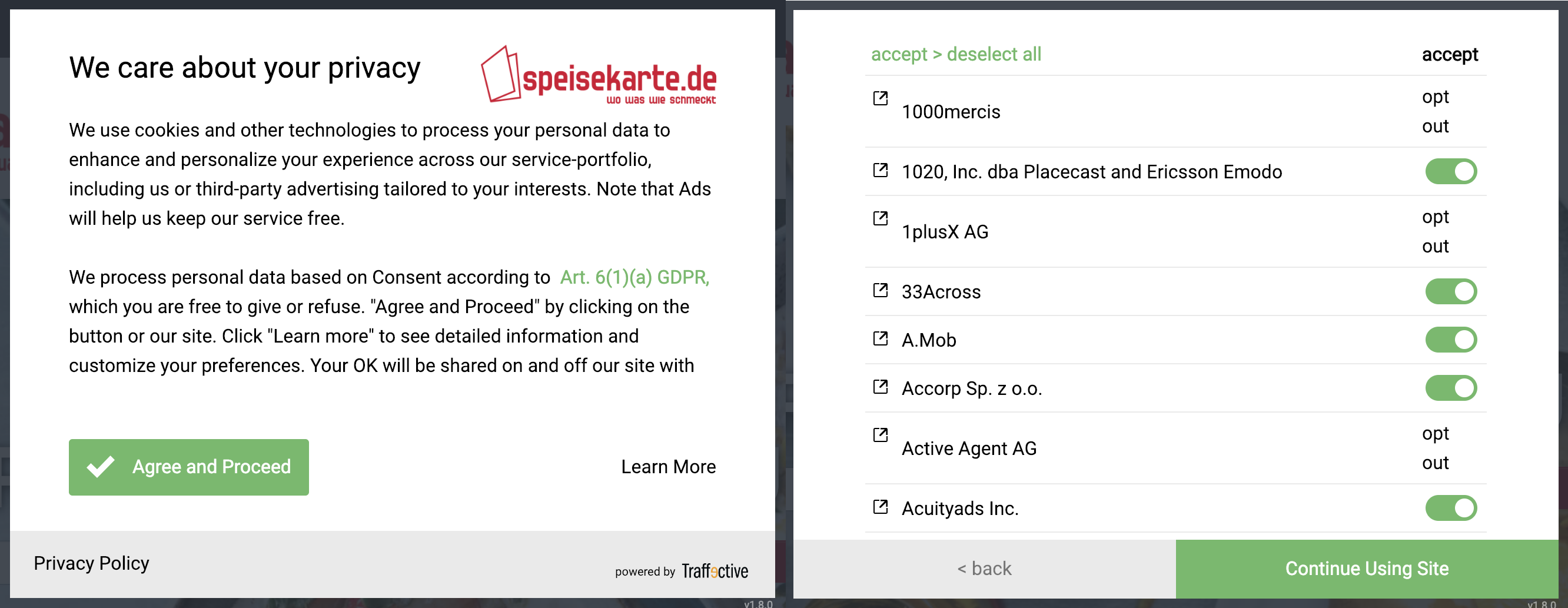
> in between. Also, the wording ‘Agree and Proceed’ or ‘Learn more’ isn’t obvious. (Large preview)The wording on buttons and links caused major confusion for users. On Speisekarte.de, you can either “Agree and Proceed” (primary, large green button) or “Learn more” (subtle grey link, not even underlined). What would you expect to appear after clicking “Learn More”? While many users expect a privacy policy to appear, the action actually prompts the management of cookies, with 405 ad selection, delivery, and reporting partners, 446 information storage and access partners, 274 content selection, delivery, and reporting partners, 372 measurement partners and 355 personalization partners. “Agree and Proceed” grants access to the storage and evaluation of customers’ personal data for 1,852 partners. That’s not too shabby, isn’t it?
It’s not obvious that the listing area for all those partners is scrollable at all, and there is no obvious way to unselect all of them. Would you find it enjoyable to manually opt out 1,852 toggles, one by one? Probably not. As it turns out, you can “deselect all” partners in the top-left corner of the window — however, this option is conveniently presented in a way that resembles breadcrumb navigation rather than a button. And, of course, all partners are opted in by default. That’s deceptive, dishonest, and disrespectful.
Once you get into the habit of rejecting cookies by default, you can find a number of shady and questionable practices that seem to be widespread. Sometimes companies place Facebook and Twitter tracking cookies in the “Necessary” category. Sometimes the option to reject cookies is conveniently hidden behind an extra “Manage” option. And sometimes there is an option to opt out from analytics, but a user is automatically opted in for “Anonymous analytics.”
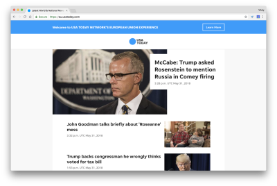
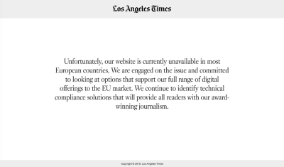
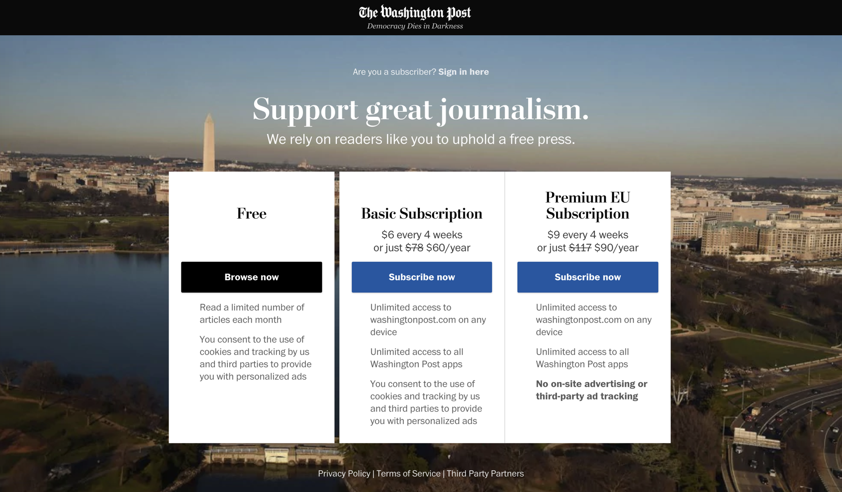
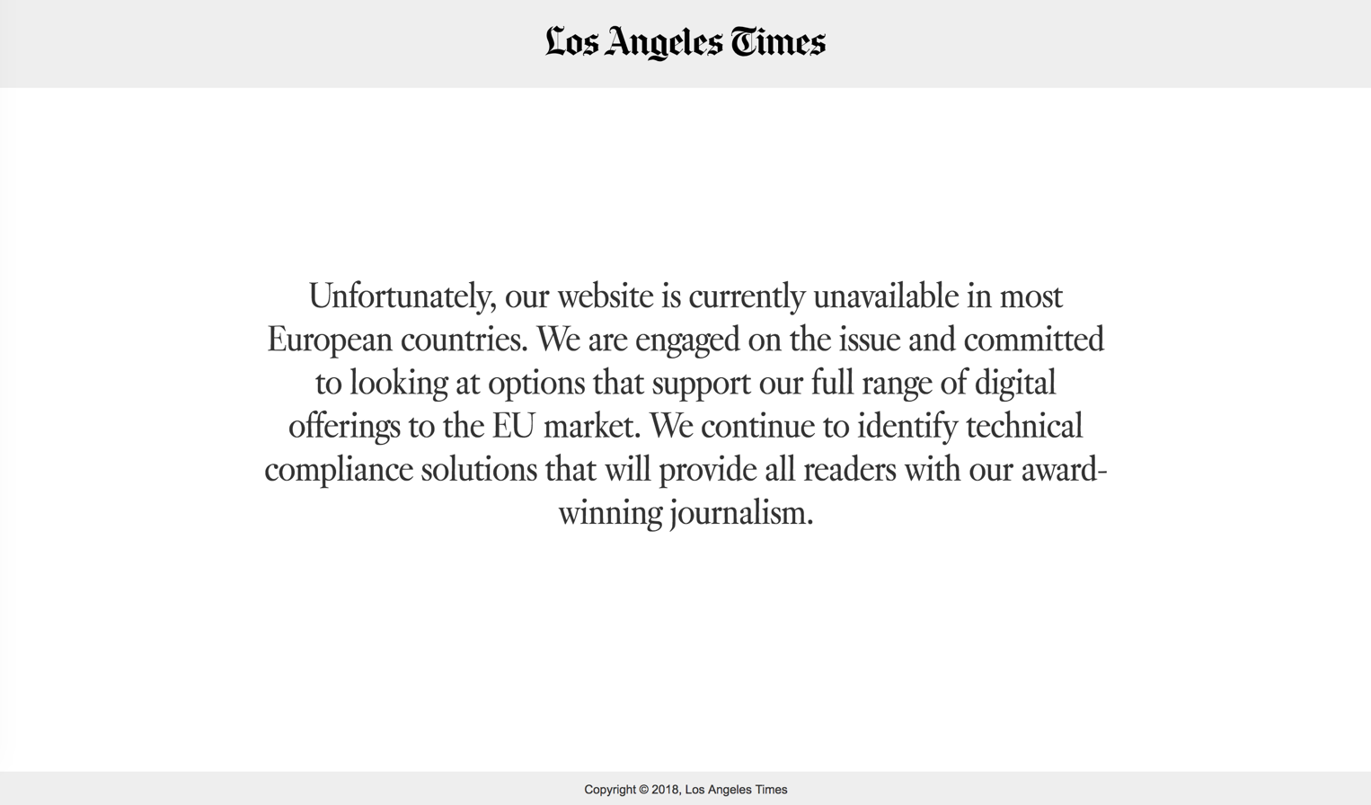
Some companies go beyond that, inventing new ways of making business should the user wish to avoid tracking. Sometimes it shows up with a “Premium EU Subscription” without on-site advertising and tracking scripts, and sometimes with a website being unavailable, or an “EU experience” (which, frankly, is much faster and lightweight than its non-EU counterpart). Not a single person accessing the site appreciated either of these options. That shouldn’t be a big revelation, but there is a significant amount of users who, being confronted with such treatment, have nothing left but to leave the site in search for alternatives.

Guidelines And Strategies For Better Design
According to the EU regulation, each cookie, its provider, purpose, expiry date, and type should be explained and elaborated in detail in a privacy policy, and many services such as TrustArc, IAB Consent Framework, Cookiebot, OneTrust, Cookie Consent, and many others provide this feature out of the box. They also provide an option to customize which groups of cookies should be presented as choices to the user, and while the default experience is decent, often it can be used to make it unnecessarily difficult for the customer to adjust their settings.

At the end of the day, we need to provide good experiences while also achieving our business goals. We can do that with a series of steps:
- We need to audit and group all cookies required on the site;
- We need to decide how each of these groups would be labelled, which ones would be required, and which would be optional;
- We need to understand what impact disabling a group of cookies would have on the functionality of the site, and communicate each choice to the user;
- Last but not least, we need to decide what settings should be selected by default, and what customization options we want to present to the user.
The simplest design pattern seems to be obvious. If you need user consent, display a narrow notification notice in the header or at the bottom of the viewport. No need to blur out or darken the content to make the notification noticeable; just make sure it doesn’t blend in with the rest of the site. If possible, allow users to accept or reject cookies with two obvious buttons: “Okay” and “No, thanks.” Otherwise, provide an option to adjust settings, following an overview of cookie categories. There, you have to make obvious the consequences each choice has on the website functionality, and enable users to “Approve all” or “Reject all” cookies at once — for the entire site, and for each category.
Where to place the notification notice? The position doesn’t seem to really matter — it didn’t make any difference in decision-making. The overlay covering half of the page, however, was perceived as the most annoying option — and it shouldn’t be too surprising as it literally blocks a large portion of the content on the page. Most users almost instinctively know what they are presented with, and they also know what action they’d prefer to take to get on with the site, so lengthy explanations are ignored or dismissed as swiftly as push notifications or permission requests.
In the next article of the series, we’ll look into notifications UX and permission requests, and how we can design the experience around them better — and with user’s privacy in mind.
- Part 1: Common Concerns And Privacy In Web Forms
- Part 2: Better Cookie Consent Experiences
- Part 3: Better Notifications UX And Permission Requests
- Part 4: Privacy-Aware Design Framework
A kind thank you to Heather Burns for reviewing this article before publication.
Further Reading
- The Potentially Dangerous Non-Accessibility Of Cookie Notices
- Using AI For Neurodiversity And Building Inclusive Tools
- How To Harness Mouse Interaction Data For Practical Machine Learning Solutions
- Privacy By Design: How To Sell Privacy And Make Change


