How To Use Spaces In Web Design With Gestalt Principles

Email Newsletter
Weekly tips on front-end & UX.
Trusted by 182,000+ folks.
 Celebrating 10 million developers


 Custom Web Forms for Angular, React, & Vue. Your backend.
Human brains are hardwired to connect the dots and make sense out of everything the eyes see. Design is a creative field where forms and space intermingle to lend us a variety of experiences. Whatever design we come across, our brains are hardwired to transform that piece into simpler components made up of basic shapes and forms that are at play with the spaces. Our minds flood with memories and — thanks to our experiences — we recognize the patterns easily.
Space — both positive and negative — plays a pivotal role in unifying the design elements. As a result, we see a uniform pattern (or not). When the elements are arranged in an orderly manner, the intelligent use of spaces draws our eye to the most noticeable space — be it positive or negative.
The positive space poses as the flesh or the meat of the design; it’s the part where you see the shapes, colors, patterns and so on. The negative space, on the other hand, is the background or the hyped white space (most of the times).
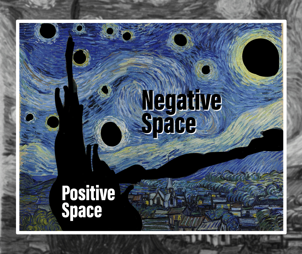
As much as the positive space seems to dominate the negative counterpart, both are used in equilibrium to tell a harmonious, coherent, and a seamlessly complete story.
In balanced compositions, the positive parts and negative space of the design work together and complement each other to form a seamless, aesthetically pleasing whole. Unbalanced compositions, on the contrary, can cause discomfort to the audience and convey an incomplete, rather distorted story.
But what kind of story do spaces tell in web design?
In the midst of the spaces, the success and failure of web design is determined more by the utility and the usability. Just consider that if you have poor design skills, the overall efficacy and the presentation of the web design will be disturbed. Content is king, but from an alternative point of view, the content will take its toll on your website if the spaces are not used appropriately.
If you think your developing skills rock but your design skills could need some more improvement, you’ve just hit the jackpot. In this article, we’re going to cover:
- Positive versus negative space relationship, importance and implementation;
- The connection between spaces and cognitive perception;
- The Gestalt principles and their implication in web design.
We’re also going to discuss some real-world web design examples with each Gestalt principle and creative use of spaces.
Without further ado, let’s begin.
Positive Versus Negative Space: Relationship, Importance And Implementation
Spaces comprise of two main dimensions: positive and negative. The positive is the element and the negative is the no element. As mentioned before, the positive is object, negative is the negligible space behind it. Where one is the focus, other serves as the background. Where the former moves and motivates, the latter remains stationary and obscure. Where one is the moon, the other is the dark sky surrounding it.
In web design, the spaces interact with each other to maintain the idea of holistic composition. Visual hierarchy is only created when both the spaces are differentiated with contrast and yet tend to the bigger picture (think of yin and yang).

We differentiate between the positive and the negative space at the meeting point. The negative occurs mainly as the white space that complements the positive to make it pop out.
It might seem that the positive space takes the lead, the negative space is equally important for a myriad of benefits. Some of these benefits are:
- It creates an easy-to-follow visual hierarchy;
- Sets the focus of attention as well as reduces distraction;
- Helps establish the scale and lets the focus appear bigger;
- It improves page scan-ability;
- Makes the flow on the page appear natural;
- It clarifies the relationship between the visual elements without the need for additional aids;
- It helps de-clutter the page;
- Enhances the style and look of the webpage.
Negative space in design isn’t that negative if you ask me. However, both space types perform great when used in a balanced ratio. Unfortunately, chaos strikes only when either one dominates the other and gives an ‘overcrowded’ or a ‘lacking’ impression. In both cases, the audience is unable to process such complex information, and hence, the motive of using space creatively for web design falls apart.
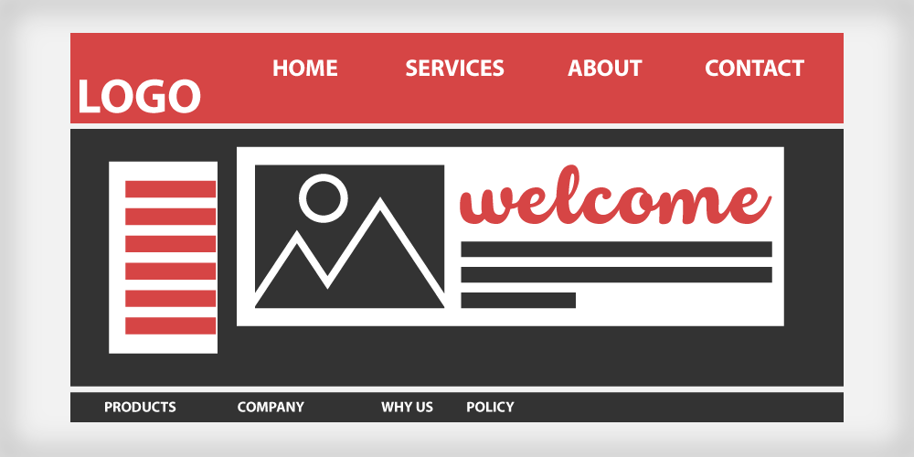
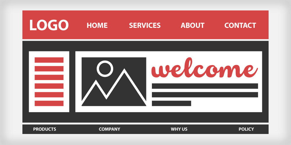
Here’s a web template with misplaced content or ‘chaos’ space:
As fascinating as the concept and arrangement of space occurs, doubt begins to fog the area.
- Is the positive space surrounded by the negative one or is the negative space eaten up by the positive one?
- How is the proportion of each space type determined?
- Which one should validate as the focal object?
- Is it mandatory to highlight one and eclipse the other to communicate your intended perception to the audience?
- How would I achieve ‘design nirvana’ with the communion of positive and negative spaces?
Questions like these can only be answered with a clear understanding of the basics. And as per the golden rule of thumb: simplicity is the best policy (we made that up because it fits!).
We mentioned in the beginning that web design is all about creating a simple user interface that helps you and your audience kill more than two birds with one stone, or in literal terms, helps increase the visual desirability of the website design as well as making it effective and easier to use — yes, with an incredible power over the use of spaces.
The Connection Between Spaces And Cognitive Perception
Since our minds are always playing the detective for finding hidden clues and missing links between the spaces, it compares present visuals with the ones experienced before as a part of the cognitive process. In order to become an efficient web designer, you must first understand how the brain pays attention to its surroundings. It may help you pin the particular use of visual elements and use them to influence the viewer’s perception.
“Great designers understand the powerful role that psychology plays in visual perception. What happens when someone’s eye meets your design creations? How does their mind react to the message your piece is sharing?”
— Laura Busche, Brand Content Strategist at Autodesk
You must now have a clear idea of how visual design and psychology are linked and have the power to influence each other. In other words, the main idea of developing a simple user-centric interface and using space for its design is by considering the Gestalt principles. These can help you understand and control the visual-psychological connection.
Recommended reading: Improve Your Designs With The Principles Of Similarity And Proximity
Gestalt Principles In Web Design
Gestalt is German for ‘forms’. It is more of a concept than a word, which states that:
“The whole is other than the sum of the parts.”
— Kurt Koffka
A collection of individual units appears as a group to us when they’re unified in some way. We see the elements as a group despite their individuality. This concept or theory applies fundamentally to all the design mediums: We don’t see text, colors, and shapes as separate elements, but instead a whole webpage as a collective entity. The same applies to a forest: we don’t only see a bunch of trees, just the same way we don’t see water drops when looking at an ocean.
The Gestalt principles describe how the human mind perceives visual components when certain terms and conditions are applied. It helps the brain create imagery of the visual. Hence, the Gestalt principles are based on six main categories:
Figure And Ground
The ‘figure’ is the object that is intuitively as well as visibly separated from the ground.

The most classic example that exists is that of the grail cup — the vase between two mirroring face silhouettes. When you first come across this image, your eyes are drawn to the most focally visual object that comes into your notice immediately, which might be the faces opposing each other or the vase. While your mind is adjusting your focus, the ground or the vase is blurred out and at that moment, your mind intuitively crops out the negative or the ground in the image.
After a while, you get to notice the vase in the background and realize it was there in the first place. As ambiguous as the Figure and Ground principle seems, designers usually create visually appealing surreal and illusionary art and web designs.
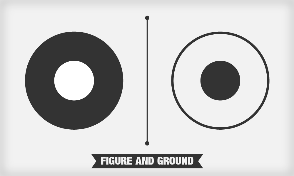
Sometimes, the relationship between figure and ground is stable, which makes both distinguishable from one another. This relationship is sometimes unstable, meaning that the figure and ground are indistinguishable from each other. Due to the ambiguousness of this relationship, the viewers confront perceptual confusion.
To give you a clear idea of how the figure-ground relationship influences web design, let’s discuss a few examples in detail. Each of these examples focus on three main areas of the figure-ground relationship: You can add explicit visual cues by using contrast, boxes, and shadows for your web design. These techniques are used to distinguish the color, size, and level of detail, to separate the content, and to add depth to the respective object of focus.
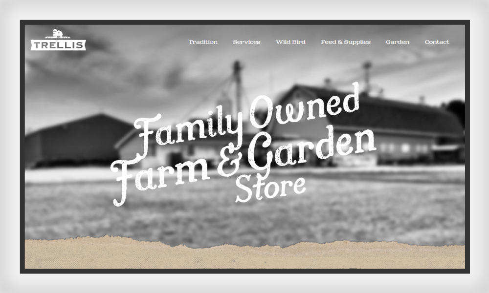
In the first example below, Trellis uses a ‘hero image’ (images with clear CTAs) with a figure-ground relationship that clearly indicates the level of detail, color, and size.

The text is the figure here in a large cursive font in the center of the page, making it stand out as compared to the image in the background. The white text over the contrasting grayscale image draws the focus of attention, which makes the text visible over it. From another perspective, the background is blurred so that the text pops out as the figure. All of these aspects show that the text here is prioritized as the figure or the positive space, while the blurred image is used as background or the negative space, hence strongly implying the concept of figure and ground.
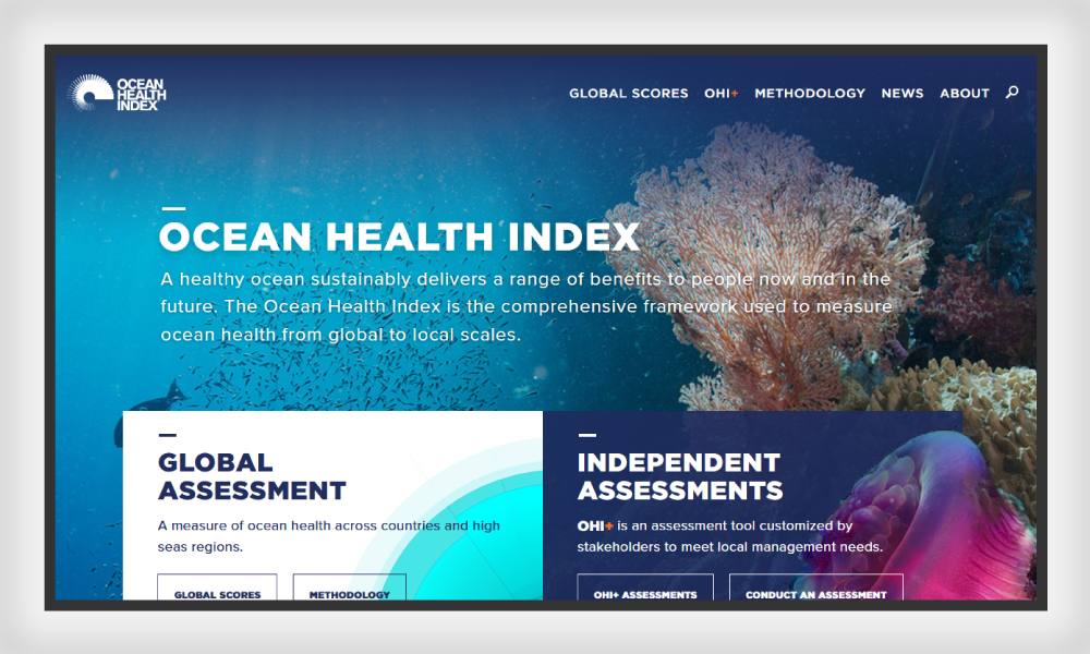
Next comes the content in boxes. Ocean Health Index makes a smart use of boxed content to separate the figure from the background. This is what you see when you come across their website:

Which part of it jumps at you when you first view this web page? If you ask me, it’s the main text in white in the upper right-hand side and the two boxes with contrasting color and text. The bold white text on the top is obviously the figure. (Notice how it’s placed over the darker image to stand out.) The boxes down below are also part of the figure, due to the contrast they offer to the ground image. The other aspect of this figure is the second contrast that is placed inside the boxes in the form of contrastive-colored text.
The background uses subtle shades that help the figures appear sharply, showing a pattern of detail here. The boxes are also overlapping the background image, bringing them in clear view over the image.
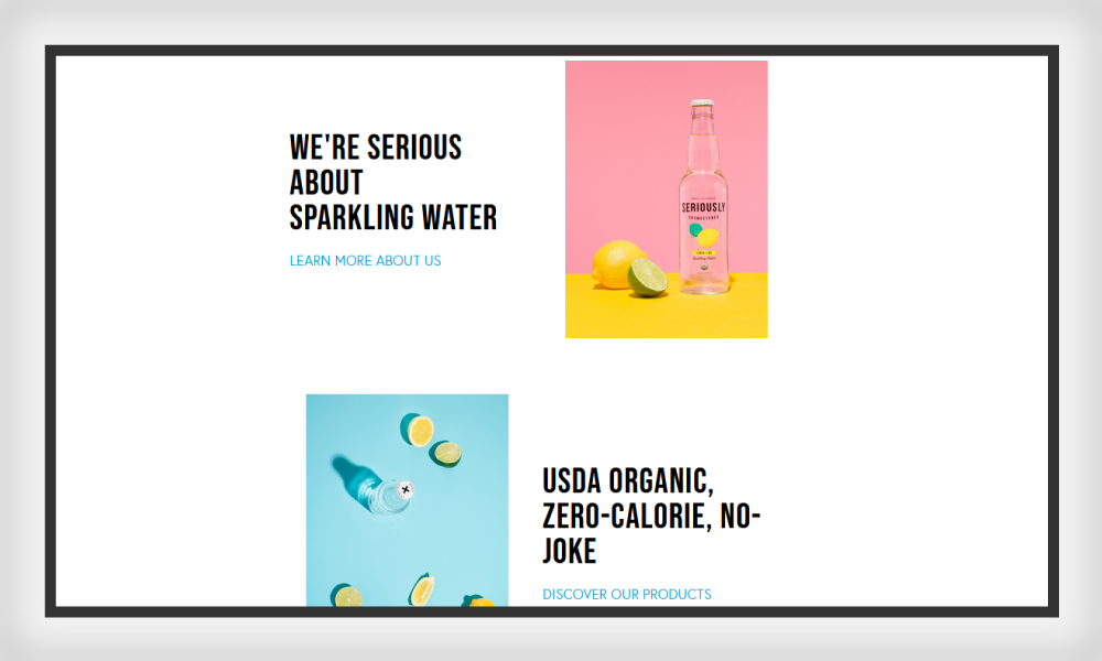
Some websites also exhibit the figure-ground relationship by adding drop shadows to the figure, in order to give a feeling that the figure is placed over the background. Here’s a screenshot from Seriously Unsweetened:

Seriously Unsweetened’s landing page uses more than one technique to maintain that figure-ground relationship in a balanced manner. There are bright colors and shadows. The ground remains white, making it easier for the figure to appear accurately above the ground. In the positive space, the objects in the figure are presented under an illusion as of being ‘on the top’ of the background. The shadow game is played inside the primary figure, making us notice that there is another figure-ground relationship within the main figure. A clever one!
Proximity
Proximity refers to the closeness of elements in a page. Different elements in webpages can be grouped together to create a bigger association. Apart from being similar, the closeness of these elements with each other than other page elements will automatically be paired in the viewer’s mind.
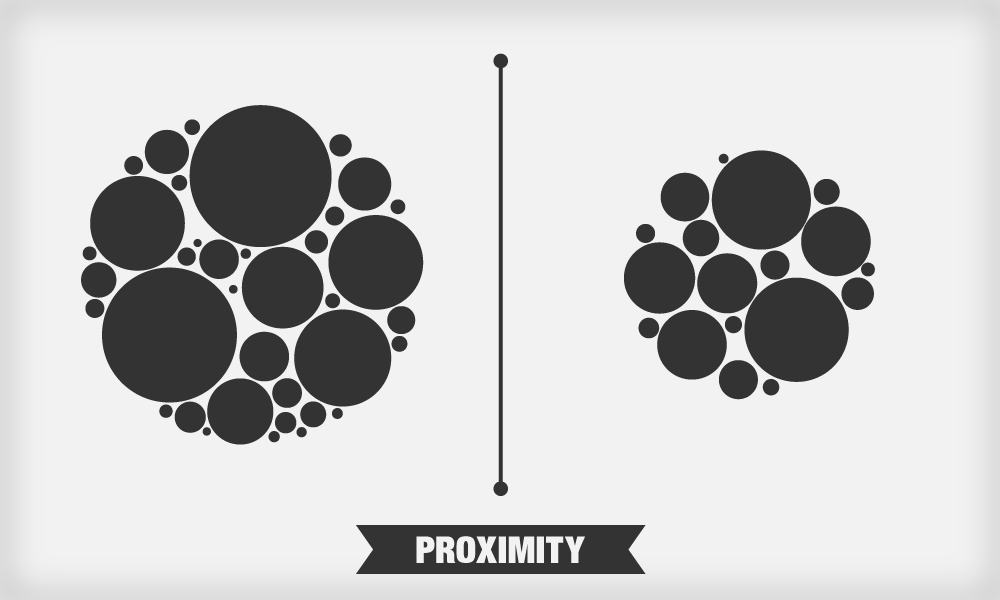
From images to texts and navigation bars to web forms, the Proximity principle applies heavily to web design. When you group similar content together, it creates a seamless relationship between the elements and delivers a better visual experience to the viewer.
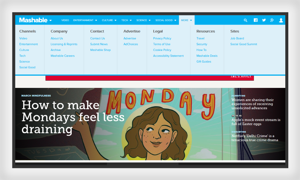
Here is an example of proximity as displayed in the navigation of the Mashable website:

In the snapshot above, you can clearly notice how the elements of the same category are placed together to show the relation with the main menu type. The users’ eyes are automatically drawn to the subtypes under the main heading — also thanks to the use of colors and text size. You can see that the items that are unrelated are set apart with the help of a line, which serves as the users’ guide in relating and separating the items as per the principle of proximity.
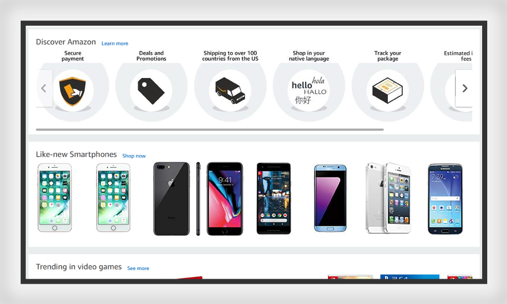
Besides delineating the navigation bar, the grid-based content also complies with the golden rule of Proximity. Amazon’s product listing is the best example:

Proximity complies with similarity, which is yet to be discussed. As you can see, similar products in the positive space are grouped and separated using narrow white space. This instructs the user to sort their preferred item from the list of similar products. Moreover, the principle of closure also comes into action among the list of similar items.
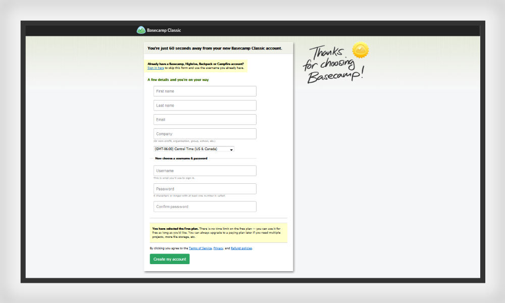
Now, we’ll take a closer look at the Basecamp web form which displays yet another ideal case for proximity in web design:

You can notice how the form is divided into two main segments: personal details and ID generation. The first section is implied as the most important field, followed by a lesser important requirement. The headings for both the sections vary as shown by the difference in color and font size. In this web form, proximity is an indicator that places and prioritizes grouping of information from highest to lowest importance.
Symmetry And Ordery
Symmetry refers to the exact reflection or the mirror image of the two opposing planes. It can be regarded as the balance that divides an object into two equal halves. Real-world examples of symmetry include geometrical images like equilateral triangles, circles, and squares and so on.
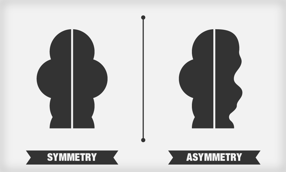
The human mind desires to find the ‘balance’ in human faces, which it finds aesthetically pleasing. The mind also tends to find symmetry in other objects, such as images because symmetry creates harmony and allows the viewers to be at comfort while viewing the image.
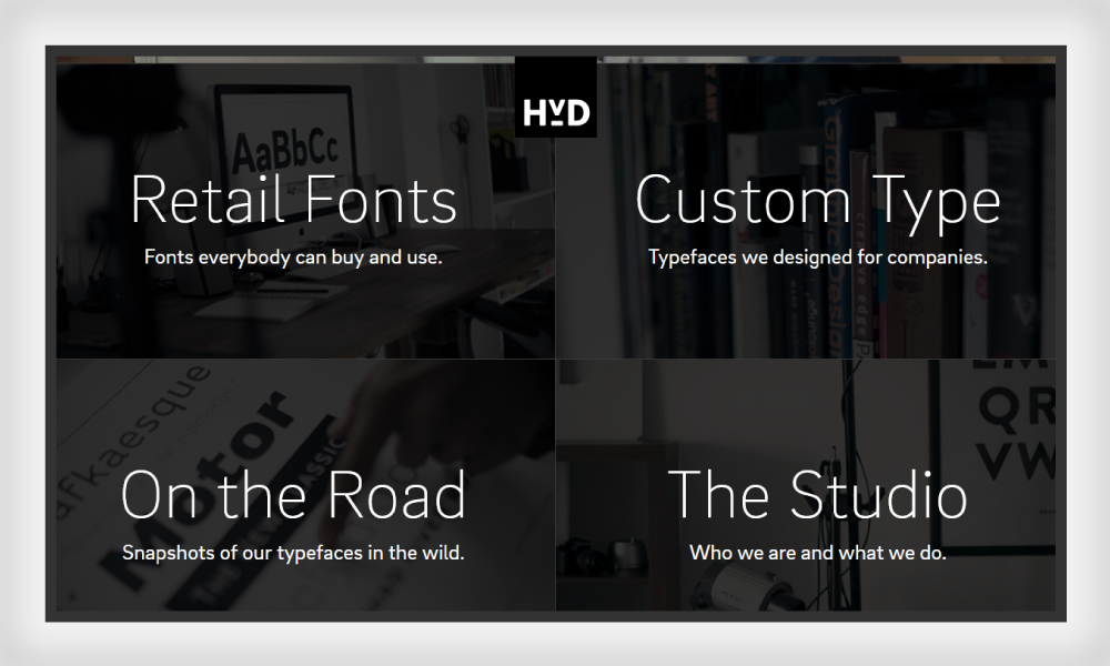
Below is a great example of symmetry in web design as exhibited by HvD Fonts:

Not only does this webpage show a typical figure-ground relationship, but also displays great symmetry. The page is dissected into four equal halves with fonts of similar size and color. The background in each of the four sections runs along the same theme with a grayscale effect. You can also notice that the negative space isn’t necessarily white; it’s the image in the background.
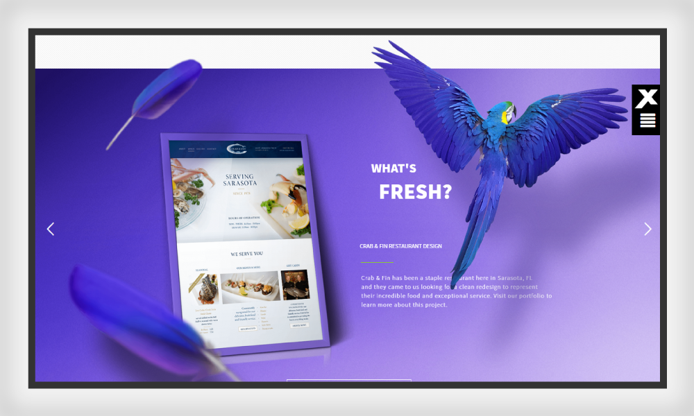
The idea of symmetry gives rise to another notion: asymmetry can be confusing and must be used with great care when used in web design. Many websites use asymmetry as the main balancing element for spacing, where the unconventional positive space is balanced with a neutral background and vice versa. And as per the concept of asymmetry, Xplode Marketing prompts asymmetry with unique aesthetics pleasing the eyes.

This webpage immediately grabs the eye using optical illusions as well as asymmetry. The positive space objects are placed in an unusual pattern over the negative space that creates the appeal. The color is the main indicator of harmony between both the spaces and develops a natural connection for the viewers to notice. There is also a strong balance of left-hand graphics with the strong and dominant wings on the right. What do you think?
Similarity
The reason that proximity works closely with the principle of similarity is the quality of shared attributes among the similarly-grouped objects. Whether it be color, shape, posture, size, shape, orientation or any other property, connectedness will prevail when one or more of these are shared in all the objects displayed in proximity.
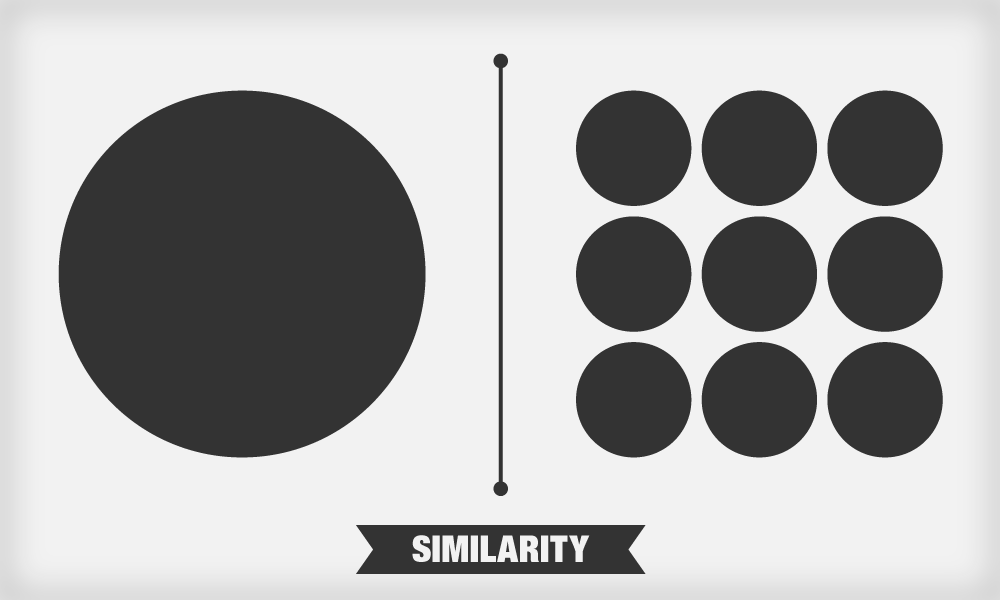
Even if the positive space elements do not look visibly connected, these will stand apart from the negative one due to the principle of similarity.
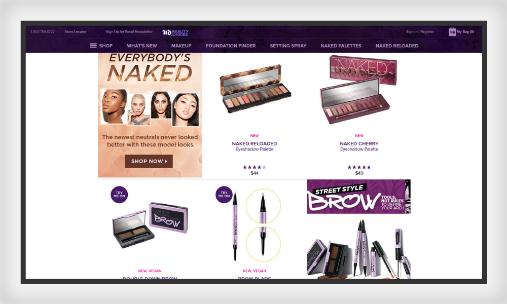
Just look at these UrbanDecay palettes list for a moment:

The positive spaces aka the figures are different from each other but do share some similarity in various aspects, such as their position, color, product layout and mode of presentation. The only dissimilar object is the ad for the eye shadow primer that stands out uniquely in the line of the similar-product category. This is obviously a marketing tactic that is intended to draw attention without hurting the overall symmetry and beauty of the page. Another point to consider here is that similarity in size sets the other image apart from the similar product category.
Other than just product display, the positive space can be employed with the similarity in conjunction with the negative space.
Let’s take a look at the influenster landing page:

The similarity in the above example shows clearly aligned boxes. Though the products in each positive space are different, the perception of similarity is conveyed by the consistent text fields in the overall page. The genre, layout, and the theme all are similar, hence delivering a seamless effect to the vision.
Closure
Did you ever come across an image that seems close but is open? That is because of the principle of closure. Our brains tend to ‘close’ the gaps in the incomplete objects and use our visual perception to complete the figure, seeing it as a whole.
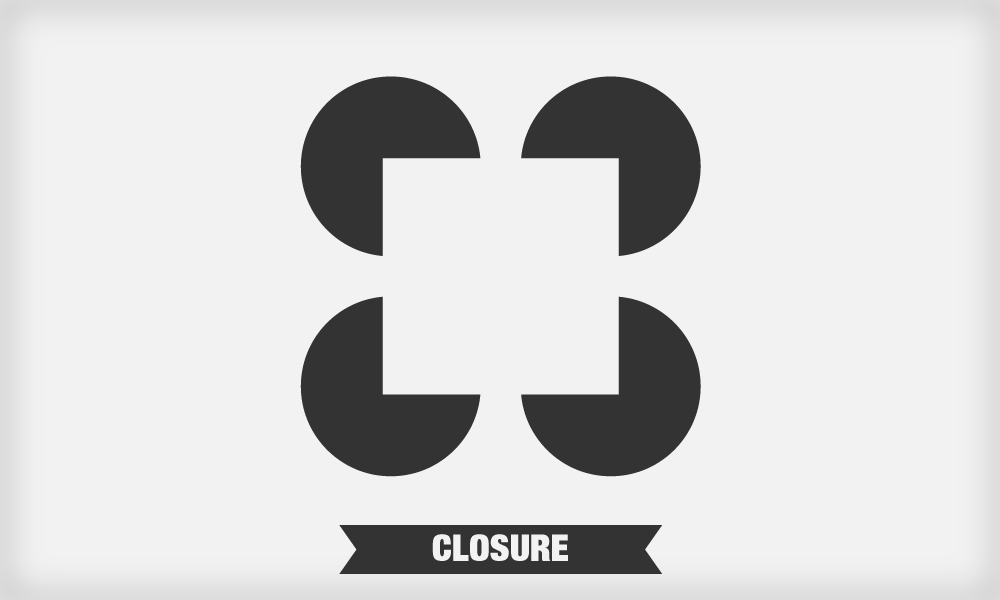
The positive and negative spaces close in to form a whole. The best example is that of the hidden shapes and forms in the negative space in and outside the design, which demands an intelligent assessment of message within the design. Using both the spaces creatively in the closure can give rise to an interesting yet simplified design.
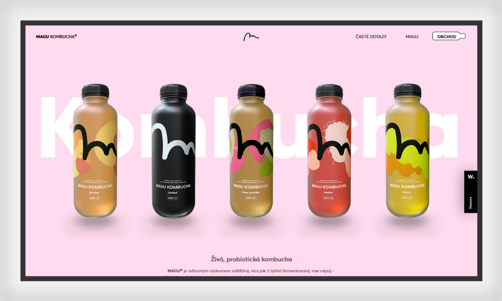
Take a look at the screenshot from Magu Kambucha below:

In this example, you can see that closure is kept intact with the principle of the figure-ground relationship. The bottles and the bold text behind are obviously the figure, where the background is solid soft pink. Where’s the closure? See the text behind the bottles? You can’t see it completely, but still know it’s ‘Kambucha’. Except for the first ‘K’ and the last ‘A’, other letters are half hidden, which are intuitively completed and the whole form begins to take shape and consequently, the meaning. This, my friend, is one good example of closure we have here!
Take a look at the screenshot from Cult below:

Even though the text is not spelled out quite clearly, our minds can easily read the word CULT. The arrangement and alignment of the text made it easy to decipher, even when the words are incomplete.
Continuity
Finally, as per the general Gestalt principles, continuity follows the pattern by leading the eyes to follow a consistent path and establishing a linear pattern from object to object. It can best be understood by the example of a positive space line with a curved over the negative space. The colors of both lines indicate that the lines bent by each other, but the pattern of continuity suggests otherwise.
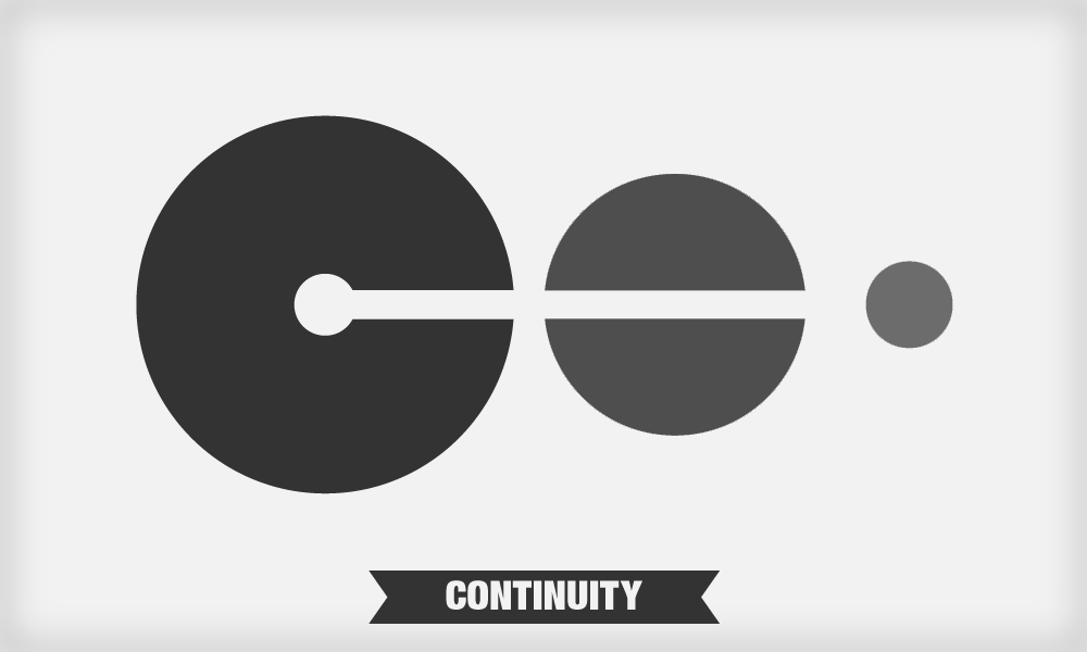
In the image above, the viewers are more inclined to see a straight line despite the color degradation. This leads us to believe that the principle of Continuity guides the perception better than the power of color. This concept flows smoothly through both kinds of spaces. When we insert a subject in the negative space, our eyes tend to draw the line of distinction between the positive space and the negative one.
The imaginary line of continuity is what we tend to introduce in the design to guide our perception when differentiating between the positive and the negative space.
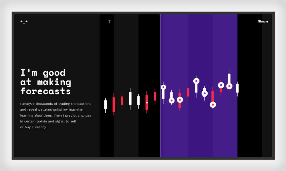
Let’s take our cue from the Crypton Trading website down below:
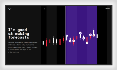
See the perfect continuation of design in the right half of the page? Regardless of the light and dark hue in the background, the pattern is pretty much obvious on the page. And when you scroll down, you will see how the pattern as well the color change in a continuous and seamless motion. The shift in tones is negligible here and all we see is a continued pattern of lines and dots.
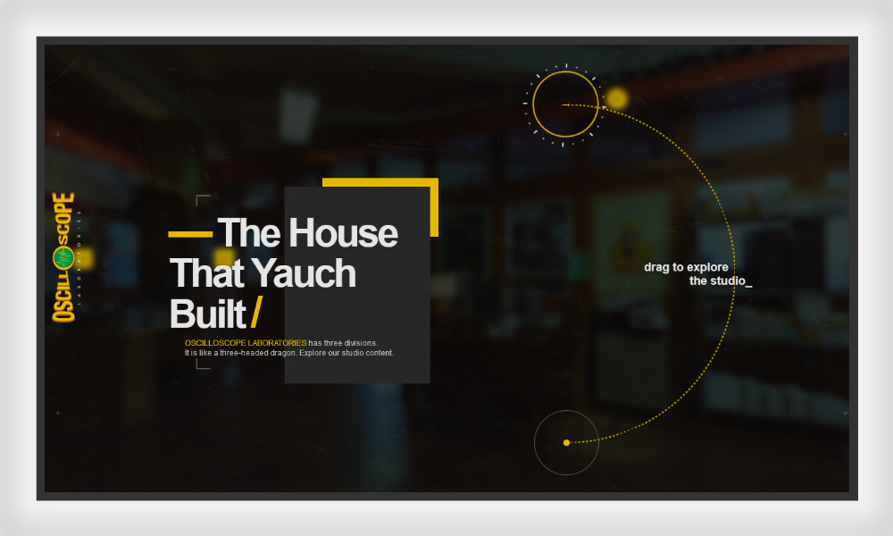
Another good example is the OscilloScope website:

The website uses the law of Continuity to take web visitors to a 360-degree view of the studio where they can navigate their way to the desired section.

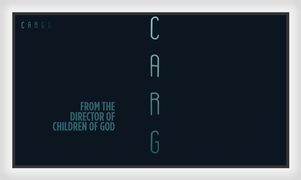
The film Cargo has a landing page that also uses the law of continuity: it get its text float across the website in a linear motion using the scroll-only navigation. Since the half-visible logo was shown vertically, the viewer has to scroll down to get a full view of it. As the page is scrolled down, the static logo starts floating along with the chunks of text running parallel to it. The navigation leads the user through different levels of experience without interfering the darkness lurking below.
Since our eyes usually follow the smoothest path, graphic designers can use such examples to make them follow the desired path and position the elements along a line.
Summing It Up
In this article, we covered the Gestalt principles in relation to positive and negative spaces in websites. We also made sure we include some real-life examples to give you a clear idea of how you can employ simple yet effective techniques to influence your audience’s perception. The key here is to use these principles to create a web design that appears more than the sum of its parts.
We humans think in terms of our perception — mainly based on visuals. According to the Gestalt principles in relation to positive and negative spaces, we tend to see the bigger picture rather than individual elements at first glance.
Positive and negative spaces help us differentiate, help us recall our experiences, and recognize the patterns. With the help of the Gestalt principles, we are better able to visualize how well we can use spaces in web design to create appealing pieces. Since spaces can appear as a tangled affair for any designer, the best way is to keep intact your Gestalt principles. This is the only way you can truly realize the importance, usage, and effectiveness of spaces in your designs and effortlessly become an effective contributor in the web design domain.
Want to add something else? Don’t forget to share your ideas. We’d love to receive the feedback!
Other Resources
Here are a few design sources to help you understand the Gestalt principles:
- “Design principles: Space And The Figure-Ground Relationship,” Steven Bradley, Smashing Magazine
- “Psychology + Design: Gestalt principles You Can Use As Design Solutions,” Mhariell Riel, Medium
- “Gestalt principles In UI Design,” Eleana Gkogka, Medium
- “The Gestalt principle: Design Theory For Web Designers,” Ahmed Hussam, Envato Tuts+
- “Design principles: Gestalt, White Space And Perception,” Barbara Marcantonio, Manifesto
Don’t forget to check out the related recommended tutorials:
- “How To Apply Optical Illusions To Web UI Design,” Jerry Cao, TNW
- “How To Create A Negative Space Logo Design,” Tarif Khan, LogoDesign.net
- “How To Improve UX Using Gestalt principles,” Steven Douglas, Justinmind
- “Using Negative Space To Create A Powerful Composition,” Sean Adams, Lynda.com (Video)
Further Reading
- The Underestimated Power Of Color In Mobile App Design
- The Principles Of Visual Communication
- Inspired Design Decisions With Emmett McBain: Art Direction As Social Equity
- What Saul Bass Can Teach Us About Web Design
 (il, mrn)

