Better Search UX Through Microcopy

Email Newsletter
Weekly tips on front-end & UX.
Trusted by 200,000+ folks.


It’s hard to overstate the importance of web search. Searching is as old as the Internet itself, and by some measures, even older. A well-designed search benefits both you and your users; it increases conversions, reduces bounce rates, and improves the user experience.
Search is especially important on large scale sites and e-commerce experiences, where the majority of revenue comes from search-driven sessions. Studies show that up to 50% of users go straight to the internal search bar of a website, and that 15% outright prefer using the search function to browsing the hierarchical menu. This means that for all the love and care that goes into determining the information architecture of a site, just as much has to go into designing the search experience.
Complicating the problem is the fact that users’ search skills are flimsy at best, and incompetent at worst. Getting good results from a search engine often requires multiple attempts and reformulations, which users rarely do. And as search technology improves over time, users are increasingly likely to accept the results of a search as the answer to their question, even if their query was flawed. Users who favor searches tend to move quickly, scanning the page for that familiar-looking rectangle, and bouncing quickly when they don’t find what they’re looking for.
Communicating with those users “at speed” is a tricky job that requires a specialized tool: microcopy. The name ‘microcopy’ belies its own importance. It may be small, but big successes often hinge on it. It’s a place where voice can shine through, where good impressions are made, and where utility and branding intersect. With that in mind, let’s dive into the many ways that microcopy and contextualization can vastly improve a search experience.
Placing And Labeling Your Search
In accordance with Jakob’s Law, your first instinct when designing a search bar should be to put a rectangular box in the upper right or upper left corner. You should add a label or A11y-friendly placeholder text, and include a submit button that says “Search.”
Hiding the search bar behind a link, forgoing placeholder text, or opting for magnifying glass icon CTA instead of plain text are all valid design decisions in the right context. Just make sure you’re not abstracting the function of the search bar unnecessarily because searching already has a higher interaction cost than browsing.
Every barrier, however inconsequential you may find it as a designer, risks negatively affecting the UX and your bottom line. If there’s a risk your users may confuse the magnifying glass icon for a “zoom” button, you should mitigate that.
Placeholder Text
Placeholder text is a great place to enhance the experience. It can be informational, it can be a place for brand expression, and it can nudge wavering users in the right direction. Anytime I see a search bar that just says “Search,” I see a missed opportunity.
So what’s a better approach? It varies from site to site. First, familiarize yourself with your business goals, your brand, and your users’ existing habits. Then, consider how you can be the most helpful.
Nudge The User
A suggestive approach can reduce the user’s anxiety. Clue your users into the fact that they can search in multiple ways, especially if they may not be familiar with your full range of products or services. ASOS suggests searching for inspiration in addition to products and brands:

Be Informative
Tell the user exactly what they’ll be getting when they hit submit. On Shutterstock, a site wholly devoted to the search of a massive photo archive, this placeholder text cleverly doubles as a tagline when paired with the logo:

Reinforce The Brand
Home Depot’s search bar doesn’t lead the user, but instead presents a helpful, personal tone which I’m sure is in line with their brand voice guidelines. This is probably the best approach considering the size of their product catalog:

Using Search Logs To Your Advantage
If you’re not sure the best way to optimize your placeholder text, a good place to start is your search log database. Learning how to break down these results can be incredibly valuable when formulating helpful content design. You’ll be able to see first-hand the vocabulary people use to search your site, and more importantly, the gaps between what you offer and what your users are looking for.
Suggested, Related, And Recent Searches
During the search process, your copy should offer as much help along the way as possible without being overbearing. That includes everything from an obvious “Cancel” or “Clear” button to logging each user’s recent searches for surfacing later. When choosing the right microcopy to accompany these features, add a dash of brown sauce.
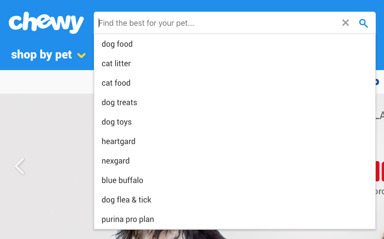
Autosuggestions
Users who use the search bar are doing so because they’re looking for something specific, which makes autosuggestions a valuable (and increasingly expected) tool. Specificity, in this case, may be as focused as “Women’s gray shoe size 9M” or as open-ended as “Sandwich shops near me.”
Autosuggestions also reduce the risk of returning bad results, alleviate the mental effort on the user, and present an opportunity to surface your most popular products.

Often these don’t require additional context or copy at all, but can just be listed below the search bar as the user types, as shown in the example above.
Related Searches
Showing related searches on the results page is another way to help guide users without getting in the way. A common pattern is providing a few clickable keywords related to the original query above the results. A little copy that states “Other users searched for” is a good way to incorporate social proof into the search experience.
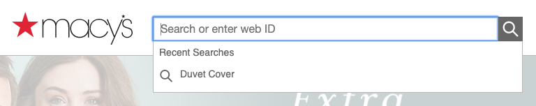
Recent Searches
If your technology allows it, saving and resurfacing recent searches is another way to helpfully reduce the memory load on the user. Make sure you add context with copy, but it can be as straightforward as this:

Handling Results
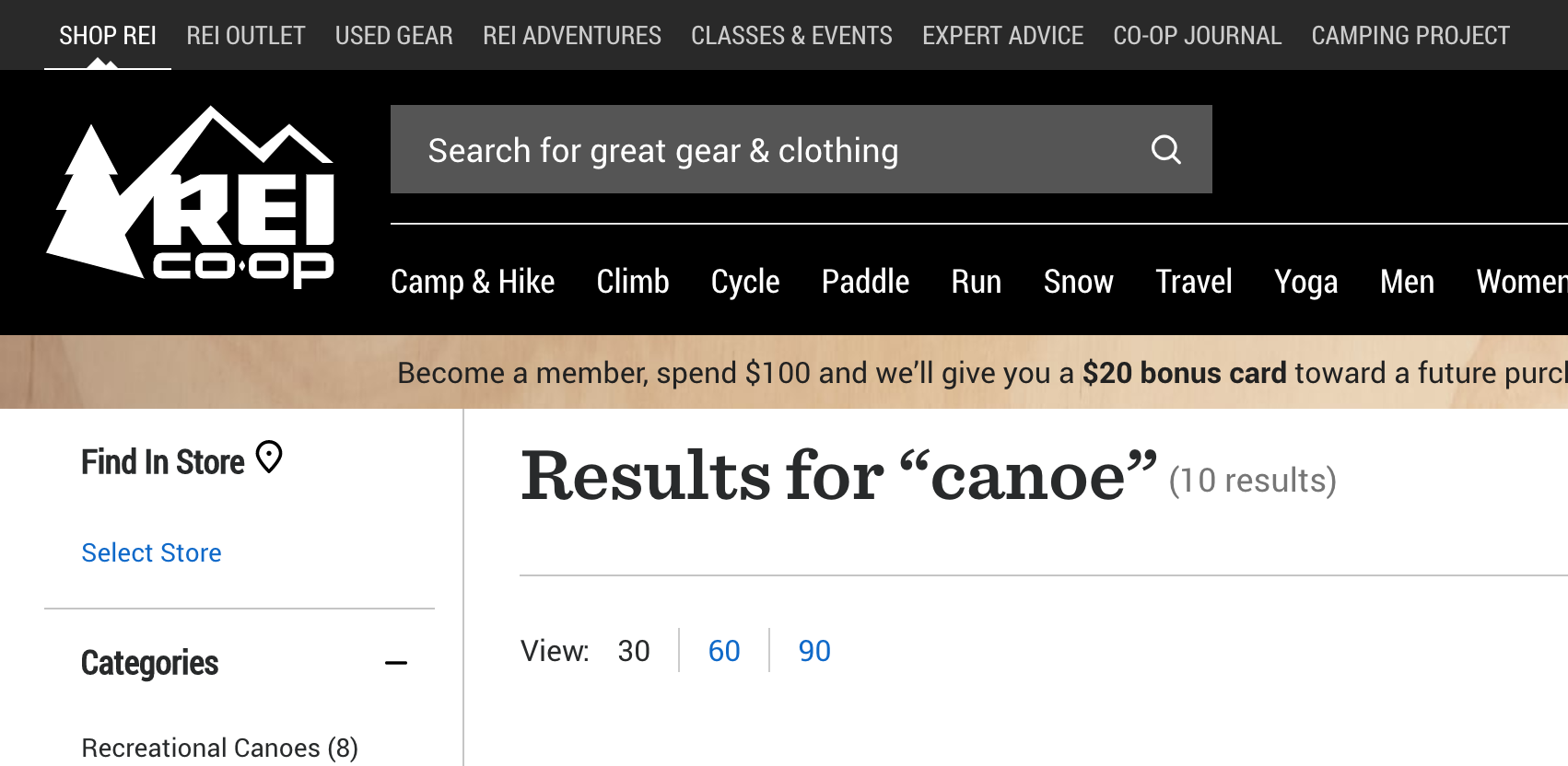
There are a two pieces of copy that I’d consider required when displaying search results:
- The query itself.
If the search bar is highly visible, it can be displayed here. You can also create an H1 that states "Results for {{terms}}." - The number of results.
If the results are paginated, you might also include the number of pages.

No Results
Whether through their own error not, users will inevitably encounter a “no results” page at some point. Luckily, there are ways to handle this gracefully; in fact, with the right approach, this dead end can actually be a great opportunity for content discovery.
First of all, don’t expect your users to refine their search if they get no results — at least not without a UI that encourages it. Users are reluctant to reformulate their query and have trouble when trying to. They’re more likely to engage with whatever information they’re presented with and take it from there, or abandon the task entirely. (When was the last time you clicked through to the second page of Google search results?)
That said, it’s easy to see how a little copywriting and contextualization can improve the experience. Nielsen Norman Group has a comprehensive guide on how to handle No Results SERPs, with the gist being:
- Make it obvious there are no results.
It’s easy to get cute and accidentally bury the lede. It’s also tempting to intentionally hide the “no results” messaging to obfuscate the error entirely. Either way, don’t trick the user. - Offer paths forward.
Suggest ways to refine the search query (such as checking your spelling), and also provide links to popular content or products that have the highest likelihood of connecting with the user. - Strike the right tone.
Use your brand voice, but don’t run the risk of exacerbating the situation with humor that might be ill-received by a frustrated user.
Also, bear in mind that empty SERPs may arise because a user mistakenly submitted without entering any query at all. You should have a content plan for this scenario as well rather than returning all items in the database, for example.
Wrapping Up
Writing a good search experience comes down to thoughtfulness. As designers, we’ve probably used and created hundreds of different web search experiences, so we breeze through the process. But when we consider every small step of the process (every microinteraction and every edge case), the minor changes we make can have a major impact on the experience. Next time you find yourself reaching for a visual solution to a search problem, consider using your words instead.
Further Reading
- How To Run A Content-Planning Workshop
- How Copywriting Can Benefit From User Research
- Designing The Words: Why Copy Is A Design Issue
- How To Deal With Redundant, Out-Of-Date And Trivial Content ROT


