Building A Component Library Using Figma

Email Newsletter
Weekly tips on front-end & UX.
Trusted by 182,000+ folks.
 Register for Free
 Custom Web Forms for Angular, React, & Vue. Your backend.
 Celebrating 10 million developers


I’ve been working on the creation and maintenance of the main library of our design system, Lexicon. We used the Sketch app for the first year and then we moved to Figma where the library management was different in certain aspects, making the change quite challenging for us.
To be honest, as with any library construction, it requires time, effort, and planning, but it is worth the effort because it will help with providing detailed components for your team. It will also help increase the overall design consistency and will make the maintenance easier in the long run. I hope the tips that I’ll provide in this article will make the process smoother for you as well.
This article will outline the steps needed for building a component library with Figma, by using styles and a master component. (A master component will allow you to apply multiple changes all at once.) I’ll also cover in detail the components’ organization and will give you a possible solution if you have a large number of icons in the library.
Note: To make it easier to use, update and maintain, we found that it is best to use a separate Figma file for the library and then publish it as a team ‘library’ instead of publishing the components individually.
Getting Started
This guide was created from a designer’s perspective, and if you have at least some basic knowledge of Figma (or Sketch), it should help you get started with creating, organizing and maintaining a component library for your design team.
If you are new to Figma, check the following tutorials before proceeding with the article:
- Best Practices: Components, Styles And Shared Libraries
- Intro To Figma: Beginner’s Guide To Figma Basics (Video)
- Figma For Beginners
- Figma 101
Requirements
Before starting, there are some requirements that we have to cover to define the styles for the library.
Typography Scale
The first step to do is to define the typography scale; it helps to focus on how the text size and line height grow in your system, allowing you to define the visual hierarchy of your texts.
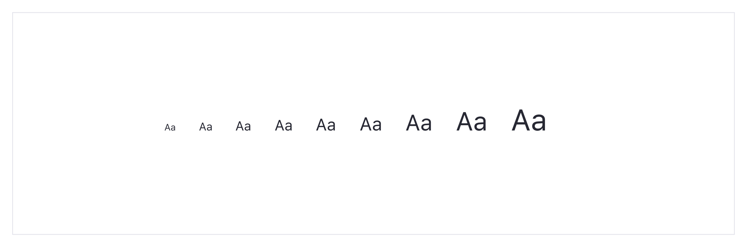
The type of scale depends on what you’re designing. It’s common to use a bigger ratio for website designs and a smaller ratio when designing digital products.
The reason for this is behind the design’s goal — a website is usually designed to communicate and convert so it gives you one or two direct actions. It’s easier in that context to have 36px for a main title, 24px for a secondary title, and 16px for a description text.
Related resource: “8-Point Grid: Typography On The Web” by Elliot Dahl.
On the other hand, digital products or services are designed to provide a solution to a specific problem, usually with multiple actions and possible flows. It means more information, more content and more components, all in the same space.
For this case, I personally find it rare to use more than 24px for texts. It’s more common to use small sizes for components — usually from 12 to 18 pixels depending on the text’s importance.
If you’re designing a digital product, it is useful to talk to the developers first. It’s easier to maintain a typography scale based on EM/REM more than actual pixels. The creation of a rule to convert pixels into EM/REM multiples is always recommended.
Related resource: “Defining A Modular Type Scale For Web UI” by Kelly Dern.
Color Scheme
Second, we need to define the color scheme. I think it’s best if you to divide this task into two parts.
- First, you need to define the main colors of the system. I recommend keeping it simple and using a maximum of four or five colors (including validation colors) because the more colors you include here, the more stuff you’ll have to maintain in the future.
- Next, generate more color values using the Sass functions such as “Lighten” and “Darken” — this works really well for user interfaces. The main benefit of this technique is to use the same hue for the different variants and obtain a mathematical rule that can be automated in the code. You can’t do it directly with Figma, but any Sass color generator will work just fine — for example, SassMe by Jim Nielsen. I like to increase the functions by 1% to have more color selection.
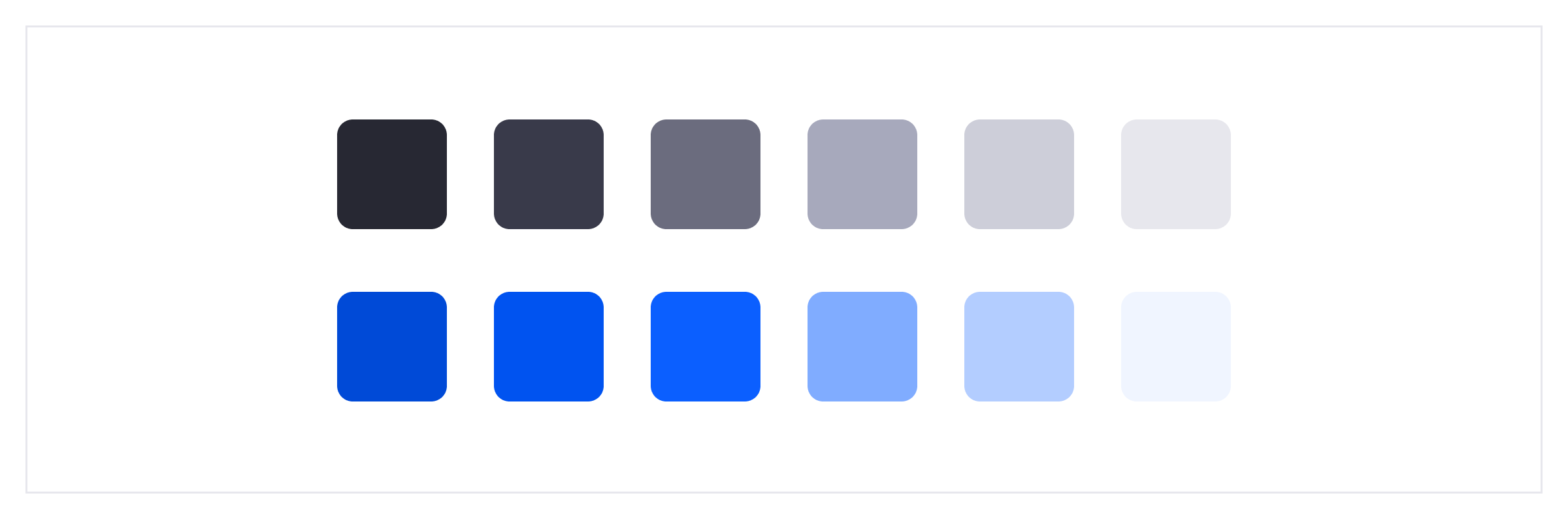
Tip: In order to be able to apply future changes without having to rename the variables, avoid using the color as part of the color name. E.g., instead of $blue, use $primary.
Recommended reading: “What Do You Name Color Variables?” by Chris Coyier
Figma Styles
Once we have the typography scale and the color scheme set, we can use them to define the Library styles.
This is the first actual step into the library creation. This feature lets you use a single set of properties in multiple elements.

Concrete Example
Let’s say you define your brand color as a style, it’s a soft-blue and you originally apply it to 500 different elements. If it is later decided that you need to change it to a darker blue with more contrast, thanks to the styles you can update all the 500 styled elements at once, so you won’t have to do it manually, element by element.
We can define styles for the following:
If you have variations of the same style, to make it easier to find them later, you can name the single styles and arrange them inside the panel as groups. To do so, just use this formula:
Group Name/Style Name
I’ve included a suggestion of how to name texts and colors styles below.
Text Styles
Properties that you can define within a text style:
- Font size
- Font weight
- Line-height
- Letter spacing
Tip: Figma drastically reduces the number of styles that we need to define in the library, as alignments and colors are independent of the style. You can combine a text style with a color style in the same text element.
Text Styles Naming
I recommend using a naming rule such as “Size/Weight”
(eg: 16/Regular, 16/SemiBold, 16/Bold).
Figma only allows one level of indentation, if you need to include the font you can always add a prefix before the size:
FontFamily Size/Weight or FF Size/Weight
*(eg: SourceSansPro 16/Regular or SSP 16/Regular).*
Color Styles
The color style uses its hex value (#FFF) and the opacity as properties.
Tip: Figma allows you to set a color style for the fill and a different one for the border within the same element, making them independent of each other.

Color Styles Naming
For a better organization I recommend using this rule “Color/Variant”. We named our color styles using “Primary/Default” for the starter color, “Primary/L1”, “Primary/L2” for lighten variants, and “Primary/D1”, “Primary/D2” for darken variants.
Effects
When designing an interface you might also need to create elements that use some effects such as drop shadows (the drag&drop could be an example of a pattern that uses drop shadows effects). To have control over these graphic details, you can include effect styles such as shadows or layer blurs to the library, and also divide them by groups if necessary.

Grids
To provide something very useful for your team, include the grid styles. You can define the 8px grid, 12 columns grid, flexible grids so your team won’t need to recreate them.
Tip: Taking advantage of this feature, you can provide all the different breakpoints as ‘grid styles’.
Master Component
Figma lets you generate multiple instances of the same component and update them through a single master component. It’s easier than you might think, you can start with some small elements and then use them to evolve your library.
To explain this workflow better, I will use one of the basic components all the libraries have: the buttons.
Buttons!
Every system has different types of buttons to represent the importance of the actions. You can start having both primary and secondary buttons with only texts and one size, but the reality is that you’ll probably end up having to maintain something like this:
- 2 color types (Primary | Secondary)
- 2 sizes of buttons (Regular | Small)
- 4 content types (Text Only | Icon Only | Text + Icon right | Icon Left + Text)
- 5 states (Default | Hover | Active | Disabled | Focus)
This would give us up to 88 different components to maintain only with the set of buttons mentioned above!
Let’s Start Step By Step
The first step is to include all the variations together in the same place. For the buttons we’re going to use:
- A single shape for the background of the button so that we can then place the color styles for the fill and the border;
- The single text that will have both text and color styles;
- Three icon components (positioned to the right, center and left) filled in with the color style (you will be able to easily swap the icons).
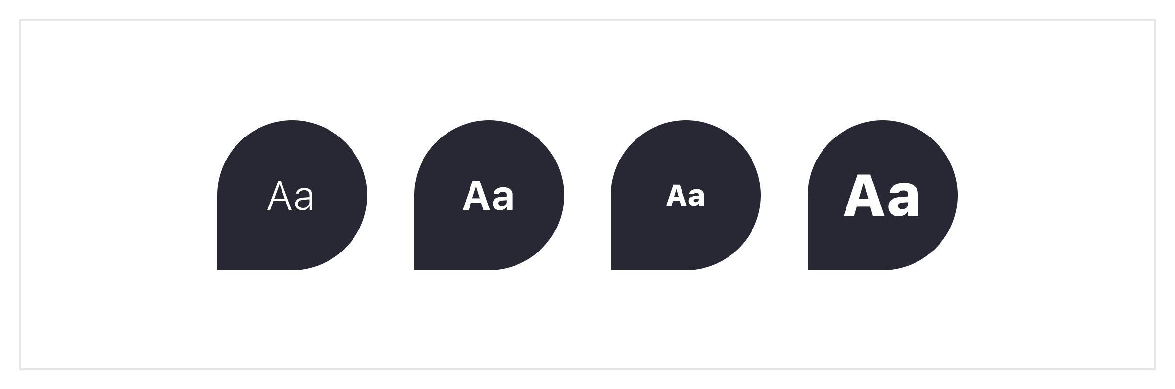
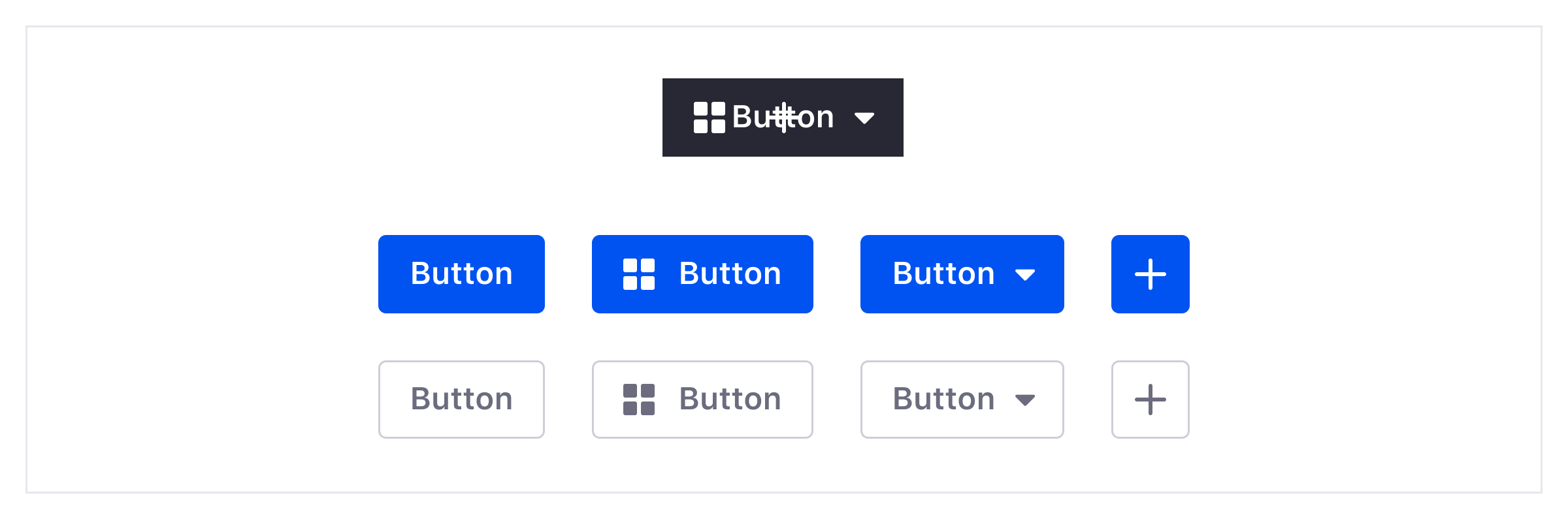
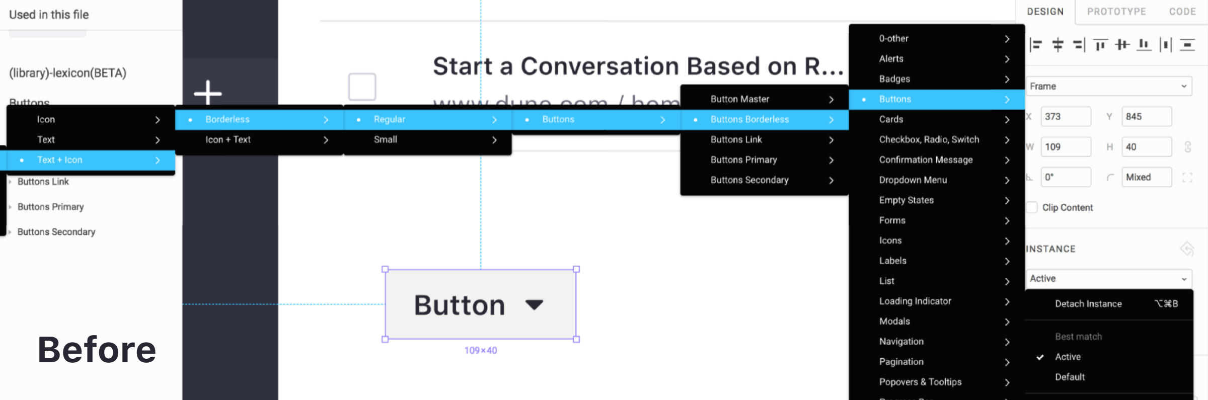
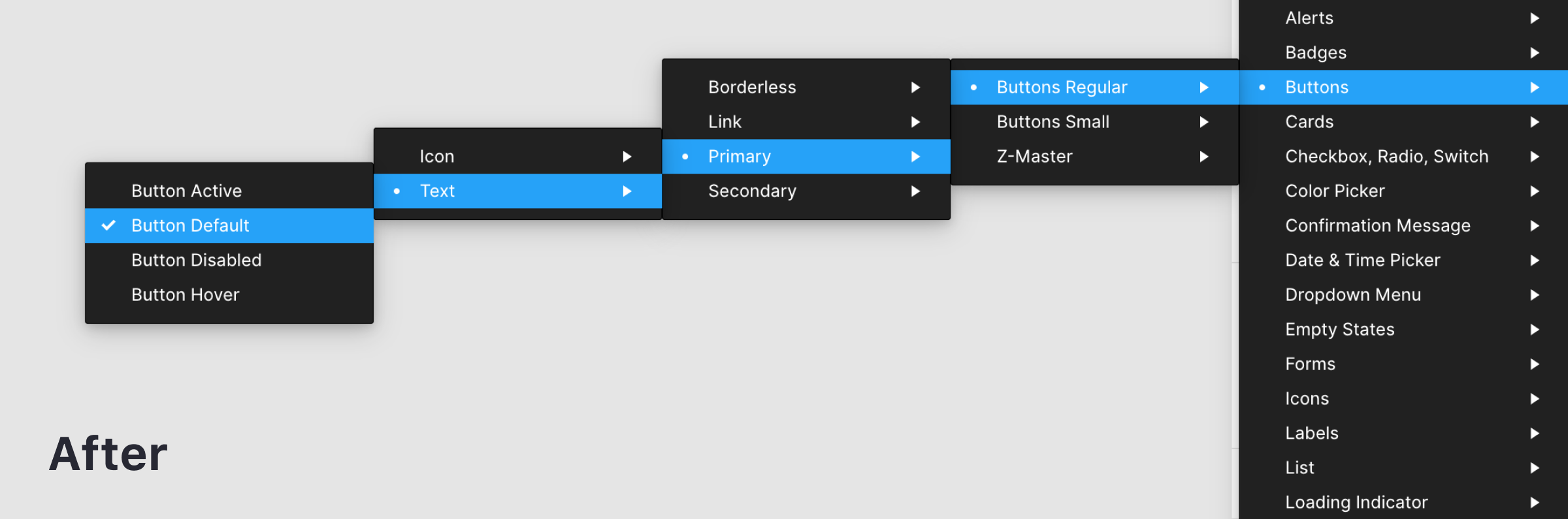
The second step is to create the master component (use the shortcut Cmd + Alt + K on Mac, or Ctrl + Alt + K on Windows) with all of the variations as instances. I suggest using a different and neutral style for the elements inside the master component and use the real styles on the sub-components, this trick will help the team use only sub-components.
You can see the visual difference between a master component and a sub-component in the next step:

In the third step you need to duplicate the master component to generate an instance, now you can use that instance to create a sub-component, and from now on every change you make to the master component will also change the sub-component you’ve created.
You can now start applying the different styles we’ve seen before to the elements inside the sub-component and, of course, you can hide the elements you don’t need in that sub-component.
Text Alignment
As I’ve shown you in the styles, the alignments are independent of the style. So if you want to change the text alignment, just select it by hitting Cmd/Ctrl and changing it. Left, center or right: it will all work and you can define different sub-components as I did with the buttons.
Tip: To help you work faster without having to find the exact element layer, if you delete an element inside the instance, it will hide the element instead of actually deleting it.
Component Organization
If you’re coming from Sketch, you could be having trouble with the organization of the components in Figma as there are a few key differences between these two tools. This is a brief guide to help you organize the components well so that the instance menu doesn’t negatively affect your team’s effectiveness.
We’ve all been there, the solution is easier than you think!
Here’s what I have learned about how to organize the components.
Figma Naming
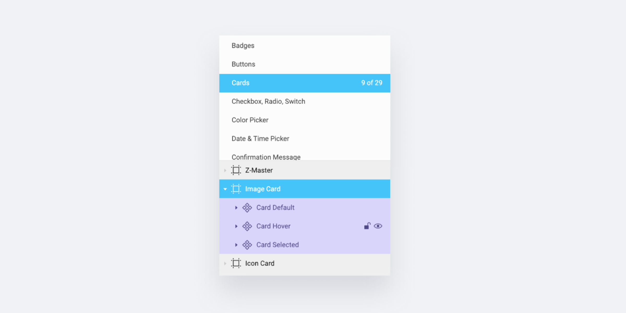
While in Sketch all the organization depends only on the single component name, in Figma it depends on the Page name, the Frame name, and the single Component name — exactly in that order.
In order to provide a well-organized library, you need to think of it as a visual organization. As long as you respect the order, you can customize the naming to fit your needs.
Here’s how I’ve divided it:
- File Name = Library Name (e.g. Lexicon);
- Page Name = Component Group (e.g. Cards);
- Frame Name = Component Type (e.g. Image Card, User Card, Folder Card, etc);
- Component Name = Component State (e.g. Default, Hover, Active, Selected, etc).
Adding Indentation Levels
When creating the Lexicon library, I found that I actually needed more than three levels of indentation for some of the components, such as the buttons that we saw before.
For these cases, you can extend the naming using the same method as Sketch for nested symbols (using the slashes in the component name, e.g. “Component/Sub-Component”), under the condition that you do it only after the third level of indentation, respecting the structural order of the first three levels as explained in the previous point.
This is how I organized our buttons:
- Page name = Component Group (e.g. Buttons);
- Frame name = Component Size (e.g. Regular or Small);
- Component name = Style/Type/State (e.g. Primary/Text/Hover).
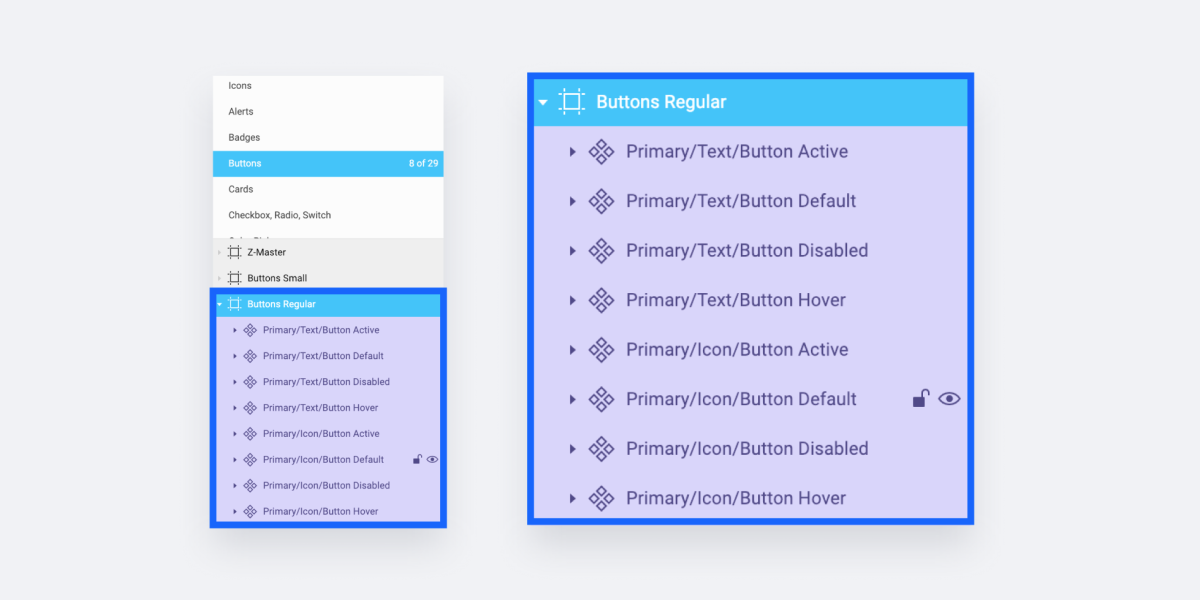
Tip: You can include the component name (or a prefix of the name) in the last level, this will help your team to better identify the layers when they import the components from the library.
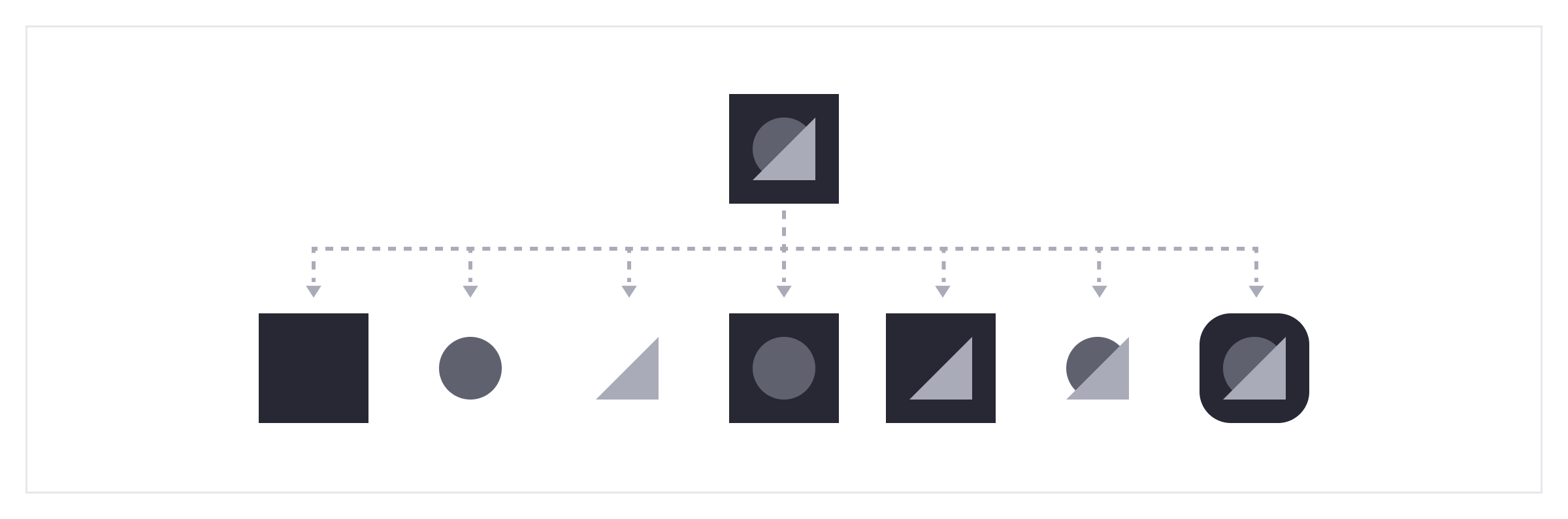
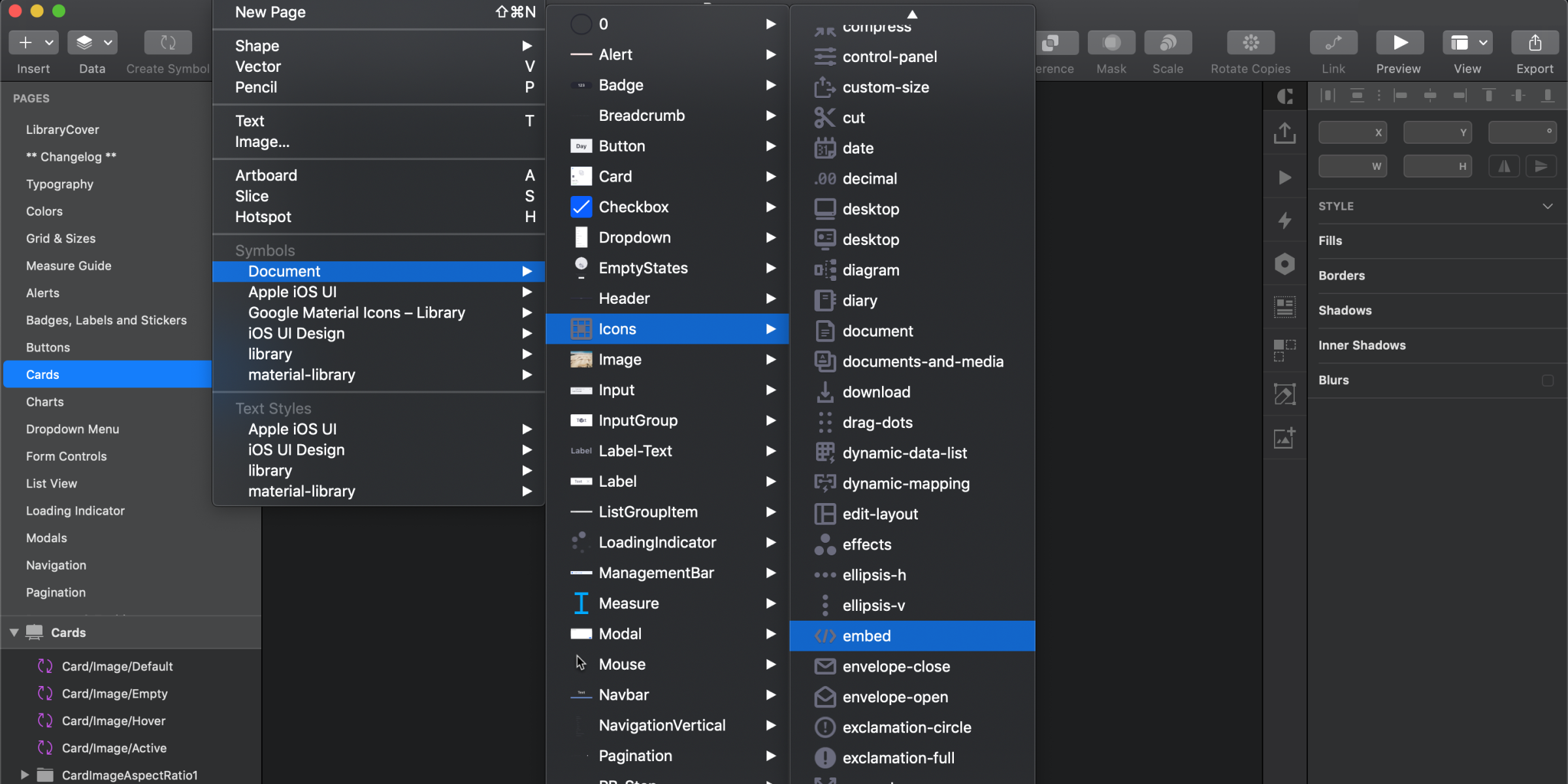
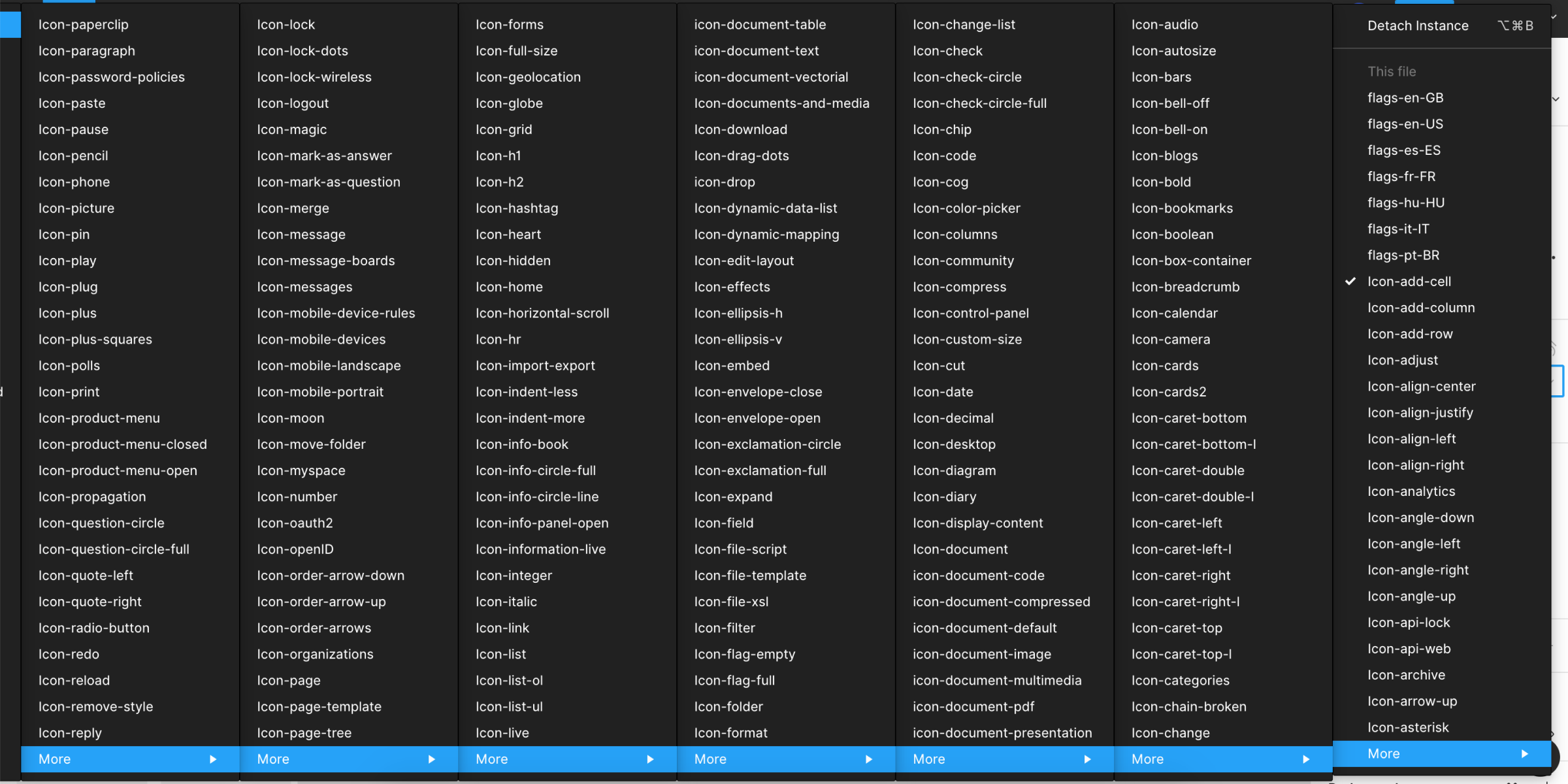
Icons Organization
Organizing the icons in Figma can be challenging when including a large number of icons.
As opposed to Sketch which uses a scroll functionality, Figma uses the sub-menus to divide the components. The problem is that if you have a large number of icons grouped in sub-menus, at some point they might go off screen (my experience with Figma on a MacBook Pro).
Here are two possible solutions:
- Solution 1
Create a page named “Icons” and then a frame for each letter of the alphabet, then place each icon in the frame based on the icon’s name. For example, if you have an icon named “Plus”, then it will go in the “P” frame. - Solution 2
Create a page named “Icons” and then divide by frames based on the icon categories. For example, if you have icons that represent a boat, a car, and a motorcycle, you can place them inside a frame named “vehicles”.
Conclusion
Now that you know what’s exactly behind a team’s library construction in Figma, you can start building one yourself! Figma has a free subscription plan that will help you to get started and experiment with this methodology in a single file (however, if you want to share a team library, you will need to subscribe to the “Professional” option).
Try it, create and organize some advanced components, and then present the library to your team members so you could amaze them — or possibly convince them to add Figma to their toolset.
Finally, let me mention that here in Liferay, we love open-source projects and so we’re sharing a copy of our Lexicon library along with some other resources. You can use the Lexicon library components and the other resources for free, and your feedback is always welcome (including as Figma comments, if you prefer).

If you have questions or need help with your first component library in Figma, ask me in the comments below, or drop me a line on Twitter.
Other Resources
- “8-Point Grid: Typography On The Web,” Elliot Dahl, freeCodeCamp
- Defining A Modular Type Scale For Web UI,” Kelly Dern, Medium
- “Relative Color Palettes With Sass,” Ethan Muller, Sparkbox
- SassMe (tool created by Jim Nielsen that lets you visualize Sass HSL color functions in real-time)
- “What Do You Name Color Variables?,” Chris Coyier, CSS-Tricks
- “Best Practices: Components, Styles, And Shared Libraries,” Thomas Lowry, Figma
- Figma YouTube Channel
- Figma Help Articles
Further Reading
- Moving From Sketch To Figma: A Case Study Of Migrating Design Systems
- An Efficient Design-to-Code Handoff Process Using Uno Platform For Figma
- Transforming The Relationship Between Designers And Developers
- From Design To Developer-Friendly React Code In Minutes With Anima
 (mb, yk, il, mrn)

