Design Your Mobile Emails To Increase On-Site Conversion

Email Newsletter
Weekly tips on front-end & UX.
Trusted by 182,000+ folks.

 Custom Web Forms for Angular, React, & Vue. Your backend.
 Celebrating 10 million developers

I find it interesting that Google has pushed so hard for web designers to shift from designing primarily for desktop to now designing primarily for mobile. Google’s right… but why only focus on designing websites to appeal to mobile users? After all, Gmail is a leader within the email client ranks, too.
Email can be an incredibly powerful driver of conversions for websites, according to a 2019 report from Barilliance.
On average, emails convert at a rate of 1.48%. That includes all sent emails though — which includes the ones that go unopened as well as the ones that bounce. If you look at emails that are opened by recipients, however, the average conversion rate jumps to 17.75%.
Let’s go even further with this:
Recent data from Litmus reveals that more emails are opened on mobile than on any other device:
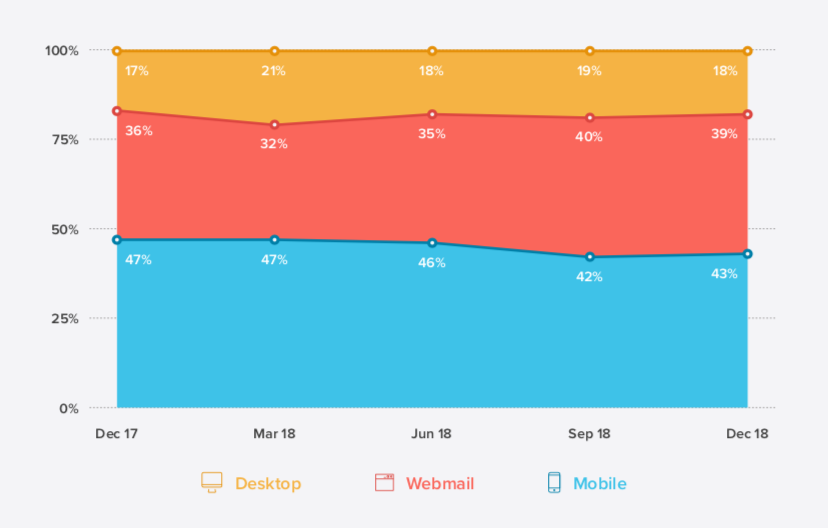
Many sources even put the average mobile open rate at well over 50%. But whether it’s 43% or 50%+, it’s clear that mobile is most commonly the first device people reach for to check their emails.
Which brings us to the following conclusion:
If users are more likely to open email on mobile and we know that opened emails convert at a higher rate than those that go unopened, wouldn’t it make sense for designers to prioritize the mobile experience when designing emails?
Mobile Email Design Tips To Increase Conversions
Let’s explore what the latest research says about designing emails for mobile users and how that can be used to increase opens, clicks and, later, your website’s conversion rates (on mobile and desktop).
Design The Same Email For Mobile And Desktop
Although email is often ranked as the most effective marketing channel for acquiring and retaining customers, that’s not really an accurate picture of what’s going on.
According to Campaign Monitor, here’s what’s actually happening with mobile email subscribers:
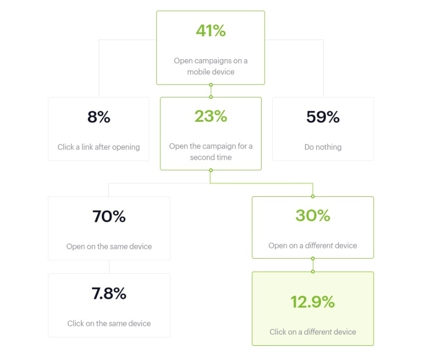
The open rates on mobile are somewhat on par with the Litmus data earlier.
However, it can take multiple opens before the email recipient actually clicks on a link or offer within an email. And guess what? About a third of them make their way over to desktop — where they convert at a higher rate than those that stay on mobile.
As the report states:
"Data from nearly 6 million email marketing campaigns suggests the shift to mobile has made it more difficult to get readers to engage with your content, unless you can drive subsequent opens in a different environment."
I’ve reconstructed the graphic above and filled it with the number of people who would take action from an email list of 1,000 recipients:
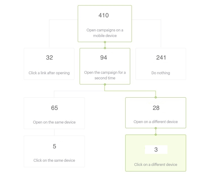
At first glance, it looks as though mobile is the clear winner — at least in terms of driving traffic to the website. After the initial mobile open, 32 subscribers go straight to the website. After a few more opens on mobile, 5 more head over there.
Without a breakdown of what the user journey looks like when opened on desktop, though, the calculation of additional clicks you’d get from that portion of the list isn’t so cut-and-dried.
However, let’s assume that Litmus’s estimate of 18% desktop opens is accurate and that Campaign Monitor’s 12.9% click-through rate holds true whether they open the email first on mobile or desktop. I think it’s safe to say that 23 desktop-only email opens can be added to the total.
So, that brings it to:
37 clicks on mobile vs 26 on desktop.
Bottom line: while mobile certainly gets more email subscribers over to a website, the conversion-friendliness of desktop cannot be ignored.
Which is why you don’t want to segment your lists based on device. If you want to maximize the number of conversions you get from a campaign, enable subscribers to seamlessly move from one device to the other as they decide what action to take with your emails.
In other words, design the same exact email for desktop and mobile. But assume that the majority of subscribers will open the email on their mobile device (unless historical data of your campaigns says otherwise). Then, use mobile-first design and marketing tips to create an email that’s suitable for all subscribers, regardless of device.
Factor In Dark Mode When Choosing Your Colors
You don’t want there to be anything that stands in your users’ way when it comes to moving from email to website. That’s why you have to consider how their choice of color and brightness for their mobile screen affects the readability or general appearance of your email design.
There are a number of ways in which this can become an issue.
As we hear more and more about how harmful blue light from our devices can be, it’s no surprise that Dark Mode options are beginning to roll out. While it’s prevalent on desktops right now, it’s mostly in beta for mobile. The same goes for email apps.
That said, smartphone users can hack their own “Dark Mode” of sorts. This type of color inversion can be enabled through the iPhone’s “Accessibility” settings.
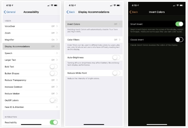
Essentially, what this does is invert all of the colors on the screen from light to dark and vice versa.
Unfortunately, the screenshotting tool on my iPhone won’t allow me to capture the colors exactly as they appear. However, what I can show you is how the inversion tool alters the color of your email design.
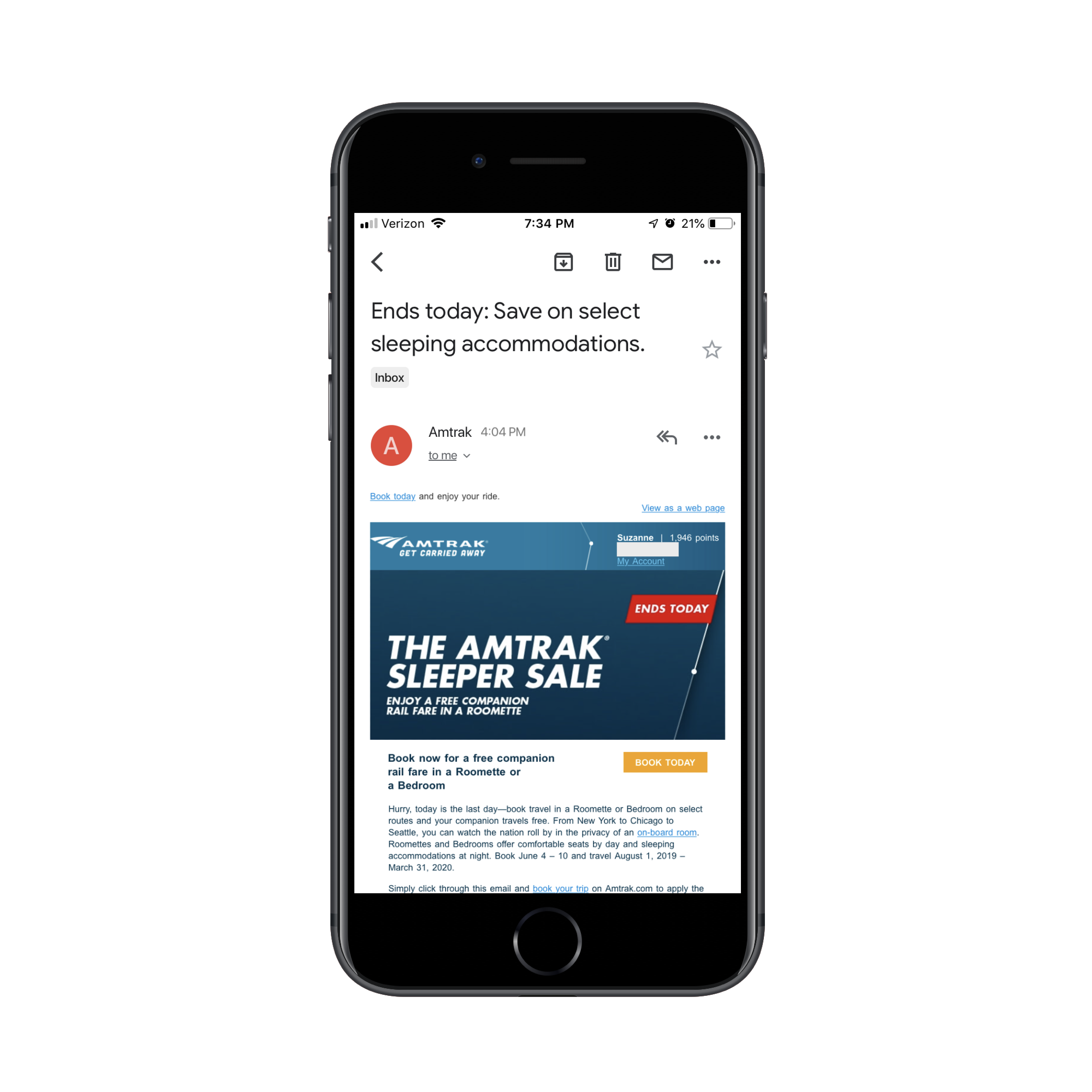
This is an email I received from Amtrak last week. It’s pretty standard with its branded color palette and brightly colored notices and CTA buttons:
Now, here is what that same email looks like when viewed through my iPhone’s “Smart Invert” setting:
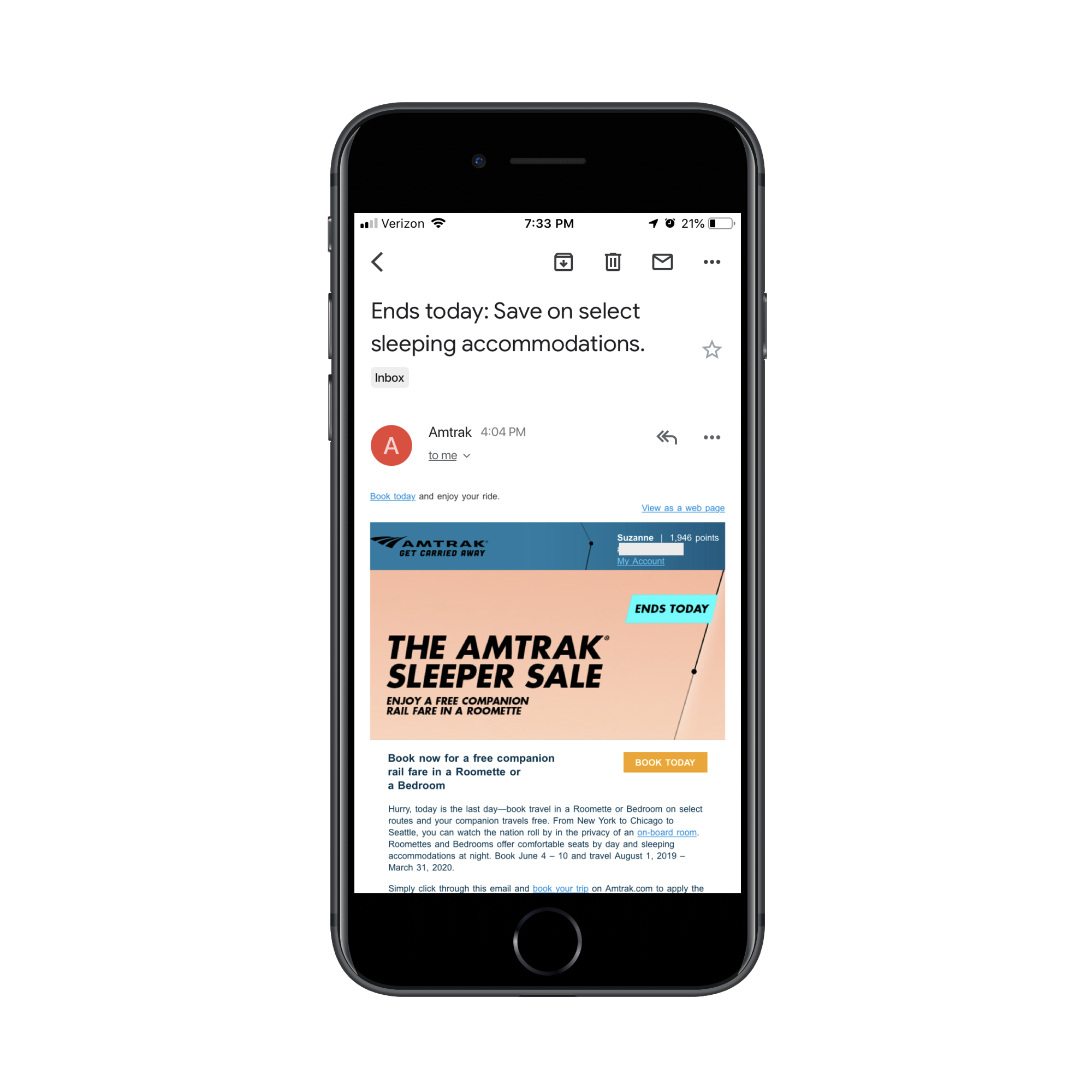
The clean design of the original with the white font on the deep blue brand colors is gone. Now, there’s a harsh mix of colors and a hard-to-read Amtrak logo in its place.
You can imagine how this kind of inconsistent and disjointed color display would create an off-putting experience for mobile users.
But what do you expect them to do? If they’re struggling with the glare from their mobile device, Dark Mode (or some other brightness adjustment) will make it easier for them to open and read emails in the first place. Even if it means compromising the appearance of the email you so carefully designed.
One bright spot in all this is that the official “Dark Mode” being rolled out to iPhone (and, hopefully, other smartphones) soon won’t alter the look of HTML emails. Only plain-text messages will be affected.
However, it’s important to still be mindful of how the design choices you make may clash with a surrounding black background. Brightly colored backgrounds, in particular, are likely to clash with the surrounding black of your email app.
How do you solve this issue? Unfortunately, you can’t serve different versions of your email to users based on whether they’re viewing it in Dark Mode or otherwise. You’ll just have to rely on your own tests to confirm that potential views in Dark Mode don’t interfere with your design or message.
In addition to the standard testing you do, set your own smartphone up with Dark Mode (or its hack counterpart). Then, run your test email through the filter and see what happens to the colors. It won’t take long to determine what sort of colors you can and cannot design with for email.
Design The Subject Line
The subject line is the very first thing your email subscribers are going to see, whether it shows up as a push notification or they first encounter it in their inbox. What do you think affects their initial decision to click open an email rather than throw it in the Trash or Spam box immediately? Recognizing the Sender will help, but so will the attractiveness of the subject line.
As for how exactly you go about “designing” a subject line, there are a few things to think about. The first is the length.
Marketo conducted a study across 200+ email campaigns and 2 million emails sent to subscribers. Here is what the test revealed about subject line length:
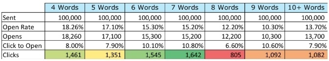
Although the 4-word subject line resulted in the highest open rate, it had a poor showing in terms of clicks. It was actually the 7-word subject line that seemed to have struck the perfect balance with subscribers, leading 15.2% of them to open the email and then 10.8% of them to click on it.
While you should still test this with your own email list, it appears that seven words is the ideal length for a subject line.
Next, you have to think about the buzzwords used in the subject line.
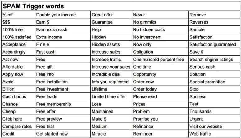
To start, keep this list of Yesware’s Spam Trigger Words out of it:
If you want to increase the chance the email will be opened, read, clicked on and eventually convert on-site, you have to be savvy about which words will appear within the subject line.
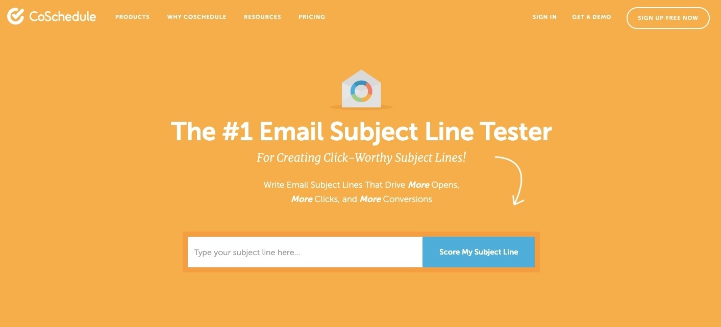
What I’d suggest you do is bookmark CoSchedule's Email Subject Line Tester tool.
Here’s an example of how CoSchedule analyzes your subject lines and clues you in to what increases and decreases your open rates:
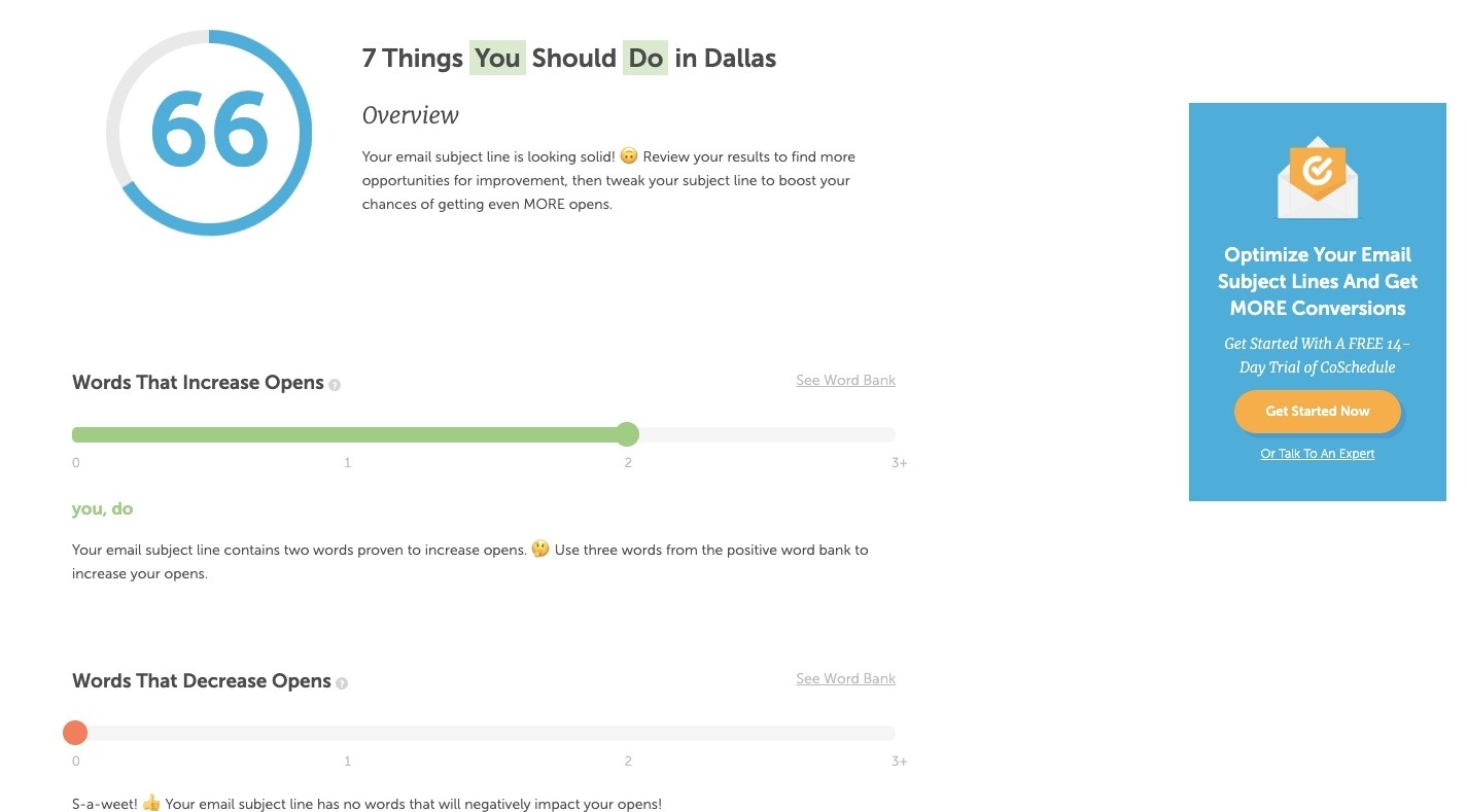
As you can see, CoSchedule tells you which kinds of words increase open rates as well as those that don’t. Do enough of these subject line tests and you should be able to compile a good set of wording guidelines for your writers and marketers.
Further down, you’ll get more insight into what makes for a strongly worded and designed subject line:
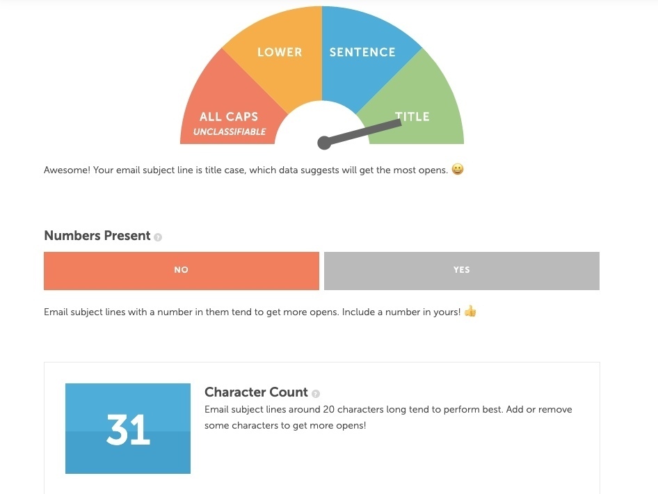
CoSchedule will provide recommendations on how to shorten or lengthen the character and word counts based on best practices and results.
Finally, at the very bottom of your subject line test you’ll see this:
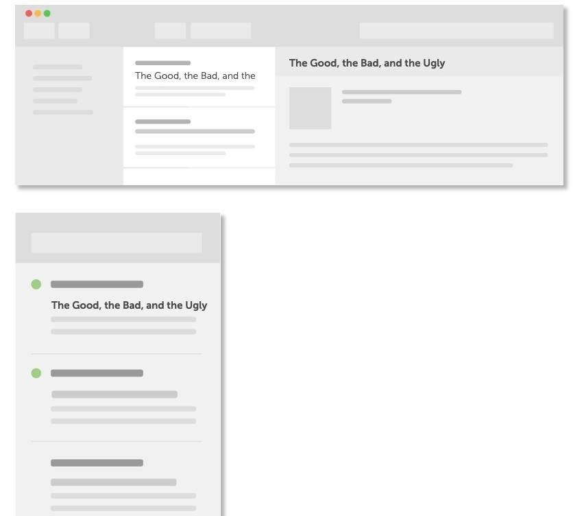
This gives you (or, rather, your writer) a chance to see how the subject line will appear within the “design” of an email client. It’s not a problem if the words get cut off on mobile. It’s bound to happen. However, you still want everything that does appear to be appealing enough to click on.
Also, don’t forget about dressing up your subject lines with emoji.
When you think about it, emoji in mobile email subject lines make a lot of sense. Text messaging and social media are ripe with them. It’s only natural to use this fun and truncated form of language in email, too.
Campaign Monitor makes a good point about this:
If you replace words with recognizable emoji, you’ll create shorter subject lines for mobile users. Even if it doesn’t shorten your subject line enough to fit on a mobile screen, it’s still an awesome way to make it stand out from the rest of your subscribers’ cluttered inboxes.
The CoSchedule test will actually score you based on how (or if) you used emoji, too:
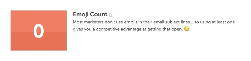
As you can see, CoSchedule considers this a competitive advantage in marketing.
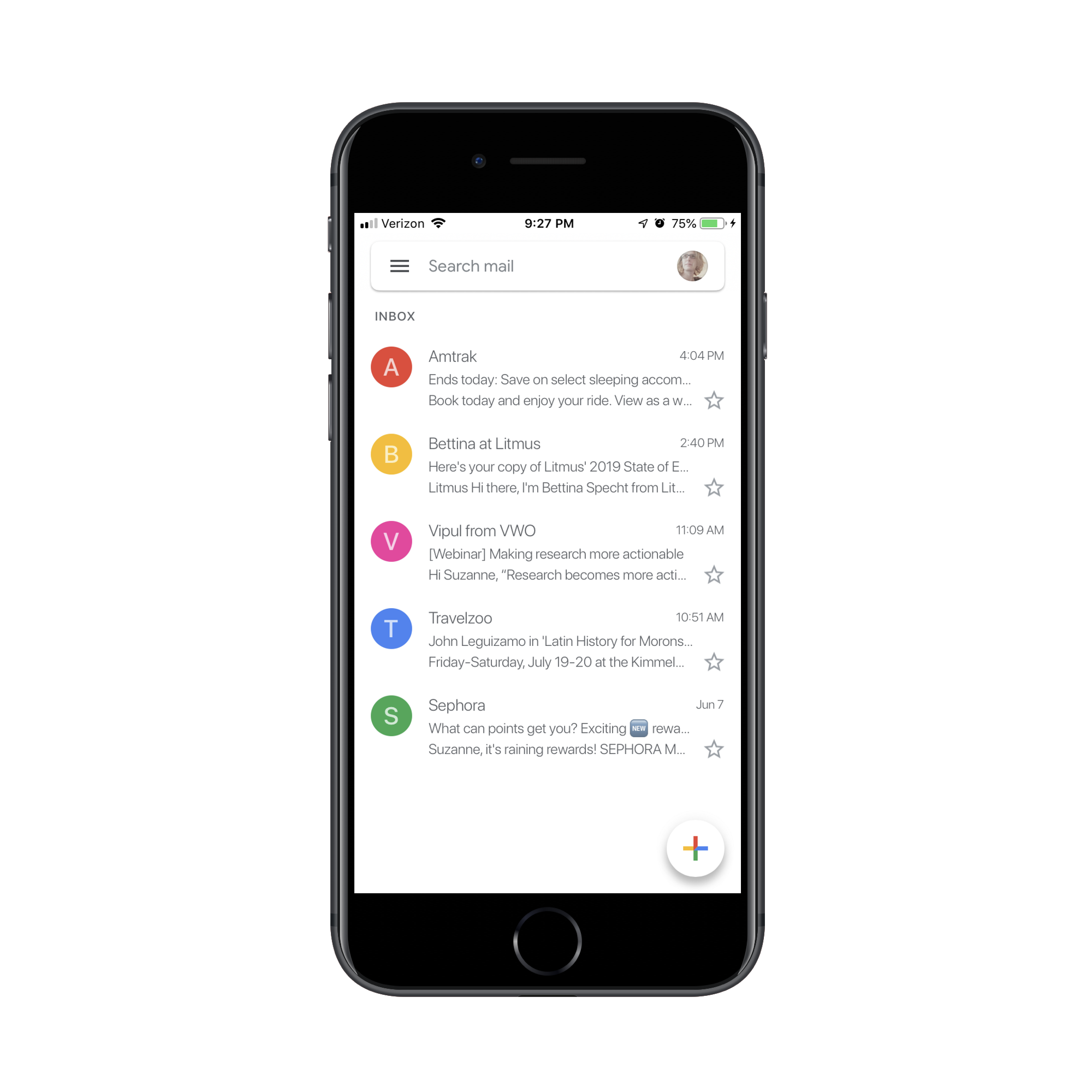
Even just looking at my own email client, my eye is instantly drawn to the subject line from Sephora which contains a “NEW” emoji:
Just be careful with which emoji you use. For starters, emoji are displayed differently from device to device, so it may not have the same effect on some of your subscribers if it’s a more obscure choice.
There’s also the localization aspect to think about. Not every emoji is perceived the same way around the globe. As Day Translations points out, the fire symbol is one that could cause confusion as some countries interpret it as a literal fire whereas some may view it as a symbol for attraction.
That said, emoji have proven to increase both open rates and read rates of emails. Find the right mobile-friendly emoji to include in your subject line and you could effectively increase the number of subscribers who visit your website as a result.
Wrap-Up
There are so many different kinds of emails that go out from websites:
- Welcome message
- Post-purchase transaction email
- Abandoned cart reminder
- Promotional news
- Product featurette
- New content available
- Account /rewards points
- And more.
In other words, there are plenty of ways to get in front of email subscribers.
Just remember that the majority of them will first open your email on mobile. And some will reopen it on mobile over and over again until they’re compelled to click on it or trash it. It’s up to you to design the email in a way that motivates them to visit your website and, consequently, convert.
Further Reading
- Everything You Need To Know About Transactional Email But Didn’t Know To Ask
- The Current State Of Email Marketing Programming: What Can And Can’t Be Used
- Level-Up Email Campaigns With Customer Journey Mapping
- How Mail.Ru Reduced Email Storage From 50 To 32 PB
 (ra, yk, il, mrn)

