Inspired Design Decisions: Avaunt Magazine

Email Newsletter
Weekly tips on front-end & UX.
Trusted by 182,000+ folks.
 Register for Free

 Custom Web Forms for Angular, React, & Vue. Your backend.

 Celebrating 10 million developers
I hate to admit it, but five or six years ago my interest in web design started to wane. Of course, owning a business meant I had to keep working, but staying motivated and offering my best thinking to clients became a daily struggle.
Looking at the web didn’t improve my motivation. Web design had stagnated, predictability had replaced creativity, and ideas seemed less important than data.
The reasons why I’d enjoyed working on the web no longer seemed relevant. Design had lost its joyfulness. Complex sets of build tools and processors had even supplanted the simple pleasure of writing HTML and CSS.
When I began working with the legendary newspaper and magazine designer Mark Porter, I became fascinated by art direction and editorial design. As someone who hadn’t studied either at art school, everything about this area of design was exciting and new. I read all the books about influential art directors I could find and started collecting magazines from the places I visited around the world.
The more inspired I became by mag- azine design, the faster my enthusiasm for web design bounced back. I wondered why many web designers think that print design is old-fashioned and irrelevant to their work. I thought about why so little of what makes print design special is being transferred to the web.
My goal became to hunt for inspiring examples of editorial design, study what makes them unique, and find ways to adapt what I’d learned to create more compelling, engaging, and imaginative designs for the web.
My bookcases are now chock full of magazine design inspiration, but my collection is still growing. I have limited space, so I’m picky about what I pick up. I buy a varied selection, and rarely collect more than one issue of the same title.
I look for exciting page layouts, inspiring typography, and innovative ways to combine text with images. When a magazine has plenty of interesting design elements, I buy it. However, if a magazine includes only a few pieces of inspiration, I admit I’m not above photographing them before putting it back on the shelf.
I buy new magazines as regularly as I can, and a week before Christmas, a few friends and I met in London. No trip to the “Smoke” is complete without a stop at Magma, and I bought several new magazines. After I explained my inspiration addition, one friend suggested I write about why I find magazine design so inspiring and how magazines influence my work.
That conversation sparked the idea for a series on making inspired design decisions. Every month, I’ll choose a publication, discuss what makes its design distinctive, and how we might learn lessons which will help us to do better work for the web.
As an enthusiastic user of HTML and CSS, I’ll also explain how to implement new ideas using the latest technologies; CSS Grid, Flexbox, and Shapes.
I’m happy to tell you that I’m inspired and motivated again to design for the web and I hope this series can inspire you too.
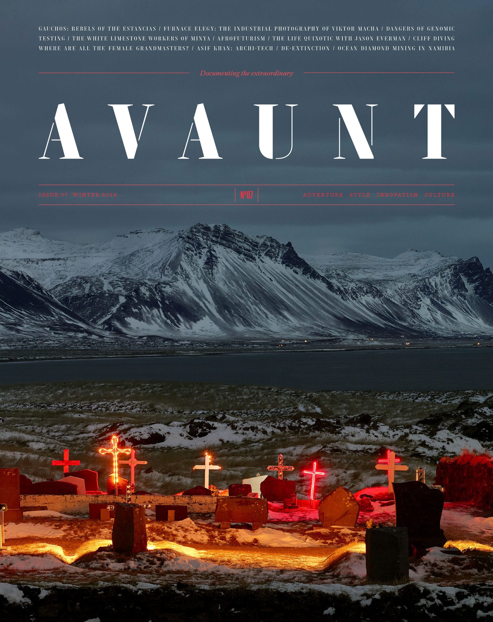
Avaunt Magazine: Documenting The Extraordinary
One look at me is going to tell you I’m not much of an adventurer. I don’t consider myself particularly cultured and my wife jokes regularly about what she says is my lack of style.
So what drew me to Avaunt magazine and its coverage of “adventure,” “culture,” and “style” when there are so many competing and varied magazines?
It often takes only a few page turns for me to decide if a magazine offers the inspiration I look for. Something needs to stand out in those first few seconds for me to look closer, be it an exciting page layout, an inspiring typographic treatment, or an innovative combination of images with text.
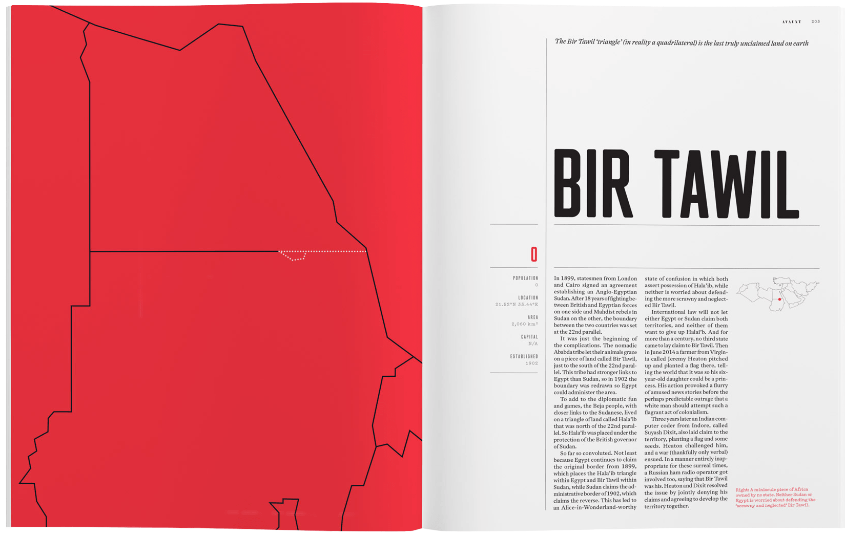
Avaunt has all of those, but what struck me most was the way its art director has used colour, layout, and type in diverse ways while maintaining a consistent feel throughout the magazine. There are distinctive design threads which run through Avaunt’s pages. The bold uses of a stencil serif and geometric sans-serif typeface are particularly striking, as is the repetition of black, white, a red which Avaunt’s designers use in a variety of ways. Many of Avaunt’s creative choices are as adventurous as the stories it tells.
Plenty of magazines devote their first few spreads to glossy advertising, and Avaunt does the same. Flipping past those ads finds Avaunt’s contents page and its fascinating four-column modular grid.
This layout keeps content ordered within spacial zones but maintains energy by making each zone a different size. This layout could be adapted to many kinds of online content and should be easy to implement using CSS Grid. I’m itching to try that out.
For sans-serif headlines, standfirsts, and other type elements which pack a punch, Avaunt uses MFred, designed initially for Elephant magazine by Matt Willey in 2011. Matt went on to art direct the launch of Avaunt and commissioned a stencil serif typeface for the magazine’s bold headlines and distinctive numerals.
Avaunt Stencil was designed in 2014 by London based studio A2-TYPE who have since made it available to license. There are many stencil fonts available, but it can be tricky to find one which combines boldness and elegance — looking for a stencil serif hosted on Google Fonts? Stardos would be a good choice for display size type. Need something more unique, try Caslon Stencil from URW.
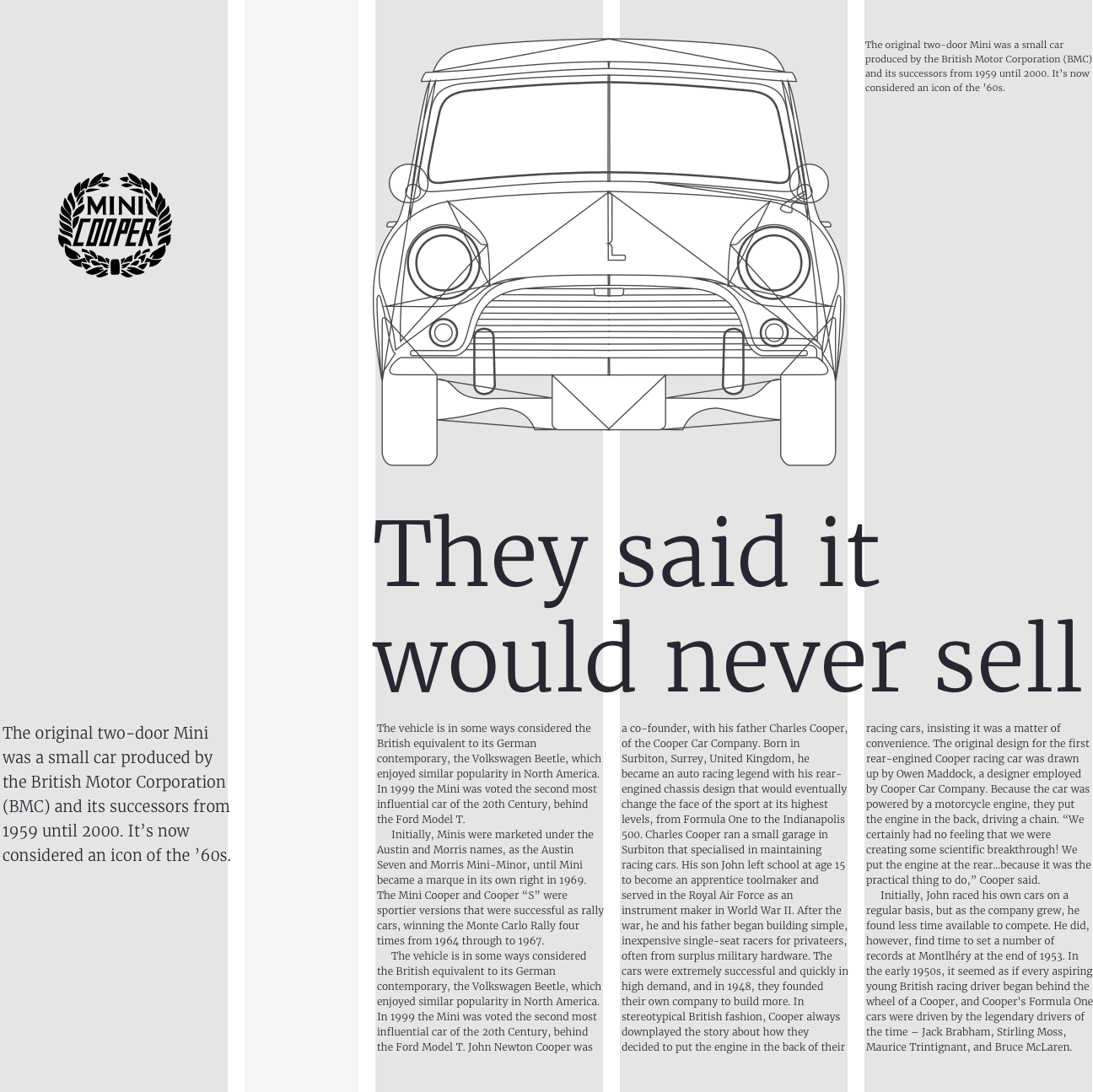
Avaunt’s use of a modular grid doesn’t end with the contents page and is the basis for a spread on Moscow’s Polytechnic Museum of Cold War curiosities which first drew me to the magazine. This spread uses a three-column modular grid and spacial zones of various sizes.
What fascinates me about this Cold War spread is how modules in the verso page combine to form a single column for text content. Even with this column, the proportions of the module grid still inform the position and size of the elements inside.
While the design of many of Avaunt’s pages is devoted to a fabulous reading experience, many others push the grid and pull their foundation typography styles in different directions. White text on dark backgrounds, brightly coloured spreads where objects are cut away to blend with the background. Giant initial caps which fill the width of a column, and large stencilled drop caps which dominate the page.
Avaunt’s playful designs add interest, and the arrangement of pages creates a rhythm which I very rarely see online. These variations in design are held together by the consistent use of Antwerp — also designed by A2-TYPE — as a typeface for running text, and a black, white, and red colour theme which runs throughout the magazine.
Studying the design of Avaunt magazine can teach and inspire. How a modular grid can help structure content in creative ways without it feeling static. (I’ll teach you more about modular grids later.)
How a well-defined set of styles can become the foundation for distinctive and diverse designs, and finally how creating a rhythm throughout a series of pages can help readers stay engaged.
Next time you’re passing your nearest magazine store, pop in a pick up a copy of Avaunt Magazine. It’s about adventure, but I bet it can help inspire your designs to be more adventurous too.
Say Hello To Skinny Columns
For what feels like an eternity, there’s been very little innovation in grid design for the web. I had hoped the challenges of responsive design would result in creative approaches to layout, but sadly the opposite seems to be true.
Instead of original grid designs, one, two, three, or four block arrangements of content became the norm. Framework grids, like those included with Bootstrap, remain the starting point for many designers, whether they use those frameworks or not.
It’s true that there’s more to why so much of the web looks the same as web designers using the same grid. After all, there have been similar conventions for magazines and newspapers for decades, but somehow magazines haven’t lost their personality in the way many websites have.
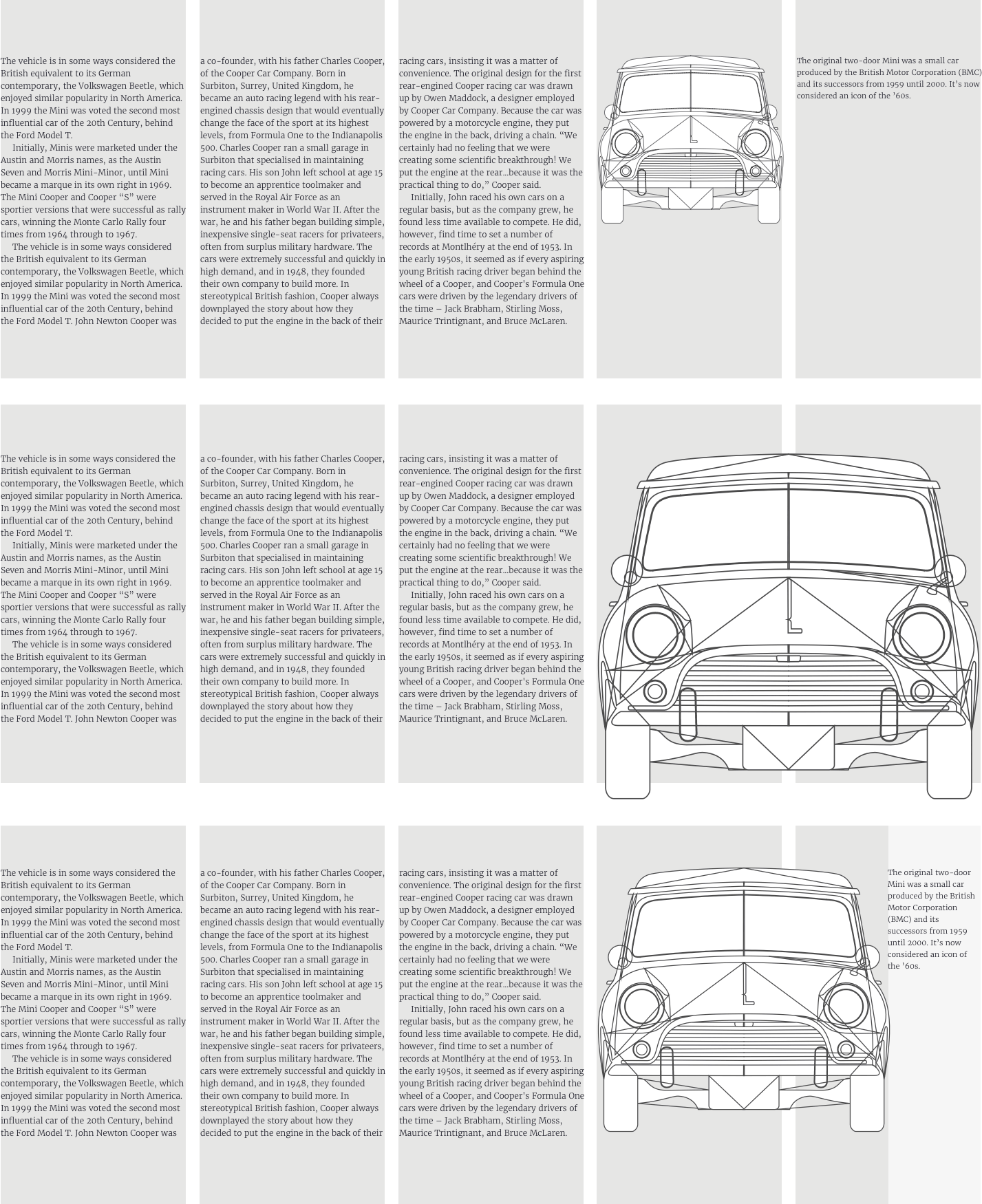
I’m always searching for layout inspiration and magazines are a rich source. Reading Avaunt reminded me of a technique I came across years ago but hadn’t tried. This technique adds one extra narrow column to an otherwise conventional column grid. In print design, this narrow column is often referred to as a “bastard column or measure” and describes a block of content which doesn’t conform to the rest of a grid. (This being a family friendly publication, I’ll call it a “skinny column.”)
In these first examples, squeezing an image into one column reduces its visual weight and upsets the balance of my composition. Making the image fill two standard columns also upsets that delicate balance.
Splitting the final column, then adding half its width to another, creates the perfect space for my image, and a more pleasing overall result.
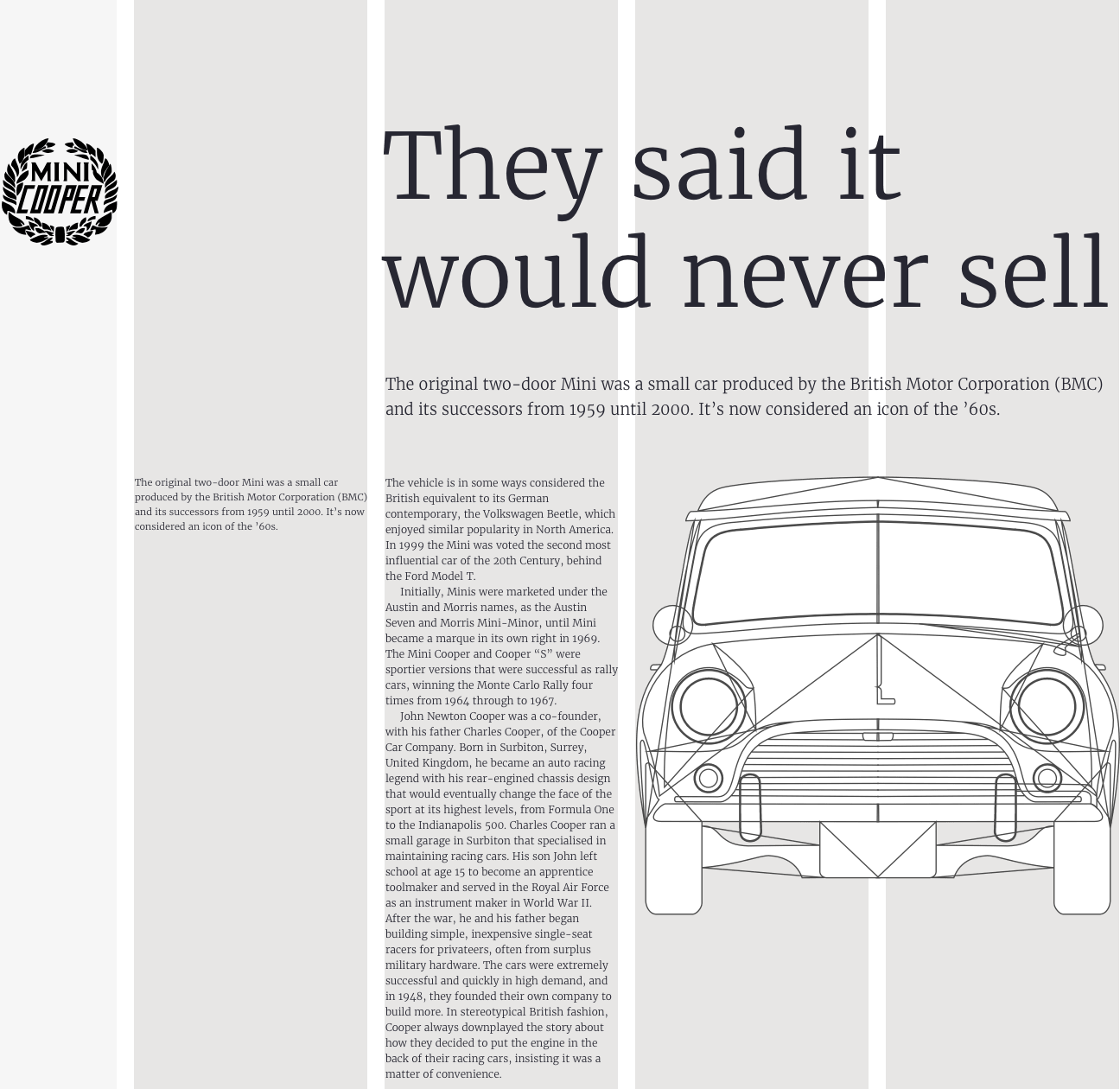
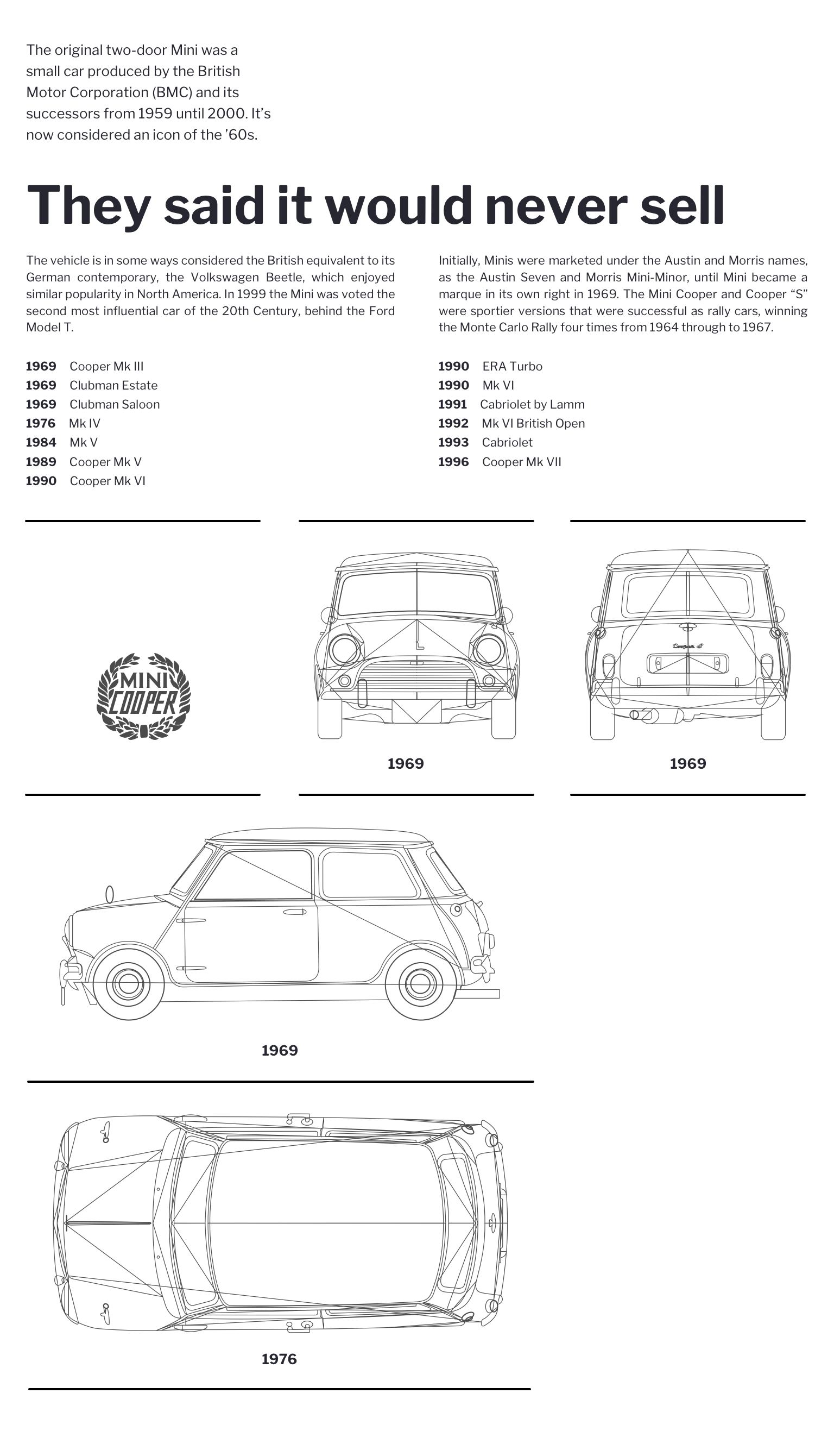
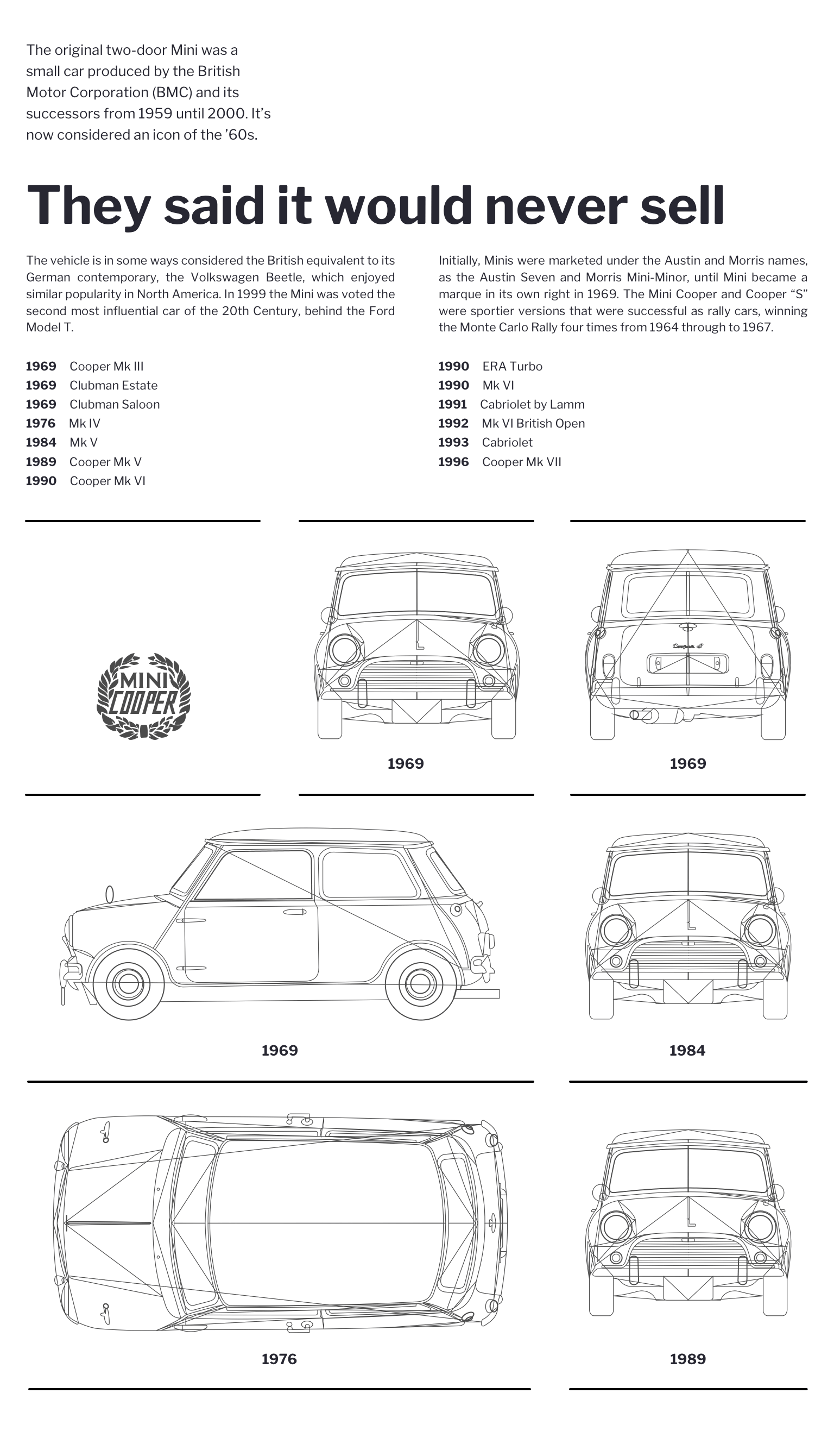
I might use a skinny column to inform the width of design elements. This Mini Cooper logo matches the width of my skinny column, and its size feels balanced with the rest of my composition.
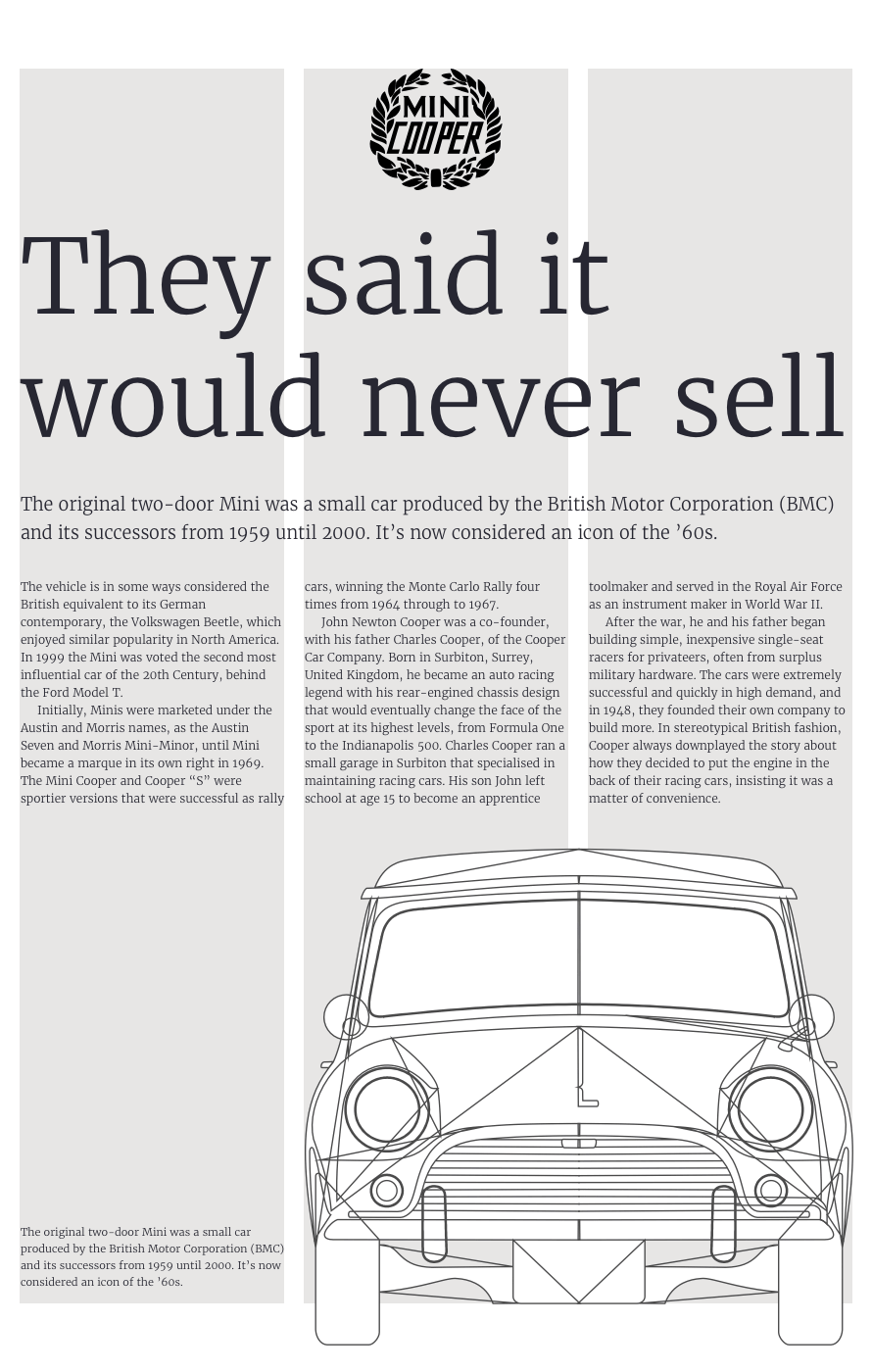
Sometimes, content won’t fit into a single column comfortably, but by combining the widths of standard and skinny columns, I create more space and a better measure for running text. I can place a skinny column anywhere within a layout to wherever I need my content.

An empty skinny column adds whitespace which allows the eye to roam around a design. The asymmetry created by placing a skinny column between two standard columns also makes a structured layout feel more dynamic and energetic.
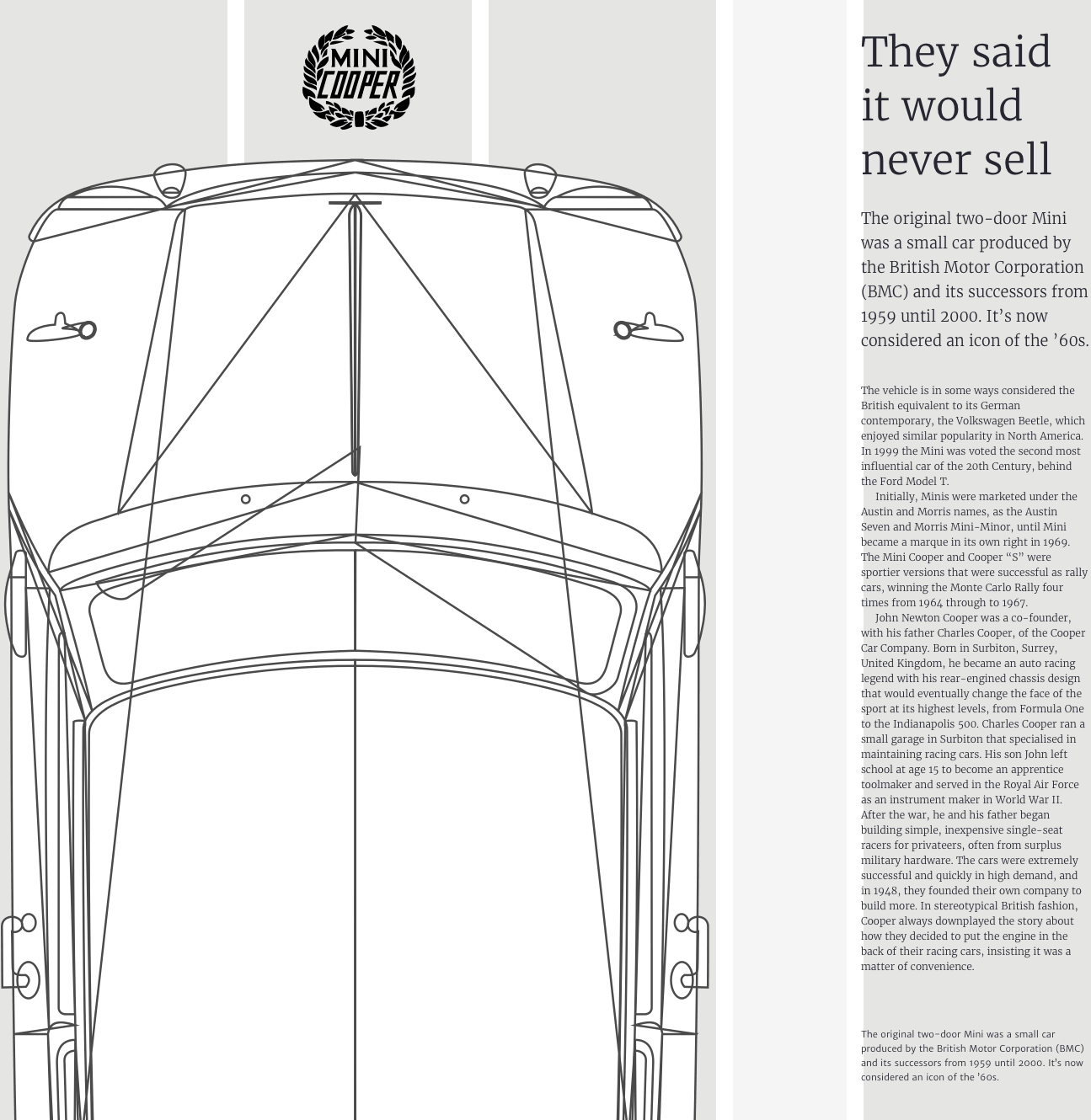
Another empty skinny column carves a wide gutter into this design and confines my running text to a single column, so that its height reflects the image’s vertical format. I can also use a skinny column to turn typographic elements into exciting design elements.
Developing With Skinny Columns
Designs like these are surprisingly simple to implement using today’s CSS. I need just four structural elements; a logo, header, figure, plus an article to contain my running text:
<body>
<img src="logo.svg" alt="Mini Cooper">
<header>…</header>
<figure>…</figure>
<article>…</article>
</body>
I start with a design for medium size screens by applying CSS Grid to the body element within my first media query. At this size, I don’t need a skinny column so instead am developing a symmetrical three-column grid which expands evenly to fill the viewport width:
@media screen and (min-width : 48em) {
body {
display: grid;
grid-template-columns: 1fr 1fr 1fr;
grid-column-gap: 2vw; }
}
I use line numbers to place items into my grid columns and rows. I place my logo into the skinny first column and the first row using a substring matching attribute selector. This targets an image with “logo” anywhere in its source value:
[src*="logo"] {
grid-column: 1;
grid-row: 1; }
Next, I place the header element — containing my headline and standfirst paragraph — into the second row. Using line numbers from 1 to -1 spreads this header across all columns:
header {
grid-column: 1 / -1;
grid-row: 2; }
With display:grid; applied, all direct descendants of a grid-container become grid-items, which I can place using areas, line numbers, or names.
This design includes a figure element with a large Mini image, plus caption text about the original Cooper model design. This figure is crucial because it describes a relationship between the img and figcaption. However, while this figure makes my markup more meaningful, I lose the ability to place the img and figcaption using CSS Grid, because by neither are direct descendants of the body where I defined my grid.
Luckily, there’s a CSS property which — when used thoughtfully — can overcome this problem. I don’t need to style the figure, I only need to style its img and figcaption. By applying display:contents; to my figure, I effectively remove it from the DOM for styling purposes, so its descendants take its place:
figure {
display: contents; }
It’s worth noting that although display effectively removes my figure from the DOM for styling purposes, any properties which inherit — including font sizes and styles — are still inherited:
figure img {
grid-column: 2/-1; grid-row: 4; }

figcaption {
grid-column: 1;
grid-row: 4;
align-self: end; }
I place my article and style its text over three columns using Multi-column Layout, one of my favourite CSS properties:
article {
grid-column: 1 / -1;
grid-row: 3;
column-count: 3;
column-gap: 2vw; }
It’s time to implement a design which includes a skinny column for larger screens. I use a media query to isolate these new styles, then I create a five-column grid which starts with a 1fr wide skinny column:
@media screen and (min-width : 64em) {
body {
grid-template-columns: 1fr repeat(4, 2fr); }
}
Then I add values to reposition the header, img and figcaption, and article, remembering to reset the column-count to match its new width:
header {
grid-column: 3/-1;
grid-row: 1; }

figure img {
grid-column: 4 / -1;
grid-row: 2; }

figcaption {
grid-column: 2;
grid-row: 2;
align-self: start; }

article {
grid-column: 3;
grid-row: 2;
column-count: 1; }
Radically changing how a design looks using CSS alone, without making changes to the structure of HTML makes me smile, even after almost two decades. I also smile when I change the composition to create a dramatically different layout without changing the grid. For this alternative design, I’m aiming for a more structured look.
To improve the readability of my running text, I divide into three columns. Then, to separate this block of content from other text elements, I place my skinny column between the first two standard columns. There’s no need to change the structure of my HTML. All I need are minor changes to grid values in my stylesheet. This time, my 1fr wide skinny column value comes between two standard column widths:
@media screen and (min-width : 64em) {
body {
grid-template-columns: 2fr 1fr 2fr 2fr 2fr; }
}
I place my header in the second row and the article in a row directly underneath:
header {
grid-column: 3 / -1;
grid-row: 2; }

article {
grid-column: 3 / -1;
grid-row: 3;
column-count: 3;
column-gap: 2vw; }
Because neither the img and figcaption are direct descendants of the body element where I defined my grid, to place them I need the display:contents; property again:
figure {
display: contents; }

figure img {
grid-column: 3/5;
grid-row: 1; }

figcaption {
grid-column: 5/-1;
grid-row: 1;
align-self: start; }
Depending on how you use them, introducing skinny columns into your designs can make content more readable or transform a static layout into one which feels dynamic and energetic.
Skinny columns are just one example of learning a technique from print and using it to improve a design for the web. I was itching to try out skinny columns and I haven’t been disappointed.
Adding a skinny column to your designs can often be an inspired decision. It gives you extra flexibility and can transform an otherwise static layout into one which is filled with energy.
Designing Modular Grids
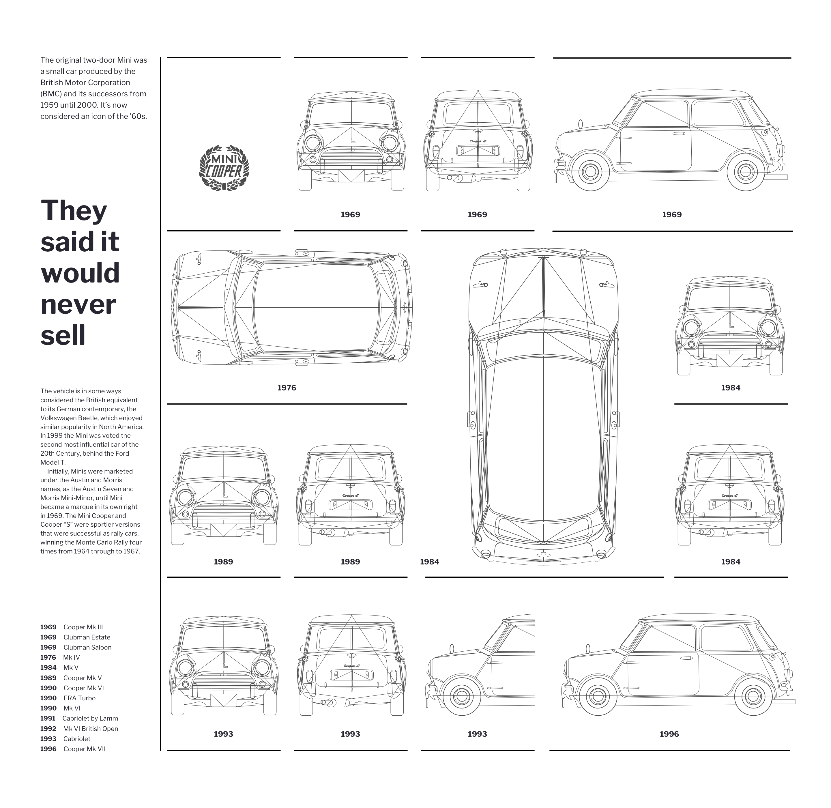
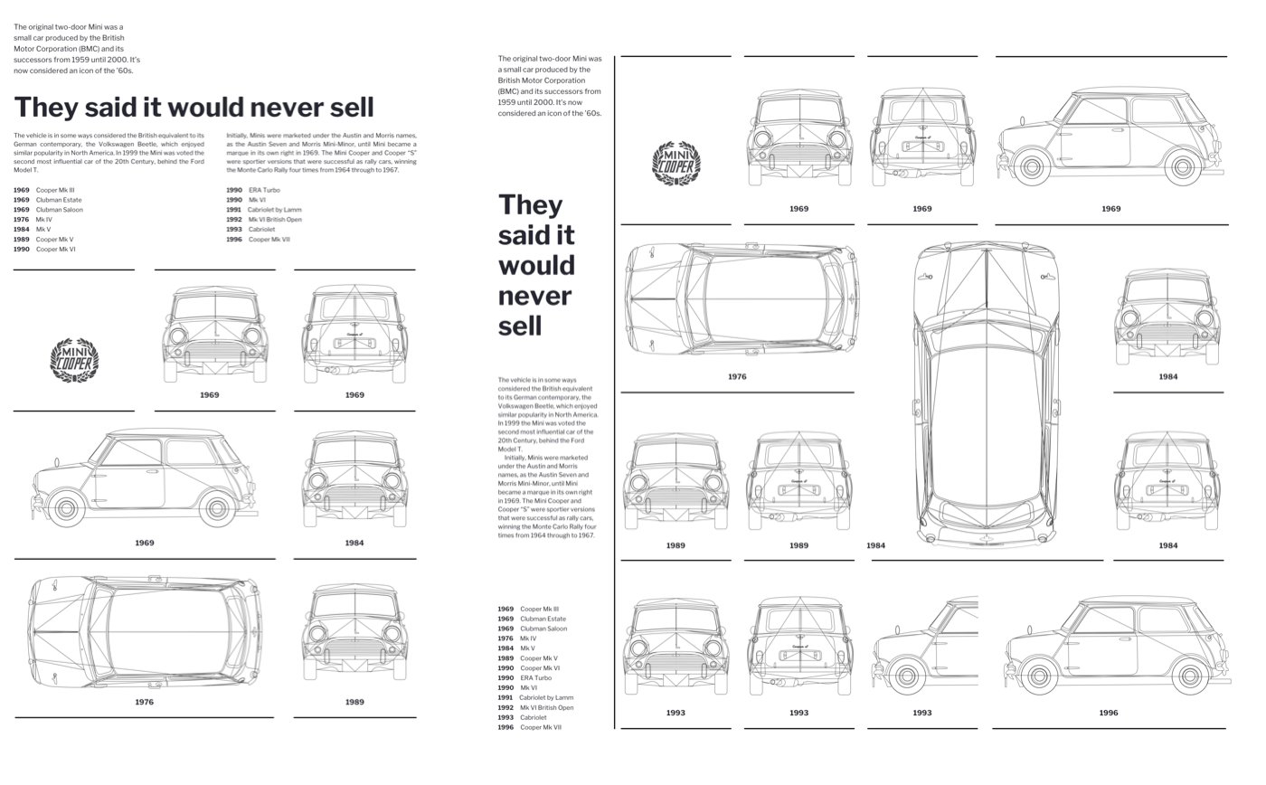
Avaunt magazine contains plenty of inspiring layouts, but I want to focus on two pages in particular. This spread contains ‘Cold War Design’ objects within a design which could be applied to a wide variety of content types.
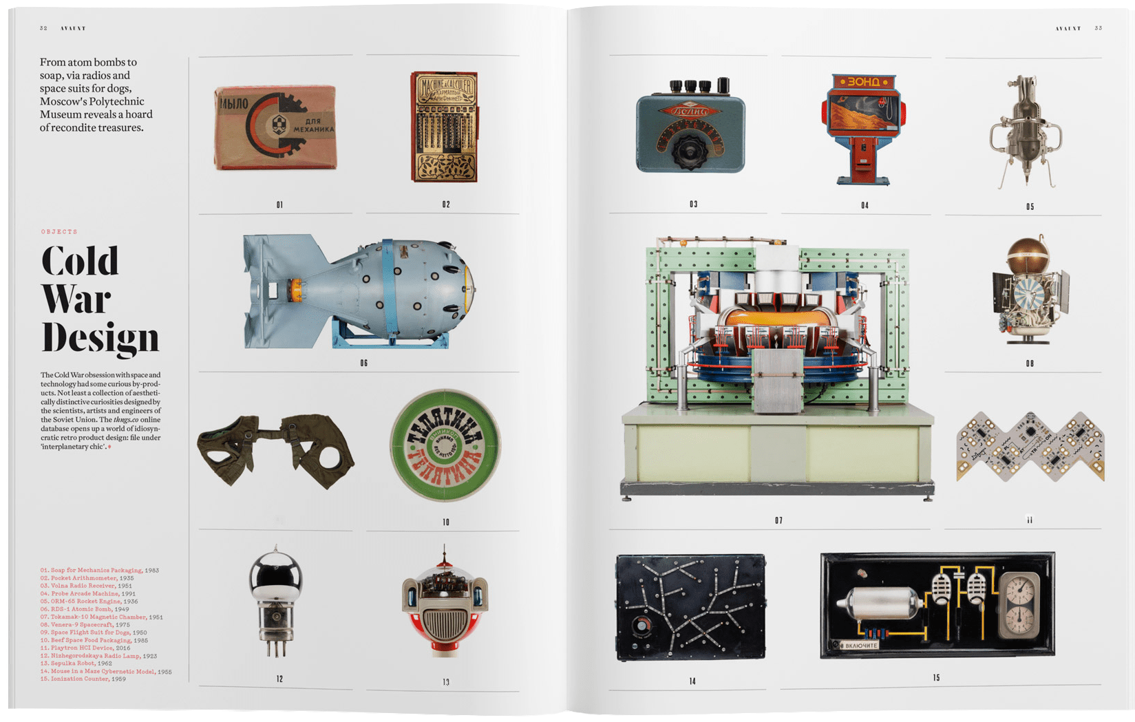
On first glance, modular grids can look complicated, however, they’re easy to work with. It surprises me that so few web designers use them. I want to change that.
When you use modular grids thoughtfully, they can fill your designs with energy. They’re excellent for bringing order to large amounts of varied content, but can also create visually appealing layouts when there’s very little content.
For this design — inspired by Avaunt — I base my modular grid on six symmetrical columns and four evenly spaced rows. Grid modules define the placement and size of my content.

I bind several modules together to create spacial zones for large images and running text in a single-column on the left. Boundary lines help emphasise the visual structure of the page.
This type of layout might seem complicated at first, but in reality, it’s beautifully simple to implement. Instead of basing my markup on the visual layout, I start by using the most appropriate elements to describe my content. In the past, I would’ve used table elements to implement modular grids. Fast forward a few years, and divisions replaced those table cells. Incredibly, now I need just two structural HTML elements to accomplish this design; one article followed by an ordered list:
<body>
<article>…</article>
<ol>…</ol>
</body>
That article contains a headline, paragraphs, and a table for tabular information:
<article>
<p class="standfirst">…</p>
<h1>…</h1>
<p>…</p>
<table>…</table>
</article>
The modular grid of Mini blueprints is the most complicated visual aspect of my design, but the markup which describes it is simple. The blueprints are in date order, so an ordered list seems the most appropriate HTML element:
<ol class="items">
<li>
<h2>1969</h2>
<img src="front.svg" alt="">
</li>
<li>
<h2>1969</h2>
<img src="back.svg" alt="">
</li>
</ol>
My HTML weighs in at only 2Kb and is under sixty lines. It’s a good idea to validate that markup as a little time spent validating early will save plenty more time on debugging CSS later. I also open the unstyled page in a browser as I always need to ensure my content’s accessible without a stylesheet.
I begin developing a symmetrical three-column layout for medium size screens by isolating grid styles using a media query:
@media screen and (min-width : 48em) {
body {
display: grid;
grid-template-columns: 1fr 1fr 1fr;
grid-column-gap: 2vw; }
}
The article and ordered list are the only direct descendants of body, but it’s what they contain which I want to place as grid-items. I use display:contents; to enable me to place their contents anywhere on my grid:
article, ol {
display: contents; }
Every element in my article should span all three columns, so I place them using line numbers, starting with the first line (1), and ending with the final line (-1):
.standfirst,
section,
table {
grid-column: 1 / -1; }
The items in my ordered list are evenly placed into the three-column grid grid. However, my design demands that some items span two columns and one spans two rows. nth-of-type selectors are perfect tools for targetting elements without resorting to adding classes into my markup. I use them, the span keyword, and the quantity of columns or rows I want the items to span:
li:nth-of-type(4),
li:nth-of-type(5),
li:nth-of-type(6),
li:nth-of-type(14) {
grid-column: span 2; }

li:nth-of-type(6) {
grid-row: span 2; }
Previewing my design in a browser, I can see it’s not appearing precisely as planned because some grid modules are empty. By default, the normal flow of any document arranges elements from left to right and top to bottom, just like western languages. When elements don’t fit the space available in a grid, the CSS Grid placement algorithm leaves spaces empty and places elements on the following line.
I can override the algorithm’s default by applying the grid-auto-flow property and a value of dense to my grid-container, in this case the body:
body {
grid-auto-flow: dense; }
Row is the default grid-auto-flow value, but you can also choose column, column dense, and row dense. Use grid-auto-flow wisely because a browser fills any empty module with the next element in the document flow which can fit into that space. This behaviour changes the visual order without altering the source which may have implications for accessibility.
My medium size design now looks just like I’d planned, so now it’s time to adapt it for larger screens. I need to make only minor changes to the grid styles to first turn my article into a sidebar — which spans the full height of my layout — then place specific list items into modules on a larger six-column grid:
@media screen and (min-width : 64em) {
body {
grid-template-columns: 1fr 1fr 1fr 1fr 1fr 1fr; }

article {
grid-column: 1;
grid-row: 1 / -1; }

li:nth-of-type(4) {
grid-column: 5 / span 2; }

li:nth-of-type(5) {
grid-column: 2 / span 2; }

li:nth-of-type(6) {
grid-column: 4 / span 2;
grid-row: 2 / span 2; }

li:nth-of-type(14) {
grid-column: 5 / 7; }
}
Keeping track of grid placement lines can sometimes be difficult, but fortunately, CSS Grid offers more than one way to accomplish a modular grid design. Using grid-template-areas is an alternative approach and one I feel doesn’t get enough attention.
Using grid-template-areas, I first define each module by giving it a name, then place elements into either one module or several adjacent modules known as spacial zones. This process may sound complicated, but it’s actually one of the easiest and most obvious ways to use CSS Grid.
I give each element a grid-area value to place it in my grid, starting with the logo and article:
[src*="logo"] {
grid-area: logo; }

article {
grid-area: article; }
Next, I assign a grid-area to each of my list items. I chose a simple i+n value, but could choose any value including words or even letters like a, b, c, or d.
li:nth-of-type(1) {
grid-area: i1; }

…

li:nth-of-type(14) {
grid-area: i14; }
My grid has six explicit columns, and four implicit rows, the height of which are being defined by the height of the content inside them. I draw my grid in CSS using the grid-template-areas property, where each period (.) represents a grid module:
body {
grid-template-columns: repeat(6, 1fr);
grid-template-areas:
". . . . ". . . . ".. .. ".. ..
.  ."
.  ."
.  ."
.  ."; }
Then, I place elements into that grid using the grid-area values I defined earlier. If I repeat values across multiple adjacent modules — across either columns or rows — that element expands to create a spacial zone. Leaving a period (.) creates an empty module:
body {
grid-template-columns: repeat(6, 1fr);
grid-template-areas:
"article logo i1 i2 i3 i3"
"article i4 i4 i5 i5
"article i7 i8 i5 i5
"article i10 i11 i12 i14 i14"; }
In every example so far, I isolated layout styles for different screen sizes using media query breakpoints. This technique has become the standard way of dealing with the complexities of responsive web design. However, there’s a technique for developing responsive modular grids without using media queries. This technique takes advantage of a browser’s ability to reflow content.
Before going further, it’s worth remembering that my design requires just two structural HTML elements; one ordered list for the content and an article which I transform into a sidebar when there’s enough width available for both elements to stand side-by-side. When there’s insufficient width, those elements stack vertically in the order of the content:
<body>
<article>…</article>
<ol>…</ol>
</body>
The ordered list forms the most important part of my design and should always occupy a minimum 60% of a viewport’s width. To ensure this happens, I use a min-width declaration:
ol {
min-width: 60%; }
While I normally recommend using CSS Grid for overall page layout and Flexbox for flexible components, to implement this design I turn that advice on its head.
I make the body element into a flex-container, then ensure my article grows to fill all the horizontal space by using the flex-grow property with a value of 1:
body {
display: flex; }

article {
flex-grow: 1; }
To make sure my ordered list also occupies all available space whenever the two elements stand side-by-side, I give it a ridiculously high flex-grow value of 999:
article {
flex-grow: 999; }
Using flex-basis provides an ideal starting width for the article. By setting the flex container’s wrapping to wrap, I ensure the two elements stack when the list’s minimum width is reached, and there’s insufficient space for them to stand side-by-side:
body {
flex-wrap: wrap; }

article {
flex-basis: 20rem; }
I want to create a flexible modular grid which allows for any number of modules. Rather than specifying the number of columns or rows, using repeat allows a browser to create as many modules as it needs. autofill fills all available space, wrapping the content where necessary. minmax gives each module a minimum and maximum width, in this case 10rem and 1fr:
ol {
grid-template-columns: repeat(auto-fill, minmax(10rem, 1fr)); grid-column-gap: 2vw; }
To avoid modules staying empty, I use grid-auto-flow again with a value of dense. The browser’s algorithm will reflows my content to fill any empty modules:
ol {
grid-auto-flow: dense; }
Just like before, some list items span two columns, and one spans two rows. Again, I use nth-of-type selectors to target specific list items, then grid-column or grid-row with the span keyword followed by the number of columns or rows I want to span:
li:nth-of-type(4),
li:nth-of-type(5),
li:nth-of-type(14) {
grid-column: span 2; }

li:nth-of-type(6) {
grid-column: span 2;
grid-row: span 2; }
This simple CSS creates a responsive design which adapts to its environment without needing multiple media queries or separate sets of styles.
By using of modern CSS including Grid and Flexbox, relying on browsers’ ability to reflow content, plus a few smart choices on minimum and maximum sizes, this approach comes closest to achieving the goals of a truly responsive web.
Read More From The Series
- Inspired Design Decisions: Avaunt Magazine
- Inspired Design Decisions: Pressing Matters
- Inspired Design Decisions: Ernest Journal
- Inspired Design Decisions: Alexey Brodovitch
- Inspired Design Decisions: Bea Feitler
- Inspired Design Decisions: Neville Brody
- Inspired Design Decisions: Otto Storch
- Inspired Design Decisions: Herb Lubalin
- Inspired Design Decisions: Max Huber
- Inspired Design Decisions: Giovanni Pintori
- Inspired Design Decisions: Emmett McBain
- Inspired Design Decisions: Bradbury Thompson
NB: Smashing membersSmashing members have access to a beautifully designed PDF of Andy’s Inspired Design Decisions magazine and full code examples from this article. You can buy this issue’s PDF and examples as well as every other issue directly from Andy’s website.
Further Reading
- Conducting Accessibility Research In An Inaccessible Ecosystem
- How To Harness Mouse Interaction Data For Practical Machine Learning Solutions
- What Saul Bass Can Teach Us About Web Design
- Infinite-Scrolling Logos In Flat HTML And Pure CSS
 (ra, yk, il, mrn)

