7 Gorgeous Free And Open-Source Typefaces And When To Use Them

Email Newsletter
Weekly tips on front-end & UX.
Trusted by 182,000+ folks.
 Register for Free
 Custom Web Forms for Angular, React, & Vue. Your backend.


 Celebrating 10 million developers
These sleek and versatile fonts are perfect for all sorts of designs, from websites to printed material, and they are all completely free for both personal and commercial use.
To facilitate your font picking and pairing process, I’ve included examples of how these typefaces have been put to use recently, as well as a few pairing ideas. Enjoy and don’t forget to ping me on Twitter to show me how you’ve used them — I’d love to see it!
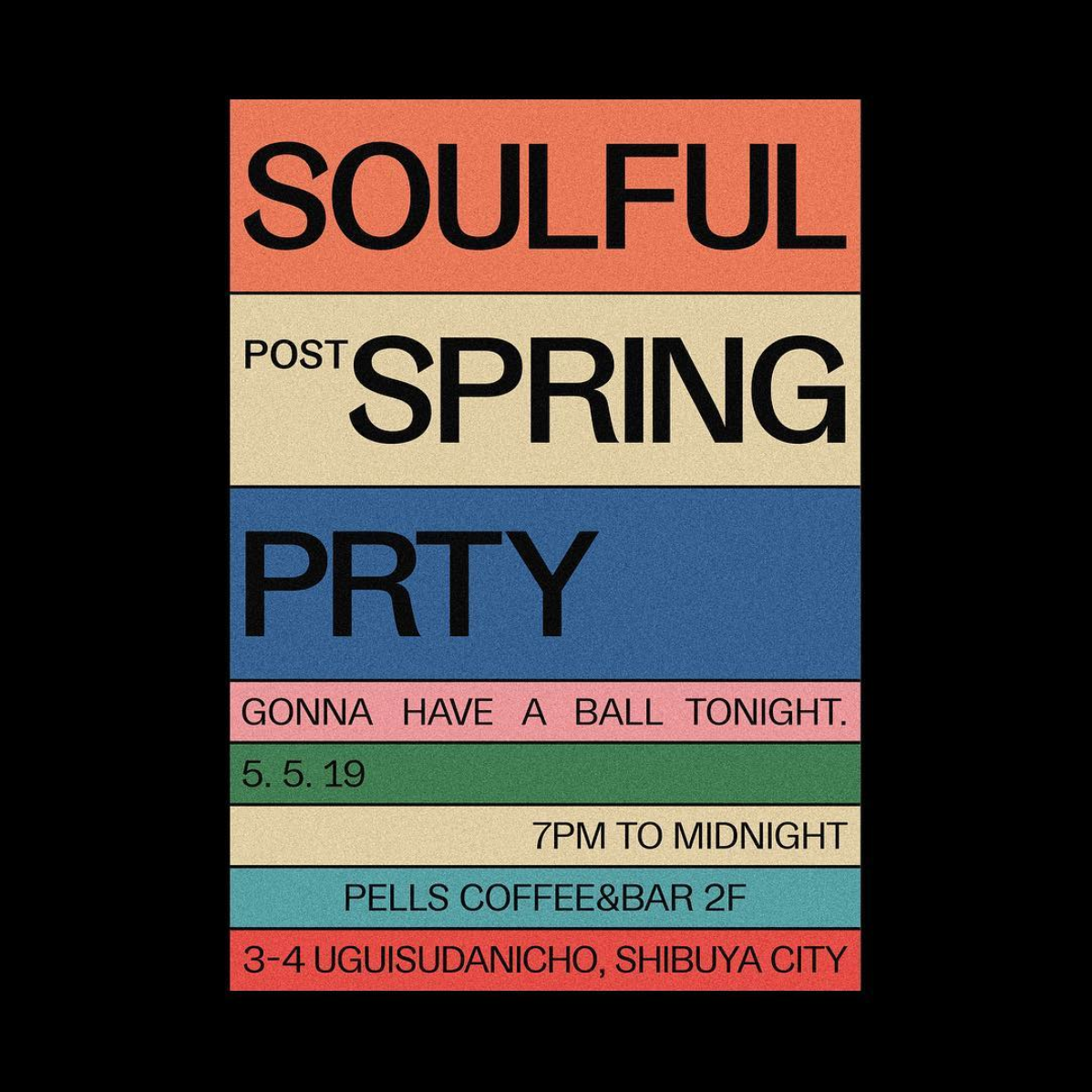
Gangster Grotesk
Designed by Adrien Midzic, Gangster Grotesk is a contemporary grotesque with angled terminal strokes that slightly curve inward. Because of these quirky individual touches, the typeface brings a unique flavor to headlines and posters when used at large sizes. Its low contrast and slightly condensed width make it a good choice for body copy and other texts of small type sizes as well.
The font family comes in three weights, from Light to Bold, with stylistic alternates, including a loopy expressive ampersand. Gangster Grotesk is offered for free when signing up for the Fresh Fonts newsletter.
Suggested Font Pairings
When applying Gangster Grotesk to titles, the quirky grotesque pairs well with low x-height serifs for text settings, such as FF Atma. Used at small point sizes instead, pairing Gangster Grotesk with Le Murmure (see below) offers the right mix of character and neutrality.
Use Case
Gangster Grotesk excels in punchy designs with strong colors when it’s asked to render strings of text, for example on this flyer designed by Tokyo-based Juri Okita for Pells Coffee.
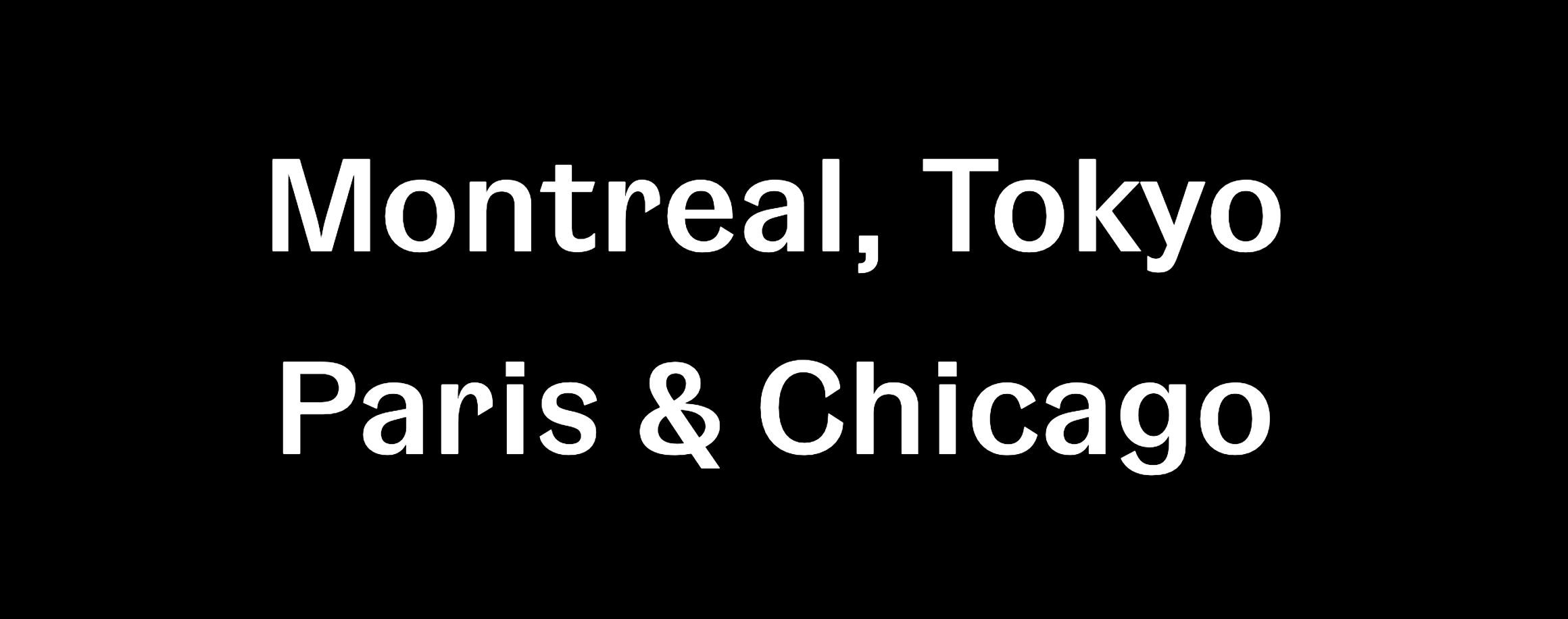
Le Murmure
Recently awarded a Certificate of Typographic Excellence by the Type Directors Club, Le Murmure was commissioned by French design agency Murmure to renew their brand image. Drawing inspiration from magazine titling fonts, Le Murmure is a condensed sans serif with an interesting mismatch between its characters, making it especially distinctive for use at large sizes. Its height and the singularity of its shapes provide elegance while conveying notions of experimentation and creativity. Le Murmure comes with many — even more — original alternate letters, and there is even a stylistic set that ‘randomizes’ all alternates for you (SS08).
Suggested Font Pairings
Used as a titling font, Le Murmure can pair well with a sans serif with warm curves, like Standard CT, or with a sans that has more pronounced irregularities, like Dinamo’s Prophet.
Use Case
Marrakesh’s Untitled Duo picked Le Murmure for the headlines of their studio’s website, complemented with Classic Sans for the navigation, which they also used at smaller size for the body text.

Reforma
Reforma is a bespoke typeface designed by PampaType for the Universidad Nacional de Córdoba in Argentina, an educational institution more than 400 years old. The typeface is composed of three subfamilies: Reforma 1918, a classic Serif, Reforma 2018, a modern Sans, and Reforma 1969, an intermediate hybrid that combines the qualities of the other two (subtle modulation and flare serifs). I find all three subfamilies to adapt well to a wide range of bodies, from display to immersive text, and each one of them comes in three weights, with matching italics.
Suggested Font Pairings
This typeface allows for interesting combinations among its different styles. The most obvious would be to use Reforma Sans for display use and to pair it with its serif counterpart for body text. However, I would encourage you to do something more original and try it the other way around, using the serif for titling.
Use Case
Graphic designer Étienne Pouvreau chose Reforma for the creation of the annual programs of the two Caf family centers of the Loir-et-Cher department in France. The booklets feature Reforma 1918 (the serif) for the headings, in italic, and Reforma 2018 (the sans) for the titles, subtitles and body text.

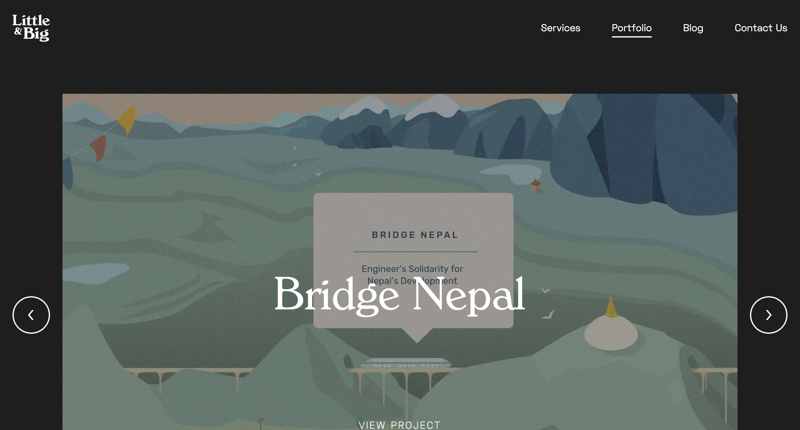
Space Grotesk
The new foundry of Florian Karsten is behind this versatile, geometric sans serif. Derived from Space Mono, a monospaced typeface designed by Colophon Foundry for Google Fonts in 2016, Space Grotesk kept the nerdy charm of its predecessor and its particular retro-future voice. Available in five weights, Space Grotesk is well-suited for a wide range of uses, from body text to bold headlines. In addition, it comes with five sets of alternate letters, the third one (SS03) removing the connections between the diagonal strokes of uppercase A, M, N, V, W, and lowercase v, w, y — which can be particularly effective to create distinctive headlines.
Suggested Font Pairings
As one would guess, Space Grotesk pairs well with Colophon Foundry’s Space Mono, the typeface it was derived from, which is also open source and free to use. Alternatively, if you’d like to pair it with a serif typeface, I would recommend one with pointy serifs and sharp details, such as Fortescue, or Wremena, which is also free to use (see below).
Use Case
Little & Big, a web design and development studio based in Sydney, Australia, chose Space Grotesk as the body text font for their website, including on blog entries, header and footer. They decided to pair it with Verona Serial, giving the website a professional, yet playful look and feel.

Syne
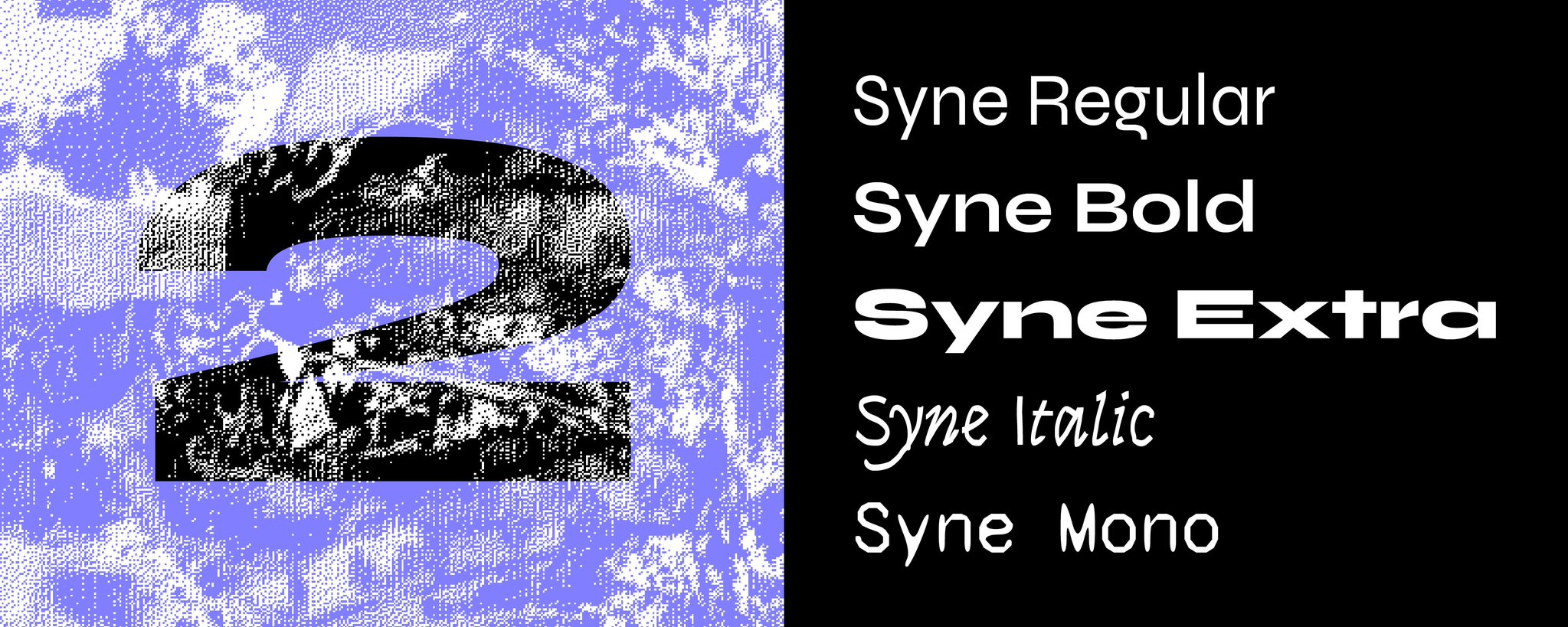
Syne is a type family designed by Bonjour Monde for the visual identity of Synesthésie, an art center close to Paris. It consists of five distinct styles, amplifying the notion of structural differentiation within a font family: Syne Extra is a wide, heavy weight intended for use at large sizes, Syne Regular is a geometric sans with short ascenders and descenders (visible in the lowercase ‘g’ among others), complemented with a wider bold style, an italic in a handwritten style and a monospaced with a distorted look. Updated just days ago, Syne now comes with more alternates, a set of brand new accents, and a variable font version.
Suggested Font Pairings
The particularity of this typeface is that you can play with its different styles, and create fresh and atypical associations among them. For instance, Syne Extra does wonder for titles and headlines, and works well with Syne Regular for body copy.
Use Case
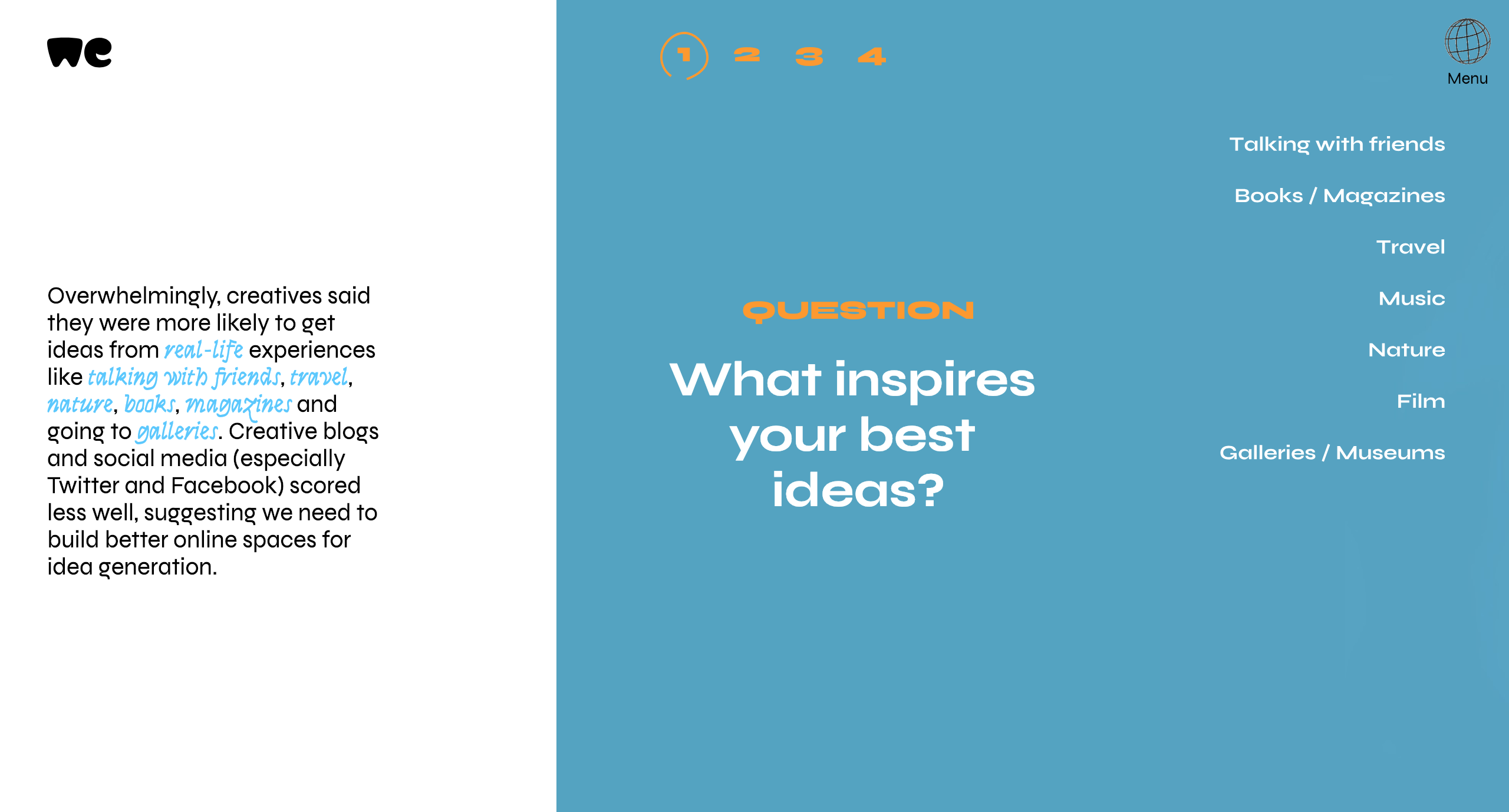
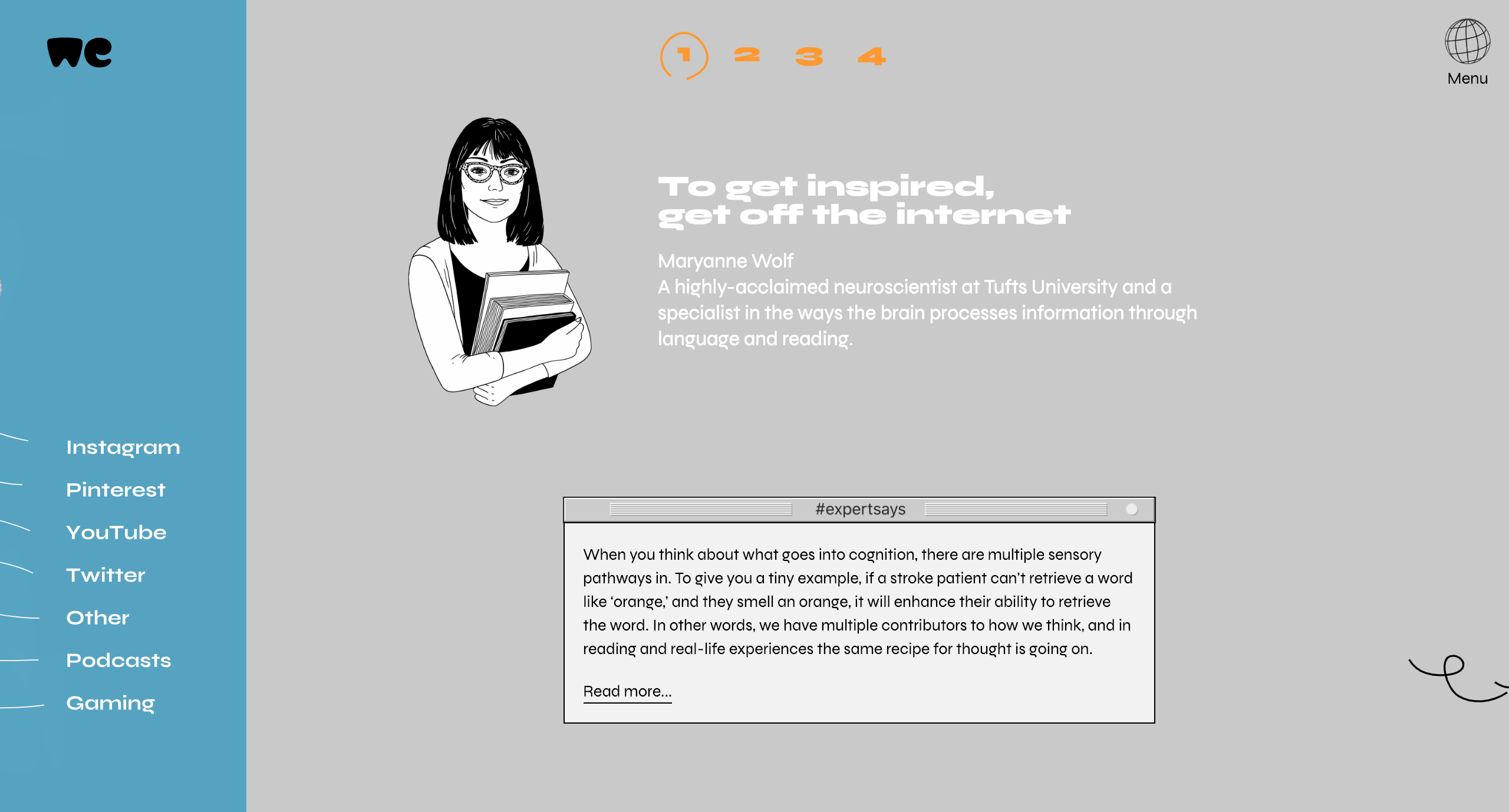
Syne was recently used by WeTransfer to present the results of their Ideas Report 2018, making extensive use of the typeface’s five different cuts on the website of the report and on its beautiful PDF companion.
VG5000

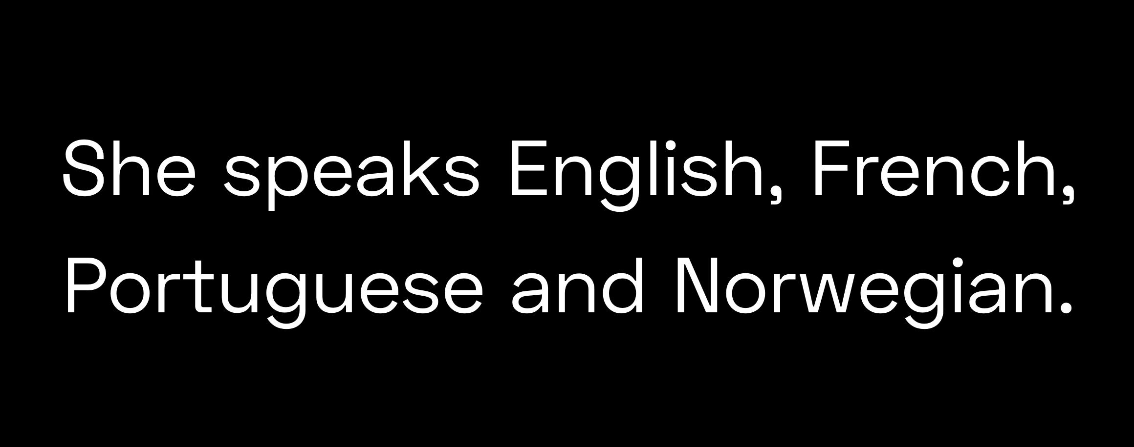
Named after the VG 5000, a computer created by Phillips in 1984, this typeface playfully combines pixelated and curved strokes, blurring the lines between old and new digital shapes. It also includes many early emojis and pictograms from the VG 5000’s original set, allowing you to create unexpected combinations. Moreover, the typeface comes with contemporary gender inclusive characters for the French language, replacing pronouns “il” and “elle” (“he” and “she”) with the neutral “iel”, and providing an alternative to gendered words by combining their masculine and feminine versions.
Suggested Font Pairings
Because of its pixelated details, and to remain truthful to its origins, I would suggest pairing VG5000 with a monospaced font, for example League Mono, which is also open source. Alternatively, you could decide to pair it with the sans or serif version of Input, or with a semi-proportional typeface like ETC Trispace, which is also free.
Use Case
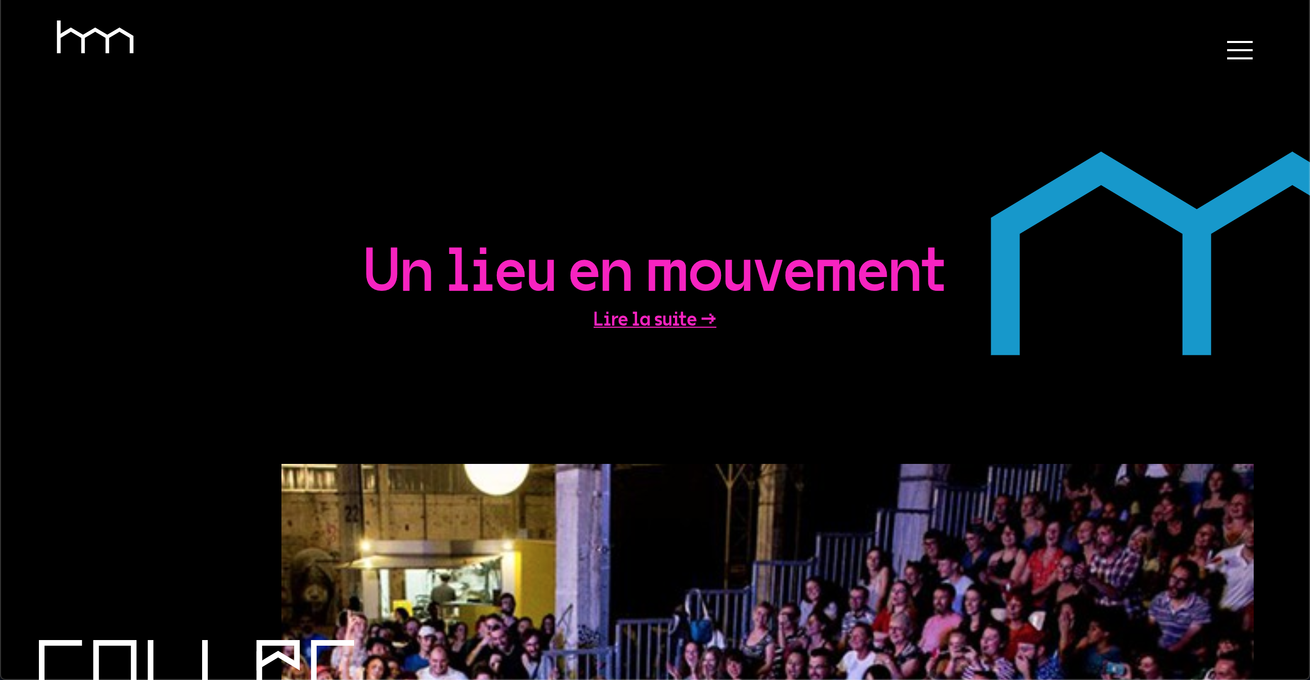
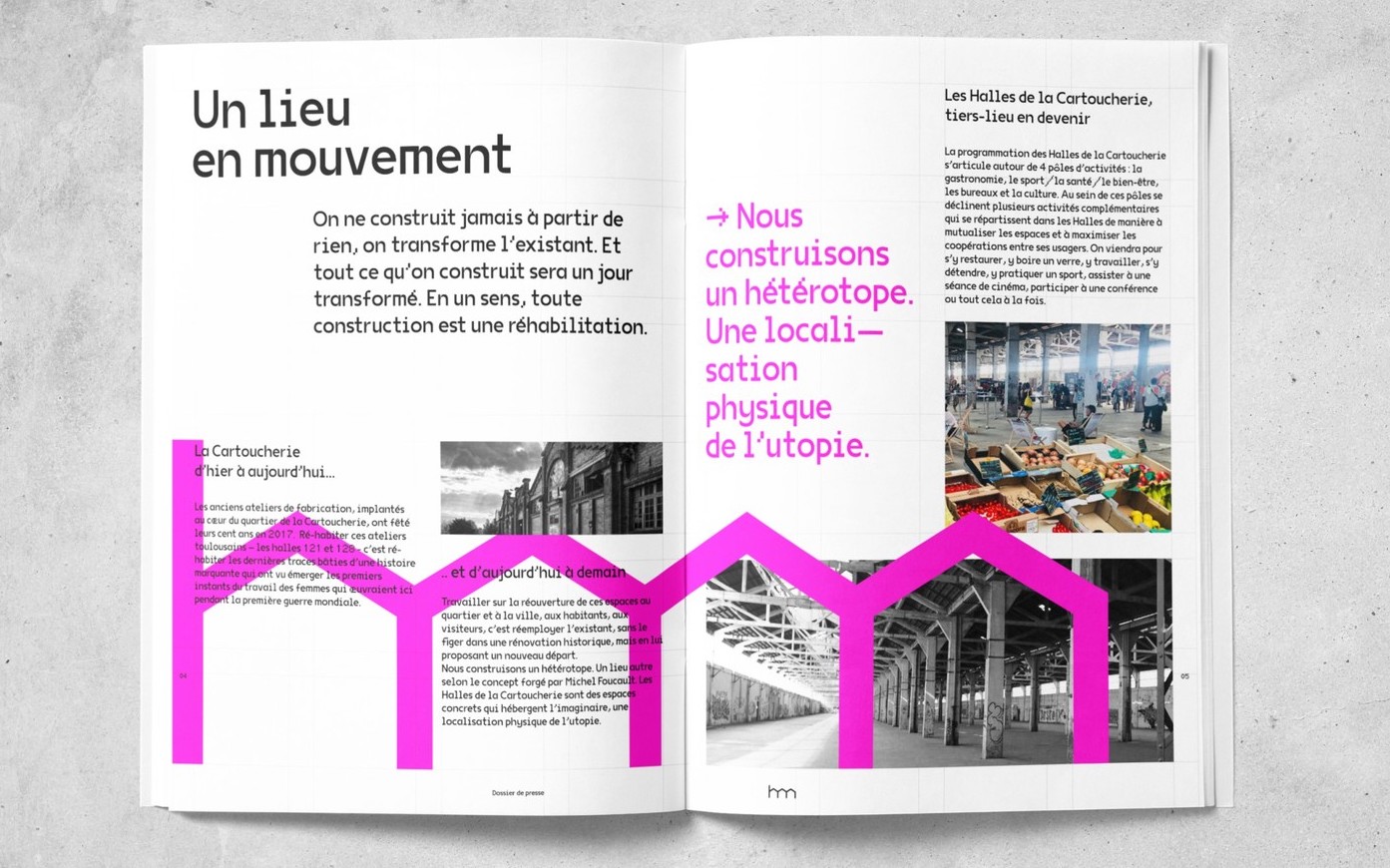
French design studio Brand Brothers put VG5000 to use for the visual identity of Les Halles de la Cartoucherie, a new, versatile space dedicated to cultural, artistic and gastronomic activities in Toulouse. Paired with a custom, grid-based logo that represents the structure of the space, VG5000 was used both at large and small sizes on print materials, on the website of the space and even on its walls, using VG5000's pixelated arrows for its wayfinding system.
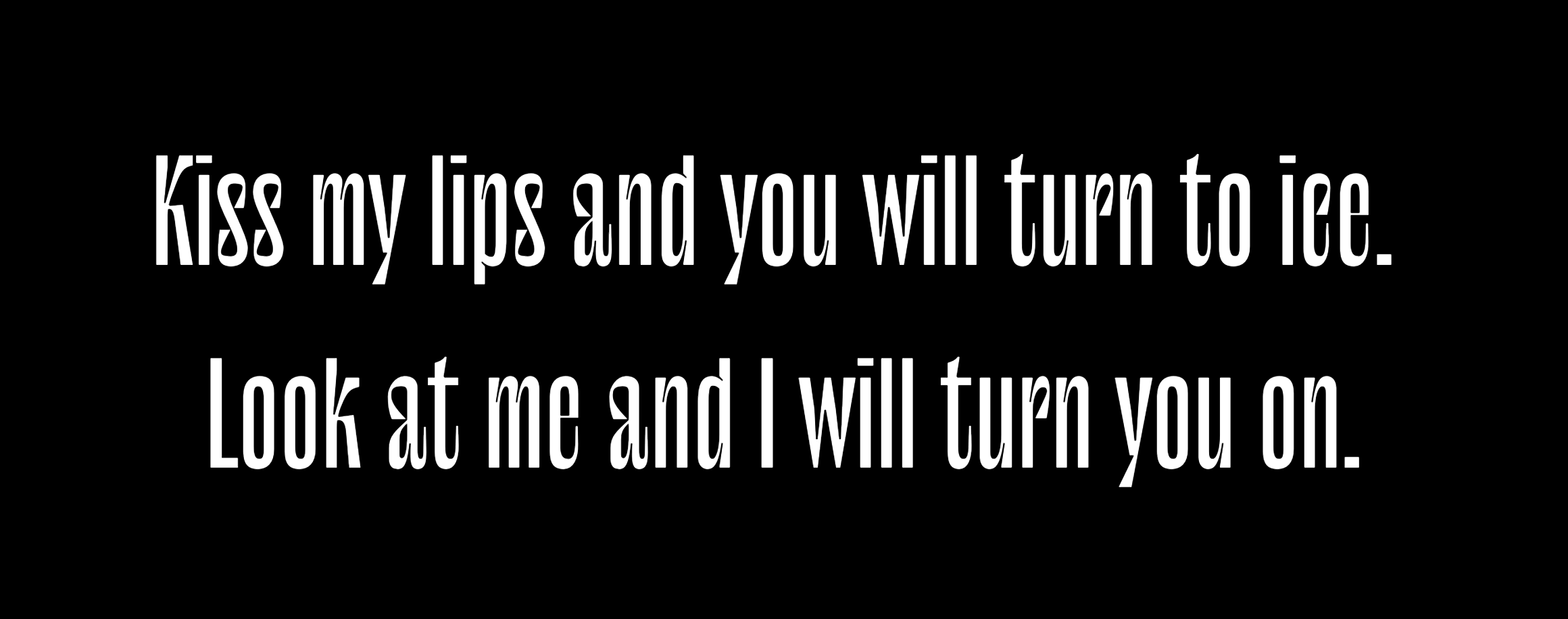
Wremena
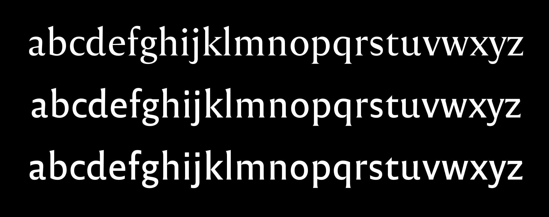
Wremena is a serif typeface designed by Roman Gornitsky and published by Moscow-based foundry Typefaces of The Temporary State. Its design was based on Vremena, a free typeface by the same designer, but it features more pronounced triangular serifs and sharper angles, which become even more visible in heavier weights. Wremena is available in three styles (Light, Regular and Bold) without italics but with support for the Latin and Cyrillic scripts. Because of its similarities with Times New Roman, Wremena can be used as a free, more contemporary alternative to the ever-popular typeface.
Suggested Font Pairings
A good tip to find pairings for a specific font is to browse the library of typefaces created by the same designer, as they often pair well together. This is especially true in this case, as Roman Gornitsky designed two sans serifs that are great matches for Wremena: Nowie Vremena, with its distinctive lowercase ‘g’, and more recently, Steinbeck, a lively font with intentional irregularities.
Use Case
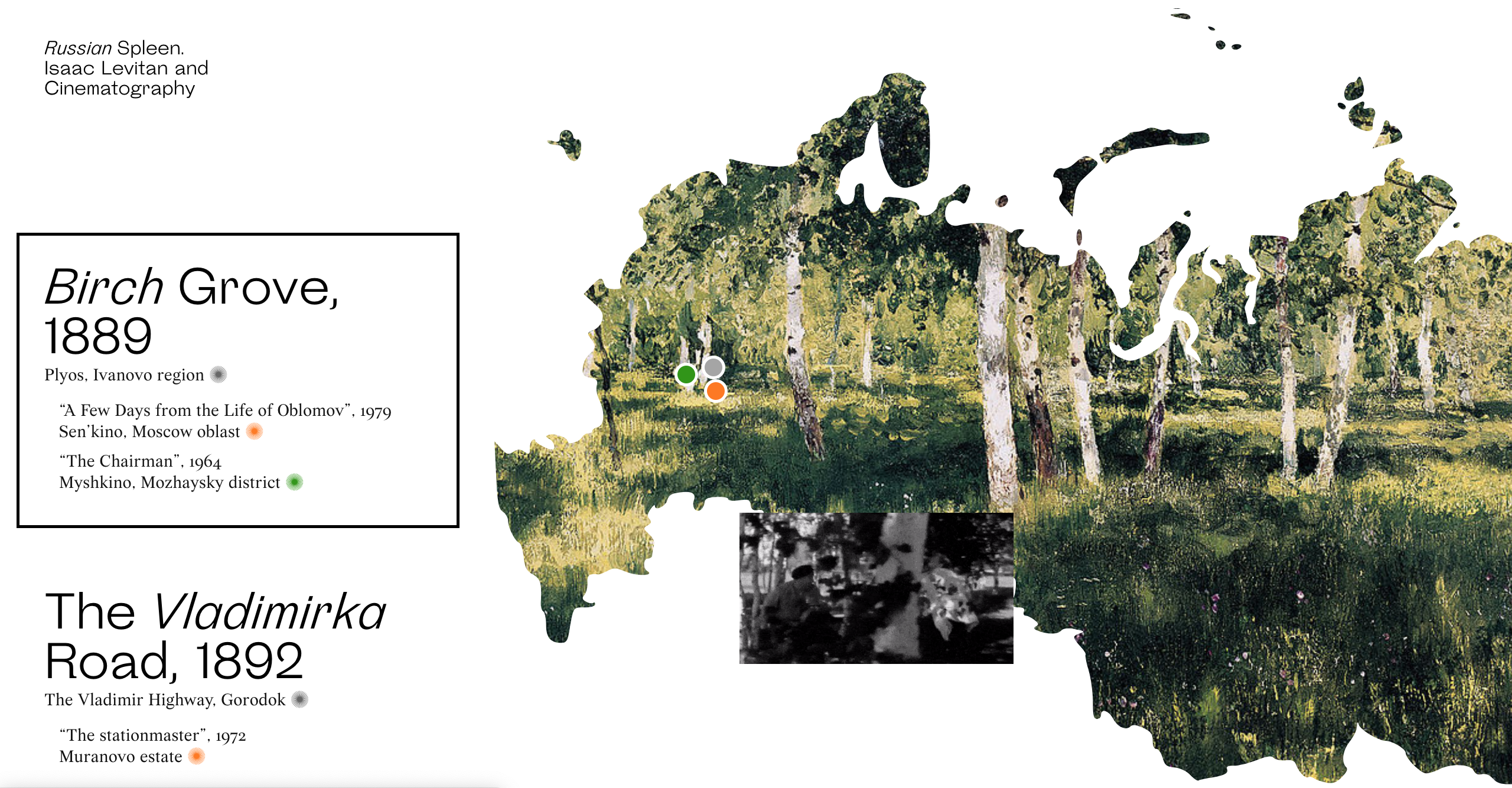
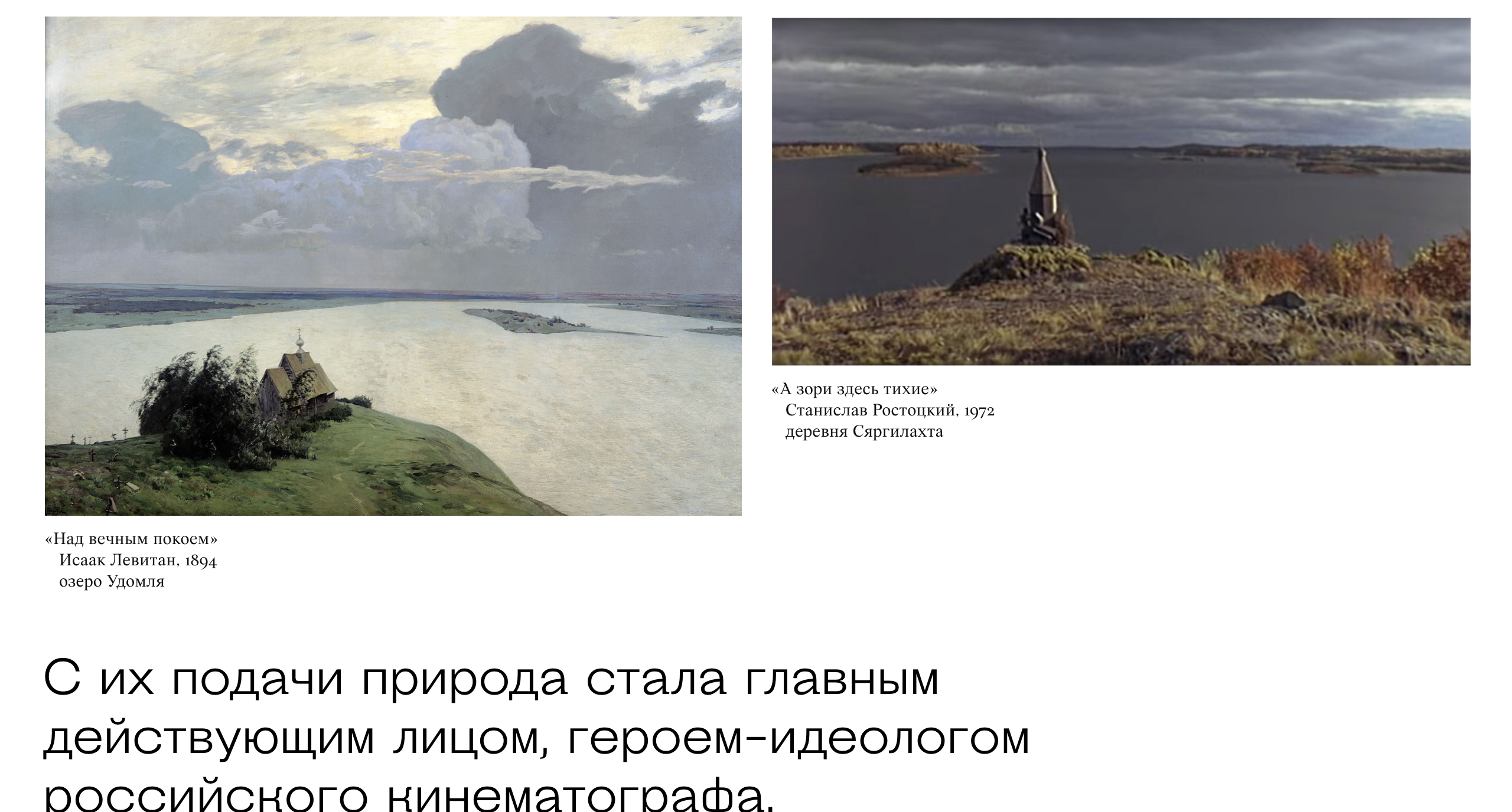
The Jewish Museum and Tolerance Center and Readymag have come together to bring the Russian Spleen project to life, which is a picturesque interactive web project that explores how Russian landscape painter Isaac Levitan impacted the 20th-century cinematography. Designer Pavel Kedich decided to typeset the website in Steinbeck (used at large sizes) and Wremena (here used for captions). Both fonts being multi-script, they allow the website to be available in English and Russian languages.
That’s It For Now!
While I’ve included great examples of how these free fonts can be used, there are many more on Typewolf and Fonts in Use. And if you’d like to discover new, high-quality free and open source fonts, make sure to subscribe to my newsletter Fresh Fonts.
All works and screenshots are property of their respective owners.
Further Reading
- Addressing Accessibility Concerns With Using Fluid Type
- Open-Source 3dicons Library: Case Study And Free Downloads
- A New Way To Reduce Font Loading Impact: CSS Font Descriptors
- Optimizing Google Fonts Performance


