How To Integrate Social Media Into Mobile Web Design

Email Newsletter
Weekly tips on front-end & UX.
Trusted by 182,000+ folks.


 Celebrating 10 million developers
 Custom Web Forms for Angular, React, & Vue. Your backend.

There are a number of reasons why social media is a popular form of socialization and communication today. For starters, it gives us a chance to connect with exponentially more people than in-person communities allow for (which is fantastic for both consumer and business). It’s also encouraged a new style of communication where brevity and visual storytelling rules.
So, why aren’t we using more social media-like features in mobile web design?
To be clear, I’m not referring to the kinds of social media elements we already see on websites, like:
- Social logins
- Social follow icons
- Social share icons
- Social feeds
- YouTube embeds
- Pinnable images.
I’m talking about drawing inspiration from the abbreviated way in which we talk to others there. After all, mobile websites, PWAs, and native apps give us very little space to tell a story and engage an audience with it. Adopting a social media-inspired design would be helpful in quickly getting our message across on mobile screens.
These elements, in particular, are worth exploring in your mobile design work.
1. Use A Notification Symbol To Direct Visitors To Action
You don’t have much space or time to waste on mobile, so why literally spell out what kind of action you want visitors to take? A lot of the symbols we use on social media can easily be repurposed for mobile websites.
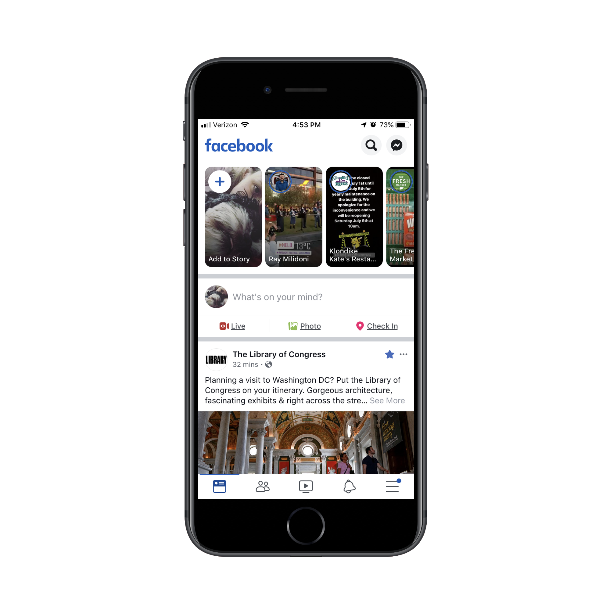
One such symbol is a notification ticker, a lot like the ones we’re accustomed to seeing in the header or footer of social media apps when there’s a message or reminder we need to be made aware of. Like this blue one found in the bottom bar on Facebook:
On occasion, the Red Bull website will put a similar-looking red ticker on its hamburger menu icon (this one is flashing though):
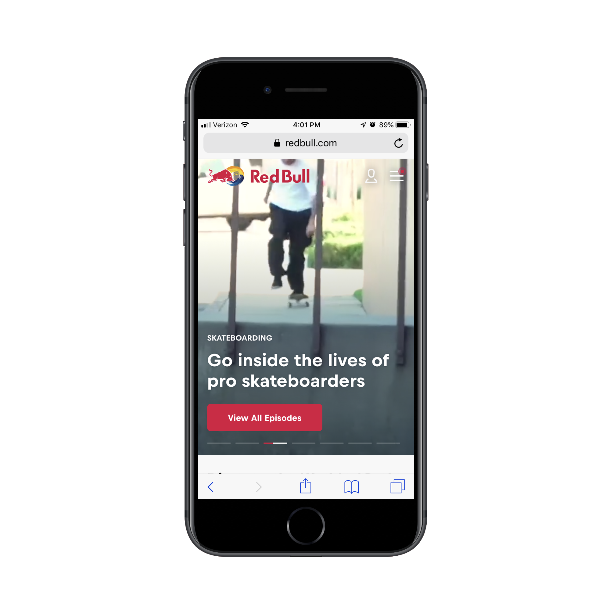
This flashing notification has nothing to do with alerting me to account activity (because I’m not logged into the website). However, it does certainly draw my eye to the navigation before anything else.
If you have something pertinent you want visitors to see in the navigation or header of the site, a notification icon is a good way to grab their attention fast. And it doesn’t have to be a colored dot the way Facebook or Red Bull have handled it. You could also use a number counter like the ones that appear when items sit in a shopping cart or emails in an inbox.
2. Boost Branding With Hashtags And Handles
The way we talk to one another on social media is quite unique. Not only do many people use acronyms to truncate how much they say in a tiny amount of space, but we’ve also adopted a quicker way of getting our messages in front of target users.
Take, for example, this message I’ve written on Twitter about a post Jad Joubran recently wrote about PWAs.
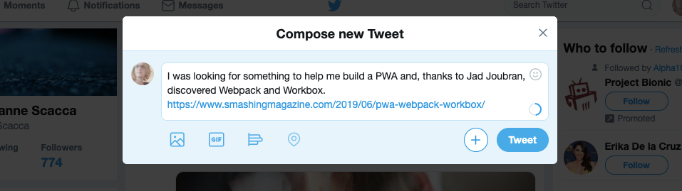
Now, I could leave my message as is and hope that Jad runs across the mention or that people interested in learning how to build PWAs find it. But there’s just too much noise on social media, which is why the usage of the handle (@) and hashtag (#) symbols has become helpful in getting our messages in front of the right people:
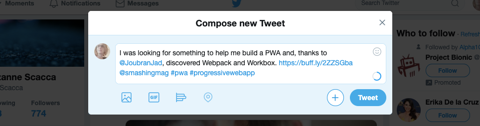
Take a look at the message above and note the differences. First, I’ve included hashtags in this post for #pwa and #progressivewebapp. That way, if someone is interested in related topics, it’ll be easier to locate this post now.
In addition, I’ve tagged Jad. This way, he’ll see my shout-out. I’ve also tagged Smashing Magazine since that’s the magazine in which the article appeared. This is good for them since it’ll increase the visibility of the brand while helping people who encounter the post make a direct connection between #pwa and @smashingmag.
The hashtag and handle have become such an innate part of how we communicate online, that I’m surprised more brands don’t use them on their websites. And I’m not talking about listing social media handles on a page. I mean actually integrating branded hashtags or handles within their designs as eos does here:
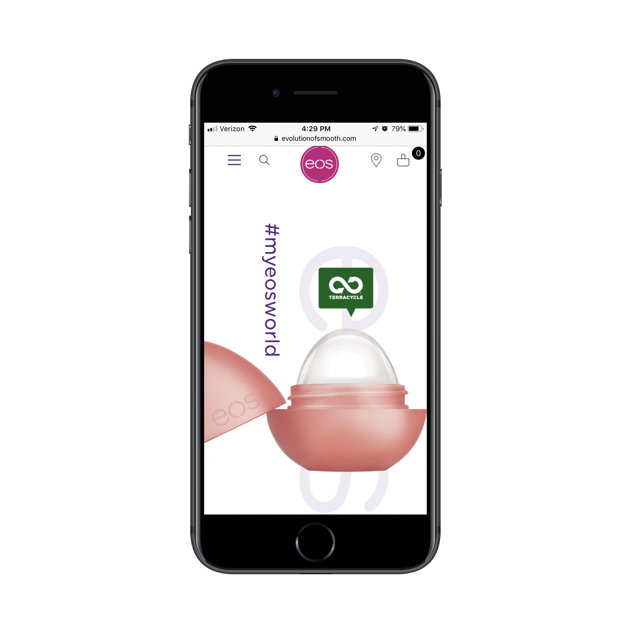
A couple of years back, I saw more hashtags and handles incorporated into web designs. Today, I don’t see it as much.
My guess is that designers have moved away from placing handles and hashtags into designs since visitors can’t readily copy or click and do anything with them. But there is value in placing branded handles and hashtags into your designs on mobile.
Think of it as a watermark for your brand images. Like the example above, people won’t just walk away thinking about how cool that chapstick “egg” looks. They’ll take note of the hashtag sitting perpendicular to it, too. And for those that are on their way to becoming loyal eos customers, that hashtag will stick with them.
3. Add Trust Marks Into The Design
There are certain social media platforms that give brands and public figures the ability to verify their identity. That way, anyone who wants to follow them will know who the person on the other side of the profile actually is (instead of, say, a bot or someone pretending to be them).
Rather than slap a “Verified Profile” label on these profiles, platforms like Twitter and Instagram use a tiny symbol that lets people know it’s okay to trust that the user is who they say they are. And it comes in the form of a small blue checkmark next to their username.
Trust marks are already used on the web to let visitors know when a site is safe enough to engage with and make a purchase through. However, they usually come in the form of big security provider logos like Norton Security that build consumer trust just before checkout.
Instead, you should find ways to leverage smaller trust marks to reinforce trust throughout the entire experience. Here’s how Sephora does this for its store:
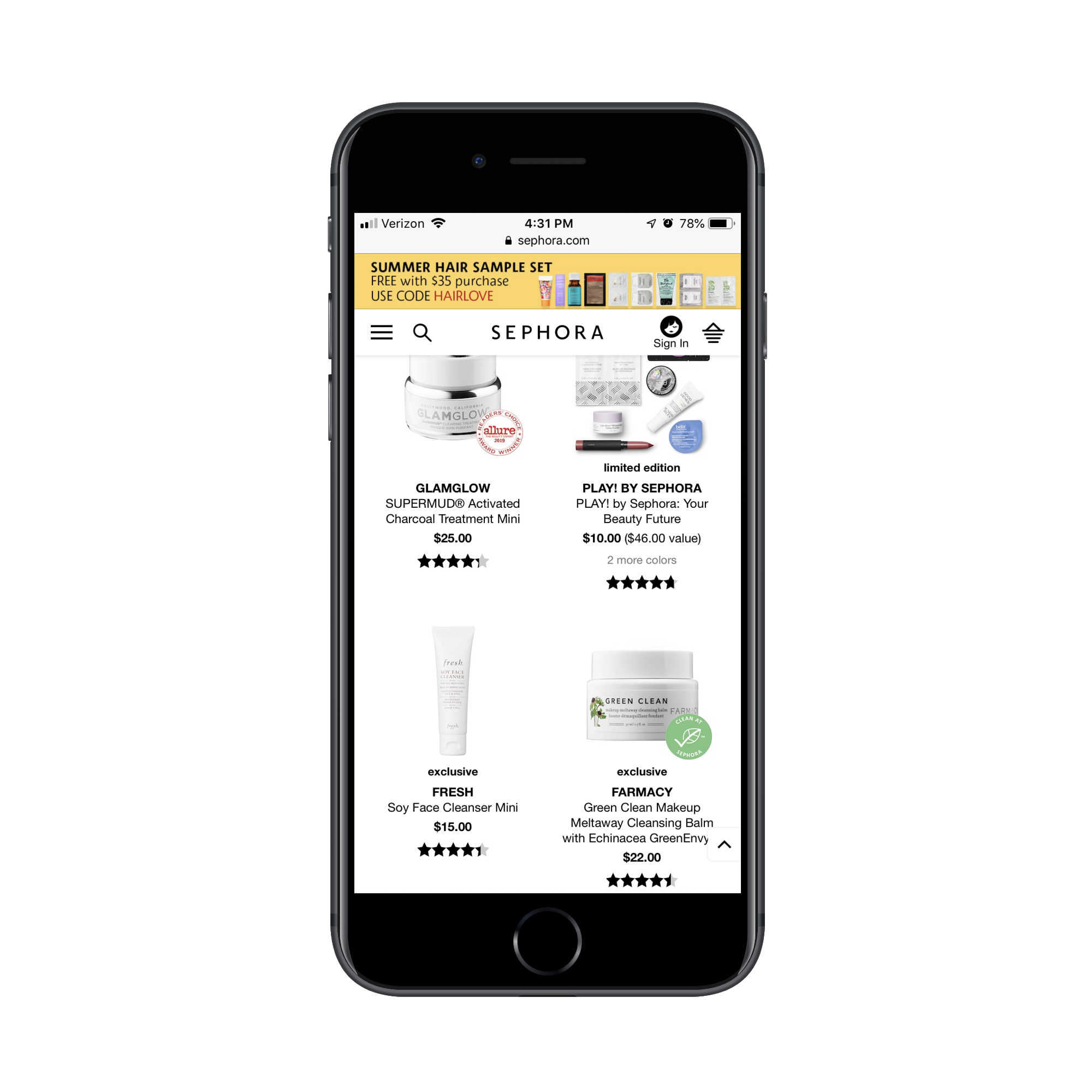
There are two trust marks present in the screenshot above.
The GlamGlow product has a red-and-white stamp on it that says “Allure Readers’ Choice Award Winner”. You already know how much people trust in the reviews and recommendations of other consumers, so you can imagine what this sort of symbol does to pique their interest and build trust in the product.
The Farmacy product has a green-and-white stamp on it that says “Clean at Sephora”. This is a label Sephora slaps onto any product that’s free of questionable ingredients. For customers that are extra conscious about where their products come from and what they’re made from, this symbol will quickly direct their attention to the kinds of products they’re looking for.
4. Lead With A Singular Memorable Image
When you scroll through your social media feed, you’re not likely to see post after post with galleries of images attached to them. Unless, that is, someone just went on vacation and they want to show off everything they did or saw.
Usually, most of the social media posts you encounter keep it simple: a text message with a complementary image attached to it. And if the image didn’t come courtesy of the link they’re promoting, then they’ll attach something equally as memorable and relevant.
Social media feeds are full of posts from the people we’re connected to, so it’s important to have one strong image that helps ours stand out among the crowd. A mobile website would benefit from that same approach.
In this case, I’m going to point you to this promotional element on the West Elm mobile website for the approaching July 4th holiday in the United States:
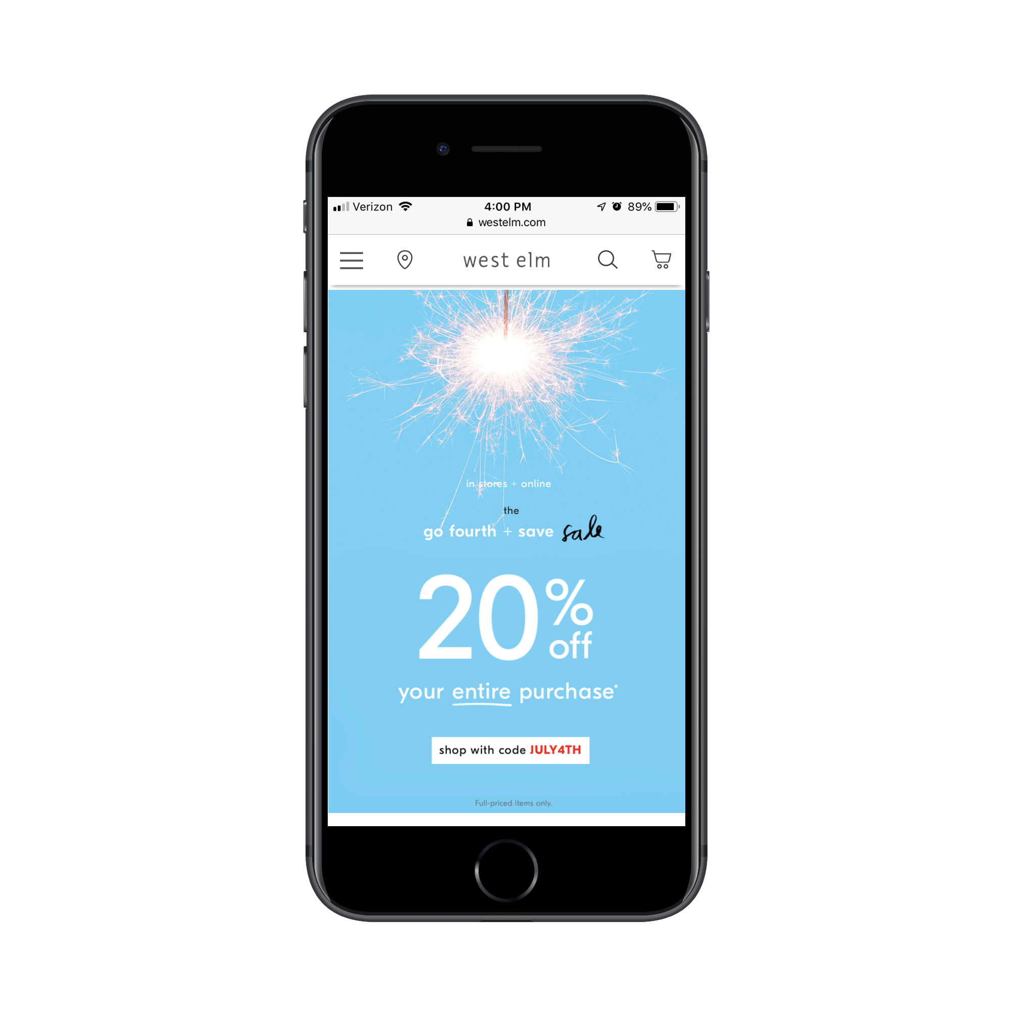
Since sparklers are a big part of how we celebrate Independence Day, this sparkler GIF is an incredibly effective, yet simplistic way to draw visitors’ attention to the relevant promotion.
Not only is the GIF memorable, but it’s very relevant to what online shoppers are looking for at the moment. Plus, it all fits within the space of a smartphone screen, which makes it a more convenient way to read about the promotion before clicking through to claim the 20% offer.
5. Make Your Brand Meme-like
When brands use social media, they have to think about more than just pairing a carefully crafted message with an engaging image. They also have to consider the consistency of their posts. In some cases, brands will use color to tie their posts together. Others will rely on the messaging itself to create a cohesive identity.
Then, there are brands that have turned their brands into memes. Old Spice’s “The Man Your Man Could Smell Like” or Terry Crews campaigns are some of the more successful and memorable examples of how to do this.
It’s not just brands like Old Spice or Dollar Shave Club whose humorous advertising become memes that can pull this off. Take a brand like Oreo, for example.
Oreo is a household name. And, yet, would anyone have considered sharing posts about Oreo cookies with others? Before 2013, I’m not so sure. After Oreo published its now-famous post during the Super Bowl blackout, though, things changed.
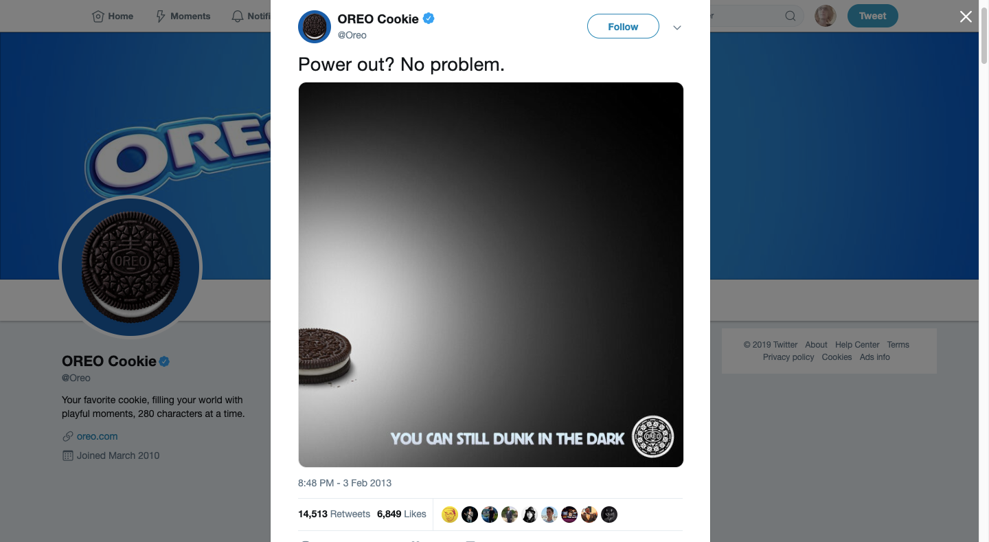
This might not be a meme on the level of Old Spice. However, it most certainly is on a similar level of trendiness and shareability.
Oreo has continued to find ways to turn its iconic Oreo cookie image into a meme-like status symbol.
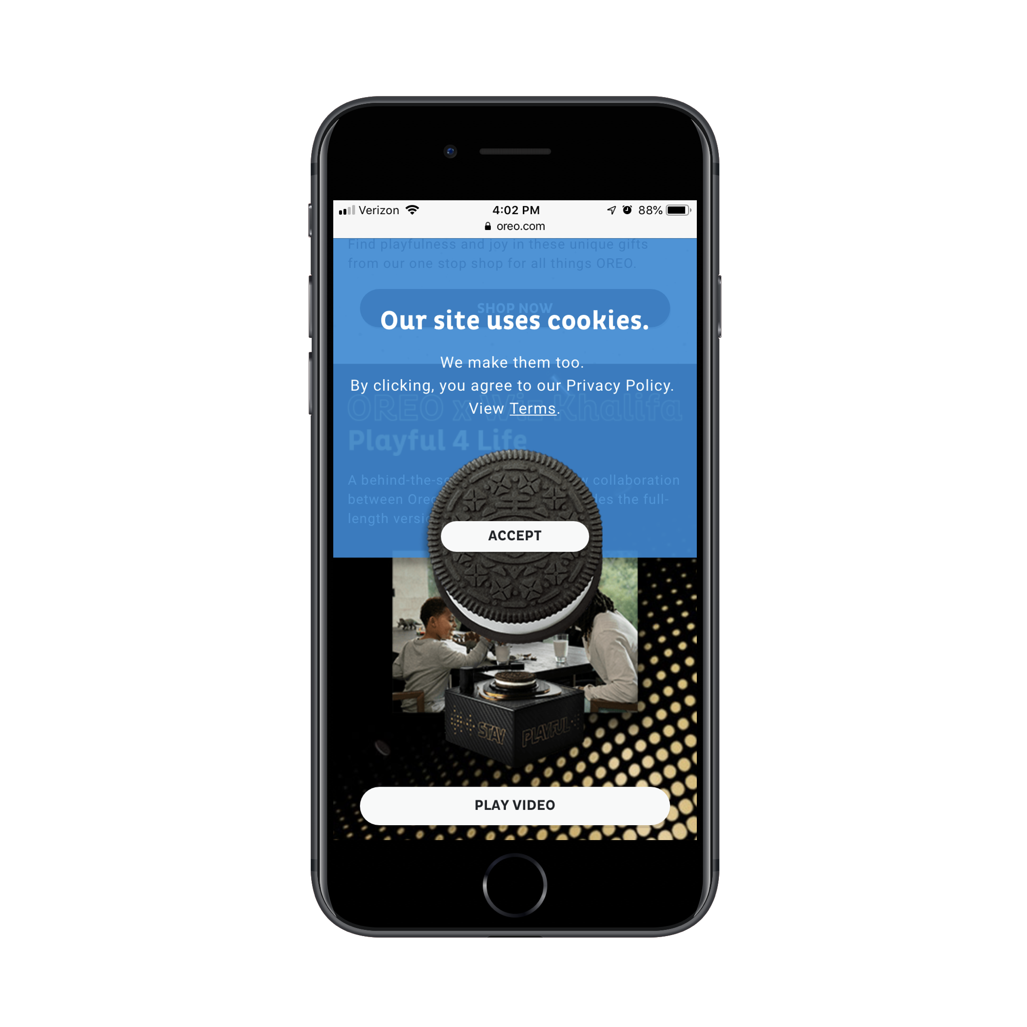
You know how everyone and their mother has been sharing cookies notices on their websites, thanks to GDPR? Oreo utilizes its brand image to have a little fun with it.
As you can see here, the drop-down creatively uses the Oreo image while also playing on the word “cookie” itself. It’s a fantastic example of how to be creative, even in the smallest of spaces and for a limited amount of time. It certainly grabbed my attention enough to deem it worth sharing here.
6. Embrace The Selfie
I recognize that selfies don’t always have the most positive of connotations, but it’s really difficult to have a discussion about using social media-like elements in design without addressing them. So, I’m going to go out on a limb here and say that mobile websites would benefit from including selfie-like portraits… when not used in a phony or obnoxious context.
I mean, that’s the main complaint about selfies, right? They’re staged and not at all realistic of a person’s actual life. Or they’re not staged because they’re taken at the worst possible time and in the least professional of contexts.
That said, selfies do stand out from super-glossy headshots and other staged company photos. And when you present them on a mobile interface, it gives a website (and the brand behind it) a more social-like presence. In other words, you’re inviting people to engage with you, not to just casually glance through copy and photos on their way to mindlessly converting. There’s something more to this experience when a selfie is present.
One example of this that I particularly love comes from Aleyda Solis, an SEO consultant and author.
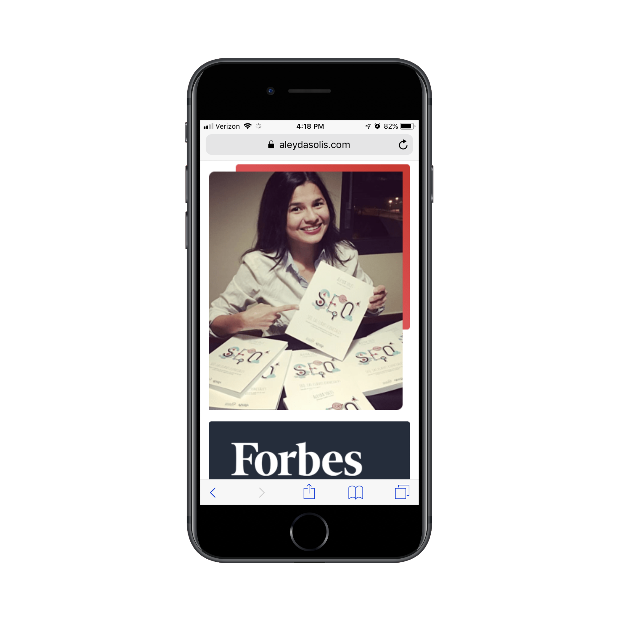
Just looking at the above screenshot out of context, I feel like I’m scrolling through her personal feed on Instagram. And because I’m so accustomed to seeing interesting-looking photos on Instagram and then immediately seeking out the captions for more information on them, I’m compelled to do the same here. Talk about Pavlov’s dog, right?
For brands with a recognizable figure or team behind them, a selfie could be a great way to up your visitors’ engagement with a website. Just make sure it paints the person or people in a positive light.
7. Use Filters To Tell Individual Stories
Way, way back in the day, we used to take photos using film and pray that the images came out okay and would be acceptable enough to frame. Then, we got digital cameras that allowed us to see what our pictures looked like in real-time, though it often led to too many rounds of picture-taking to try to capture the perfect lighting or shot.
Nowadays, our smartphones and social media platforms make all of this so much simpler. We can take photos wherever we are, whenever we feel like it and many of the tools we need to clean up a shot and apply an attractive filter are already built into our apps.
Needless to say, filters are a big part of what makes sharing photos on social media so appealing to users.
Now, it’s not as though brands haven’t utilized filters before to spruce up their branding or photography. However, have you considered what using different filters in different contexts could do for your mobile website? They could effectively turn different pages or products into unique experiences or stories of their own.
Abel is an online perfume shop that sells a small collection of perfumes, with scents like pink iris, red santal and green cedar. Notice the trend? Each scent is described by a distinct color, as this example of golden neroli demonstrates:
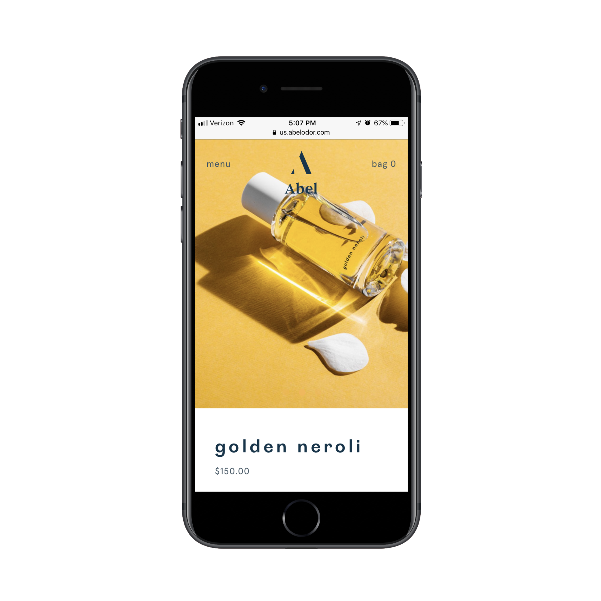
Although the perfume itself is clear in color, the design of this image gives the bottle a golden color to match its namesake. Now, here’s where it gets interesting:
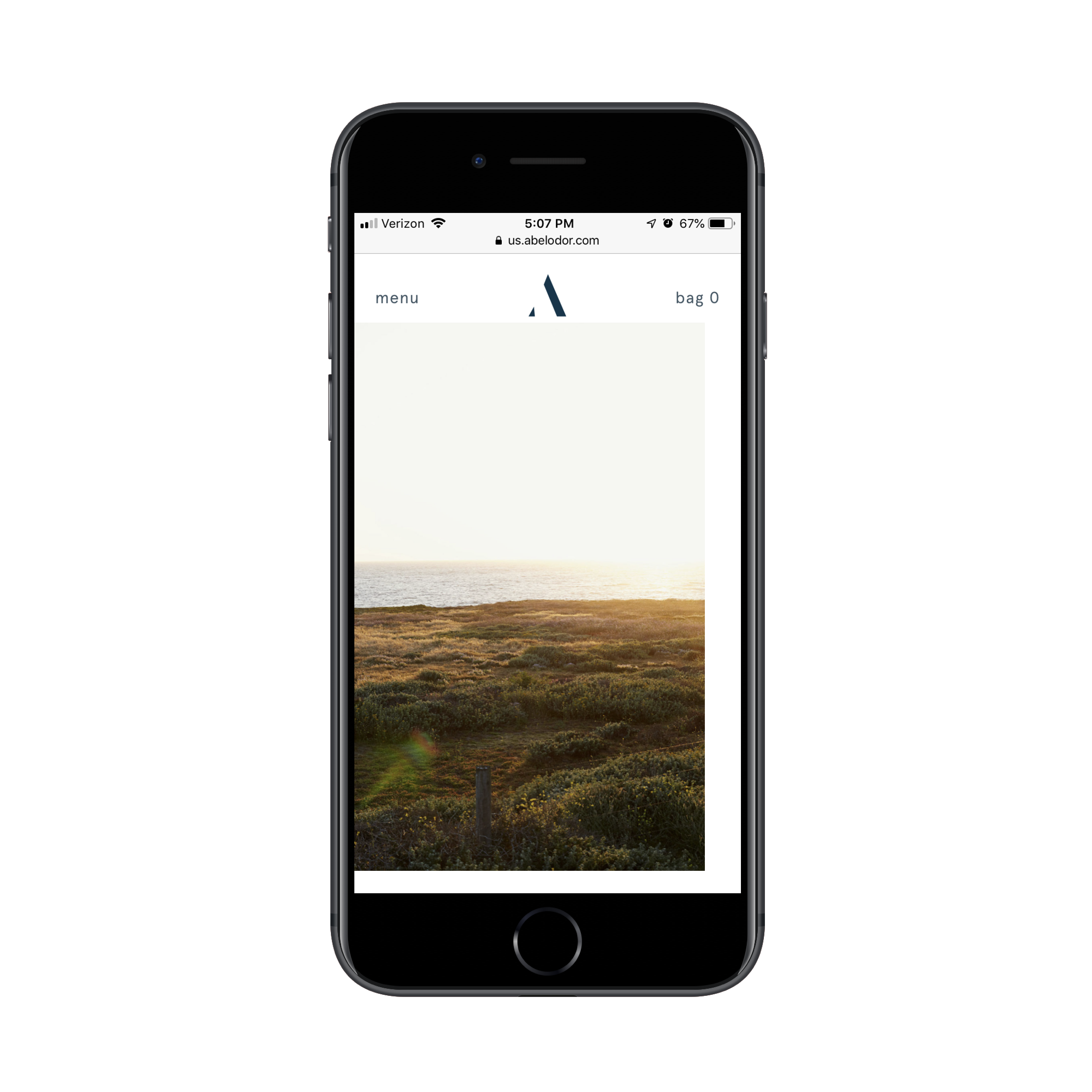
This is one of the images lower on the product’s page. While I suspect the sunset captured in the photo is real, it’s obvious that a filter has been applied to lighten and warm the overall tone of the image.
The same is done with another image further down on the page:
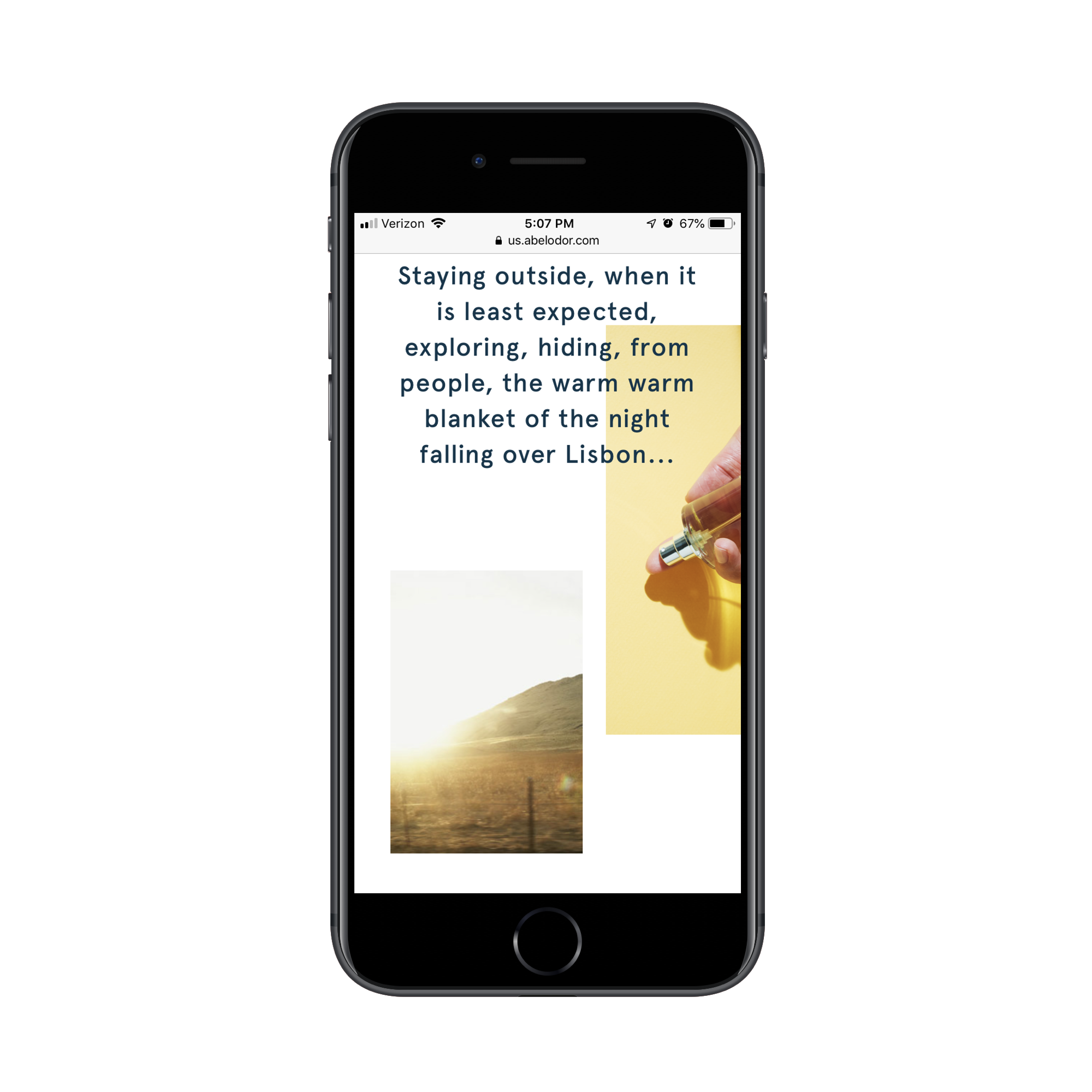
Again, the emphasis is placed on making the image lighter and warmer in tone. And if you look at the snippet of text just above, you can see that Abel even compares the sensation of this perfume to “the warm warm blanket of the night falling over Lisbon”.
So, rather than get hung up on designing your mobile website with one singular color palette, consider the individual emotion and identity of each of its pages or elements. You may find that filters and colors help you tell a stronger and unique story for each than the words alone could.
The Benefits Of A Social Media-Inspired Mobile Design
As we attempt to unlock more ways to design for mobile without stifling creativity or overwhelming the user experience, I think it’s important to look to other kinds of media for inspiration.
It’s not like we haven’t already found ways to tell a visual story through design on smaller or more isolated screens. Just look at video game design. Social media is another type of media that’s successfully carved out a style of its own. And considering how addictive and engaging social media often is for consumers, it’s a good platform to turn to for design inspiration.
Further Reading
- Using AI For Neurodiversity And Building Inclusive Tools
- The Things Users Would Appreciate In Mobile Apps
- Modern CSS Layouts: You Might Not Need A Framework For That
- The Ultimate Guide To Push Notifications For Developers


