Inspired Design Decisions: Ernest Journal

Email Newsletter
Weekly tips on front-end & UX.
Trusted by 182,000+ folks.


 Try ProtoPie AI free →
 SurveyJS: White-Label Survey Solution for Your JS App

 Celebrating 10 million developers
When you work in design for any length of time, forming habits is natural. It’s not unusual to follow a predictable process or use familiar patterns. This repetition can be fabulous for your productivity, but when each design looks much like your last, you can quickly begin to feel jaded. Staying curious is the best remedy for that feeling.
After running a small studio for eighteen years, my fatigue had become overwhelming. I dreaded each and every new email notification and phone call. While client projects offered opportunities to be creative, they also depleted my energy reserves and any capacity I had to come up with ideas.
For someone whose business — and self-esteem — relies on what I dream up, this was devastating. I admitted to my wife that I was exhausted, had no more to give, and couldn’t carry on because the business we’d started together had become a burden. I needed to recharge, reconnect with my creativity, and rekindle my enthusiasm for working in design.
When a company in Sydney offered me an interim role, I didn’t hesitate. They seemed welcoming, work was interesting, and living in Australia was something I wanted to experience. More importantly, time away allowed me to explore aspects of design which were new to me, away from the crushing pressures I’d felt building up while running my business.
Working in Australia meant finding creative ways to sell the company’s products and services, as well as exploring new approaches to the design of the products themselves. I was curious about whether graphic design and visual storytelling could make a digital product more compelling.
As I’d studied Fine Art and not art direction or graphic design, I knew very little about its principles, famous names, or history. I was eager to learn, and with the pressure of running my business lifted, I had the energy and the time for studying. I started a magazine collection, studied books on art direction and graphic design, and discovered art directors, including Alexey Brodovitch, Neville Brody, Bea Feitler, and Tom Wolsey. Their work fascinated me, and I was curious why we see so little like it online.
This curiosity took me in unexpected directions, and my head was soon bursting with ideas. I learned how to combine images and text in more exciting ways from Alexey Brodovitch and Bea Feitler. I picked up tips on how to give my typographic designs more impact from Neville Brody, and Tom Wolsey taught me how to make even the smallest design element more interesting. I studied editorial and magazine layout principles, and instead of merely copying them, I found ways to adapt them for the web to make product and website layouts more compelling.
Time away helped me rediscover my enthusiasm for design. While falling into predictable patterns — in behaviour and design — is still tempting, since coming home, I’ve realised how important it is to stay curious, study other media, and keep my mind open to the lessons we can learn from them.
Curiosity keeps a creative mind open to new possibilities, and that’s what Ernest Journal magazine — the inspiration for this issue — is all about.
Ernest Journal: Curiosity And Adventure
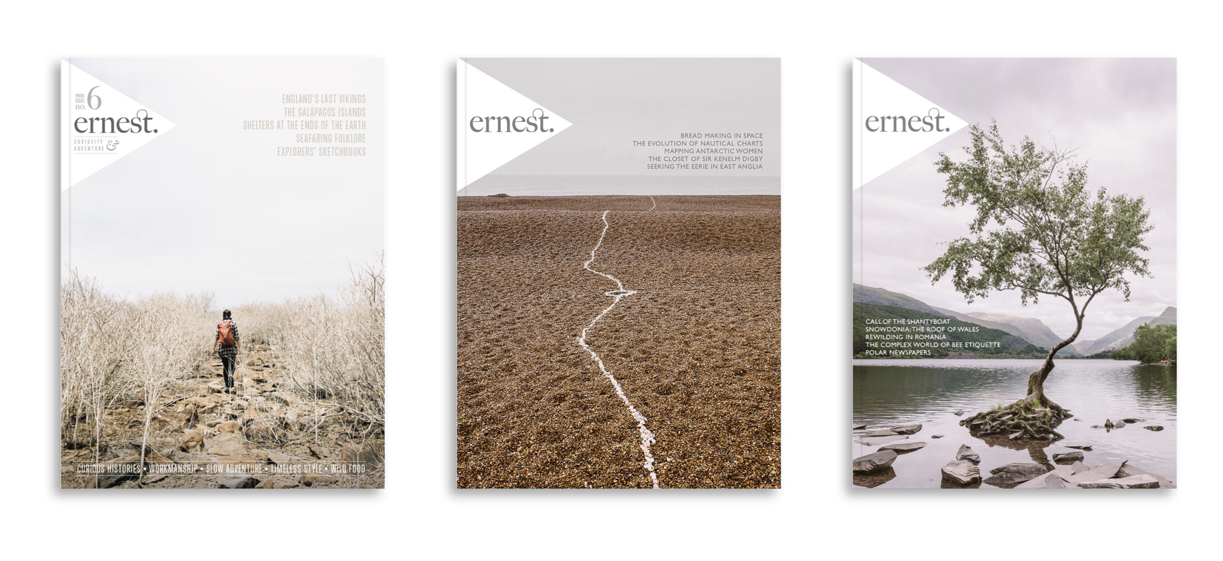
Despite its smaller format, on my latest visit to my favourite magazine shop, I was drawn to Ernest Journal. Ernest is “a journal for enquiring minds. It’s made for those who value surprising and meandering journeys, fuelled by curiosity rather than adrenaline, and guided by chance encounters.”
When you open Ernest Journal for the first time, you’re immediately drawn to its content, rather than its design. There are beautiful photographs and striking graphic designs which are often presented large enough to spread from one page to the next.
The design of Ernest Journal is simple, but not minimal. It gets maximum value from only a small number of assets, in particular, its dominant two typefaces, Freight Big Pro and Gill Sans Nova.
Freight Big Pro is a high contrast serif typeface by Joshua Darden — the founder of type foundry Darden Studio — who also designed Jubilat and Omnes, two fonts I use regularly. Freight Big Pro is a family of twelve styles and comes with a host of OpenType features including beautiful ligatures, a feature used by Ernest Journal for headlines and even its logotype. While Gill Sans has never been a particular favourite of mine, the designers of Ernest Journal put it to good use in contemporary looking headlines and other typographic details.
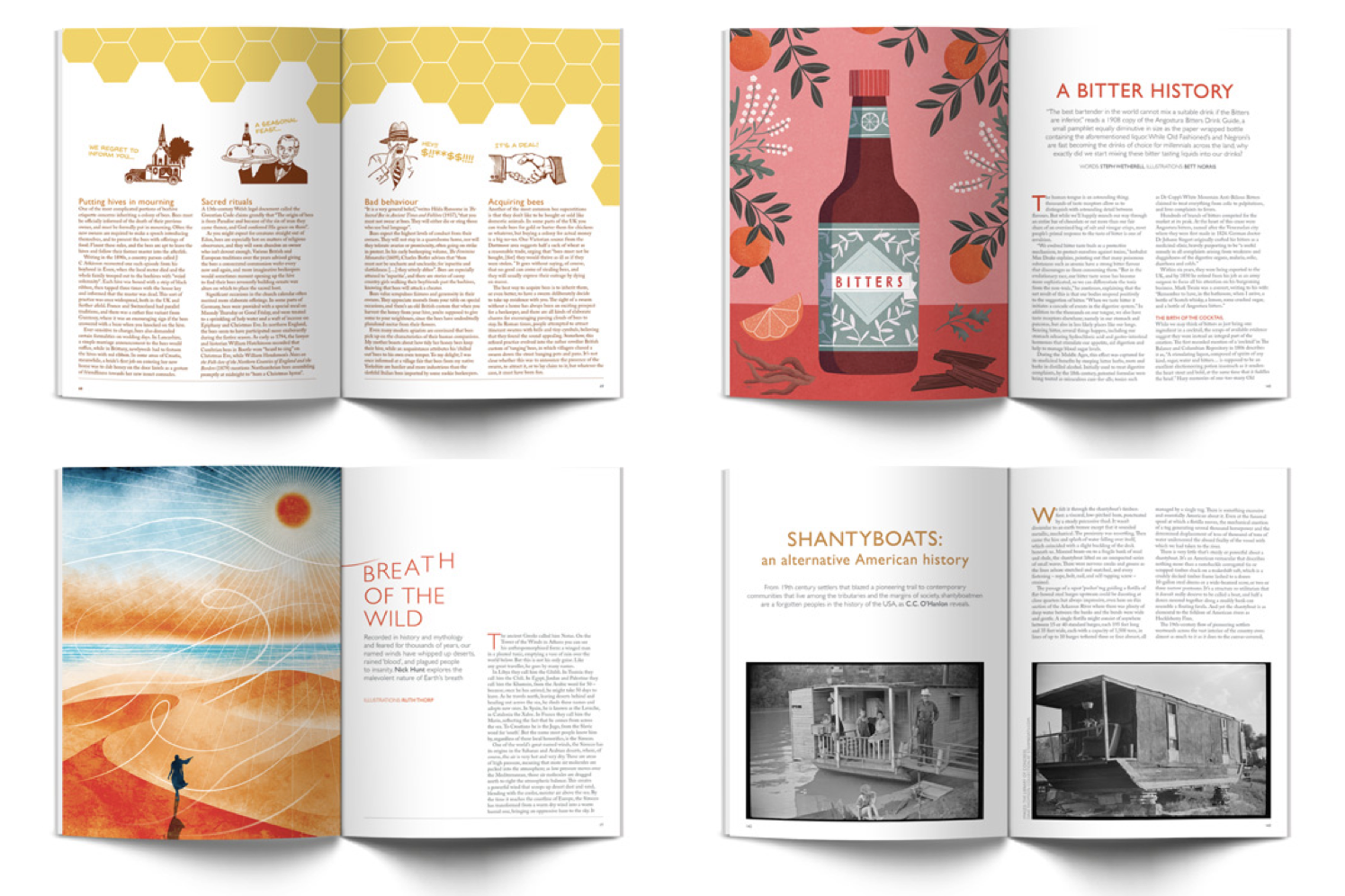
Ernest Journal’s layout consists mainly of two and three columns, but it’s their thoughtful use, which helps the overall design feel connected, despite the variety of content and styles in the magazine. I’ll teach you how to create varied yet connected designs later in this issue.
Ernest Journal is an excellent example of how to use colour and typography to create consistency across an entire publication. At the same time, by picking colours from graphics and photographs to use for headlines, pull-quotes, and other details, their designers connect this overall design to individual stories. This adds variety and makes the stories Ernest Journal tells even more engaging.
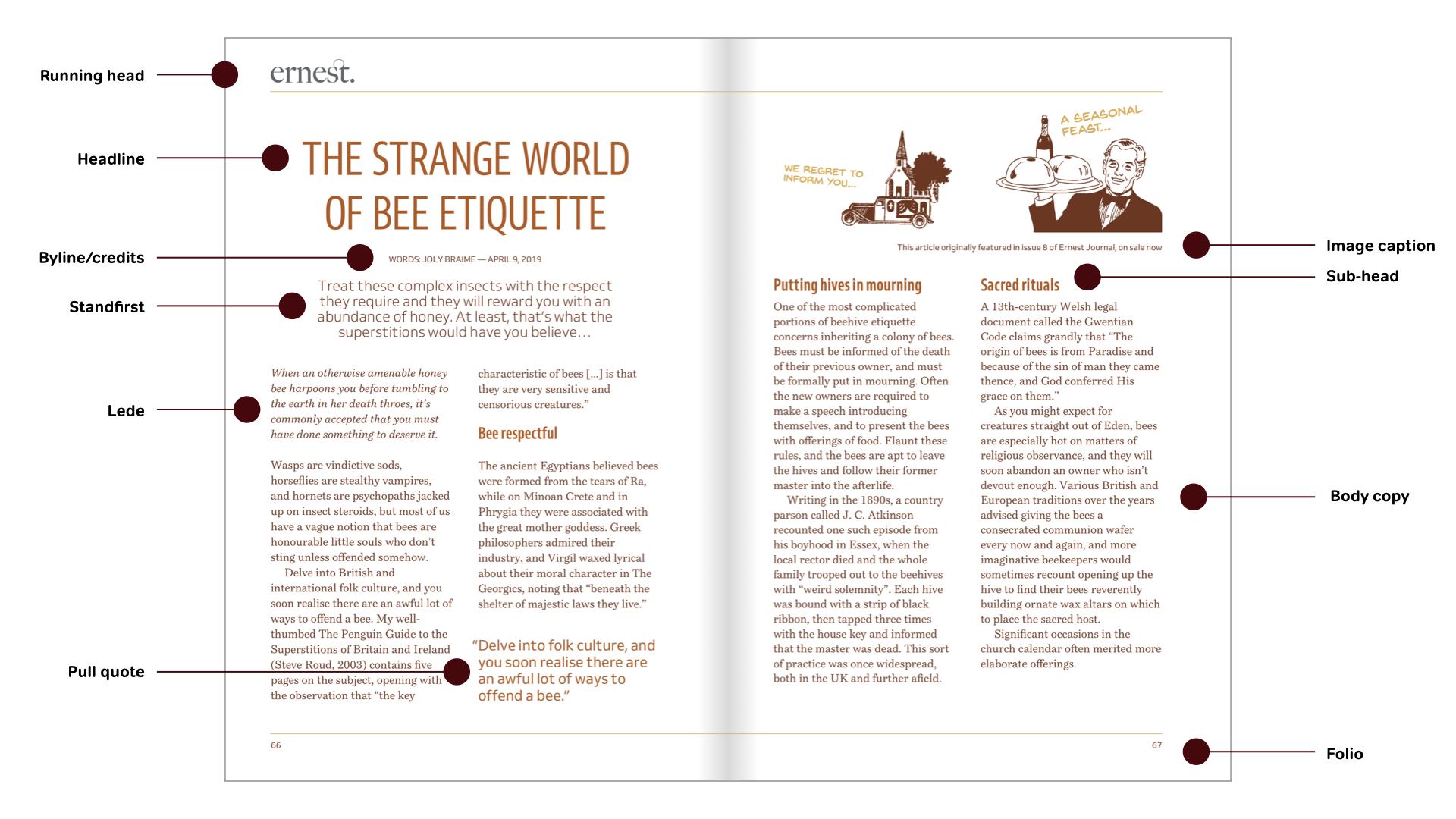
Magazine Anatomy
The not-so-snappily named Web Hypertext Application Technology Working Group (WHATWG) surveyed thousands of websites before settling on names for new elements including header and footer. Magazines have their own terminology for parts of a page which you can use to name product or website components:
| HTML | CSS | |
|---|---|---|
| Running head | <header> | [role="banner"] |
| Folio | <footer> | [role="contentinfo"] |
| Headline | <h1> | .type-headline |
| Byline/credits | <small> | .type-credits |
| Standfirst (deck, intro, or kicker) | <p> | .type-standfirst |
| Lede | <p> | .type-lede |
| Image caption | <figcaption> | — |
| Pull quote | <blockquote> | — |
| Body copy | <article> | — |
| Sub-head | <hx> | — |
Next time you’re passing a magazine store, drop in and look for a copy of Ernest Journal. It might be small, but you’ll find it packed with ideas to use on your next project.
Inspired By Ernest Journal
Many people blame frameworks including Bootstrap for the homogenous layouts we see all too often on the web, but the problem comes from our thinking, not the framework. The cold, hard truth is that Bootstrap doesn’t create unimaginative designs. Lazy designers do.
The majority of Ernest Journal’s content is placed using a symmetrical grid which can easily be reproduced for the web using a framework’s twelve columns. Content is simply laid out using a mix of two and three columns. Yet unlike many websites built using a framework, Ernest Journal’s pages are exciting and varied. There’s no reason why frameworks can’t be used to create layouts as engaging as Ernest Journal. All it takes is an understanding of layout design and imagination.
Variety is a crucial part of the success of Ernest Journal’s design, and it’s a lesson we can apply to products and websites. Single columns have been used by book designers for generations and designs based on them look classical. Grids with two symmetrical columns feel orderly. They can hold a tremendous amount of content without becoming overwhelming. Combine white space with three or more columns and your designs immediately take on an editorial feel, reminiscent of a quality print publication, like Ernest Journal.
Designing With Frameworks
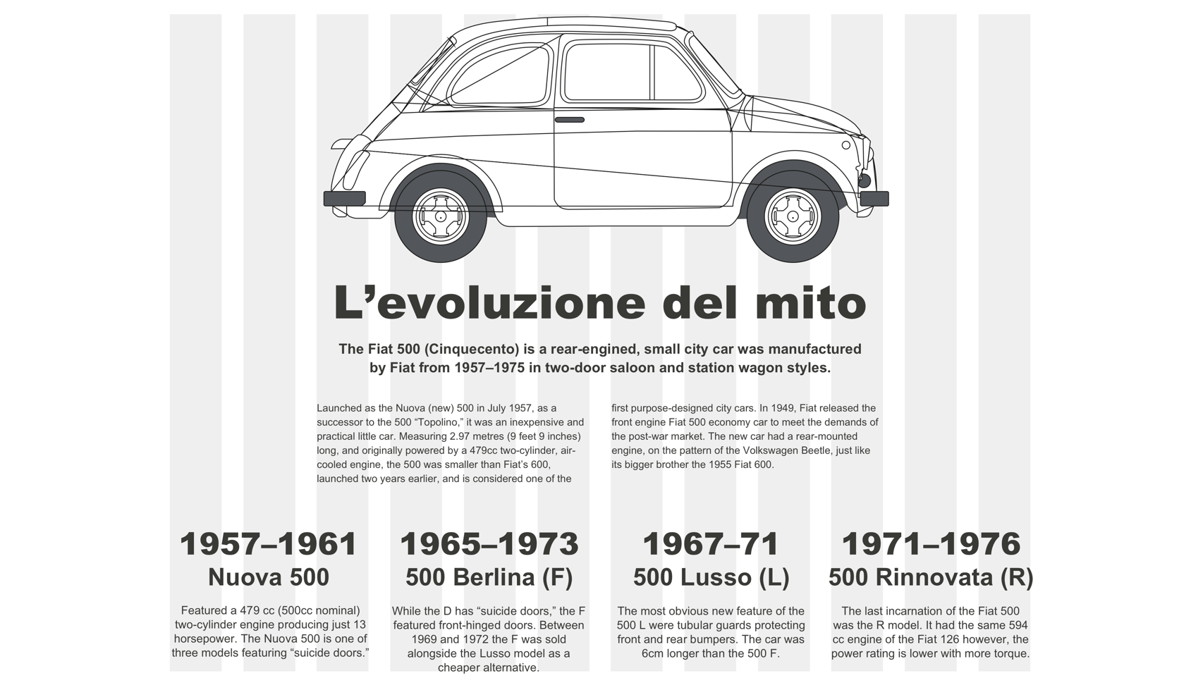
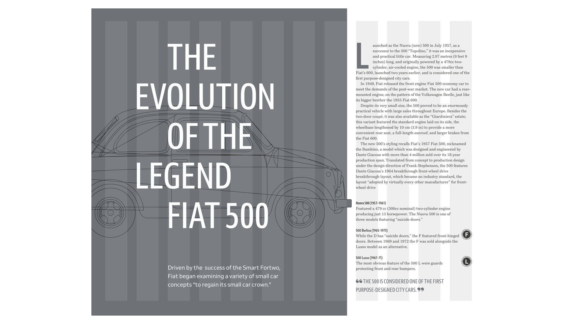
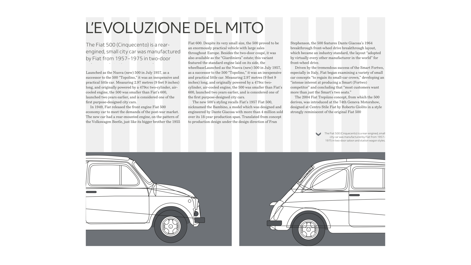
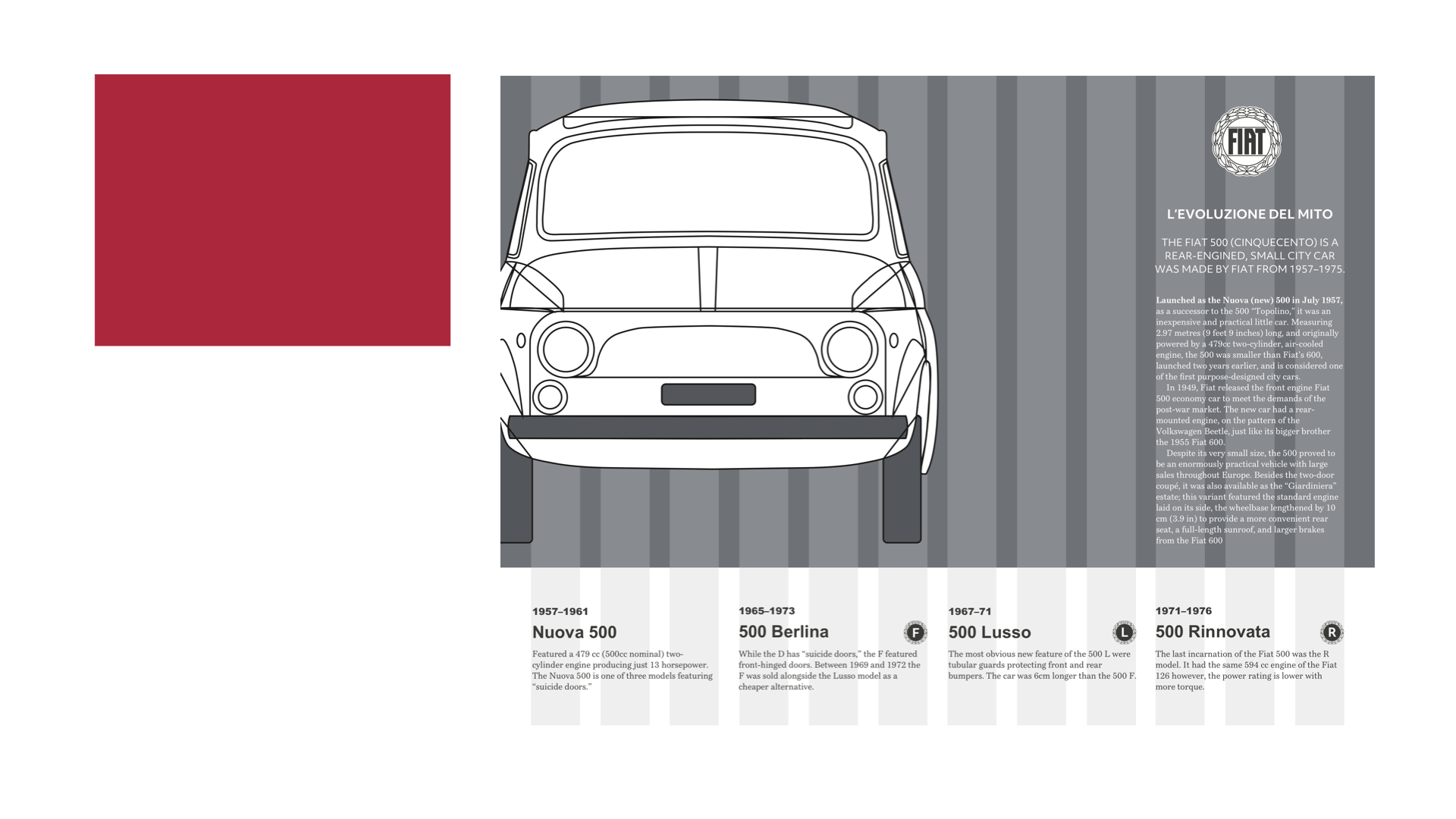
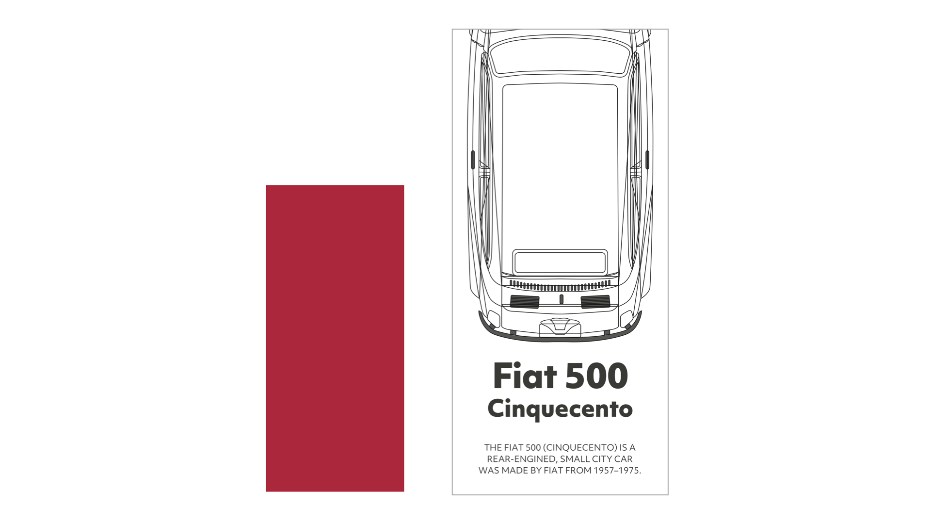
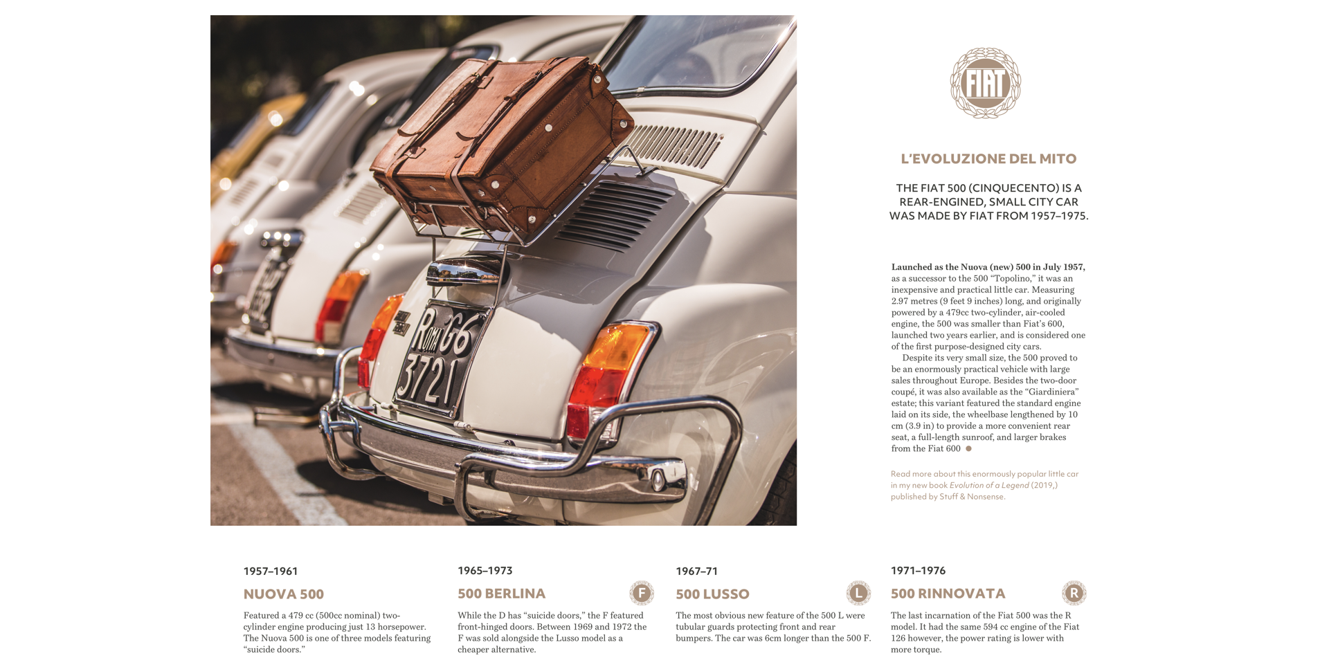
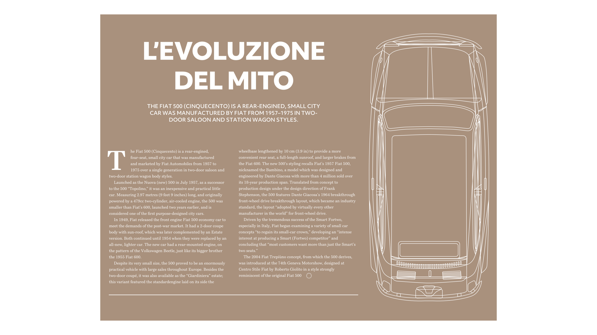
The original Fiat 500 was a tiny car which made a big impression on the motor industry. It was enormously popular and became the template for a generation of small cars. For this design about the rise of this iconic little car, I want to make a similarly big impression by filling a large panel with a headline and image. This panel occupies two-thirds the width of my page — eight of my twelve columns. The running text on the right occupies four columns, and its width is matched by the standfirst paragraph opposite, bringing this asymmetric composition into balance.
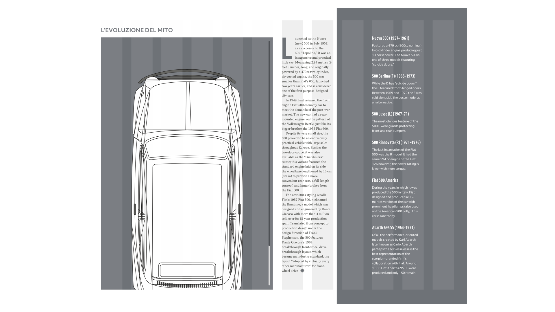
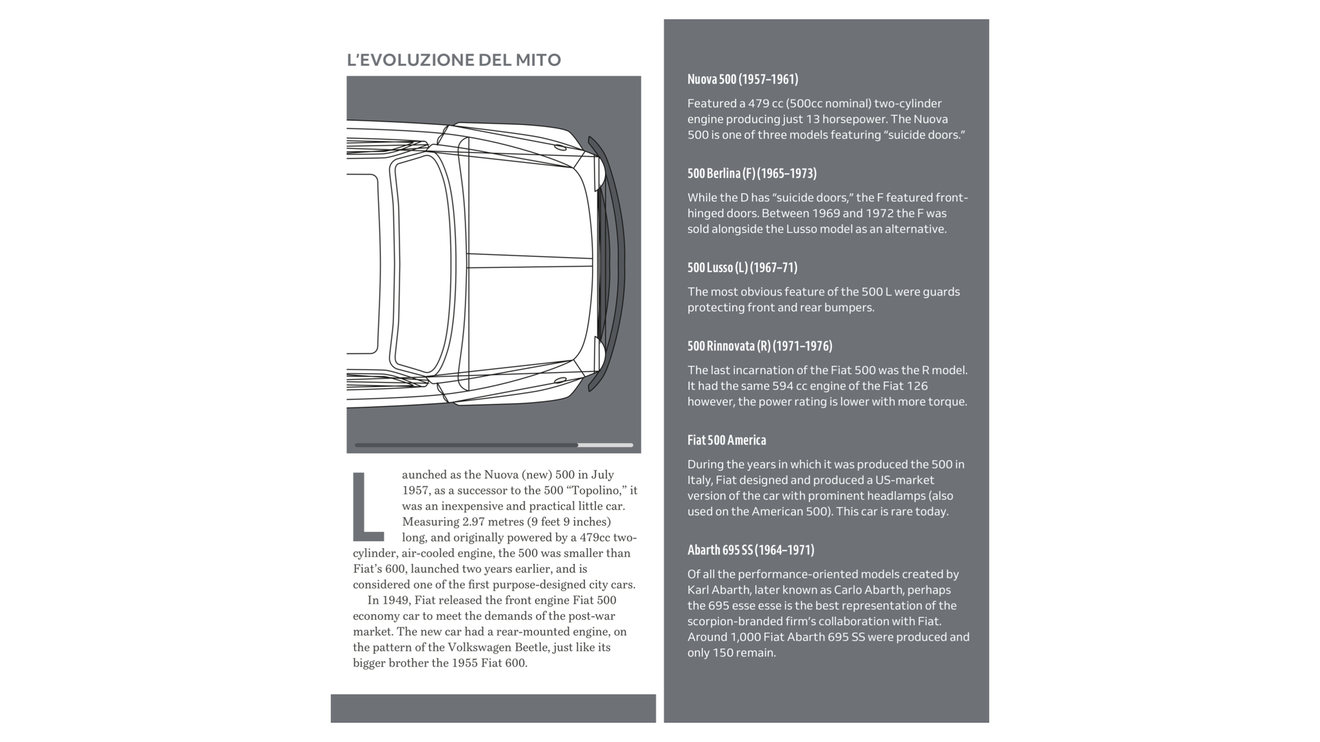
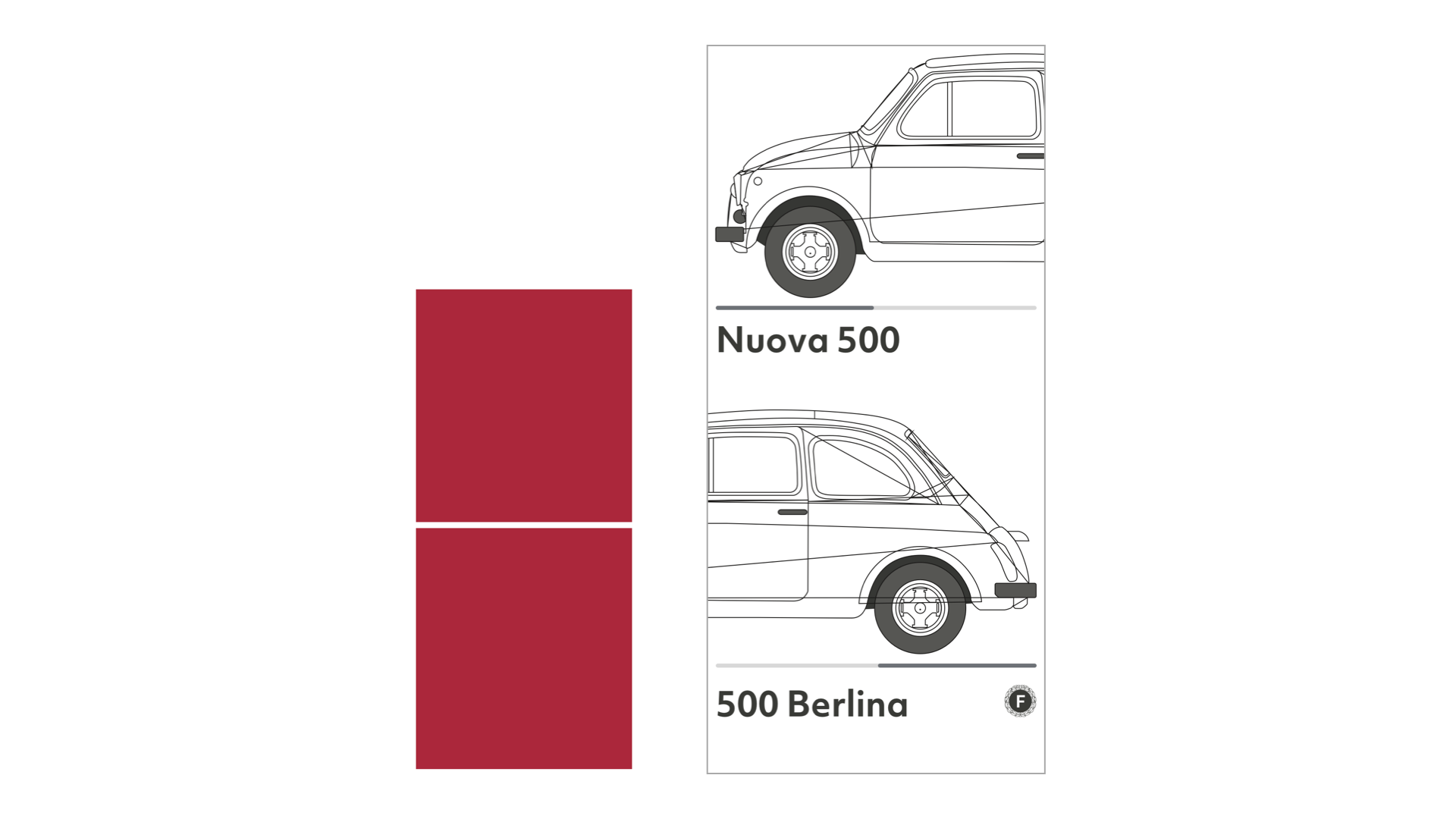
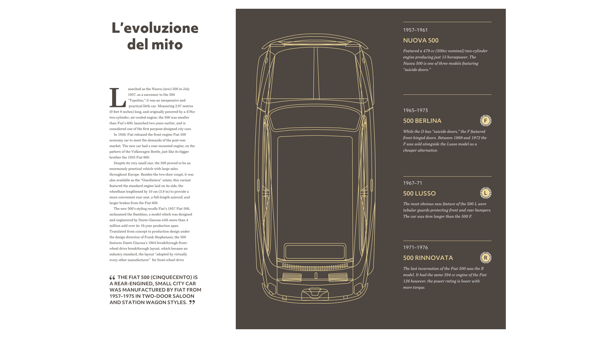
By using a variety of connected but diverse layouts, you can make stories more engaging and keep readers interested. My next design is based on that same twelve column grid but looks completely different. Here, the large image occupies six columns, half the width, and the full height of my page. Text runs down two columns in the centre, and supporting information — including a timeline of Fiat 500 models — matches its width, even though I place it within a much wider panel.
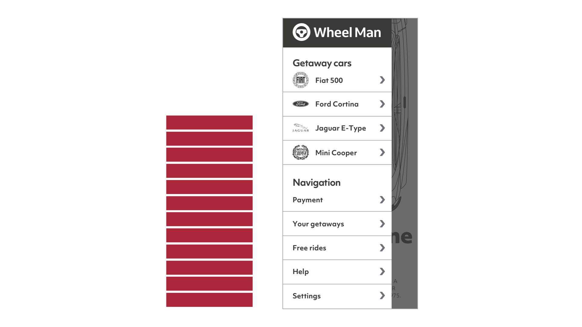
Now, I know some of you will be wondering how to adapt designs like this to smaller screens. Proportionately narrow columns of text don’t make sense when space is limited, so I use the entire screen width. Instead of asking people to flick past a tall image, I place the Fiat 500 on its side within a horizontal scrolling panel.
Even when using just two or three symmetrical columns, you can create a surprising variety of layouts. So that your design feels connected and familiar across all its pages, develop a system for how to use those columns. You might use three columns for running text, giving your design an editorial feel, and twin-columns for images.
Alternatively, use twin-columns of text for an orderly feeling and three columns for images. This increased repetition of shapes helps a composition to feel more dynamic.
Changing how you place images in three columns is a simple way to vary the look and feel of a design. My next design sets one large image across two-thirds of the page, and a small picture in the remaining third. But image proportions are not nearly as interesting as the position of the gutter between images, and how it offsets the gutter between running text columns below.
There’s still space on medium-size screens for an exciting juxtaposition of two and three columns. But what about small screens?
Twin-columns of running text would make no sense in such a narrow width, but you needn’t sacrifice the benefits of white space, even when it’s limited. For this small-screen design, I place images into a horizontally scrolling panel. Then, I use a narrow column to indent the running text.
Designing Connected Layouts
In the last issue, I introduced you to Swiss artist and typographer Karl Gerstner and the “mobile grid” he designed to lay out content in Capital magazine consistently and without restrictions. Those same principles apply when placing content inspired by Ernest Journal.
A single module — filling the entire width of the page — slows people down and encourages them to linger on its content. It isn’t necessary to use every pixel, and I devote a quarter of this composition to white space to give this design a feeling of luxury.
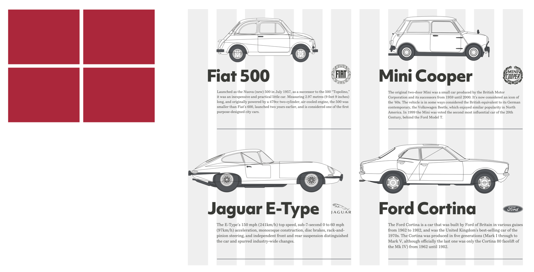
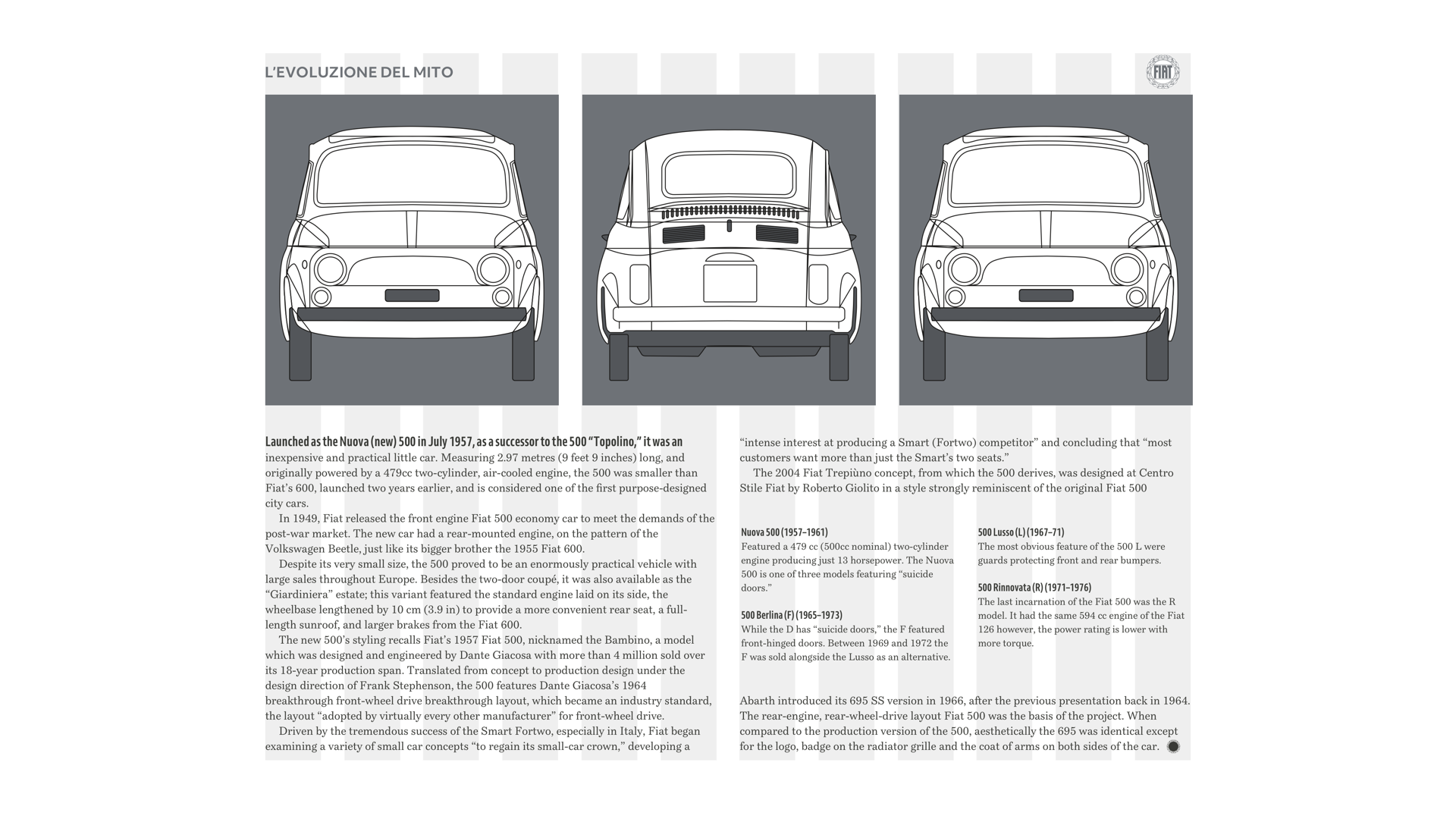
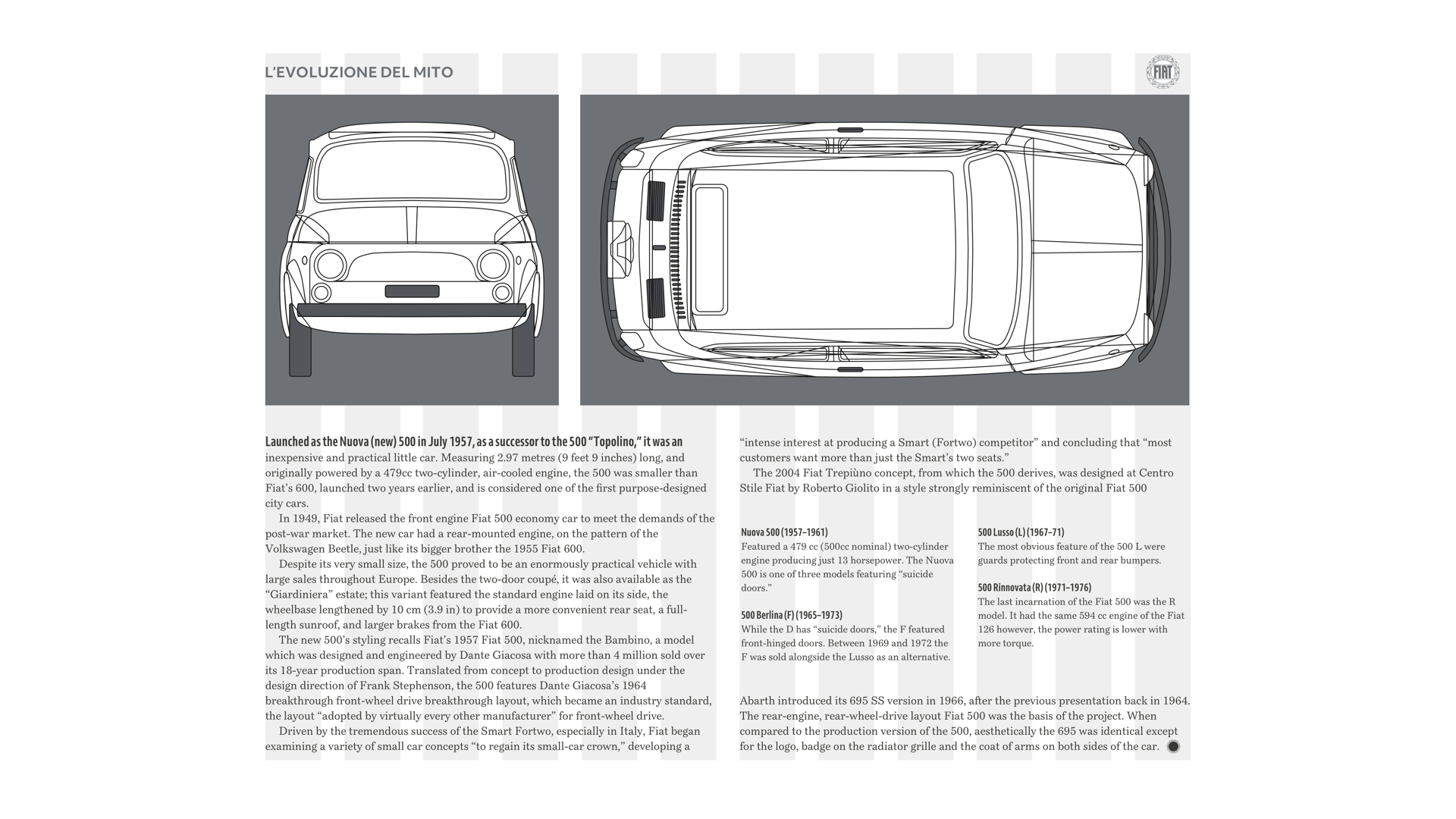
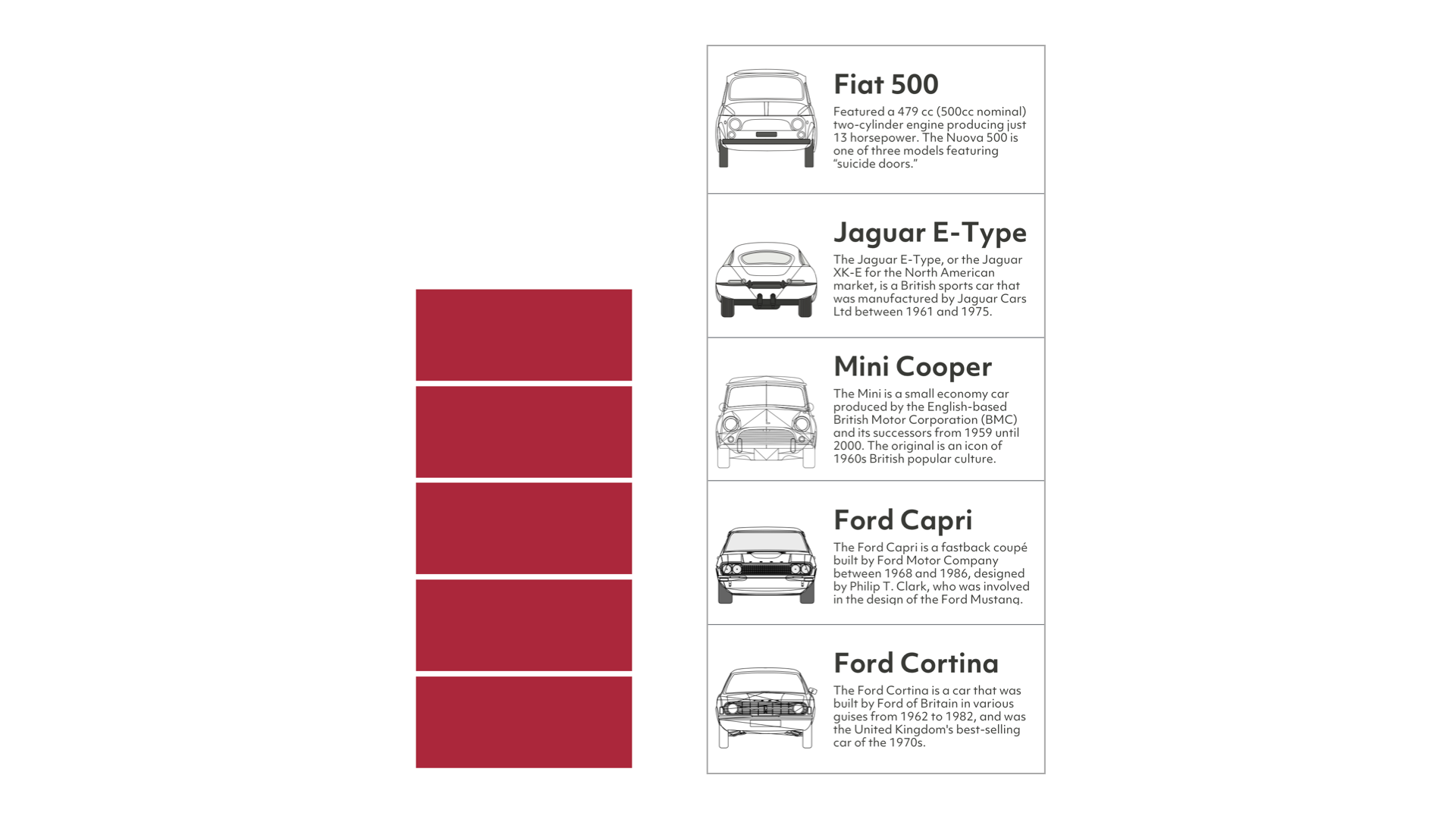
Something is reassuring about the structure of a twin-column layout, so for this design, I give equal space to these classic cars. To prevent this design from becoming predictable, I utilise extra columns for larger cars and use gutters to stagger the start of my headlines and paragraphs.
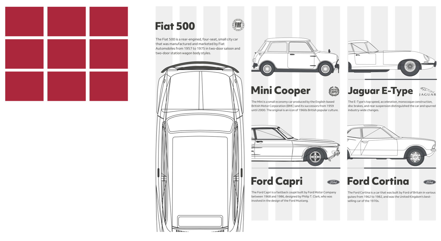
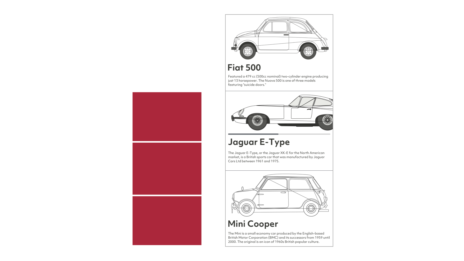
It’s possible to pump energy into the structure of a symmetrical three-column design. For this next design, I use those three columns in two different ways, first with a top-down view of the Fiat 500, then a smaller module for each of the remaining cars.
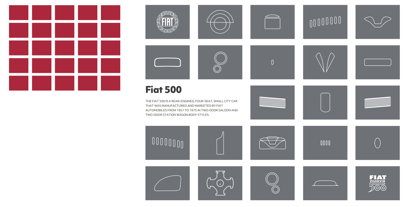
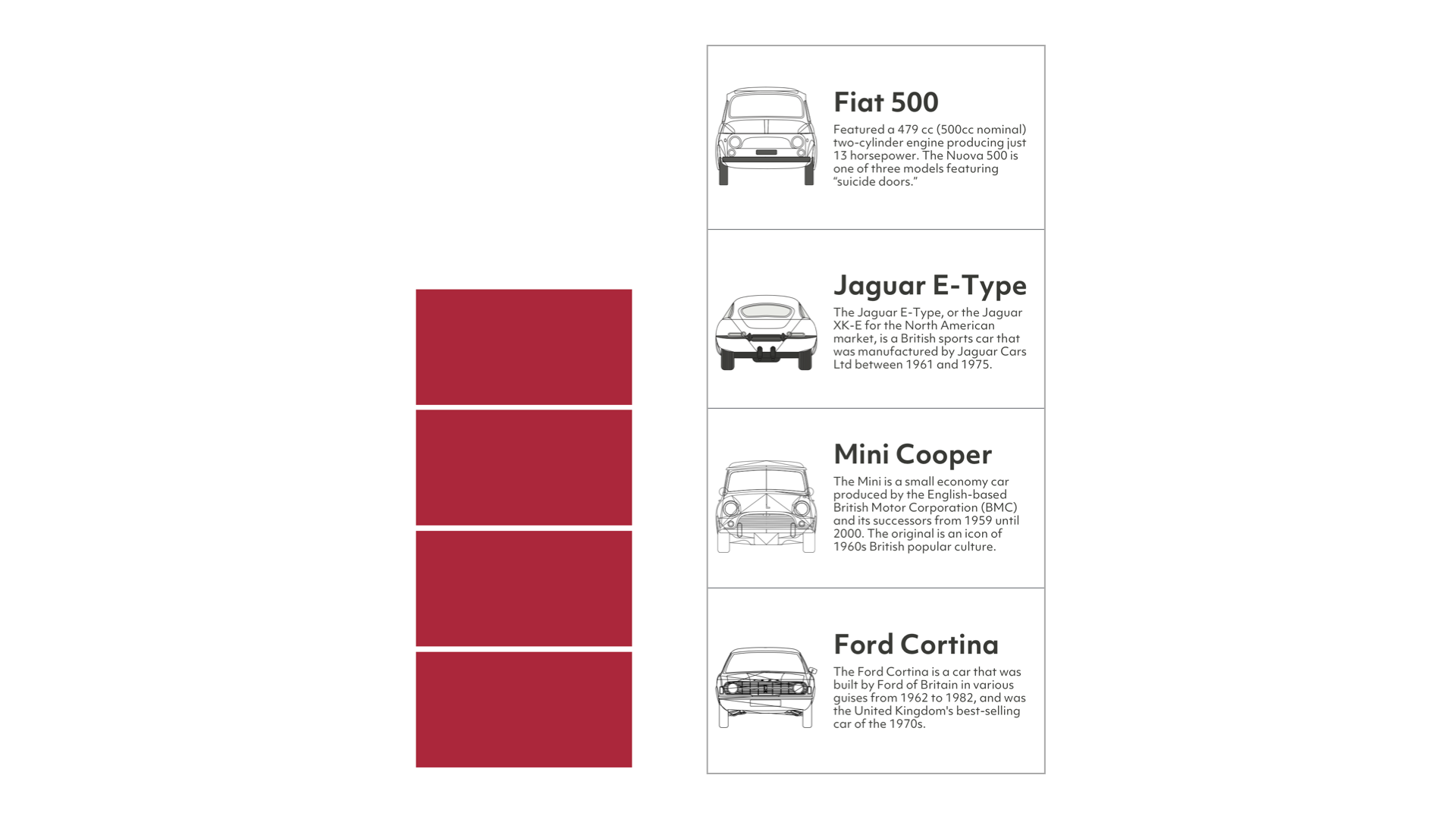
Designs which use odd numbers of columns and rows can be compelling, especially when arranged in a modular grid. This design demands attention not only because it‘s interesting visually, but also because it’s so different from other pages. It’s an excellent choice for interrupting the rhythm of reading to make someone focus on a particular piece of content.
Controlling Reading Rhythm
The pace in which someone moves through a product or website is an essential factor in their experience. This principle is as useful on a mobile’s smaller screen as it is on a larger one.
Slowest
Slower
Slow
Fast
Faster
Fastest
Creating Connections
One of the most attractive features of Ernest Journal, and a technique you can quickly adapt to the websites you design is using an accent colour picked from images. You can use accents for headlines, pull quotes, and other typographic and details to connect them with graphics and photographs.
Choose which elements to apply this accent colour and then style them throughout your website to create continuity. Use just one accent — or tints of that colour — per article to give each its own distinctive style.
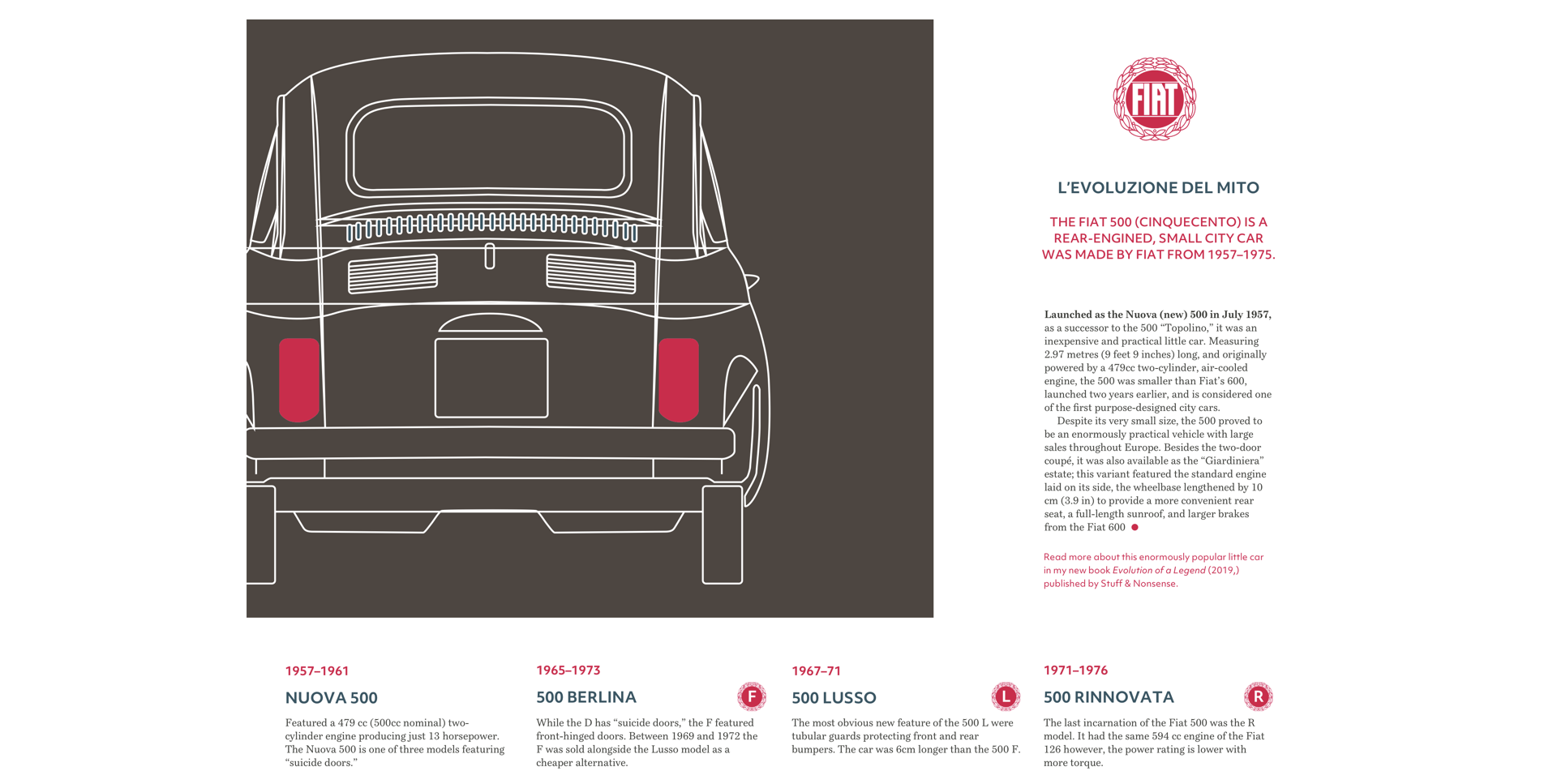
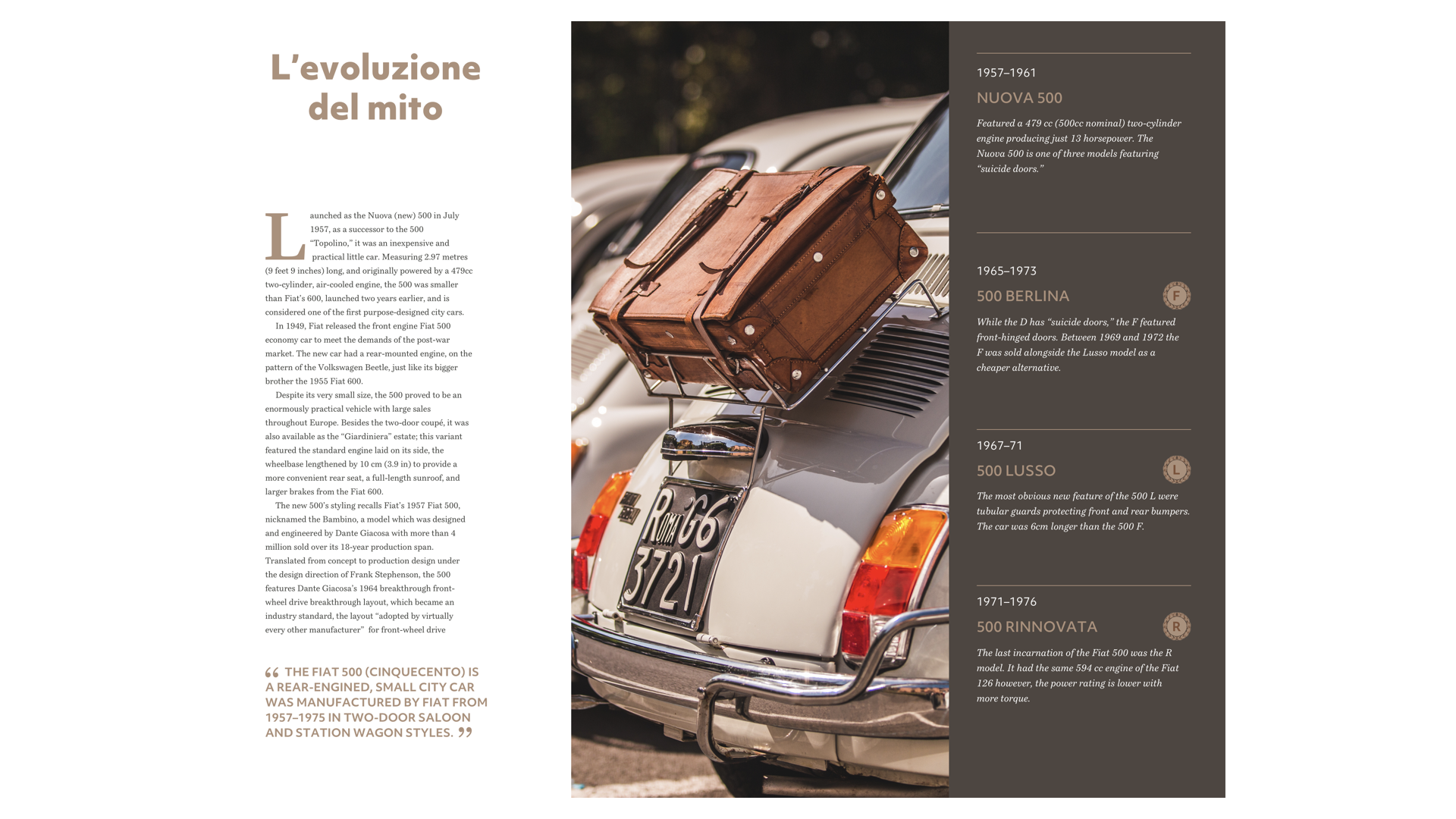
On this first article, I pick a dark pink from the lights on the Fiat 500 and use it for my headline, standfirst, and dates in my timeline. For the second article, I sample a warm light brown from the suitcase in a photograph of another Fiat 500. There are plenty of tools available online to help you sample colours from images, but my favourite is still Adobe Color.
Using large blocks of colour can help you distinguish between content types, and choosing the same colour for panel backgrounds and typographic elements such as drop caps will maintain a subtle connection between them.
I use a warm dark brown for my drop cap, headline, and pull quote, and in the background of the panel which dominates these pages. The yellow outlines in the illustration, borders, and titles in the timeline is a colour I use to connect multiple pages.
For the second page, I also use the same light brown as before to create a palette of colours and consistency across all my designs.
Foundation Styles
Colours help create a signature style that can make a design memorable. Colour connects content to a brand, creates connections between images and text. They define the personality of a product or website, and ultimately an entire company, so it’s crucial to develop a suite of colours to use throughout your designs.
But colour isn’t the only aspect of a design which can help maintain that all-important consistency. You can create signature typographic elements, including block quotes, dates, and drop caps, as well as border styles, and image treatments which repeat across pages.
With these styles forming the foundation to your design, you’ll then be free to use colour and type variations to give each article its own unique look.
In this design, a background colour covers the entire page. Simply changing that colour between articles, while maintaining layout and typography styles, adds variety and creates a series of pages which, while different, feel like they belong together.
Using a tool like Adobe Color, experiment with analogous and complementary colours. Creating a colour family sampled from graphics and photographs, and using them in several combinations, is a simple way to create a variety of designs for sections across your website.
Ernest Journal’s design is successful because although each article has its own distinctive elements which connect the visual style with the content, those articles use a consistent grid system and foundation styles. This consistency helps Ernest Journal feel like a unified whole and not a collection of separate pieces.
Read More From The Series
- Inspired Design Decisions: Avaunt Magazine
- Inspired Design Decisions: Pressing Matters
- Inspired Design Decisions: Alexey Brodovitch
- Inspired Design Decisions: Bea Feitler
- Inspired Design Decisions: Neville Brody
- Inspired Design Decisions: Otto Storch
- Inspired Design Decisions: Herb Lubalin
- Inspired Design Decisions: Max Huber
- Inspired Design Decisions: Giovanni Pintori
- Inspired Design Decisions: Emmett McBain
- Inspired Design Decisions: Bradbury Thompson
NB: Smashing membersSmashing members have access to a beautifully designed PDF of Andy’s Inspired Design Decisions magazine and full code examples from this article. You can buy this issue’s PDF and examples as well as every other issue directly from Andy’s website.
Further Reading
- Switching It Up With HTML’s Latest Control
- What Saul Bass Can Teach Us About Web Design
- Modern CSS Layouts: You Might Not Need A Framework For That
- The Modern Guide For Making CSS Shapes
 (ra, yk, il, mrn)

