My Design Process Of The Cover Design For Smashing Magazine Print Issue #1
Email Newsletter
Weekly tips on front-end & UX.
Trusted by 200,000+ folks.
Back in 2016, Vitaly Friedman asked me to design the cover and layout for a printed version of Smashing Magazine, a magazine for web designers and developers. The design I created back then for the cover and inside template layout, however, was shelved for a while as the project was paused for about two years owing to other priorities. Later, after Smashing Magazine launched its new website, a new style was born, and the design I had come up with didn’t really match anymore. So it was dropped.
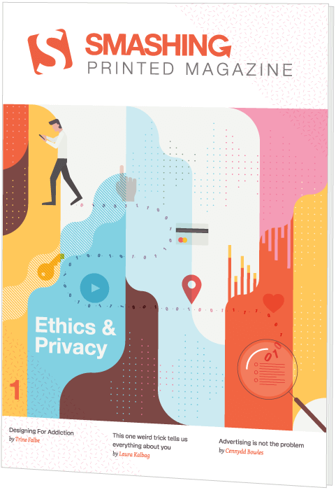
Around mid 2018, the project was reignited, and I was asked to design a new layout template for the magazine. Later, around the beginning of this year, I also redesigned the cover. Now, the pilot issue of a shiny new Smashing Magazine Print has been launched.
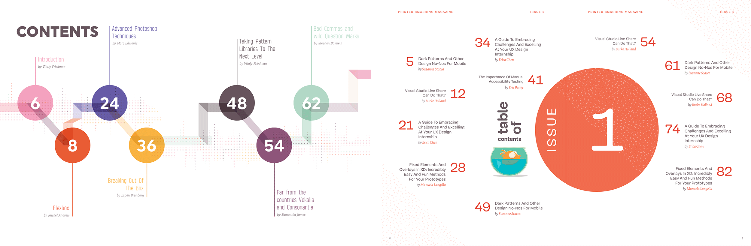
I’m very happy they chose my initial design of the table of contents, as I was really fond of it myself. The version I created later (see the above image to the right) was very different, since I went for something closer to the current design style.
In my first design back in 2016, I could choose the typefaces, and I had total freedom over the design style. It was totally different — very geometric and more modernistic. So I was very happy to see that some of the designs were adopted in the magazine’s final layout, like the table of contents and this page design for the introduction.
Reshape To Fit The New Design Style
The challenge now was to reshape the design to fit the current style of orange-red roundness, and cartoon cats. The answer was, of course, very simple: start from scratch.
Brainstorming And Sketching
Fortunately, the theme of the first edition had been identified, which made it easier for me to think about a suitable illustration. Smashing Print #1 would be about ethics and privacy. My first idea in terms of the overall design concept was to try out something along the direction of Noma Bar’s negative space design style. That’s easier said than done, of course, but I thought it would be awesome if I could pull it off and come up with something clever like that.
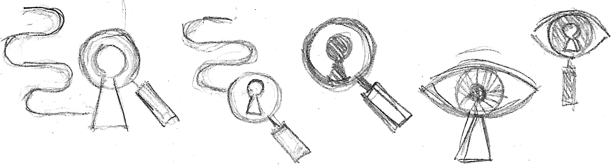
After writing down a few keywords (spying, watching, tracing), things like an eye, a keyhole and a magnifying glass came to mind as suitable subjects to use in my illustration. As for “tracing” I thought of a trail of digital data, which I saw in the shape of a perfect curvy line with ones and zeros. So I doodled a couple of basic ideas.
Inspiration Browsing
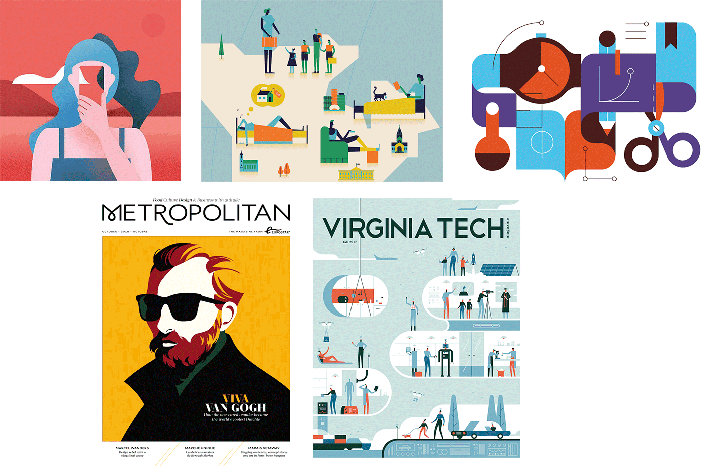
While designing this cover I did a lot of browsing around. Here are a couple of images that inspired me. The bottom-left one inspired me purely in terms of the layout. In the top-right one I really like the rounded shapes, plus its simplicity and contrasting colors. The middle-top and bottom-right ones use cute figures and a fun, vertical 2D approach. The top-left one has nice smooth shapes and colors, and I like its strong image. There were more images, for sure, but these five did it for me.
First Design
Choosing Colors
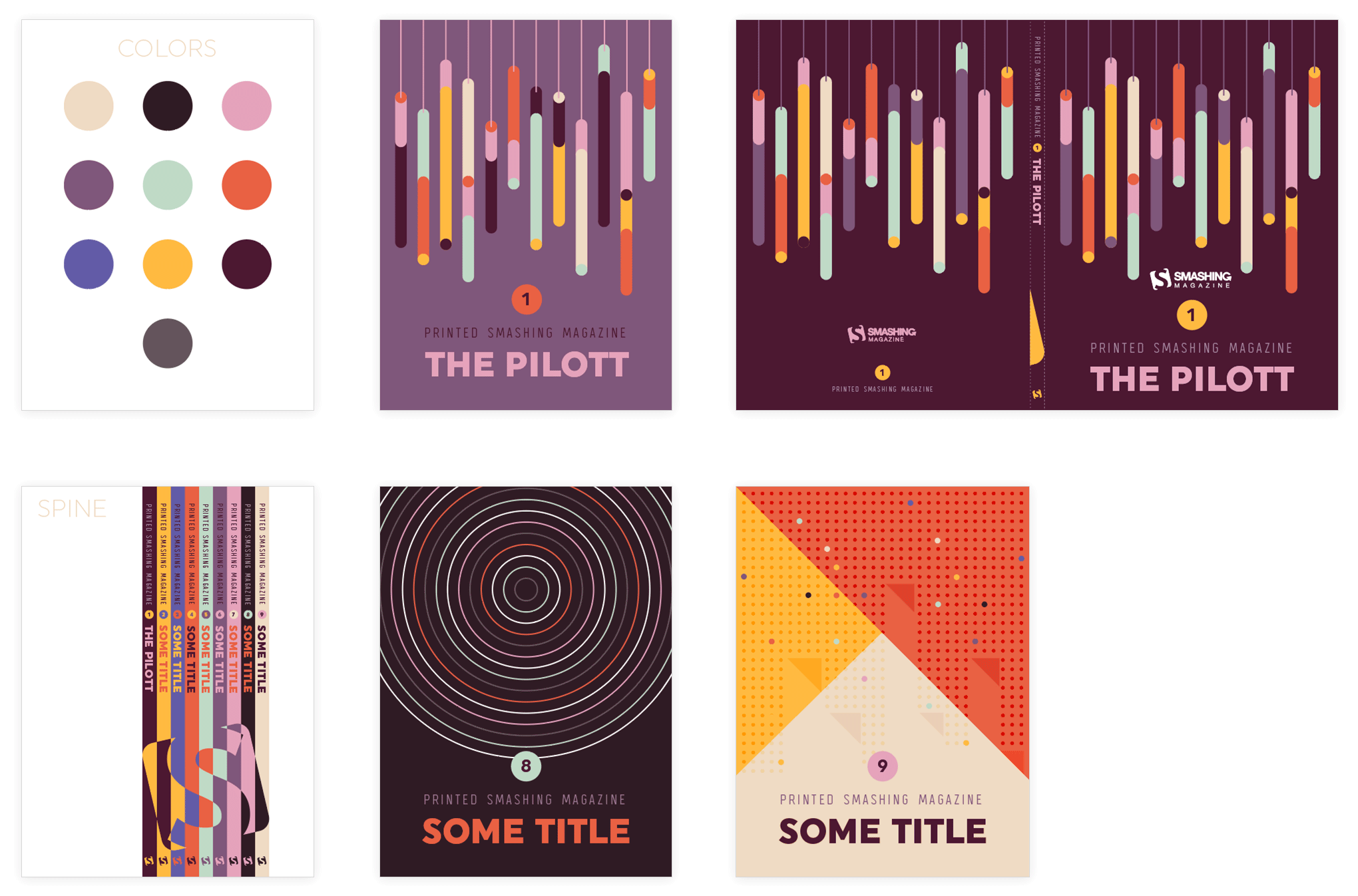
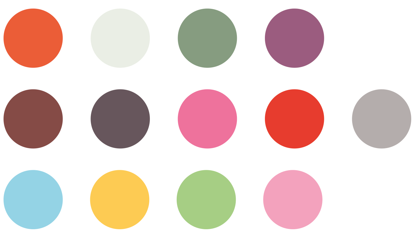
I often start a design by choosing my color palette first. The colors I picked here were chosen purely because I felt they go well together. I wasn’t sure I would use all of them, but somehow I’m used to having a color palette in circles placed above my artboard. Then I use the color picker tool to select the color fill I want to apply, or I select them all and make them global swatches.
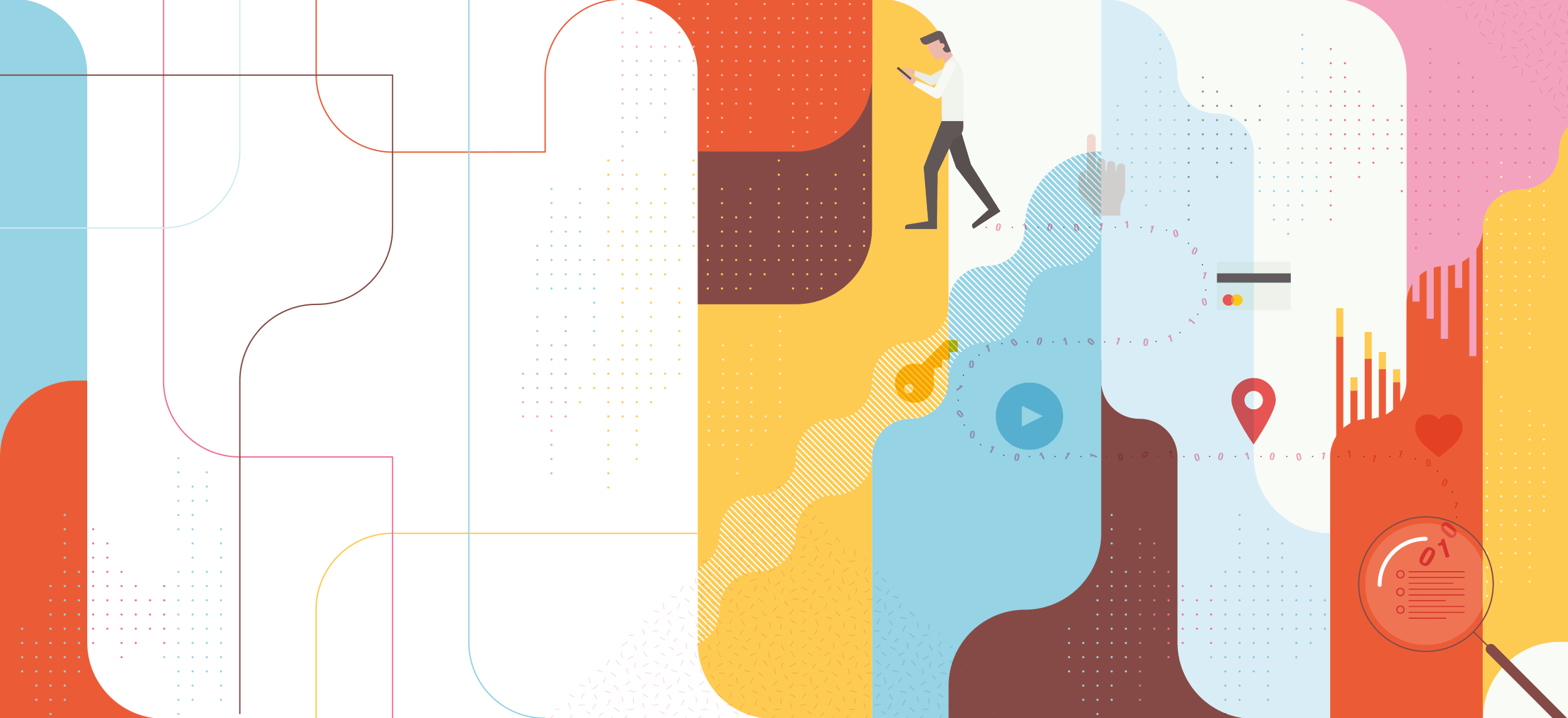
Then I worked with the doodle of the magnifying glass as an eye in Illustrator and played around with a bit of color and composition. I thought adding some colored bars at the bottom would give the illustration an eye-catching touch. They represent digital data gathered from users, converted into analytical graphs.
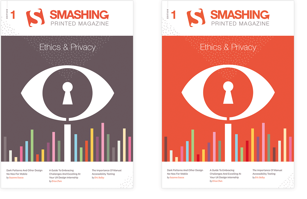
I ended up with the design shown to the left. (Ignore the name of the magazine, as this was changed later on.) I wasn’t sure how much of the Smashing orange-red I should use, so I tried out a version with a lot of orange as well, even though I preferred the other one.
While I did like the result, the idea of doing something with a trail also appealed to me as a second concept. I visualized a person walking around with a smartphone leaving a literal trail of all their interactions. That trail was then picked up, and zoomed in to and saved and analyzed. At the beginning of the trail I added a magnifying glass. I would have also mixed in some graph bars, but at this point I didn’t know where or how exactly I would incorporate them into my composition, though I was already playing with the idea of using some sort of rounded shape background, combined with some subtle patterns.
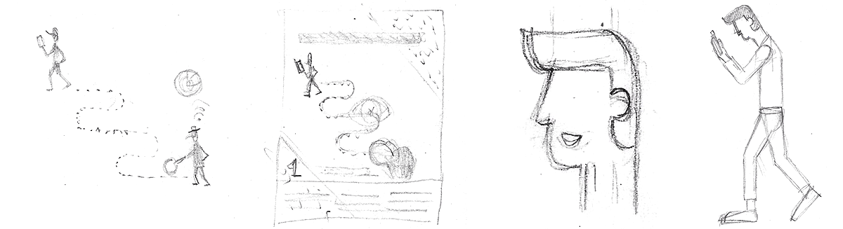
Typically, I don’t sketch out my entire design. I only quickly doodle the idea and sketch out the elements I need in more detail, like the person with the phone. Once I had the concept fixed in my mind, I started out designing in Adobe Illustrator. First, I created a grid of guides to be used for the background shapes, and also for positioning the trail and figure. There were a couple of steps to get to this final design.
Final Design
Setting Up A Grid
The inspiration image at the bottom left encouraged me to go for a layout with a lot of white space at the top for the title and some white space at the bottom to add three key articles. As for the illustration itself, I envisioned using a square grid, perhaps going all the way over the spine and back.
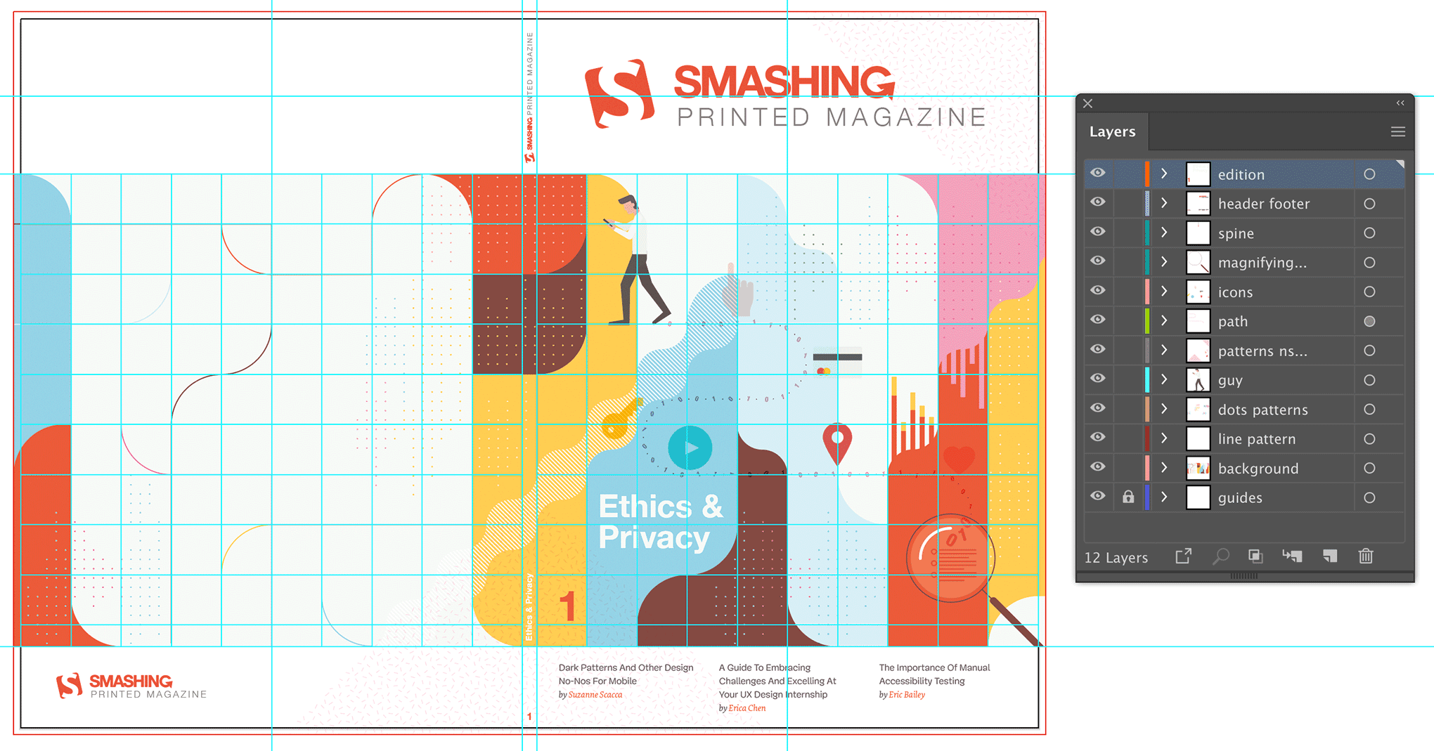
I created this square grid and placed the guides in a separate layer. Once this was set up, I started with the walking man and his smartphone, positioning him somewhere at the top-left.
Next came the curvy path. I just drew an angled line on top of the grid and used the corner widget to convert these into perfect rounded corners. I was thinking of using ones and zeros on the trail, because that’s how I visualize digital data. I turned the curvy path into a fine dotted line with a very wide gap to use as a guide to place the numbers. Once I started to place the numbers on each dot, it looked way too busy, so I decided to place one tiny dot between each number.
The next thing in the process was the creation of the background. I only had a vague idea in my head: a composition of geometrical vertical shapes with rounded corners in different colors from the palette. During this phase, I did a lot of experimenting. I moved and recolored shapes over and over. Once I had the flat colored shapes finished, I started adding in patterns on top. I tried out tiny dot grids that I randomly shaped in length and width, and applied color to. This was all a matter of intuition, to be honest, trying out something, then trying out something else, comparing both and choosing what worked best: changing color, changing the transparency mode, opacity value, and so on.
The bar graphs and icons were created in the last phase, together with the magnifying glass, and the spine and back. I just kept the idea at the back of my head, and waited till I had the man and the background shapes ready. Finally, I added in some basic icons to refer to the type of action made on the data, such as geolocation.
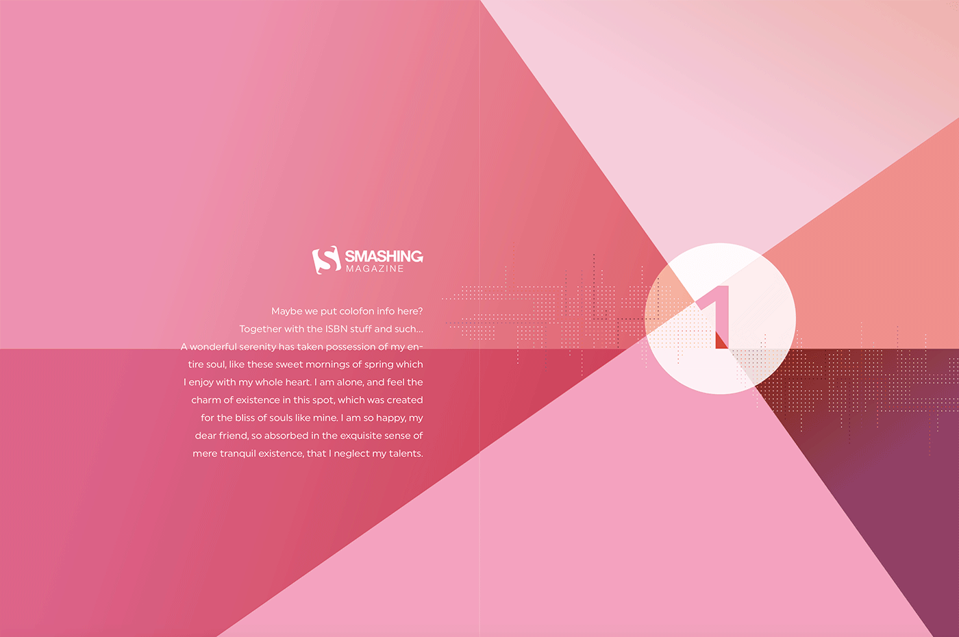
Back Cover
As for the back cover, I had already envisioned the background composition going all the way around, only much lighter. That’s how I came up with the idea of using a light area in the center with a couple of intersecting colored lines there.
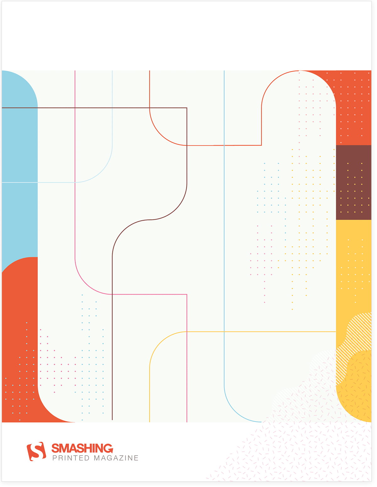
In the final printed version, text is added in the center space, nicely framed in a rounded box with a yellow border, so the composition of the lines you see here has been removed and doesn’t match the printed version.
Spine
For the spine, I’d had the fun idea earlier of having the Smashing logo build up with each release (see image at the top of the article), but the tricky thing here is that each edition needs to have the exact same thickness or the whole concept falls apart. It wasn’t realistic since I wasn’t sure each edition would have exactly the same page count. I had to remember that the width of the spine could vary. So I came up with the idea of using some sort of pattern combinations that can vary in width, but still have the magazines connected.
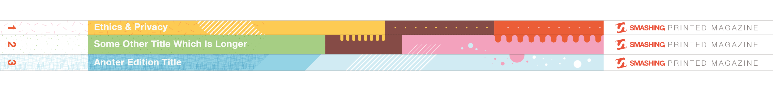
The general idea was also to use a different theme pattern for each issue. The pilot issue uses fine dots in combination with a capsules pattern. In the spine I use a couple of others. The idea is to achieve a coherent composition when you place or stack them in the right order, which serves also a motivation to buy all issues. 😉
Drawing Can Be Really Simple
Here I’ll describe a quick process of a simple detail of the cover illustration: the creation of the walking man’s face. I know a lot of people are convinced that drawing in Adobe Illustrator isn’t easy and that you have to use the pen tool a lot, but that’s not true. You can create beautiful illustrations using only simple shapes like rectangles and circles, combined with the corner widget, pathfinder options and align tools.
Quick Design Process Of The Walking Man
If you keep the shapes in your illustration as simple, flat 2D, drawing in Adobe Illustrator can be easy. Take the head of the walking man. I didn’t even use the pen tool. I've only used simple shapes: rectangles and a circle, and these steps:
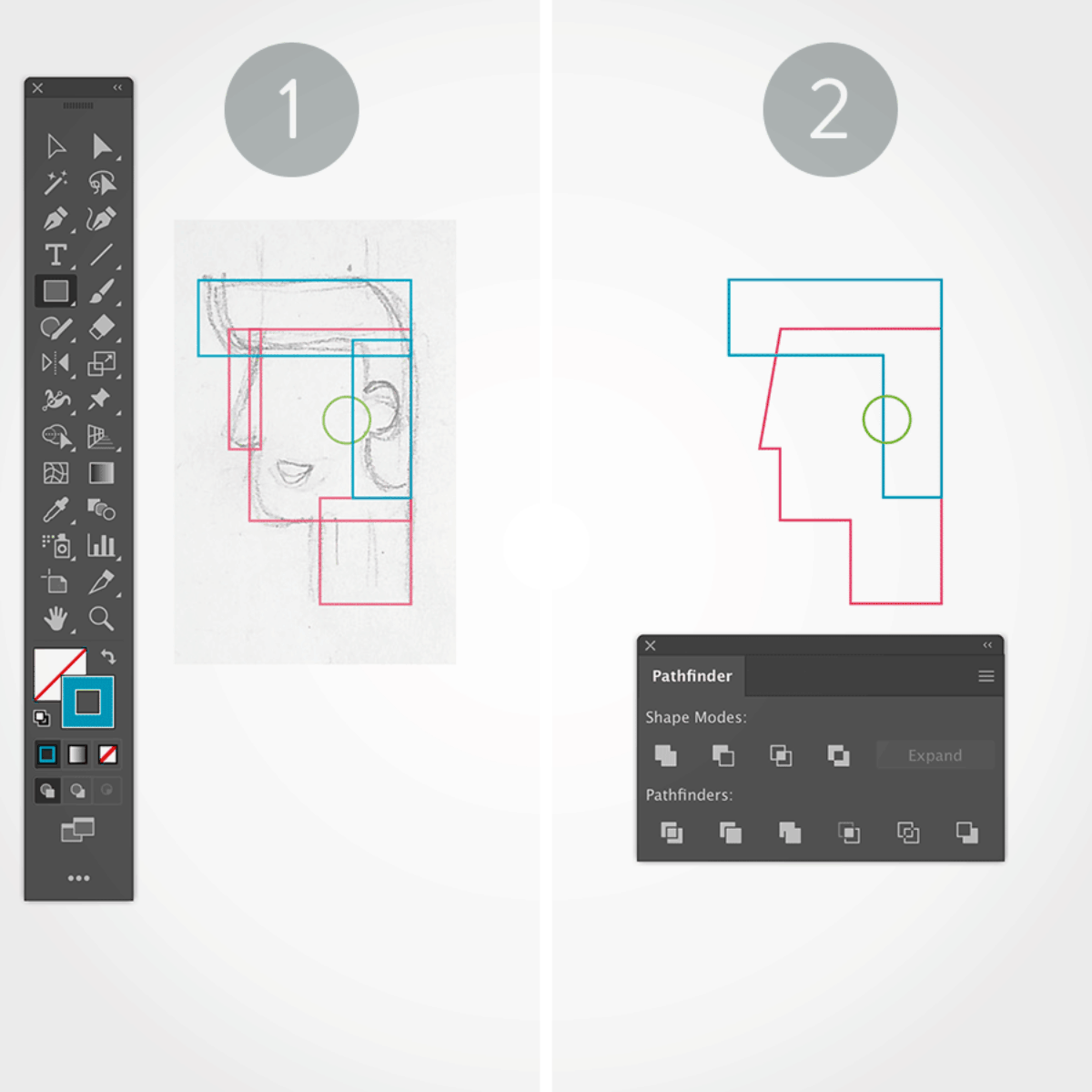
1. Rectangles And Circle
With the sketch in the background, I drew a rectangle for each part of the head, and a circle for his ear.
2. Align And Unite
Next, I used the align options to align the shapes correctly, and the `Pathfinder > Unite` option, and I also moved the top-left corner point a little to the right for his nose, using the → key.
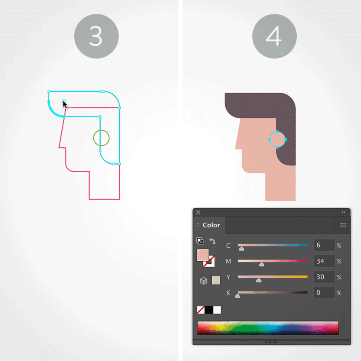
3. Rounded Corners
Then, with the Direct Selection tool (white arrow) I created the rounded corners for the hair and chin.
4. Arrange And Apply Color
All that remains is removing the strokes and applying a proper fill color for each shape. Last but not least, I made sure the shapes were in the correct stacking order by using the `Object > Arrange` options.
Chapter Illustrations
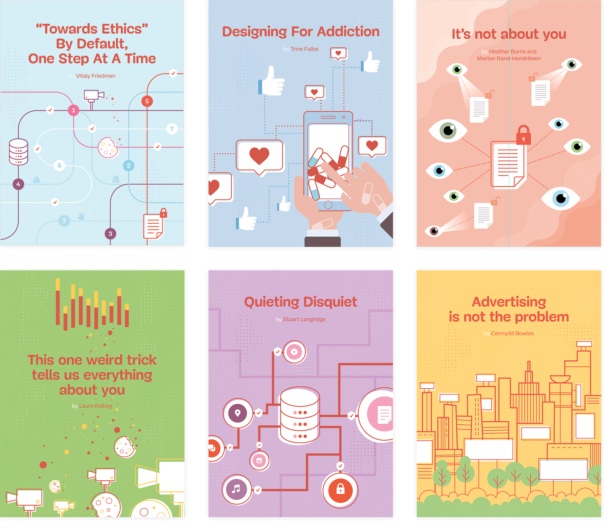
The chapter illustrations also have a bit of my handiwork. Below are the illustrations created by someone else, but the request came to improve them a little bit and make them full-page.
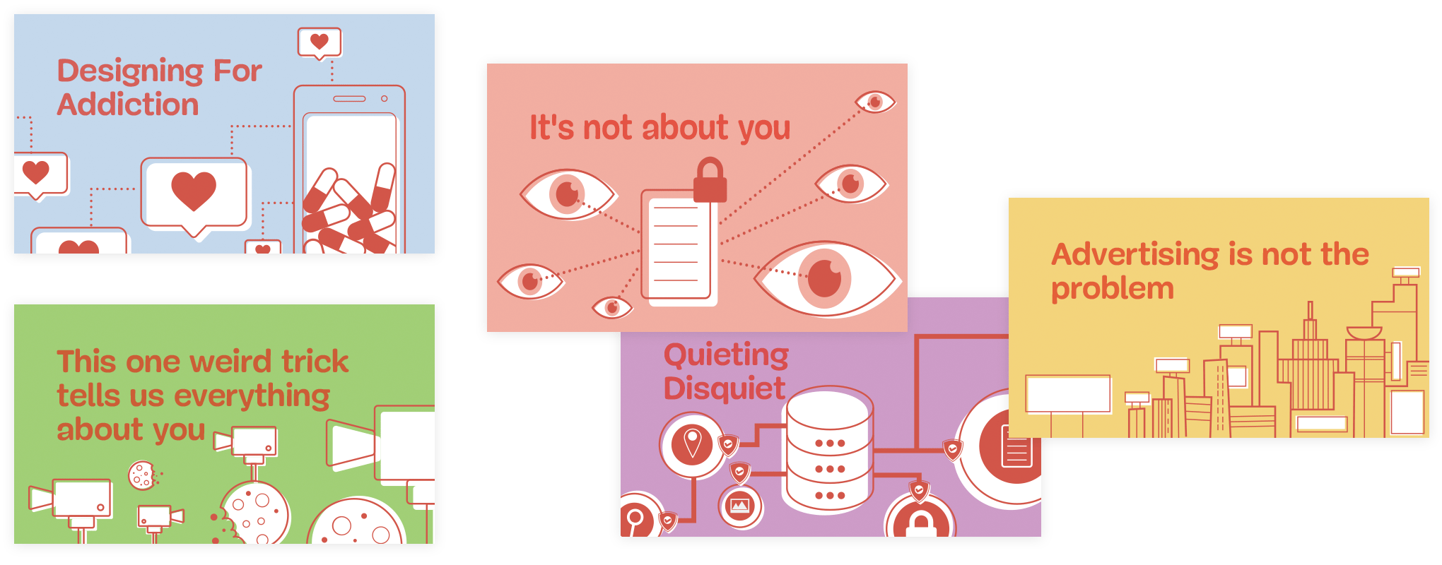
And so I did. Below are the ones I delivered to Smashing Magazine and which were implemented in the final version.
Note: As you can see, I've incorporated the dotted pattern and modified some of the icons a little bit, but I kept the overall illustration style.
For the first chapter, there was no image, so that one was based on the style already in place.
I hope you've enjoyed my design process story and the quick process tutorial. Don’t forget to check out the pilot issue of Smashing Magazine Print (view sample PDF). It’s a must-have for any web designer! Enjoy!
Print + eBook
$ 22.50 $ 29.95Quality hardcover. Free worldwide shipping. 100 days money-back-guarantee.
eBook
DRM-free, of course.
ePUB, Kindle, PDF.
Included with your Smashing Membership.
Download PDF, ePUB, Kindle.
Thanks for being smashing! ❤️
Further Reading
- T-Shaped vs. V-Shaped Designers
- Scaling Success: Key Insights And Practical Takeaways
- CSS Scroll Snapping Aligned With Global Page Layout: A Full-Width Slider Case Study
- How Smashing Magazine Uses TinaCMS To Manage An Editorial Workflow