Inspired Design Decisions With Alexey Brodovitch

Email Newsletter
Weekly tips on front-end & UX.
Trusted by 182,000+ folks.
 Custom Web Forms for Angular, React, & Vue. Your backend.
 Celebrating 10 million developers


Before writing Art Direction for the Web, I began to study Alexey Brodovitch when I became fascinated by editorial and magazine design. I was drawn to his precision, in particular, the way Brodovitch brought photographs and text together.
Then, I became intrigued by his design process, how he sketched layouts, arranged them into spreads, and created a rhythm which flowed through his magazines. Later, I appreciated his rebellious rejection of anything he considered mediocre. I still love the advice he gave his students to look beyond his medium to inspiration from other forms of art, architecture, and design.
I like to think I share a little of Brodovitch’s rebelliousness, because I want to develop the web into a creative medium, rather than as merely a platform for products. An innovative approach to website design matters because it creates more engaging experiences and attractive visual designs. Those things can help our digital products and websites appeal to audiences and communicate better. In practical terms, better communication teaches how to use a product. It also helps them to understand why they should choose that product. This approach aids editorial, marketing, and news to communicate, and is crucial to developing an affinity between a brand and its audience.
There are few books currently available on Alexey Brodovitch’s work, the most definitive being Kerry William Purcell’s 2011 “Alexey Brodovitch.”
This monograph contains collections from throughout Brodovitch’s life, most interesting to me are his designs for Harper’s Bazaar magazine, some of which I’ll explore in this issue. This book will make a fabulous addition to your design collection.
Inspired By Alexey Brodovitch
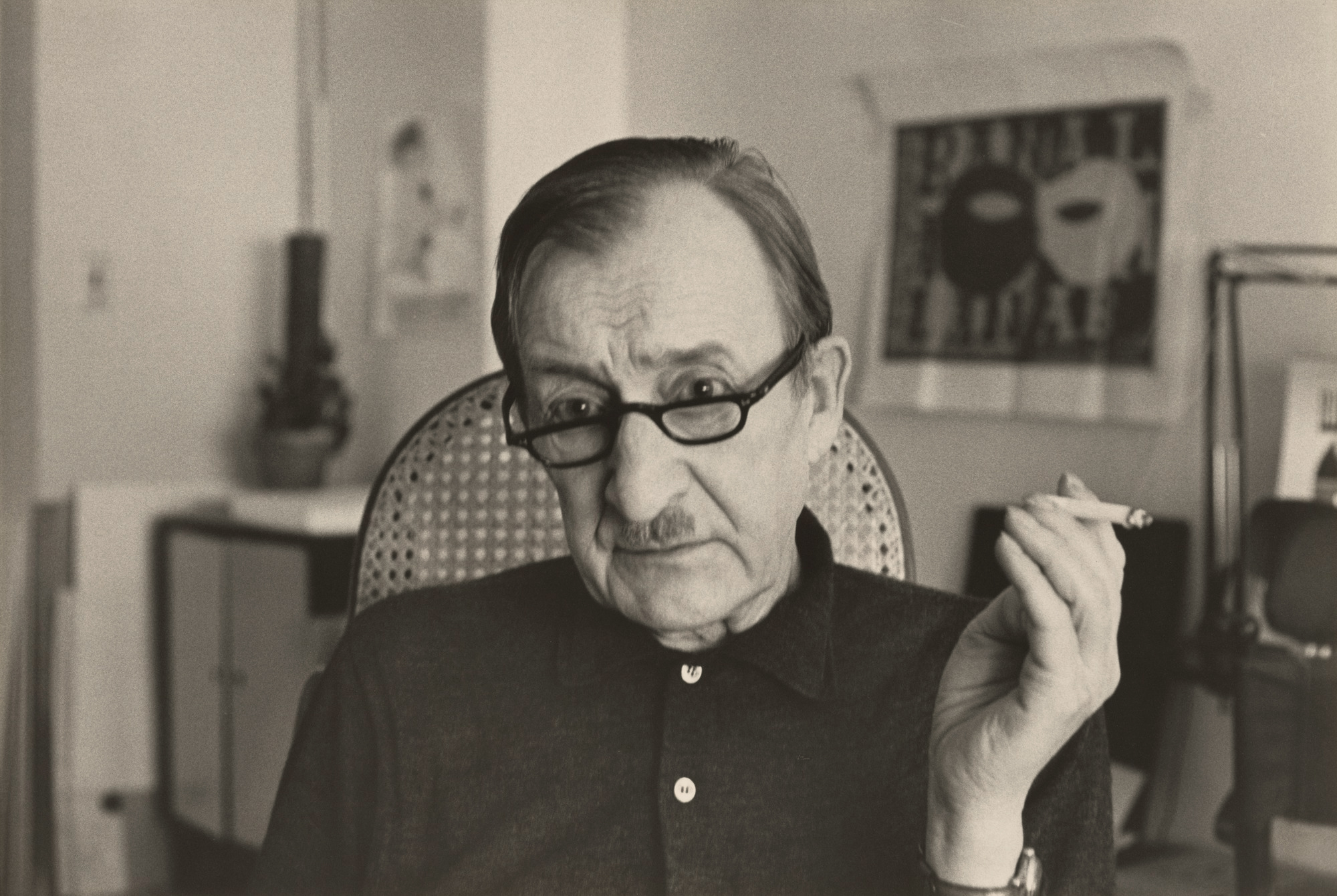
Alexey Brodovitch was born in Russia in 1898. As a young man, Brodovitch fought in the White Army again the Bolsheviks during the Russian Civil War, which wasn’t the start in life I’d expected for someone who went on to become one of the most influential art directors of the twentieth century.
Forced into exile, Brodovitch moved to Paris where — while working as a scene painter — he met artists including Marc Chagall and was exposed to movements including Bauhaus, Constructivism, Dadaism, and Futurism.
Constructivism
Whereas autonomous art was driven by the subconscious, and painters like Wassily Kandinsky and Joan Miro suppressed conscious control of the painting process, the constructivist movement sought to consciously and deliberately construct art.
This meant deliberately placing lines and shapes using geometry. The results were often striking, which lead to constructivism’s use in political art and propaganda. Constructivism influenced artists and designers throughout the twentieth century, including Neville Brody, who’s work on The Face Magazine I’ll cover later in this series.
Alexander Rodchenko
Seven years his senior, Alexander Rodchenko was a significant influence on Brodovitch and generations of artists, graphic designers, and photographers. Rodchenko was one of the founders of the constructivist movement.
“In order to educate man to a new longing, everyday familiar objects must be shown to him with totally unexpected perspectives and in unexpected situations.
— Alexander Rodchenko
Photomontage — the technique of cutting and rearranging multiple images into a new work — was popular in Constructivism. This approach to composition inspired Brodovitch throughout his life, where he became renowned for the way he deliberately and precisely brought photography and typography together.
When Brodovitch began working part-time designing layouts for Cahiers d’Art — a contemporary art journal — and the influential design magazine Arts et Métiers Graphiques, he refined his techniques, creating striking magazine and poster designs. After beating Pablo Picasso into second place in a poster competition, Brodovitch established his own design studio and while still in his thirties became one of the most respected commercial artists in Paris.
Disillusioned by the art scene in Paris, in 1930 Brodovitch moved to the United States where he taught advertising design at what is today the Philadelphia University of the Arts. His goal was to develop American advertising to the level of design in Europe. He exposed his students to French and German magazines and taught them to reexamine their techniques. In the spirit of the Bauhaus School, Brodovitch took his students outside the classroom to find inspiration elsewhere, encouraging them to find their own creative style.
Brodovitch was “intolerant of mediocrity” and frequently asked his students to “astonish me.” Brodovitch’s courses focussed on design and photography in equal measure, so as well as influencing a generation of art directors and graphic designers, he taught photographers including Diane Arbus and Richard Avedon. He’d work with them later at Harper’s Bazaar magazine.
Brodovitch was asked by The Art Directors Club of New York to design their 1934 Annual Art Directors Exhibition. There, Carmel Snow — who at the time was editor-in-chief at the US edition of Harper’s Bazaar magazine — saw Brodovitch’s work for the first time. She said:
“I saw a fresh, new conception of layout technique that struck me like a revelation: pages that “bled” beautifully cropped photographs, typography and design that were bold and arresting.”
— Carmel Snow (The World of Carmel Snow. McGraw-Hill, 1962)
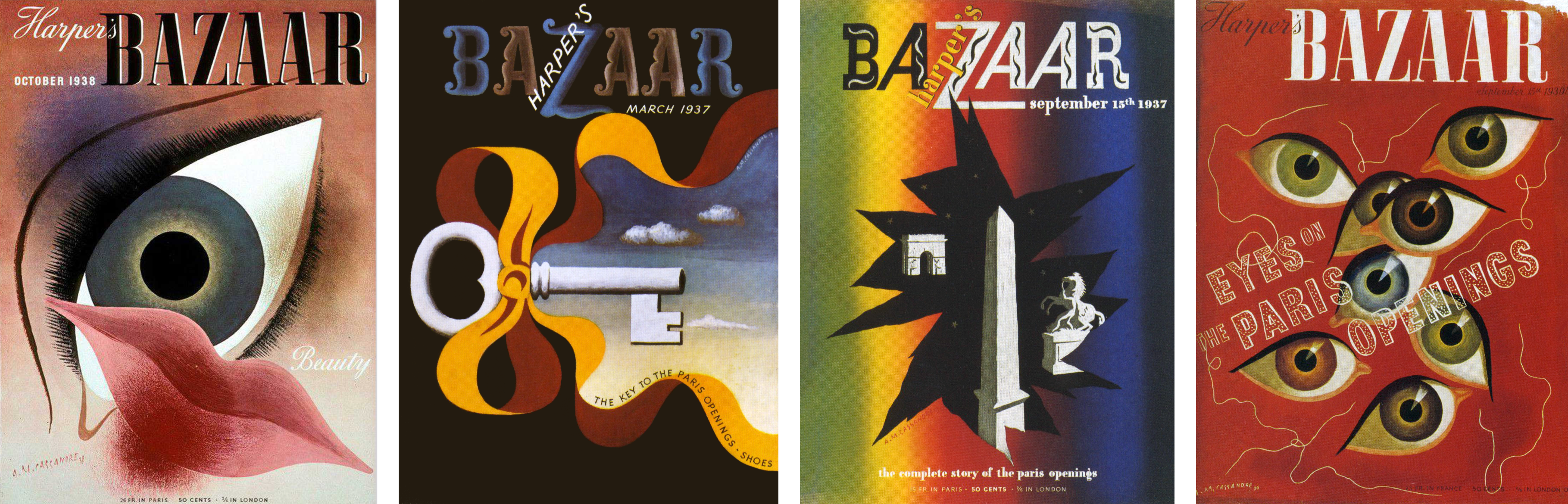
Astonish Me
Harper’s Bazaar became Brodovitch’s most well-known project. Determined to keep his designs fresh, he frequently commissioned work from European artists including Jean Cocteau, Marc Chagall, and Man Ray. To keep Harper’s Bazaar readers surprised, Brodovitch explained:
“Surprise quality can be achieved in many ways. It may be produced by a certain stimulating geometrical relationship between elements in the picture, or through the human interest of the situation photographed, or by calling our attention to some commonplace but fascinating thing we have never noticed before, or it can be achieved by looking at an everyday thing in a new interesting way.”— Alexey Brodovitch
It’s Brodovitch’s art direction for Harper’s Bazaar which has influenced designers since the 1940s. His designs were elegant, something Carmel Snow once described as “good taste, plus a dash of daring.” His knowledge of photography gave his work its classic feel. Brodovitch often cropped photographs in unexpected ways, and he placed them off-centre — sometimes bleeding them outside the margins of a page — to create compositions which were full of energy and movement.
Throughout his career at Harper’s Bazaar and beyond, Brodovitch frequently used content in photographs or illustrations to inform his placement and shape of the text. His colour choices were often bold, and he used large blocks of colour for emphasis.
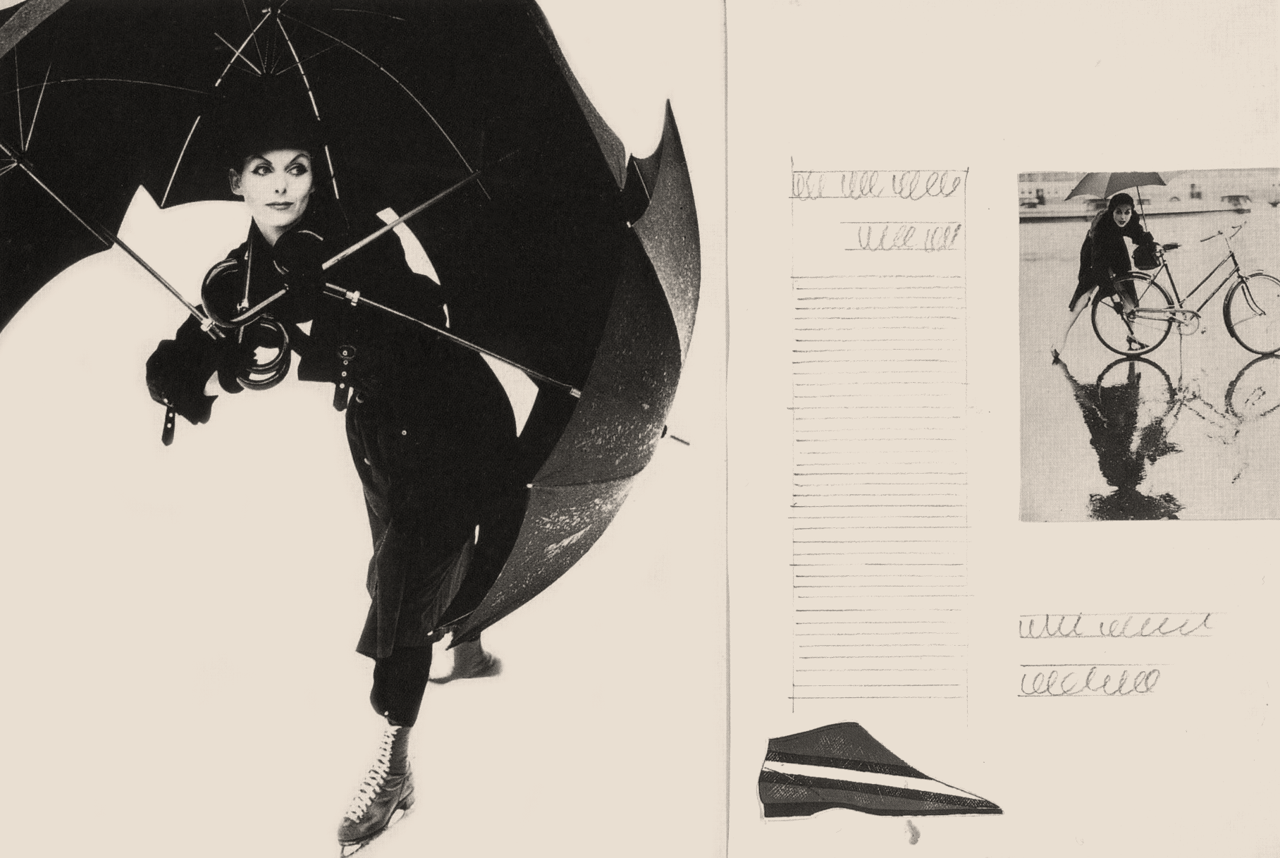
I find Brodovitch’s design process as fascinating as his finished work because I learn more about how someone thinks by looking at their work-in-progress. Brodovitch began by designing his layouts as sketches on paper. Then, he arranged his spreads on the floor of his studio to create a well-paced magazine.
Scattering Images
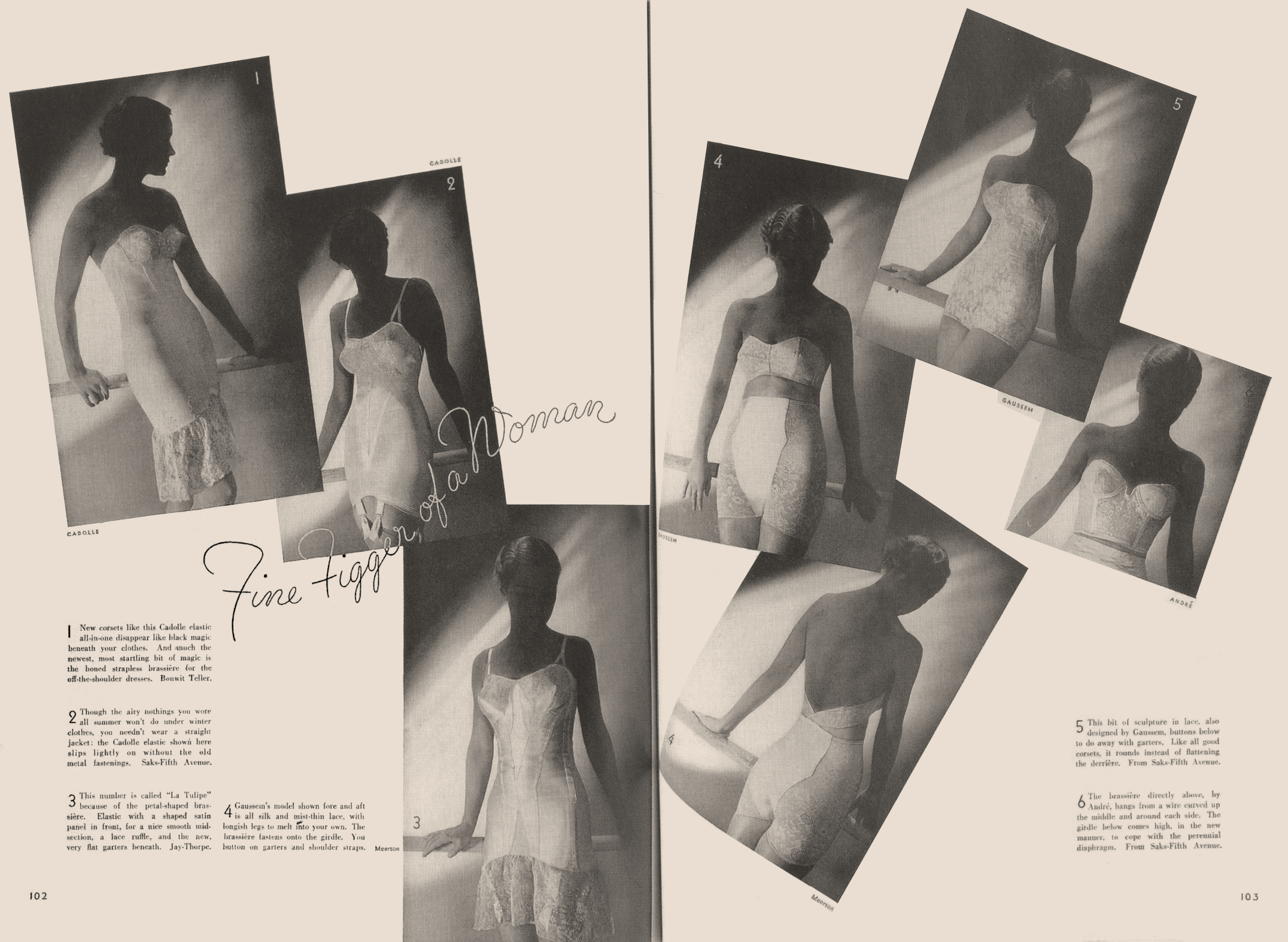
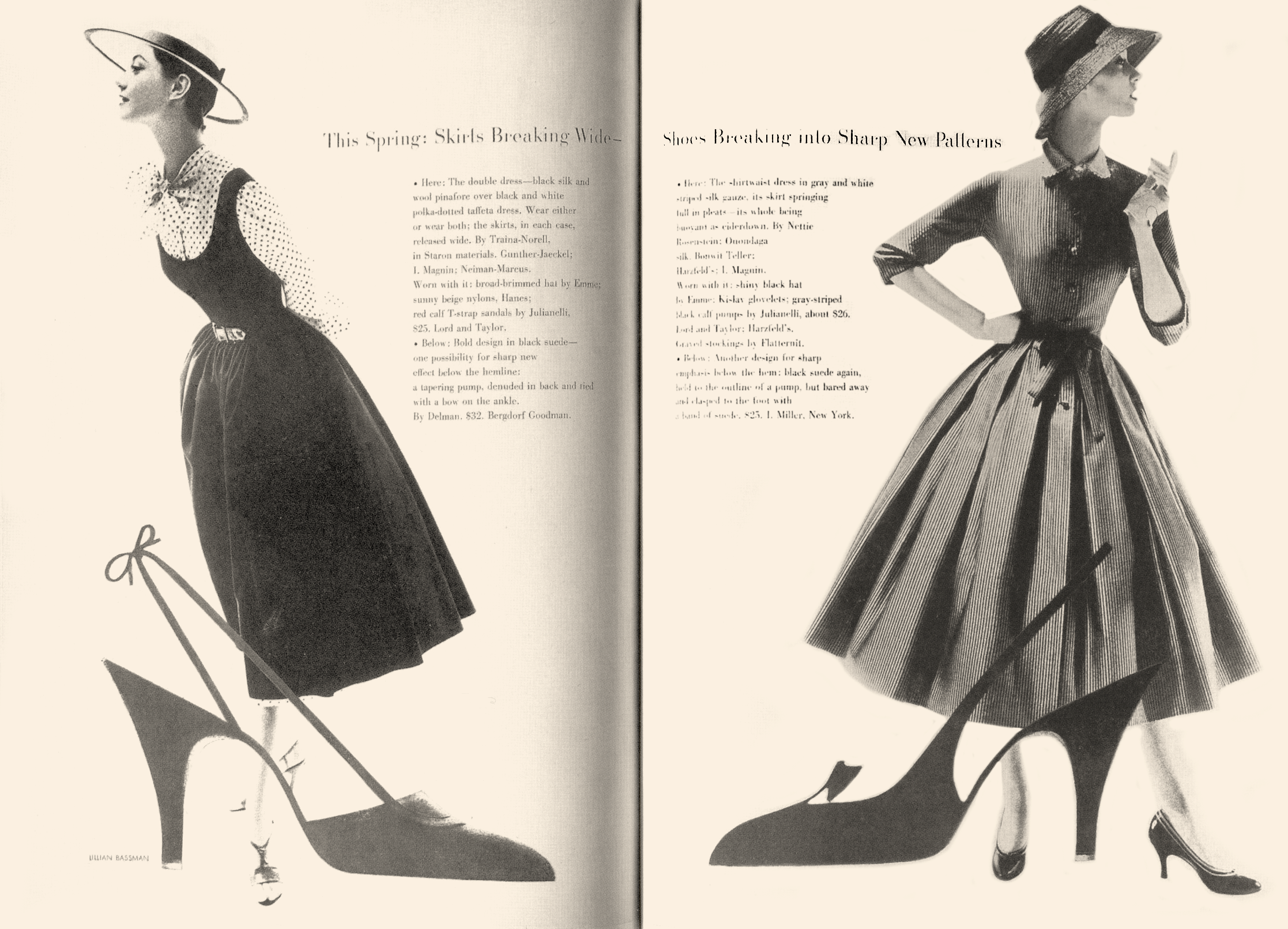
Early in his career, Brodovitch was inspired by Mehemed Fehmy Agha — the influential art director who designed the first double-page spread — and frequently scattered pictures across his pages like playing cards.
These might seem at first like a random arrangement of pictures, but they were deliberately placed and filled Brodovitch’s designs with movement. We can use the same technique today, even when designing flexible layouts.
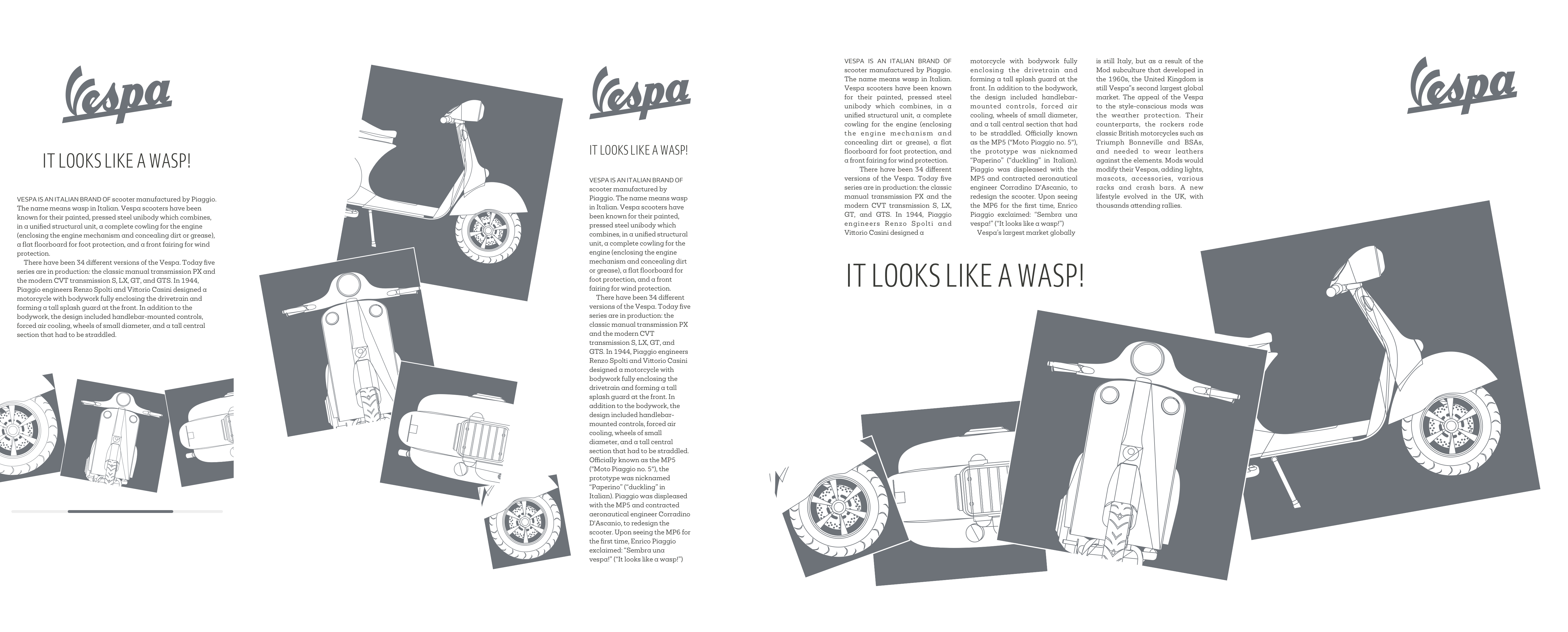
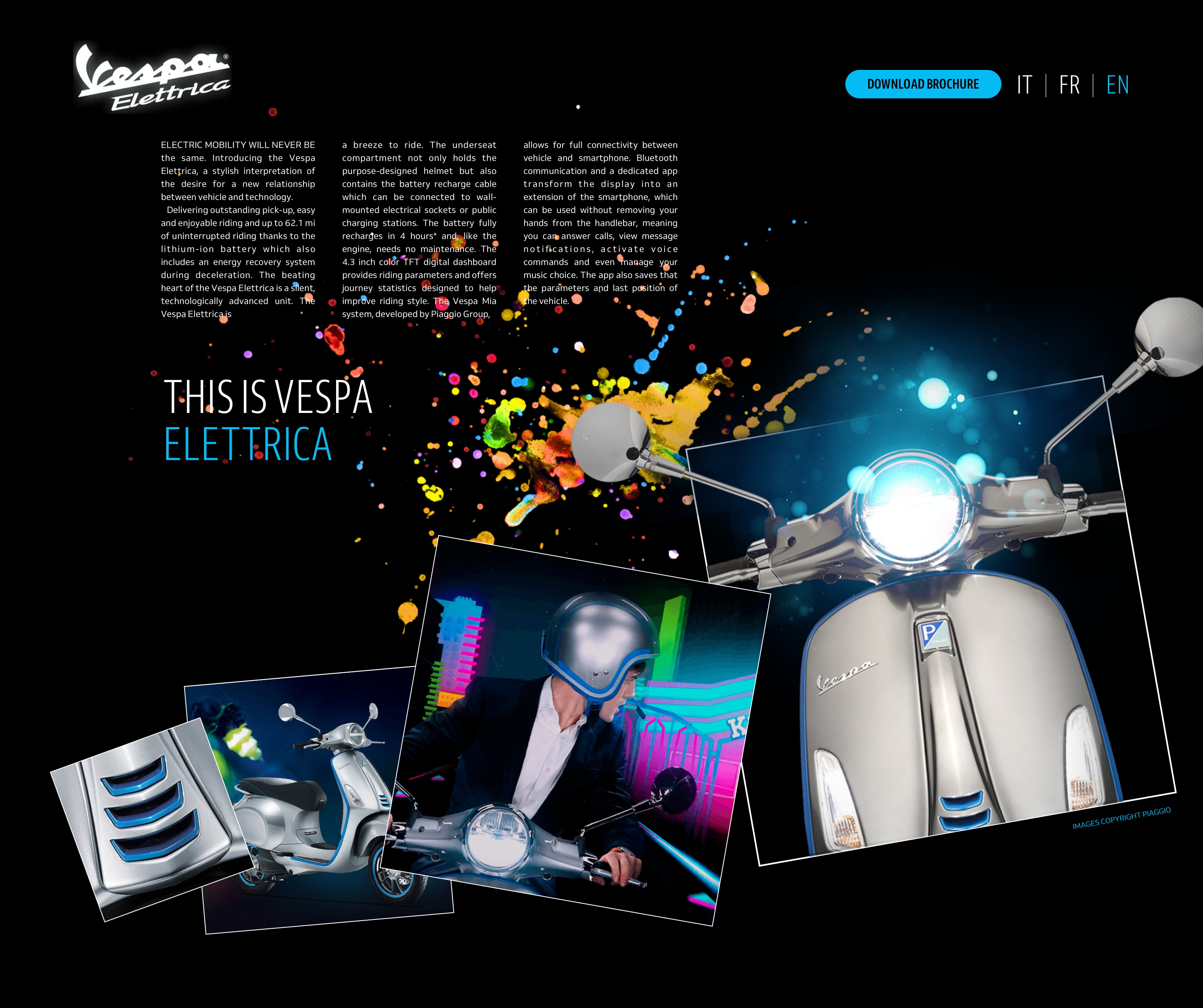
For my first Brodovitch-inspired design, I scatter four differently sized images across the viewport. I can arrange these pictures either horizontally, vertically or even diagonally according to the screen dimensions.
To help me design a consistent experience across screen sizes, I form a storyboard from a short series of sketches.
To develop this design, I use a combination of CSS Grid, Flexbox, and transforms. My markup is minimal and meaningful, using only three elements for layout; a top-level heading, a main element for my running text, and a figure element which contains my four images:
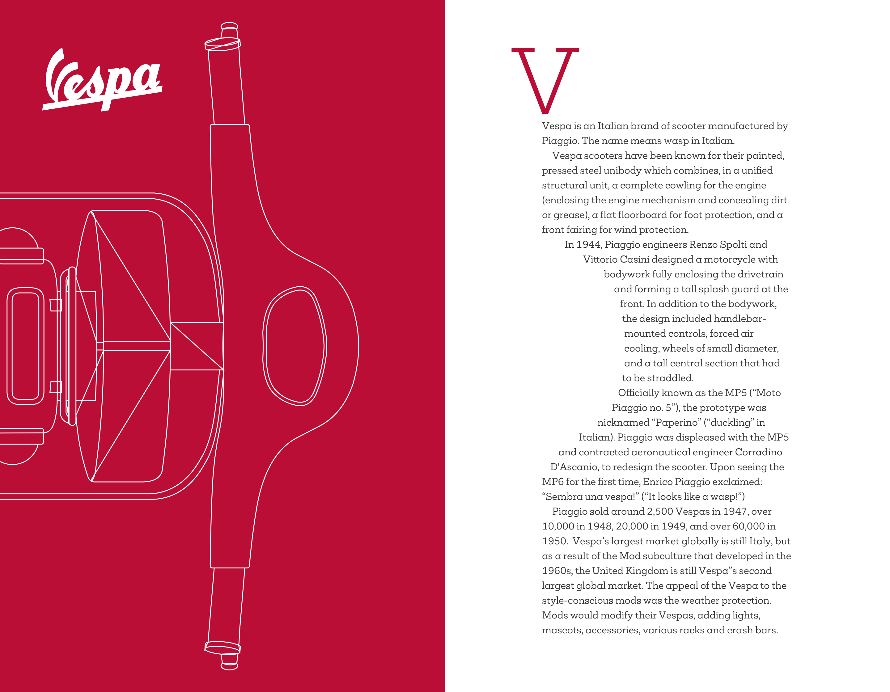
<h1 aria-label="Vespa"><svg>…</svg></h1>

<main>
<h2>It looks like a wasp!</h2>
<div>…</div>
</main>

<figure>…</figure>
For smaller screens, I need only foundation styles for colour and typography as the normal flow, handles my single column layout. In normal flow, elements display one after another, depending on a document’s writing mode. If you’re new to these concepts, Rachel Andrew wrote an excellent primer.
To develop a small screen design consistent with larger screen sizes, I rotate images alternately within a horizontally scrolling figure element. As the browser default sets a flex container to no-wrap and arranges its flex items along a horizontal axis, I need only apply display: flex; to my figure element:
figure {
display: flex; }
By ensuring my figure never exceeds the width of my viewport and setting the horizontal overflow to scroll, I develop a simple scrolling panel which may contain as many images as I need:
figure {
max-width: 100vw;
overflow-x: scroll; }
My figure element contains four SVG images. To maintain their aspect ratio when using Flexbox, I enclose each one in its own division:
<figure>
<div><img src="img-1.svg" alt=""></div>
<div><img src="img-2.svg" alt=""></div>
<div><img src="img-3.svg" alt=""></div>
<div><img src="img-4.svg" alt=""></div>
</figure>
To fill all the horizontal space with images, I use the flex-grow property. flex-grow controls the ratio by which elements expand to occupy available space in a container, flex-shrink does the opposite. This property specifies the ratio that elements reduce in size when a container is narrower than their combined widths. I want my flex items to grow to fill any available space, but not shrink:
figure div {
flex-grow: 1;
flex-shrink: 0; }
Both flex-grow and flex-shrink allow the widths of elements to be completely fluid, with no restriction on how wide or narrow they can be. There are occasions when a flex item should start at a certain size before it grows or shrinks. In Flexbox, flex-basis provides a starting width for an element before it flexes:
figure div {
flex-basis: 40%;
/* flex: 1 0 40%; */ }
To shave a few bytes from my style sheet, I can combine those three properties into one by using the flex shorthand.
Choosing Between Flexbox And Grid
People often ask me when to use Flexbox or Grid. Of course my answer depends on the style of element they’re implementing. For my set of four figure images, I can use Flexbox or Grid to develop a 2x2 arrangement where every image appears the same size. But, when I add or remove an image, the result using Flexbox isn’t what I’m looking for, as the final image expands to fill the entire width of my figure. By changing Flexbox to Grid, every item aligns to the grid which maintains their size.
It’s common in print to see design elements which overlap to create the illusion of depth. On the web, achieving this effect has been tricky, so design elements mostly stay separate. Grid enables designs which in the past were either difficult or even impossible to implement.
When a screen’s large enough to render my main and figure elements side-by-size, I apply display: grid; to the body element with column widths which match the 6+4 compound grid, I showed you in issue 2. I also set the gap between columns and rows:
@media screen and (min-width : 48em) {

body {
display: grid;
grid-template-columns: 2fr 1fr 1fr 2fr 2fr 1fr 1fr 2fr;
grid-column-gap: 2vw;
grid-row-gap: 4vh; }
}
Then, I place the heading, main, and figure elements onto that grid using line numbers:
h1 {
grid-column: 7;
grid-row: 1;  }

main {
grid-column: 6 / -1;
grid-row: 2;  }

figure {
grid-column: 1 / 6;
grid-row: 1 / 3;  }
Finally, when a screen’s large enough and I can get the biggest impact from my scattered pictures, I reposition the heading, main, and figure elements into new positions on my grid:
@media screen and (min-width : 64em) {

h1 {
grid-column: 8;
grid-row: 1; }

main {
grid-column: 2 / 6;
grid-row: 1; }

figure {
grid-column: 1 / -1;
grid-row: 2; }
}
Then, I apply grid properties to my figure element to create four columns, each one larger than the last:
figure {
grid-template-columns: 1fr 2fr 3fr 4fr;
grid-gap: 0;
align-items: end; }
I align my items to the end of their grid container, then nudge and rotate my images to give them the scattered look which Brodovitch inspired:
figure div:nth-of-type(1) {
transform: translate(20px, -20px) rotate(-20deg); }

figure div:nth-of-type(2) {
transform: rotate(-5deg); }

figure div:nth-of-type(3) {
transform: rotate(10deg); }

figure div:nth-of-type(4) {
transform: translate(-60px, -80px) rotate(-20deg); }
People have told me that designs like these are appropriate for editorial design but not for products or websites which promote or sell them. This isn’t the case at all. Graphic design principles matter as much to a digital medium as they do for print. Diverse and interesting designs stand out whichever medium you choose to deliver them.
Alexey Brodovitch instinctively knew how to combine photographs with written content, often turning text into shapes that contrasted with or mirrored the forms in his photography. Over the next few pages, I’ll show you how to adapt his inspired design techniques to the web.
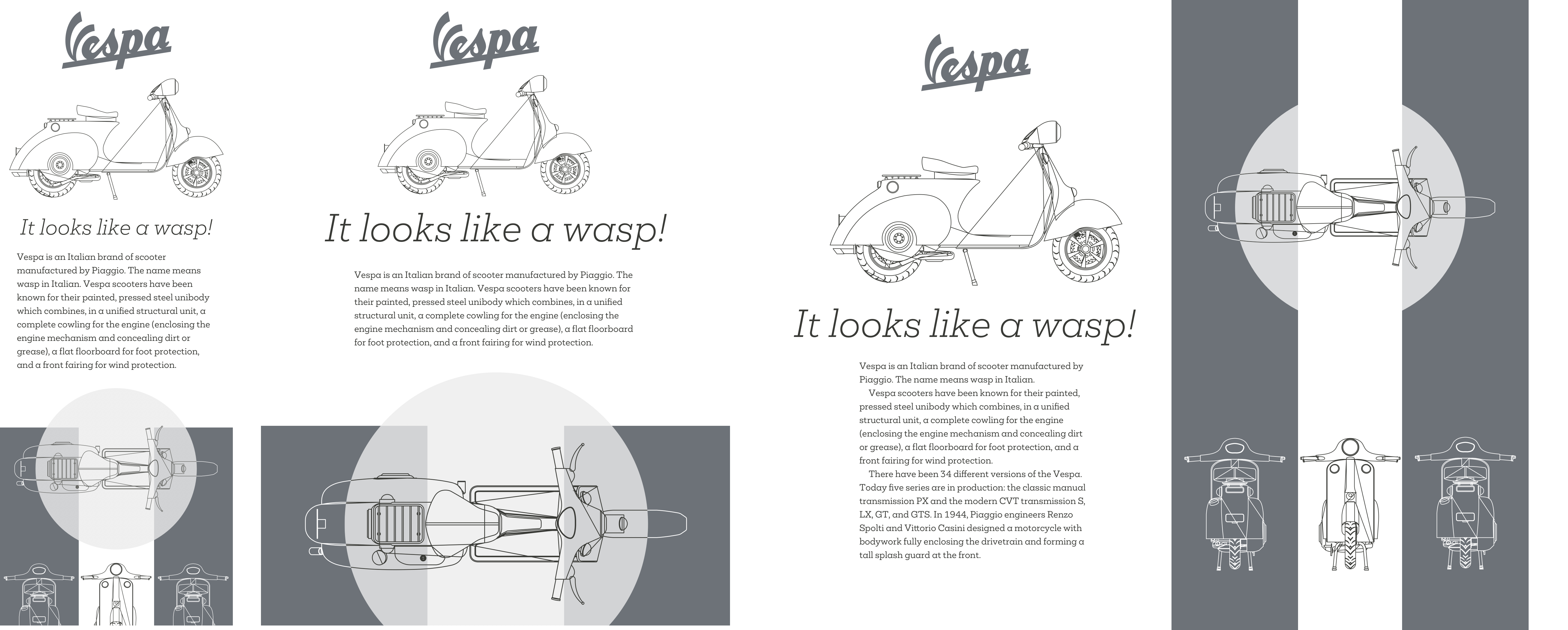
Lesson 2: Mirroring Pictures And Text
Aexey Brodovitch made the double-page spread his playground, using its large canvas to carefully construct his compositions. Facing pages allowed Brodovitch the possibility to contrast or connect both sides of a spread.
I need three structural elements to implement this next Brodovitch inspired design; a heading, main, and aside:
<h1 aria-label="Vespa"><img></h1>
<main>…</main>
<aside>…</aside>
Normal flow again handles my single column layout for small screens, and I need only foundation styles for colour and typography. These include background and foreground colours for the inverted aside:
aside {
background-color: #ba0e37;
color: #fff; }
Medium-size screens share those same foundation styles. I also reuse the same 6+4 compound grid from my previous design. To implement the asymmetric layout of elements inside my main and aside elements, I use Grid with four columns and a set of rows with a mixture of pixel and rem units:
@media screen and (min-width : 48em) {

main,
aside {
display: grid;
grid-template-columns: 2fr 1fr 1fr 2fr;
grid-template-rows: 10rem 200px 10rem auto; }
}
I add another unit, a viewport height unit, to those elements to ensure they always fill the full height of a screen:
main,
aside {
min-height: 100vh; }
My main and aside elements each contain a figure element and an SVG image and caption. To place those child elements on my grid, I apply display:contents; to my figure, and effectively remove it from the DOM for styling purposes, so its descendants take its place:
main figure {
display: contents; }
Then, I place the images and captions into columns and rows using line numbers:
main img {
grid-column: 1 / 4;
grid-row: 1 / 5; }

main figcaption {
grid-column: 4 / -1;
grid-row: 3; }

aside img {
grid-column: 2 / -1;
grid-row: 1 / 5; }

aside figcaption {
grid-column: 1;
grid-row: 3;
align-self: center; }
Next, I apply styles for larger screens, first by creating a grid with two symmetrical columns, then placing my main and aside elements onto that grid using named lines:
@media screen and (min-width : 64em) {

body {
display: grid;
grid-template-columns: [main] 1fr [aside] 1fr; }

main {
grid-column: main; }

aside {
grid-column: aside; }
}
All that remains is for me to position the heading containing the two-tone Vespa logo. As I only need this version of the logo on larger screens, I use the picture element to swap a standard version for my two-tone variation:
<h1><picture><source srcset="logo-2-tone.svg" media="(min-width: 64em)"><img src="logo.svg" alt="ihatetimvandamme"></picture></h1>Although Flexbox and Grid have mostly taken over as my main layout tools, there are still good uses for CSS positioning. As I want my logo in the centre of my layout, I position it half-way across the viewport, then use a transform to move it left, so its centre matched the background behind it:
h1 {
position: absolute;
top: 14rem;
left: 50vw;
z-index: 2;
transform: translateX(-95px); }
Carving Text Into Shapes
Shapes add movement to a design which draws people in. They help to connect an audience with your story and make tighter connections between your visual and written content.
I’ve seen very few examples of using CSS Shapes which go beyond Basic Shapes, including circle(), ellipse(), inset(). Even instances of a polygon() are few and far between. Considering the creative opportunities CSS Shapes offer, this is disappointing. But, I’m sure that with a little inspiration and imagination, we can make more distinctive and engaging designs.
Inspired by Alexey Brodovitch, in my next design, the shape of the running text reflects shapes in the header image opposite. It often needs surprisingly little markup to develop dynamic and original layouts.
To implement this design, I need just two structural elements; a header which also contains a picture element, and the main element for my running text:
<header>
<picture>…</picture>
</header>

<main>…</main>
I’ve made a simple small screen design, so I only need colour and typography foundation styles. By using a picture element in my header, browsers swap the portrait orientation image — which best suits small screens — with a landscape variation when I introduce layout styles.
For larger screens, I apply an asymmetrical two-column grid to the body and place the header and main elements using named lines. I also ensure the grid extends to the full viewport height, regardless of the amount of content:
@media screen and (min-width : 64em) {

body {
display: grid;
grid-template-columns: [header] 1fr [main] 1fr;
max-width: 100vw; }

header {
grid-column: header; }

main {
grid-column: main; }
}
I needn’t make a polygon path to flow my text around. Instead, I use a mask image which I add to the page using Generated Content applied to a pseudo-element:
main:before {
content: "";
display: block;
float: left;
width: 170px;
height: 800px;
shape-outside: url('mask.svg'); }
Note: Watch out for CORS (cross-origin resource sharing) when using images to develop your shapes. You must host images on the same domain as your product or website. If you use a CDN, make sure it sends the correct headers to enable shapes. It’s also worth noting that the only way to test shapes locally is to use a web server. The file:// protocol simply won’t work.
When you need content to flow around a shape, use the shape-outside property. You must float an element left or right for shape-outside to have any effect.
You can also use Shapes to sculpt structural shapes from solid blocks of running text, in the style of Alexey Brodovitch.
The markup I need to implement this design is similar to my previous example, a header which again contains a picture element, and the main element for running text:
<header>
<picture>…</picture>
</header>

<main>…</main>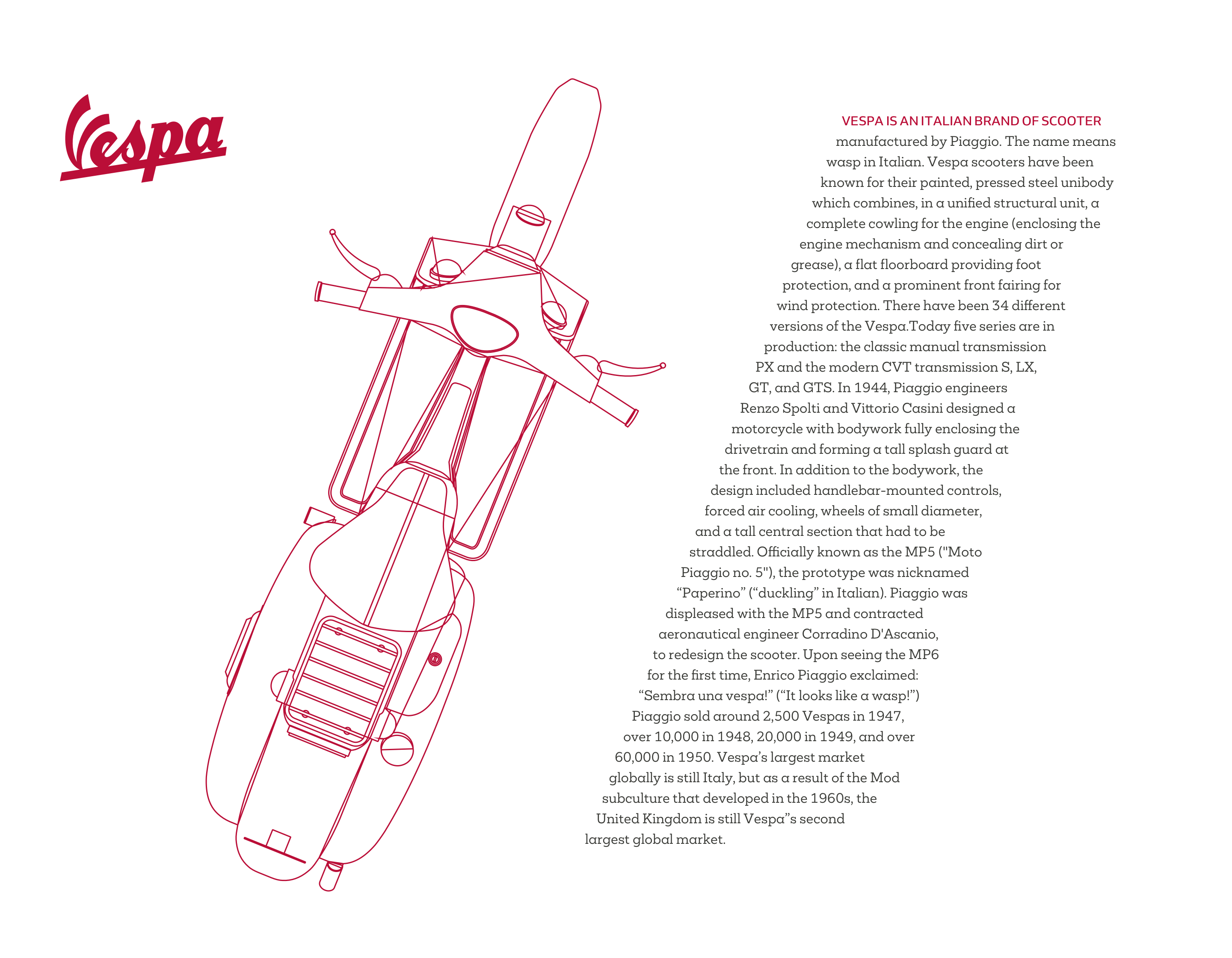
Inside my main element are two SVG images which I use to carve my running text into its shape. To prevent these presentational images being announced by screen readers, I give them both an aria-hidden attribute and a value of true:
<img src="shape-1.svg" alt="" aria-hidden="true">
<img src="shape-2.svg" alt="" aria-hidden="true">
<p>…</p>
Using what should be by now a familiar 6+4 compound grid, I apply Grid to the body element and place the header and main elements using line numbers:
@media screen and (min-width : 64em) {

body {
display: grid;
grid-template-columns: 2fr 1fr 1fr 2fr 2fr 1fr 1fr 2fr; }

header {
grid-column: 1 / 5; }

main {
grid-column: 5 / 9; }
}
Next, I rotate the header image clockwise by twenty degrees and place its transform-origin in the centre horizontally and vertically to ensure it stays in the middle of my header:
header picture {
transform: rotate(20deg);
transform-origin: 50% 50%; }
Finally, I float the first image left, and the second image right, so that my running text flows between them and mirrors the shape of the rotated image opposite. I don’t need a class attribute on these images. Instead, I use an attribute selector which targets the image source:
[src*="shape-1"],
[src*="shape-2"] {
width: 200px;
height: 100vh; }

[src*="shape-1"] {
float: left;
shape-outside: url('mask-1.svg'); }

[src*="shape-2"] {
float: right;
shape-outside: url('mask-2.svg'); }
Tools like CSS Shapes now give us countless opportunities to capture readers’ attention and keep them engaged. I hope by now, you’re as excited about them as I am.
Developing Pictures And Text
When Brodovitch became frustrated with the commercial constraints of working on Harper’s Bazaar, in 1949, he began collaborating on Portfolio, the short-lived, but significant graphic design magazine. Running to just three issues, Portfolio allowed Brodovitch to focus on not just a magazine, but a “graphic experience.”
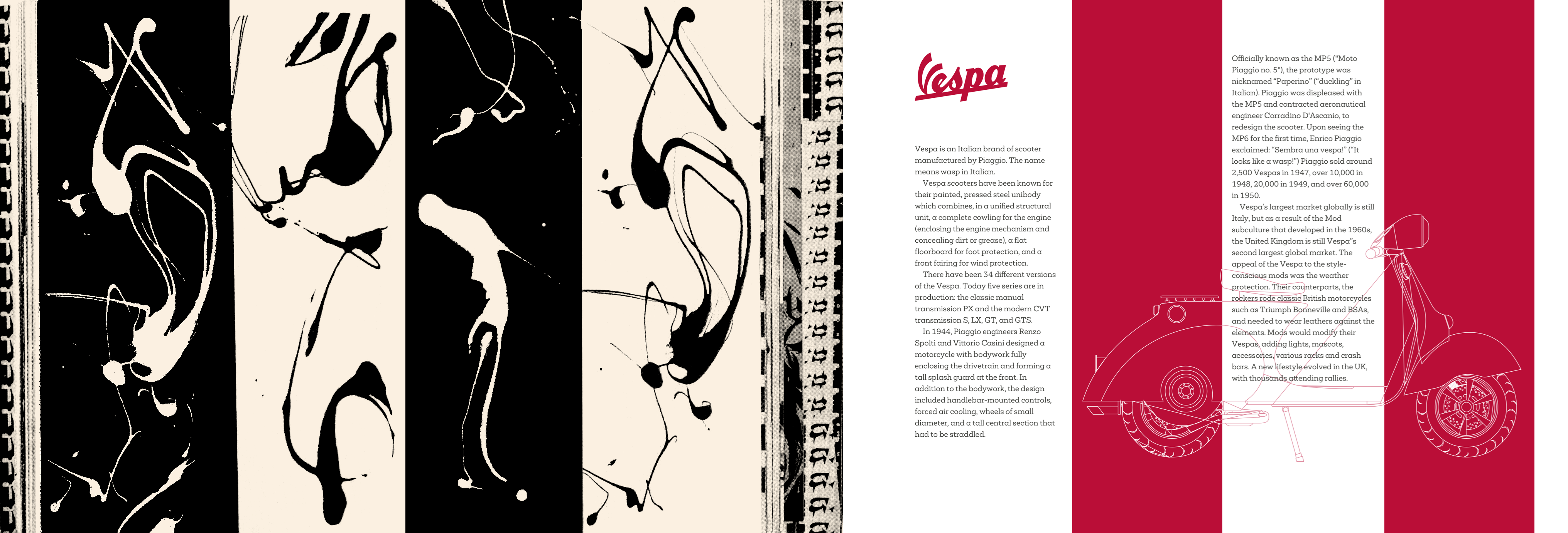
In issue 2 of Portfolio, Brodovitch designed a spread on the work of abstract-expressionist artist Jackson Pollock. In his design, shapes flow between columns which extend the full height of the page. I want to achieve the same style in my next Brodovitch inspired design, but whereas Brodovitch’s spread includes no copy, mine has two columns of running text. I also want the image behind my text to grow and shrink as the viewport changes size.
My markup for implementing this design contains only the bare minimum of main and aside elements:
<main>…</main>
<aside>…</aside>
The aside also contains a division which I use to place the running text onto my grid, and a figure element containing the images I need to accomplish the design:
<aside>
<div>…</div>
<figure>
<img src="clip-left.svg" alt="">
<img src="clip-center.svg" alt="">
<img src="clip-right.svg" alt="">
</figure>
</aside>
This design feature should be visible at any screen size, so before implementing layout styles, I set up the figure’s three separate images. The left and right images are white on a red background, and the centre image has red outlines on a white background. My first task is to establish the figure element as a positioning context for its descendants and position them absolutely in the top-left of my figure:
figure {
position: relative; }

figure img {
position: absolute;
top: 0;
left: 0; }
Next, I use the clip-path property to clip each of the images so that only one-third of them is visible:
figure img:nth-of-type(1) {
z-index: 2;
clip-path: polygon(0% 0%, 0% 100%, 33.33% 100%, 33.33% 0%); }

figure img:nth-of-type(2) {
z-index: 1;
clip-path: polygon(0% 0%, 100% 0%, 100% 100%, 0% 100%); }

figure img:nth-of-type(3) {
z-index: 2;
clip-path: polygon(100% 0%, 66.66% 0%, 66.66% 100%, 100% 100%); }
With these images positioned, I add layout styles for larger screens to place the main and aside elements onto my grid:
@media screen and (min-width : 64em) {

body {
grid-template-columns: 2fr 1fr 1fr 2fr 2fr 1fr 1fr 2fr;
grid-column-gap: 2vw; }

main {
grid-column: 1 / 3; }

aside {
grid-column: 3 / -1; }
}
To create the effect of three columns which extend to the full height of my page, I specify the full viewport height on my body element, then use a CSS gradient background image to give my aside element its column style. The percentage stop values in this gradient match the 33.33% widths of my clipped images:
body {
height: 100vh; }

aside {
background-image: linear-gradient(to right,
#ba0e37 33.33%,
#fff 33.33%,
#fff 66.66%,
#ba0e37 66.66%); }
All that remains is to place my column of running text and figure in the aside, so I apply grid values to the aside and place the division and figure using line numbers. As these elements overlap on my grid, I use z-index to push the figure backwards and my running text forward:
aside {
display: grid;
grid-template-columns: 1fr 1fr 1fr;
grid-template-rows: 1fr 1fr; }

aside div {
z-index: 2;
grid-column: 2;
grid-row: 1 / 3; }

figure {
z-index: 1;
grid-column: 1 / -1;
grid-row: 2; }
This design may look complicated and on a first glance may not seem achievable across a range of screen sizes, but it’s surprisingly simple to develop. It retains its personality from small screens to larger ones and is flexible at every size in-between.
Flexible designs which include precisely positioned elements were previously tricky to implement using floats and CSS positioning. Modern CSS techniques have made these designs much more straightforward to accomplish, which I hope will result in a new generation of inspired designs.
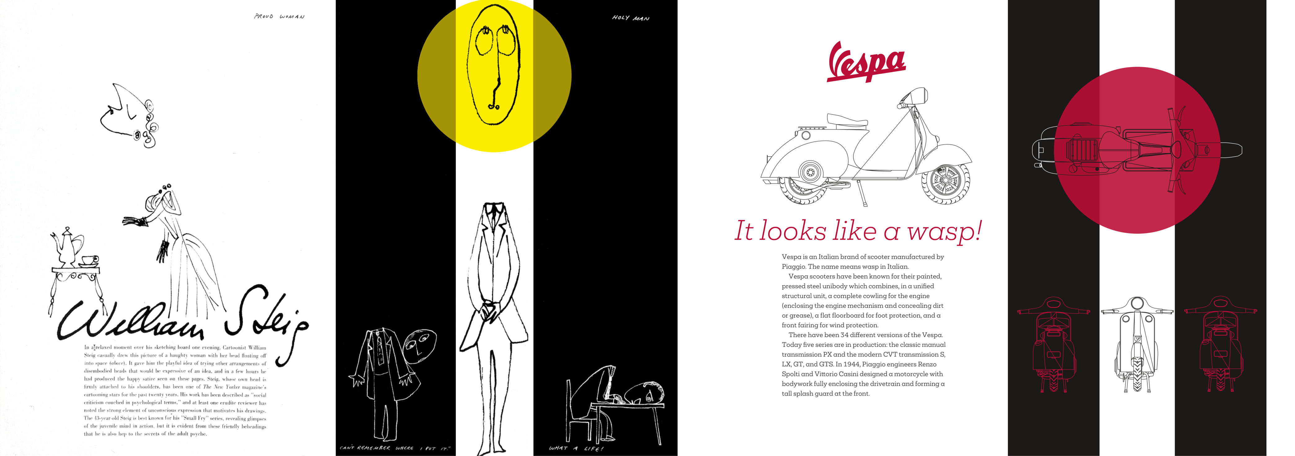
My final design is again inspired by a spread from Portfolio’s second issue. Here, Brodovitch used a striking combination of black and white columns and a bold splash of colour. Implementing this design needs just two structural elements; a main and footer element:
<main>…</main>
<footer>…</footer>
My main element contains a headline logo, an image, and a block of running text. The footer includes two divisions, each containing a set of SVG images to accomplish the effect:
<main>
<h1 aria-label="Vespa"><svg>…</svg></h1>
<img src="vespa.svg" alt="Vespa">
<h2>…</h2>
<p>…</p>
</main>

<footer>
<div>…</div>
<div>…</div>
</footer>
For medium-size screens, I place these elements on my grid using named lines:
@media screen and (min-width : 48em) {

body {
display: grid;
grid-template-columns: [main] 1fr [footer] 1fr;
min-height: 100vh; }

main {
grid-column: main; }

footer {
grid-column: footer; }
}
To adjust my layout proportions for larger screens, I need only change values for grid-template-columns on the body element:
@media screen and (min-width : 64em) {

body {
grid-template-columns: [main] 2fr [footer] 3fr; }
}
Content in the main element needs only basic styling, but the footer which occupies the right half of larger screens requires more. To accomplish this footer’s striped column effect, I again use a linear gradient and four percentage-based colour stops:
footer {
background-image: linear-gradient(to right,
#000 33.33%,
#fff 33.33%,
#fff 66.66%,
#000 66.66%); }
Each footer division contains a set of three SVG images:
<footer>
<div>
<img src="top-left.svg" alt="">
<img src="top-center.svg" alt="">
<img src="top-right.svg" alt="">
</div>

<div>
<img src="bottom-left.svg" alt="">
<img src="bottom-center.svg" alt="">
<img src="bottom-right.svg" alt="">
</div>
</footer>
Styling the footer’s second division involves turning it into a flex container. As the browser’s default Flexbox styles include a horizontal flex-direction and no wrapping, I need just a single line of CSS:
footer div:nth-of-type(2) {
display: flex; }
To ensure my images grow to fill the columns, but never exceed their width, I apply the flex-grow property and a value of 1, plus a max-width value of 33% to match my columns:
footer div:nth-of-type(2) img {
flex: 1;
max-width: 33%; }
The CSS clip-path property enables you to clip and element so that only part of it remains visible. These clipping paths can be any shape, from basic circles and eclipses to complex polygon shapes with any number of coordinates.
- 1. For the first image, I clip the right side leaving only the portion on the left visible (black area.)
- 1. I position the second image absolutely and use a lower z-index value to send it to the bottom of my stacking order.
- 1. For the third and final image, I clip the left side leaving only the portion on the right visible.
- 1. My final result includes an SVG circle positioned over my images. A mix-blend mode tints the colour of elements below it in my stacking order.
For the images in the first division, I again position them absolutely within a positioning context, then use the clip-path property to clip each one so that only one-third of them is visible:
footer div:nth-of-type(1) {
position: relative;
min-height: 300px; }

footer div:nth-of-type(1) img {
position: absolute;
top: 0;
left: 0; }

footer div:nth-of-type(1) img:nth-of-type(1) {
clip-path: polygon(0% 0%, 0% 100%, 33.33% 100%, 33.33% 0%); }

footer div:nth-of-type(1) img:nth-of-type(2) {
clip-path: polygon(0% 0%, 100% 0%, 100% 100%, 0% 100%); }

footer div:nth-of-type(1) img:nth-of-type(3) {
clip-path: polygon(100% 0%, 66.66% 0%, 66.66% 100%, 100% 100%); }
My final task is to add an SVG circle which uses a mix-blend-mode to blend its colour with elements behind it:
footer div:nth-of-type(1) svg {
position: absolute;
mix-blend-mode: darken; }
Since I discovered his work, Alexey Brodovitch has been the most substantial influence on the work I make for the web and how I encourage my students to think about theirs. His inability to accept anything mediocre has pushed me to think beyond what’s expected from product and website design. I hope my designs include his dash of daring.
Read More From The Series
- Inspired Design Decisions: Avaunt Magazine
- Inspired Design Decisions: Pressing Matters
- Inspired Design Decisions: Ernest Journal
- Inspired Design Decisions: Bea Feitler
- Inspired Design Decisions: Neville Brody
- Inspired Design Decisions: Otto Storch
- Inspired Design Decisions: Herb Lubalin
- Inspired Design Decisions: Max Huber
- Inspired Design Decisions: Giovanni Pintori
- Inspired Design Decisions: Emmett McBain
- Inspired Design Decisions: Bradbury Thompson
NB: Smashing membersSmashing members have access to a beautifully designed PDF of Andy’s Inspired Design Decisions magazine and full code examples from this article. You can buy this issue’s PDF and examples as well as every other issue directly from Andy’s website.
Further Reading
- Conversational Design Essentials: Tips For Building A Chatbot
- Conversational Interfaces: Where Are We Today? Where Are We Heading?
- Is The Internet Killing Creativity?
- Improving The Double Diamond Design Process
 (ra, yk, il, mrn)

