A Guide To Optimizing Images For Mobile

Email Newsletter
Weekly tips on front-end & UX.
Trusted by 182,000+ folks.
(This is a sponsored article.) You know how critical it is to build websites that load quickly. All it takes is for a page to load one second too long for it to start losing visitors and sales. Plus, now that Google has made mobile-first indexing the default, you really can’t afford to let any performance optimizations fall by the wayside what with how difficult it can be to get your mobile site as speedy as your desktop.
Google takes many factors into account when ranking a website and visitors take maybe a handful of factors into account when deciding to explore a site. At the intersection of the two is website speed.
It should come as no surprise that images cause a lot of the problems websites have with speed. And while you could always just trim the fat and build more minimally designed and content-centric sites, why compromise?
Images are a powerful force on the web.
Not only can well-chosen images improve the aesthetics of a site, but they also make it easier for your visitors to consume content. Of course, there are the SEO benefits of images, too.
So, today, let’s focus on how you can still design with as many images as you want without slowing down your website. This will require you to update your image optimization strategy and adopt a tool called ImageKit, but it shouldn’t take much work from you to get this new system in place.
The Necessity Of An Image Optimization Strategy For Mobile
According to HTTP Archive:
- The median size of a desktop website in 2019 is 1939.5 KB.
- The median size of a mobile website in 2019 is 1745.0 KB.
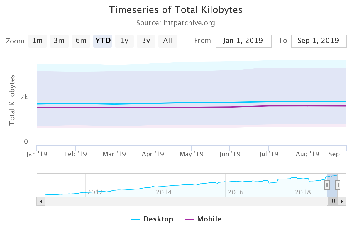
If we don’t get a handle on this growth, it’s going to be impossible to meet consumer and Google demands when it comes to providing fast websites. That or we’re going to have to get really good at optimizing for speed.
Speaking of speed, let’s see what HTTP Archive has to say about image weight.
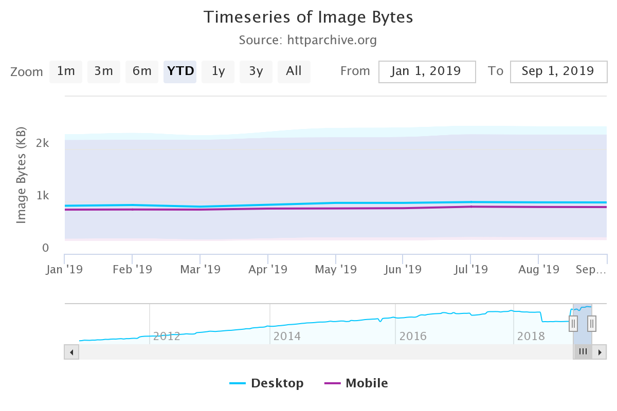
As it stands today:
- The median size of images on desktop is 980.3 KB out of the total 1939.5 KB.
- The median size of images on mobile is 891.7 KB out of the total 1745.0 KB.
Bottom line: images add a lot of weight to websites and consume a lot of bandwidth. And although this data shows that the median size of images on mobile is less than their desktop counterparts, the proportion of images-to-website is slightly larger.
That said, if you have the right image optimization strategy in place, this can easily be remedied.
Here is what this strategy should entail:
1. Size Your Images Correctly
There are lots of tedious tasks you’d have to handle without the right automations in place. Like resizing your images.
But you have to do it, right?
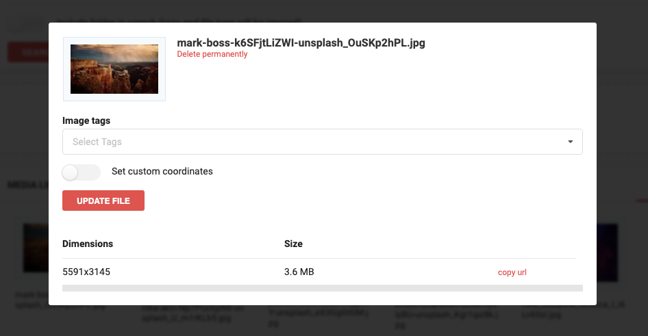
Let’s say you use Unsplash to source a number of images for a website you’re working on.
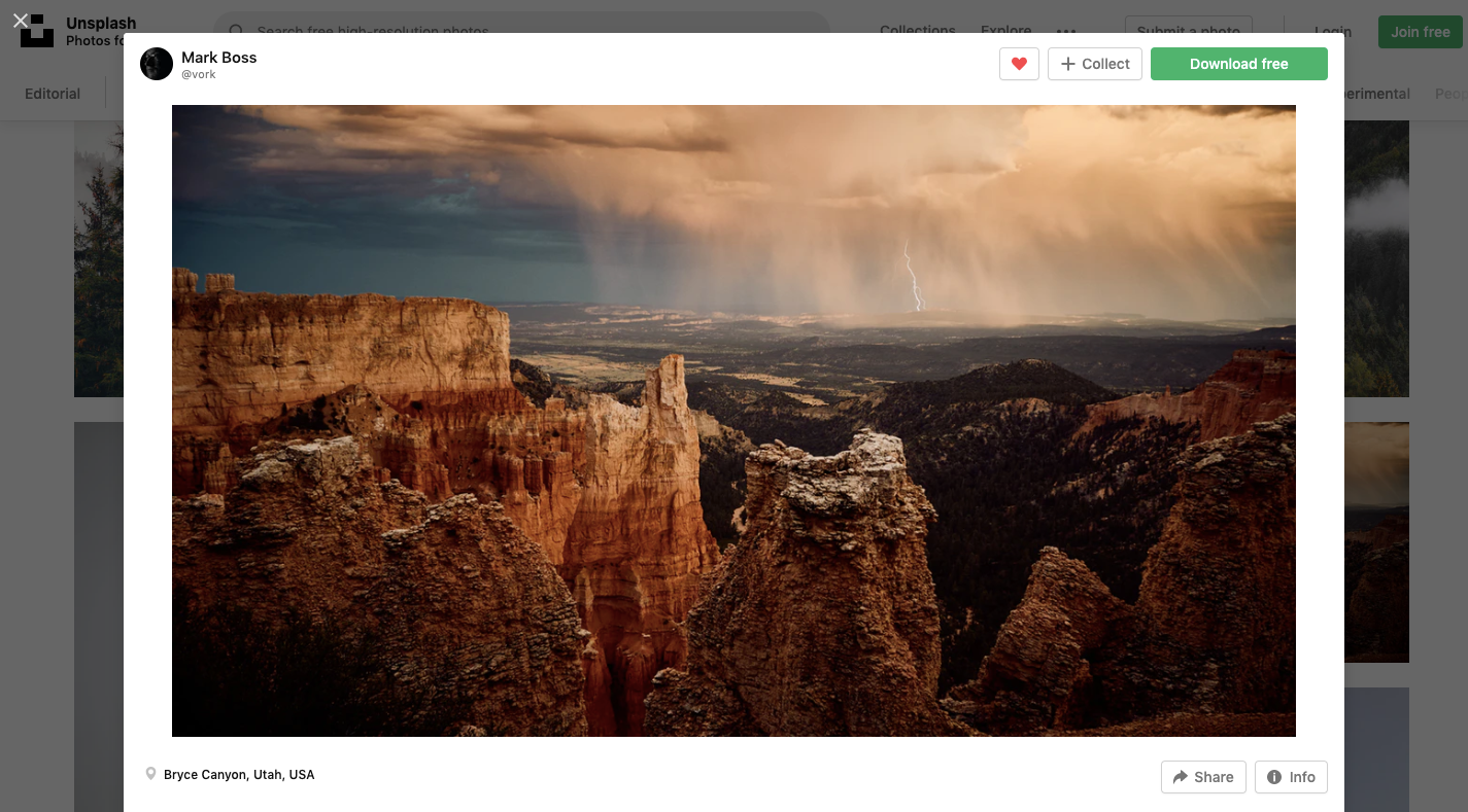
Unlike premium stock repositories where you might get to choose what size or file format you download the file in, you don’t get a choice here.
So, you download the image and any others you need. You then have the choice to use the image as is or manually resize it. After looking at the size of the file and the dimensions of the image, you realize it would be a good idea to resize it.
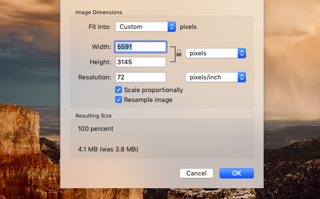
This particular image exported as a 3.6 MB file and a 5591×3145 px image. That’s way too big for any website.
There’s no reason to upload images larger than 1 MB — and that’s even pushing it. As for dimensions? Well, that depends on the width of your site, but I think somewhere between 1200 and 2000 px should be your max.
You’re going to have to go through this same process whether images come from a stock site or from someone’s DSLR. The point is, no source image is ever going to come out the “right” size for your website, which means resizing has to take place at some point.
What’s more, responsive websites display images in different sizes depending on the device or browser they’re viewed on. And then there are the different use cases — like full-sized image vs. thumbnail or full-sized product photo vs. featured image.
So, there’s more resizing that has to be done even after you’ve gone through the trouble of manually resizing them.
Here’s what you shouldn’t do:
- Resize images one-by-one on your own. It’s time-consuming and inefficient.
- Rely on browser resizing to display your images responsively as it can cause issues.
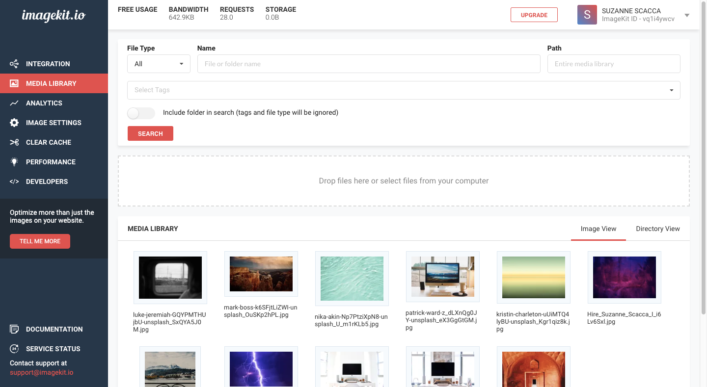
Instead, you can integrate your existing image server (on your web host) or external storage service (like S3) with ImageKit. Or you can use ImageKit’s Media Library to store your files.
As you can see, ImageKit has accepted the upload of this Unsplash photo at its original dimensions and sizes. The same goes for wherever your files originate from.
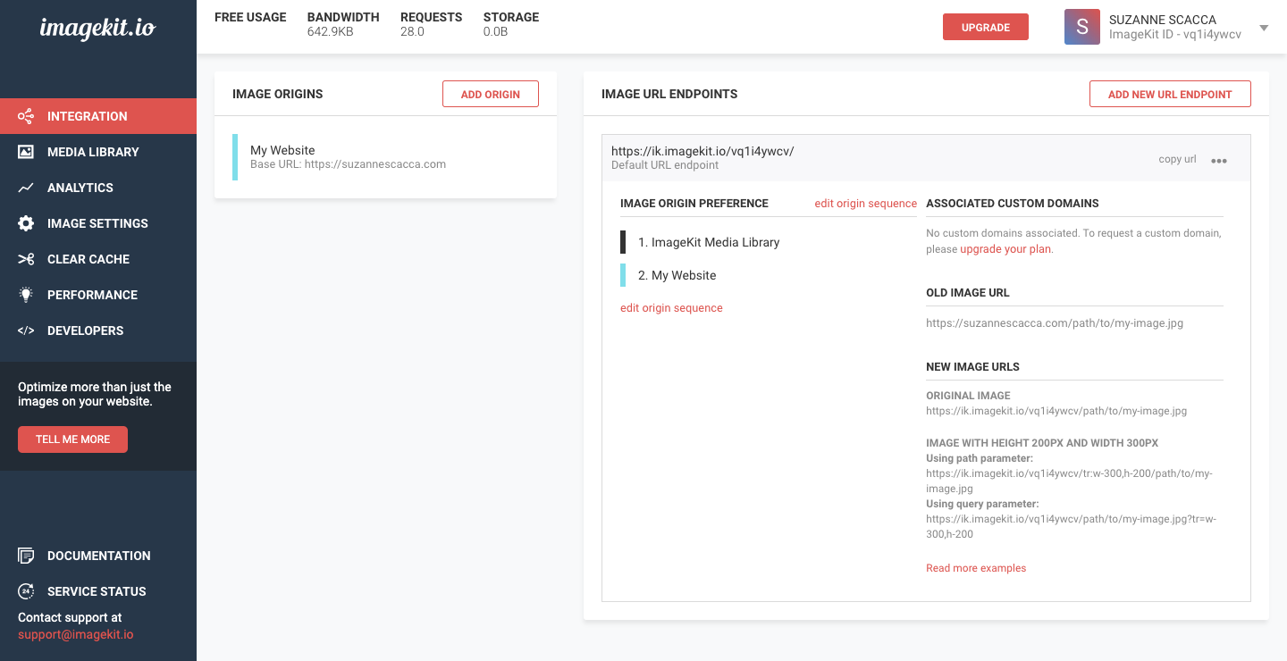
However, once you integrate your images or image storage with ImageKit, the tool will take control of your image sizing. You can see how that’s done here:
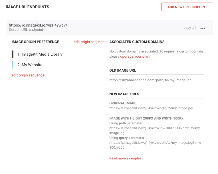
Let me briefly explain what you’re looking at above:
- The Image Origin Preference tells ImageKit where images need to be optimized from. In this case, it’s the ImageKit Media Library and they’ll be served over my website.
- The Old Image URL is a reminder of where our images lived on the server.
- The New Image URLs explains where your images will be optimized through ImageKit.
The formula is simple enough. You take the original URL for your image and you transform it with the new ImageKit URL.
The ImageKit URL alone will instantly shrink the size of your image files. However, if you want to do some resizing of your image’s dimensions while you’re at it, you can use transformation parameters to do so.
For example, this is the Unsplash photo as seen from the media library of my website. It lives on my own servers, which is why the address shows my own URL:
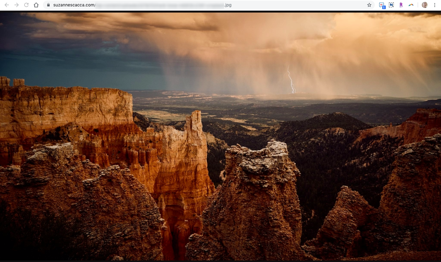
To see what it looks like once ImageKit has transformed it, I swap out my domain name with the endpoint provided by ImageKit. I then add my image resizing parameters (they allow you to do more than just resize, too) and reattach the remainder of the URL that points to my image storage.
This is what happens when I use ImageKit to automatically resize my image to 1000×560 pixels:
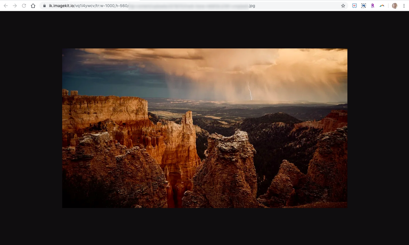
To create this resized image, I transformed the ImageKit URL into the following:
https://imagekit.io/vq1l4ywcv/tr:w-1000,h-560/…
It’s the width (w-) and height (h-) parameters that reduced the file’s dimensions.
Now, as you can see, this isn’t as pixel-perfect as the original image, but that’s because I have quite a bit of compression applied to the file (80%). I’ll cover how that works below.
In the meantime, let’s focus on how great the image still looks as well as the gains we’re about to get in speed.
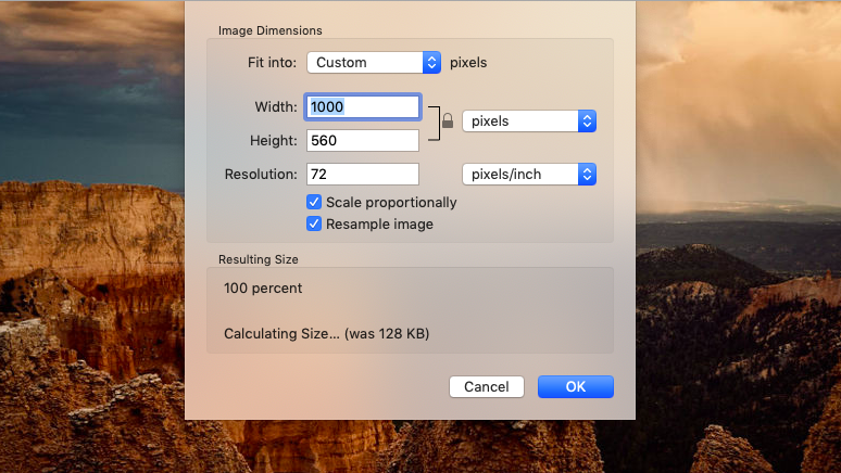
Previously, this was a 3.6 MB file for the 5591×3145 px image. Now, it’s a 128 KB file for the 1000×560 px image.
To sweeten the deal further, ImageKit makes it easy to resize your images this way using URL-based image transformation. Essentially, it works like this:
- You save one master image to ImageKit’s media library or your preferred server.
- ImageKit automatically uses multiple techniques to bring down the image size significantly.
- You can then use ImageKit’s resizing and cropping parameters to modify each image to cater to different device resolutions and sizes.
When 91mobiles took advantage of this form of image optimization, it saved its website 3.5 TB every month of bandwidth. And they didn’t have to do anything but integrate with the platform. There was no need to move their images to ImageKit or another third-party storage service. It all took place within their legacy infrastructure.
2. Use Faster-loading Image Formats
It’s not just the size of your images that drain storage space and bandwidth. The file types you use have an impact, too.
PNGs, in general, are used for things like logos, images containing text and other super-fine images that have a transparent background. While you can use them to save your photos, they tend to produce the largest sizes. Even when lossless compression is applied, PNGs still remain larger in size than other file types.
GIFs are the animated counterpart of PNGs and use lossless compression as well.
JPGs, on the other hand, are best suited for colorful images and photos. They’re smaller in size and they shrink down with lossy compression. It’s possible to compress JPGs enough to get them to a manageable size, but you have to be careful as lossy compression degrades the overall quality of a file and there’s no turning back once it’s been done.
WebPs have been gaining in popularity since Google introduced them in the early 2010s. According to a Google study, WebPs can be anywhere between 25% and 34% smaller than JPGs. What’s more, you can use both lossy and lossless compression on WebPs to get them down to even smaller sizes.
Something to keep in mind with WebPs is that they’re not universally accepted. As of writing this, WebPs aren’t accepted by iOS devices. However, the latest versions of all other browsers, Google or otherwise, will gladly display them.
As for how ImageKit helps with this, it’s simple really:
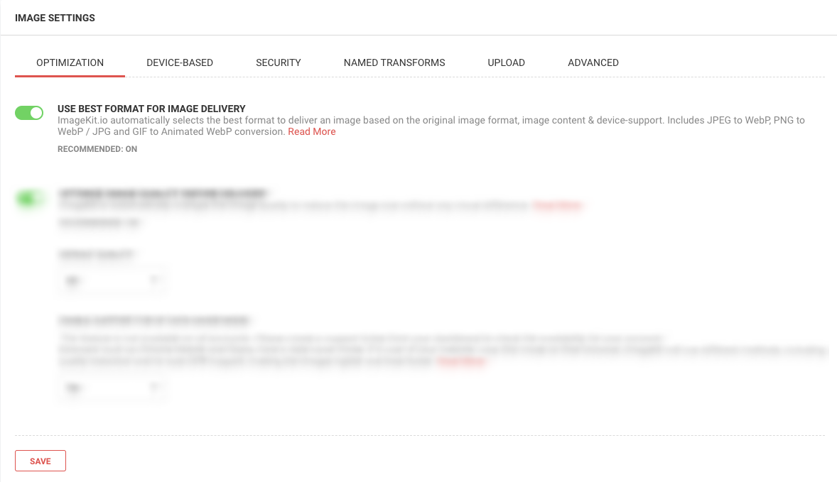
When this setting is configured, ImageKit automatically determines the best file format to deliver each of your files in. It takes into account what the original image format and content was along with whether or not the visitor’s device supports it.
JPGs, PNGs and GIFs will all be converted into WebPs when possible — say, if the visitor visits from Chrome (which accepts them). If it’s not possible — say, if the visitor visits from Safari (which doesn’t accept them) — ImageKit will convert to the best (i.e. smallest) format with the defined transformations. This might be a PNG or JPG.
Nykaa was able to capitalize on this image optimization strategy from ImageKit. Even though their website had already been designed using a mix of JPGs and PNGs and were stored in a number of places around the web, ImageKit took care of automating the image formats right from the original URLs.
3. Compress Images
Next, we need to talk about image compression. I’ve already referenced this a couple times, but it breaks down to two types:
Lossless
This form of compression is used on PNGs and GIFs. To compress the file, metadata is stripped out. This way, the integrity of the image remains intact, but the file shrinkage isn’t as substantial as you’d get with lossy compression.
Lossy
This form of compression is applied to JPGs and WebPs. To compress the file, some parts of the image are “lost”, which can give certain spots a granier appearance than the original image. In most cases, it’s barely noticeable unless you look closely at a side-by-side of the two images. But to your visitors, the degradation is easy to miss since there’s no original to compare against.
With lossy compression, you get to control what percentage of the file degrades. A safe range would be anything over 70% to 80%. ImageKit, by default, sets its optimization for 80% and it estimates that you can save at least 20% to 25% of your file size just from that. In reality, though, it’s probably more (we’re looking at upwards of 40% like in the Unsplash image example above):
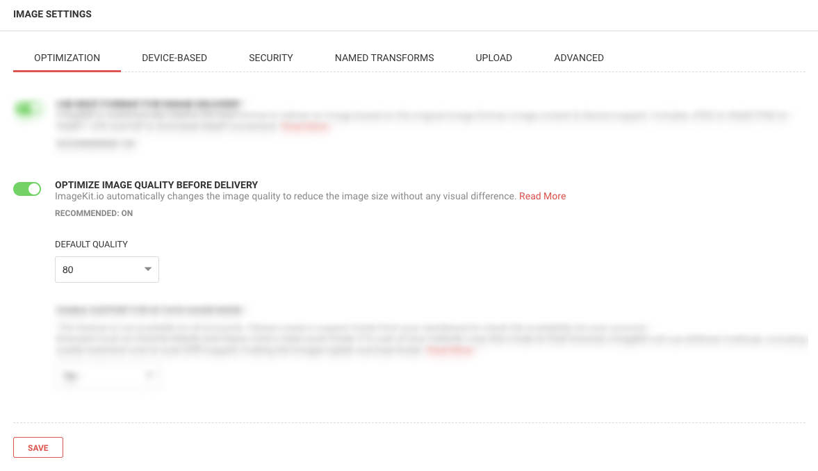
You can change this to whatever default you believe will maintain quality while giving you the image sizes that help your site load quickly.
Whether you use the default or your own optimization setting, remember to switch on the additional compression settings available under the Advanced tab.
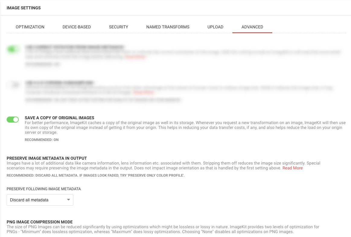
These three settings, in particular, will enable you to do as much compressing and as safely as possible.
The first setting “Save a Copy”, for instance, keeps your original images on the ImageKit server. That way, you have a copy of the image pre-compression without having to manage the burden of it on your own server.
The second setting “Preserve Image Metadata” enables you to apply lossless compression when feasible.
And the last setting “PNG Image Compression Mode” allows you to decide what level of lossless optimization you want to use on your PNGs: maximum, minimum or none.
When done, you’ll end up with results like this side-by-side comparison:

This is a JPG from Unsplash. Can you tell which is the original and which is the compressed and resized version from ImageKit?
The one on the left with the black trim is:
- 1500×1005 px
- 266 KB
- Compressed at 95%
The one on the right with the white trim is:
- 5444×3649 px
- 2.5 MB
- Original
It’s up to you to decide which of the ImageKit compression and optimization settings you’re most comfortable using and then configure accordingly.
4. Save To And Pull Images From External Server
There are two ways to run images through ImageKit.
The first is by uploading your images directly to its Media Library:
The second is by integrating with your website or external storage service. We’ve actually already seen this part of ImageKit. It’s where you get your URL endpoints from so you can define your image parameters:
Even with all of the optimizations above, you might still be having a hard time with image storage and maintenance — either because of how they affect your speed or how much storage you have to hold them.
For instance, if you store your images on your server, you’ll eventually be constrained for space (unless you have a monster-sized hosting account).
When you’re building massive e-commerce stores or business websites with thousands or even millions of images and corresponding image sizes, you can’t afford to be hosting those images on your own. Granted, there is a way to serve them more quickly to visitors (which I’ll explain in the next point), but why take on the burden and cost of additional storage if you don’t have to?
5. Add A CDN
A CDN is another essential optimization tool for large repositories of images. Think of it like a second server, only this one caches (copies) your website and serves them through data centers located significantly closer to your visitors around the world.
As a result, the time it takes to send your website and its thousands of product images from New York, New York to Bangladesh, India happens insanely fast.
With ImageKit, you get to enjoy the privilege of serving your images not just through its core processing servers, but through AWS CloudFront CDN (included in all plans) which has over 150 locations worldwide.
Sintra, a client of ImageKit, saw a big leap in performance after moving to ImageKit. With the ImageKit image CDN (which has delivery nodes all around the globe), it saw an 18% drop in page load times.
Wrapping Up
What’s especially nice about ImageKit is that it’s not just a preventative measure against slowdowns caused by images. You can use it to retroactively fix and improve mobile websites and PWAs, even if they already have millions of images on them. What’s more, the performance center makes it easy to keep an eye on your website’s images and identify opportunities for speed enhancements.
Plus, as you can see from the tips above, ImageKit has simplified a lot of the work you’d otherwise have to do, whether you’d handle it manually or configure it through a plugin.
With consumers and Google becoming pickier by the day about how quickly websites load on mobile, this is the kind of image optimization strategy you need. It’ll lighten your load while ensuring that any images added before or after ImageKit are optimized to the fullest. Even better, your clients will reap the benefits of more leads and greater conversions.
Further Reading
- How To Hack Your Google Lighthouse Scores In 2024
- Programmatically Discovering Sharing Code With oEmbed
- The Things Users Would Appreciate In Mobile Apps
- Getting Started With Neon Branching
 (yk, mrn)