Signs Your Website Feels More Like A Haunted House Than A Welcoming Home

Email Newsletter
Weekly tips on front-end & UX.
Trusted by 182,000+ folks.

 Celebrating 10 million developers

 Register Free Now
 SurveyJS: White-Label Survey Solution for Your JS App
When building a website or PWA, no one ever thinks, “I really hope my visitors run away in fear!” Yet, one wrong move could make a visit to your website seem like a nightmarish walk through a haunted house instead of an awe-inspiring tour of a new home.
To be clear, I’m not talking about dark color palettes or blood-red typography that might remind someone of something they’d seen in a horror movie. If those kinds of design choices make sense and don’t intrude on readability, go for it! What I’m talking about are those ominous feelings emitted by the design and content of a website — similar to the ones someone might feel when walking through a haunted house.
Dr. Frank T. McAndrew answered the question “What Makes a House Feel Haunted?” in an article on Psychology Today back in 2015. He explains:
“From a psychological point of view, the standard features of haunted houses trigger feelings of dread because they push buttons in our brains that evolved long before houses even existed. These alarm buttons warn us of potential danger and motivate us to proceed with caution.”
When a visitor shows up on your website, the last thing you want is for them to be wary of moving through it. You want your website to give off a welcoming and safe vibe; not one that makes visitors wonder what’s lurking around the corner.
So, today, I want to look at some ways in which a website might be giving your visitors the heebie-jeebies and what you can do to eliminate those haunted house-like elements from the experience.
Four Signs Your Website Feels Like A Haunted House
In a lot of ways, a website is like your home. You add comfortable furnishings to it. You make it feel warm and inviting. And you clean up before anyone comes over, so they’re not freaked out by the accumulated dust or clutter.
If you keep that in the back of your mind (i.e. your website = your home), you can avoid these scary missteps as you design websites (as well as PWAs and mobile apps) for your clients.
1. It Feels Abandoned
There’s a video game and movie called Silent Hill that’s based on Centralia, a real ghost town in Pennsylvania. Decades ago, there was a coal mine fire in the town that led to toxic conditions like the gas and smoke that billow up from the ground to this day.
It’s an element the video game designers and cinematographers latched onto when creating their own eerily abandoned setting for Silent Hill:
Eventually, Centralia was condemned due to the dangers posed by the fire and the resulting toxicity. Today, there are only a few residents who remain in town.
While there are some tourists who venture to Centralia out of curiosity, they don’t stay long. And why would they? The town is unlivable and it’s devoid of any meaningful experiences.
Your website may be sending similar signals if it’s:
- Too simple in design,
- Too outdated looking,
- Devoid of useful content,
- Seemingly uncared for,
- Powered only by a basic chatbot,
- Missing contact details or a working contact form.
The Blockbuster website (which I can’t believe still exists) is a good example of the kinds of signals a website might send to visitors if it were abandoned:
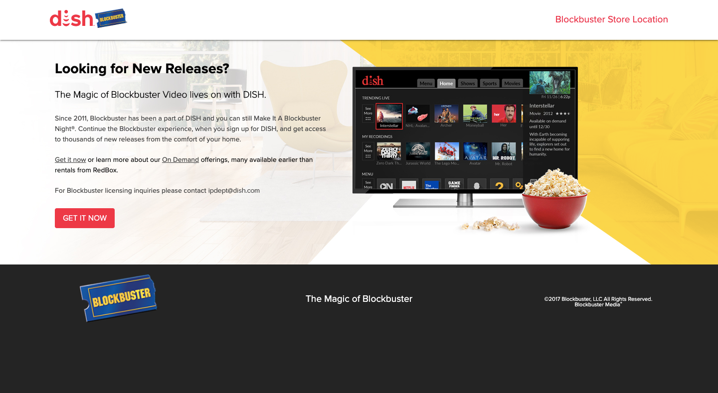
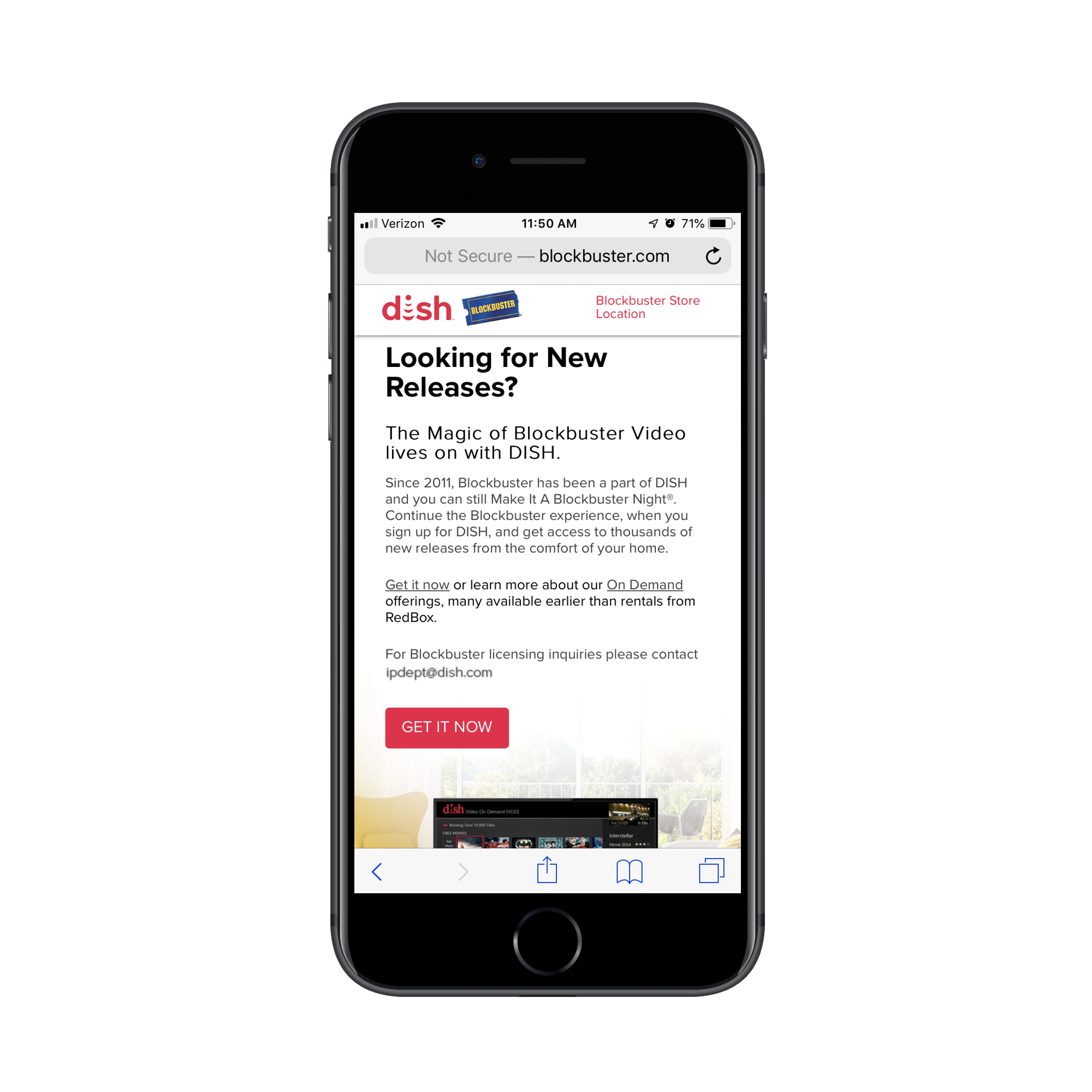
The copyright on this website is from 2017, which is why the design of the site isn’t as bad as one might expect it to be. Even the mobile counterpart is responsive:
That said, this website is nothing but a husk of what it once was in its heyday.
For example, this is what shows when someone clicks on “Blockbuster Store Location”:
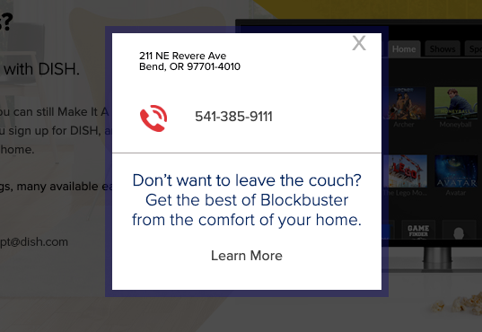
If I had arrived at this site hoping to find a local video store to rent a movie from, I’d be confused by this pop-up. Does the store actually exist at 211 NE Revere Ave? What’s going to happen when I call the number? And why are they telling me I don’t have to leave the couch?
What DISH should’ve done when buying out Blockbuster is to take ownership of this domain, but then direct it to their own website. As it stands now, it feels as though there’s no one on the other side of this website and there’s no point in keeping it alive (much like the business itself).
It’s these kinds of questions and that eerie feeling of “What’s going on here????” that you want to keep your visitors from experiencing.
2. It’s Too Confusing
Another hallmark of a haunted house is excessive confusion. This is something that real-life serial killer H. H. Holmes mastered with his “Murder Castle”.
“This edifice became Holmes’ booby-trapped Murder Castle. The space featured soundproof rooms, secret passages and a disorienting maze of hallways and staircases. The rooms were also outfitted with trapdoors over chutes that dropped Holmes’ unsuspecting victims to the building’s basement.”
— History.com
Interestingly, there is a term in the field of environmental psychology related to this particular quality of a space: legibility.
Essentially, if a space (like a home or a website) has clear pathways and a logical organization, it’s much easier for visitors to get oriented. Not only that, if a layout mirrors that of other spaces, it assists in recognizability and comfort. That sounds a lot like the legibility and navigability of a website, right?
Obviously, you don’t want your visitors to feel as though they’re going to get lost in your website or like they’re trapped within the walls of it. There are a number of things that could make them feel this way though:
- Poor color contrasts,
- Jarring typography or animations,
- Excessively deep navigation without a trail of breadcrumbs,
- Disappearing navigation,
- Infinite scroll,
- Incessant pop-ups and disruptions that won’t go away no matter how many times they’re dismissed,
- An unclear or confusing call-to-action that makes them wonder what happens when they click it.
Let’s look at an example.
How many of you would feel confident pursuing any of the paths (links) available to you on the ARNGREN website?
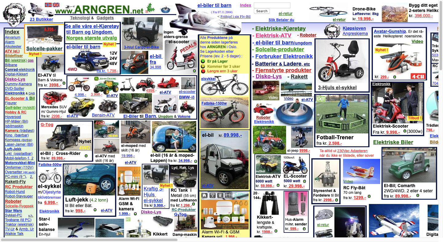
This is what appears when you click on the “PEDALS” image/link in the top-middle of the ARNGREN home page:
As you can see, the “Index” disappears from the left, so the only option visitors have is to click the home page link or hit the browser “Back” button to depart from the path they’ve taken.
Then there’s the page itself which scrolls on and on, showing off more pictures of bicycles and scooters. There are occasional descriptions and links that appear, but it’s really nothing more than a painful rabbit hole to fall down:
This website is exactly how I expect visitors of H. H. Holmes’ Murder Castle felt when they first stepped inside those confusing hallways or fell through one of his trap doors. There’s no rhyme or reason to any of the pages and it almost feels as dangerous to backtrack as it is to move forward.
If you’d like to avoid taking your visitors on such a harrowing journey, focus on creating a clear and open path that’s easy to traverse and to get off of when they want to.
3. It Looks Too Low Budget
It’s not just real haunted houses you want to avoid emulating. You should also steer clear of certain types of haunted house attractions.
I’m what you might call a horror addict. I watch scary movies all year long. I take haunted tours every time I visit a new city. And I spend a good chunk of the months of September and October going to haunted house attractions.
As you can imagine, I’ve seen some really impressive haunted houses, and I’ve seen some that are really poorly done.
This, for instance, is an encounter I had with a street actor at Halloween Horror Nights:
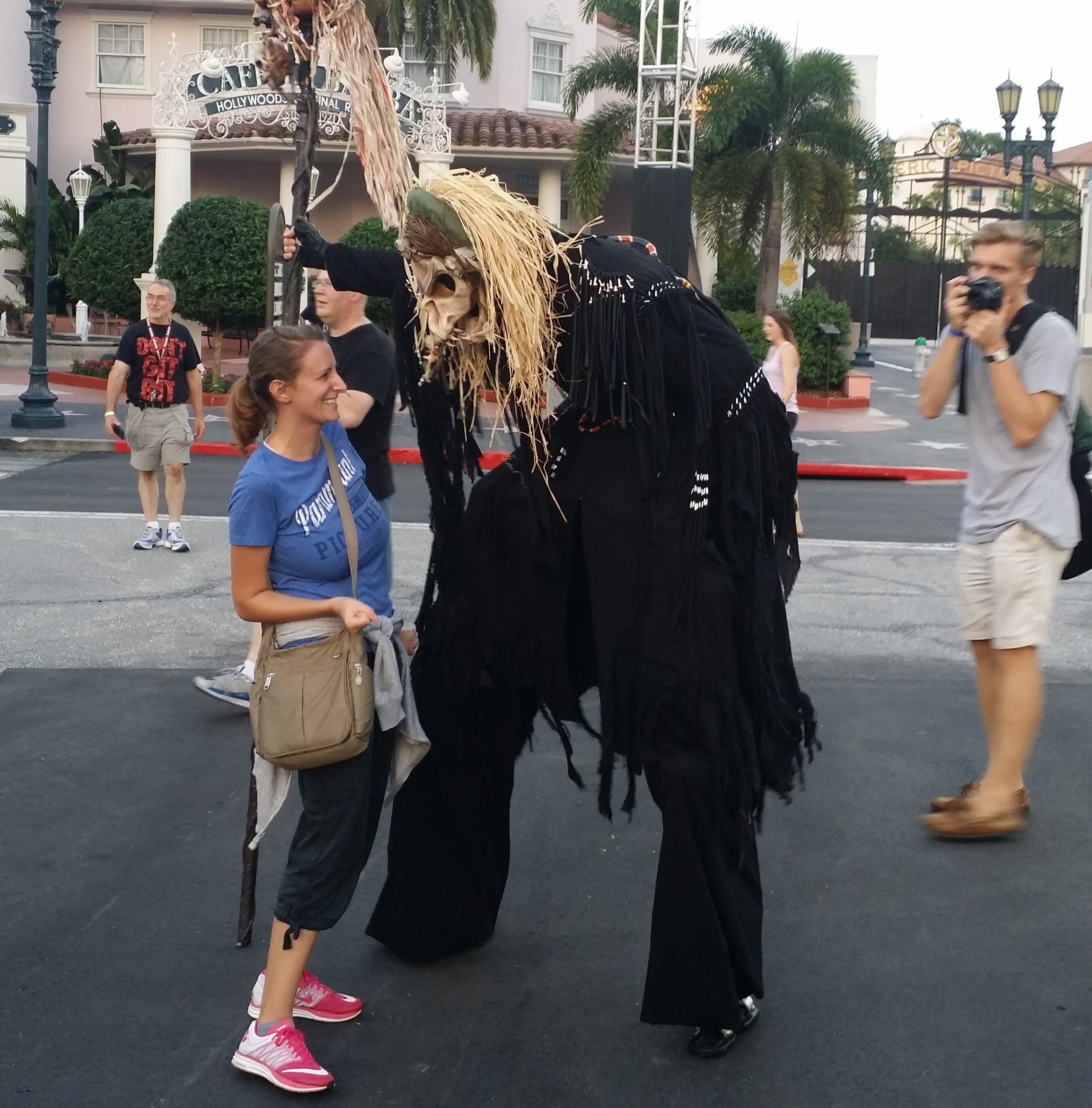
Although I have a slightly cowered stance, you can see that I'm laughing. That’s because I could see his face through the holes of his mask.
Now, this by no means is a low budget haunted house/Halloween event. And this actor deserves all sorts of kudos for walking around steamy hot Florida in that getup and on stilts, no less. But I will say that being there in the daytime where I could see through the mask did deflate my enthusiasm. It also had me wondering if the rest of the experience would be as disappointing. (For the record, it wasn’t.)
You definitely don’t want your visitors noticing flaws, odd design choices and other errors on your site. Then, wondering why the company behind it didn’t put more money into design and development.
If your website looks cheesy, overdone or like it was cheaply thrown together, you’re going to have a big problem on your hands. The rest of the web has set a very high bar for what a website should look like and how it should work. Fail to live up to those expectations and you’ll find that people will start to question the legitimacy or worth of the business behind it.
For instance, this is the website for Yale University’s School of Art:
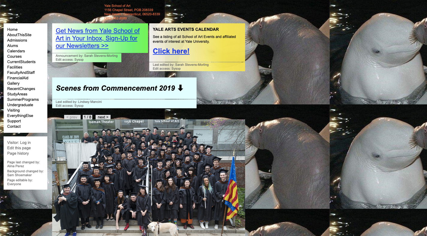
I thought it was a joke, that somehow I’d landed on someone pretending to be Yale University at yale.net instead of yale.edu. But I was wrong. This is the real website of the art department at the Ivy League university.
So, I dug a little further, hoping that somewhere on this subdomain would be an explanation of why this website sucked so much. This is what I found:
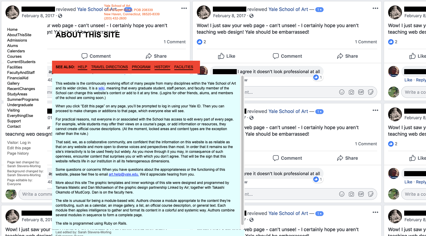
Let me point you to the most revealing parts of the explanation. First, they explain that this site is an open-source wiki:
"It is a wiki, meaning that every graduate student, staff person, and faculty member of the School can change this website’s content or add to it at any time."
Next, they warn you that you may be shocked by what you see:
"As you move through it you may, in consequence of such openness, encounter content that surprises you or with which you don’t agree. That will be the sign that this website reflects life in our institution in all its heterogeneous dimensions."
Considering the editor of this page used a negative review from Facebook as the repeating background image, there must be some inside joke here. In fact, when I looked into it further, it seems as though this school has had a tradition of scary web design choices as far back as 2010. So, they obviously know what they’re doing.
Here’s the thing though: even if you’re designing for someone with as well-known a reputation as Yale, building something that looks like it was thrown together in Paint back in 2001 is no way to go. There’s no exception for design this bad and I don’t think your visitors will be happy that you wasted their time either.
I realize this might help with the virality of a site, but it’ll do nothing for the credibility of it. All you’ll end up with is a few thrill seekers stumbling through in search of a good laugh or shock. What you need instead is visitors who feel comfortable and confident enough to convert.
4. It Looks Unsafe
The last thing that might leave people feeling unsettled is a lack of security (or at least the perception of none).
One of the things I often get asked by people who don’t like scary movies or going to haunted houses is:
“But aren’t you scared?”
Of course, I’m scared! I enjoy all of this horror stuff because I can do so safely from a distance. I know that the scare actors in a haunted house aren’t going to hurt me and I know that Michael Myers isn’t going to pop out of my TV screen and butcher me in the middle of the night. Plus, it’s a much more enjoyable way to get my cardio in without having to hit the treadmill.
I think for some people, though, they don’t have that same sense of security when partaking in activities like these, which is why they steer clear. And this is something you need to be extra careful about when it comes to your website. Specifically, be mindful of:
- Installing SSL certificates on every website.
- Using security badges at checkout.
- Preventing 404 errors.
- Fixing faulty contact forms.
- Blocking spam in comment sections and forums.
- Monitoring for server downtime.
- Repairing the white screen of death.
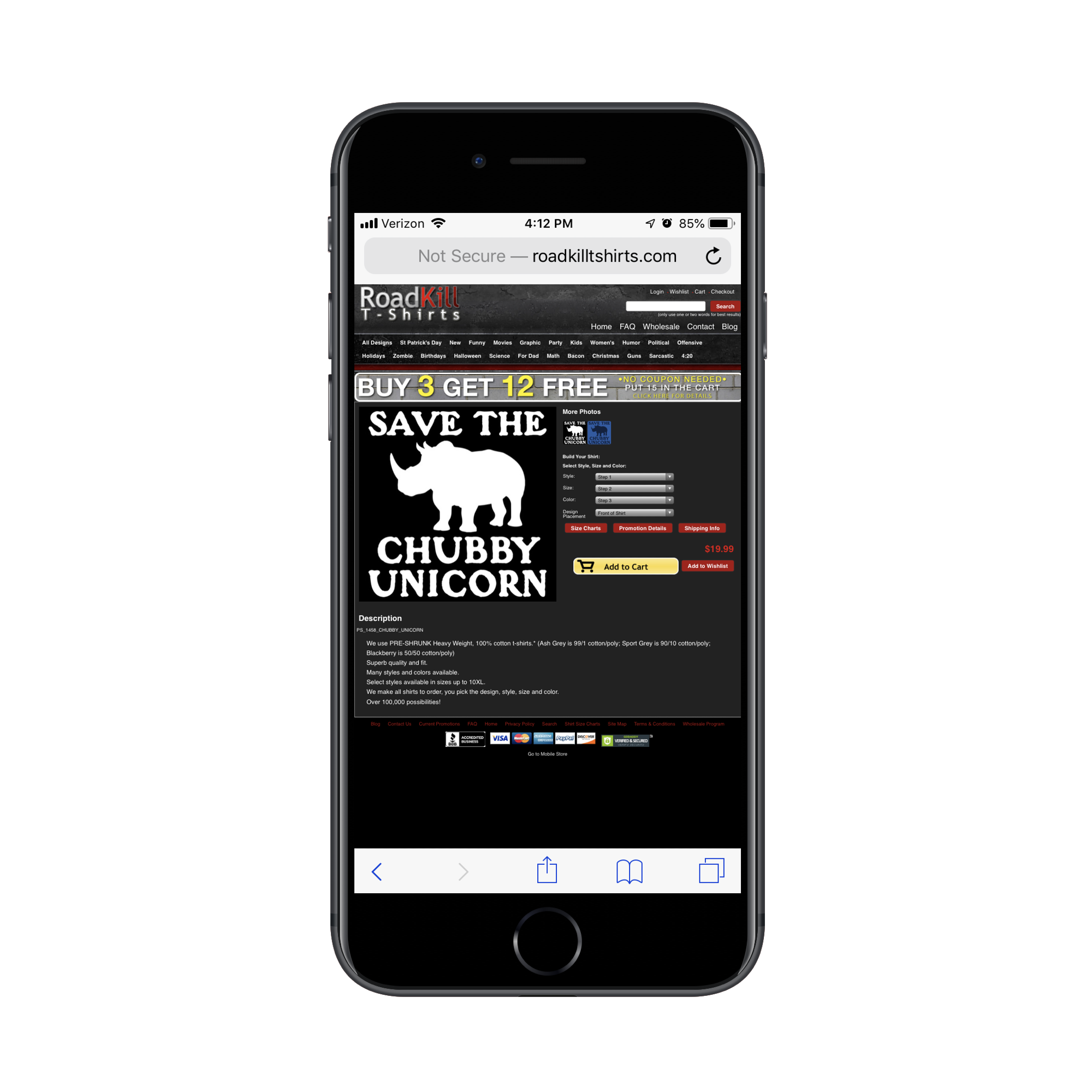
Let’s look at an example of a website that sends a number of red flags pertaining to security. This is RoadKill T-Shirts:
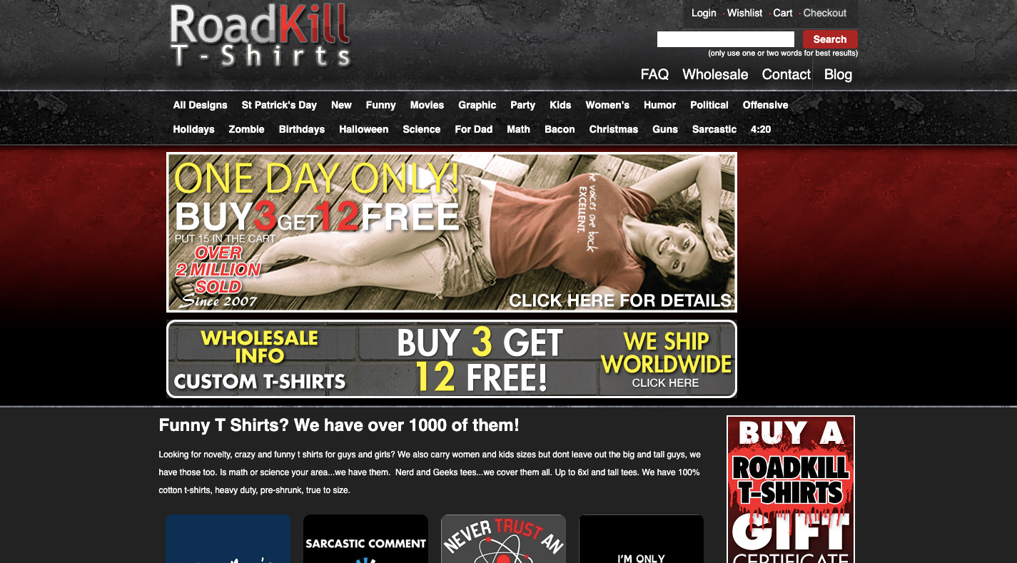
At first glance, you might think this e-commerce website is okay. The design is outdated, but it’s a low-end tee-shirt shop. Visitors can’t be expecting too much from the design.
But then you move over to your mobile device and realize it’s not responsive:
That said, there may be some visitors who are able to look past these design missteps, especially if there’s a tee shirt decal they really want.
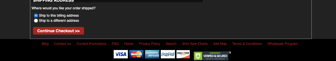
One of the first red flags that should stop them in their tracks though is the “Not Secure” notice in their browser window. Although there is a GoDaddy security seal at the very bottom of the checkout page, I’m not all that sure I’d trust that to protect my purchase as a consumer either.
Then, there’s the matter of the contact form. I was curious to see how secure users would feel about filling in contact information without submitting a payment, so I forced an error:
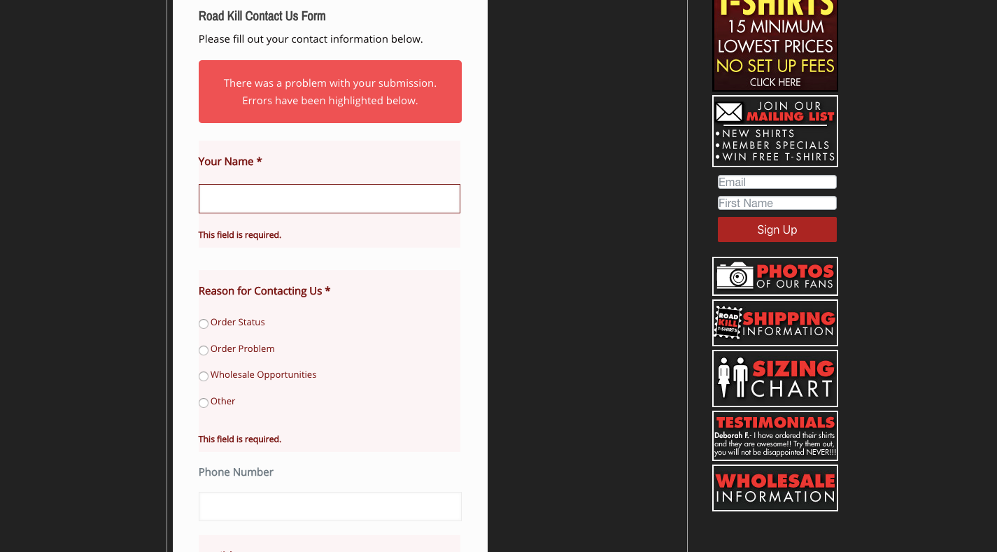
I’m happy to see that the failure to fill in required fields triggered such a response. However, here’s what happens to the bottom of the form as a result:
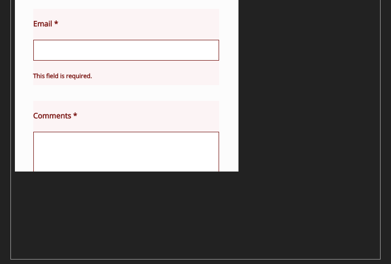
Users can tab down to reveal the “Submit” button. However, what if your visitors don’t know that they can do that? They may just end up abandoning the form and the website altogether if something as simple as the contact form is so fraught with error.
There are a variety of ways a website might seem unsafe to visitors, so do what you can to fortify it on the backend and then provide trust marks on the frontend to put their minds at ease.
Wrapping Up
When a visitor enters your website, what do you want their first thought to be?
“Oh great! There’s the product I was looking for!”
Or:
“Hmmm... Maybe I should go back to Google and see if there’s a different place to buy this product from.”
There are so many ways to give your visitors pause when they visit a website. But if you start looking at your website like a home, you can avoid the common pitfalls that make a website feel more like a haunted house than a warm and welcome homecoming.
Further Reading
- Creating A Magento PWA: Customizing Themes vs. Coding From Scratch
- How To Improve Your Microcopy: UX Writing Tips For Non-UX Writers
- Hidden vs. Disabled In UX
- So Your Website Or App Is Live… Now What?


