What Newspapers Can Teach Us About Web Design

Email Newsletter
Weekly tips on front-end & UX.
Trusted by 182,000+ folks.


 Celebrating 10 million developers
 Custom Web Forms for Angular, React, & Vue. Your backend.

It’s easy to get caught up in the latest trends in web design. Web technology is constantly improving, and today developers have a formidable range of features at their disposal. This makes for a forward-thinking, innovative space — as it should — but also one at risk of being unrooted. Every art has its ancient masters. In the case of websites, it’s newspapers.
When you dig into the basic principles of news design, overlaps with the web are frequent and oftentimes indistinguishable. Many web design best practices can be traced directly back to news design. When it comes down to it, websites are made for users to engage with, and hopefully return to. Newspapers have been playing that game for centuries, and winning.
Anyone with even a passing interest in web design stands to benefit from knowing how news design works, and why it works. This piece will examine several tenets of newspaper design and show their connection to best practice online. At the core of that connection is a principle childlike in its simplicity, one newspaper and web designers alike would do well to remember.
Hold The Home Page
Newspapers have been around since the 17th century. They’ve worked hard for their rules, and because their content changes daily the rules have to be abstract. Ninety-five percent of what we see in any given newspaper will not be there the next day. It is what don’t see that is essential for wrangling the contents of newspapers into shape.
This framework is what we’ll be looking at; some of the invisible rules that hold newspapers together. They are concerned mainly with form, and how readers process information. The parallels with web design will soon become clear, and hopefully the lessons too. Let’s start with an obvious one — above the fold.
Above The Fold
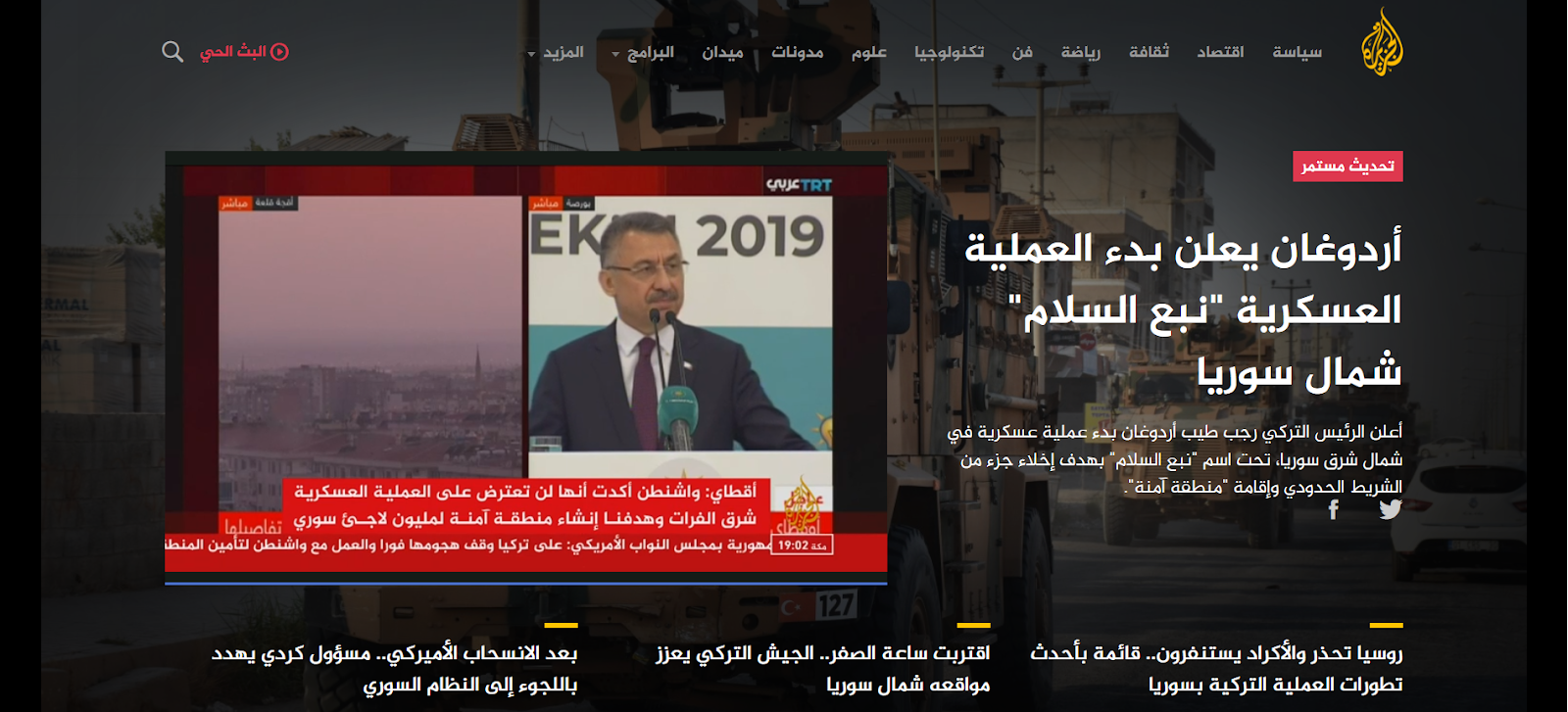
If you’ve worked on the web you’ve likely heard the phrase ‘above the fold,’ meaning the content you’re met with when you land on a web page. It is a newspaper term, and it dates back centuries. Due to their size newspapers are often stacked folded in half, so above the fold literally means the content visible above where they’re folded in half. It is the first thing potential readers see. It is often the one and only chance to make an impression, to get people to buy a copy because they just have to know more. If the newspaper isn’t worth picking up for the front page, what reason is there to think it’s worth picking up at all?
The space above the fold is the domain of the lead story, the most important piece of information in the entire paper. It has to hook the reader. This usually equates to big headlines, key pieces of information, and striking imagery. That said, there is not a rigid format. Whatever grabs people’s attention without distorting the truth is on to a winner.
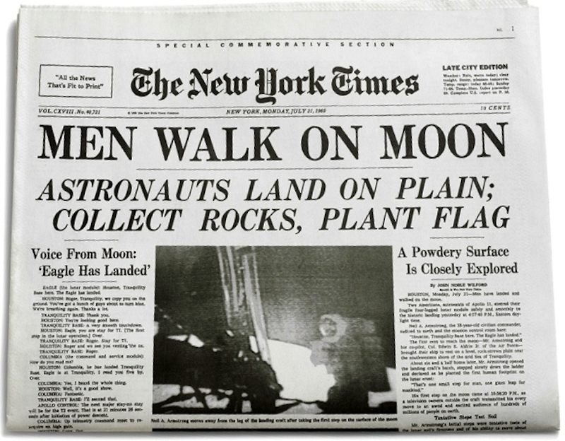
Above the fold is a newspaper’s first and most important answer to ‘the pub test’ — what you’d blurt out if you were telling someone the crux of the story in the boozer. If you had the chance to tell your friends men walked on the moon yesterday, you probably wouldn’t open with the brand of shoes involved. You’d sprint in and yell, “Men have walked on the moon!” That’s above the fold. It’s where newspapers condense the most important story (or stories) of the day to the key points.
The same applies to websites, which no doubt is why the terminology has carried over. ‘Above the fold’ in web design (which online means what you see before scrolling) is the website’s answer to the pub test. What’s the single most important thing people should know? Though this is particularly relevant to home pages, it applies everywhere.
According to a study of 25 million browsers last year, ‘above the fold’ is comfortably the most viewed part of a web page, with engagement peaking just below. From news to ecommerce to social media, the same principle applies: get to the point.
The Gutenberg Principle
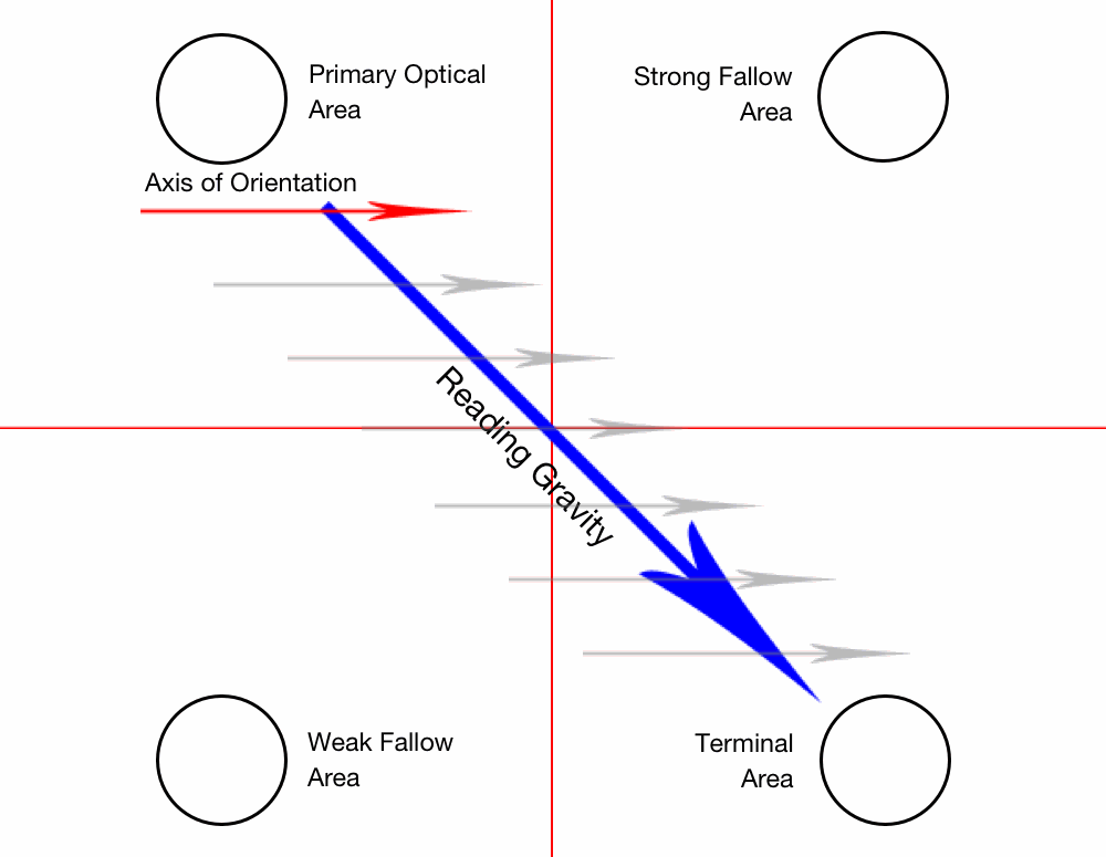
So you’ve grabbed someone’s attention. Congratulations. You’ll need to know about the Gutenberg Principle — or Z-pattern. Championed by ‘the father of newspaper design’ Edmund C. Arnold (more on him later), the Gutenberg Principle is a good rule of thumb to follow when thinking about how people engage with a page of content, be it paper or pixels.
The Gutenberg Principle states that when faced with homogenous content, we start at the top left hand corner and finish at the bottom right hand corner, flicking from right to left as we go. This stems from an idea called reading gravity. We in the western world spend our lives reading from left to right, flicking down and to the left to get to the start of the next line. Newspaper design tends to ape that flow.
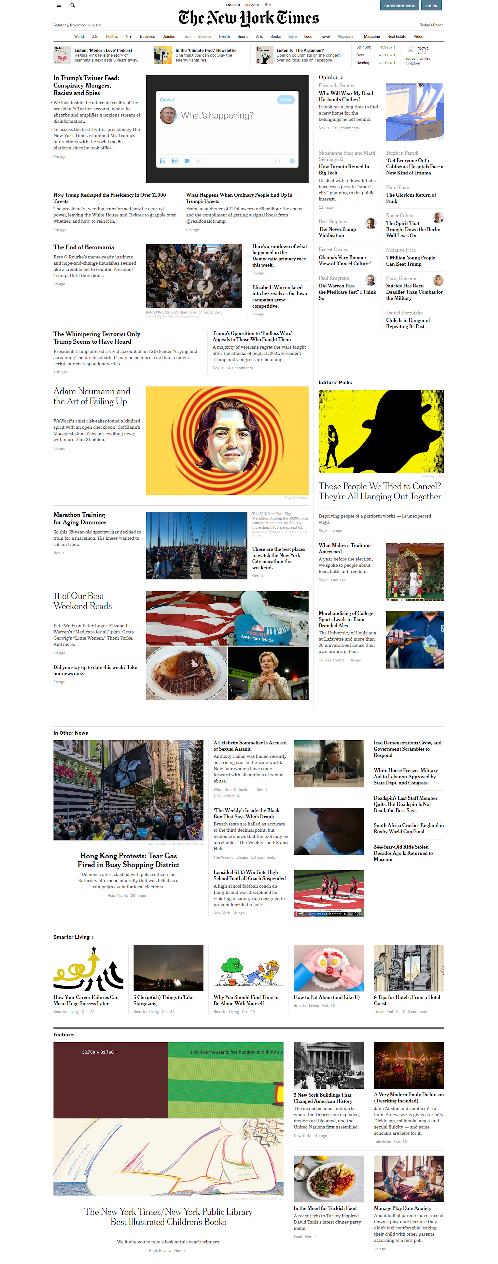
Take the New York Times front page shown earlier for example. Your eyes zig-zag with each line. Where does your eye flick after ‘PLANT FLAG’? Almost certainly to ‘Voice from Moon.’ Breaking this flow tends to be jarring for readers because it’s at odds with a lifetime of reading habits. How often do you see the lead story hugging the right hand side of the page rather than the left? Not often.
The same flow applies to web design. Steven Bradley’s Smashing Magazine article on compositional flow and rhythm explores the principle in an online context, and certainly deserves a read, but I would add that there’s huge value in looking at its application in print. This is a principle that was being applied for decades before the world wide web came along, after all. Any given shortlist of Society for News Design finalists will be a masterclass in content flow. Here are some recent winners to whet your appetite.
Now to be clear, reading gravity isn’t quite as binding as, say, gravity. The eagle eyed among you may have noticed the qualifier that this applies mostly to ‘homogenous’ content. What’s more, it isn’t based on something innate in human nature — it’s guided by language. In languages that read right to left (Arabic for example) the same principle applies, but it is flipped.

This mattered less in the day of print. Papers were generally limited to a geographical region and could reflect the primary language of that region’s audience. In the online realm anyone, anywhere could be visiting your website, so it’s not only valuable to understand the Gutenberg Principle, but to design websites that change shape depending on the language they’re being read in.
The Gutenberg Principle is not the only way people engage with content. Eye tracking studies have shown F-shaped patterns are also common online, for example, with more and more ‘hopping’ the further down the page readers go.
These patterns are all useful to know. They are not rules, just trends. Strong news design does not blindly adhere to the Z-pattern come what may; it uses it as a foundation. The same is true for web design. If in doubt, remember it, but don’t worship it. The human eye has an ingrained reading gravity, but great design leads rather than follows.
The adaptability of the web opens up amazing new possibilities for content presentation. The lessons of the Gutenberg Principle are starting points which can and should be played around with. The best rule breakers usually know exactly what the rules are.
For more information on the Gutenberg Principle follow the links below:
- The Gutenberg Principle explained by the SUNY Political Institute
- Understanding the Z-Layout in Web Design by Brandon Jones
Nameplates
Every newspaper has a nameplate. It’s just about the only thing you can guarantee won’t change from edition to edition. It’s the bit at the top (or very occasionally, along the side) of the front page, and comprises of the publication’s name and logo.
A lot of these are iconic in their own right. The nameplates of publications like The Washington Post and The Sun are seared into the public consciousness. Nameplates are the branding, the bit that says, ‘We’re not that other newspaper. We’re this newspaper.’ It communicates who you are and what you’re about.
It also serves as a kind of directory. Newspapers often have teasers in their nameplates, pointing readers to stories that don’t quite warrant a spot on the front page, but are still worth knowing about. It’s a key player in the above the fold game. Stick around. Keep reading. There’s something here for you. Keeping in mind the Gutenberg Principle, the nameplate is likely the very first thing readers will see.
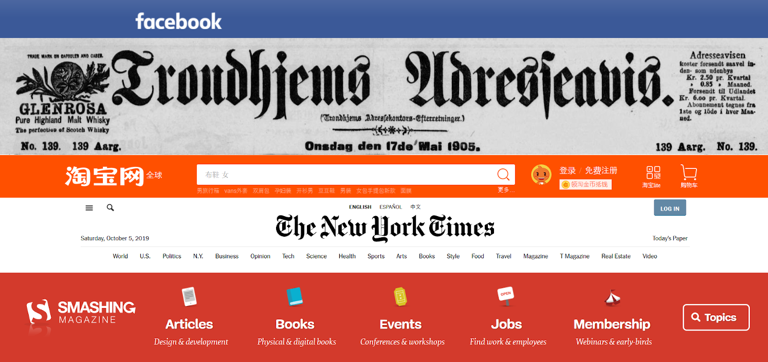
Practically every website has a nameplate, only on websites we call it the header. Smashing Magazine has one, Amazon has one, Facebook has one. It’s weird for a website not to have one, and for it not to appear on every page. On the web every page has to have a bit of the front page about it. A lot of users arrive at a site via the root domain, but a lot don’t.
This is one reason why nameplates online tend to be busier than their print elders. They are able to do more, which is just as well given more is asked of them. But in news and web design the underlying purpose of the nameplate is the same: get the brand front and centre and guide users to something they’ll care about.
Grid Systems And Content Blocks
Newspapers are pure content. From cover to cover, they are packed with information, information which needs to be well organised and well presented. The grid system is foundational to newspaper design. As water shapes itself to a bowl, news content shapes itself to grid systems.
Columns are the most important element of this. Depending on a newspaper’s format (tabloid, broadsheet, etc.) it might have anywhere from four to fourteen columns. It is rare for the content of newspapers not to shape themselves to these columns one way or another. Text flows down a column then resumes in the next one. Images can span multiple columns, especially if they’re eye-catching.

Newspapers have evolved beyond the strangely rigid stream of consciousness affairs you’ll find in earlier efforts like those above. Now it is generally accepted that newspaper content should be organised in blocks, with each story forming its own box. This is called modular layout, and there are several reasons why it is the standard.
First, it is easier to organise. If every story fits in a clean, tidy space, they can be rearranged with relative ease. When you’re trying to fit dozens (or hundreds) of stories into a finite space with the clock ticking, this is a godsend.
Second, it is clearer. Good information is only worth so much when it’s presented badly. Blocks create pages within pages, where each piece of information is distinct and easy to follow.

These standards have always played a role in web design, but they are particularly useful to understand now we have CSS Grid at our disposal. Not only do newspaper grid systems offer guidance for arranging content neatly and clearly, they show how content blocks interact with each other, and with advertising. The wrong alignment can look very silly indeed, while the right arrangement is a joy to read.
As ever, there are differences. For example, online there are rarely jumps (when you reach the bottom of a column and continue reading at the top of the next one) because web pages can go down indefinitely. This kind of layout generally makes less sense online because it leads to readers scrolling up as well as down to get through a single piece of content, which is pretty counterintuitive. As Rachel Andrew demonstrates, jumps can be just the thing for listings and small amounts of content, but the practice is generally a product of print’s physical limitations. The main value of jumps in web design may well be for stacking blocks of content, rather than organising copy.
What’s more, both in print and online abandoning the grid system can be striking in its own right. Just as Dada art recoiled from aesthetic norms of the early 20th century, so do brutalist websites invert the grid system to offer something more… unconventional.

As noted already, to break the rules first you need to know them. For this and everything else, Tim Harrower’s The Newspaper Designer’s Handbook is a superb place to start. For a more sweeping introduction, Carrie Cousins’ Utilising Grids in Print Design over at Design Shack is excellent.
And how much does this all matter when you move over to the web? Well, more and more. CSS properties like Grid, Shapes, and Flexbox makes it easier than ever to both follow and break the rules of the grid system. Just as newspapers routinely venture outside the invisible lines of their wireframes, so too can websites push the boundaries of their own medium.
In his book Art Direction for the Web, Andy Clarke dives head first into the lessons of print media (and others), showing how advances in CSS can add whole new dimensions to the grid system. As Clarke himself puts it:
"For years we’ve told each other the web isn’t print. We’ve told ourselves the things we admire in other design media cannot — and sometimes should not — be used online. We needn’t think that anymore."
Hear, hear.
For more inspiration, watch Jen Simmons live code a print layout in CSS Grid at Smashing Conference 2019. Beautiful. And for a more in-depth history of the grid system and its usage, check out this ‘Grids Are Good’ presentation by Khoi Vinh and Mark Boulton.
Look Forward… But Look Backward First
The conventions above were forged by decades — in some cases centuries — of experience, and there’s plenty more where they came from. What they all essentially boil down to is understanding content, and how people are likely to engage with that content.
Newspapers at their best follow a cartoonishly simple principle: present information in ways that are as clear, as attractive, and as accessible as possible. That’s a worthy goal for any website. And don’t take my word for it. These ideas were championed by Edmund C. Arnold, the aforementioned father of modern newspaper design.’ Arnold designed or redesigned hundreds of newspapers during his career, including The Chicago Tribune, The Boston Globe, The National Observer, and Newsday.
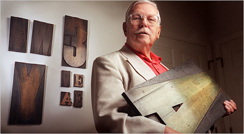
He pushed for designers to have more influence, for newspapers to have flair as well as substance. He was also a journalist, and an academic, and wrote numerous books about newspaper design and typography. He knew his stuff. It is no coincidence that the Society for News Design (SND), of which he was a founding member in 1992, now holds two awards each year — one for news design, the other for digital.
Anyone keen to learn more about Arnold and his work could do a lot worse than starting with the resources below:
- Modern Newspaper Design by Edmund C. Arnold
- Edmund C. Arnold interview by the Society for News Design
- Remembering the Father of Modern Newspaper Design
Newspaper designers are students of the web — so too should web designers be students of newspapers. As improvements in web technology open up new frontiers, it pays to know whether someone else has been here before. We are all looking for the same thing, after all. It’s all, fundamentally, the same language.
You can see this playing out in real time as newspapers adapt to the web. The gold standard of news design online at the moment is probably The New York Times, which was a finalist in the print and digital SND awards this year. What’s interesting about the Times online is the blend between classicism and innovation. The homepage still essentially looks like the front page of a print edition, while individual stories, like ‘The Plot to Subvert Democracy’, immerse themselves in the new possibilities of the web.
Or take a newspaper designer like Mario García — part of the generation after Edmund — who’s most recent book, The Story, was designed to be read on mobile phones. The best news designers relish change. The proof is in the pudding. (For those interested, García blogs daily about the overlap of news and web design.)
This, in a lot of ways, is the main takeaway of news design. Its top practitioners are not dogmatists — they are students. When asked at the twilight of his career what his advice was to the next generation of designers, Edmunc C. Arnold’s answer was not a series of rules. It was far simpler than that: know where you came from.
"My message to young designers is this: look, kids, you can do better, but the only way to achieve your potential is to go back to — and understand — the basics. That sounds boring, but it’s reality."
Newspapers don’t hold all the keys to great web design, but understanding the principles that guide them can only benefit web designers. There are plenty of kindred spirits in those two worlds. I’m no web designer, but I recognise good web design when I see it in part because of what I know about newspapers. Purpose and style has a way of looking, well, stylish.
Web design guru Jeffrey Zeldman hit the nail on the head when he tweeted this more than a decade ago:
Content precedes design. Design in the absence of content is not design, it's decoration.
— zeldman (@zeldman) May 5, 2008
Vitaly Friedman was bowing to the same altar when he said, “Good design is about effective communication, not decoration at the expense of legibility.” Both he and Zeldman would find plenty of allies in the news design space. Few, if any, mediums have a richer history wedding content and design than newspapers do. That struggle is all they have.
To The As Yet Unimagined
It’s worth reiterating here that there are clear and undeniable differences between news design and web design. In newspapers the dimensions of the space are always the same, while websites must adapt to radically different screen sizes and devices. In newspapers what you see is what you get, while websites can hide all sorts of useful features out of sight until they’re prompted to appear. The aim of this piece is not to convince you that news and web design are the same. They are, however, often very similar. To be master of one does not make you master of the other, but it helps.
Perhaps this is why Friedman collated a selection of award-winning newspaper designs all the way back in 2008. Back then he rued the fact that print techniques weren’t applicable online. Back then CSS wasn’t sophisticated enough. Well, its is now, and that’s really exciting.
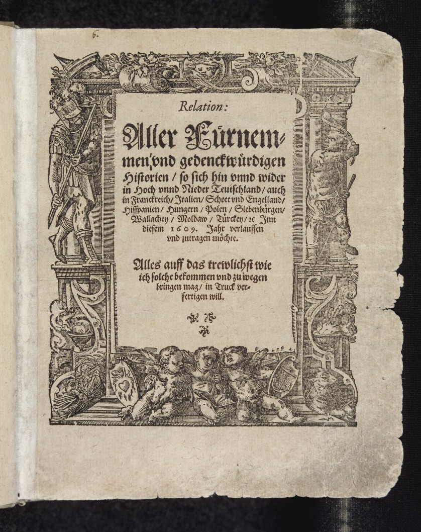
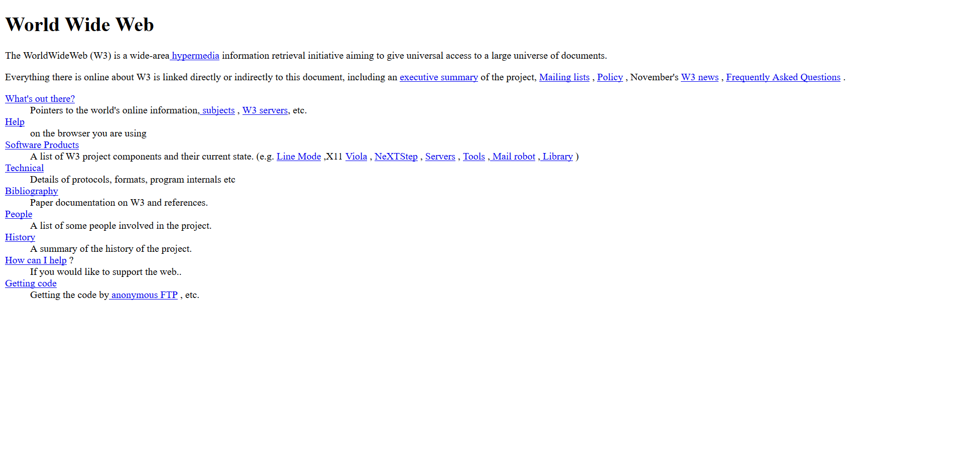
The process never ends. It can’t end. No newspaper or website worth its salt is ever truly ‘done.’ It is always evolving. Look at the first ever newspaper and the first ever website and it’s fair to say a lot has changed in both worlds since then:
Both formats have improved massively since those humble beginnings, and there’s an awful lot left to achieve. As C. Y. Gopinath traced out beautifully in 2016, the parameters are always changing; web technology, screen sizes, devices, internet speeds, you name it. In the mobile age maybe the nameplate belongs at the bottom. Who knows? It all lies ahead.
In many respects a torch has been passed from news design to web design. If developers can push forward with the knowledge of their elders on hand, they’ll achieve things previous generations couldn’t even have imagined. What an incredible opportunity. I can’t wait to see what they come up with.
Further Reading
- Overcoming The Challenges Of Content Creation For Informational Websites
- The Things Users Would Appreciate In Mobile Apps
- A Designer’s Accessibility Advocacy Toolkit
- Frequently Heard In My Beginning Front-End Web Development Class


