Live Sketching A Site Visitor Journey To Create A Sitemap With Your Client

Email Newsletter
Weekly tips on front-end & UX.
Trusted by 182,000+ folks.
 Celebrating 10 million developers
 Custom Web Forms for Angular, React, & Vue. Your backend.


Drawing can instantly lower barriers and make communication with a client much easier. Having a face-to-face meeting with your client can cause anxiety for those of us that push pixels for a living, but even the simplest kind of sketching can help. On top of drawing, let’s take a few clues from a meeting rockstar: Priya Parker.
Author of the book “The Art of Gathering” and TED Talk speaker, Priya Parker is a proponent of making gatherings (and meetings!) meaningful. Her top line meeting ideas include allowing some controversy, fostering group decision making, and setting meeting goals. I’ll touch on all three of these items and show how to use the act of drawing to accomplish them.
Our Example
Let’s walk through such a goal-oriented sitemap meeting. Our faux-client: an event service company called BPS Events Services. They rent tables, designs centerpieces, and acts as a one-stop shop for sit-down events — everything but the food. Let’s go meet the team: a marketer, salesman, warehouse manager, and one executive officer. All very different points of view.
Walk in the door, make your introductions, and start off with goals in mind (and in voice). Declare the goal and set a time limit at the forefront. Avoid sloppy language like “I want to have a sitemap from today’s meeting” but use more concrete terms such as “The output from today’s 90-minute meeting will be a sitemap.” Expectations are always appreciated, and so are time limits.
Leave Your Laptop At Home, Markers Are The Better Tool
I don’t use technology to organize the thoughts of my clients. Adding a layer of digitization between what is said and what is captured is a barrier that clients find difficult to overcome, and frankly, off-putting. If a client is afraid of the tech you are using to craft something, they may devalue the input they wish to offer because of that fear.
I want full honesty, and I want my permission to correct me, in order to get things right. That’s why I use large-scale drawing on a whiteboard. Not only does it work in realtime, but it’s also correctable, and I know that when my customer picks up a marker; they really have full intentions to help me understand the whole story of their company and their customers.
The whiteboard as a canvas is large enough to expand on important points, to create concepts that are temporary before they are made permanent (or erased!) and even allow for those in a room to stretch. The whiteboard is energy; it’s the energy of creativity, the energy of idea exploration, and it allows everyone to make mistakes. It’s a perfect canvas when ideas are not nailed down.
And I will admit, a marker may induce a bit of fear to many (we’ve all heard it, or said it: “I can’t draw”) but no one is afraid to write a word or two, or tell someone else what to visibly edit!
Recommended reading: Doodling: How Can Designers Use This To Their Benefit?
Now let’s fill your room with some energy!
Invite Surprise Guests To Add Controversy
Your client is made up of several different stakeholders, with varying responsibilities and personalities, and each with different website “must-haves”. The best possible person in the room, however, should be a prospective customer acting as a website visitor. As this invite may not be possible, a set of proxies made up of personas will do.
Inviting made up personas into the meeting may work against the ambitions and personal goals of your real attendees. What fun!
Creating Our New Guests
A customer persona, (with its physical manifestation being a customer profile) is a specification of a user that your client may encounter. They can be detailed and complex, or extremely simple.
Many customer profiles include information including an avatar or photo, demographic information, interests, and how they spend their money.
The persona is used as a lensing tool to understand how a customer may act, feel, and interact with your brand or organization. In our case, it is website specific.
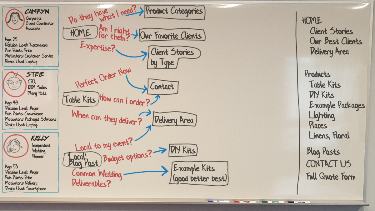
For BPS Events Services, we will create three customer persona profiles to act as typical site visitors that may be buyers:
- Camryn, the corporate event coordinator;
- Steve, the CFO of a mid-sized company planning a sales meeting;
- Kelly, the independent wedding planner.
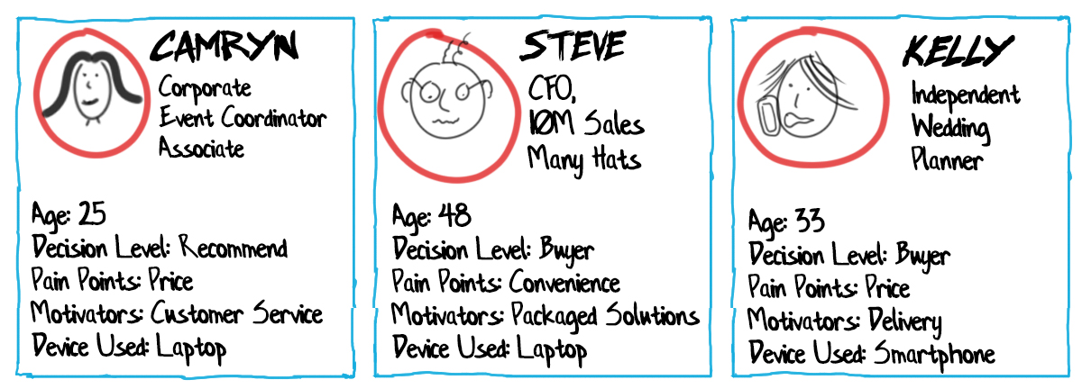
I start with a name, age, and any other demographic or personal characteristics to make them seem real. The more real a person seems, the more likely your team can sympathize with their positions. Hats, actions and locations can enhance “cartoony” stick figures well and help tell the story.
Second, I focus on four simple persona statements:
- The device used to visit your site,
- Decision level,
- Pain points
- Motivators.
These four personal statements tell the room how the person may interact with your company, why they need may need you, and how you can influence them. It’s basic yes, but we have set ourselves up with only 90 minutes!
More importantly, the customer profiles must be made visible by the whole group at once — not just paper on the table. Large visible profiles are the stand-in for the actual persona. They can be pointed to, stood in front of, yelled at, and can accept empathy (as much as markings on a board can receive!)
The Value Of Visitor Presence
The real value of having site visitor profiles in the room is the lens they provide for present stakeholders. Forcing attendees to see a new website tailored to visitor needs adds a little controversy, and forces all to see the problems through new eyes.
Similar to the Thinking Hats group discussion system, customer personas allow meeting attendees to see through new eyes and look through filters that remove selfish motives -effectively putting down personal agendas. This methodology is a helpful tool for web designers who many struggle with getting clients to think visitor-first.
Additionally, you likely don’t have to be “the bad guy”. Likely one person in attendance will be a customer persona advocate. This person will police the others and call them out if the personas are not honored — and even defend the personas. This advocate may never have had the chance to steer others into the customer-focused viewpoint before — and this may very well be one of those few chances.
Step On Up To The Whiteboard
Many create customer profiles ahead of time on paper or boards (a project for you, dear web designer, or for your client). But they can also be created rough, on the fly, and on a whiteboard with various degrees of detail. I personally like creating them live because attendees can have a say and make adjustments.
Tip: Getting 10 minutes alone with your target whiteboard before a meeting can work wonders!
Don’t overdo it, just create something clean, legible, and that can be referenced throughout the meeting!
Being able to point to a persona is important in the upcoming conversations. The examples above are created with large names so they can be spoken in the room, with common color schemes for ease of recognition, and with text in black for easy readability.
Whiteboards are of course ubiquitously available in conference rooms across the industrialized world. Hate squeaky whiteboards? Get a 48” wide roll of paper online and some no-bleed low-odor markers like Mister Sketch or Neuland brand.
Some More Drawing Tips
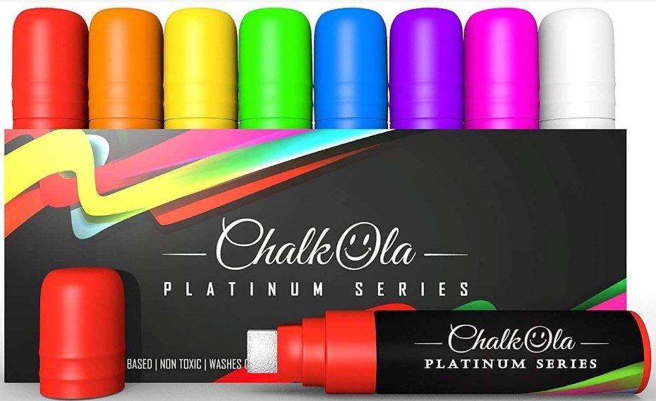
In the case of the whiteboard, you may be tempted to use that readily available red marker for multiple components — resist! Invest in your own set of whiteboard markers and look like a champ — there are a variety of choices out there: rainbow colors, standard colors in wide widths, and even neon-colored chalk-based markers (whiteboard safe) that come with thicknesses as wide as 15mm! Nothing says “Wow I know what I am doing” quite like hot pink in a world of faded thin blue lines.
The Visitor Journey Through The New Website
A Customer journey is typically defined as the empathetic review of a customer’s interaction with a problem and your solution. This is generally used in broader scope-marketing campaigns. Customer journeys can be incredibly powerful and telling but also complicated.
Let’s start simple, and ask your customers personas how they plan to navigate your new or revised website.
Let The Sitemap Guidance Begin!
Today we are NOT talking about how visitors GET to the website, but only, what their experience is once they get there.
Assign a landing page for every visitor. If you have guidance from an existing data set of analytics, borrow the top three landing pages. If you don’t, choose from what you know and can assume: the home page, the number one standalone product or service, and an evergreen blog post. (Considering landing pages for specific campaigns? Go for it!)
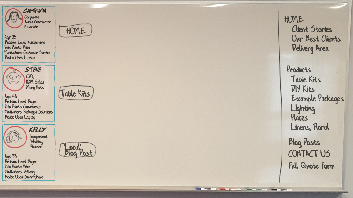
Use your whiteboard to craft the very beginnings of a sitemap in a format that suggests room for growth. The center of the whiteboard is used for the customer’s ‘page’ journeys, and the right sidebar is used to capture the sitemap in an organized fashion of your choice.
Ask the room: “When your users land on their first page of your site on their first visit, what do they see and how do they feel? Let’s start with Camryn (persona 1).”
The responses to this question should go well beyond sitemap preference. Because the question offered the verb “feel” you will find responses including words like trust, payday, relief, confusion, leadership, and so on. This empathetic question sets the tone for the rest of your meeting, helps you understand your client’s own brand understanding, and opens up the conversation on the right foot.
Run through this question for each persona, and log the information on the whiteboard around that starter page in a mindmap fashion. Whether it is feelings, lack of information, desire for more, confusion, or “heck I’m ready to buy now already”, every comment can act as a potential pathway to new content.
The responses may also be very concrete like, “I need to find the phone number for sales”, or “I need to know the minimum order size for the new biodegradable plate designs.” These are obviously just as important, but don’t let them be the only responses.
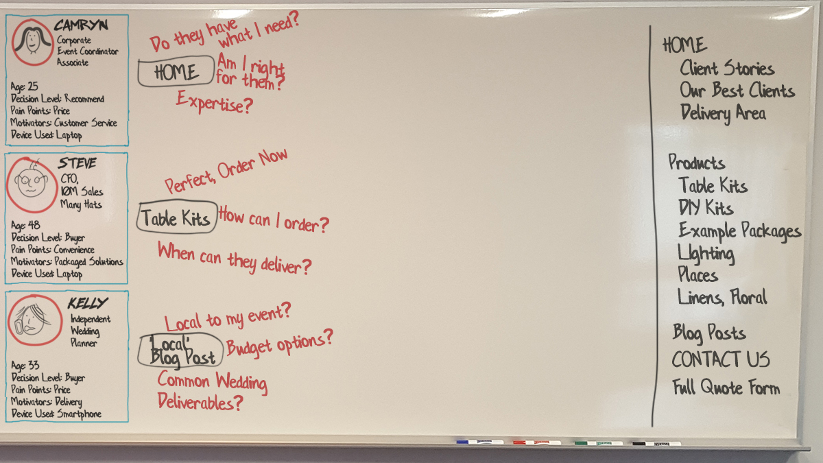
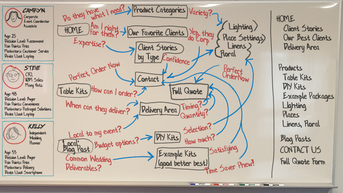
Building The Content Web
Now that we have guessed at what the user feels and is thinking at each page, let’s act as a guide and show them some link options. We are going to respond to the first page responses in a conversational, back and forth kind of way… Almost like a website guide.
Note: At this point, we’re acting as guides to lead the user from a point of zero information to one of decision making, comfort, trust, and inquiry. If you are a fan of the StoryBrand method by Donald Miller, you will identify with the story consent and guidance component that we are building.
With your gathered group, draw possible links to new pages that answer the questions or respond to the feelings that you previously generated. It is important to remind your group that we’re only answering the thoughts of the personas user here.
These links are drawn in a web format across your whiteboard to second click pages. It is not yet in a sitemap format, but one that shows the importance of that second click. Allow overlap between personas.
As new pages are defined, log them in your right sidebar in a top-level nav format.
Drawing Suggestions
I suggest creating your page blocks as black text with black containers around them. Use a different color ink to create the arrow/line/connector links between the blocks.
Repeat this entire process and keep going: focus on feelings, information, and website guidance to lead your customer towards connecting with your brand in a hard or soft way through an eventual on page Call-to-Action (e.g. Buy Now, vs. Facebook Like, vs. Download our Guide).
Hopefully, some questions may look back to other pages, or force attendees to consider new places to put answers to specific questions. Try your best to exhaust the customer journey through your site with this process.
Fostering Group Decision Making On The Board
Try not to erase items that have already been added to a board. Instead, I like to add graphical tags to items: Stars, checkmarks or plus signs for affirmations, and frowny faces, minus symbols, and Xs for negative feedback.
You can also use colors to denote positive and negative feedback: green and red.* This method can show the team decision-making and encourages feedback, without wiping out concepts already discussed.
* Keep in mind that if you do decide to use colors, always ask if anyone in the room is colorblind.
From Journey To Sitemap
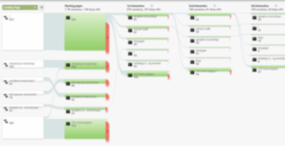
If you are familiar with Google Analytics (GA), you may see similarities between what we are creating and what is reported in GA Behavior Flow. That’s a good thing. If you have GA data, compare it with the content flow you are crafting. Are there similarities? Are there differences? Does it matter for the redesign?
The beautiful thing about the journey discussions is the lack of fluff and the limitations that it places on page count. This method simplifies the view of the website for many stakeholders.
By taking the journey steps and creating pages for those steps, you’re creating a sitemap that is extremely satisfying for participants. The simple approach to messaging and compression results in a website unlike what they would have imagined, but exactly what they wanted.
Wrapping Up
Communicating with a client on a large canvas such as a whiteboard can be a little scary but tremendously beneficial once you get going. Showing your knowledge for an entire group to see, critique and edit can be hard at first. But drawing as a group is an act of removing barriers.
By communicating visually, blockades to understanding are removed, fear of failure is admonished, and technology is pushed aside. This brings up the opportunity for more good friction — with full understanding and all the cards on the table, er… whiteboard.
The Williemien Brand Team states in the introduction to their book “Visual Thinking” regarding what happens when you draw “you work at the intersection of image, spoken words and written text, where you maximize effectiveness and impact.” This is exactly what our aim should be: let’s keep in mind to continuously utilize the power of our brains to process things visually.
So arm yourselves with some markers, practice up on your whiteboard handwriting and lettering for an hour, and roll out a meeting that your next client won’t soon forget!
Other Resources
Here are some awesome books to keep you motivated:
- “The Art of Gathering,” Priya Parker
- “Building a Story Brand,” Donald Miller
- “Visual Thinking,” Williemien Brand
- “The Sketchnote Handbook,” Mike Rohde
- “Hand Lettering for Everyone,” Cristina Vanko
- “The Graphic Facilitator’s Guide,” Brandy Agerbeck
Further Reading
- The Power Of Pen And Paper Sketching
- When Friction Is A Good Thing: Designing Sustainable E-Commerce Experiences
- A Guide To Attracting Clients To Your Agency
- Transforming The Relationship Between Designers And Developers


