Recreating The Arduino Pushbutton Using SVG And <lit-element>

Email Newsletter
Weekly tips on front-end & UX.
Trusted by 182,000+ folks.
 Register for Free
 Celebrating 10 million developers
 Custom Web Forms for Angular, React, & Vue. Your backend.


In this article, Uri Shaked will show you how to build custom HTML components that mimic physical objects, such as the Arduino Pushbutton. We’ll draw the component in Inkscape from scratch, optimize the generated SVG code for the Web, and wrap it as a standalone web component using the lightweight
lit-element library, paying extra attention to accessibility and mobile usability considerations.Today, I am going to take you through the journey of creating an HTML component that mimics a momentary pushbutton component that is commonly used with Arduino and in electronic projects. We will use technologies such as SVG, Web Components and lit-element, and learn how to make the button accessible through some JavaScript-CSS trickery.
Let’s start!
From Arduino To HTML: The Need For A Pushbutton Component
Before we embark on the journey, let’s explore what we are going to create, and more importantly, why. I’m creating an open-source Arduino simulator in JavaScript called avr8js. This simulator is able to execute Arduino code and I will be using it in a series of tutorials and courses that teach makers how to program for Arduino.
The simulator itself only takes care of the program execution — it runs the code instruction by instruction and updates its internal state and a memory buffer according to the program logic. In order to interact with the Arduino program, you need to create some virtual electronic components that can send input to the simulator or react to its outputs.
Running the simulator alone is very much like running JavaScript in isolation. You can’t really interact with the user unless you also create some HTML elements, and hook them to the JavaScript code through the DOM.
Thus, in addition to the simulator of the processor, I’m also working on a library of HTML components that mimic physical hardware, starting with the first two components that you will find in almost any electronics project: an LED and a pushbutton.
The LED is relatively simple, as it only has two output states: on and off. Behind the scenes, it uses an SVG filter to create the lighting effect.
The pushbutton is more interesting. It also has two states, but it has to react to user input and update its state accordingly, and this is where the challenge comes from, as we will shortly see. But first, let’s nail down the requirements from our component we are going to create.
Defining The Requirements For The Pushbutton
Our component will resemble a 12mm pushbutton. These buttons are very common in electronics starter kits, and come with caps in multiple colors, as you can see in the photo below:
In terms of behavior, the pushbutton should have two states: pressed and released. These are similar to the mousedown/mouseup HTML events, but we must make sure that the pushbuttons can also be used from mobile devices, and are accessible for users without a mouse.
As we will be using the state of the pushbutton as input for Arduino, there is no need to support "click" or "double click" events. It is up to the Arduino program running in the simulation to decide how to act upon the state of the button, and physical buttons do not generate click events.
If you’d like to learn more, check out a talk I held with Benjamin Gruenbaum at SmashingConf Freiburg in 2019: “Anatomy of a Click”.
To summarize our requirements, our pushbutton needs to:
- look similar to the physical 12mm pushbutton;
- have two distinct states: pressed, and released, and they should be visually discernible;
- support mouse interaction, mobile devices and be accessible to keyboard users;
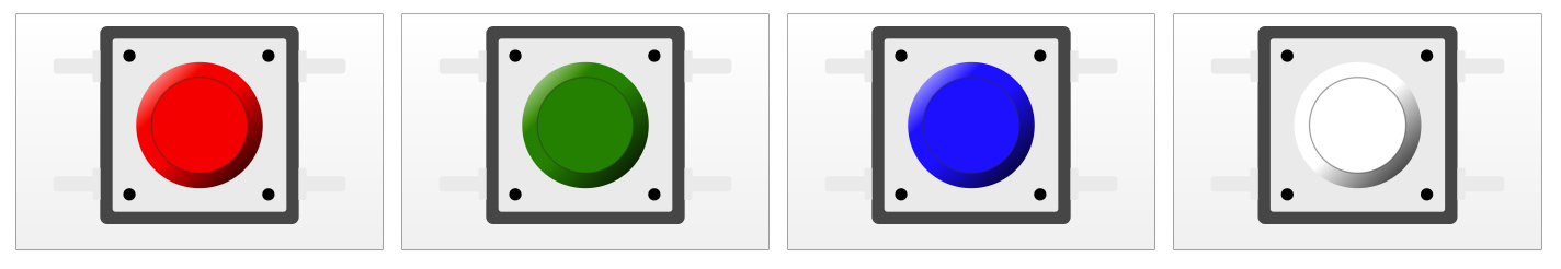
- support different cap colors (at least red, green, blue, yellow, white and black).
Now that we have defined the requirements, we can start working on the implementation.
SVG For The Win
Most web components are implemented using a combination of CSS and HTML. When we need more complex graphics, we usually use raster images, in either JPG or PNG format (or GIF if you feel nostalgic).
In our case, however, we will use another approach: SVG graphics. SVG lends itself to complex graphics much more easily than CSS (yeah, I know, you can create fascinating things with CSS, but it doesn’t mean it should). But don’t worry, we are not giving up on CSS entirely. It will help us with styling the pushbuttons, and eventually even with making them accessible.
SVG has another big advantage, in comparison with raster graphics images: it is very easy to manipulate from JavaScript and can be styled through CSS. This means that we can provide a single image for the button and use JavaScript to customize the color cap, and CSS styles to indicate the state of the button. Neat, isn’t it?
Finally, SVG is just an XML document, which can be edited with text editors, and embedded directly into HTML, making it a perfect solution for creating reusable HTML components. Are you ready to draw our pushbutton?
Drawing The Pushbutton With Inkscape
Inkscape is my favorite tool for creating SVG vector graphics. It’s free and packed with powerful features, such as a large collection of built-in filter presets, bitmap tracing, and path binary operations. I started using Inkscape for creating PCB art, but in the past two years, I started using it for most of my graphic editing tasks.
Drawing the pushbutton in Inkscape is pretty straightforward. We are going to draw a top-view illustration of the button and its four metal leads that connect it to other parts, as follows:
- 12×12mm dark gray rectangle for the plastic case, with slightly rounded corners to make it softer.
- Smaller, 10.5×10.5 light gray rectangle for the metal cover.
- Four darker circles, one in each corner for the pins that hold the button together.
- A large circle in the middle, that is the contour of the button cap.
- A smaller circle in the middle for the top of the button cap.
- Four light-gray rectangles in a “T” shape for the metal leads of the button.
And the result, slightly enlarged:

As a final touch, we’ll add some SVG gradient magic to the contour of the button, to give it a 3D feel:

There we go! We have the visuals, now we need to get it to the web.
From Inkscape To Web SVG
As I mentioned above, SVGs are pretty straightforward to embed into HTML — you can just paste the content of the SVG file into your HTML document, open it in a browser, and it will be rendered on your screen. You can see it in action in the following CodePen example:
See the Pen SVG Pushbutton in HTML by @Uri Shaked
However, SVG files saved from Inkscape contain a lot of unnecessary baggage such as the Inkscape version and the window position when you last saved the file. In many cases, there are also empty elements, unused gradients and filters, and they all bloat the file size, and make it harder to work with it inside HTML.
Luckily, Inkscape can clean most of the mess for us. Here is how you do it:
- Go to the File menu and click on Clean up document. (This will remove unused definitions from your document.)
- Go again to File and click on Save as…. When saving, select Optimized SVG (*.svg) in the Save as type dropdown.
- You will see an “Optimized SVG Output” dialog with three tabs. Check all the options, except for “Keep editor data”, “Keep unreferenced definitions” and “Preserve manually created IDs…”.
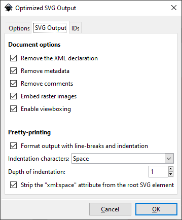
Removing all these things will create a smaller SVG file that is easier to work with. In my case, the file went from 4593 bytes down to just 2080 bytes, less than half the size. For more complex SVG files, this can be a huge saving of bandwidth and can make a notable difference in the loading time of your webpage.
The optimized SVG is also much easier to read and understand. In the following excerpt, you should be able to easily spot the two rectangles that make the body of the pushbutton:
<rect width="12" height="12" rx=".44" ry=".44" fill="#464646" stroke-width="1.0003"/>
<rect x=".75" y=".75" width="10.5" height="10.5" rx=".211" ry=".211" fill="#eaeaea"/>
<g fill="#1b1b1b">
  <circle cx="1.767" cy="1.7916" r=".37"/>
  <circle cx="10.161" cy="1.7916" r=".37"/>
  <circle cx="10.161" cy="10.197" r=".37"/>
  <circle cx="1.767" cy="10.197" r=".37"/>
</g>
<circle cx="6" cy="6" r="3.822" fill="url(#a)"/>
<circle cx="6" cy="6" r="2.9" fill="#ff2a2a" stroke="#2f2f2f" stroke-opacity=".47" stroke-width=".08"/>
You can even further shorten the code, for instance, by changing the stroke width of the first rectangle from 1.0003 to just 1. It doesn’t make a significant difference in the file size, but it makes the code easier to read.
In general, a manual pass over the generated SVG file is always useful. In many cases, you can remove empty groups or apply matrix transforms, as well as simplify gradient coordinates by mapping them from “user space on use” (global coordinates) to “object bounding box” (relative to the object). These optimizations are optional, but you get code that is easier to understand and maintain.
From this point on, we’ll put Inkscape away and work with the text representation of the SVG image.
Creating A Reusable Web Component
So far, we got the graphics for our pushbutton, ready to be inserted into our simulator. We can easily customize the color of the button by changing the fill attribute of the smaller circle, and the start color of the gradient of the larger circle.
Our next goal is to turn our pushbutton into a reusable Web Component which can be customized by passing a color attribute and reacts to user interaction (press/release events). We will use lit-element, a small library that simplifies the creation of Web Components.
lit-element excels in creating small, stand-alone component libraries. It’s built on top of the Web Components standard, which allows these components to be consumed by any web application, regardless of the framework used: Angular, React, Vue or Vanilla JS would all be able to use our component.
Creating components in lit-element is done using a class-based syntax, with a render() method that returns the HTML code for the element. A bit similar to React, if you are familiar with it. However, unlike react, lit-element uses standard Javascript tagged template literals for defining the content of the component.
Here is how you would create a simple hello-world component:
import { customElement, html, LitElement } from 'lit-element';

@customElement('hello-world')
export class HelloWorldElement extends LitElement {
  render() {
    return html`
      <h1>
        Hello, World!
      </h1>
    `;
  }
}
This component can then be used anywhere in your HTML code simply by writing <hello-world></hello-world>.
Note: Actually, our pushbutton requires just a bit more code: we need to declare an input property for the color, using the @property() decoractor (and with a default value of red), and paste the SVG code into our render() method, replacing the color of the button cap with the value of the color property (see example). The important bits are in line 5, where we define the color property: @property() color = 'red'; Also, in line 35 (where we use this property to define the fill color for the circle that makes the cap of the button), using the JavaScript template literal syntax, written as ${color}:
<circle cx="6" cy="6" r="2.9" fill="${color}" stroke="#2f2f2f" stroke-opacity=".47" stroke-width=".08" />
Making It Interactive
The last piece of the puzzle would be to make the button interactive. There are two aspects we need to consider: the visual response to the interaction as well as the programmatic response to the interaction.
For the visual part, we can simply inverse the gradient fill of the button contour, which will create the illusion the button has been pressed:

The gradient for the button contour is defined by the following SVG code, where ${color} is replaced with the color of the button by lit-element, as explained above:
<linearGradient id="grad-up" x1="0" x2="1" y1="0" y2="1">
  <stop stop-color="#ffffff" offset="0" />
  <stop stop-color="${color}" offset="0.3" />
  <stop stop-color="${color}" offset="0.5" />
  <stop offset="1" />
</linearGradient>
One approach for the pressed button look would be to define a second gradient, invert the order of colors, and use it as the fill of the circle whenever the button is pressed. However, there is a nice trick that allows us to reuse the same gradient: we can rotate the svg element by 180 degrees using a SVG transform:
<circle cx="6" cy="6" r="3.822" fill="url(#a)" transform="rotate(180 6 6)" />
The transformattribute tells SVG that we want to rotate the circle by 180 degrees, and that the rotation should happen about the point (6, 6) that is the center of the circle (defined by cx and cy). SVG transforms also affect the fill of the shape, and so our gradient will be rotated as well.
We only want to invert the gradient when the button is pressed, so instead of adding the transformattribute directly on the <circle>element, as we did above, we are actually going to set a CSS class for this element, and then take advantage of the fact that SVG attributes can be set through CSS, albeit using a slightly different syntax:
transform: rotate(180deg);
transform-origin: 6px 6px;
These two CSS rules do exactly the same as the transformwe had above — rotate the circle 180 degrees around its center at (6, 6). We want these rules to be applied only when the button is pressed, so we’ll add a CSS class name to our circle:
<circle class="button-contour" cx="6" cy="6" r="3.822" fill="url(#a)" />
And now we can use the :active CSS pseudo-class to apply a transform to the button-contour whenever the SVG element is clicked:
svg:active .button-contour {
  transform: rotate(180deg);
  transform-origin: 6px 6px;
}
lit-element allows us to attach a stylesheet to our component by declaring it in a static getter inside our component class, using a tagged template literal:
static get styles() {
  return css`
    svg:active .button-contour {
      transform: rotate(180deg);
      transform-origin: 6px 6px;
    }
  `;
}
Just like the HTML template, this syntax allows us to inject custom values to our CSS code, even though we don’t need it here. lit-element also takes care of creating Shadow DOM for our component, so that the CSS only affects the elements within our component and does not bleed to other parts of the application.
Now, what about the programmatic behavior of the button when pressed? We want to fire an event so that the users of our component could figure out whenever the state of the button changes. One way to do this is to listen to mousedown and mouseup events on the SVG element, and fire “button-press”/“button-release” events correspondingly. This is what it looks like with lit-element syntax:
render() {
  const { color } = this;
  return html`
    <svg
      @mousedown=${() => this.dispatchEvent(new Event('button-press'))}
      @mouseup=${() => this.dispatchEvent(new Event('button-release'))}
      ...
    </svg>
  `;
}
However, this is not the best solution, as we’ll shortly see. But first, take a quick look at the code we got so far:
import { customElement, css, html, LitElement, property } from 'lit-element';

@customElement('wokwi-pushbutton')
export class PushbuttonElement extends LitElement {
  @property() color = 'red';

  static get styles() {
    return css`
      svg:active .button-contour {
        transform: rotate(180deg);
        transform-origin: 6px 6px;
      }
    `;
  }

  render() {
    const { color } = this;
    return html`
      <svg
        @mousedown=${() => this.dispatchEvent(new Event('button-press'))}
        @mouseup=${() => this.dispatchEvent(new Event('button-release'))}
        width="18mm"
        height="12mm"
        version="1.1"
        viewBox="-3 0 18 12"
        xmlns="https://www.w3.org/2000/svg"
      >
        <defs>
          <linearGradient id="a" x1="0" x2="1" y1="0" y2="1">
            <stop stop-color="#ffffff" offset="0" />
            <stop stop-color="${color}" offset="0.3" />
            <stop stop-color="${color}" offset="0.5" />
            <stop offset="1" />
          </linearGradient>
        </defs>
        <rect x="0" y="0" width="12" height="12" rx=".44" ry=".44" fill="#464646" />
        <rect x=".75" y=".75" width="10.5" height="10.5" rx=".211" ry=".211" fill="#eaeaea" />
        <g fill="#1b1b1">
          <circle cx="1.767" cy="1.7916" r=".37" />
          <circle cx="10.161" cy="1.7916" r=".37" />
          <circle cx="10.161" cy="10.197" r=".37" />
          <circle cx="1.767" cy="10.197" r=".37" />
        </g>
        <g fill="#eaeaea">
          <path d="m-0.3538 1.4672c-0.058299 0-0.10523 0.0469-0.10523 0.10522v0.38698h-2.1504c-0.1166 0-0.21045 0.0938-0.21045 0.21045v0.50721c0 0.1166 0.093855 0.21045 0.21045 0.21045h2.1504v0.40101c0 0.0583 0.046928 0.10528 0.10523 0.10528h0.35723v-1.9266z" />
          <path d="m-0.35376 8.6067c-0.058299 0-0.10523 0.0469-0.10523 0.10523v0.38697h-2.1504c-0.1166 0-0.21045 0.0939-0.21045 0.21045v0.50721c0 0.1166 0.093855 0.21046 0.21045 0.21046h2.1504v0.401c0 0.0583 0.046928 0.10528 0.10523 0.10528h0.35723v-1.9266z" />
          <path d="m12.354 1.4672c0.0583 0 0.10522 0.0469 0.10523 0.10522v0.38698h2.1504c0.1166 0 0.21045 0.0938 0.21045 0.21045v0.50721c0 0.1166-0.09385 0.21045-0.21045 0.21045h-2.1504v0.40101c0 0.0583-0.04693 0.10528-0.10523 0.10528h-0.35723v-1.9266z" />
          <path d="m12.354 8.6067c0.0583 0 0.10523 0.0469 0.10523 0.10522v0.38698h2.1504c0.1166 0 0.21045 0.0938 0.21045 0.21045v0.50721c0 0.1166-0.09386 0.21045-0.21045 0.21045h-2.1504v0.40101c0 0.0583-0.04693 0.10528-0.10523 0.10528h-0.35723v-1.9266z" />
        </g>
        <g>
          <circle class="button-contour" cx="6" cy="6" r="3.822" fill="url(#a)" />
          <circle cx="6" cy="6" r="2.9" fill="${color}" stroke="#2f2f2f" stroke-opacity=".47" stroke-width=".08" />
        </g>
      </svg>
    `;
  }
}
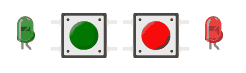
You can click each of the buttons and see how they react. The red one even has some event listeners (defined in index.html), so when you click on it you should see some messages written to the console. But wait, what if you want to use the keyboard instead?
Making The Component Accessible And Mobile-Friendly
Hooray! We created a reusable pushbutton component with SVG and lit-element!
Before we sign off on our work, there are a few issues we should look at. First, the button is not accessible to people who use the keyboard. In addition, the behavior on mobile is inconsistent — the buttons do appear pressed when you hold your finger on them, but the JavaScript events are not fired if you hold your finger for more than one second.
Let’s start by tackling the keyboard issue. We could make the button keyboard-accessible by adding a tabindex attribute to the svg element, making it focusable. A better alternative, in my opinion, is just to wrap the button with a standard <button> element. By using the standard element, we also make it play nicely with screen readers and other assistive technology.
This approach has one drawback through, as you can see below:
The <button> element comes with some built-in styling. This could easily be fixed by applying some CSS to remove these styles:
button {
  border: none;
  background: none;
  padding: 0;
  margin: 0;
  text-decoration: none;
  -webkit-appearance: none;
  -moz-appearance: none;
}

button:active .button-contour {
  transform: rotate(180deg);
  transform-origin: 6px 6px;
}
Note that we also replaced the selector that inverts the grid of the buttons’ contour, using button:activein place of svg:active. This ensures that the button-pressed style applies whenever the actual <button> element is pressed, regardless of the input device used.
We can even make our component more screen-reader friendly by adding an aria-label attribute that includes the color of the button:
<button aria-label="${color} pushbutton">
There is still one more thing to tackle: the “button-press” and “button-release” events. Ideally, we want to fire them based on the CSS :active pseudo-class of the button, just like we did in the CSS above. In other words, we would like to fire the “button-press” event whenever the button becomes :active, and the “button-release” event to fire whenever it is :not(:active).
But how do you listen to a CSS pseudo-class from Javascript?
Turns out, it is not so simple. I asked this question to the JavaScript Israel community, and eventually dug up one idea that worked out of the endless thread: use the :activeselector to trigger a super-short CSS animation, and then I can listen to it from JavaScript using the animationstart event.
A quick CodePen experiment proved that this actually works reliably. As much as I liked the sophistication of this idea, I decided to go with a different, simpler solution. The animationstart event isn’t available on Edge and iOS Safari, and triggering a CSS animation just for detecting the change of the button state doesn’t sound like the right way to do things.
Instead, we’re going to add three pairs of event listeners to the <button> element: mousedown/mouseup for the mouse, touchstart/touchend for mobile devices, and keyup/keydown for the keyboard. Not the most elegant solution, in my opinion, but it does the trick and works on all browsers.
<button
  aria-label="${color} pushbutton"
  @mousedown=${this.down}
  @mouseup=${this.up}
  @touchstart=${this.down}
  @touchend=${this.up}
  @keydown=${(e: KeyboardEvent) => e.keyCode === SPACE_KEY && this.down()}
  @keyup=${(e: KeyboardEvent) => e.keyCode === SPACE_KEY && this.up()}
>
Where SPACE_KEY is a constant that equals 32, and up/down are two class methods that dispatch the button-press and button-release events:
@property() pressed = false;

private down() {
  if (!this.pressed) {
    this.pressed = true;
    this.dispatchEvent(new Event('button-press'));
  }
}

private up() {
  if (this.pressed) {
    this.pressed = false;
    this.dispatchEvent(new Event('button-release'));
  }
}
- You can find the full source code here.
We Did It!
It was a pretty long journey that started with outlining the requirements and drawing the illustration for the button in Inkscape, went through converting our SVG file to a reusable web component using lit-element, and after making sure it’s accessible and mobile-friendly, we ended up with nearly 100 lines of code of a delightful virtual pushbutton component.
This button is just a single component in an open-source library of virtual electronic components I’m building. You are invited to peek at the source code, or check out the online Storybook where you can see and interact with all the available components.
And finally, if you are interested in Arduino, take a look at the programming Simon for Arduino course I’m currently building, where you can also see the pushbutton in action.
Till next time, then!
Further Reading
- Switching It Up With HTML’s Latest Control
- How To Harness Mouse Interaction Data For Practical Machine Learning Solutions
- How To Create Dynamic Donut Charts With TailwindCSS And React
- Conducting Accessibility Research In An Inaccessible Ecosystem
 (dm, il, mrn)

