The Split Personality Of Brutalist Web Development

Email Newsletter
Weekly tips on front-end & UX.
Trusted by 200,000+ folks.


Of all the design trends to hit the Internet in recent years, brutalism is surely the most eye-catching, and the most poorly defined. A variety of major brands have embraced ‘brutalist’ aesthetics online. There are even directories for those interested in seeing a selection of them in one place. The style has well and truly entered the mainstream.
Indeed, brutalist web design has grown so quickly that there does not seem to be a clear consensus on what the style actually is. To some it means practicality, to others audacity. Much like the architecture it takes its name from, brutalist web development has become two competing philosophies in one. Neither is necessarily ‘right’, but knowing the difference is important. It may even be sensible to start calling them different things.
A Brief(ish) History Of Brutalism
Before we get ahead of ourselves, let’s recap the term ‘brutalist’ — where it came from and what it means. Brutalism is a style of architecture that took off after World War II, reaching its peak in the ‘50s and ‘60s. Championing simple, geometric designs and bared building materials, the trend was in large part a reaction against the ornate, over-designed structures of preceding decades.
The name comes from béton brut, which is French for raw or rough concrete. Concrete is a common material for brutalist structures, lending itself as it does to the style’s no-frills approach. Other materials can be and are used, but concrete is especially common. Whatever structures are made of, embellishments are deemed unnecessary. The form and the materials are enough.
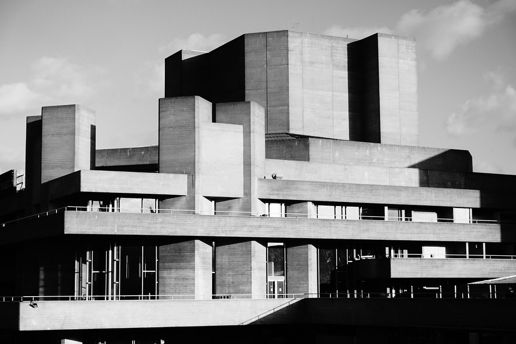
The United Kingdom, with its fondness for grey, drab things, particularly took to the style. Notable examples of brutalist architecture here include the Royal National Theatre, the Barbican Estate, and Balfron Tower. It has proven especially popular for public buildings — libraries, theatres, universities, housing estates, and so on.
Although there is not a catch-all definition that everyone agrees on, deference is often paid to English architectural critic Rayner Barnam, whose 1955 essay ‘On the New Brutalism’ attempted to outline the core ideas of the style. In anticipation of those of you who would not read the whole thing, Barnham boiled the philosophy down to the following:
"In the last resort what characterizes the New Brutalism in architecture as in painting is precisely its brutality, its je-m’ en-foutisme, its bloody-mindedness."
Loosely translated, je-m’ en-foutisme translates as ‘don’t give a damn attitude. To be sure, brutalist buildings are unconcerned about conventional standards of beauty. They are also rather divisive. Where some gush over their firm, utilitarian character, others decry ugliness, impersonality, and, well, brutality.
Love it or hate it, brutalist architecture celebrates rawness. Indeed, Barnam opened his essay with a quote by Swiss-French architect Le Corbusier: “Architecture is the establishing of moving relationships with raw materials.” Le Corbusier’s Unité d'habitation housing designs inspired a generation of brutalist architects.

So in short, brutalist architecture not only reduces construction to its fundamental materials, it finds beauty in that simplicity. Critics say it’s a bit in your face, a bit impersonal, a bit totalitarian even. The dual meaning of ‘raw’ and ‘brutal’ has clouded the definition, but as a rule, the goal is rawness and the result is perceived by some as brutal.
The style has waned in popularity since its postwar heyday, but it endures as one of the most distinctive around. A good few have attained listed status, and I for one am glad they have. A city of brutalist buildings would be a bit much, but a city without any is poorer for it.
Other Resources
- #SOSARCHITECTURE, an online archive of brutalist buildings
- ‘The incredible hulks: Jonathan Meades' A-Z of brutalism’ for The Guardian
- Wikipedia’s list of brutalist structures
Practicality Or Audacity?
So what’s all this got to do with web development? The philosophy, mainly, and the way it has splintered. Brutalism has found new life online, especially in the last three or four years. A slew of sites have taken on the brutalist moniker, and with the trend’s rise have come accompanying aw(ww)ards, articles, and directories.
Browsing through these things you may well get the impression that not everyone is talking about the same thing. That’s because they aren’t. In the world of web development, ‘brutalist’ has grown to encompass a variety of styles. It’s a disservice to designers to keep lumping together such different approaches. I have separated web brutalism into two types below, but as we shall see even that may not be enough.
Type One: l’Internet Brut
The first type of brutalist web design has much more in common with its architectural forebears. Think of it as l'Internet brut, where the raw materials are HTML and, to a lesser extent, CSS. The backgrounds are light, the text is black, and the hyperlinks are blue. There’s some wriggle room, but that’s the gist of it. No faffing about. Short of displaying actual code you couldn’t get much rougher.
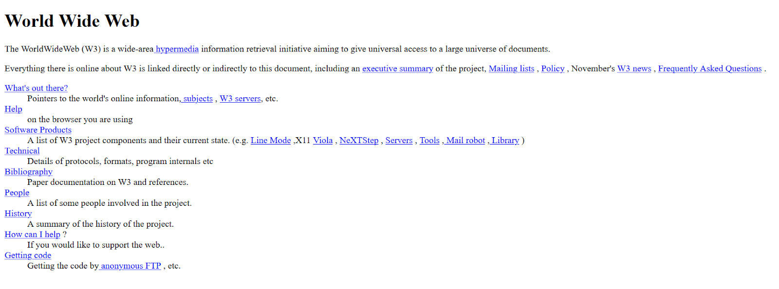
There are countless examples of this style, big and small. The first ever website is an inadvertent disciple, while more recently Brutalist Web Design by programmer David Bryant Copeland puts forward a lovely little manifesto for the style.
Going up in the world, other websites with strong brutalist streaks include:
Although the raw materials of these sites are very similar, they don’t all look the same. They are shaped around their content and purpose. Like their architectural cousins, there’s actually a huge variety in form.
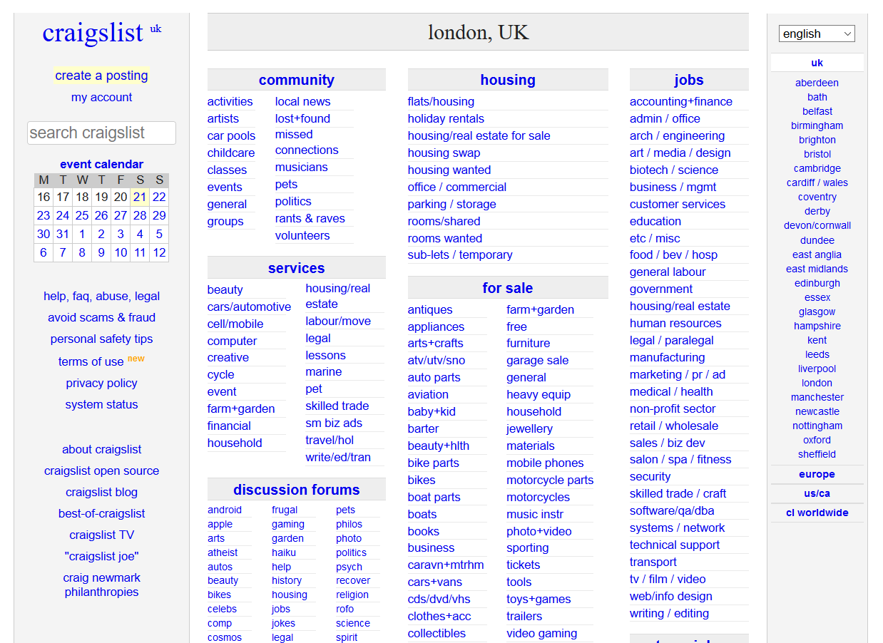
As you can see with the Craigslist homepage above, there is very little in the way of excess, and possibly even less in the way of style. It’s barely changed in 20(!) years, because it hasn’t needed to. Take a look at the code and even a novice like me can follow how the pages are put together. You don’t have to guess how it’s built because it’s all right there in front of you.
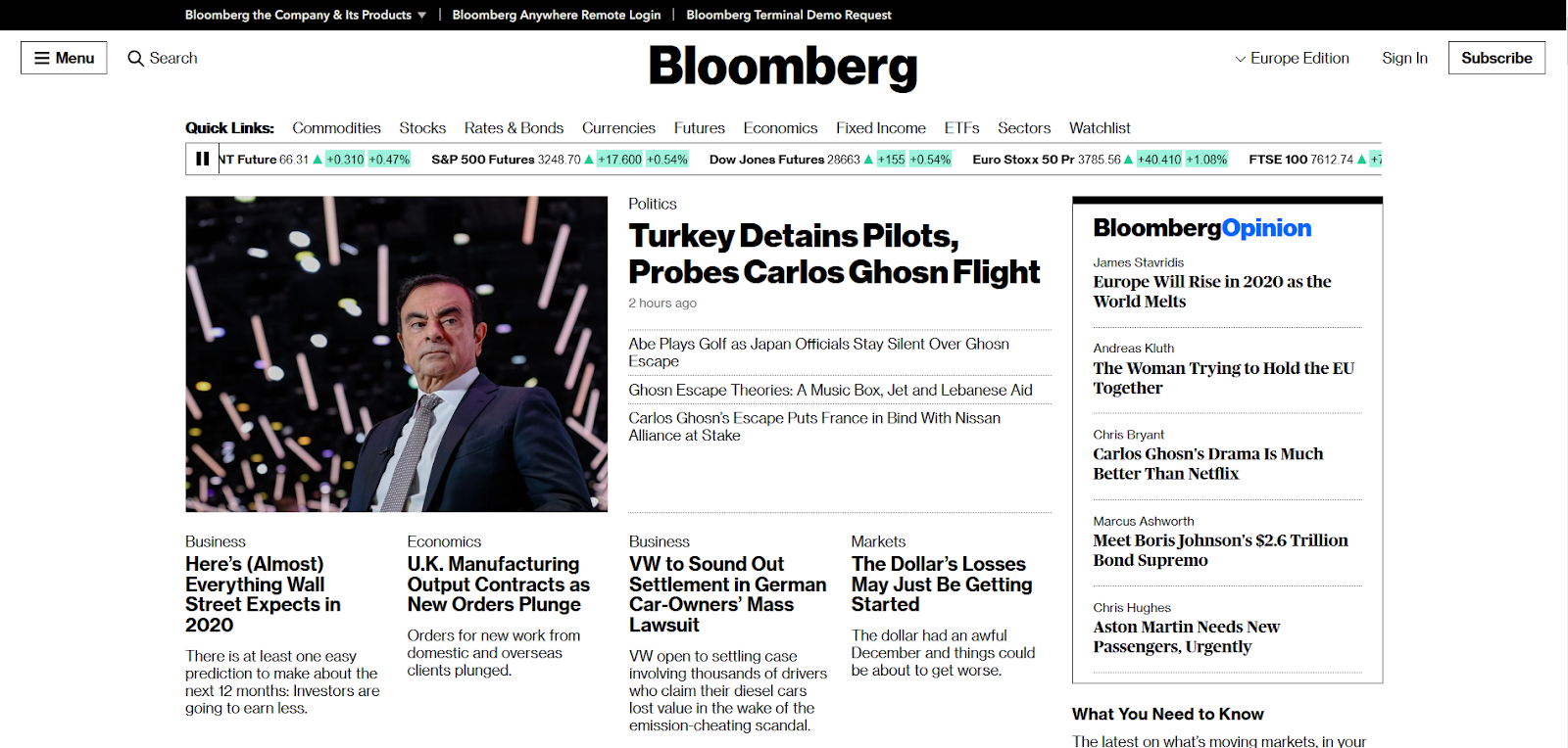
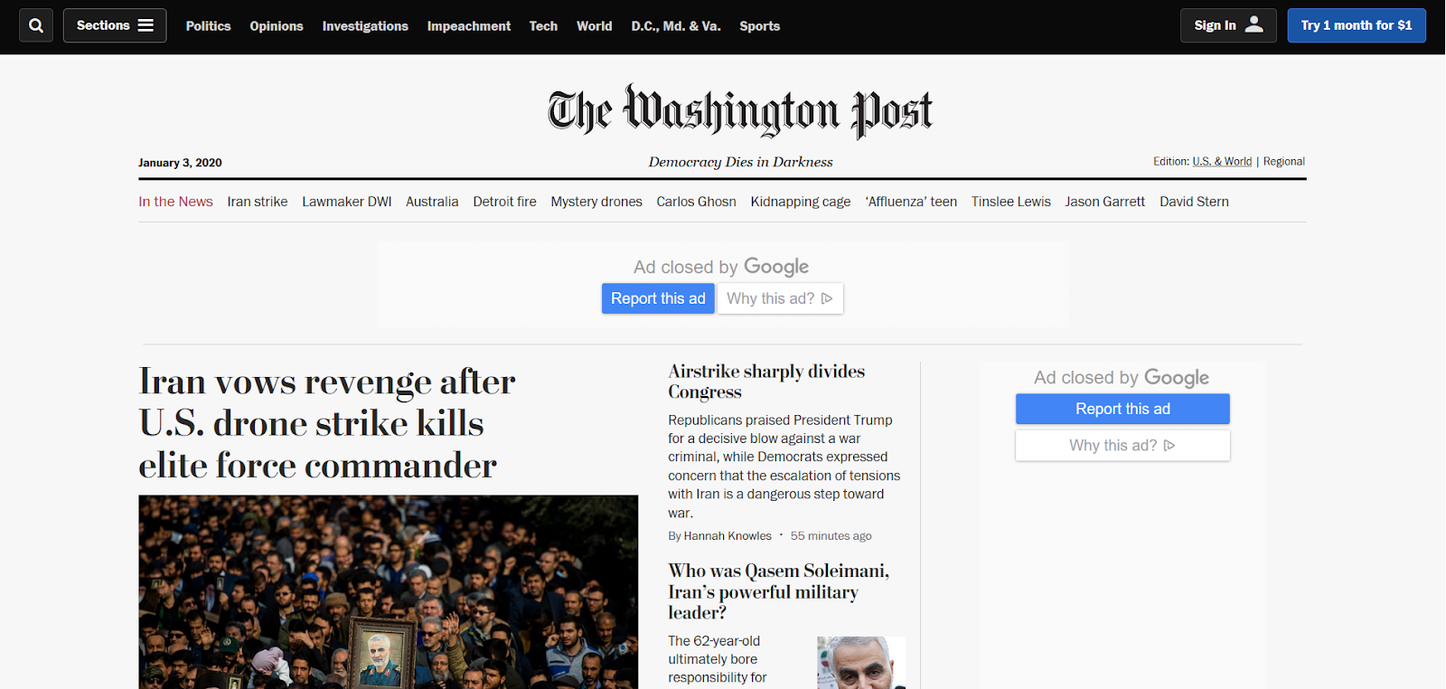
With sites like this you’ll often notice an overlap with the ‘publicly minded’ leaning on a lot of these websites — marketplaces, forums, encyclopedias. It’s oddly appropriate to see a site like Wikipedia take on the digital form of, say, Robin Hood Gardens. Bloomberg has plenty of company in the news space as well. Papers like The New York Times and The Washington Post have embraced similarly blunt, functional designs in recent years. News design has always had a strong brutalist streak.
It bears mentioning here that several of the sites used as examples here didn’t set out to be brutalist. Much like Villa Göth, which is widely considered the source of the term brutalism, they set out to be practical and simple. They were adopted, so to speak. Their success is what inspired (and continues to inspire) architects and developers alike. They’re so unconcerned about appearances that they became shining examples of brutalist design without even realizing it!
Sites in this vein don’t always scream beauty, but there is an elegance to their functionality. They are unconcerned and unpretentious, shaped for their purpose using the raw elements of the web. (Pun intended.)
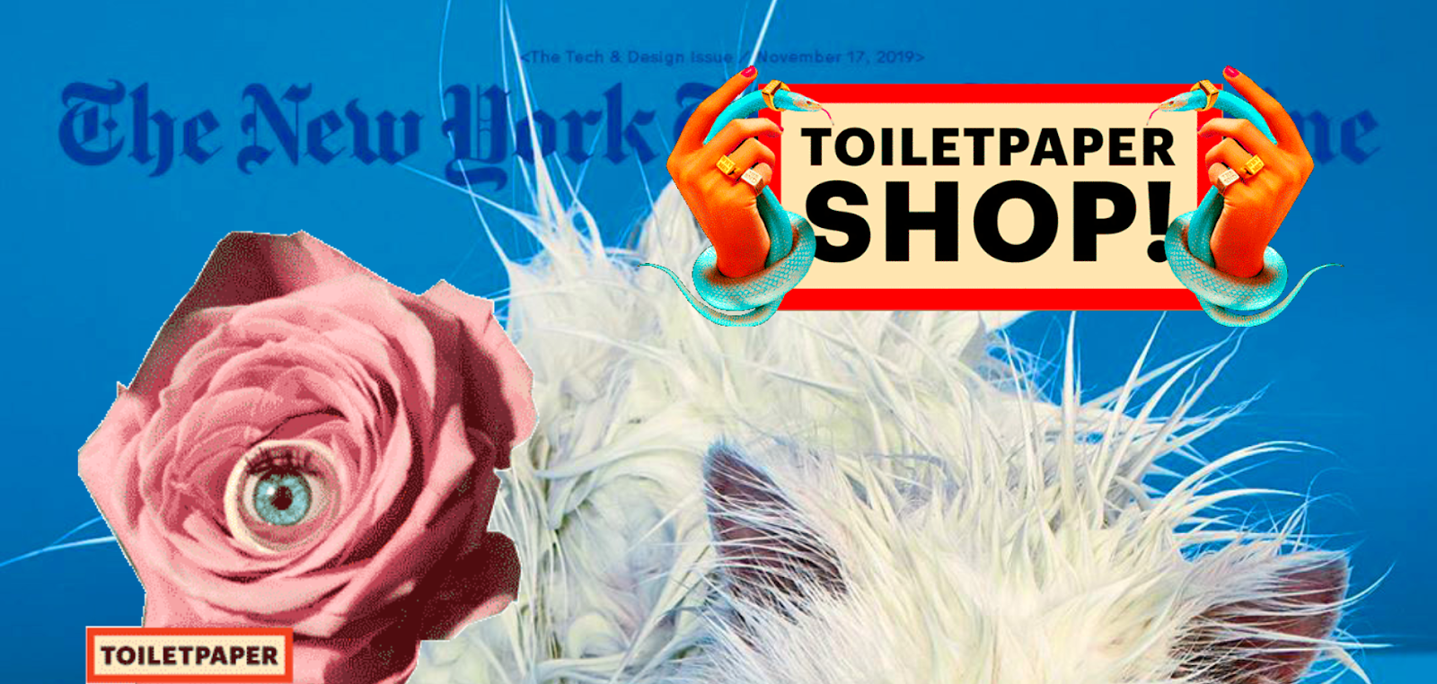
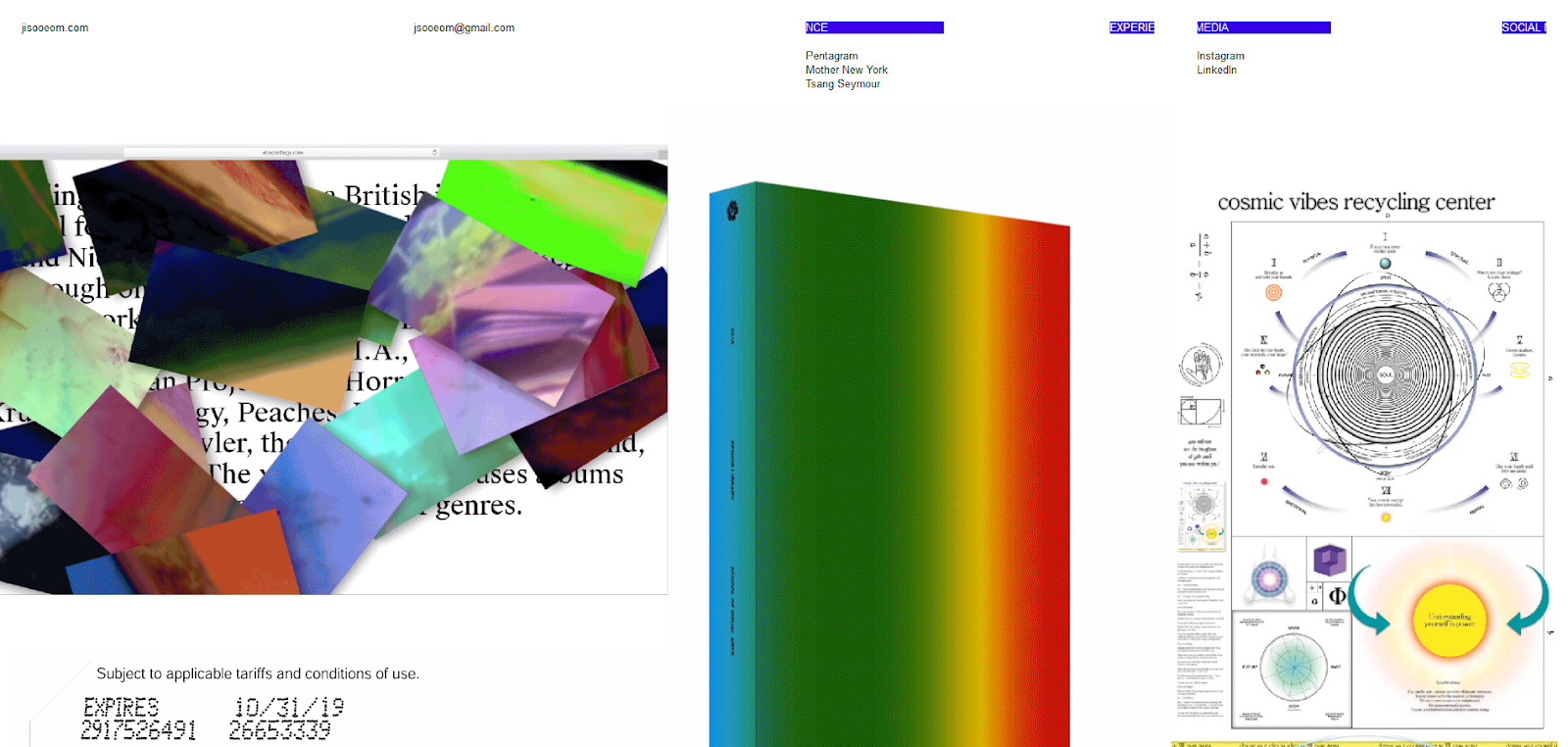
Type Two: l’Internet Fou
This is the split. Right here. Those of you with even a passing interest in web design trends will know what we’ve looked at so far fails to account for a huge number of ‘brutalist’ sites. As Vitaly Friedman noted in Smashing Book 6:
"Brutalism in architecture is characterized by unconcerned aesthetics, not intentionally broken aesthetics. When applied to web design, this style often goes along with deliberately broken design conventions and guiding principles."
The rise of ‘brutalist’ design over the last few years has had a lot more to do with brutalness than with rawness. This is the madder world, at times bordering on anarchy. Here design conventions are subverted and usability is an afterthought — and that’s not when it’s being actively sabotaged. These are the sites that prompt articles titled ‘Style Over Substance’, and for The Washington Post to sum up the style as ‘intentionally ugly.’
In the suitably migraine-inducing article ‘Brutalism: BrutAl wEbsIteS for mOdern dAy webMAsTeRS’, Awwwards describes this second strain as follows:
"Brutalism in web design laughs in the face of rationalism and functionality, in the world of design it can be defined as freestyle, ugly, irreverent, raw, and superficially decorative, etc."
I hope it isn’t controversial to say that this is an altogether different approach to type one. At a stretch, you might argue that this approach is more the domain of artists and graphic designers, and that art is, therefore, the rawest form their websites can take, but that would be a stretch. There’s no question brutalist architecture can drift into ‘statement’ territory, but that’s not its natural realm.
The Brutalist Websites directory suggests, ‘Brutalism [online] can be seen as a reaction by a younger generation to the lightness, optimism, and frivolity of today's web design.’ There are shades of the founding brutalist ethos in this, but it is more irreverent and subversive. They can be very beautiful in their own way, but also cut from a completely different cloth from the Craigslists of this world.
This Town Ain’t Big Enough For The Two Of Us
So there you have it. When brutalist web design isn’t going all in on rationalism and functionality, it’s laughing in the face of rationalism and functionality. All clear?
The term has grown to encompass approaches that are in many senses at odds with each other. Indeed, Pascal Deville, who founded the Brutalist Websites directory after coining the term in 2014, thinks the style has splintered into three micro-stylistics:
- Purists,
- UX minimalists,
- Anti-ists (or artists).
Having vetted hundreds of submissions over the years, he’d know better than just about anyone else. He says:
"The purists reference strongly to the architectural characteristics of Web Brutalism, such as the concept of ‘truth to materials’ and the use of the purest markup elements available. The UX minimalists, in contrast, see efficiency and performance as the main driver of Web Brutalism and even believe that the radical limitation of possibilities can boost conversions. The ‘anti-ists’ or artists see web design as an (still) undervalued form of art and don’t show much respect the status quo and mostly get bad press."
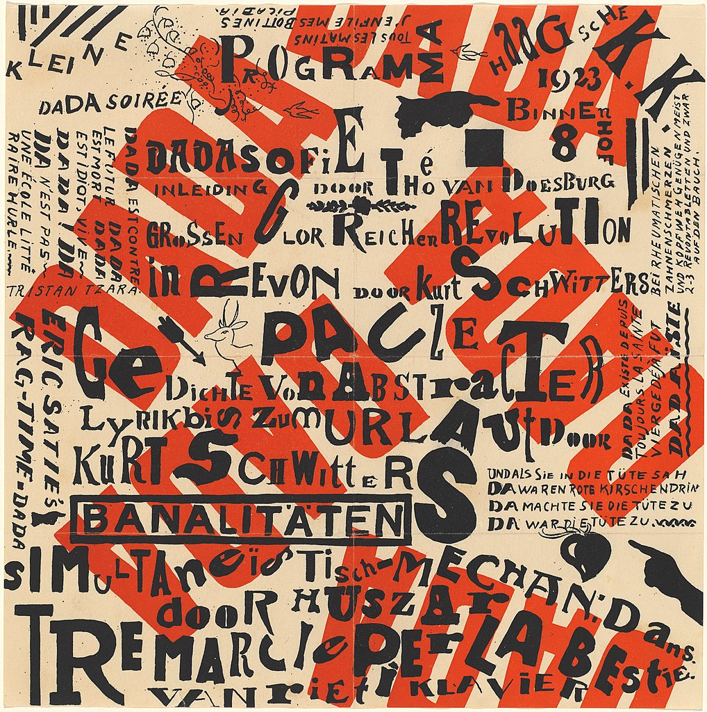
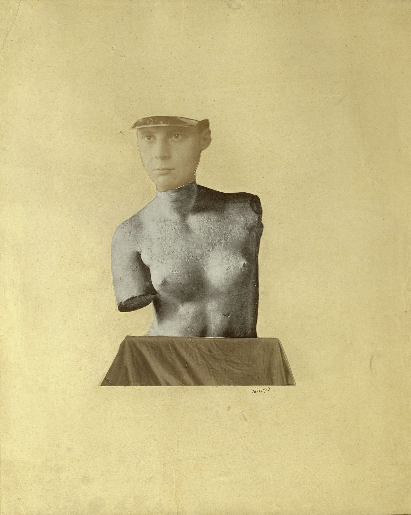
What is a ‘proper’ brutalist website? To an extent, the answer depends on the context. If a website belongs to an artist then something brash may be more appropriate than something unconcerned. Generally speaking, though, it seems to me that the sensibilities of the ‘anti-ist’ type are actually much closer to something like Dadaism, with all its absurdity and mirth and mess, or the avant-garde leanings of Expressionism.
I don’t want this to come across as a game of semantics, where different styles are filed away neatly into little boxes. What I am more concerned with is highlighting different approaches so that each may be given the space needed to flourish. As Deville acknowledges, the creative potential of the web is still being explored. ‘It's a new form of art and I'm very happy to experience first hand,’ he says. ‘It's happening now.’
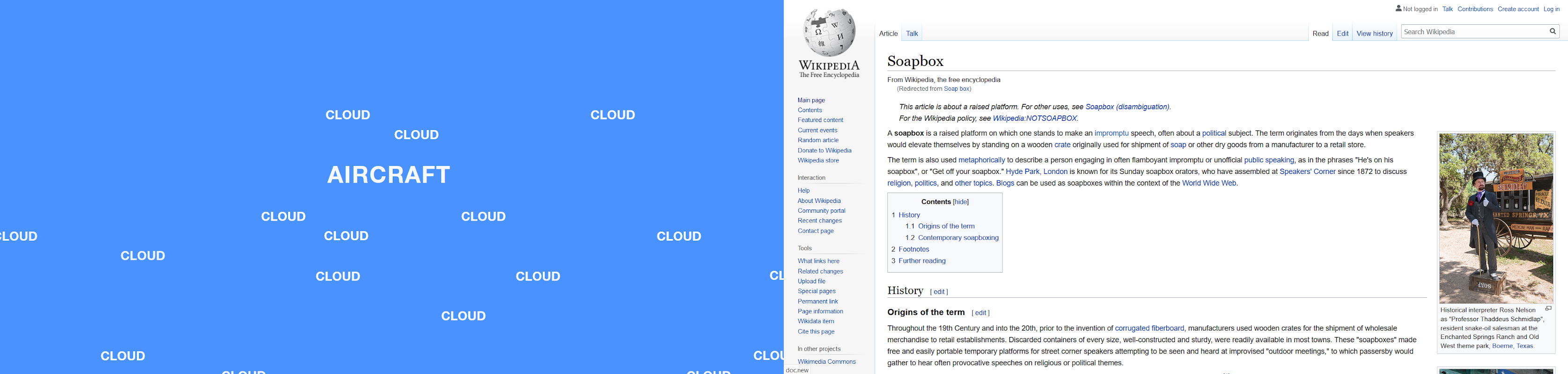
This has practical consequences as well. Whether you’re a developer talking to a client or a client talking to a developer, it pays to be clear which version of brutalist web design you’re on about. If you’re a real champ you’ll naturally refer them to this article. Otherwise, visual examples like the one below are likely your best bet for getting to the point.
Beyond that, maybe we should start giving different styles different names. I appreciate this would be rather inconvenient to a lot of people. Domains have been bought, awards awarded, and articles written, but going forward the label seems too restrictive. It can no longer contain so many approaches. If nothing else, the split personality of brutalist web development shows how much terrain remains to be explored in web design.
There are countless schools of art — Brutalism, Expressionism, Romanticism, Art Deco, Futurism, Dadaism, Impressionism, absurdism, modernism, minimalism, and on and on and on. They find form through paintings, buildings, literature… why not websites? As the links below show, I’m not alone in asking this. With every new development style, ‘anti-mainstream’ becomes less adequate for describing what designers are doing. They are starting to explore the philosophy of web design in ways that haven’t been done before.
- Nielsen Norman Group on the difference between brutalism and antidesign
- ‘On Web Brutalism and Contemporary Web Design’ in Dialectic
- Creative Bloq asks if brutalist websites are the web’s ‘punk moment’
- Nick Babich outlines the principles of minimalist web design, by far the most popular ‘ism’ online to date.
The ‘Dadaist’ strain of brutalist web design has one thing absolutely right: the scope for what a website can be is far, far too narrow. The web is an infinite sandbox, and embracing the breadth of possibilities within it can only be a good thing. That starts with expanding our vocabulary.
Further Reading
- How To Design Effective Conversational AI Experiences: A Comprehensive Guide
- Overcoming The Challenges Of Content Creation For Informational Websites
- The Split Personality Of Brutalist Web Development
- Better Context Menus With Safe Triangles


