How To Design Mobile Apps For One-Hand Usage

Email Newsletter
Weekly tips on front-end & UX.
Trusted by 200,000+ folks.


On Friday, January 2007 the world shrank into our palms as three revolutionary products — the iPod, a phone, and a breakthrough internet communicator — were unified to create the smartphones we know and love today.
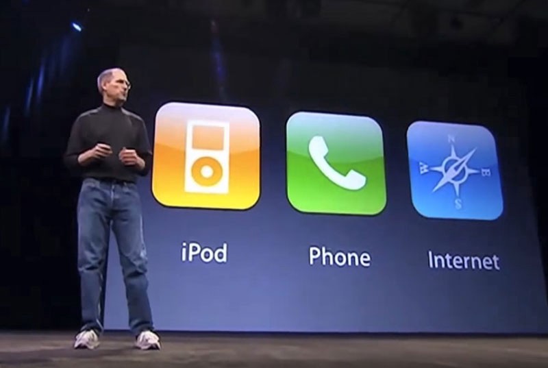
iPhone was built to be comfortably used for one-handed operation, allowing for a smoother thumb movement across the screen.
“
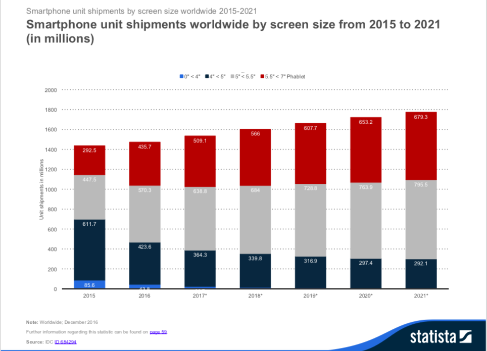
But it wasn’t until the turn of the last decade that phablets gained popularity owing to their bigger screens, so much so that less than 1% devices sold today had smaller than 4-inch screens.
90% of the smartphones sold today have bigger than 5-inch displays.
“
In the meantime, this goldrush for bigger-the-better presented app makers and designers with opportunities to utilize the screen real estate to serve more content and functions.
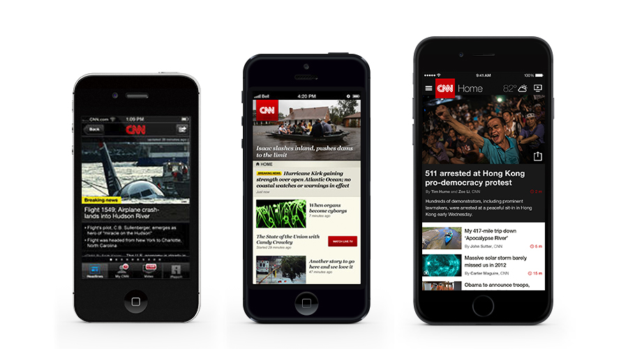
For instance, the CNN App was among the few who got early access to iPhone 5 introduced in 2012. The developers not only gave it an aesthetic transformation but also designed a reader-friendly, visually-appealing experience that made headlines stand out.
With Bigger Screens, The Ease Of Access And Reachability Suffer
While bigger screens are great for showing more content, the #1 design consideration of Steve Jobs for making 3.5-inch phones suffers — designing for one-handed usage.
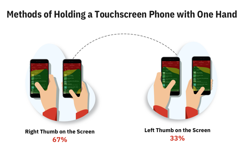
In his 2-month-long research — at airports, streets, cafes, on buses and trains — Steven Hoober shed light on the three ways users hold their phones.
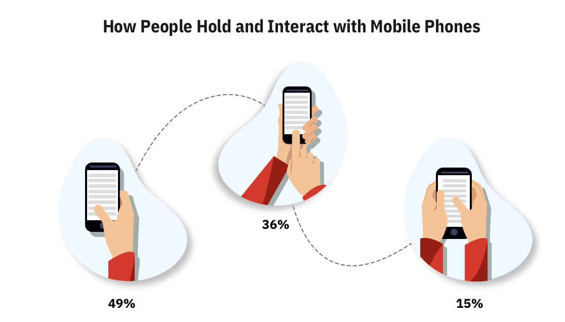
49% of users hold their phones with one-hand specifically while they are on the go.
“
Making a strong case for designing apps for one-handed usage. Steven also found that users frequently alter their grip based on their comfort and situation.
Why Designing For One-Handed Usage Should Become The Top Priority For App Makers
We use our phones a great deal when we are preoccupied or in a hurry. This greatly impacts how users hold their phones and how they use the apps resulting in a lot more of one-handed-usage than the 49% number suggested above.
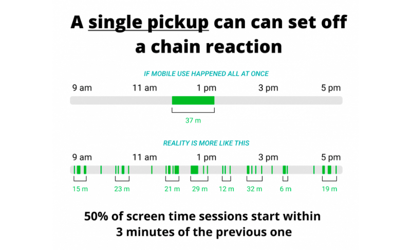
Research suggests that an average user checks their phones for as many as 58 times a day out of which 70% of mobile interaction lasts less than 2 minutes.
We use our phones in “distracted short-burst usage”.
“
A team of researchers at Simform observed usage and behavior of short-burst sporadic usage in multiple scenarios such as:
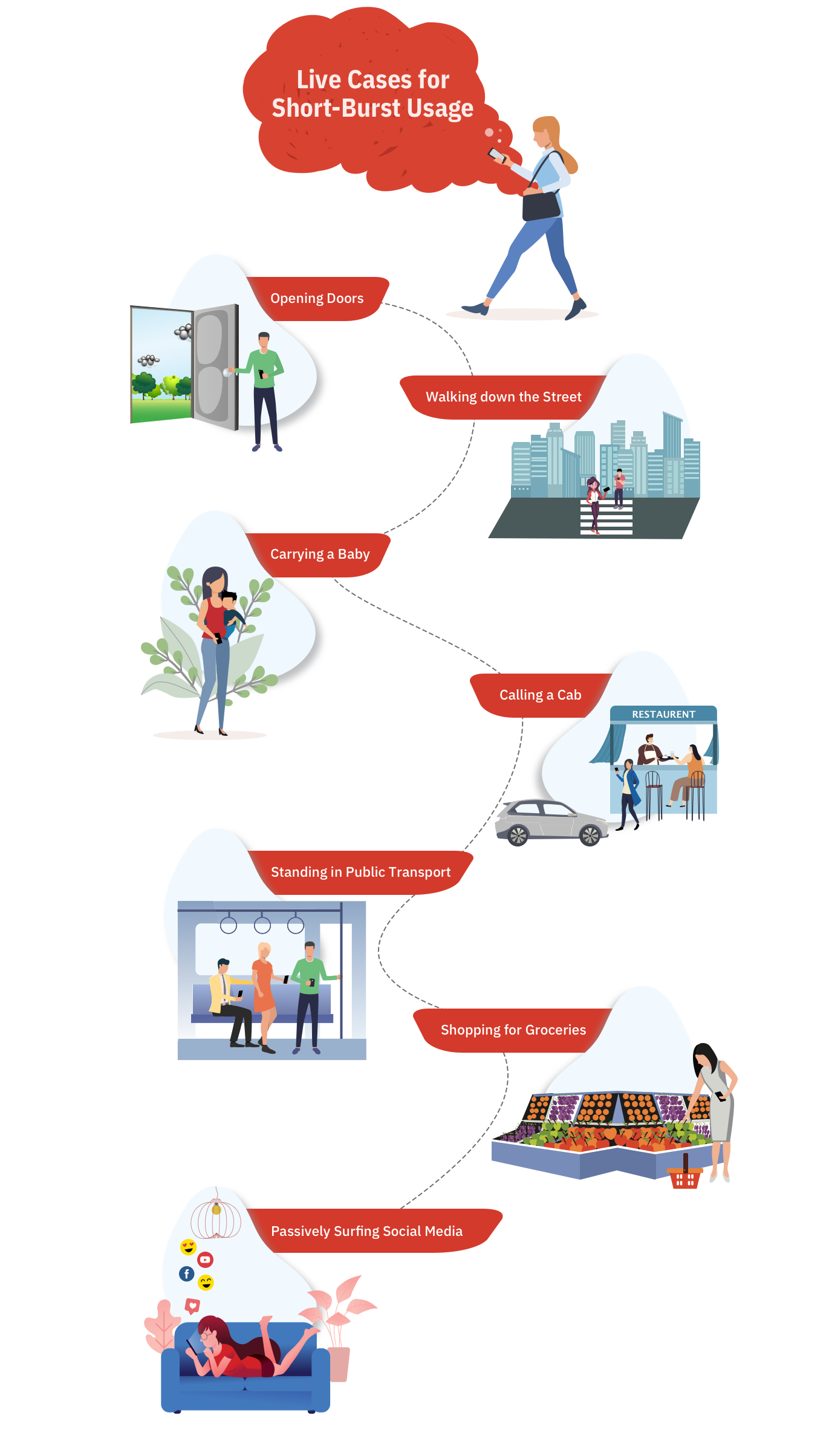
Google’s Product Director, Luke Wrobleski, terms these short bursts as ‘one thumb, one eyeball’ mobile-usage experience. It reflects how a distracting environment forces users to engage in single-handed usage within short spans of partial attention. He further adds that the most optimal type of smartphone usage with a single hand is one where quick interaction is supported by smooth functionality.
How To Design For Keeping These One-Handed Short-Burst Usages In Mind?
The answer is rather simple. Do continuous usability testing and study different ways your users hold their phones in various situations.
If the users of your app tend to use the app a lot in distracting scenarios, then you should focus on designing patterns that target reachability and one-handed use.
Let’s take a look at the evolution of Spotify’s interface to get a perspective of the problem:
Spotify used the Hamburger Menu at the top-left which concealed these features and set the users on a treasure hunt of sorts. With the advent of bigger screens, however, another design challenge was added to the list — reachability.
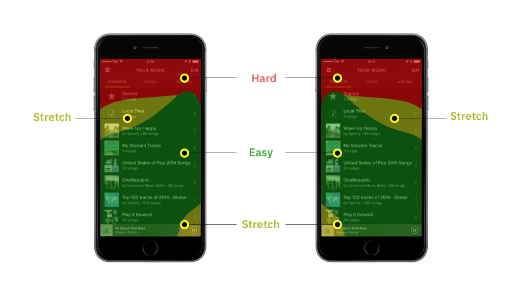
This compelled Spotify’s team to pull down the Hamburger Menu in 2016 and lay its core features — Home, Browse, Search, Radio, and Library — at the bottom that resulted in an increase of 9% clicks in general and 30% on menu items.
Use Established UX Patterns For Common App Usage Scenarios To Make One-Handed Usage Easy
Why reinvent the wheel? When you can use proven UX patterns that work. Many designers have already focused on one-handed usage as their designing principle.
We have gone through hundreds of apps and thousands of patterns to find the best patterns one-handed usage in mind. So let’s look at what works, what problems are solved, and what benefits you will get out of these.
We divide the most common user behaviors and UX patterns in six categories:
- Navigation UX Patterns
e.g. menu bars, tab bars, and, gestures for easily moving between the most important sections of the app; - Designing For Actions
Creating, editing, posting, adding, removing, and other actions users take to utilize the core functionality of the app; - Shopping, Transactional And Checkout Flow Design Patterns
- Searching, Sorting, And Filtering Patterns for when users want to quickly find or browse content;
- Input And Interaction Patterns
Sliders, pickers, selectors, dropdowns, form fills, zooming, scrolling that make up the building blocks of any app; - Miscellaneous Patterns
Media playback, photo capture, photo editing, and map navigational patterns.
1. Designing App Navigation Keeping ‘One-Handed Usage’ In Mind
What Is It?
The foundation of a great app is a good navigation design. Good navigation helps users discover the features faster and find what’s important to them.
70% of users discover features of the app using navigation links compared to search or other ways. Navigation bars, menus, gestures, links, tabs, etc are the most common navigation UX patterns.
A good navigation design should have all the important sections right upfront and easily accessible.
Challenges
Common UX patterns like Apple’s tab bar and Google’s swipeable menu have limitations. You can put only a limited number of features in the tab bar and to access all of the swipeable menu items is not easy.
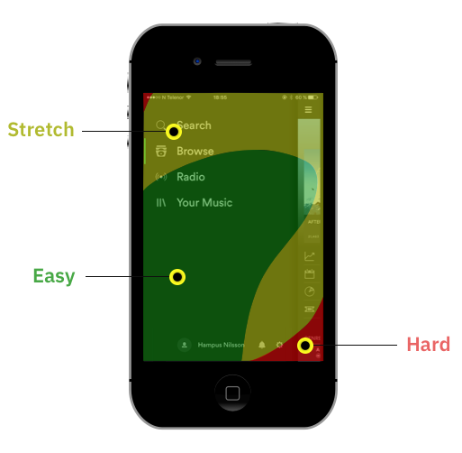
Users shouldn’t have to struggle to reach an important part of the app by stretching to the top of the screen. That’s just bad usability. Specifically, if the users are on-the-go and are using the app in a short burst.
Solution
Facebook and many other apps solve this challenge by putting items in a tab icon called More or Menu from where users can access more features and sections of the app. This, however, is not ideal for reachability and one-handed use.
- Use the flyout menu instead of a full-page menu for reachability and fitting in more than 5 items.
- Expanded tab bar for when you have more content.
- Personalized tab bar for power users to quickly access what they like.
- Use gestures to imbibe ease-of-access in users’ habits.
- Getting back and closing a page should be easy as well.
- Quickly jumping to a section of the page with smart UX patterns
Facebook, for instance, conceals numerous features in a Hamburger Menu that declutters the main screen. Although this inclusion has a cleaner and more organized appeal, users suffer from one-handed reachability.
Use Flyout Menu Instead Of A Full-Page Menu For Reachability
Thankfully, we have a way to resolve this challenge —
Full-page menus can be replaced with flyout menus, which like the name suggests ‘fly-out’ from the bottom. This allows for easier access to the options even with one hand.
Expand The Tab Bar For When You Have More Content
Human Interface Guidelines recommend having no more than 5 features in the bottom navigation bar. This makes it tricky for app builders to present additional core functionalities at the forefront.
This is where the ‘More’ option (3 dots) comes in handy. Located at the bottom bar, it can conceal other functionalities and reveal them with a click.
Personalized Tab Bar For Power Users To Quickly Access What They Like
Every user is different and a feature that is important for one user may not be that important for the other. To make the most of your app, you can allow users to customize their tab bars with frequently used functionalities.
Gestures Are Easy To Imbibe In Users’ Habits For Quick Navigation
Popularised by Tinder, Gesture-based navigation is a great technique to facilitate single-handed usage. Gestures if smartly used can help expand navigation for one-handed use.
From Designing “Getting To” To “Getting Back” Using Gestures And Accessibility
Navigation isn’t only about getting to a screen or section of the app. It is important to design for — going back to where the user came from, closing a screen, or jumping to a section on a page! Let’s look at how apps use gestures and UX patterns to do those things easily.
Patterns For Quickly Jumping To Different Sections Of The App
Apps with many categories, subcategories, and sections such as books, wiki, restaurant menus, products may need more organization to ensure users don’t struggle with finding content.
These can be organized in a hierarchy and using UX patterns to increase accessibility and ease of use.
2. One-Handed Patterns For Core Actions Like — Creating, Editing, Posting, Adding, Deleting And Others
What Is It?
Users spend about 50% of their mobile phone time in self-expression, social interaction, online shopping, managing finances, health and productivity, and planning upcoming events. These action-driven UX patterns include things like creating social posts, editing documents, editing, a few others.
Challenges
When designing action-driven apps, we have to ensure they don't take the backseat. Like, having a post or creating a button at the top instead of right next to your thumb.
Solution
There are three things to keep in mind when designing the user experience of these core actions.
- Core actions should grab users’ attention by the prominent placement of the icon or button. Don’t put them at the top right corner of the app where they can get buried. It should be easily reachable without needing to use second hand or overreaching.
- On top of that, users should be able to finish the entire creation and addition task flow with one hand. This includes things like canceling the task, typing with keyboard opening up, moving to the next step and so on.
- Designing for complex editing tasks with multi-level edit menus and controls.
- With reachability as a goal, you can make sharing and sending things easy and simple too.
The Button Or Icon For The Core Task Of The App Should Draw Users In
Apps’ core tasks center around things like capturing images, creating a post, adding files, sharing, etc. It becomes necessary to have users focus on these first and make it — reachable and discoverable.
For instance, Snapchat hides everything and only incentivizes users to capture photos and videos. Also, the ‘Send’ button immediately asks users to share their stories with others.
Breaking Up Complex Editing Tasks With Menus And Controls Designed Specifically For Mobile
For many users, mobile phones are the most used computing devices. There is a generation of users who get real work done on their mobile phones. For example, document editing is no longer a computer-only affair since a host of mobile apps offer the service.
Microsoft Word and WPS Office offer a host of editing tools and multi-level menus within thumb’s reach. These intuitive menu systems are smart and powerful allowing users to do complex operations and multiple choices.
With Reachability As A Goal, You Can Make Sharing And Sending Things Easy And Simple Too
What amplifies our experience with our favorite music these days is the super-quick shareability options for social media, often just a click away.
You can employ a share extension that slides up from the bottom and allows users to directly type messages.
Divide Creating Or Adding Tasks Into Multiple Steps
Creating boards, favorites, and wish lists can be a drag, especially when they are placed at the top extremes. Let’s look at the patterns that handle multi-step data inputs.
Flipboard and Airbnb keep everything at the bottom and within the reach of the thumb. From typing to selecting the next steps or canceling the action is very simple.
3. Designing Faster Checkout And Transactional Experiences For When You Are On-The-Go
What Is It?
According to Kaspersky Cybersecurity Index, 50% of eCommerce sales happen on mobile phones. Add to that commercial transaction like booking a ride, flight, hotel room, movie tickets, and concert tickets and you realize how important designing mobile checkout experience is. A report by Baymard Institute suggested that 23% of shoppers who abandon their cart abandon it because of the complicated checkout process. This is specifically true for mobile shoppers for whom checkout is a multi-step process where inputting data is not as easy.
Challenges
The checkout process requires many inputs and careful attention from users.
- Designing a one-handed checkout experience would mean users can complete the transaction with minimal thumb movement and fewer steps.
- This is especially very important for users who are on the move or need to do the transaction immediately.
Solution
To design a one-handed checkout experience we have to minimize the information required from the users.
- When choosing product variations like size, color, time/date and others, they should be easily accessible and discoverable.
- We can use applications like Google and Apple wallet or autofill from things like Keychain, 1password, and LastPass to fill the information like names, credit cards, addresses, One-time-passwords.
- We also must emphasize the simple and minimal thumb movements from the users.
Adding Items To Carts And Choosing Product Preferences At Thumb’s Reach
The logistics of shopping online can be simplified within three steps — adding items to carts, picking product variations, and completing the payment process.
As designers, it becomes essential for us to not only make these selections noticeable but also to place them within the reach of a thumb.
One way to achieve this goal is to display product variations in a tray that slides up when the user chooses an item.
Another way is to allow users to scroll through the page and quickly select variations of a product while the option to ‘Place the Order’ or ‘Buy’ stays static at the bottom.
Using e-Wallets And Password Managers For Swift Payment
The Payment Methods Report 2019 suggests that over 71% of online transactions are carried out via e-Wallets like Apple Pay, Google Pay, Alipay, Fitbit, Samsung Pay, YandexMoney, and others. These wallets are not only deemed to be faster but are also much safer and easier to access.
The checkout process can be made more efficient and straightforward. What’s more, you can also add a swipe-to-pay option for higher conversions.
4. Searching, Filtering, And Sorting Content With Reachability As The Main Goal
What Is It?
Without the right UX, finding just the right products or items can be a tedious challenge for the user. Searching, filtering, and sorting tools determine how easy or difficult it is for the user to browse the site’s product and item catalog.
Filters are a great tool to narrow down high volumes of content and to find the most relevant results.
In theory, they are different: sorting organizes the content according to a certain parameter, filtering removes it from view.
During Baymard’s Product Listings & Filtering study, it was observed that sites with an average product list usability saw abandonment rates of 67–90%. What’s more, there was about 17–33% abandonments from users trying to find the exact same types of product from e-Commerce sites with a slightly tweaked toolset. This resulted in approximately 4X increase in leads.
Challenges
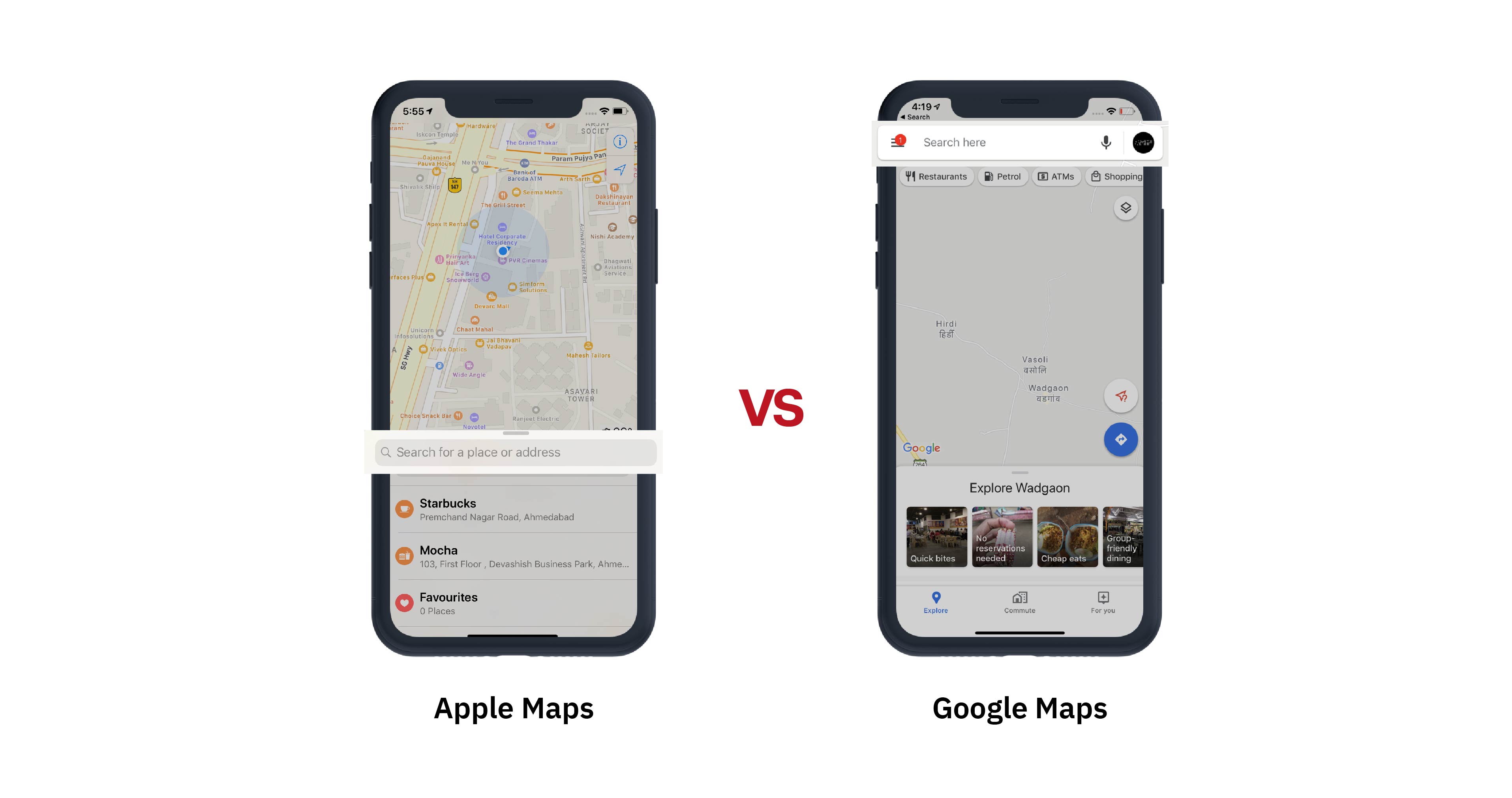
- Searching on mobile should be easily accessible. For example, Youtube, Amazon Prime, Slack, Google Maps make it difficult for users to reach the search menu by having them reach the top right corner.
- Organizing the information hierarchy of filters as there are too many parameters and categories so that users can find what they are looking for quickly.
- Manage multi-level information in UI especially when there are many categories and each category has many items.
- Changing UI based on different states like “Filter is applied” and what “Filters are applied”.
- All this should be accomplished by users in the reach of users’ thumb.
Solution
- Use gestures or easily accessible buttons for search. When users go to the search screen give suggestions as well as open the text box immediately.
- Speak the language of the users and keep users intent in mind when organizing filters. Keep the filters/sorting button near the reach of users. Also, make accessing and closing the filters menu with one hand.
- To solve information complexity use either a two-step filtering control or side by side filtering control.
- Apply filters immediately. Make filters interactive based on actions users take. Allow users to choose multiple options. Change filter categories to match applied filters.
- Show recommendations, recently used or most frequently used information first.
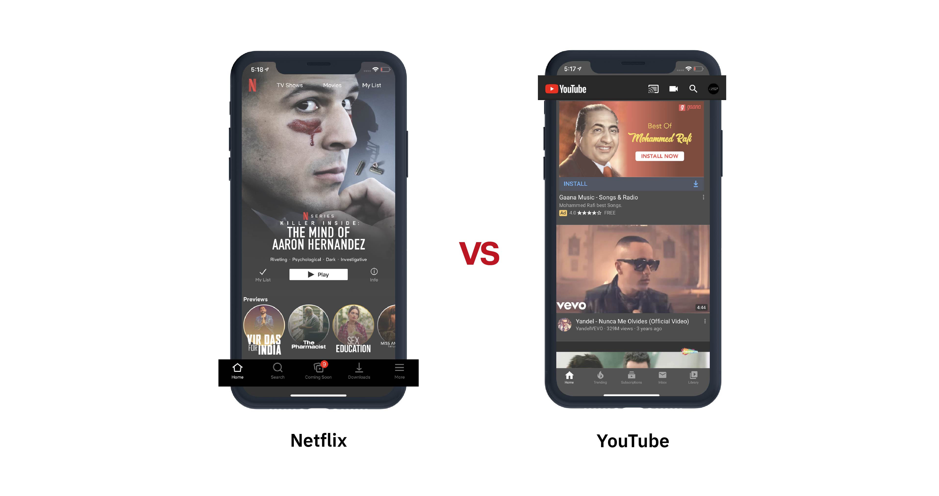
For many apps, Search is one of the top 5 features used. But many app designers make reaching the search icon difficult. See the comparison below for Apple Maps vs Google Maps and Netflix vs Youtube.
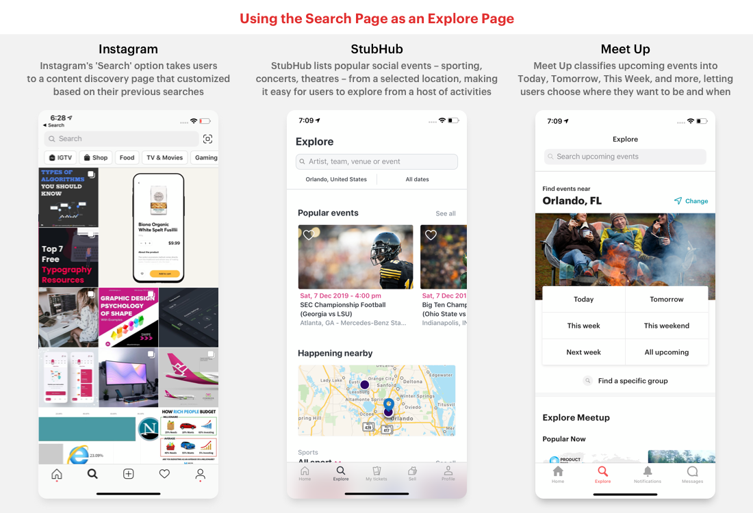
Some apps use the search screen as a content discovery screen. They recommend users what they’d like, what they searched before, what’s trending and so on.
Remove Friction And Impending Steps From Searching And Filtering
To make things really quick for users, we can make it so that when they tap on the search icon on the tab bar the keyboard immediately pops up so that users can start typing their queries immediately. See the examples of Netflix and SpotHero.
Many apps like Amazon or Google Drive use the search bar prominently at the top of the home page. In such cases, we can use gestures (swipe down) like the Inshorts app to immediately start typing instead of having to reach the top and tap on the search bar.
Double-Tap On The Search Icon To Pull Up The Keyboard
If you want to use your search page to show information to users then you can also use double-tap to pull up the keyboard like Microsoft News, Spotify, and Reddit Apollo.
Thumb Reachable Filter Menu Should Let Users Find Information Faster
Online shopping, booking, on-demand and other apps alike can contain a laundry list of items for users to choose from.
The biggest consideration for designing a filtering menu for small devices is the information hierarchy. Let’s look at these examples to understand how filtering and sorting can be designed when options are aplenty. These show how you can handle information complexity without letting one-handed usage suffer.
Also, filters should be responsive and reactive to users’ choices and indicate when filters are applied.
To make this process more responsive, search results can be filtered in the background simultaneously as users select the choices.
5. User Input Controls Such As Forms, Pickers, Selectors, Dropdowns, Sliders That Make Up The Building Blocks Of An App
What Is It?
With smaller screens comes smaller real estate. Fundamental user interactions have to be reimagined in order to increase the productivity of mobile users.
Things like filling up forms, typing up the password, choosing date/time, making a selection, popovers had to translate well to touch interface without abandoning the metaphors of PCs.
Challenges
Inputting data on mobile devices is tedious, especially when there are a number of data fields to be filled.
Translating user interactions to smaller devices is not easy. The biggest challenges are:
- Speed of user input should be very fast with minimal movement of users' thumb.
- Information should be gathered in a minimal number of steps.
- The input control design should have an easily understood interface and metaphor.
- The experience should be delightful and consistent.
- Users must know their location and information must not be lost.
When done correctly, adding inputs in trackers, calendars, and others alike could become a short task.
Solutions
- Any user action like filling up forms or making choices should be closer to the bottom. The flow of actions and choices should be consistent without any jarring UI changes.
- Information needed to move ahead should be in thumb’s reach.
- Data input options including notifications should be clear and near to the bottom.
- Bigger forms can be divided into multi-step and multi-screen forms. This multi-screen approach should have going forward and going back very easily.
Fixing Filling Up Forms Starting With Sign-Up Forms
We all hate filling up sign up forms. They are time-consuming and ask for unnecessary information.
Filling up forms can be less laborious by turning a lengthy form into multiple screens. Using things like auto-fill, thumb reachable buttons for next and previous steps, continuous keyboard presence, and no scrolling makes this approach faster and easier.
Get Quick Input From Users With Minimal Thumb Movement
Positioning the user-input controls towards the bottom of the screen allows for quicker data entry and prompt call-to-action responses.
Use pickers, dropdowns, scrollers, and sliders to supply information to users.
Smart Mobile Patterns For User Input Controls
Let’s look at some more patterns that make getting input from users easier.
6. Miscellaneous Patterns For Media Playback, Photo Capture, Photo Editing, And Map Navigation Patterns
With over 2 million apps on Google Store and 1.83 million apps on the App Store, it has become imperative for designers to make their apps stand out. One way to do this is to make common functions fun and smooth for users, and this final section is a round-up of miscellaneous user interactions.
Conclusion
Although reachability is a big part of it designing for one-handed usage, it is not just about ensuring everything close to users’ reach. Apps that have good one-handed use also save the time of users, remove friction, take out unnecessary steps, and most importantly focus on quickening the “distracted short burst usage” of apps.
We looked at many patterns that designers can use to solve different UX challenges. For more, you can check these websites to find patterns that help you design for one-handed use.
Further Reading
- T-Shaped vs. V-Shaped Designers
- The Scent Of UX: The Unrealized Potential Of Olfactory Design
- A Complete Guide To Live Validation UX
- Designing Better Links For The Web
 (cc, yk, il, mrn)

