Magic Flip Cards: Solving A Common Sizing Problem

Email Newsletter
Weekly tips on front-end & UX.
Trusted by 182,000+ folks.
 Register for Free
 Custom Web Forms for Angular, React, & Vue. Your backend.

 Celebrating 10 million developers
What are the chances your next client will use the word interactive while introducing their project? In my experience, the answer is 100%, so I’m always looking for robust CSS techniques to help me deliver the various features and effects that come up when discussing this goal.
A little piece of interactivity I’m asked to implement again and again is flip cards — blocks of content that turn about when hovered or tapped to reveal content on their reverse side. It’s a neat effect that encourages playful browsing, and another way to show more information without navigating away from the page. But the standard method has a problem when it comes to accommodating different card content lengths.
In this tutorial, we’re going to build a flip card grid which solves that problem with some CSS basics — transforms, flex, and grid. You’ll need to be familiar with these, and it will help to have a good grasp of CSS positioning techniques. We will cover:
- How flip cards are usually implemented using absolute positioning;
- The sizing problem that absolute positioning introduces; and
- A general solution for automatic sizing of overlaid content.
Creating A Basic Flip Card
With good modern browser support for three-dimensional transforms, creating a basic flip card is relatively straightforward. The usual method is to place the front and back card faces in a parent container, and absolutely position the back face so it can match the size of the front face. Add an x-axis transform to the back face to make it appear reversed, add another to the card itself on hover, and we’re in business.
.cards {
  display: grid;
}

.card {
  perspective: 40rem;
}

.card-body {
  transform-style: preserve-3d;
  transition: var(--time) transform;

  .card:hover & {
    transform: rotateX(-180deg);
  }
}

.card-front, .card-back {
  backface-visibility: hidden;
}

.card-back {
  position: absolute;
  top: 0; right: 0; bottom: 0; left: 0;
  transform: rotateX(-180deg);
}
A standard flip card implementation using absolute positioning (see the Pen “[Magic Flip Cards 1: The Standard Implementation](https://codepen.io/smashingmag/pen/JjdPJvo)” by Dan Halliday)
What Could Go Wrong?
Our standard solution has a big problem, though: it doesn’t work when the back face needs more space than the front face provides. Giving the card a large, fixed size is one solution, but that approach is also guaranteed to fail at some point for some set of screen sizes.
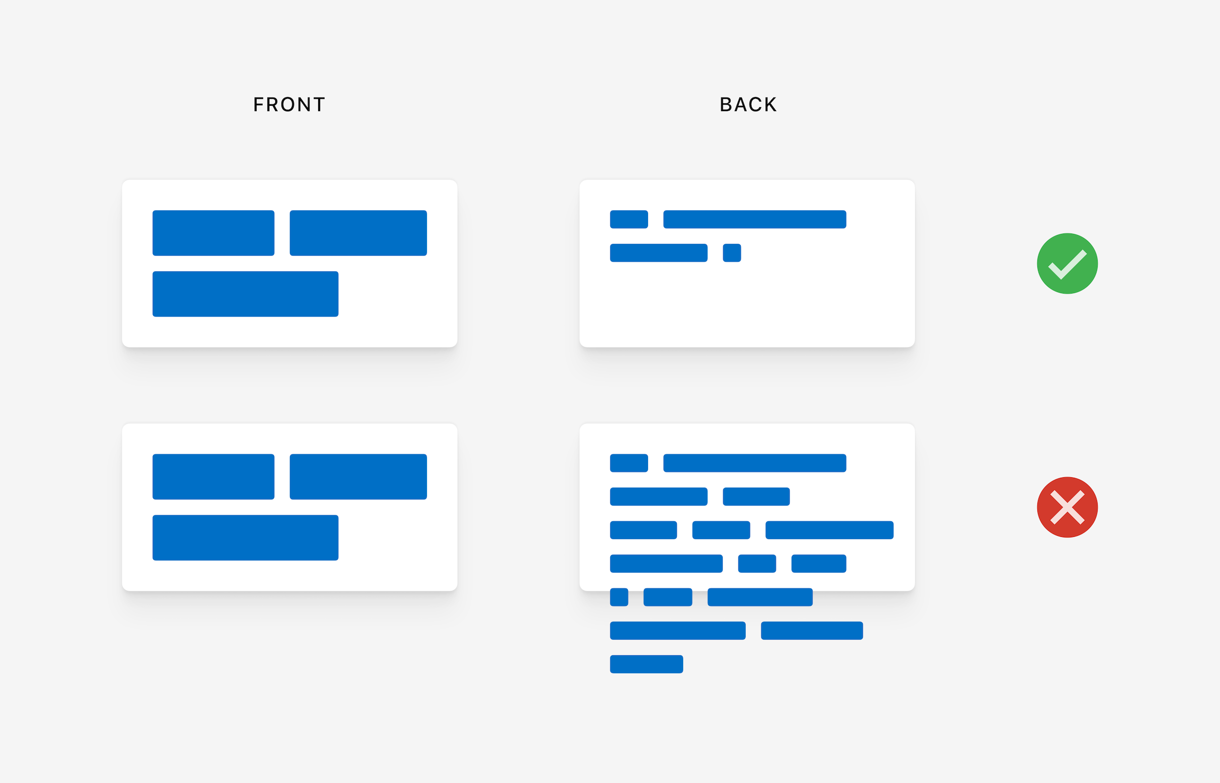
Design comps naturally feature neat-looking boxes with text that fits perfectly. But when starting development, it can be hard to get a page and card layout that works for the real content. And when displaying dynamic content from a CMS, it can be impossible! Even with word or character limits, there’s often no solution that works reliably across all devices.
How the standard flip card implementation fails with longer back content (see the Pen “[Magic Flip Cards 2: How Absolute Positioning Fails](https://codepen.io/smashingmag/pen/QWbLMLz)” by Dan Halliday)
We should always strive to create layout implementations that tolerate a wide range of content lengths. But it’s not easy! I’ve often had occasion to fall back to using fixed sizing and position, whether due to time constraints, insufficient browser support, a weak reference design, or just my own inexperience.
Over the years, I’ve learned that a good iterative process and healthy dialogue with the designer can help a lot when wrangling these issues, and often you can meet somewhere in the middle to get a robust layout with some interactivity. But back to the task at hand — can it be done?
Thinking Outside The Box
In fact, it is possible to size the cards based on both the front and back content, and it’s not as hard as it seems at first. We just need to be methodical and persistent!
Constraining The Problem
Let’s start by making a list of our layout’s requirements. Trying to write down precisely what you want might seem like a chore, but it’s a great way to uncover constraints that can be simplified to solve a problem. Let’s say:
- We want to see one or more rectangular cards, arranged in a single-column or multi-column grid;
- We want the cards to flip over on hover or tap to reveal a second set of content on the back face;
- We want the cards to always be big enough to show all their front and back content, regardless of content length or styling; and
- In the case of multiple columns, ideally, we want all the cards to be the same size so that the rows align nicely.
Thinking through these requirements, we can notice a couple of things that simplify the problem:
- If the cards are going to be presented in a grid, we have a constraint on their width — that is, their widths are functions of the viewport or grid container rather than their own content;
- Given that we know a card’s width (as a percentage of its parent, at least), we’ve solved for the horizontal dimension and we just need to have the card’s height expand to fits the taller of its front or back face; and
- If we can do that and each card is vertically self-sized, we can use CSS Grid’s
grid-auto-rowsto make all rows of cards as tall as the tallest card.
Figuring Out The Card Trick
So, how do we self-size the cards? Now we’ve simplified our problem, we’re within reach of the solution.
Forget, for a moment, the idea of putting content on top of other content, and focus on our new requirement: a parent that is as tall as its tallest child. That’s easy! Using columns, we can cause a parent to expand to the height of its tallest child. Then, we just need to employ a little sleight of hand to get the children aligned:
- Set the children to be the same width as their parent
- Allow the second child to overflow to the right
- Transform it leftwards back into its proper place
.cards {
  display: grid;
}

.card-body {
  display: flex;
}

.card-front, .card-back {
  min-width: 100%;
  mix-blend-mode: multiply; // Preview both faces
}

.card-back {
  transform: translate(-100%, 0);
}
Vertical sizing by fixed horizontal overflow (see the Pen “[Magic Flip Cards 3: Vertical Sizing by Fixed Horizontal Overflow](https://codepen.io/smashingmag/pen/ExjYvjP)” by Dan Halliday)
If this approach seems obvious, rest assured that I spent many hours going through some really terrible ideas before thinking of it. At first, I had planned to print a hidden duplicate version of the back face text inside the front face to expand the card to the correct size. And when I did think of using column overflow, I was originally cropping the right-hand column using overflow:hidden, and transforming it only at the last moment when the hover started, as I hadn’t yet realized I could just keep it transformed from the beginning and use another method such as opacity or backface-visibility to turn it on and off as needed.
In other words, obvious solutions are the result of hard work! If you feel like you’ve been bashing your head against your desk for hours on a layout problem, it is important to take a step back and decide whether you are spending your client’s time wisely: whether to suggest they alter the design, and whether to pursue the solution in your own time as a learning exercise when the pressure’s off. But when you do come up with simple methods, never feel stupid because it took a long time. Now, let’s review our complete solution.
.cards {
  display: grid;
}

.card {
  perspective: 40rem;
}

.card-body {
  display: flex;
  transform-style: preserve-3d;
  transition: var(--time) transform;

  .card:hover & {
    transform: rotateX(-180deg);
  }
}

.card-front, .card-back {
  backface-visibility: hidden;
  min-width: 100%;
}

.card-back {
  transform: rotateX(-180deg) translate(-100%, 0);
}
The complete magic flip cards solution (see the Pen “[Magic Flip Cards 4: The Complete Solution](https://codepen.io/smashingmag/pen/xxGKLZO)” by Dan Halliday)
Are There Any Caveats?
The solution works well generally, with just a few minor caveats to bear in mind:
- The cards must be present in a grid layout or in some other context where their widths are not content-dependent.
- Cards require a content wrapper of some sort (our
card-body) so that the hover area doesn’t change during animations. If the card itself is animated, you’ll see some glitching as the animation rapidly stops and restarts. - Styling such as backgrounds and box-shadows are best placed directly on the front and back faces, as any effects on the card itself will not be animated. Beware of styling such as box-shadows on the card body, as naturally they will get flipped upside down.
- Cards’ front and back faces need their
box-sizingproperty set toborder-boxif they have their own padding, owing to theirmin-widthrequirement, otherwise they will overflow. - Safari still requires
-webkit-backface-visibility, in its vendor-prefixed form.
Adding Some Polish
Now we’ve solved the hard problem, let’s look at a couple of tweaks we can make to get the whole interaction working as smoothly as possible.
First, check whether the cards overlap while flipping. This will depend on whether you’re using multiple columns, the width of the column gutter, the orientation of the flip, and the perspective value of the card, but it is likely to happen. You can increase the duration of the animation to see things more clearly. When hovering, it looks unnatural for the hovered card to flip underneath its later neighbors, so we need to put it on top using z-index. Easy enough, but watch out! We need to wait until the outgoing animation is complete before restoring the z-index. Enter transition-delay:
.card {
  transition: z-index;
  transition-delay: var(--time);
  z-index: 0;

  &:hover {
    transition-delay: 0s;
    z-index: 1;
  }
}
Next, consider creating an active state for the cards. I usually try and make cards like these link to somewhere relevant — even if not specified by the designer — as elements with hover effects like this feel very tappable so it’s good to provide a destination for readers who try their luck. I like a short, subtle scale transform, as it works reasonably well whether or not the second half of the animation is cut off by loading of the destination page (I’d love for browsers to complete in-flight animations cleanly before navigation, though I’m sure that would be far more difficult to implement in practice than it sounds).
This is also a great opportunity to think about how accessible our cards’ back content is. Our markup is concise and well-ordered so we’ve covered screen readers and other use cases that ignore styling, but how about keyboard users? If we’re going to make the cards themselves anchors, they will receive focus as keyboard users tab through the page. Let’s reuse the card’s hover state as a focus state, and the back content will appear naturally during keyboard browsing.
.card {
  transition: z-index, transform calc(var(--time) / 4);
  transition-delay: var(--time), 0s;
  z-index: 0;

  &:hover {
    transition-delay: 0s;
    z-index: 1;
  }

  &:active {
    transform: scale(0.975);
  }
}

.card-body {
  .card:hover &, .card:focus & {
    transform: rotateX(-180deg);
  }
}
Finally, don’t forget that now the card automatically scales to fit its content, you can use pretty much any alignment and spacing techniques you like inside the front and back containers. Use flex alignment to center titles, add padding, even put another grid inside the card. This is the beauty of good layout solutions that scale with their content — reduced coupling of children to parents, and the modularity that allows you to focus on one thing at a time.
.card-front, .card-back {
  display: flex;
  align-items: center;
  background-color: white;
  box-shadow: 0 5px 10px black;
  border-radius: 0.25rem;
  padding: 1.5rem;
}
Wrapping Up
I hope you find this CSS technique useful! Why not try some variations on the animation, such as a scale effect, or a simple cross-fade? The technique isn’t limited to the cards form factor either. It can be used anywhere where the responsibility for vertical sizing falls to more than one element. Imagine a magazine website featuring large photographs with overlaid captions — you could use it to accommodate both images with tall aspect ratios, and long dynamic text.
Above all, remember the benefits of taking some time to really think hard about whether there’s a way of implementing a design that looks as if it would only work with fixed sizing and position. Often, there is, and no matter how tricky the problem may seem at first, writing down all your requirements, putting some time aside to create a minimal test case, and stepping through it methodically is always the best bet.
Further Reading
- How To Design Effective Conversational AI Experiences: A Comprehensive Guide
- What Are CSS Container Style Queries Good For?
- How To Harness Mouse Interaction Data For Practical Machine Learning Solutions
- How To Build A Magazine Layout With CSS Grid Areas
 (ra, il, mrn)

