Inspired Design Decisions With Neville Brody: Design Cannot Remain Neutral

Email Newsletter
Weekly tips on front-end & UX.
Trusted by 182,000+ folks.
 Celebrating 10 million developers


 Custom Web Forms for Angular, React, & Vue. Your backend.
Although I was born in North West England, I grew up in Corby, a steel working town in the middle of the country. From the 1930s, Corby had grown to rely on steel production, with working-class families — a large number of them from Scotland — flocking to the area. During the Second World War, burning oil to produce thick smoke prevented all but a few German bombs, but when I was in my teens, a different toxic cloud, Thatcherism, hung over Corby as it did many industrial and manufacturing centres across the UK.
Corby had become part of the nationalised British Steel Corporation during the 1960s, but within twenty years, the Conservative government announced the closure of the Corby plant. This lead to 11,000 job losses and an unemployment rate in the town of over 30%.
As a teenager growing up in Corby in the early 1980s, my prospects were as grim as many thousands of others in the town. Music was one form of distraction and clubs and pubs around Corby had a thriving local music scene. Bands with names like Bandits At 7 O’Clock, The Laughing Mothers, and Play The Joker, were inspired by the dark themes of post-punk, rockabilly and classic rock.
Music wasn’t only for escapism, it was also a way to express political opinions and support the causes we cared about. As part of the Corby Music Collective, my band, The Inline, played gigs in support of the anti-apartheid movement and even supported Billy Bragg on his first national tour in support of striking miners. I still have the backstage pass which Billy signed for me.
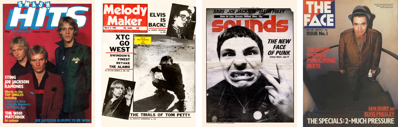
Local bands designed their own publicity and the mostly two-colour artwork was edgy and unpolished. Local screen-printing workshops offered affordable flyers and posters. Music magazines were popular too. Not mainstream publications like Melody Maker or teen titles like titles, but titles like Sounds, which covered counter-culture, and of course The Face. I knew there was something special about it, although at the time I didn’t know what an art director did or who Neville Brody was.
The Face became a pop culture mirror to the political and social turmoil in Britain at that time. Its unconventional and thought-provoking designs and Brody’s subsequent work redefined the British music press from the 1980s onwards and influenced a generation of designers. Even twenty-five years after he created them, Brody’s pages from The Face magazine are still remarkable designs. I’m still inspired by them every day and in this issue, I’m going to explain some of the ways how.
Inspired By Inspired By Neville Brody
British punk was a reaction to mass unemployment and a reflection of the social unrest in 1970s Thatcherite Britain. Punk rejected anything it considered self-indulgent, and its DIY approach stripped music back to basics.
In 1977 — at the height of punk’s influence on British culture — Brody began studying graphics at The London College of Printing, where he soon found the environment frustrating and out of step with what was happening around them. Tutors at the LCP emphasised commercial applications for graphic design and Brody’s experimental work was condemned by them as “uncommercial.”
But Brody’s fast-paced, DIY approach to approach to design and especially his use of homemade typography were perfectly suited to the band posters he made while still at the LCP. After leaving, Brody designed record sleeves for Rocking Russian before moving to Stiff Records, and ultimately to The Face. The Face was a culture, fashion, and music magazine published in Britain until 2004 and Brody worked as its art director until 1986.
"The Face was a living laboratory where I could experiment and have it published. Our golden rule was to question everything. If a page element existed just as taste or style, it could be abandoned. Page numbers could be letters or shapes increasing in size. We could start the headline on the page before. We had disasters and near misses every issue. We had two weeks to art direct everything, then a week to lay it out. It was pre-computer so everything was traced by hand. […] It certainly wasn’t a nine-to-five job. You had to be obsessed to make it work."
— Neville Brody
Good typography is often described in terms of rules, but Brody wasn’t interested in rules, so he skipped typography classes at the LCP. Not knowing the conventional rules of typography meant that Brody wasn’t limited by them. Instead, Brody studied typography he saw around him, from the Dadaism movement, Futurism, and the work of Alexander Rodchenko, whom I introduced in a previous issue.
Brody saw typography as a medium for commenting ideas and so should be expressive and entertaining. Widely spaced letters became a familiar part of Brody’s designs for The Face. He used this extra whitespace for its aesthetic, and to emphasise the horizontal, vertical, and sometimes diagonal direction of lines of type. His wide letter-spacing also slowed down the reading experience and created spaces for people to pause and consider the content.
But despite Brody’s lack of traditional typography training, his priority was still that people should be able to easily read the magazine. With that in mind, he worked closely with the editorial team at The Face.
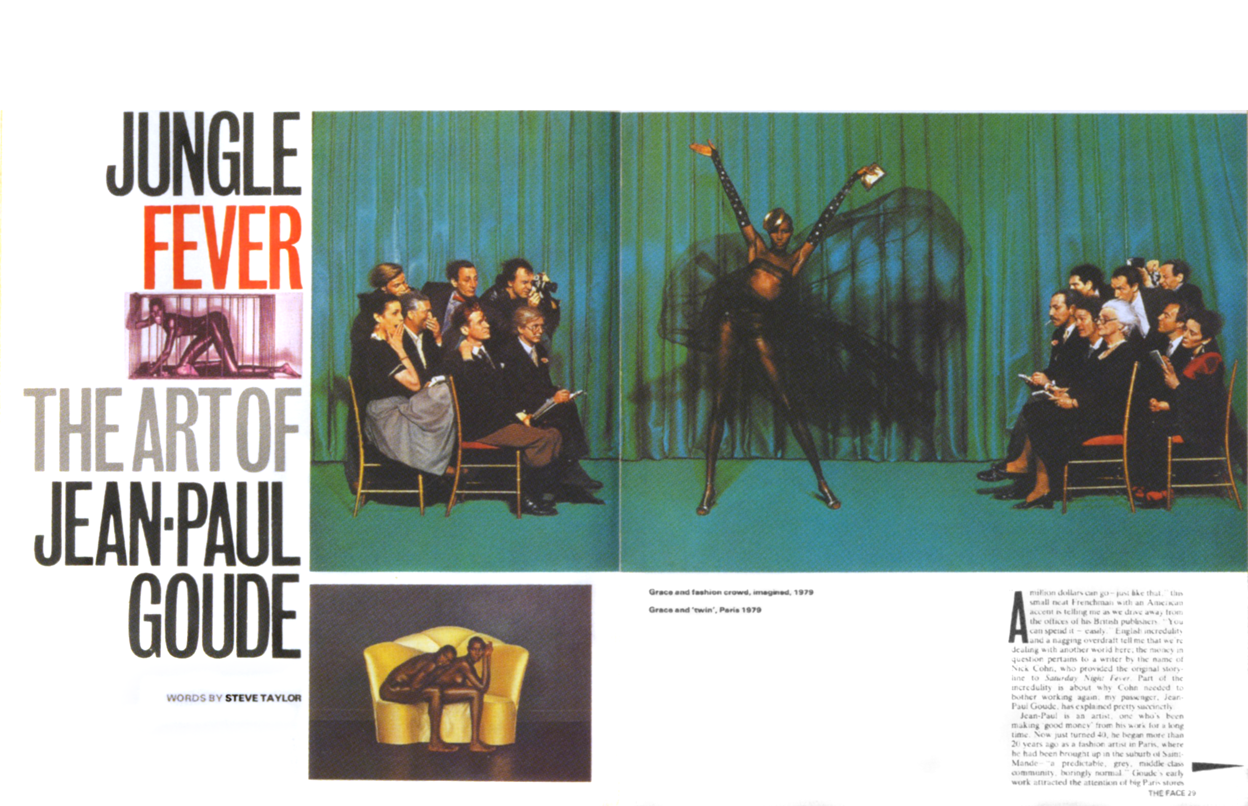
The Face maintained punk’s rebellious attitude, but its original aesthetic wasn’t just superficial. With The Face, Brody questioned the structure of a magazine and how people experience it. I find plenty of parallels between how he explored the multi-page experience of reading a magazine and how people use the web.
In The Face, bleeding images and type off the edges of a page does more than making the magazine look unique. It suggests that there’s more to see outside the visible page and that what someone sees is part of something bigger.
The layout grid throughout The Face uses just two or three columns, but Brody’s execution shows just how flexible even the simplest grids can be when combined with imagination. The Face demonstrates how a system for design is the structure on which you start building a design. It should support a design, not define, nor dictate the end result.
On the web, we’re told to not make someone look more than once, to not make them think. But, one of the reasons I find Brody’s work so fascinating is it makes people look twice. His spread designs for The Face were often self-contained and encouraged people to linger on them rather than quickly turn the page. While you might think this runs counter to the principles of user experience design, in reality, it can be a factor in making your designs more memorable because people spend more time considering them.
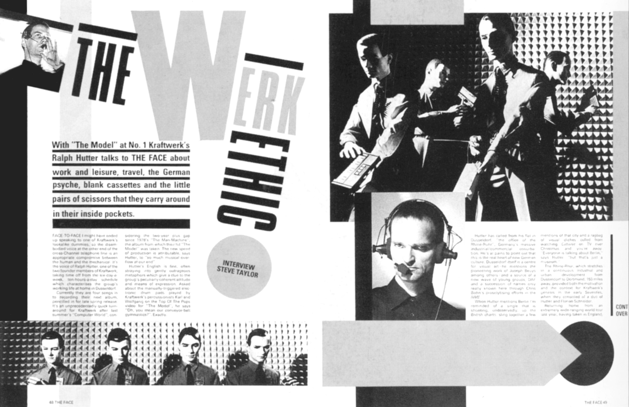
This rule-breaking attitude needn’t be at the expense of usability. Brody’s designs for The Face use a grid, which provides structure to a page and continuity throughout the magazine. They also include features which guide someone through an article, from where to start reading, to knowing they’ve reached the end. Drop-caps are a traditional device for helping someone know where to start, but Brody became obsessed with finding alternatives, including graphic symbols, alternative type treatments, and whitespace. As Brody explained to Jon Wozencroft in 1987, “Once you have broken down the rules, literally anything is possible.”
"For a lot of designers, The Face became the perfect graphic phrase-book, but its success, I hope, is also an indication that you can go against the grain and make it work commercially."
— Neville Brody
Brody wanted his work to demonstrate that breaking with traditional approaches to design is possible, even when what you’re designing is commercial. He didn’t want people to merely imitate his designs or use them to create new rules or traditions. I feel the same way about exploring ideas from print and other media and applying them to the web without questioning what we’re aiming to achieve and why we’re doing it.
After five years, Brody left The Face in 1986 and became one of Britain’s most influential and prolific designers. In the 1990s, Brody co-founded the FUSE project with Jon Wozencroft, and their groundbreaking magazine ran for twenty issues. He also co-founded FontFont, the typeface library, alongside Erik Spiekermann. In 2018, Brody stepped down from his position as Dean of the School of Communication at the Royal College of Art.
Jon Wozencroft — Brody’s partner at FUSE — published two volumes of ‘The Graphic Language of Neville Brody’ in 1988 and 1994. You can still find copies available on eBay. ‘The Story of The Face: The Magazine that Changed Culture’ by Paul Gorman is more readily available, as is a compendium of all twenty issues of FUSE. They’ll all make fabulous additions to your graphic design library.
Blends Add Depth And Richness
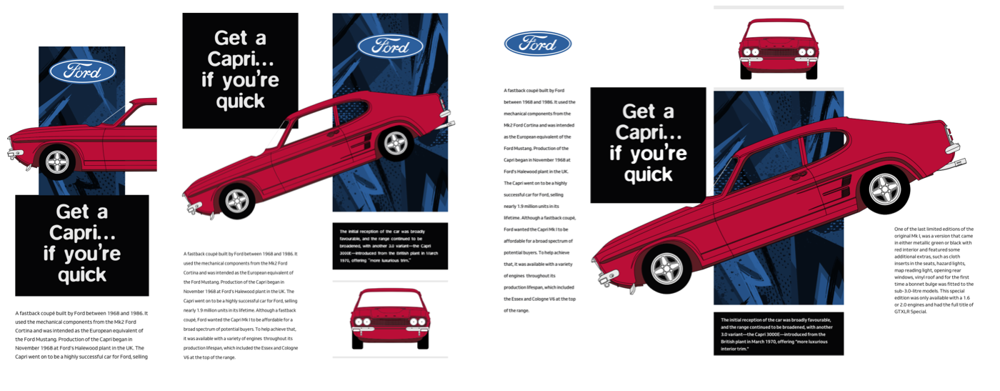
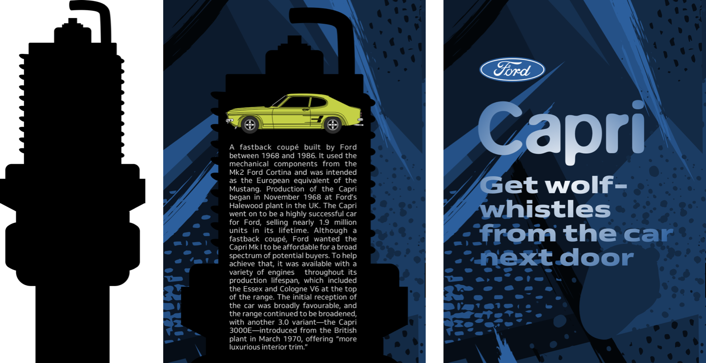
For my first Brody-inspired design, the main content contrasts with a colourful and chaotic background image. I need only two structural elements to implement this energetic design; a header which contains the iconic Ford logo, a headline, and the tagline from a 1970s Capri advertisement. The main content includes an SVG profile of the Capri which sits on top of my running text:
<header>
<img src="logo.svg" alt="Ford">
<h1>Capri</h1>
<p>You might get wolf-whistles from the car next door</p>
</header>

<main>
<p><svg>…</p>
</main>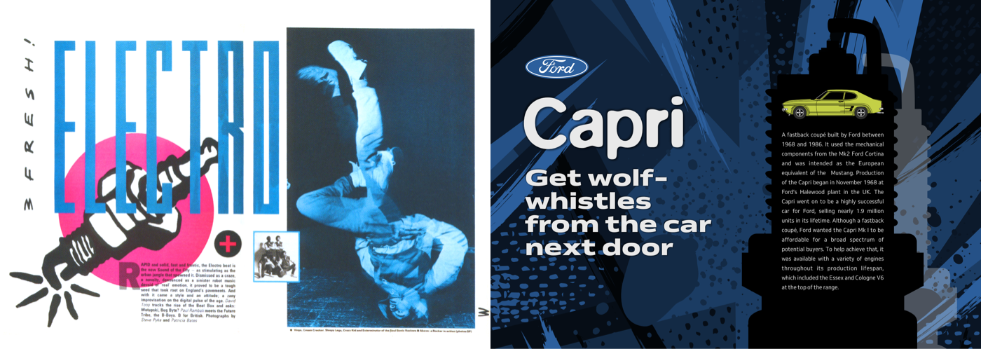
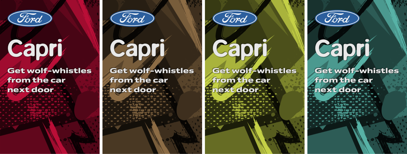
Using an inline SVG for this graphic image means one fewer requests to a server, and provides the ability to change the Capri’s paint colour to match any colour background. I start by adding background and foreground colours to the body of this page. Setting its minimum height ensures this background will fill the full height of the page at every screen size:
body {
padding: 0 1rem;
min-height: 100vh;
background-color: #ba0e37;
color: #fff; }
The Ford logo may be a classic, but I don’t want it to dominate this page when seen on small screens. I limit its maximum width to one-third of any viewport. This selector targets an image where “logo” occurs somewhere in an image’s source attribute:
[src*="logo"] {
max-width: 33vw; }
I add a double shadow to ensure my heavy headline and tagline spring out from the page. While the first shadow uses positive X and Y values, the second uses negative values. When combined, these shadows spread all around my text:
h1,
h1 + p {
margin-bottom: 0;
font-weight: 900;
text-shadow:
4px 4px 2px rgba(0,0,0,.35),
-4px -4px 2px rgba(0,0,0,.35); }

h1 {
font-size: 3.4rem; }

h1 + p {
font-size: 1.802rem; }
My design should raise someone’s blood pressure as much as driving a Capri, so I add an adrenaline-filled background image which covers the entire page:
body {
background-image: url(body.png);
background-size: cover; }
This image may be monochrome, but adding a background-blend-mode property with a value of multiply crams this page with colour:
body {
background-blend-mode: multiply; }
Introducing Background-Blend-Mode
Blend modes were proposed initially by the Adobe Web Platform team. They allow web designers the same control over blending colours that have been a feature of graphics software like Adobe Photoshop for years. These modes determine how two elements or more elements combine with each other.
The CSS Compositing and Blending module includes three properties; background-blend-mode, mix-blend-mode, and isolation. To implement this design, I use background-blend-mode which allows blending an element’s background colours and images:
body {
background-color: #ba0e37;
background-image: url(body.png);
background-blend-mode: multiply; }
There are fifteen background-blend-mode options; color, color-burn, color-dodge, darken, difference, exclusion, hard-light, hue, lighten, luminosity, overlay, saturation, soft-light, and screen.
Blend modes can be used to blend a background colour with a single background image, or when an element has more than background image, they can be applied differently to each which can add depth to a design. This background-blend-mode applies to all background images:
body {
background-image: url(body-1.png), url(body-2.png);
background-blend-mode: multiply; }
Whereas, to blend these two images differently, I apply two background-blend-mode values, making sure to list them in the same order as my images:
body {
background-image: url(body-1.png), url(body-2.png);
background-blend-mode: screen, multiply; }
CSS blend modes don’t merely save time on trips to an image editor, they’re also a fabulous way to add depth and texture to a design which can be refreshing when the majority of websites are flat and two-dimensional.
To implement the rest of this small screen design. I add a background image of a spark plug silhouette which fills the main element which contains my running text:
main {
background-image: url(main-1.svg);
background-position: 0 0;
background-repeat: no-repeat;
background-size: 100%; }
Then, I use a mixture of rem-based and viewport width padding to solidify that content into a narrow column:
main p {
padding: 8rem 20vw 6rem; }
Text which is justified to both left and right edges often creates unsightly rivers of white space between words. These gaps can interrupt the reading experience. It’s for this reason, justified text is rarely used online.
Hyphenation wraps words onto multiple lines and splits a line’s last word with a hyphen. There are three values for hyphenation in CSS:
- none: Words aren’t broken, so longer words will flow onto a new line, sometimes leaving an unattractive gap at the end of a line.
- manual: Words are broken when either a hard hyphen or an invisible soft hyphen (
) inside them suggests an opportunity. - auto: A browser inserts hyphens according to its own rules and the language used. Browsers vary in how they apply these rules.
Sadly, not all browsers support hyphenation, so to avoid unsightly rivers within the text, I should only apply the hyphens property to supporting browsers. For this, I use a feature query.
Introducing Feature Queries
You’ll probably already know all about @media queries and use them to adjust styles across different screen sizes. While @media queries test whether a device is a printer or screen, and tests for height, width, or orientation, the @supports at-rule tests browsers’ features.
A basic feature query tests both a property and a value. For example, this query tests whether a browser supports the column-count property and a value of 2 before applying them to a main element:
@supports (column-count: 2) {
main { column-count: 2; }
}
Browsers which don’t support column-count will ignore this style. Occasionally, I may need to also style an element when the browser doesn’t support a feature, can apply those styles using a :not operator:
@supports not (column-count: 2) {
main { padding: 0 3rem; }
}
I might also need to test support for two features at the same time using an and operator. Styles will apply to this main element when a browser supports both column-count and hyphens:
@supports (column-count: 2) and (hyphens: auto) {
main p { hyphens: auto; }
}
Otherwise, I might test whether a browser supports one or more in a series of features using the or operator:
@supports (column-count: 2) or (hyphens: auto) {
main p { hyphens: auto; }
}
The feature you test needn’t be the same as the style you want to apply. For example, in this design, I only want to justify my main paragraphs if a browser supports hyphenation:
@supports (hyphens: auto) {

.mk1 main p {
hyphens: auto;
text-align: justify;
text-align-last: left; }
}
For larger screens, I want the main content placed on the right, so I apply a symmetrical two-column grid with a 5vw gap between columns:
@media screen and (min-width : 64em) {

body {
display: grid;
grid-template-columns: 1fr 1fr;
gap: 5vw; }
}
As the visual order of the header and main is the same as the document flow, there’s no need for me to place those elements on my grid.
I remove the limit on the Ford logo’s maximum width, then apply a second background image to the main. I use two different sets of background-position values to offset this white spark plug picture:
[src*="logo"] {
max-width: none; }

main {
min-height: auto;
background-image: url(main-1.svg), url(main-2.svg);
background-size: cover;
background-position: 0 4rem, 5vw 6rem;  }
Finally, I adjust the padding on my main paragraphs to accommodate the width of that second background image:
main p {
padding: 18rem 12vw 0; }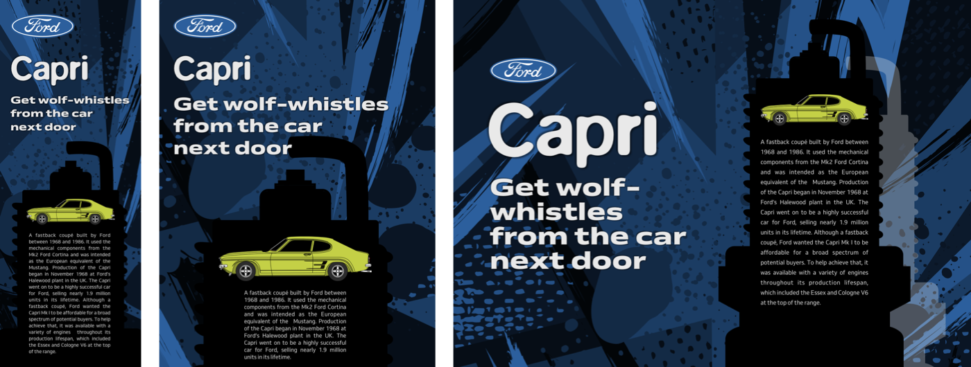
Theming Using CSS Custom Properties
Previously only pre-processing tools like LESS and Sass enabled developers to use variables in stylesheets, but now Custom Properties have brought variables natively to CSS. CSS Custom Properties are a fabulous new feature and have widespread support in contemporary browsers.
To write a custom property, simply add two dashes to the start of a style rule:
--color-text-default : #272732;Hyphens or underscores are allowed in property names, but not spaces. Property names are also case-sensitive, so –color-text-default and –Color_Text_Default are two distinct properties.
To use a custom property in a stylesheet, var() tells a browser to retrieve the value of a property. Here, a browser retrieves the dark colour from the –color-text-default variable and applies it to the body element:
body {
color : var(--color-text-default); }
CSS Custom Properties are fabulous tools for theming, so to change the body background colour and the fill colour of my SVG Capri, I apply a shared custom property:
--theme: #ba0e37; }

body {
background-color: var(--theme); }

svg path {
fill: var(--theme); }
Vertical Text For Impact
This very different design shares much of the same HTML, but has an altogether different look and feel. I use a header which contains a heading, a Ford logo, and the large brake disk image:
<header>
<div>
<img src="logo.svg" alt="Ford">
<img src="brake.svg" alt="Brake disk">
</div>

<h1>Ford Capri <spanvMK1</span></h1>
</header>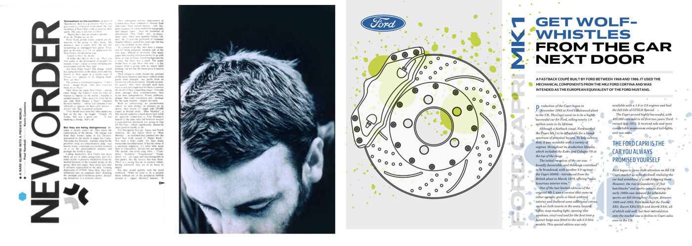
The main element includes a headline and a division which contains my running text:
<main>
<h2><span>Get wolf-whistles</span> from the car next door</h2>

<p>…</p>

<div>
<p>…</p>
<p>…</p>
<p>…</p>
</div>
</main>
Background and foreground colours are the starting point for implementing this design:
body {
padding: 1rem;
background-color: #fff;
color: #272732; }
I then add two abstract background images, placing the first in the top-left of my body element, the second in the bottom-right. Both background images will be contained within the body while preserving their aspect ratio:
body {
background-image: url(body-1.png), url(body-2.png);
background-position: 0 0, 100% 100%;
background-repeat: no-repeat;
background-size: contain; }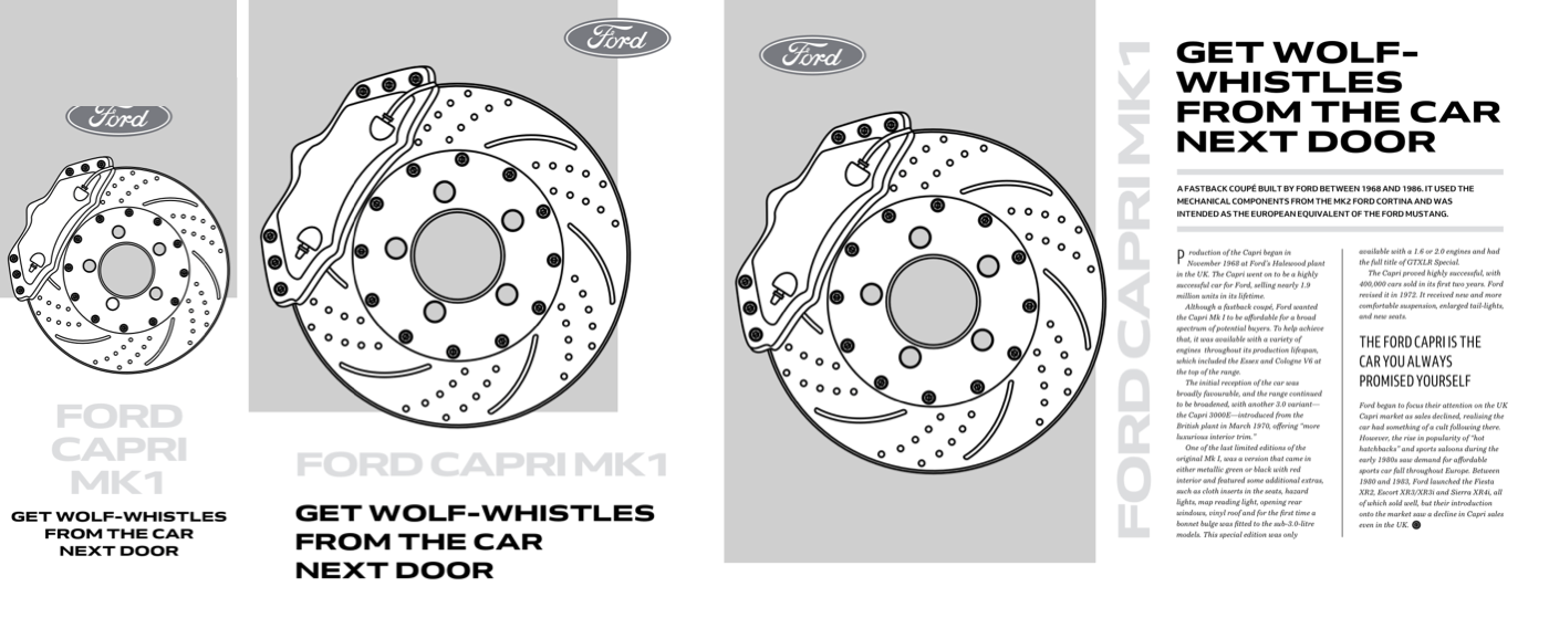
My design includes a variety of typography treatments, including columns, drop-caps, and vertical text. I start by super-sizing the light grey main headline, and setting it uppercase. Using a span element within this headline allows me to change that part to blue:
h1 {
font-size: 3.4rem;
line-height: 1.2;
text-transform: uppercase;
color: #dedddd; }

h1 span {
color: #2c5f9d; }
I apply the same text-transform to the second-level headline, then turn the paragraph which immediately follows it into a standfirst by adding two thick borders:
h2 {
font-size: 1.424rem;
line-height: 1.2;
text-transform: uppercase; }

h2 + p {
padding: 1rem 0;
border-top: 10px solid #e9e9e9;
border-bottom: 10px solid #e9e9e9;
font-size: 0.889rem;
font-weight: 600;
text-transform: uppercase; }
Although paragraph indentation is a common print typography technique, paragraph spacing is more popular on the web. Because I want to give this design an editorial feel, I remove the margins from paragraphs in my main, then indent every following paragraph by 1em. By using a text-based unit, this space will stay in proportion with the size of my text:
main div > p {
margin: 0;
font-family: 'Vollkorn', serif;
font-style: italic; }

main div > p + p {
text-indent: 1em; }
Drop caps add personality to a design, but are also an obvious pointer to where someone should start reading. Implementing drop caps online previously involved a mixture of font-size, line-height, and margin styles, but now we can use the initial-letter property instead.
Initial letter reduces styling to a single property, and a value which defines the number of line heights the letter occupies. Initial letter automatically adjusts the font size to span this number of lines.
I want to apply initial-letter to the first letter of the first paragraph in my main element. Not all browsers support initial-letter, so to avoid non-supporting browsers applying any styles relating to my drop cap, I use a feature query. Because Apple’s Safari requires a vendor specific prefix, that query includes both prefixed and unprefixed properties and an or argument:
@supports (initial-letter: 1) or (-webkit-initial-letter: 1) {

main div > p:first-of-type::first-letter {
margin: 0 .5rem;
font-family: Arial, Helvetica, sans-serif;
-webkit-initial-letter: 2;
initial-letter: 2;
color: #2C5F9D; }
}
A long-standing Safari bug renders an initial letter using system fonts instead of web fonts, so choose a system font which looks most similar to your intended drop cap style.
For larger screens, I apply a symmetrical two-column grid to the body and reduce the size of my two background images to 55%. Because the visual order of this design again matches the order of my HTML, I don’t need to place my header and main elements explicitly:
@media screen and (min-width : 64em) {

body {
display: grid;
grid-template-columns: 1fr 1fr;
background-size: 55%; }
}
header acts as a boundary which stops the eye moving beyond it. Right: Allowing that element to bleed off the top and left edges implies there’s more to see outside the viewport. (Large preview)One of the most obvious aspects of this design is the large vertical headline in the centre of the page. Vertical text elements are common in magazines, but I rarely see them on the web, except in Chinese, Japanese, Korean, and other scripts, which use vertical writing modes.
Before implementing my vertical headline, I make space for it by applying grid properties to my header. The second column is just wide enough to take my vertical headline, while the first column occupies all remaining space:
header {
display: grid;
grid-template-columns: 1fr 6rem;
padding: 1rem 0 1rem 2rem; }
To develop my vertical headline, I need do nothing more than switch its default writing mode to vertical (right–left:)
h1 {
writing-mode: vertical-lr; }
My headline fits in the centre of this page, and the reading direction starts at the top. To make it read bottom-up, I can spin it around by 180 degrees and justify it right, so it starts at the top of the column:
h1 {
text-align: right;
transform: rotate(180deg); }
Text Orientation
Using transform:rotate(); and text-align:right; to change an element’s reading direction feels like a hack, and it is.
You won’t need that hack for long, though, because a new set of writing mode values are coming.
sideways-rl. Content flows vertically top-to-bottom and text is written sideways, towards the right. (Large preview)
sideways-lr. Content flows vertically top-to-bottom and text is written sideways, towards the left. (Large preview)To improve someone’s reading this block of running text, I introduce columns using the column-count property. This design divides my content into two columns, with a gutter and a solid rule between them:
main div {
column-count: 2;
column-gap: 4rem;
column-rule: 1px solid #e9e9e9; }
Browsers adjust the widths of these two columns to fill the available space. When I want to specify column width instead of the number of columns, I use the column-width property with a text-based unit value, including ch, em, ex, rem, vw, vmax, and vmin.
There’s one final touch I want to add to the vertical headline in this design; blending it with the body behind. Alongside background-blend-mode, the Compositing and Blending module includes mix-blend-mode which blends elements with each other. You can use the same fifteen blend modes with either property. Using a multiply value on my vertical headline allows the abstract background image on my body element to bleed through this headline:
h1 {
mix-blend-mode: multiply; }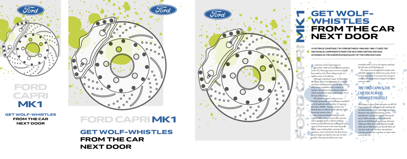
Beyond Primitive Clipping Paths
You probably won’t be surprised to learn that this design uses the same header and main elements as my previous examples. This time, both contain a figure:
<header>
<figure>…</figure>
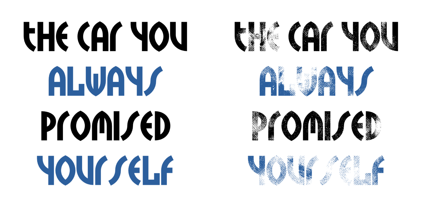
<h1>The car you <span>always</span> promised <span>yourself</span></h1>
</header>
<main>
<figure>…</figure>
<p>…</p>
<div>
<p>…</p>
</div>
</main>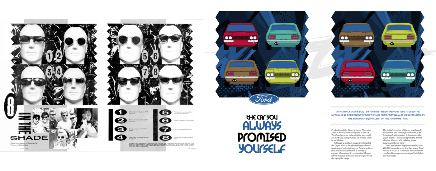
Each figure contains four pictures of my colourful Capris:
<figure>
<img src="capri-front-red.png" alt="">
<img src="capri-back-green" alt="">
<img src="capri-back-brown" alt="">
<img src="capri-front-lime" alt="">
</figure>
I arrange these pictures in a 2x2 grid, then I add a background colour and abstract background image, blending them together with a background-blend-mode:
figure {
display: grid;
grid-template-columns: 1fr 1fr;
gap: 2rem;
background-color: #2c5f9d;
background-image: url(figure.png);
background-size: cover;
background-blend-mode: multiply; }
Good typography is as important for personality, as it is for readability. Brody’s designs are distinctive partly because of the original typefaces he created for The Face and other magazines. I set my headline using TokyoTwo — a facsimile of one Brody typeface — to bring a little of his style to my design.
h1 {
font-family: 'TokyoTwoSolid';
font-size: 7vmax;
text-transform: uppercase; }
I highlight specific words by adding span elements around them:
h1 span {
color: #2C5F9D; }
In newspapers and magazines, online and in print, a standfirst is the ‘first’ few lines of an article and should be designed to ‘stand’ out. You might also see standfirst paragraphs referred to as “decks,” “kickers” because they kick readers into the content, “riders,” “summaries” as they often summarise the content of an article, or &mdahs; my personal favourite — “the sell” because one of its jobs is selling content to a reader.
While a standfirst paragraph is often “larger, bolder,” or “in capitals,” that’s not necessarily how it always looks. There’s no rule book to dictate its size or style, or even its position. That’s something important to bear in mind when you’re designing layouts for many different devices or screen sizes. The design of a standfirst should help it do its job and should be designed to catch someone’s eye, encourage people to read on, give people an idea of what an article contains, and improve understanding and share-ability.
To add zig-zag lines and transform this default paragraph into a standfirst, I add :before and :after pseudo-elements, each containing an SVG image which stays crisp no matter how large someone’s device or screen:
main figure + p:before {
content: url(line-1.svg);
display: block;
margin-bottom: .75rem; }

main figure + p:after {
content: url(line-2.svg);
display: block;
margin-top: .75rem; }
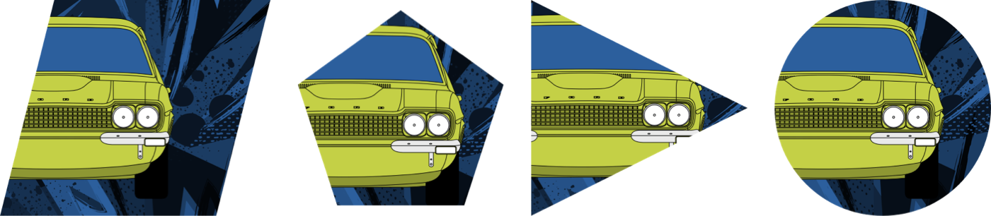
I introduced you to the clip-path property alongside Alexey Brodovitch. It enables you to clip an element so that only part of it remains visible. These paths can be any shape, from basic circles and eclipses to complex polygon shapes with any number of coordinates.
My design uses zig-zags around its standfirst and at the sides of my colour-filled figures. But, those shapes aren’t part of any image attached to a figure, they’re the result of clipping these figures with a polygon path:
figure {
-webkit-clip-path: polygon(0% 10%, 5% 20%, 0% 30%,…);
clip-path: polygon(0% 10%, 5% 20%, 0% 30%,…); }
All that remains is to add background images to the body, adjusting their position and size, plus apply a two-column symmetrical grid for larger screens:
body {
display: grid;
grid-template-columns: 1fr 1fr;
gap: 2rem; }

body {
background-image: url(body-small.svg);
background-position: 50% 0;
background-repeat: no-repeat;
background-size: cover; }

@media screen and (min-width : 64em) {

body {
background-image: url(body-large.svg);
background-position: 0 12rem;
background-size: contain; }
}
Responsive Grids And Rotation
To implement my final Brody-inspired design, my aim is to use the most minimal set of structural elements:
<img src="logo.svg" alt="Ford">

<h1>Get a Capri… if you’re quick</h1>

<header>
<picture>
<source media="(min-width: 48em)" srcset="header-lg.png">
<img src="header-small.png" alt="Ford Capri">
</picture>
</header>

<main>
<p>…</p>
<p>…</p>
</main>

<figure>…</figure>
<aside>…</aside>
<div></div>
Whereas my earlier designs introduced grid properties at larger screen sizes, this final design uses them from the beginning. In this three-column grid, the two outer column widths are text-based, while the centre column occupies all remaining space:
body {
display: grid;
grid-template-columns: 3rem 1fr 3rem;
background-color: #f0f0f1; }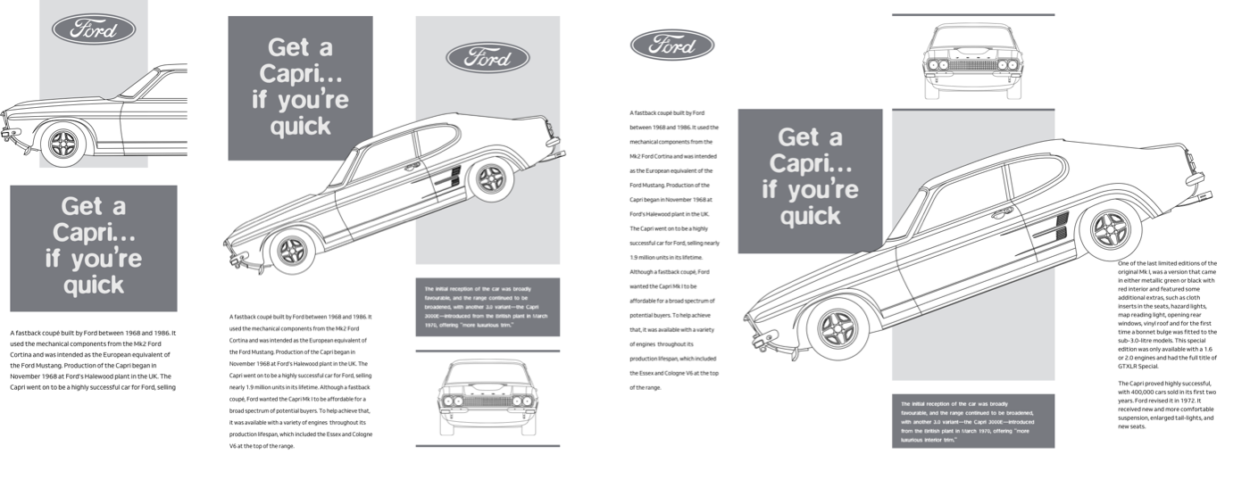
I start by placing the Ford logo into that centre column and on the first row:
[src*="logo"] {
grid-column: 2;
grid-row: 1;
justify-self: center; }
The header with its Capri image spans every column, and occupies the full page width. I place it in the second row, under my logo:
header {
grid-column: 1 / -1;
grid-row: 2; }
A division acts as an abstract back-drop to my header. It fits neatly into the second column, and spans the first two rows:
body > div {
grid-column: 2;
grid-row: 1 / 3;
z-index: 1;
background-color: #2c5f9d;
background-blend-mode: multiply;
background-image: url(div.png);
background-size: cover; }
By adding a low z-index value to this division pushes it into the background, and to ensure my logo and header spring into the foreground, I give them a higher value:
[src*="logo"],
header {
z-index: 2; }
That layered header adds depth to small screens, but when more space is available, this design comes to life. The two-column grid is simple, but the row pattern is more intricate and includes a mixture of text-based, flexible length, and intrinsic units:
@media screen and (min-width : 48em) {

body {
grid-template-columns: 1fr 1fr;
grid-template-rows: 16rem 8fr 16rem auto auto auto;
grid-column-gap: 5vw; }
}
I place the header into the third row and allow it to span the full width of my grid. Then, I slot the remaining elements into their places using grid line numbers:
header {
grid-column: 1 / -1;
grid-row: 3; }

h1 {
z-index: 1;
grid-column: 1;
grid-row: 1 / 3; }

main {
grid-column: 1;
grid-row: 4 / 6; }

aside {
grid-column: 1;
grid-row: 6 / 7; }

body > div {
grid-column: 2;
grid-row: 1 / 4;
border-top: 10px solid #e9e9e9; }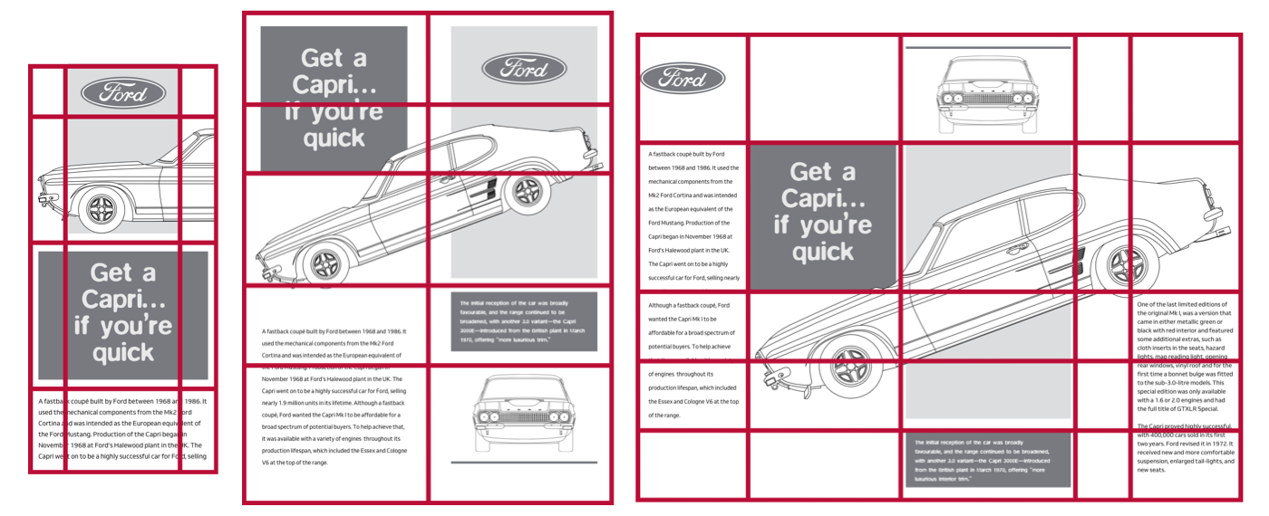
I don’t need to style this figure, only its img and figcaption. By applying display: contents;, I’m able to place those child elements onto my grid:
figure {
display: contents; }

figure img {
grid-column: 2;
grid-row: 5 / 7; }

figure figcaption {
grid-column: 2;
grid-row: 4 / 5; }
Now I can rotate my header image and move it up so that it overlaps other elements in my design.
header {
z-index: 2;
transform: rotate(-20deg) translateY(-6rem); }
I’ve always thought of responsive design not as a challenge, but as a chance to be creative. Each breakpoint provides an opportunity to make designs which make the most from every screen size.
For large screens, I replace the previous grid properties with a five column layout where four of the columns are flexible and the other is text-based. I use the repeat value to create six rows which all have intrinsic height. Whereas the default align-items value is stretch, I align my grid items to the start:
@media screen and (min-width : 64em) {

body {
grid-template-columns: 1fr 1fr 1fr 6rem 1fr;
grid-template-rows: repeat(6, auto);
gap: 1rem;
align-items: start; }
}
I reposition each element onto this new grid using line numbers which separate my content across each column.
[src*="logo"] {
grid-column: 1;
grid-row: 1; }

h1 {
grid-column: 2;
grid-row: 2; }

main {
grid-column: 1 / 2;
grid-row: 2 / 5; }

header {
grid-column: 2 / -1;
grid-row: 2; }

figure img {
grid-column: 3;
grid-row: 1; }

figure figcaption {
grid-column: 3;
grid-row: 4; }

aside {
grid-column: 5 / -1;
grid-row: 3 / 5; }

body > div {
grid-column: 3;
grid-row: 2 / 4;
align-self: stretch; }
Using line numbers enables some elements to occupy the same columns and rows, so they overlap. The higher z-index value I gave to the header earlier, brings the large picture of my Capri into the foreground, where I can adjust its rotation and vertical offset:
header {
transform: rotate(-20deg) translateY(3rem); }
A subtle transition and a series of transform values, add up to a little surprise when someone hovers over the profile of this classic Ford:
header {
transition: transform .25s ease; }

header:hover {
transform: rotate(-21deg) scale(1.025) translateY(3rem); }
Bonus: Introducing CSS Masks
In my first Capri design, I added a spark plug silhouette as a background image to my content, but changing its colour would involve exporting a new asset.
Depending on the mask image, there are two types of masks in CSS:
- luminance
White areas are transparent, black ones are opaque, and everything in between is semi-transparent. - alpha
The default, alpha-channels.
Masking is a fabulous time-saver which involves a single mask-image with an alpha-channel. Whereas with clip-path, parts of an element or either invisible or visible, using mask-image means parts of an element can be rendered with several levels of opacity.
Elements in parts of a mask which are 100% black will be fully visible. In sections where the mask is 100% transparent, contents will be completely hidden. Any percentage in-between will partially mask an element.
When a mask is applied, only the areas inside it are visible, which allows me to change an element’s background colour or image whenever I need to.
Applying a mask-image is as simple as specifying a mask URL. CSS masks use similar properties and values to background images, so first I specify a mask‘s position, then repeat properties, and its size. mask-position uses X and Y values which are the same as background-position.
As well as common values like repeat, repeat-x, repeat-y, and no-repeat, are mask-repeat also accepts the lesser known tiling values, space and round.
mask-size options include one or two number values, plus contain and cover. I put these properties together to apply a spark plug silhouette mask to my main content:
main {
mask-image: url(mask.png);
mask-position: 0 4rem;
mask-repeat: no-repeat;
mask-size: cover; }
It’s also possible to define which area of a box is affected by a mask by using the mask-clip and mask-origin properties in similar ways to how background-origin and background-position affect background images. You might choose to clip a mask to either the border-box, content-box, or padding-box, plus several other options.
I’m also excited by the possibilities from mask-border, an experimental property which will combine the flexibility of border images with masks.
Masks can add depth to text too. To make my header content shine, I could use a bitmap or a SVG gradient image. But remember, CSS generated linear and radial gradients are also background images, so can be mask images too. They add style with almost no impact on performance:
main {
mask-image: linear-gradient(
transparent,
rgb(0,0,0) 50%,
transparent 100%); }
I want a circular radial-gradient to fade the edges of my header content:
main {
mask-image: radial-gradient(
circle at 50% 50%,
rgba(0,0,0,1),
rgba(0,0,0,.15) 80%); }
By fine-tuning my alpha channel values and colour stop points, I can create the perfect look to fit my design.
Read More From The Series
- Inspired Design Decisions: Avaunt Magazine
- Inspired Design Decisions: Pressing Matters
- Inspired Design Decisions: Ernest Journal
- Inspired Design Decisions: Alexey Brodovitch
- Inspired Design Decisions: Bea Feitler
- Inspired Design Decisions: Otto Storch
- Inspired Design Decisions: Herb Lubalin
- Inspired Design Decisions: Max Huber
- Inspired Design Decisions: Giovanni Pintori
- Inspired Design Decisions: Emmett McBain
- Inspired Design Decisions: Bradbury Thompson
NB: Smashing membersSmashing members have access to a beautifully designed PDF of Andy’s Inspired Design Decisions magazine and full code examples from this article. You can buy this issue’s PDF and examples as well as every other issue directly from Andy’s website.
Further Reading
- Getting To The Bottom Of Minimum WCAG-Conformant Interactive Element Size
- What Saul Bass Can Teach Us About Web Design
- Sliding 3D Image Frames In CSS
- Infinite-Scrolling Logos In Flat HTML And Pure CSS
 (ra, yk, il, mrn)

