Inspired Design Decisions With Otto Storch: When Idea, Copy, Art And Typography Became Inseparable

Email Newsletter
Weekly tips on front-end & UX.
Trusted by 200,000+ folks.


For the past few years, books about HTML and CSS have almost vanished from my studio bookshelves. I replaced them with books on art direction, editorial, and graphic design.
Recently, I was browsing a new addition to my library and was captivated by one magazine spread. I loved the way its designer has playfully combined images and typography to create a design which was full of energy and movement. To remind myself to take another look at this design, I snapped a picture of it with my iPhone.
When I first saw that striking design, I hadn’t heard of the designer who’d created it, Brooklyn-born Otto Storch. Although he was an award-winning graphic designer, unlike many of his contemporaries, Storch and his work have been largely overlooked.
Storch amassed a vast body of work, and it’s an incredible shame that his work isn’t more widely known, especially online. There’s no Wikipedia page devoted to Storch, and no one has published a book about him or his work.
I’m not only influenced by Otto Storch’s work, but also by the fact he was a prolific designer with a strong work ethic. I’m inspired by how he took what he’d learned from Alexey Brodovitch, combined it with his approach to design, and made distinctive and engaging work. I hope I can do that too.
I’ve never heard Otto Storch‘s name mentioned during a design conference or seen him referenced in a book about web design. But discovering him has made me want to make more people aware of the man and his work.
He’s also made me consider the role of creativity in an industry which is business focussed, fast-moving, and has practical as well as technical constraints. Publishing can be a cut-throat business, and the magazines Storch worked on weren’t high-fashion. What he made wasn’t art, but that didn’t mean it wasn’t creative. Storch understood that ideas are as essential to effective communication as pictures and the written word. Throughout his career, Storch worked hard to include ideas despite the limitations of his medium. That’s an approach which is as essential on the web today as it was in magazines in the 1960s.
Inspired By Otto Storch
Otto Storch was born in 1913, and during the 1930s, he began his career in the forgotten art of pre-digital photographic retouching. During the 1950s, Storch took evening classes and studied design under Alexey Brodovitch who encouraged him to get a job working on a magazine.
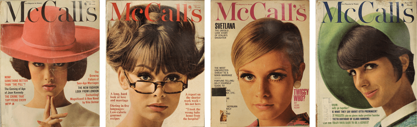
Success didn’t happen overnight, and it took seven years of freelancing before Storch Better Living magazine in New York hired him as an assistant art director. McCall published several titles including Popular Mechanics, Blue Book and Red Book, and McCall’s Magazine itself. Storch moved to McCall’s Magazine where he built on what he’d learned from Brodovitch and his experience designing advertising materials, album covers, book covers, and magazines.
Storch wasn’t afraid to make opinionated choices and its this assertiveness which makes much of his work distinctive.
“Good art direction does not come from an uncertain person. I am capable of intense feeling and was willing to lose a popularity contest with departmental editors when necessary. The visual responsibility of the magazine was mine.”
— Otto Storch
Like Bea Feitler, Storch carried on Alexey Brodovitch’s legacy of imaginative magazine layouts. He understood the double-page spread is a creative canvas and made it a feature of his work, sometimes by allowing elements to flow between pages. Other times, Storch made the gutter an integral part of his design.
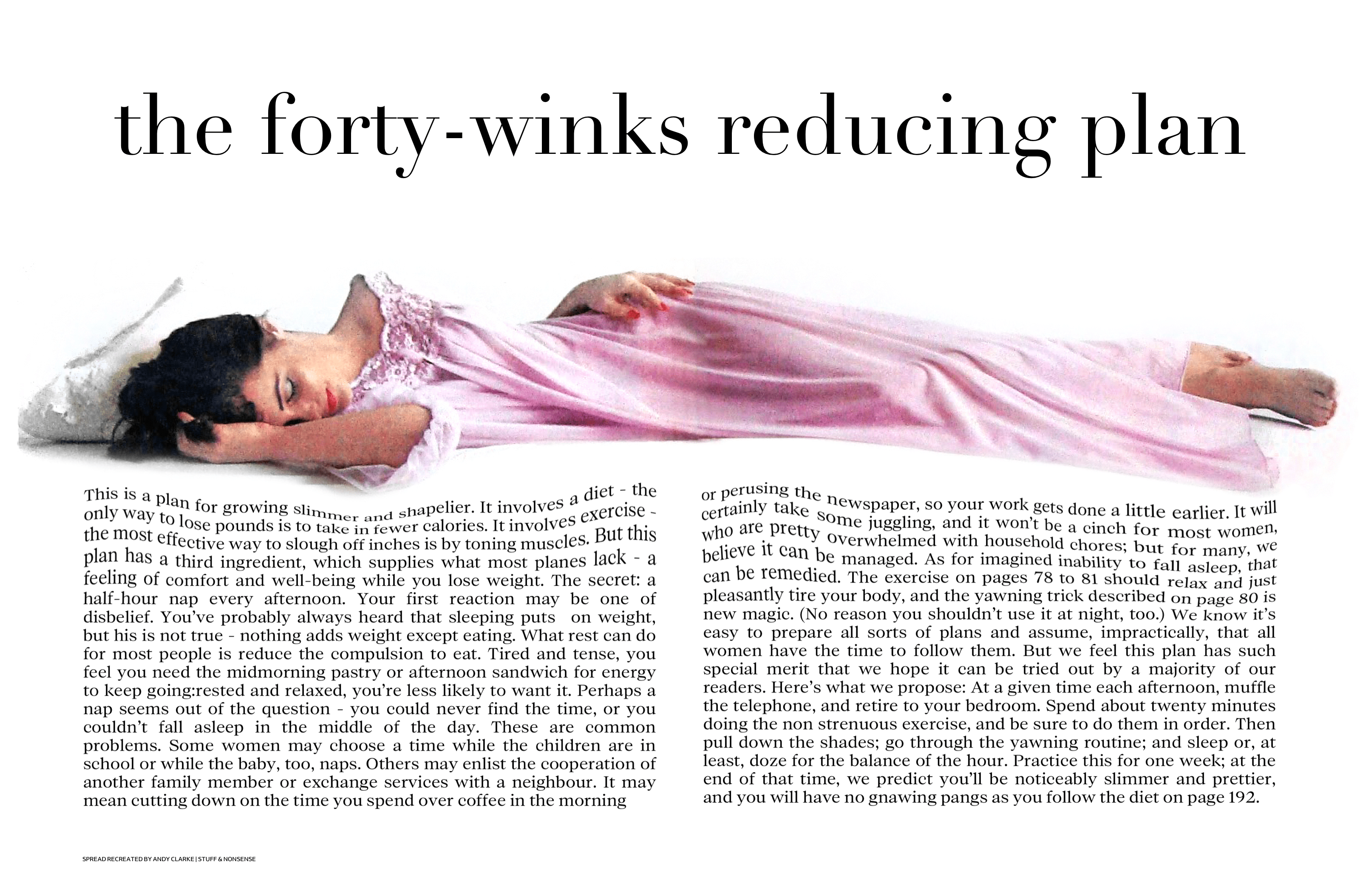
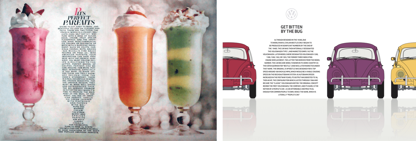
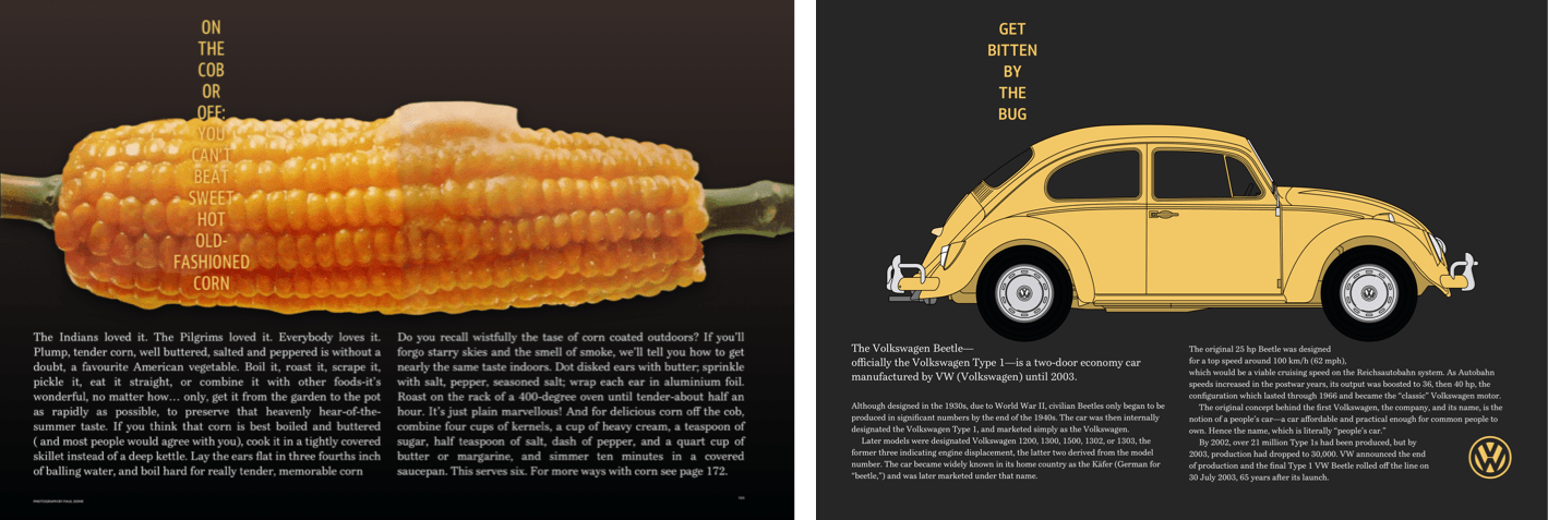
Storch often used large headlines and images to unify his spreads. For ‘On the cob or off,’ its a corn cob which drips butter on both pages. For another feature, ‘The Forty-winks reducing plan,’ he allowed his subject to stretch out, resting on a bed of running text. This copy sinks under the weight of the sleeping model.
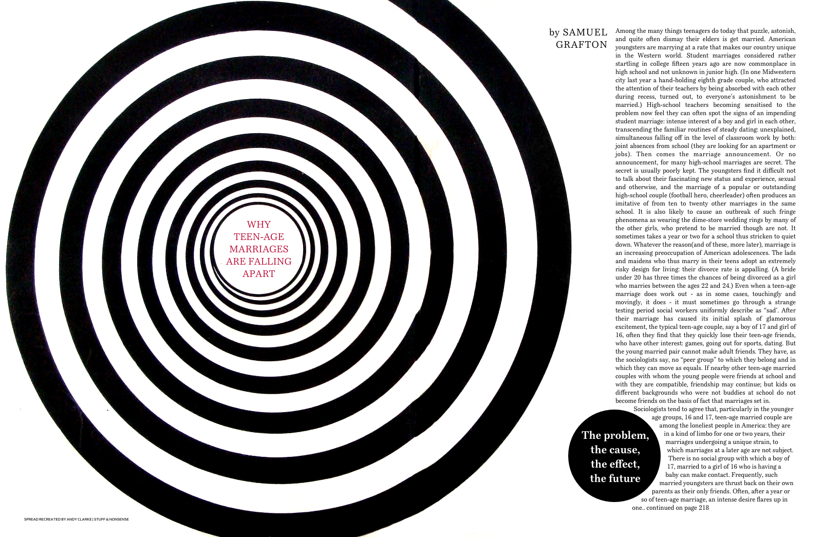
The large black-and-white graphic in ‘Why teen-age marriages are falling apart’ isn’t confined to just one page. Instead, it occupies three out of four columns on the spread and so dominates the design. The gravity of a headline in the middle of those concentric circles pulls the eye towards it.
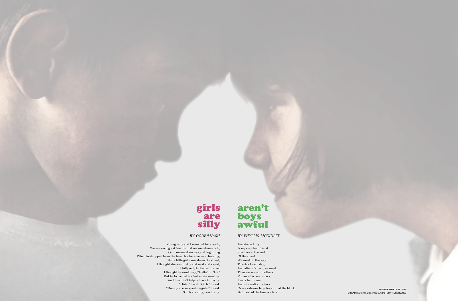
In ‘Girls Are Silly, Aren’t Boys Awful,’ Storch placed two children forehead to forehead with the gutter between them. He emphasised this tension by aligning his text in opposite directions.
Storch made combining images and text look obvious and effortless, but the results he achieved came from years of experience and practice.
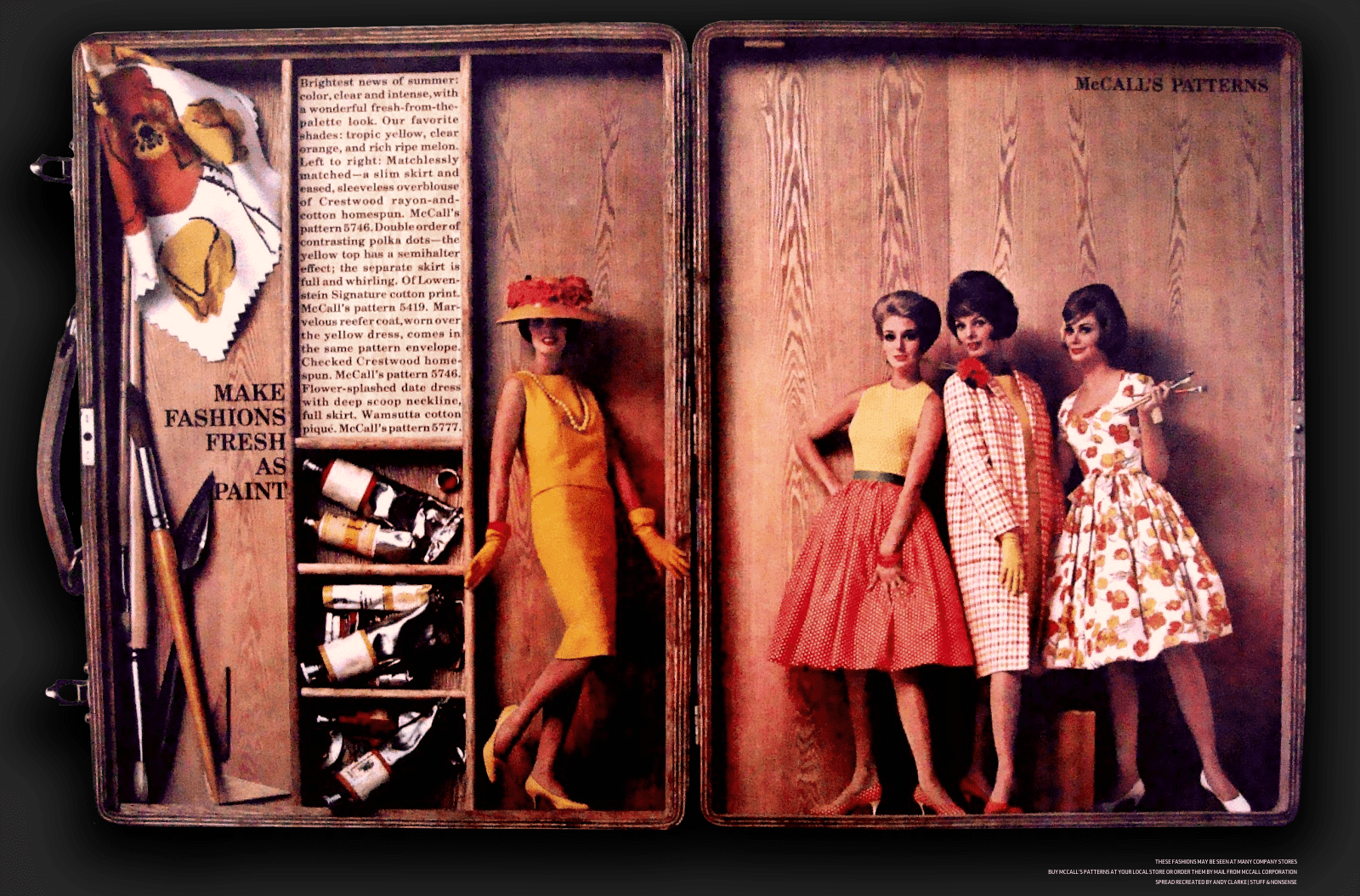
For ‘Make fashions fresh as paint,’ Storch’s tightly packed text fits perfectly into a compartment in an artist’s paintbox. The models in this spread for McCall’s Patterns also fit inside the box. Storch’s playful and unexpected use of scale adds yet another dimension to this design.
Storch believed that in editorial design, a strong idea, copy, images, and typography are integral. I think the same is true in web design, despite its apparent differences to print.
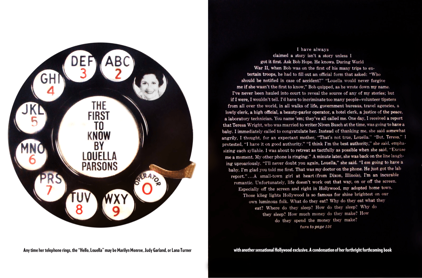
Storch understood typography could do much more than present readable content and he had a knack for turning type into graphical objects. In print design for left-to-right languages, the left page is called “verso”, and the right is called “recto.” For McCall’s extract of a book called ‘The First to Know,’ Storch mirrored the recto and verso pages, then set his text into a circle which reflects the circular telephone dial.
There’s plenty Otto Storch, and his designs can teach us about the work we do on the web today. Like Alexey Brodovitch, Storch’s mastered his canvas and rather than be limited by it; he used his pages to present content in ways which made it not just understandable, but also more appealing. This appeal matters, because it connects people with a brand, a product, or a story, and that matters to any business, whatever the medium.
Otto Storch might be a new addition to my list of inspiring designers, but his designs are already influencing mine.
Shape Up
The W3C’s CSS Shapes Module Level 1 has been a Candidate Recommendation recommendation since 2014, and all contemporary desktop and mobile browsers have implemented its shape-outside, shape-margin, and shape-image-threshold properties.
[src="shape.png"] {
float: left;
shape-outside: url(shape.png);
shape-margin: 20px; }
Web designers aren’t aware of the creative potential offered by CSS Shapes, and that there’s no longer a reason to not use them. It’s also possible web developers still think Shapes have poor support in browsers. Still, with all contemporary browsers now supporting Shapes — and their properties degrading gracefully in legacy browsers — there’s currently no reason to avoid using them.
Do More With Shapes
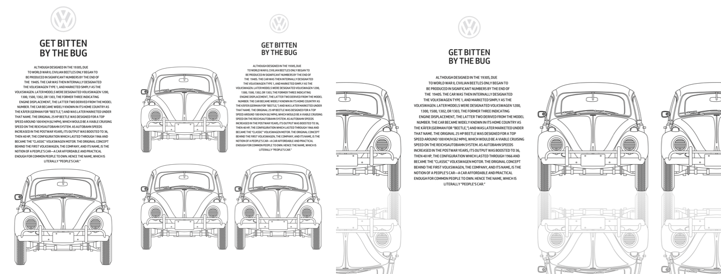
This design by Otto Storch was one of the first to get my attention. I admired the structural simplicity of its two justified columns of copy, and how the placement of his images — with text wrapped around them to create organic shapes — playfully filled the page with energy and movement.
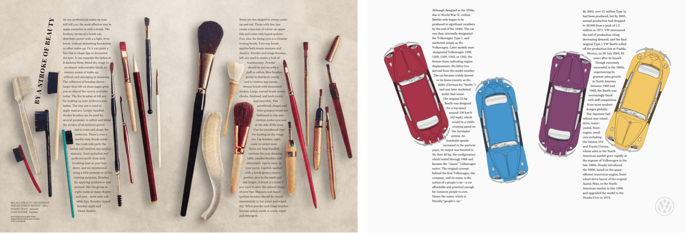
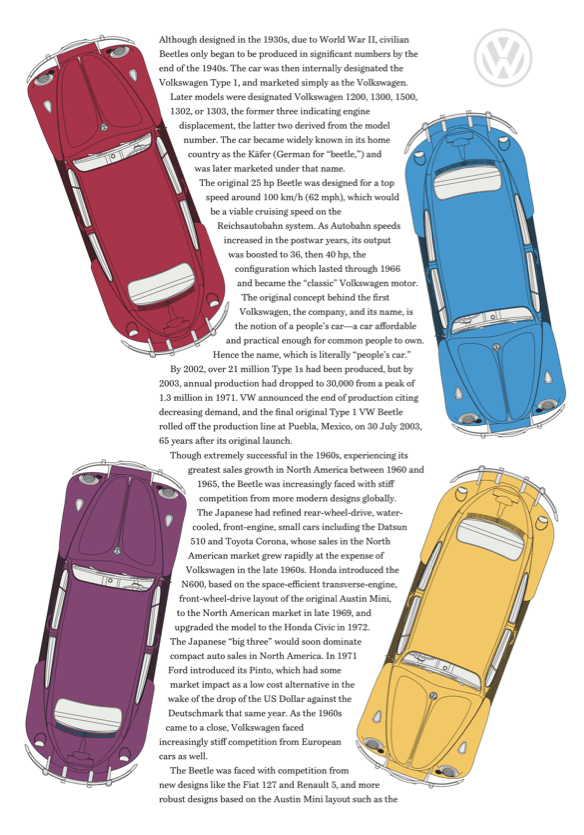
I rarely see layouts with this kind of energy online, so my design includes four brightly coloured Beetles, each Volkswagen placed at an angle to contrast with the two tall columns of text. I need only two structural elements to implement this Storch-inspired design; the main element and an aside. Each of these elements contains paragraphs of running text, plus two picture elements which enable me to swap small images for larger ones:
<main>
<picture>…</picture>
<p>…</p>
<p>…</p>
<picture>…</picture>
<p>…</p>
<p>…</p>
</main>

<aside>
<picture>…</picture>
<p>…</p>
<p>…</p>
<picture>…</picture>
<p>…</p>
<p>…</p>
</aside>
These picture elements fit to the edges of small screens, but I still need whitespace on both sides of my paragraphs of running copy. By using viewport width units, that space always remains in proportion to those screens:
p {
margin-right: 10vw;
margin-left: 10vw; }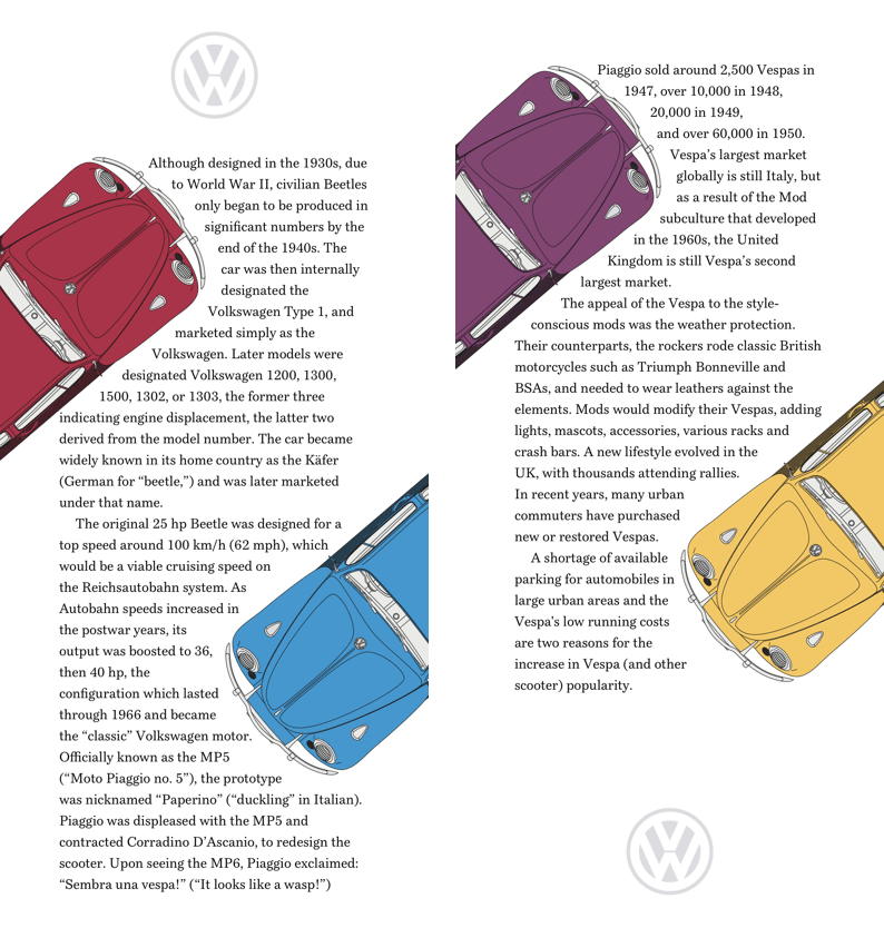
The picture element is one of the most useful additions to HTML. By combining media queries with multiple images, a browser can select an image which is most appropriate for a layout.
I use the media property and min-width value most often, and while this design requires only two images per picture element, its possible to add more images and even combine media values to create complex queries:
<picture>
<source srcset="large.png" media="(min-width: 48em)">
<img src="small.png" alt="Volkswagen Beetle">
<</picture>
The images in these pictures contain cropped versions of my Beetles which are best suited to small screens. I apply the same width to all my images, then add a shape-margin in preparation for the CSS Shapes which come next:
picture {
width: 160px;
shape-margin: 20px; }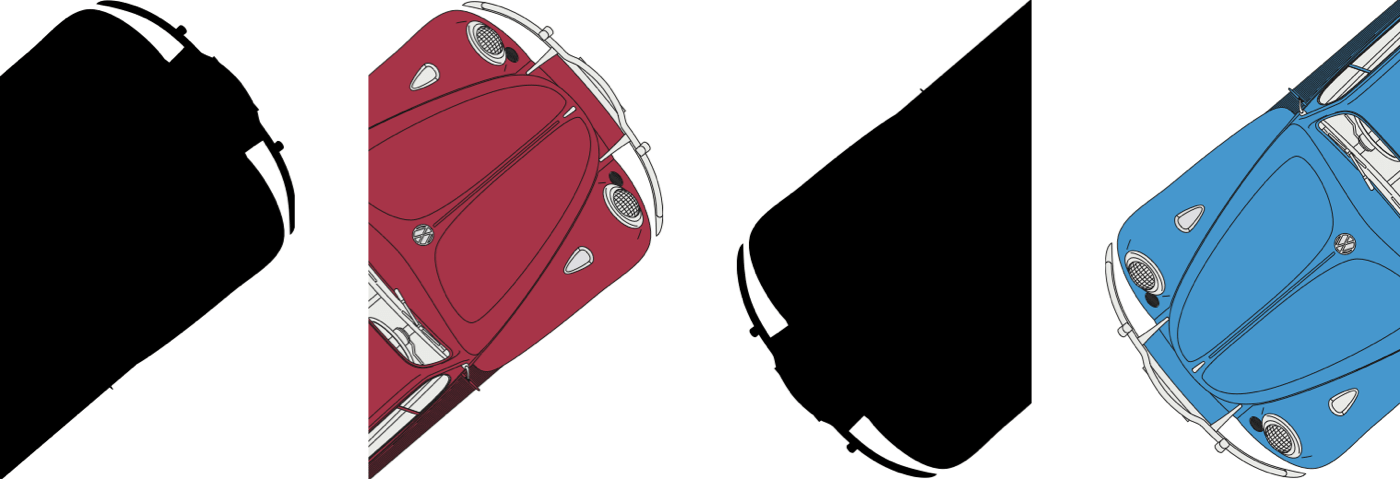
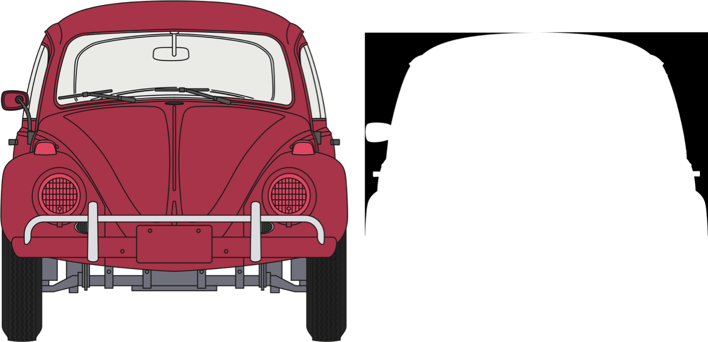
I find shapes from images easier and quicker to implement than using polygon coordinates. To develop a shape from an image, it needs an alpha channel which is wholly or partially transparent. When images are partially transparent, the shape-image-threshold property can control the areas which form the shape.
I can use the same image for more than one shape. Even though my design includes four differently coloured cars, I need just two shape images:
main picture:first-of-type,
aside picture:first-of-type {
float: left;
shape-outside: url(shape-1-sm.png); }

main picture:last-of-type,
aside picture:last-of-type {
float: right;
shape-outside: url(shape-2-sm.png); }
With my small screen design complete, I introduce larger images for medium size screens as well as shape images to match. I apply new widths for the images to fit larger screens:
@media (min-width: 48em) {

main picture:first-of-type {
width: 290px;
shape-outside: url(shape-1-lg.png); }

main picture:last-of-type {
width: 230px;
shape-outside: url(shape-2-lg.png); }

aside picture:first-of-type {
width: 230px;
shape-outside: url(shape-3-lg.png); }

aside picture:last-of-type {
width: 290px;
shape-outside: url(shape-4-lg.png); }
}
Although my design for larger screens might look complex at first glance, the layout couldn’t be simpler, and those main and aside elements form two symmetrical columns:
@media (min-width: 64em) {

body {
display: grid;
grid-template-columns: 1fr 1fr; }
}
Whitespace plays a big part in this large screen design. With those columns introduced, the 10vw horizontal margins I applied to my paragraphs earlier means that whitespace comprises 40% of this layout.
Just as Otto Storch used his pages to present content in ways which made it appealing as well as understandable, this design doesn’t just tell the story of the Volkswagen Beetle, its layout hints at how fun this iconic little car was to drive.
Make Text Look Delicious
Like Brodovitch, Otto Storch excelled in combining images with text, and he often carved copy into shapes which mirrored them. In this design, Storch created a delicious text block shaped like a glass. We rarely find techniques like this used online, but they can help to draw readers into a story whatever the medium. Inspired by Storch, for my next design, I sculpted my copy to reflect the shape of a Volkswagen Beetle.
My design includes three alternative layouts. A single column of scrolling content for small screens, a 2x2 grid for medium screens, and a large screen design with a horizontally scrolling content area.
There are four structural elements needed to implement these three designs, one main element for my content, plus large images of three brightly coloured Beetles. I enclose these elements with a section, then add a decorative, presentation division which represents a tarmac road:
<section>

<img src="shape-1.png" alt="">

<main>

<h1>Get bitten by the bug</h1>

</main>

<img src="img-1.png" alt="Volkswagen Beetle">
<img src="img-2.png" alt="Volkswagen Beetle">

</section>

<div> </div>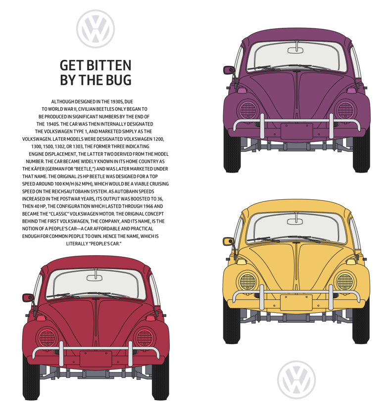
I don’t need my horizontally scrolling panel to appear on small screens, so add only foundation styles and shapes which sculpt my text into the shape of a Beetle. I start by aligning paragraph text to the centre, and setting it in uppercase. While I wouldn’t normally set text an entire block of text in this way, the solid uppercase letterforms help to emphasise the Beetle shape:
p {
text-align: center;
text-transform: uppercase; }
Early drafts of the CSS Shapes specification included a shape-inside property which would’ve enabled us to wrap text on the inside of shapes as Storch did. I’m disappointed that the W3C postponed this feature until CSS Shapes Module Level 2 which is still an Editor’s Draft. You can achieve similar effects using shape-outside, but I, for one, can’t wait until we can use type as creatively as Otto Storch online.
I add two shape images to my paragraph. Text will flow between these images to mirror the face of a Beetle:
<p>
<img src="shape-2.png" alt="">
<img src="shape-3.png" alt="">
…
</p>
I specify dimensions for these two images and set their opacity to zero as I don’t want them seen by a viewer:
p img {
width: 100px;
height: 125px;
opacity: 0; }
These images are purely presentational and convey no content or meaning, so to remove any semantics from them, I add role attributes. To take them out of from the accessibility tree, I also add aria-hidden attributes to these two images:
<img src="shape-2.png" alt="" role="presentation" aria-hidden="true">To carve my text into the shape of the iconic Volkswagen, I apply shape-outside using the same two images, floating the first image left and the second to the right:
p img:nth-of-type(1) {
float: left;
shape-outside: url(shape-l.png); }

p img:nth-of-type(2) {
float: right;
shape-outside: url(shape-r.png); }
I don’t want my presentation division visible to assistive technologies either, so I add those same role and aria-hidden attributes to this too:
<div role="presentation" aria-hidden="true"> </div>As I don’t need the division to be visible to people using small screens, I set its display property to none:
div {
display: none; }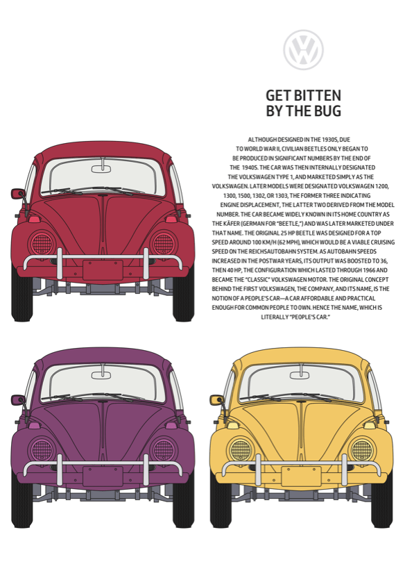
My small screen design is stylish, like the Beetle, but the extra space available on medium-size screens allows me to place my sculpted text alongside the pictures it’s imitating.
Before implementing any design, I make a storyboard to decide how to rearrange elements as screen sizes change. For medium-sized screens, I arrange my four elements in a 2x2 symmetrical column grid. By using minmax values for sizing these columns, I ensure they fill all available space, but their width never shrinks below 400px:
@media (min-width: 48em) {

section {
display: grid;
grid-template-columns: minmax(400px, 1fr) minmax(400px, 1fr);
grid-gap: 2vw;
align-items: end; }
}
For larger screens, I also need two rows. They should be equal in height and occupy all available vertical space:
@media (min-width: 64em) {

body {
display: grid;
grid-template-rows: 1fr 1fr; }
A large, horizontally scrolling content area dominates this design and is wider than the viewport. The panel includes four columns — three for images and one for my sculpted copy — and each one is a minimum of 400px wide. By setting the maximum width to the viewport and allowing scrolling only on the horizontal axis, any content which is outside the viewport is hidden but still accessible:
section {
grid-template-columns: repeat(4, minmax(400px, 1fr));
max-width: 100vw;
overflow-x: scroll; }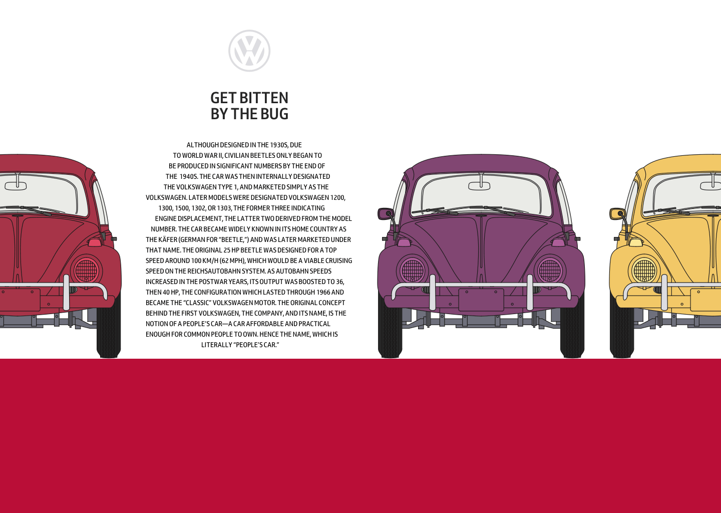
Below my content is a presentational division which represents the road under the wheels of my Beetle shapes. This element is invisible on smaller screen sizes, so to make it visible, I change the display property from none to block, then add a light grey background colour. The grid properties I previously set on the body element defines the height of this division:
div {
display: block;
background-color: #a73448; }
}
Webkit’s Dave Hyatt originally proposed CSS Reflections as far back as 2008, but so far they haven’t been implemented in other browser rendering engines. CSS Reflections are currently only supported by Google Chrome.
As you might imagine, reflections create a copy of an element. A reflection can appear either above, below or to the left or right. Just as in the physical world, when an element changes in some way, its reflection follows.
There are three experimental properties available for CSS Reflections. Its direction and an optional offset which controls the distance between an element and its reflection. You can also apply a mask to any reflection to change its appearance, for example, by using a gradient mask to fade the intensity of a reflection gradually.
CSS Reflections have limited support in browsers, but they can still add an extra dimension to a design for browsers which have implemented them. I want to add reflections only when a browser supports them and when the screen is large enough to use them to full effect.
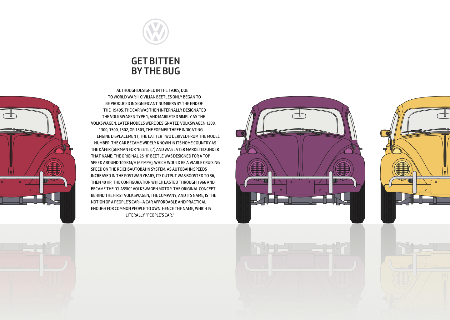
To achieve the result I’m looking for, I use nested media and feature queries which first test a viewport’s minimum width, then whether a browser supports -webkit-box-reflect:below. I add the reflections and change the colour of my presentational division from red to grey:
@media (min-width: 64em) {
@supports (-webkit-box-reflect:below) {

section {
-webkit-box-reflect: below 0 linear-gradient(transparent, white); }

div {
background-color: #f0f0f1; }
}
}
Mirror Symmetry
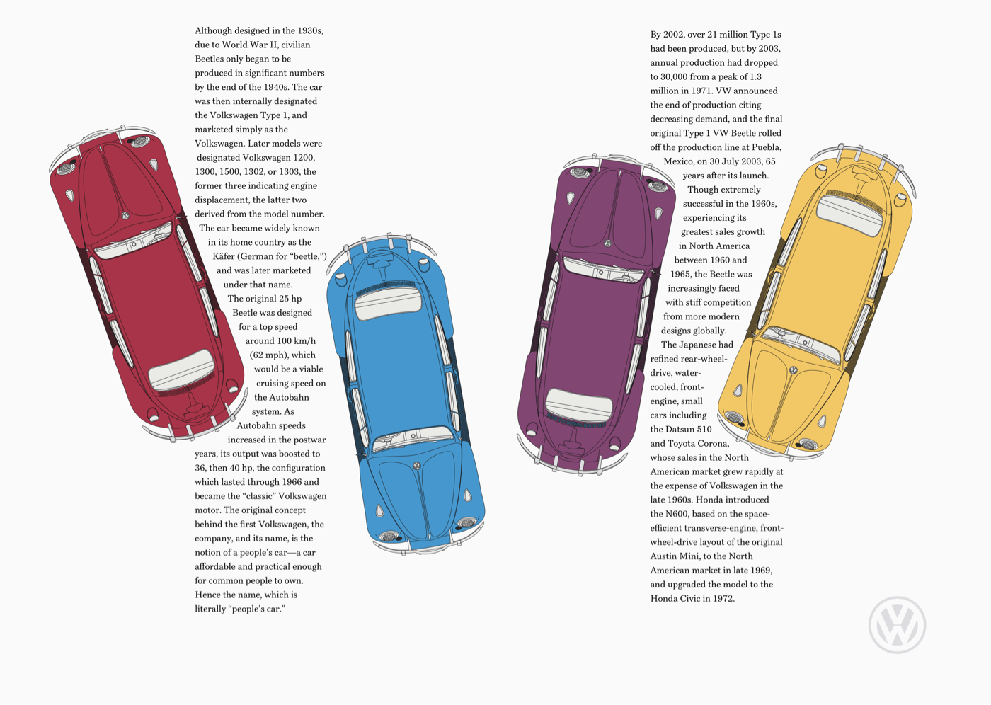
This striking black and red spread from McCall’s Patterns is one of Storch’s most distinctive designs. There’s a reassuring symmetry to its layout and how Storch used the same colours on its two pages. I was immediately drawn to his design and want to achieve a similar effect.
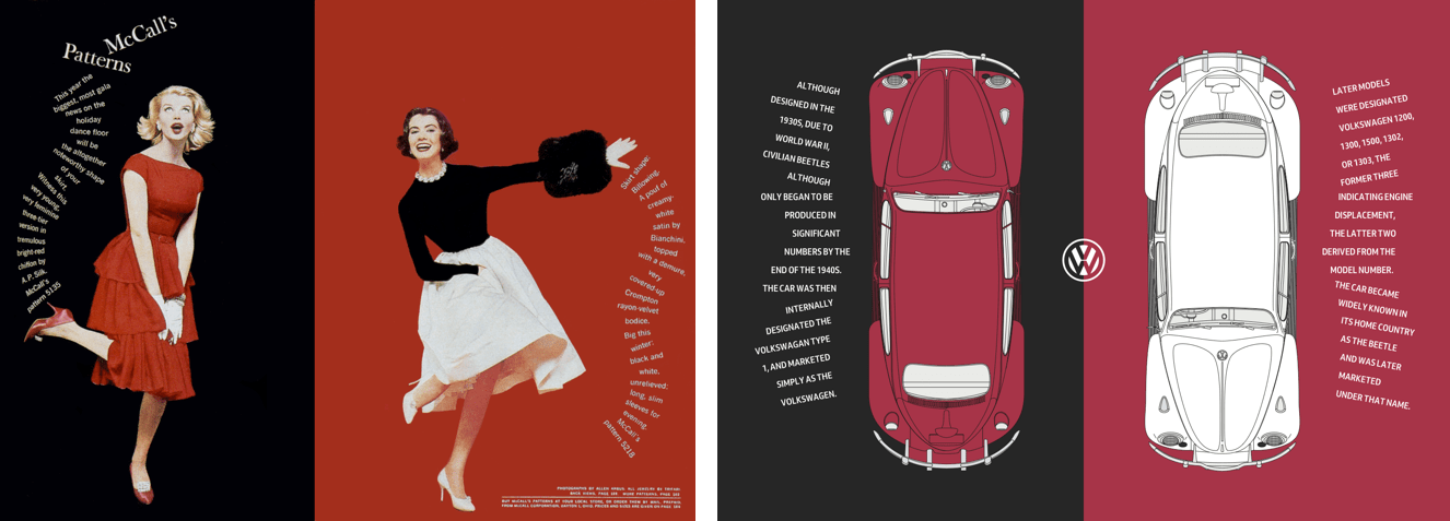
The HTML I need to implement this design couldn’t be simpler. Just two structural elements, one main and an aside, which both contain picture elements:
<main>
<picture>…</picture>
<p>…</p>
</main>

<aside>
<picture>…</picture>
<p>…</p>
</aside>
These main and aside elements also each contain a paragraph of text. To achieve the rotations needed for this design, I wrap each line of text inside a span element. I wish there was a better, more semantic alternative to these presentational elements, but without additional styles, they don’t disrupt the readability of my paragraphs:
<p>
<span>Although </span>
<span>designed in the </span>
<span>1930s, due to </span>
<span>World War II, </span>
<span>civilian Beetles </span>
<span>only began to </span>
<span>be produced in </span>
<span>significant </span>
<span>numbers by the </span>
<span>end of the 1940s.</span>
</p>
I start by applying a dark grey background colour to the body element:
body {
background-color: #262626; }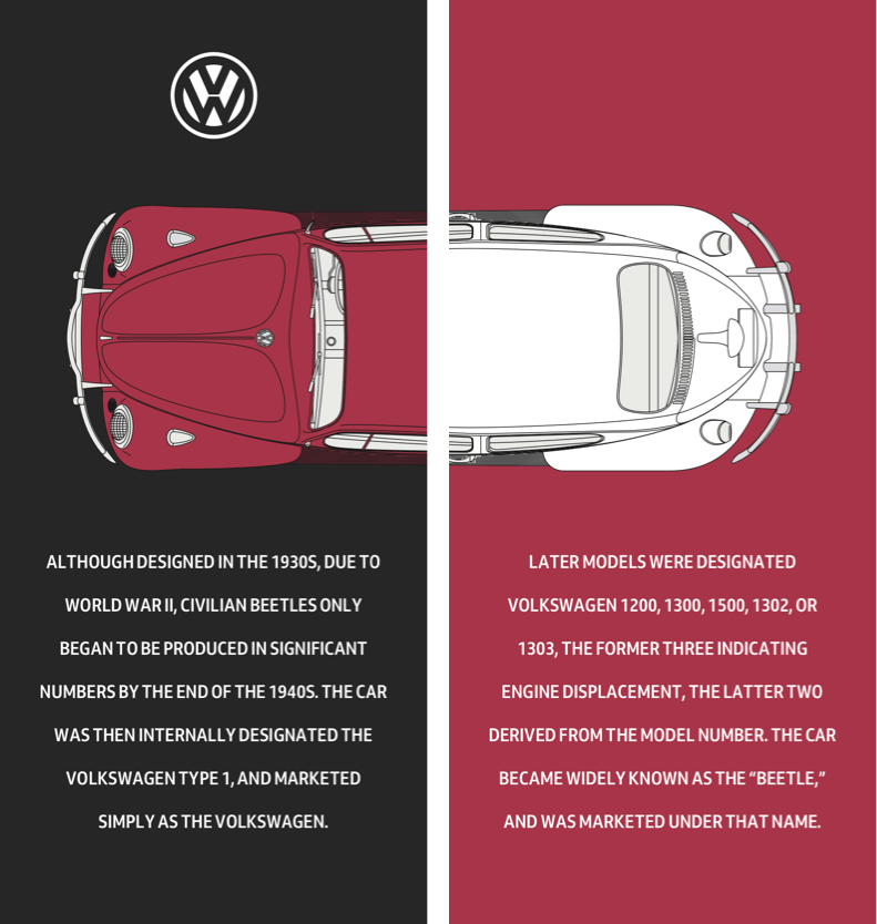
Then, a minimum height ensures that my main and aside elements always fill the viewport height. To centre their content both horizontally and vertically, I apply flexbox properties and set their direction to column:
main,
aside {
display: flex;
flex-direction: column;
justify-content: center;
align-items: center;
min-height: 100vh;
padding: 2rem 0;
box-sizing: border-box;
color: #fff; }
I want the colour of my main Beetle matched by the subsequent panel, so I set its background colour to the same red:
aside {
background-color: #a73448; }
Whereas long passages of uppercase text are generally more difficult to read than those set in mixed case, uppercase is appropriate for shorter pieces and can create a stylish look:
p {
margin: 0 2rem;
text-align: center;
text-transform: uppercase; }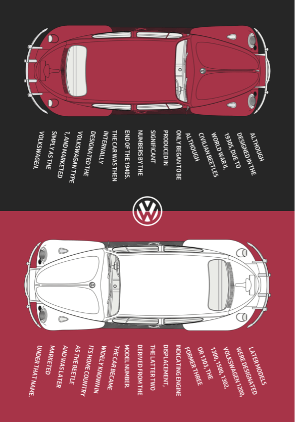
In my small-screen design, the main and aside elements stack vertically and their heights match that of the viewport. For medium-size screens, I reset the minimum height of those elements to fill half the viewport:
@media (min-width: 48em) {

main,
aside {
min-height: 50vh;
padding: 2rem; }
The extra space available on medium-size screens allows me to style my paragraphs by changing the writing mode, so their text is displayed vertically and reads from right to left:
p {
max-height: 12em;
margin: 0;
text-align: left;
writing-mode: vertical-rl; }
Changing the display property on these span elements to block splits my paragraph onto multiple lines. Then, line-height adds space between the lines, which allows room for my rotations:
p span {
display: block;
line-height: 2; }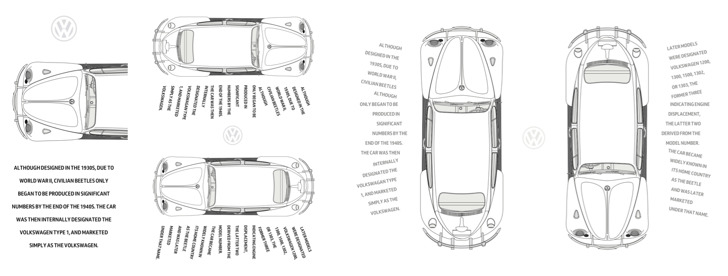
Transforms, including rotate, scale, and translate have been a part of CSS for almost two decades. Using transform involves adding a transform-function like rotate, then a value in parenthesis.
To achieve the effect I’m looking for; I rotate the first six lines of my text anti-clockwise by fifteen degrees. The last six lines are rotated by the same amount but in the clockwise direction. All remaining lines remain unaltered:
p span:nth-child(-n+6) {
transform: rotate(-15deg); }

p span:nth-child(n+12) {
transform: rotate(15deg); }
In the future, you’ll be able to use functions like rotate independently of the transform property, but as I write this, only Firefox has implemented individual transforms.
To make room for my rotated text, I add margins to two of my lines:
p span:nth-child(6) {
margin-left: 1em; }

p span:nth-child(12) {
margin-right: 1em; }
}
This design becomes more striking with the space available on large screens. For them, I apply grid values to the body element to create two symmetrical, equal-height columns:
@media (min-width: 64em) {

body {
display: grid;
grid-template-columns: 1fr 1fr; }
I apply a symmetrical three-column grid to both main and aside elements which both extend to the full viewport height:
main,
aside {
display: grid;
grid-template-columns: 1fr 1fr 1fr;
grid-column-gap: 0;
padding: 2rem;
min-height: 100vh; }
I spread the main picture across second and third columns, and the aside picture into the first and second columns:
main picture {
grid-column: 2 / -1;
grid-row: 1;
padding: 0 5vw; }

aside picture {
grid-column: 1 / 3;
padding: 0 5vw; }
I place the paragraphs into the remaining columns, and by giving all elements the same row number, they will stay on the same line regardless of source order:
main p {
grid-column: 1;
grid-row: 1; }

aside p {
grid-column: 3; }
In this version of my design, the text should run from top to bottom instead of right to left, so I reset the writing-mode to horizontal, top-bottom and then align text to the right:
main p,
aside p {
max-height: none;
writing-mode: horizontal-tb; }

main span {
text-align: right; }
Finally, I replace the rotation values and margins on my lines of text to better suit this large-screen design:
main p span:nth-child(-n+6) {
transform: rotate(10deg); }

main p span:nth-child(n+12) {
transform: rotate(-10deg); }

main p span:nth-child(6) {
margin: 0 0 15px; }

main p span:nth-child(12) {
margin: 15px 0 0; }

aside p span:nth-child(-n+6) {
transform: rotate(-10deg); }

aside p span:nth-child(n+12) {
transform: rotate(10deg); }

aside p span:nth-child(6) {
margin: 0 0 15px; }

aside p span:nth-child(12) {
margin: 15px 0 0; }
}
Span Columns
For many of his most memorable designs, Otto Storch allowed large images and typographic elements to spread across two pages. This technique created striking spreads, including this one where he placed a buttery corn cob on top of two columns of justified text.
I want a similarly striking effect for my final Beetle-based design, and to implement it I only need three structural elements; a header — containing an SVG logo, headline, and a picture of my yellow Volkswagen — then main and aside elements:
<header>
<svg>…</svg>
<h1>Get bitten by the bug</h1>
<figure>
<picture>…</picture>
</figure>
</header>

<main>…</main>
<aside>…</aside>
Normal flow plus a few foundation styles are all I need to implement the small screen version of this design. First, I add a dark background and specify white text:
body {
padding: 2rem;
background-color: #262626;
color: #fff; }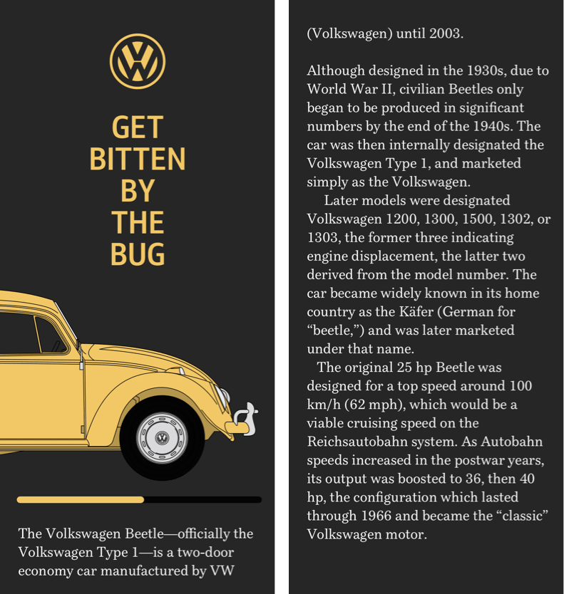
To place the headline in the centre of the page, I apply margins, set its maximum width using text-based units, then align its uppercase words to the centre:
h1 {
margin: 0 auto 1.5rem;
max-width: 8rem;
text-align: center;
text-transform: uppercase; }
Instead of resizing images, so they fit within a narrow viewport, I often allow them to spread beyond it and add a horizontally scrolling panel. This technique is one of my favourite small-screen design devices.
This figure contains an image which is wider than the viewport and contains the car’s complete profile, including its wheels. By adding overflow-x: scroll; to the figure, I make parts of the picture outside the viewport accessible:
figure {
overflow-x: scroll; }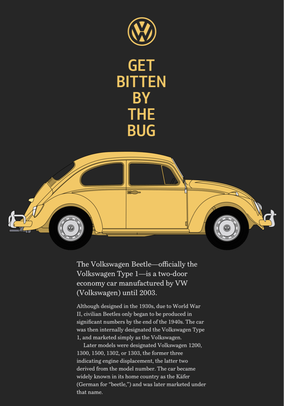
Although medium-size screens inherit many of those foundation styles, when more space becomes available, I want to emphasise the vertical axis in the design by creating a narrow column of text using wide viewport-based margins. I also reset the figure elements overflow to make all its content visible:
@media (min-width: 48em) {

figure {
overflow-x: visible; }

p {
margin-right: 25vw;
margin-left: 25vw; }
}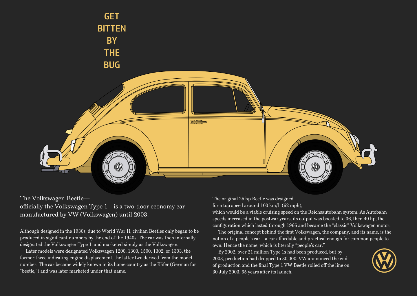
The largest version of my design is the most complex. It not only places a large picture of my Beetle on top of two columns of running text, but that text wraps around its wheels. I start by applying grid properties for larger screens to the body element to create a symmetrical two-column grid:
@media (min-width: 64em) {

body {
display: grid;
grid-template-columns: 1fr 1fr;
padding: 4rem; }
My header spans both columns, and then nested grid values arrange the VW logo, headline and image of my Beetle. In this nested grid, the two outer columns occupy all remaining available space, while the centre column automatically resizes to accommodate its content:
header {
grid-column: 1 / -1;
display: grid;
grid-template-columns: 1fr auto 1fr;
grid-row-gap: 4vh; }
I place the logo and headline into this centre column:
svg,
h1 {
grid-column: 2; }
Then, add margins between the paragraphs:
p {
margin-right: 1rem;
margin-left: 1rem; }
The picture element for this design includes two images. The first is complete with wheels for small and medium screens, and the second is a car missing its wheels for large screens. To bolt wheels back onto this Beetle, I use :before pseudo-elements inside both main and aside elements. Then, I add a shape-margin to add space between them and the running text nearby:
main:before,
aside:before {
display: block;
shape-margin: 10px; }
Using generated content, I add the rear wheel before the main element and float that wheel to the right. The shape-outside property then wraps text around this wheel:
main:before {
content: url(shape-l.png);
float: right;
shape-outside: url(shape-l.png); }
I apply similar values to before the aside element, this time floating the wheel left:
aside:before {
content: url(shape-r.png);
float: left;
shape-outside: url(shape-r.png); }
}
The running text now wraps around the Beetle’s wheels, which makes my design more compelling without sacrificing readability or responsiveness.
Conclusion
Otto Storch created many memorable designs, but I’m sad that he and his work have largely been forgotten. There’s no Wikipedia page devoted to Storch, and no one has published a book about him or his work. Storch’s designs have plenty to offer designers who work on the web, and I hope more people will rediscover him.
His work also demonstrates how much more we can achieve online using Shapes. Despite now being well-supported, this CSS property has been overlooked almost as much as Storch himself. Shapes offer so much more than simple text wrapping, and their full potential has yet to be realised. I hope that will change, and soon.
Read More From The Series
- Inspired Design Decisions: Avaunt Magazine
- Inspired Design Decisions: Pressing Matters
- Inspired Design Decisions: Ernest Journal
- Inspired Design Decisions: Alexey Brodovitch
- Inspired Design Decisions: Bea Feitler
- Inspired Design Decisions: Neville Brody
- Inspired Design Decisions: Herb Lubalin
- Inspired Design Decisions: Max Huber
- Inspired Design Decisions: Giovanni Pintori
- Inspired Design Decisions: Emmett McBain
- Inspired Design Decisions: Bradbury Thompson
NB: Smashing membersSmashing members have access to a beautifully designed PDF of Andy’s Inspired Design Decisions magazine and full code examples from this article. You can buy this issue’s PDF and examples as well as every other issue directly from Andy’s website.
Further Reading
- 2-Page Login Pattern, And How To Fix It
- What Saul Bass Can Teach Us About Web Design
- Beyond CSS Media Queries
- Combining CSS :has() And HTML
 (vf, ra, yk, il, mrn)

