Smart Interface Design Patterns Checklists PDF

Email Newsletter
Weekly tips on front-end & UX.
Trusted by 182,000+ folks.
Sharing the things we have learned is at the heart of everything we do at Smashing. That goes for the team as well as our authors, and Vitaly has been working on a set of checklists to accompany his workshop, Smart Interface Design Patterns. The resulting PDF is 402 pages packed with useful information to help you create better interfaces. And, we’re offering it to you free of charge.
These checklists are based on the work Vitaly has been doing for many years, exploring and examining examples of desktop and mobile interfaces. Learning what works and what doesn’t in usability tests and user interviews.
In the PDF is a collection of over 150 questions to ask yourself when designing and building almost anything — accordions, drop-downs, carousels, timelines, tables, sliders, advanced configurators, maps, seating selection, and onboarding. They can act as a jumping-off point for discussion, as designers and developers sit together to plan a component, or work through a particular design problem.
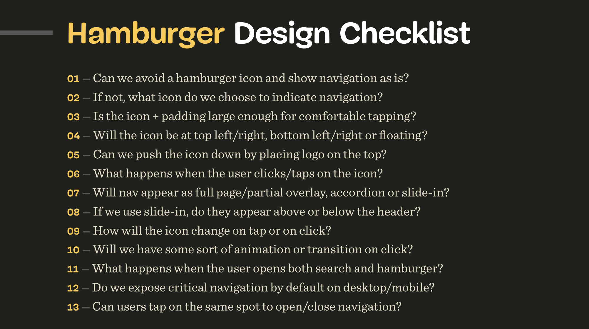
They can help to bring to mind all the fine details that go into interface design. How large should a hamburger icon be to avoid rage clicks? Should sections in an accordion collapse automatically when moving from one to another? Can users tap on the same spot to undo actions when zooming or filtering?
These aren’t golden rules, but rather starting points to help you consider all angles when working alone, or in a team. These checklists have been created after years of work on real projects with real users. Your projects can benefit from all of that existing knowledge, rather than needing to discover these issues for yourself or wait for your visitors to tell you about the problems they are having.
Subscribe To Newsletter And Get The PDF
To download, we ask for one thing: your real email address. In return, you’ll get the checklist and also our Smashing bi-monthly email newsletter and occasional emails when we have a new book or event that might be of interest. We don’t spam, nor do we pass on your email address to anyone outside of Smashing.
- Subscribe to our lovely email newsletter.
Please use your actual email — it’s no fun to land in spam. - Verify your email.
Please check your inbox and click on a button in the confirmation email. - Download the checklist PDF.
Voilà! We hope you’ll find the PDF useful for your work.
After subscribing, you’ll get a link to the PDF via email. There is a huge amount of work that has gone into this PDF. We hope you’ll find it useful in your work. Thank you for your trust, and we hope to release more useful tools for you soon!
 (vf, il, mrn)