Inspired Design Decisions With Herb Lubalin: Typography Can Be As Exciting As Illustration And Photography

Email Newsletter
Weekly tips on front-end & UX.
Trusted by 182,000+ folks.
 Register for Free


 Celebrating 10 million developers
 Custom Web Forms for Angular, React, & Vue. Your backend.
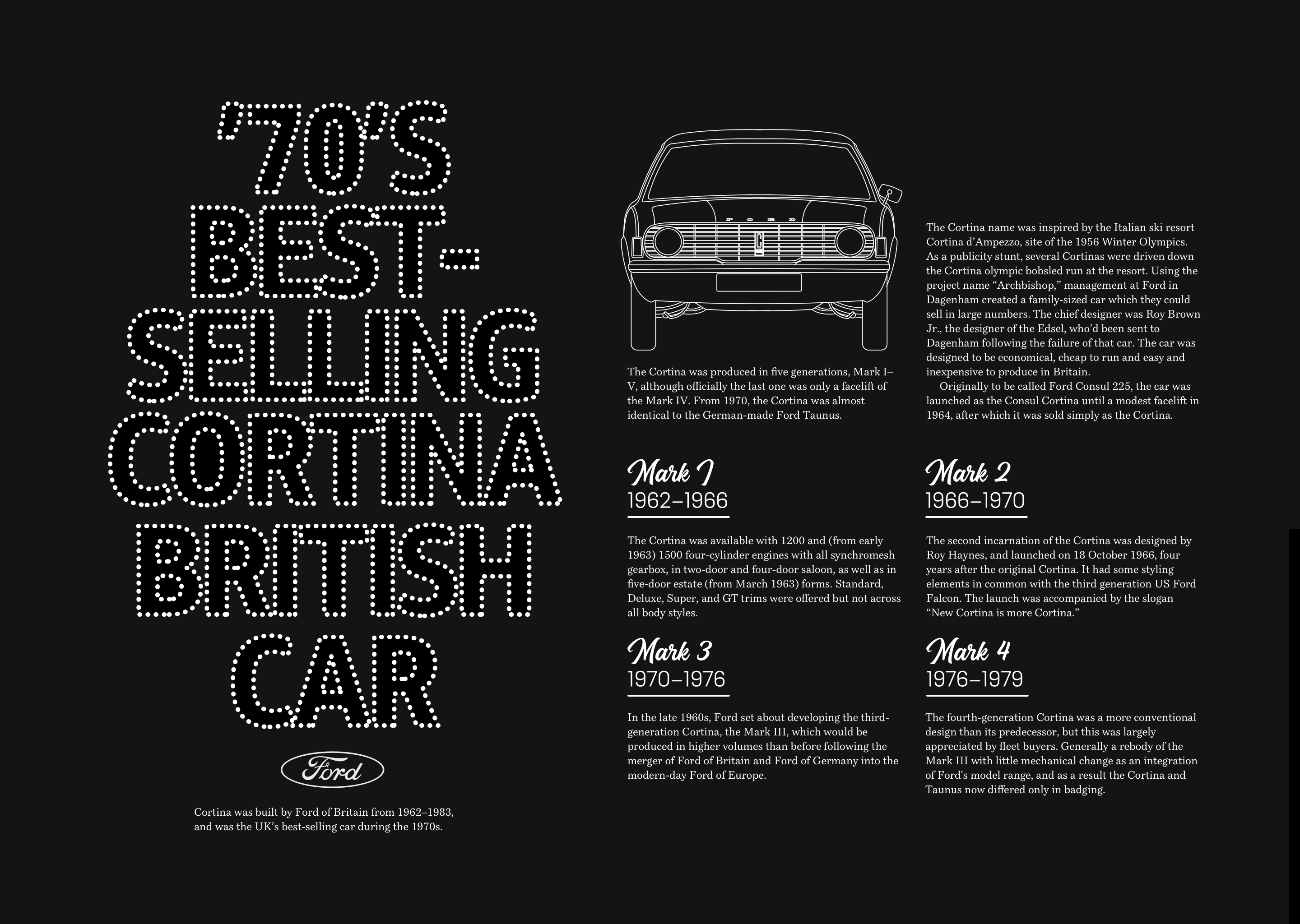
While good use of type helps people to read, great typography can do so much more. Typography can eloquently articulate an idea and colourfully communicate a message in ways which are as powerful as any illustration or photograph.
I’m someone who loves cinema as much as I admire typography. Few things inspire me as much as seeing movie poster typography which either evokes the atmosphere of a film and adds to the telling of its story.
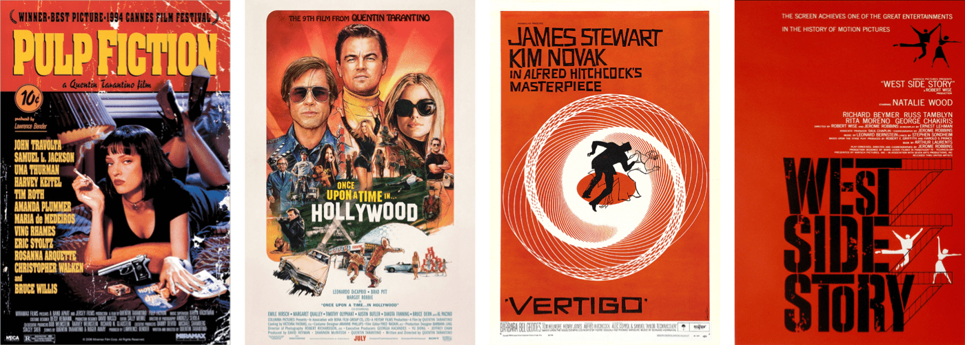
More recently, typography in Quentin Tarantino’s film posters perfectly reflects the atmosphere and character of his movies. In Pulp Fiction, the title’s Aachen Bold typeface is as hardboiled as the film itself. For Once Upon a Time in Hollywood, although the typesetting of the iconic sign deviates from reality as much as other parts of the film, the poster conjures up the spirit of Hollywood.
Saul Bass is possibly the best-known graphic designer of his era and for 1950s and ’60’s Hollywood he created movie posters which are as recognisable as the sign itself. For his poster design for Hitchcock’s Vertigo in 1958, Bass used hand-cut typography which evokes German expressionist films of the 1920s. In 1960, Bass’s slashed title typography for Pyscho — again for Alfred Hitchcock — is both clever and obvious. While Saul Bass is often incorrectly credited with designing one of my favourite film posters from West Side Story, — Bass did design the title sequence — the poster was actually designed by Joseph Caroff who also created James Bond’s famous 007 logo.
Although we don’t yet have the same control over typography on the web as we do in print, new file formats, font delivery services, and web fonts have meant far more typographic flexibility than we had ten years ago. Typography controls in CSS have helped us be more creative with type too. On top of basic font style properties, we can now reliably fine-tune OpenType figures, hyphenation, ligatures, and even kerning.
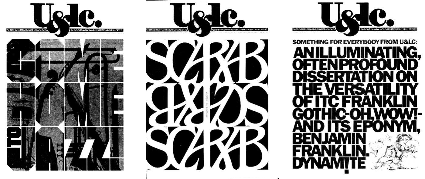
It’s rare to find such creative uses for type online, studying the work of graphic designers and talented typographers can open our eyes to what we can achieve using today’s type technologies. One of my personal favourite designers and typographers is Herb Lubalin, and learning about him and his work has transformed my own approach to typography.
Inspired By Herb Lubalin
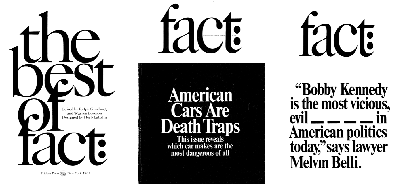
Herb Lubalin was an American graphic designer who spent his career designing everything from advertising, posters, and even postage stamps. He was fascinated by the look of words and how typographic design can make them sound. Lubalin understood how by combining art, copy, and typography, graphic designers add conviction when communicating messages. He said:
“The better people communicate, the greater will be the need for better typography-expressive typography.”
— Herb Lubalin
Having narrowly passed the entrance exam to the Cooper Union art school in New York, Herbert (Herb) Lubalin was fired from his first job as a graphic artist for asking for a $2 per week raise. In pre-war American advertising agencies, the job of a layout artist was simply to place headlines, copy, and images into available space, but that changed after WW2 with an influx of immigrant designers from Europe. They included Austrian Herbert Bayer, Russian Mehemed Fehmy Agha, and Belarusian Alexey Brodovitch.
These designers imported new processes which brought art directors, layout artists, and writers together to form the creative teams made popular by the famous advertising creative director Bill Bernbach in the 1960s and 1970s.
In 1945, Lubalin became art director at Sudler & Hennessey — a creative studio which specialised in the pharmaceutical industry — where he led a team of designers, illustrators, and photographers. The process which Lubalin established first at Sudler & Hennessey and from 1964 in his own studio is fascinating. He drove the design process by making “tissues” — pen and ink sketches which established the spacial arrangement of its elements — and detailed notes on typographic designs including typeface choices, sizes, and weights.
At the start of any new project, Lubalin began by sketching arrangements of headlines, copy, and images onto tissue paper. Then, he’d lay another tissue on top to refine his ideas, then another, and another, to rapidly develop his design. After his assistants recovered discarded tissues from the floor or trash, they became collectors’ items.
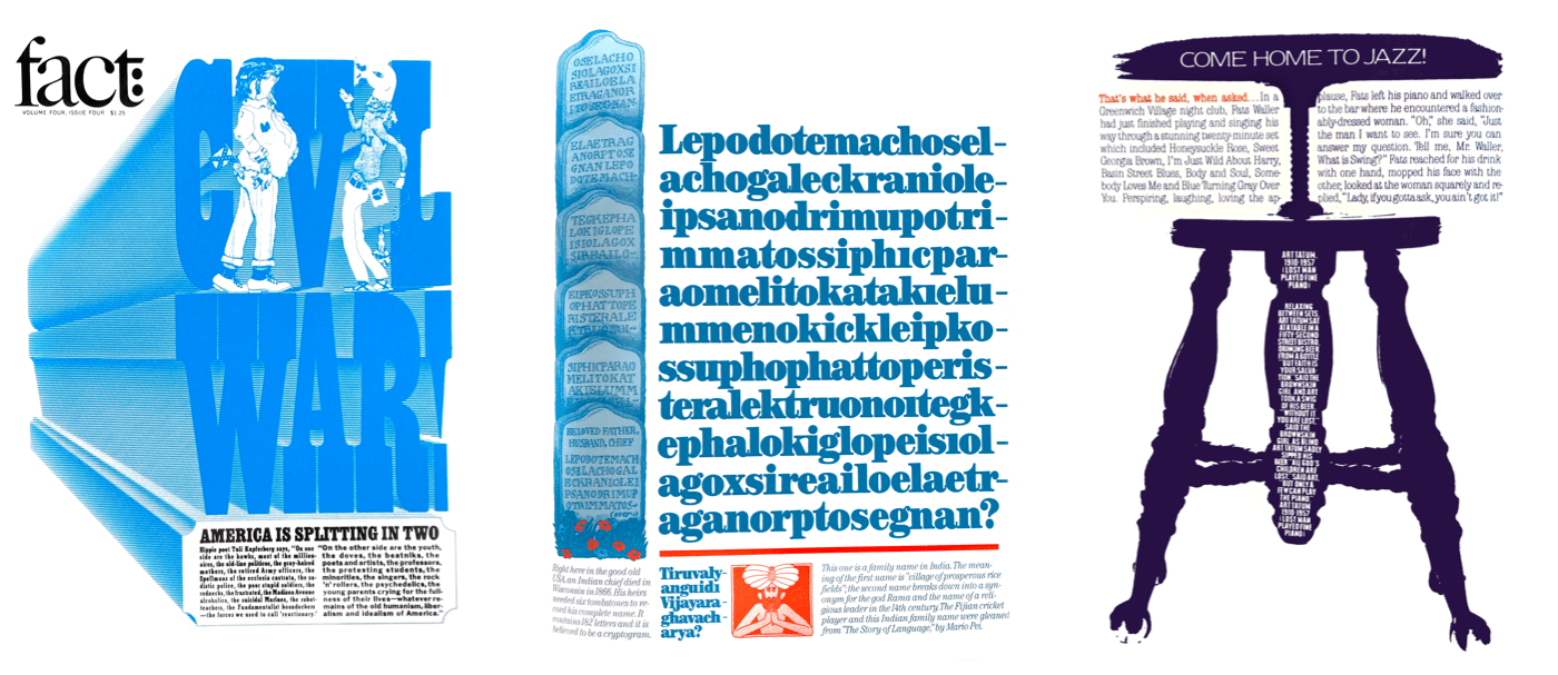
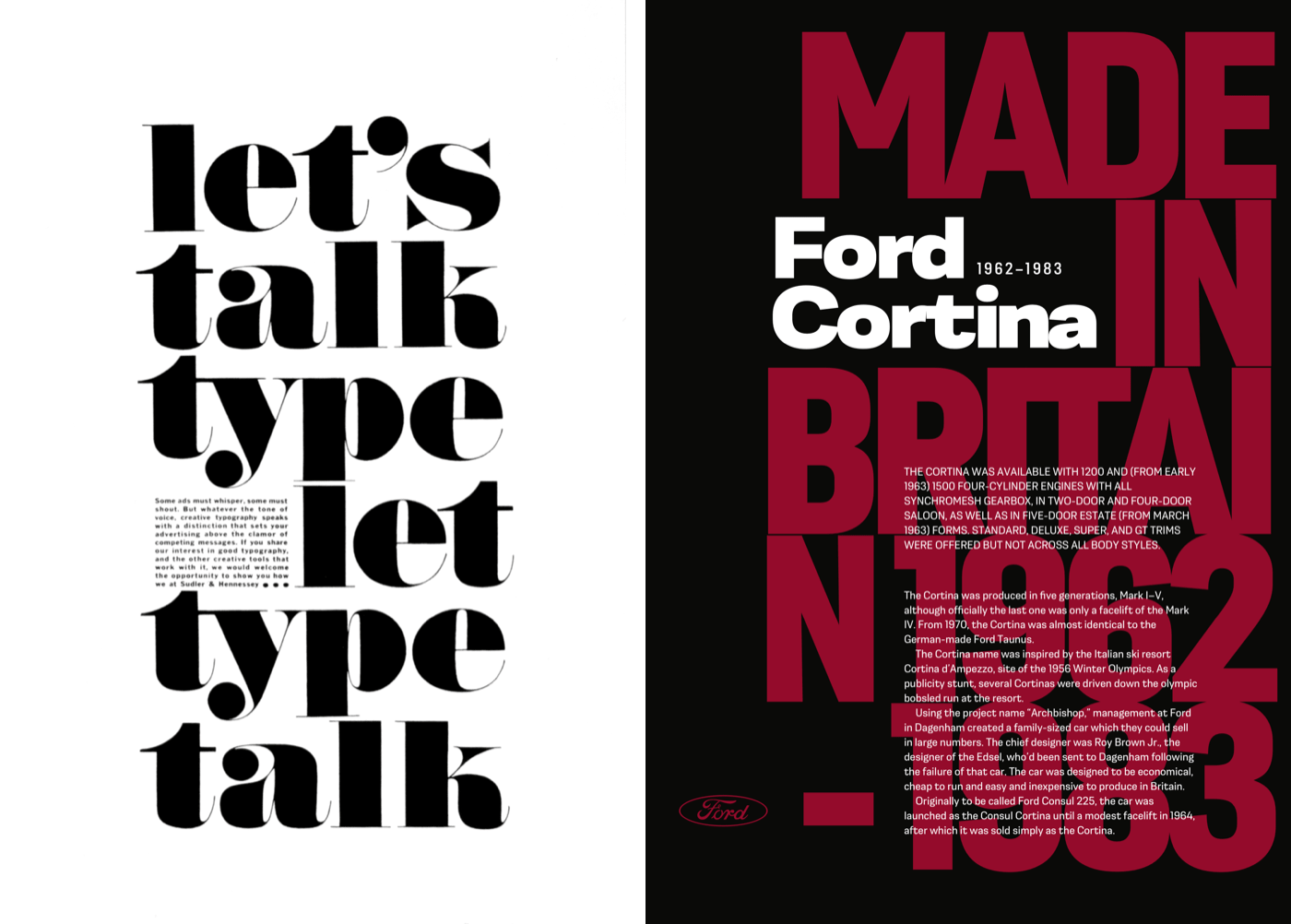
Lubalin was an obsessive perfectionist about typography. For “Let’s talk type” — a trade advertisement for Sudler & Hennessey — Lubalin precisely placed the only paragraph. This copy sits perfectly on the baseline alongside the word “let” and its size and leading allow for the descender from the letter “y” above.
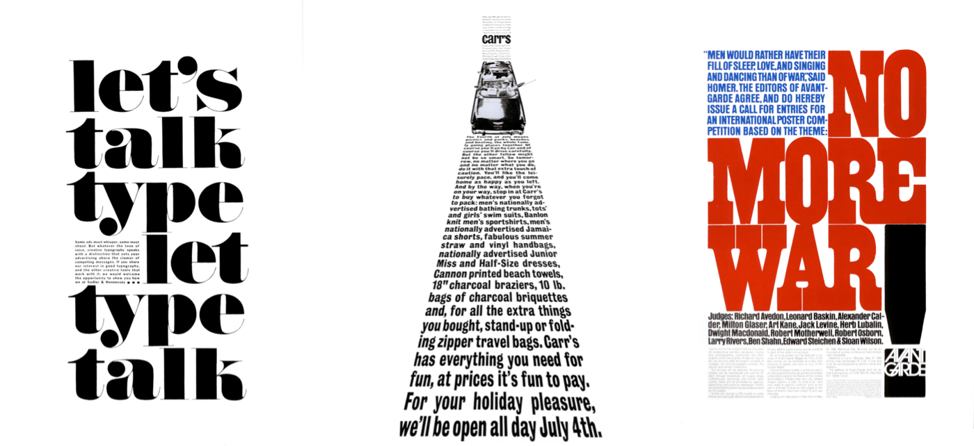
Lubalin was equally as precise about the placement of text in a poster which announced the Avant Garde anti-war poster competition. He would frequently take a scalpel blade to type, adjusting the spacing between letters and altering the height of ascenders and descenders to fit his designs. Letters in the headline for “No More War” are precisely sized and aligned. The tracking of the uppercase blue standfirst creates a block of copy which perfectly fits into its space.
In “The fourth of July means picnics…” Lubalin used perspective to represent the road ahead. This meant considering the tracking of every line of text, sometimes altering words to fit the design. Working with Lubalin’s designs wasn’t easy, and as one of his assistants later described:
“To make everything line up, you’ve got to do it over and over again, and then, if the client alters the text, you’ve got to redo the whole thing. To him (Lubalin,) it was worth it. How long it took or how much it cost wasn’t as important to him as it was to other designers.”
Because of his relentless conviction as well as his talent, Lubalin went on to become one of the most celebrated graphic designers and typographers of the twentieth century. There’s plenty we can learn from how he approached his work and his conviction that design can compellingly communicate.
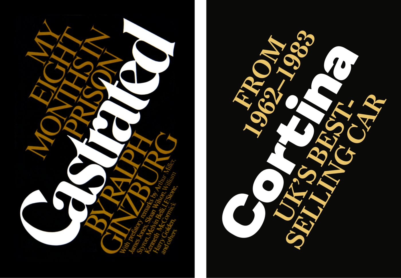
There are two books on Herb Lubalin and his work you should add to your collection. “Herb Lubalin: Art Director, Graphic Designer and Typographer” (1985) by Gertrude Snyder and Alan Peckolick is out of print, but good copies are available on eBay. Better still is “Herb Lubalin: American Graphic Designer” (2013) by Adrian Shaughnessy and published by Unit Editions. A limited edition of 2000, Shaughnessy’s book features hundreds of examples of Lubalin’s work.
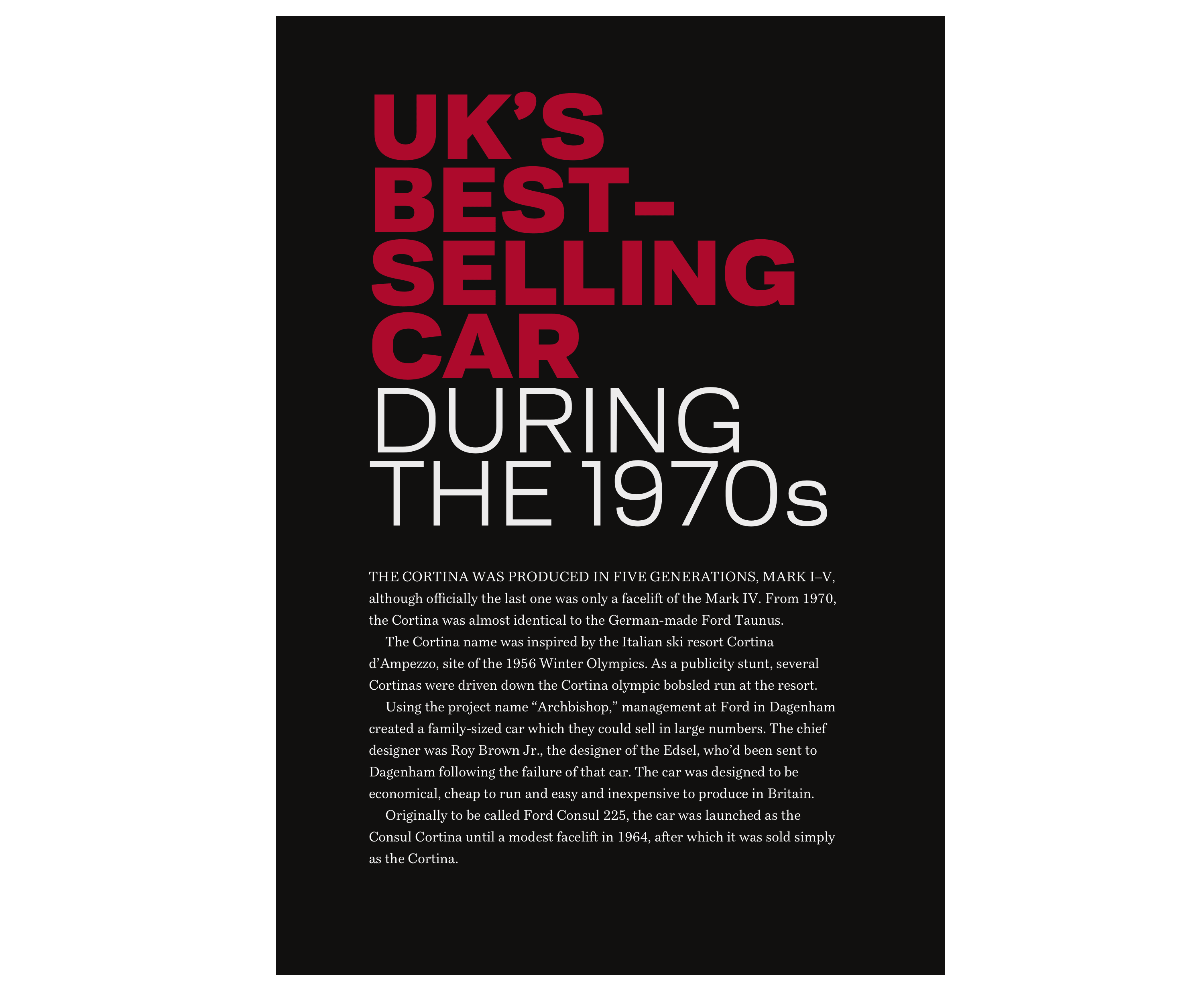
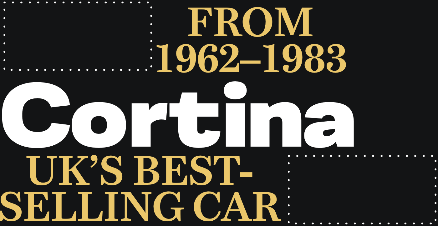
Pre-Formatting Headlines
Headlines are a perfect place to begin being more adventurous with type. Expressive typography needn’t need fancy fonts. You can create an eye-catching headline by using different styles and weights found within many everyday font families. Look for extended families like Montserrat — designed by Julieta Ulanovsky and available on Google Fonts — with its variety of weights ranging from thin and light, to extra-bold, and even black.
For this first Herb Lubalin inspired design, my headline uses black and light weights from this sans-serif typeface. Negative tracking (letter-spacing) and tight leading (line-height) combine to create a block of type which demands attention.
In the past, developing headlines like this involved hard-coding the design into your HTML by adding breaks between individual words, like this:
<h1><strong>UK’s <br>
best-<br>
selling <br>
car</strong> <br>
during <br>
the <br>
1970s</h1>
Other times, you might use wrap each word with an inline span element and then change its display property to block:
<h1><strong><span>UK’s</span>
<span>best-</span>
<span>selling</span>
<span>car</span></strong>
<span>during</span>
<span>the</span>
<span>1970s</span></h1>
Instead of these presentational elements, I add explicit line breaks in my HTML:
<h1><strong>UK’s
best-
selling
car</strong>
during
the
1970s</h1>
Browsers ignore anything more than a single space between words, so on small viewports, this headline reads like a sentence. I only need foundation styles which style its colours, size, and weights, as well as the negative tracking and tight leading which makes this headline distinctive:
h1 {
font-size: 6vmax;
font-weight: 300;
line-height: .75;
letter-spacing: -.05em;
text-transform: uppercase;
color: #fff; }

h1 strong {
font-weight: 600;
color: #bd1f3a; }
Whereas HTML’s pre element respects pre-formatted text and presents it exactly as written in a document, the CSS white-space property enables similar results without sacrificing semantics. Of the six available white-space values, these are the four I use these most often:
white-space: normal;
Text fills line-boxes and breaks as requiredwhite-space: nowrap;
The text won’t wrap, and it may overflow its containerwhite-space: pre;
Explicit line-breaks are respected, text breaks with new lines and br elementswhite-space: pre-wrap;
White-space is respected, but the text will also wrap to fill line-boxes
I only need the effects of the white-space property on larger viewports, so I isolate it with a media query:
@media (min-width: 64em) {

h1 {
white-space: pre; }
}
Using several styles from one font family adds visual interest. My Lubalin-inspired design incorporates light, bold, and black weights, plus condensed and regular styles of this sans-serif typeface to produce a variety of text-treatments.
First, I need two structural elements to accomplish my design, main and aside:
<main>…</main>
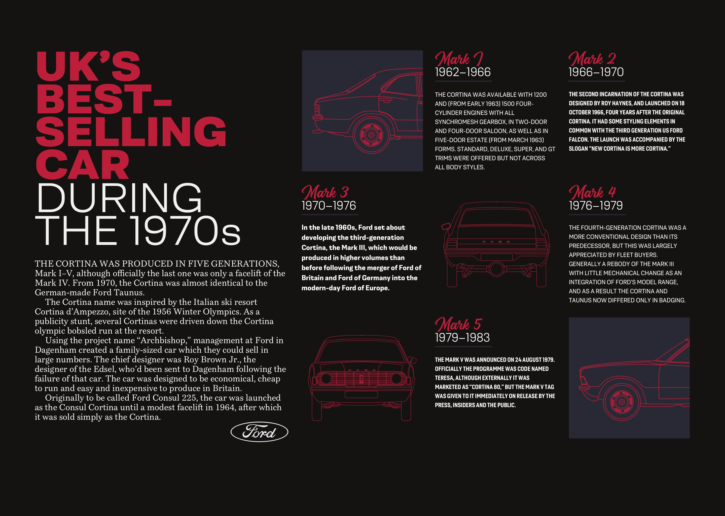
<aside>…</aside>While the main element includes my headline and running text, the aside contains four images in a division and five articles about versions of the classic Cortina:
<aside>
<div>
<img src="img-1.svg" alt="Ford Cortina Mark 1 front profile">
<img src="img-2.svg" alt="Ford Cortina Mark 3 rear">
<img src="img-3.svg" alt="Ford Cortina Mark 4 front">
<img src="img-4.svg" alt="Ford Cortina Mark 5 rear profile">
</div>

<article>…</article>
<article>…</article>
<article>…</article>
<article>…</article>
<article>…</article>
</aside>
First, I specify the styles of paragraphs in each of my articles using pseudo-class selectors. Each paragraph uses a different combination of font styles and weights, with mixed-case and uppercase letters:
article:nth-of-type(1) p {
font-family: 'light';
text-transform: uppercase; }

article:nth-of-type(2) p {
font-family: 'bold-condensed';
font-weight: 600;
text-transform: uppercase; }

article:nth-of-type(3) p {
font-family: 'bold-condensed';
font-weight: 600; }

article:nth-of-type(4) p {
font-family: 'light';
text-transform: uppercase; }

article:nth-of-type(5) p {
font-family: 'bold-condensed';
font-weight: 600; }
With those foundation styles in place for every screen size, I introduce layout to the aside element which will be visible on for medium-size screens. For layouts like this, where elements don’t overlap, I often grid-template-areas for their simplicity. This design has nine grid areas. While I could give these areas names which describe the content I’ll place into them — for example, “mark-1” — instead I use letters which makes moving items around my grid a little easier:
@media (min-width: 48em) {

aside {
display: grid;
grid-template-areas:
"a b c"
"d e f"
"g h i";
grid-gap: 1.5rem; }
}
I need to place the four images into my template areas, and not the division which contains them. I change the display property of that element to contents, which effectively removes it from the DOM for styling purposes:
aside div {
display: contents; }
I place those images using area names. Moving them into another area only involves referencing a different area name and no change to their order in my HTML:
aside img:nth-of-type(1) {
grid-area: a; }

aside img:nth-of-type(2) {
grid-area: e; }

aside img:nth-of-type(3) {
grid-area: g; }

aside img:nth-of-type(4) {
grid-area: i; }
Then, I place articles into the five remaining areas to complete my layout:
aside article:nth-of-type(1) {
grid-area: b; }

aside article:nth-of-type(2) {
grid-area: c; }

aside article:nth-of-type(3) {
grid-area: d; }

aside article:nth-of-type(4) {
grid-area: f; }

aside article:nth-of-type(5) {
grid-area: h; }
On small and medium-size screens, the main and aside elements stack vertically in the order they appear in my HTML. The extra space available in larger viewports allows me to place them side-by-side so visual weight is balanced across both sides of a screen. First, I apply a five-column symmetrical grid to the body element:
@media (min-width: 64em) {

body {
display: grid;
grid-template-columns: repeat(5, 1fr); }
}
Then, I place both main and aside elements using line numbers. This creates an asymmetrical design with a column of white space between my main content and the articles which support it:
main {
grid-column: 1; }

aside {
grid-column: 3 / -1; }
}
Reordering And Rotating
CSS Grid is now the best tool to use for implementing inspired layouts, and its powerful properties are also useful for developing intricate typographic designs.
My header contains a headline followed by two paragraphs and their order in HTML means they make sense when read without any styling applied:
<header>
<h1>Cortina</h1>
<p>UK’s best-selling car</p>
<p>From <span>1962–1983</span></p>
</header>
To begin this design, I add foundation styles for both elements, setting their alignment, colours, and sizes:
header h1,
header p {
margin: 0;
text-align: center; }

header h1 {
font-size: 10vmax;
color: #ebc76a;
line-height: 1; }

header p {
font-size: 4vmax;
line-height: 1.1;
text-transform: uppercase; }
I ordered my HTML for a semantic sentence structure, rather than any visual presentation, so to allow me to reorder the elements visually, I add Flexbox properties to my header and a flex-direction value of column:
header {
display: flex;
flex-direction: column; }
By default, elements appear in the order they occur in HTML, but in my design, the last paragraph in this header appears first, above the headline.
The default order value for all elements is 0, so to change the position of this paragraph without altering my HTML, I add a negative value of -1, which places it at the top:
header p:last-of-type {
order: -1; }
My design for medium-size screens includes two large bands of background colours, developed using a CSS gradient. So next, I change the foreground colours of my headline and paragraphs to contrast them against this new background:
@media (min-width: 48em) {

body {
background-image: linear-gradient(to right,
#0a0a08 0%,
#0a0a08 50%,
#fff 50%,
#fff 100%); }

header h1 {
color: #fff; }

header p {
color: #ebc76a; }
}
The unusual alignment of the three elements in this header is possible by combining CSS Grid with Flexbox. Although it might not be obvious at first, I place the headline and paragraphs in this header onto a four-column symmetrical grid. Leaving one column in the first and last rows empty creates a dynamic diagonal which adds interest to this header:
@media (min-width: 64em) {

header {
display: grid;
grid-template-columns: repeat(4, 1fr);
align-items: start;
padding-top: 0; }
}
My headline spreads across all four columns:
header h1 {
grid-column: 1 / -1; }
While the first — which appears at the bottom of my header — leave the first column empty:
header p:first-of-type {
grid-column: 2 / -1; }
The final paragraph—now placed at the top of the header — spans the first three columns, leaving a space on the left:
header p:last-of-type {
grid-column: 1 / 4; }
It’s unusual to see rotated text elements on the web, but when you do, they’re often memorable and always a nice a surprise. I want my headline rotated anti-clockwise, so I add a transform which rotates it negatively by 30 degrees and moves it vertically down by 150px:
header {
transform: rotate(-30deg) translateY(150px);
transform-origin: 0 100%; }
transform-origin specifies the point around which transforms happen. You can choose an origin in the centre or any of the four corners of an element — top-left (0 0), top-right (100% 0), bottom-right (100% 100%) or bottom-left (0 100%). You might also specify an origin in pixels, em, or rem units.
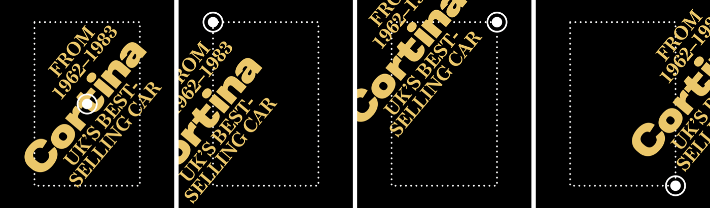
For an extra element of surprise, I add a subtle transition to that transform and reduce the amount of rotation when someone passes their cursor over my headline:
header {
transition: transform .5s ease-in; }

header:hover {
transform: rotate(-25deg) translateY(150px); }
Combining Header Elements
In my next Lubalin-inspired design, I combine an ordered list of Cortina models with a multi-coloured headline to make a powerful statement with this header:
<header>
<div>
<h1>…</h1>
<ol>…</ol>
</div>
</header>
This headline includes three lines of text. Whereas I previously avoided using additional elements, to style these lines differently I need three inline span elements:
<h1>
<span>Best</span>
<span>Selling</span>
<span>Cortina</span>
</h1>
The most semantic choice to mark up my list of Cortina models and the years during which they were manufactured, is an ordered list. To strongly emphasise each model name, I enclose them within strong elements, which deliver semantic value as well as a bold appearance from default browser styles:
<ol>
<li><strong>Mark I</strong> 1962–1966</li>
<li><strong>Mark II</strong> 1966–1970</li>
<li><strong>Mark III</strong> 1970–1976</li>
<li><strong>Mark IV</strong> 1976–1979</li>
<li><strong>Mark V</strong> 1979–1983</li>
</ol>
For small viewports, I need only a few foundation styles. The large font size and minimal leading create a solid block of text. Then, I change the span element’s display value from inline to block and use pseudo-class selectors to change the foreground colours of the first and third lines:
h1 {
font-size: 18vmin;
line-height: .9;
color: #fff; }

h1 span {
display: block; }

h1 span:nth-of-type(1) {
color: #ba0e37; }

h1 span:nth-of-type(3) {
color: #31609e; }
I want items in my ordered list to form a two-column symmetrical grid where each column occupies an equal amount of available space:
ol {
list-style-type: none;
display: grid;
grid-template-columns: 1fr 1fr; }
Then, I tighten the items’ leading and add a solid blue border to the bottom of all but the last list-item:
li {
display: inline-block;
line-height: 1.2; }

li:not(:last-of-type) {
border-bottom: 1px solid #31609e; }
Conveniently, there’s no need to specify column or row numbers for each list-item because CSS Grid arranges them automatically because of normal flow. To add greater emphasis, I change the strong elements’ display values to block and set them in uppercase:
li strong {
display: block;
font-size: 1.266rem;
font-weight: 600;
text-transform: uppercase; }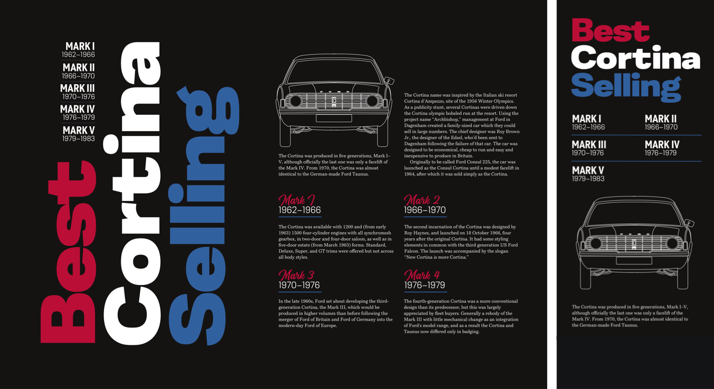
Centring an element both horizontally and vertically used to be tricky, but thankfully, Flexbox has made this alignment trivial to implement. Flexbox has two axes — main axis and cross axis — which change direction if you change the default flex-direction value from a row.
The flex-direction of my header remains row, so I align-items centre on the cross axis (vertical,) then justify-content centre along the main axis (horizontal:)
@media (min-width: 48em) {

header {
display: flex;
align-items: center;
justify-content: center; }
}
With content now entered in the header, I apply a grid which contains three columns and two rows. Their dimensions will be defined by their content and will resize automatically:
header > div {
display: grid;
grid-template-columns: repeat(3, min-content);
grid-template-rows: auto auto; }
The three multi-coloured lines in the headline are the foundation for this header design. I want to place them into specific columns and rows in this grid, so I add display: contents; to the headline:
h1 {
display: contents; }
Then, I place that multi-coloured text into columns and rows using line numbers:
h1 span:nth-of-type(1) {
grid-column: 1;
grid-row: 2; }

h1 span:nth-of-type(2) {
grid-column: 2;
grid-row: 1 / 3; }

h1 span:nth-of-type(3) {
grid-column: 3;
grid-row: 1 / 3; }
I want the text in my header to appear vertical, so I rotate each span clockwise by 180 degrees, then change their writing-mode to vertical left–right:
h1 span {
transform: rotate(180deg);
writing-mode: vertical-lr; }
The headline and ordered list in my design form a solid block. To pack these elements tightly together, I change the list’s display property from grid to block. Then, I align content in each list-item to the right, so they sit on my headline’s baseline:
ol {
display: block; }

li {
text-align: right; }
SVG And Text
It’s taken me a long time to appreciate SVG and to become familiar with how to get the best value from it, and I’m still learning. SVG is capable of producing far more than basic shapes, and one of its most exciting features is the text element.
Like HTML text, SVG text is accessible and selectable. It’s also infinitely styleable by using clipping paths, fills including gradients, filters, masks, and strokes. Adding text to SVG is just like including it in HTML, using the text element. Only content inside these text elements is rendered by browsers, and they ignore anything outside them. You can add as many text elements as you need, but my next headline needs only one:
<svg>
<text>’70’s best-selling Cortina British car</text>
</svg>
SVG includes a set of properties and attribute values which can be applied to text. Many SVG properties — like letter and word spacing, and text-decoration — are also in CSS. But it’s styling features unique to SVG which help to make SVG text so appealing.
For example, textLength sets the width of rendered text, which will shrink and stretch to fill the space depending on the lengthAdjust value you choose.
textLength
The text will be scaled to fit. Set textLength in percentages or use any numerical values. I prefer to use text-based units, em or rem.lengthAdjust
Defines how the text will be compressed or stretched to fit the width defined in the textLength attribute.
When used directly on a text element, SVG properties act the same as inline styles:
<svg>
<text textLength="400">’70’s best-selling Cortina British car</text>
</svg>
But just as with inline styles, the best value is achieved by styling SVG elements using CSS, whether in an external stylesheet or embedded in HTML. You can even use a style element in an external SVG file or a block of SVG included alongside HTML:
<svg>
<text class="display">’70’s best-selling Cortina British car</text>
</svg>

<style>
.display {
font-size: 100px;
font-family: 'black-extended';
font-weight: 600;
letter-spacing: -1px;
text-anchor: middle;
text-transform: uppercase; }
</style>
HTML has its span element and SVG includes a similar element which is useful for separating text into smaller elements so they can be styled uniquely. For this headline, I divide the content of the text element between six tspan elements:
<text>
<tspan>’70’s</tspan>
<tspan>best-</tspan>
<tspan>selling</tspan>
<tspan>Cortina</tspan>
<tspan>British</tspan>
<tspan>car</tspan>
</text>
By splitting my headline into multiple elements, I’m able to style each individual word. I can even position them precisely within my SVG, according to the baseline or even relative to each other.
xis the horizontal starting point for the text baseline;yis the vertical starting point for the text baseline;dxshifts text horizontally from a previous element;dyshifts text vertically from an earlier element.

For my headline, I position the first tspan element 80px from the top, then each subsequent element appears 80px below it:
<text>
<tspan y="80">’70’s</tspan>
<tspan dy="80">best-</tspan>
<tspan dy="80">selling</tspan>
<tspan dy="80">Cortina</tspan>
<tspan dy="80">British</tspan>
<tspan dy="80">car</tspan>
</text>
tspan elements are useful for precise positioning and individual styling, but they’re not without accessibility concerns. Assistive technology pronounce tspan elements as individual words and even spell them when a tspan wraps a single letter. For example, a screen reader will pronounce this series of tspan elements:
<tspan>C</tspan>
<tspan>o</tspan>
<tspan>r</tspan>
<tspan>t</tspan>
<tspan>i</tspan>
<tspan>n</tspan>
<tspan>a</tspan>
As:
“C”, “o”, “r”, “t”, “i”, “n”, “a”
We shouldn’t inconvenience people who use assistive technology or worse make our content inaccessible because of our styling choices. So avoid using tspan unnecessary and never for single letters.
Stroking Text With CSS And SVG
Adding a stroke often helps legibility when text is placed in front of a background image, and it can also make subtle and striking results. You won’t find an official way to stroke text in any CSS specification. But there is an experimental property which uses a Webkit vendor prefix and is widely supported by contemporary browsers.
text-stroke is shorthand for two properties: text-stroke-color and text-stroke-width. For my stroked headline, I first set foundation typography styles for family, size, and weight, then adjust the leading and tracking:
h1 {
font-size: 100px;
font-family: 'black-extended';
font-weight: 600;
letter-spacing: -6px;
line-height: .8;
color: #fff; }
Then I apply text-stroke and add the text-fill-color property with a value of transparent which overrides the white foreground colour:
h1 {
/* -webkit-text-stroke-color: #fff; */
/* -webkit-text-stroke-width: 5px; */
-webkit-text-stroke: 5px #fff;
-webkit-text-fill-color: transparent; }
Although text-stroke is an experimental property and not in a W3C specification, now that browsers have implemented it, there’s little chance of it being removed. But if you’re still concerned about supporting a legacy browser, consider using a feature query to test for text-stroke support and provide an appropriate fallback for them.
SVG has stroke properties too, plus a few options which aren’t available in CSS. If you need more options and the widest browser support, SVG is the answer. My SVG header includes six tspan elements:
<svg>
<text>
<tspan>’70’s</tspan>
<tspan>best-</tspan>
<tspan>selling</tspan>
<tspan>Cortina</tspan>
<tspan>British</tspan>
<tspan>car</tspan>
</text>
</svg>
On top of foundation typography styles, I add the equivalent SVG properties for text-stroke-color and text-stroke-width. I also reduce the opacity of my stroke, which is an option unavailable in CSS:
text {
stroke: #fff;
stroke-width: 1.5px;
stroke-opacity=".8"; }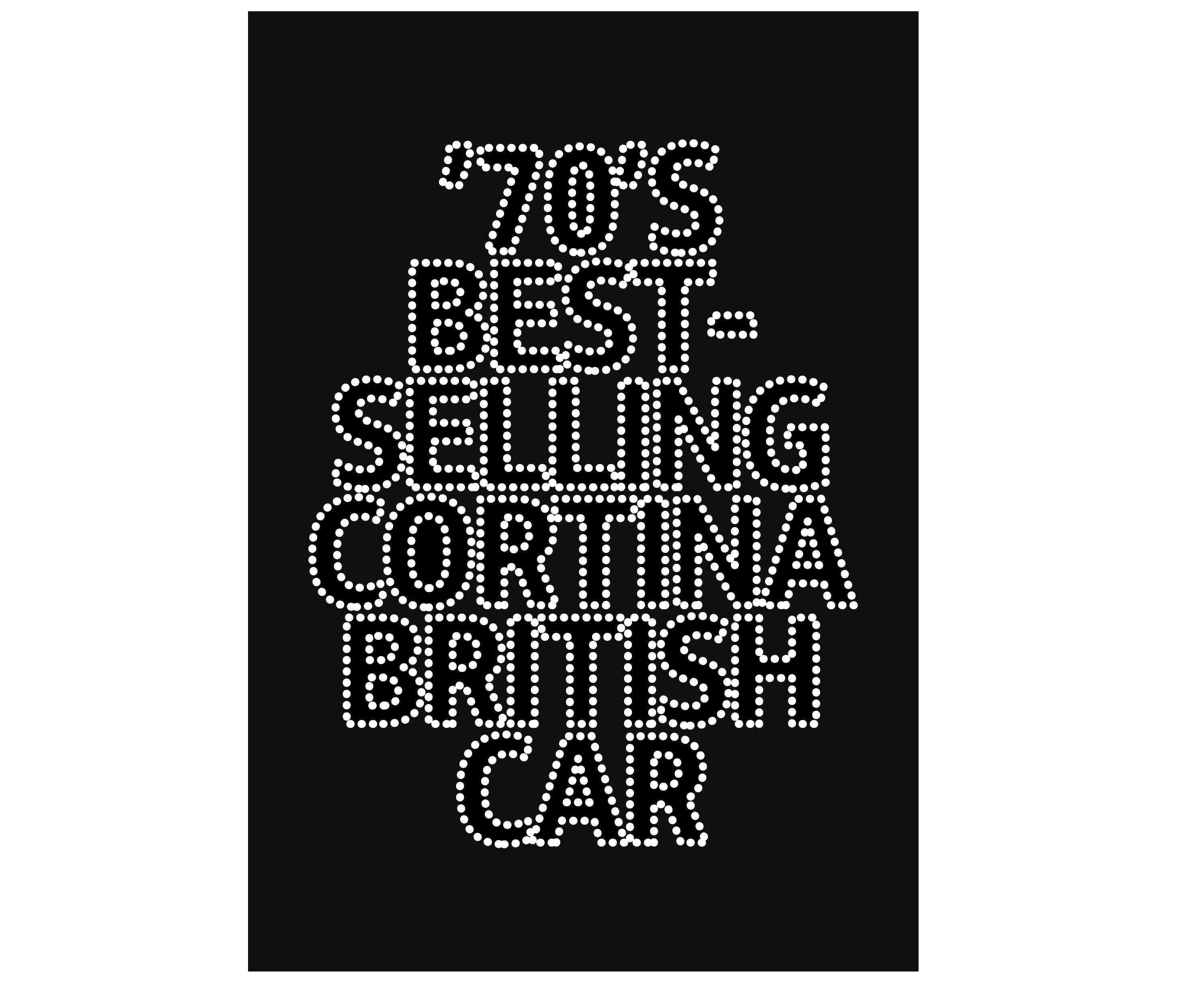
SVG includes other properties which fine-tune aspects of a stroke. Unlike CSS, SVG strokes can be dashed using the stroke-dasharray property. Alternate values define filled areas and blank areas, so the dashes around my headline text are one unit filled, then ten units blank:
text {
stroke-dasharray: 1, 10; }
Should you need more complex patterns, add extra numbers to the pattern, so a stroke-dasharray value of 1, 10, 1 results in a dashed stroke which is 1 (filled,) 10 (blank,) 1 (filled,) 1 (blank,) 10 (filled,) 1 (blank,) and repeats.


Optimize SVG Accessibility
CSS typography controls are now more powerful than ever, but there are occasions when a design calls for more than styled HTML text. Image replacement techniques have fallen out of fashion, but SVG — whether in an external file or inline within HTML — can deliver scalable text effects. SVG can also be useful for overall performance when optimised well and can be made accessible.
This header contains two typefaces. One is Magehand, a decorative retro-style script by Indonesian type designer Arief Setyo Wahyudi. The other is Mokoko, a slab serif by London-based Dalton Maag which is available in seven weights from thin to black.
Embedding these two fonts in both Web Open Font Format (WOFF) and WOFF2 formats would add over 150kb to my page. Whereas, by converting these fonts to outlines in a graphics editor and delivering the header as an optimised SVG image would add only 17kb.
The SVG image in my header contains three paths:
<svg xmlns="https://www.w3.org/2000/svg">
<path id="top">…</path>
<path id="bottom">…</path>
<path id="middle">…</path>
</svg>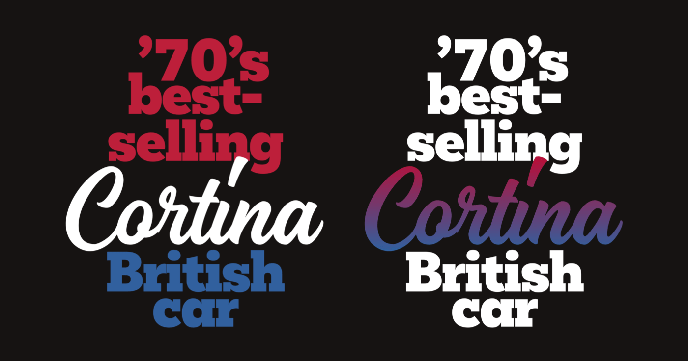
The order of these paths matters, because just as in HTML, elements are stacked in the order they’re written. SVG includes a set of properties and attribute values which can be applied to any element. I use the fill property to colour each path in my header:
<path fill="#bd1f3a">…</path>
<path fill="#31609e">…</path>
<path fill="#fff">…</path>
For an even more stylish effect, I can define a linear gradient with two colour stops, and reference that to fill my decorative script:
<defs>
<linearGradient id="cortina" gradientTransform="rotate(90)">
<stop offset="0%"  stop-color="#bd1f3a" />
<stop offset="100%" stop-color="#31609e" />
</linearGradient>
</defs>

<path fill="#fff">…</path>
<path fill="#fff">…</path>
<path fill="url('#cortina')">…</path>
SVG files are frequently smaller than bitmap images or the combined size of several font files, but they nevertheless need careful optimisation to achieve the best performance.
Every element, handle, and node increases the size of an SVG file, so replace paths with basic shapes like circles, ellipses, or rectangles where possible. Simplify curves to reduce the number of nodes and use fewer handles. Popular graphic software like Adobe Illustrator, Affinity Designer, and Sketch export files bloated by unoptimised elements and unnecessary metadata. But, tools like SVGOMG by developer Jake Archibald will strip away unneeded items and can often reduce SVG file size substantially.
SVG images which contain text outlines can also be made accessible by using alternative text and ARIA properties. When linking to an external SVG file, add alternative text as you should with any non-decorative image:
<img src="header.svg"
alt="Cortina. ’70s best-selling British car">
The best way to help people who use assistive technology is to embed SVG into HTML. Add an ARIA role and a descriptive label and screen readers will treat the SVG as a single element and read the label description aloud:
<svg role="img" aria-label="Cortina. ’70s best-selling British car">
…
</svg>
Adding a title element helps assistive technology to understand the difference between several blocks of SVG, but this title won’t be displayed in a browser:
<svg>
<title>Cortina. ’70s best-selling british car</title>
</svg>
When there are several blocks of SVG in a document, give each one a unique ID and add that to its title:
<svg>
<title id="header">…</title>
</svg>
ARIA has several attributes which help SVG accessibility. When SVG is purely decorative and has no semantic value, hide it from assistive technology by adding an aria-hidden attribute:
<svg aria-hidden="true">
…
</svg>
For my design, I use SVG in place of an HTML heading. To replace the missing semantics for assistive technology, use an ARIA role attribute and a value of heading. Then add a level attribute which matches the missing HTML:
<svg role="heading" aria-level="1">
…
</svg>
Clipping Type
The CSS background-clip property defines whether an element’s background extends underneath its border-box, padding-box, or content-box, according to the CSS box model:
border-box
Background extends to the outside edge of the border (and underneath the border).padding-box
Background extends to the outside edge of the padding only.content-box
The background is rendered within (clipped to) the content box only.

But, there’s one more value which offers many more opportunities for inspiring typography. Using text as a value for background-clip clips an element’s background to the space occupied by the text it contains.

In my next example, the brake disk background image is visible only where there’s text in the headline. When my headline includes more content or its text size increases, more of that background image will be visible:
h1 {
background-image: url(pattern.svg);
background-clip: text;
-webkit-background-clip: text;
color: transparent; }
You can apply the text value for background-clip to any element except the :root, HTML. As support forbackground-clip is limited, I use a feature query which delivers those styles only to supporting browsers:
h1 {
color: #fff; }

@supports (background-clip: text) or (-webkit-background-clip: text) {
h1 {
background-color: #fff;
background-image: url(pattern.svg);
background-position: 50% 100%;
background-repeat: no-repeat;
background-size: 50%;
background-clip: text;
-webkit-background-clip: text;
color: transparent; }
}
Inspired by Lubalin, I want to place images inside the letters of my next headline, and the SVG image element allows me to do just that.
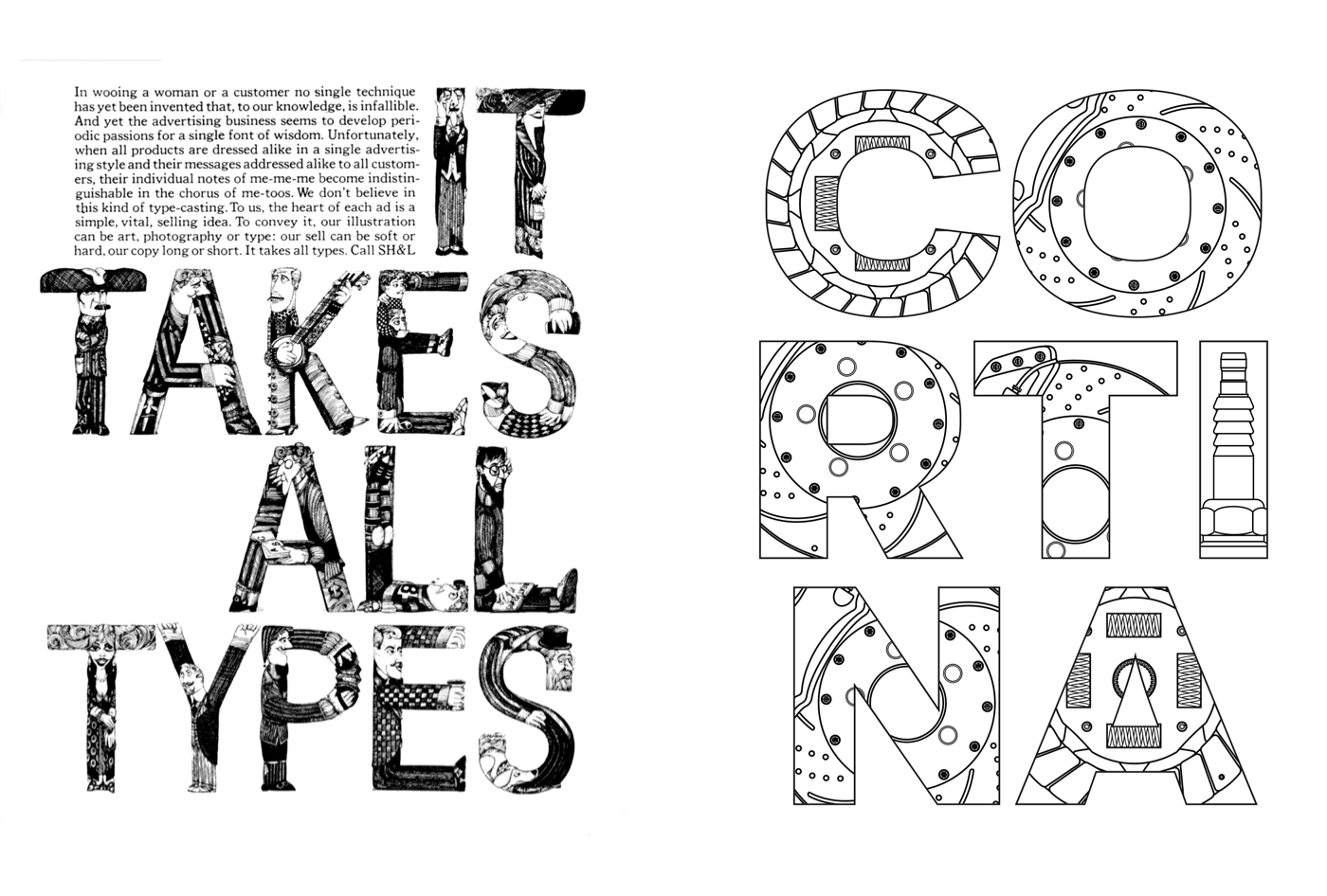
As this SVG image represents a heading, I add alternative text plus an ARIA role and level to ensure it remains accessible:
<img src="header.svg" alt="Cortina"
role="heading" aria-level="1">
In SVG, the defs element stores graphical objects which can be referenced from elsewhere in a file. These include the patterns which contain my images and I add one for each letter:
<svg>
<defs>
<pattern id="letter-c">…</pattern>
<pattern id="letter-o">…</pattern>
<pattern id="letter-r">…</pattern>
…
</defs>
…
</svg>
Content in the defs element is not rendered directly and to display it I reference them with either a use attribute or url. My SVG contains one path for each of the seven letters in the word “Cortina,” and I fill each path with a pattern using its unique ID:
<svg>
<defs>…</defs>
<path fill="url(#letter-c)">…</path>
<path fill="url(#letter-o)">…</path>
<path fill="url(#letter-r)">…</path>
…
</svg>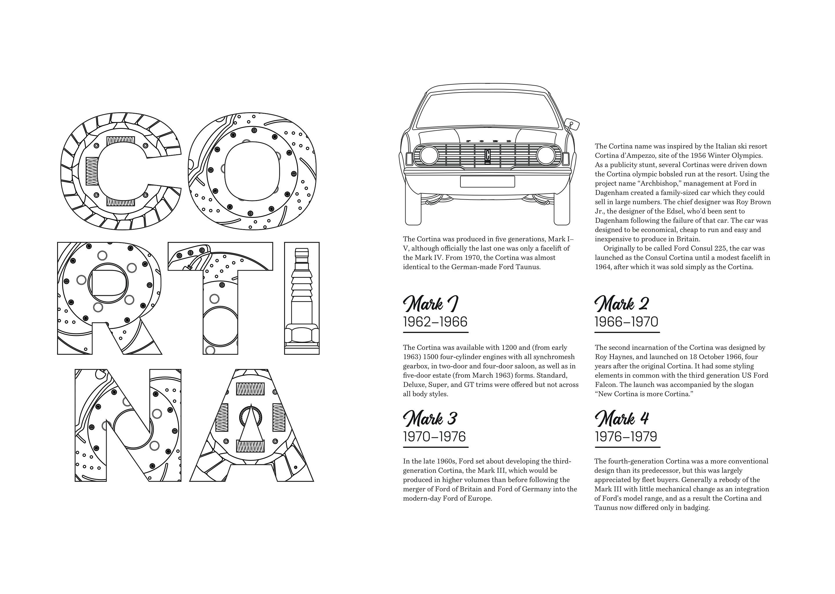
Image elements allow either bitmap or vector images to be rendered within an SVG. My design incorporates three car part blueprint images which I link to using a standard href attribute:
<defs>
<pattern id="letter-c" width="100%" height="100%">
<image href="pattern-c.png" height="250" width="250"/>
</pattern>
…
</defs>
These three car part pattern images fill each letter, and the result is a striking headline design which demands attention.
Combining Techniques
There’s no doubt that Herb Lubin had a masterful ability to make type talk. For this final Lubin-inspired example, I put together the techniques I’ve demonstrated to create a compelling design for this classic ’70s Ford.
To develop this design, I need two structural elements which should be very familiar by now, a main and aside:
<main>…</main>
<aside>…</aside>
My main element contains a header element with an SVG headline followed by a division which includes my running text. I add an ARIA role and level to my headline to ensure its SVG text is accessible:
<main>

<header>
<svg role="heading" aria-level="1">…</svg>
</header>

<div>…</div>

</main>
To serve a full image to small screens and half to larger viewports, I use a picture element and a minimum width media query:
<aside>
<picture>
<source srcset="half.svg" media="(min-width: 74em)">
<img src="full.svg" alt="Ford Cortina">
</picture>
</aside>
Lubalin’s designs are often energetic, so to fill my main element with energy, I apply grid properties and use three columns and five rows to develop an asymmetrical layout.
main {
display: grid;
grid-template-columns: 1fr 1fr 1fr;
grid-template-rows: repeat(5, 1fr); }
This design is dominated by an outline of the charismatic Cortina, and a text-based background image which covers the main element. I scale this SVG to fill the element’s background, and change the background-origin so it appears only behind the content and not its border or padding:
main {
background-image: url(main.svg);
background-origin: content-box;
background-position: top right;
background-repeat: no-repeat;
background-size: 100% 100%; }
Leaving columns around my header and text division empty creates negative space which helps to lead someone’s eye around the composition. The header occupies the first two of my three columns while the division fills the last two:
header {
grid-column: 1 / 3;
grid-row: 2 / 3; }

main div {
grid-column: 2 / 4;
grid-row: 3 / 6; }
One of the benefits of using the SVG text element is the ability to position text according to its baseline or relative to each elements. My headline SVG includes two text elements for the name of this car, and a third for the period it was manufactured. I want to place this final text element precisely 250px from the left and 60px from the top of my SVG:
<svg>
<text x="0" y="60">Ford</text>
<text x="0" dy="70">Cortina</text>
<text x="250" y="60">1962–1983</text>
</svg>
This dazzling design becomes more memorable on larger viewports when the text-based SVG background image and my Cortina outline fit alongside each other. I apply a two-column symmetrical grid to the body element:
@media (min-width: 74em) {

body {
display: grid;
grid-template-columns: [main] 1fr [aside] 1fr; }
}
Then, I place the main and aside elements onto my grid using line names:
main {
grid-column: main; }

aside {
grid-column: aside; }
}
On the web, inspiring typography should be attractive and readable, but the readability of running text can easily be affected by the background behind it.
The backdrop-filter applies CSS filter effects to elements behind the text. These filters include blur, brightness and contrast, and colour effects which can all help to make the running text more readable against either background images, graphics, or patterns.
Apply one or multiple filters using the same CSS filter syntax I demonstrated in a previous issue:
main {
backdrop-filter: brightness(25%); }

main {
backdrop-filter: brightness(25%) contrast(50%); }
backdrop-filter is part of the Filter Effects Module Level 2 specification. It already has solid support in contemporary browsers, although some still require the Webkit vendor prefix:
main div {
-webkit-backdrop-filter: blur(3px);
backdrop-filter: blur(3px); }
Read More From The Series
- Inspired Design Decisions: Avaunt Magazine
- Inspired Design Decisions: Pressing Matters
- Inspired Design Decisions: Ernest Journal
- Inspired Design Decisions: Alexey Brodovitch
- Inspired Design Decisions: Bea Feitler
- Inspired Design Decisions: Neville Brody
- Inspired Design Decisions: Otto Storch
- Inspired Design Decisions: Max Huber
- Inspired Design Decisions: Giovanni Pintori
- Inspired Design Decisions: Emmett McBain
- Inspired Design Decisions: Bradbury Thompson
NB: Smashing membersSmashing members have access to a beautifully designed PDF of Andy’s Inspired Design Decisions magazine and full code examples from this article. You can buy this issue’s PDF and examples as well as every other issue directly from Andy’s website.
Further Reading
- Getting To The Bottom Of Minimum WCAG-Conformant Interactive Element Size
- What Saul Bass Can Teach Us About Web Design
- Modern CSS Layouts: You Might Not Need A Framework For That
- Infinite-Scrolling Logos In Flat HTML And Pure CSS
 (vf, ra, yk, il, mrn)

