Inspired Design Decisions With Max Huber: Turning Mundane Subjects Into Exciting Visual Communication

Email Newsletter
Weekly tips on front-end & UX.
Trusted by 182,000+ folks.


 Custom Web Forms for Angular, React, & Vue. Your backend.
 Celebrating 10 million developers
Years ago, I wished I could work on advertising projects for household names because I thought that above-the-line work would bring creative satisfaction. I’ve been lucky to work with many well-known businesses and charities, but looking back, my smaller projects were the most satisfying creatively.
Often, big brands have already established guidelines which mean there’s less room for me to experiment and exercise my creative muscles. I’m not saying brand guidelines are unimportant, but I prefer to work on projects where I feel I add the most value and a little of myself.
These days, product companies seem more interested in refining interfaces and simplifying user experiences. I value those things when I use a product, but I find working on these projects less rewarding. Well-known clients still have a certain allure — and having logos in my portfolio has been good for business — but I now look for projects which offer me the freedom to develop my creative interests.
I’m fascinated by how design can tell engaging stories about products and services, even those which might be considered mundane by some. I enjoy exploring how images, layout, and typography can be used to communicate messages in visually distinctive ways. Above all, I love using my experience and interests in art direction and graphic design to help businesses, charities, and sometimes individuals, who might otherwise be exposed to them.
“I do not attempt to speak on behalf of the machines. Instead, I have tried to make them speak for themselves, through the graphic presentation of their elements, their operations and their use.”
— Giovanni Pintori
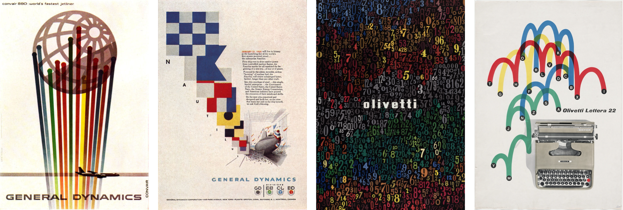
Even highly regarded, well-known designers spent time working with mundane subjects and produced iconic work. After moving from Switzerland to the United States, Erik Nitsche for magazines including Harper’s Bazaar, Life, and Vanity Fair. But it’s his work for General Dynamics which became his most recognized. In his five years as an art director at the aerospace and defence company, Nitsche developed an information design system which resulted in annual reports, posters, technical data, and Dynamic America, a 420-page book tracing the company’s history.
Italian designer Giovanni Pintori worked for business products manufacturer Olivetti for 31 years where the simple style and geometric shapes he applied to advertisements, calendars, and posters developed into the company’s design vocabulary.
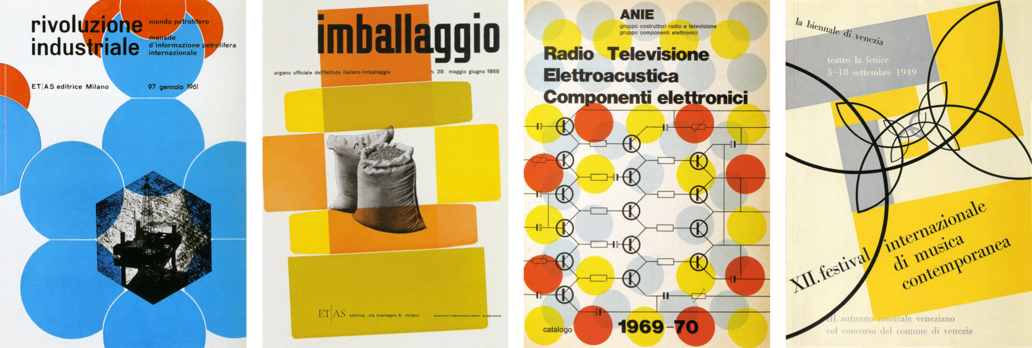
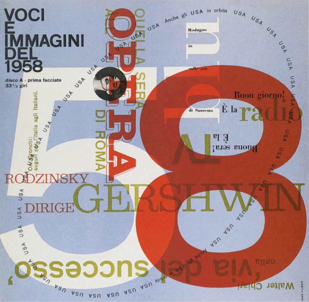
Born in Switzerland, Max Huber also spent most of his career working in Italy. While his portfolio contains work for many leading Italian brands, his food labels and wrapping paper designs for La Rinascente supermarkets are fascinating too.
What these three designers, and plenty more like them, can teach us that even the most mundane subjects can offer exciting opportunities to communicate through design. And that’s something I try to remember every day.
Inspired By Max Huber
Although less well known than many of his contemporaries, Max Huber was one of Switzerland’s most distinguished designers. Born in Baar in 1919, Huber moved between Switzerland and Italy until the end of the Second World War.
In his early career in Milan, Huber worked at the studio of Antonio Boggeri where he was influenced to mix media, including illustration, photography, and typography. From 1950–1954, Huber worked for the high-end Italian department store chain La Rinascente and won the first of its Golden Compass (Compasso d’Oro) awards in 1954.
In the 1940s, Milan was the centre of Italy’s avant-garde movement. While there, Huber mixed with artists, designers, and intellectuals. This mixture stimulated Huber, and he experimented blending creative work from many disciples.
Huber never took these influences at face value. He manipulated photographs, cut subjects from their backgrounds, and mixed them with blocks of color and shapes. Colorful strips add movement to Huber’s designs and his poster designs for Monza Autodromo — Milan’s famous race track — are as exciting as the races themselves.
Huber often used flat shapes — arrows, circles, and swirling patterns — and overlapped them with monochrome and duotone photographs. His record cover designs and the cases he made for his own jazz collection, swing with energy.
While not always recognized for his skill as a typographer, Huber’s work is filled with inspiring typography. He effortlessly switched between modern serif and contemporary sans-serif typefaces and seemed comfortable when using both. While the Swiss style is most associated with Neo-grotesque sans-serif typefaces, Huber’s work with serifs is equally inspiring.
Huber defined grids to emphasise text alignment, then used large headlines followed by text in a strict hierarchy. But he was also unafraid of playing with type, setting it at unusual angles and experimenting with perspective.
From the 1960s until death in 1992, Huber worked on a variety of commissions including a brand redesign and a jazz-based wallpaper design which featured Louis Armstrong, which he called Rhythm. His client, Oscar Braendli, commissioned Huber to design exhibitions.
Huber also designed for Adriano Olivetti and embraced these projects with the same enthusiasm for experimentation. Both are clear examples of how distinctive design can turn even the most mundane subjects into exciting visual communication.
They prove that synergy and trust in a relationship between client and designer can bring extraordinary results which can last for decades.
Although his signature style developed throughout his lifetime, Huber’s commitment to experimenting remained. Even he included individual elements of his style — bold blocks of color, iconic shapes, photographic manipulation, and strong typography — throughout his lifetime, Huber built a portfolio of work which is remarkably varied. In later life, Huber taught graphic design in the southern Swiss town of Lugano, which coincidentally is where I stay when I work in Switzerland. He died in Mendrisio — where my Swiss office is located — in 1992 and there’s a museum dedicated his work in nearby Chiasso.
There’s been only one book on Max Huber and you should find space for it on your bookshelf or coffee table. “Max Huber” (2006) by Stanislaus von Moos, Mara Campana, and Giampiero Bosoni. It’s a thorough catalogue of work from throughout his career written by people who knew Max Huber personally.
Identifying Old Style (Humanist) Typefaces
The periods where design changes often go step-by-step with advances in technology. What’s true of the web today — and how developments in CSS affect what’s possible online — was also the case with early typography developments. Some early typefaces were Humanist because their origins were in handwriting from the middle of the fifteenth century.
But when steel punchcutting techniques — the metal blocks used for typesetting until the nineteenth century — became more precise, typefaces became more refined.
This precision allowed type designers to add flourishes to what we now call Old style typefaces.
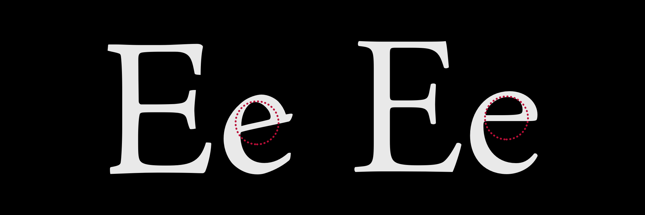
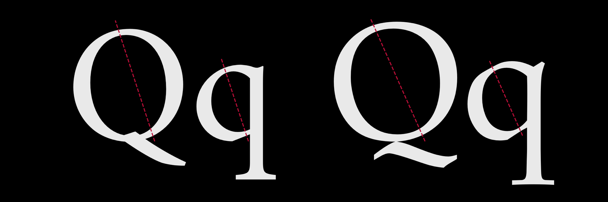
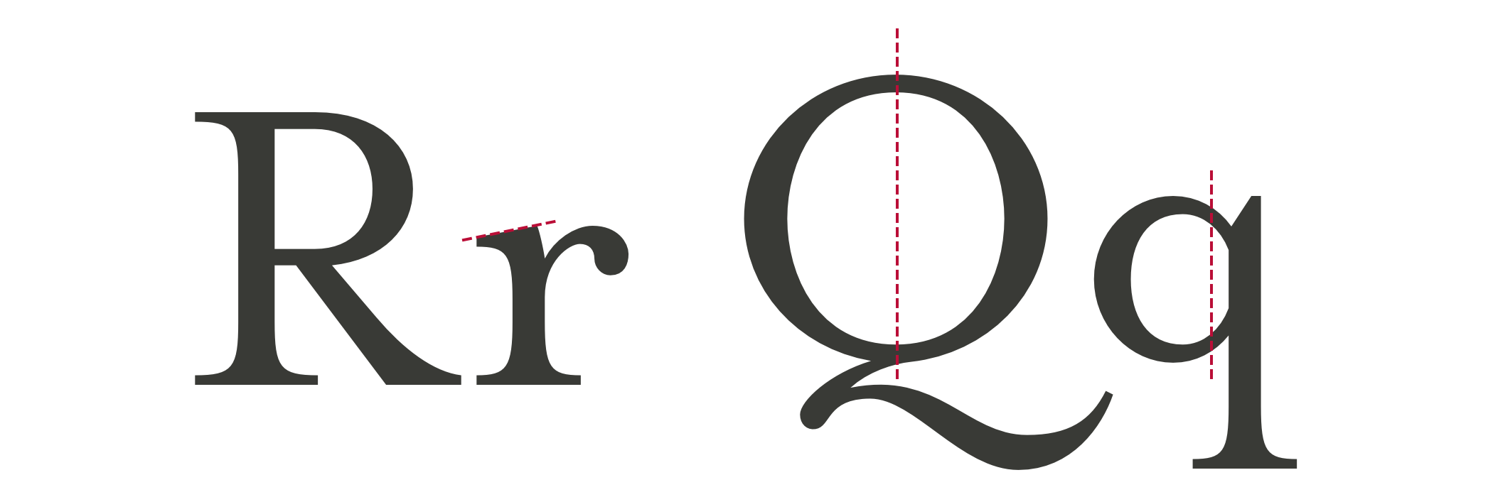
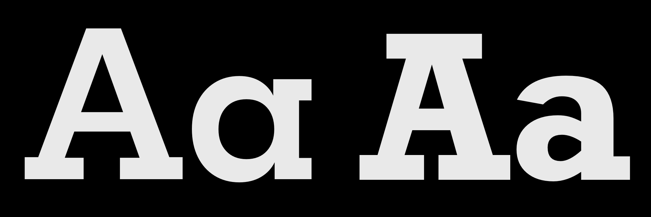
Whereas Humanist typefaces commonly include a lowercase “e” with a slanted crossbar, Old style typefaces introduced a horizontal crossbar.
Stress in a typeface is the angle drawn between thinner parts of a letter. In typefaces with vertical stress, this line is drawn vertically from top to bottom. In typefaces with a diagonal (Humanist) stress, the line between the thinnest parts of a letter is drawn at an angle.
Old style typefaces continue in the Humanist style of diagonal stress, but have more contrast between their thickest and thinnest strokes. Old style typefaces are frequently bracketed as they have curves which connect their serifs to a stroke.
Baskerville was designed in the 1750s by John Baskerville. His typefaces have remained popular, and there are many modern interpretations. Garamond-style fonts remain popular in print design, and Monotype Garamond is bundled with several Microsoft products.
Old Style Type
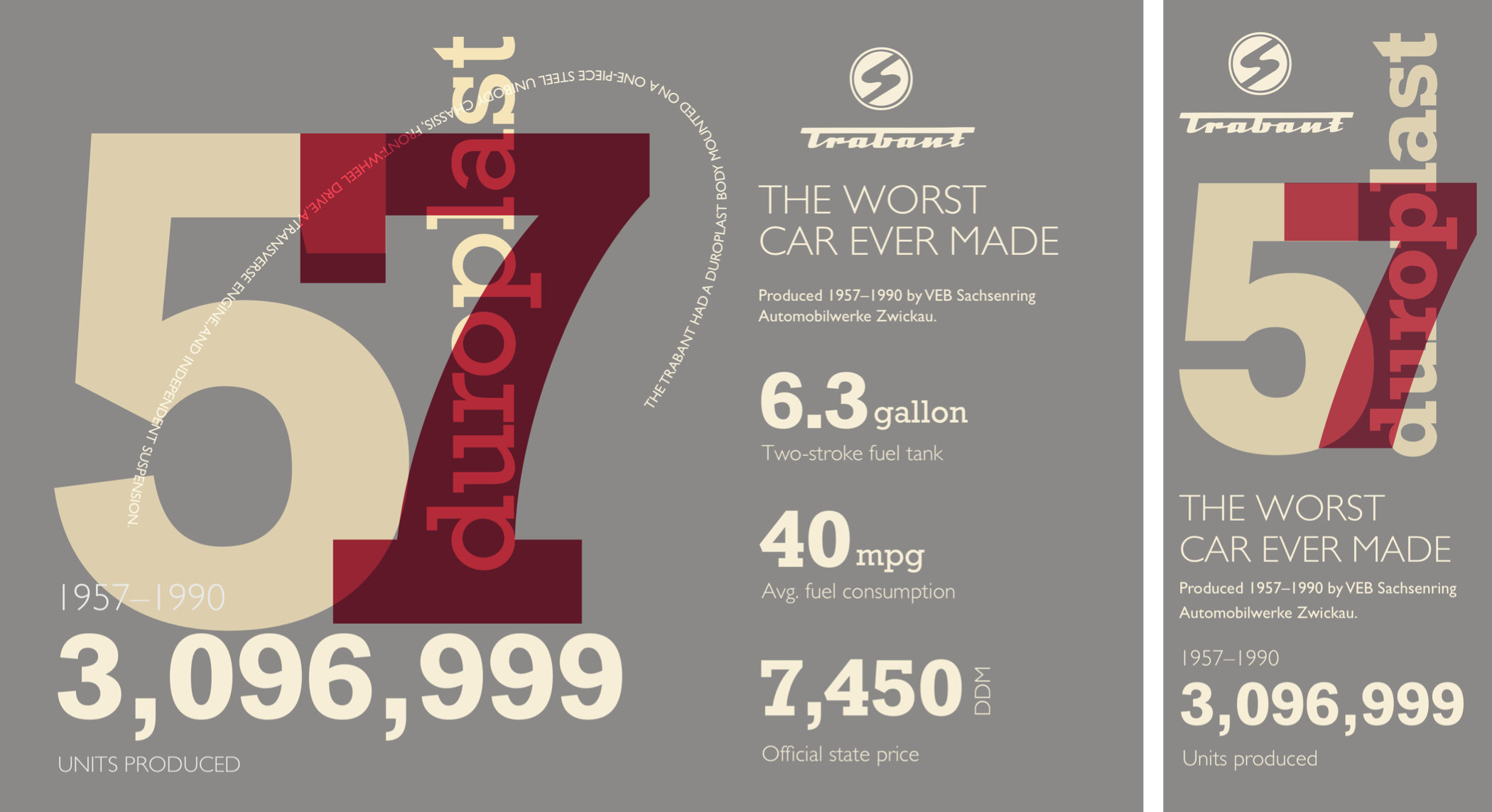
Despite its unconventional layout, I need only four conventional elements to develop this old-style design. A header, banner division, paragraph, and footer element:
<header>…</header>

<div id="banner">…</div>

<p>…</p>

<footer>
<svg>…</svg>
</footer>
As I’ve shown in past issues, my process begins by adding foundation styles including this Old style typeface:
body {
background-color: #6e2838;
font-family: "old-style";
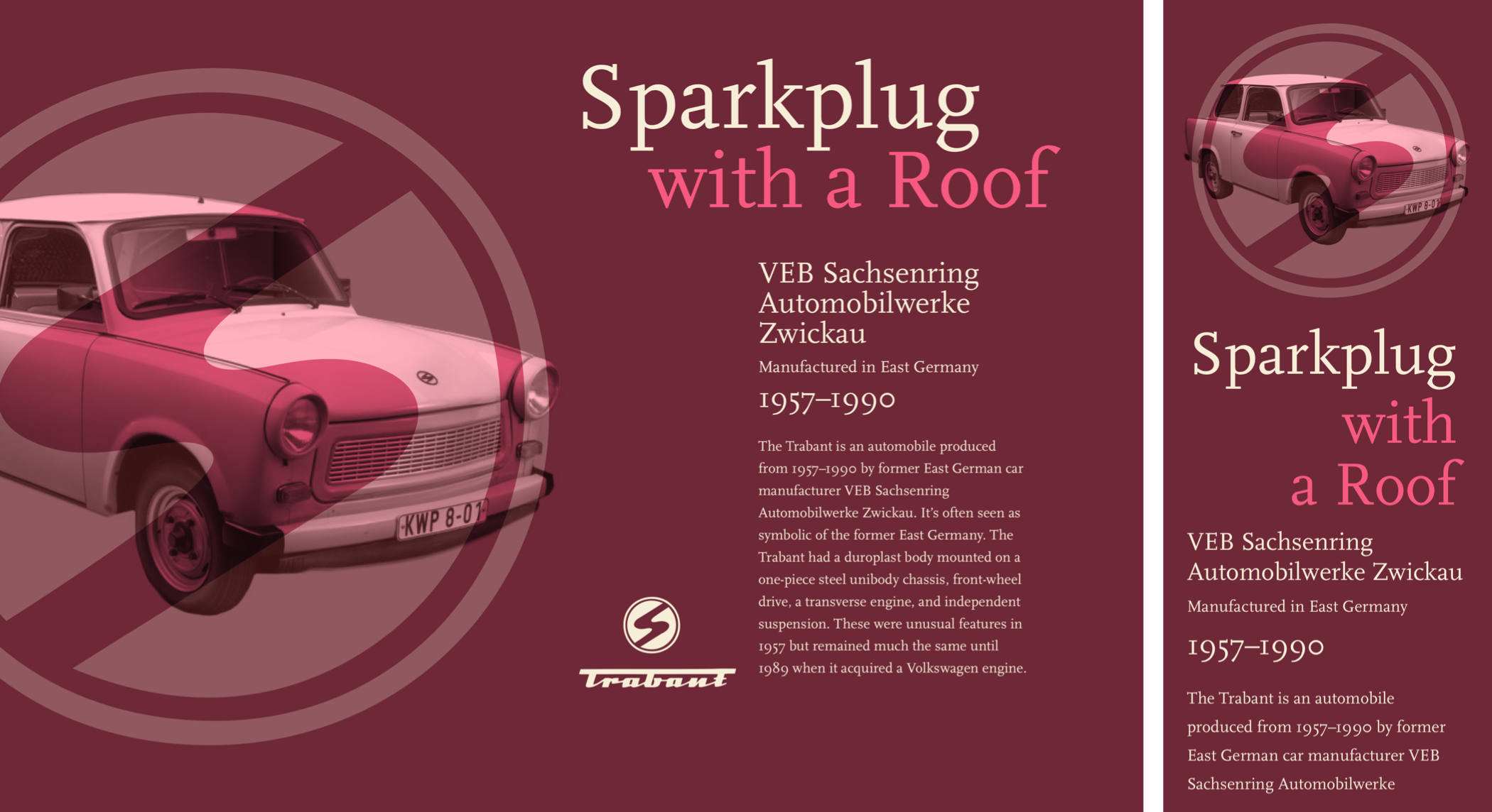
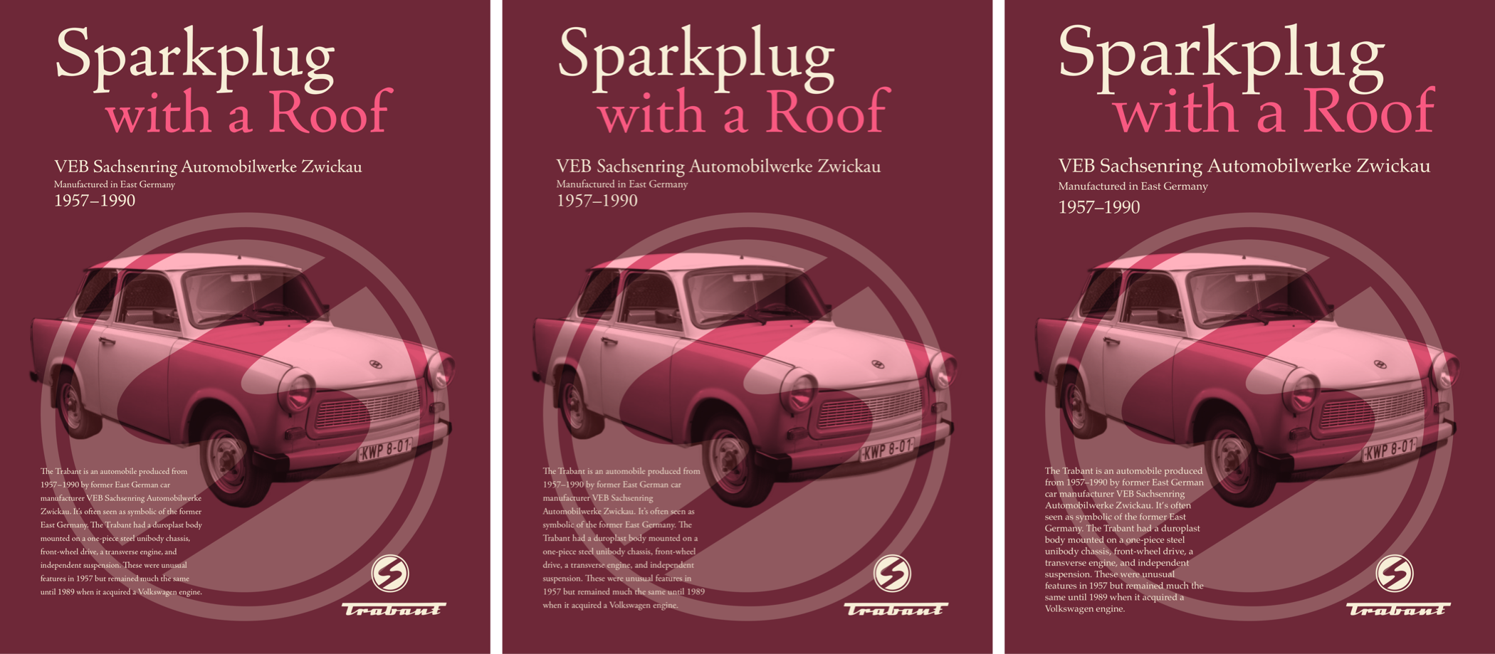
color: #f7eed7; }A Trabant header dominates my design on even the smallest screens. This header blends two images. The first is a scalable SVG Trabant logo mark. To hide this presentational image from assistive technology, I add an ARIA role and set its hidden attribute to true. Then, I add a different ARIA role of img to the second image, a picture of what’s been called “the worst car ever made:”
<header>
<img src="header.svg" alt="" role="presentation" aria-hidden="true">
<img src="header.png" alt="Trabant" role="img">
</header>
I need the large Trabant logo to remain perfectly circular whatever the width of its parent element. An aspect ratio is a ratio between an element’s width (x) and height (y.) A 1:1 ratio for squares, 1.618:1 is the golden ratio, and 16:9 for widescreen media.
A popular technique for maintaining intrinsic ratio was developed in 2009 by Thierry Koblentz, and it uses padding-top applied to an element or a pseudo-element inside it. Different padding percentages create different ratios:
1:1          100%
4:3          75%
16:9         56.25%
This logo is circular, so the box it occupies should always remain square. I add a :before pseudo-element and set its top padding to 100%:
header:before {
content: "";
display: block;
padding-top: 100%; }
I now have three elements inside my header. By placing the pseudo-element and my images into the same grid area, CSS Grid makes stacking them easy:
header {
display: grid; }

header:before,
header img {
grid-column: 1;
grid-row: 1; }
To centre these images horizontally and vertically — no matter how wide or tall they might become — I align and justify them both to the center:
header {
align-items: center;
justify-content: center; }
Finally, to blend the photograph of my Trabant and its SVG logo together, I add a mix-blend-mode with a value of overlay:
header img:last-of-type {
mix-blend-mode: overlay; }
My banner division contains a large two-tone headline followed by three short paragraphs:
<div id="banner">
<h1>Sparkplug <span>with a roof</span></h1>
<p>VEB Sachsenring Automobilwerke Zwickau</p>
<p>Manufactured in East Germany</p>
<p>1957–1990</p>
</div>
I align this headline to the right, then tighten its leading to complement its large size. Then, I apply an accent color to the span element inside which adds the two-tone effect:
h1 {
font-size: 4.875rem;
line-height: 1.1;
text-align: right; }

h1 span {
color: #f85981; }
To de-emphasise the banner’s second paragraph, I use an :nth-of-type pseudo-class selector and reduce its size:
#banner p {
font-size: 1.424rem; }

#banner p:nth-of-type(2) {
font-size: 1rem; }
With those foundation styles in place for every screen size, I introduce layout for medium-size screens by adding a three-column symmetrical grid with three automatically sized rows:
@media (min-width: 48em) {

body {
display: grid;
grid-template-columns: repeat(3, 1fr);
grid-template-rows: auto auto auto;
padding: 4rem; }
}
The header and banner division both fill the full width of my layout. I place the banner into the first row, even though it comes second in my HTML:
header,
#banner {
grid-column: 1 / -1; }

header {
grid-row: 2 / 4; }

#banner {
grid-row: 1; }
Adjusting type sizes to maintain a balanced hierarchy is one of the most satisfying aspects of developing designs across screen sizes. It’s also one of the most challenging. I increase the size of the headline and two paragraphs by moving them up my typographic scale:
h1 {
font-size: 8rem;
line-height: 1.1;
text-align: center; }

#banner p {
font-size: 2.027rem; }

#banner p:nth-of-type(2) {
font-size: 1.266rem; }
My header dominates a large screen by filling half its width, and I balance its visual weight with the remaining content, including the oversized headline. Although this design appears asymmetrical, it’s grid is symmetrical and contains six even-width columns:
@media (min-width: 82em) {

body {
grid-template-columns: repeat(6, 1fr);
grid-column-gap: 2vw;
grid-row-gap: 2vh; }
}
The header covers the first three columns and all three rows in my layout:
header {
grid-column: 1 / 4;
grid-row: 1 / 4; }
I need to place the banner’s headline and division onto my grid, and not the banner which contains them. I change the display property of that division to contents, which effectively removes it from the DOM for styling purposes:
#banner {
display: contents; }
I place the banner’s child elements opposite my header using column and row line numbers. Next, I increase the size of my headline again, then place the division and paragraph of running text, leaving the column before them division empty. This creates a space for my footer:
#banner h1 {
grid-column: 4 / -1;
grid-row: 1;
font-size: 6.5rem; }

#banner div {
grid-column: 5 / -1;
grid-row: 2; }

body > p {
grid-column: 5 / -1;
grid-row: 3; }
Finally, I place the footer alongside my running text which adds to the asymmetric look of this Old style design:
footer {
grid-column: 4;
grid-row: 3; }
Fusing illustration and photography with bold shapes and clear typography was a defining aspect of Huber’s signature style. By choosing contemporary Old style typefaces and using today’s technologies — including blend-modes and web fonts — we can follow Huber’s example and create modern-day designs with a classic feel.
Transitional Typefaces
During the 17th century, The Age of Enlightenment was an intellectual movement which rejected traditional art, literature, and philosophy. In 1692 Louis XIV commissioned a new typeface which was based on scientific principles rather than calligraphy. The result was Romain du Roi, a typeface with letters based on a grid of 2,304 squares.
Romain du Roi was more precise in its design than most previous typefaces and featured strokes with a sharper contrast between thick and thins. It influenced now-famous type designers John Baskerville, Giambattista Bodoni, and William Caslon. Their work removed all traces of Humanist calligraphy to create Transitional (neo-classical) typefaces which took advantage of new inks and better quality papers.
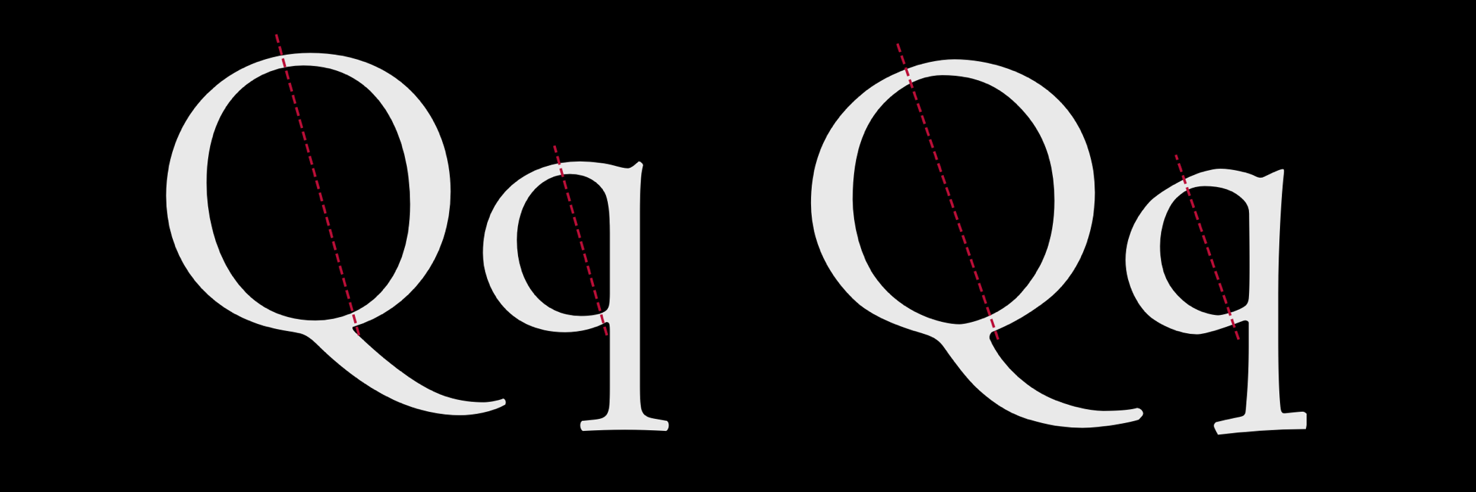
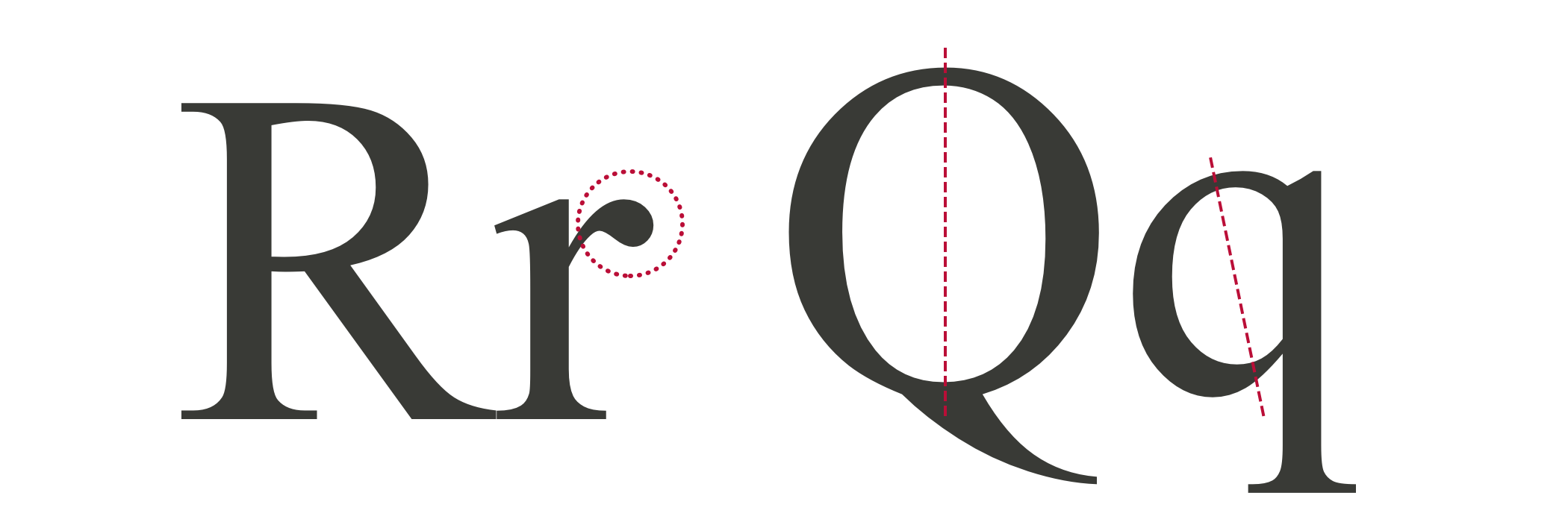
In transitional typefaces, lowercase letters have vertical, or almost vertical, stress. The head serifs on ascending letters including “b,” “d,” “h,” and “l” are usually more horizontal. The ends of many strokes are marked by ball terminals in place of angled or blunt or serifs.
Contemporary transitional typefaces are popular, including Cambria which was designed by Jelle Bosma in 2004 for Microsoft’s ClearType Font Collection. Cambria was released with Windows Vista. Georgia was designed by Matthew Carter in 1993. Designed by Zuzana Licko in 1996, Mrs Eaves is a Baskerville variant and was named after Sarah Eaves, John Baskerville’s wife.
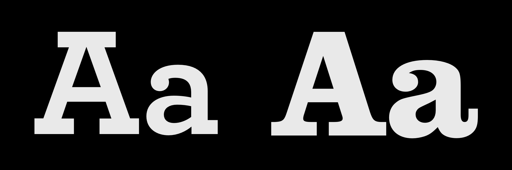
Identifying Modern Typefaces
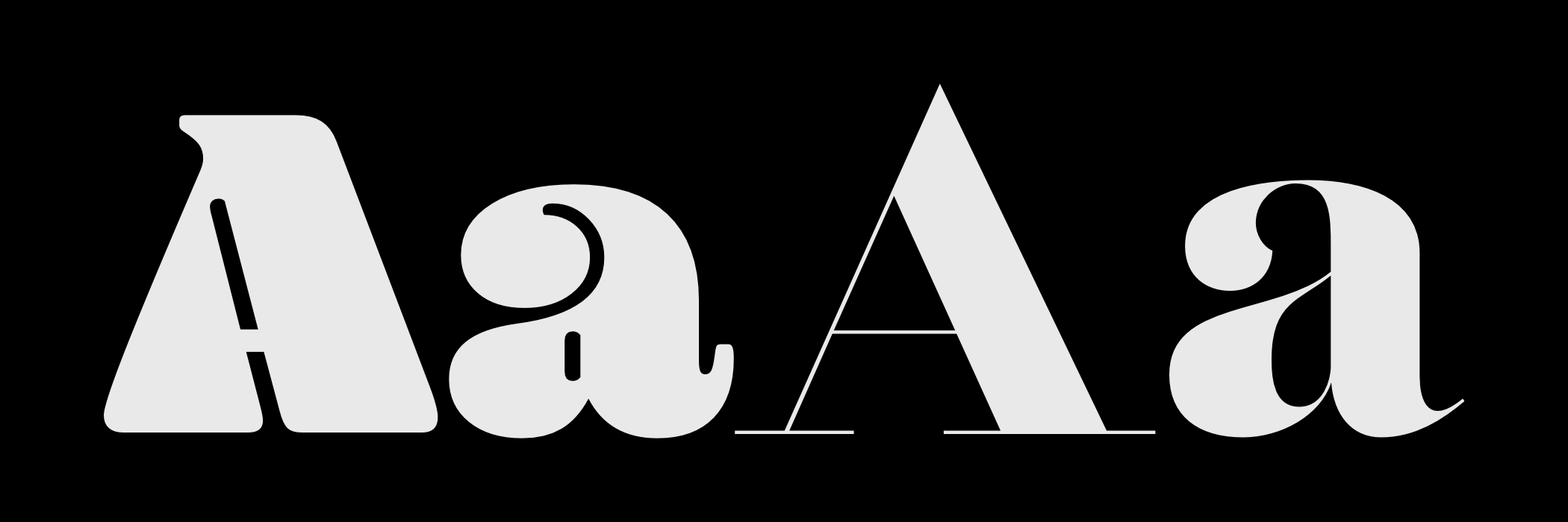
While Old Style and Transitional typefaces heightened the contrast between thick and thin strokes, Modern typefaces took this characteristic to the extreme. The term Modern can be misleading as the first typeface in this style was designed in 1784 by Firmin Didot. Didot was the son of François-Ambroise whom several typefaces including Ambroise and, of course, Didot are named after.
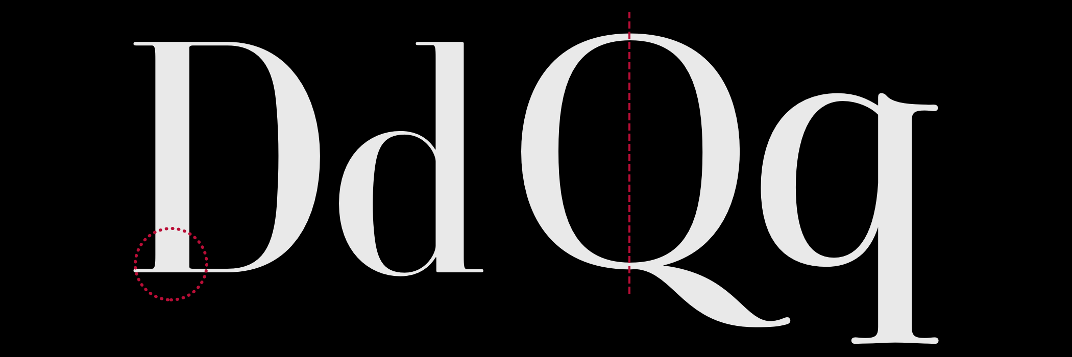
Giambattista Bodoni gave his name to Didone style typefaces with a sudden change in contrast between thick and thin strokes. These typefaces also feature unbracketed serifs with sharp angles between thicks and thins, vertical axes, and small apertures in open letters, including the lowercase letter “a.”
Modern typefaces are often seen as elegant and stylish choices. This is why, when you browse shelves full of fashion magazines, you’ll find they often use Didone typefaces for their mastheads.
But those same characteristics — extreme contrast, smaller apertures, and vertical axes — are also found in modern typefaces with very different personalities.
Modern Typefaces
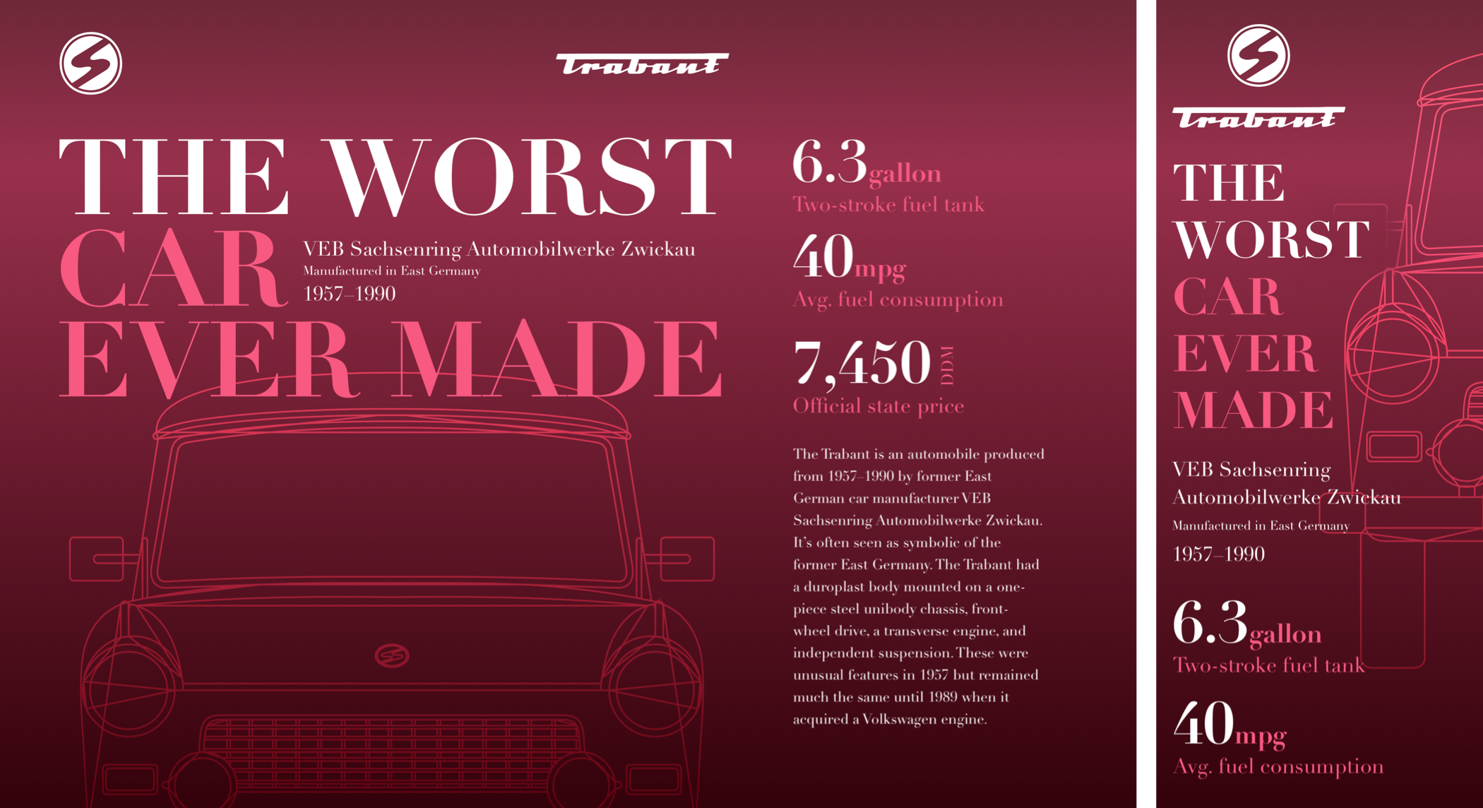
I need just three structural elements to implement my next Huber-inspired design; a header which contains the two Trabant logos, a banner division, and my main content:
<header>
<div><svg>…</svg></div>
<div><svgv…</svg></div>
</header>

<div class="banner">…</div>

<main>
<ul>…</ul>
<p>…</p>
</main>
These foundation styles add personality to every screen, whatever its size. They add a modern high-contrast typeface and a background blending an outline of the Trabant with a linear gradient to adds depth to this design:
body {
background-color: #34020B;
background-image: url(body.svg),
linear-gradient(180deg, #6E2838 0%, #98304D 21%, #34020B 99%);
font-family: "modern";
color: #fff; }
I position the Trabant blueprint half-way horizontally, while the gradient repeats across my page:
body {
background-position: 50vw 2rem, 0 0;
background-repeat: no-repeat, repeat-x; }
The banner includes a large headline. I add explicit line breaks to my HTML and a span element to add color to specific words. Then, I group the paragraphs in my banner into a division. This will allow me to alter its position within my layout on larger screens later in the process:
<div id="banner">
<h1>The worst <span>
car
ever made</span></h1>
<div>
<p>VEB Sachsenring Automobilwerke Zwickau</p>
<p>Manufactured in East Germany</p>
<p>1957–1990</p>
</div>
</div>
The position of my blueprint background image leaves room for a large headline. To make sure it doesn’t escape the space I’ve allowed for it, I restrict this headline’s maximum width to half the viewport width:
#banner h1 {
max-width: 50vw; }
Then, I add color to the span element and size the banner’s type, increasing the headline size and reducing its leading to create a solid block of text:
#banner h1 {
font-size: 4rem;
line-height: 1;
text-transform: uppercase; }

#banner h1 span {
color: #f85981; }

#banner p {
font-size: 1.424rem; }

#banner p:nth-of-type(2) {
font-size: 1rem; }
This design includes a list of Trabant specifications; its fuel capacity and consumption, plus the car’s price, which was defined by the East German government:
<li>
<h3>Two-stroke fuel tank</h3>
<p><b>6.3</b>gallon</p>
</li>

<li>…</li>
<li>…</li>
This HTML order makes sense when reading without styles, but I need the headline and paragraph combination reversed visually to form a tighter block of copy. I flip the order of my headline and paragraph by specifying list items as flex containers and changing their default direction from row to column-reverse:
li {
display: flex;
flex-direction: column-reverse; }

ul p {
font-size: 1.802rem; }

ul p {
color: #f85981; }
Numeral design is an important consideration when choosing a typeface. Your choice might depend on clarity and readability when the type is set at small sizes. The numerals in many characterful modern typefaces have distinctive curves and other characteristics which can contribute to the personality of a design when used at larger sizes.
I want to make a feature of the numerals in this design, so I oversize the bold element. And while I wouldn’t normally advocate altering the tracking of any typeface, increasing the letter-spacing of these numerals helps to accentuate their character:
ul p b {
font-size: 4.5rem;
letter-spacing: .05em;
line-height: .8;
color: #fff; }
The price in my list of specifications also includes a span element which contains the East German currency code, DDM:
<li>
<h3>Official state price</h3>
<p><b>7,450</b> <small>DDM</small>
</li>
To me, every typographic element — no matter how small — is an opportunity to experiment with interesting type treatments. The tiny footprint of this small element makes it perfect for rotating into a vertical position so it sits neatly alongside the large numeral:
ul p small {
font-size: .889rem;
text-align: right;
transform: rotate(180deg);
writing-mode: vertical-rl; }
This level of typographic detailing might seem excessive for foundation styles, but I put as much thought into designing type for small screens as I do into a layout for larger ones.
It also means I need only make minor adjustments for medium-size screens, first by changing the color values in my CSS gradient background and repositioning my Trabant blueprint to the centre of the screen and 30rem from the top:
@media (min-width: 48em) {

body {
background-image: url(body.svg),
linear-gradient(180deg, #6E2838 0%, #98304D 20%, #34020B 100%);
background-position: 50% 30rem, 0 0; }
}
Introducing layout to medium-size screens involves little more than placing the two header logos at opposite sides of the screen. I add two symmetrical columns to the header and align the logos to balance their centre lines:
header {
display: grid;
grid-template-columns: 1fr 1fr;
align-items: center;
width: 100%; }
I align the first logo to the left and the second to the right:
header > *:first-child {
text-align: left; }

header > *:last-child {
text-align: right; }
Supersizing a headline is a fabulous way to showcase the intricate details in many modern typefaces, so I increase its size and utilise the whitespace I added to my HTML to split its words across three lines:
#banner h1 {
white-space: pre;
max-width: 100vw;
font-size: 8rem; }
Whereas on small screens, the banner’s paragraphs follow the headline as they do in the HTML, I want to combine them with my headline to create an interesting typographic element.
I use absolute positioning to move the division which contains these paragraphs into place. The text-based top and left values allow these paragraphs to stay in the correct position when the headline changes size:
#banner {
position: relative;
margin-bottom: 25rem; }

#banner div {
position: absolute;
top: 8.25em;
left: 20em; }
For my final medium-size screen adjustment, I turn my unordered list into a flex container and set its items to occupy an even amount of available horizontal space:
ul {
display: flex; }

li {
flex: 1; }
Adapting a design for several screen sizes is a challenge I really enjoy. To make use of the extra space available on large screens, I apply grid values to the body element to create three symmetrical columns:
@media (min-width: 82em) {

body {
display: grid;
grid-template-columns: repeat(3, 1fr);
grid-column-gap: 2vw; }
Elements in this design don’t overlap, so I use grid-template-areas for their simplicity. This design has nine grid areas, and I give each one a name which reflects its content; header, banner, data, and main:
body {
grid-template-areas:
"header header ."
"banner  banner data"
". . main"; }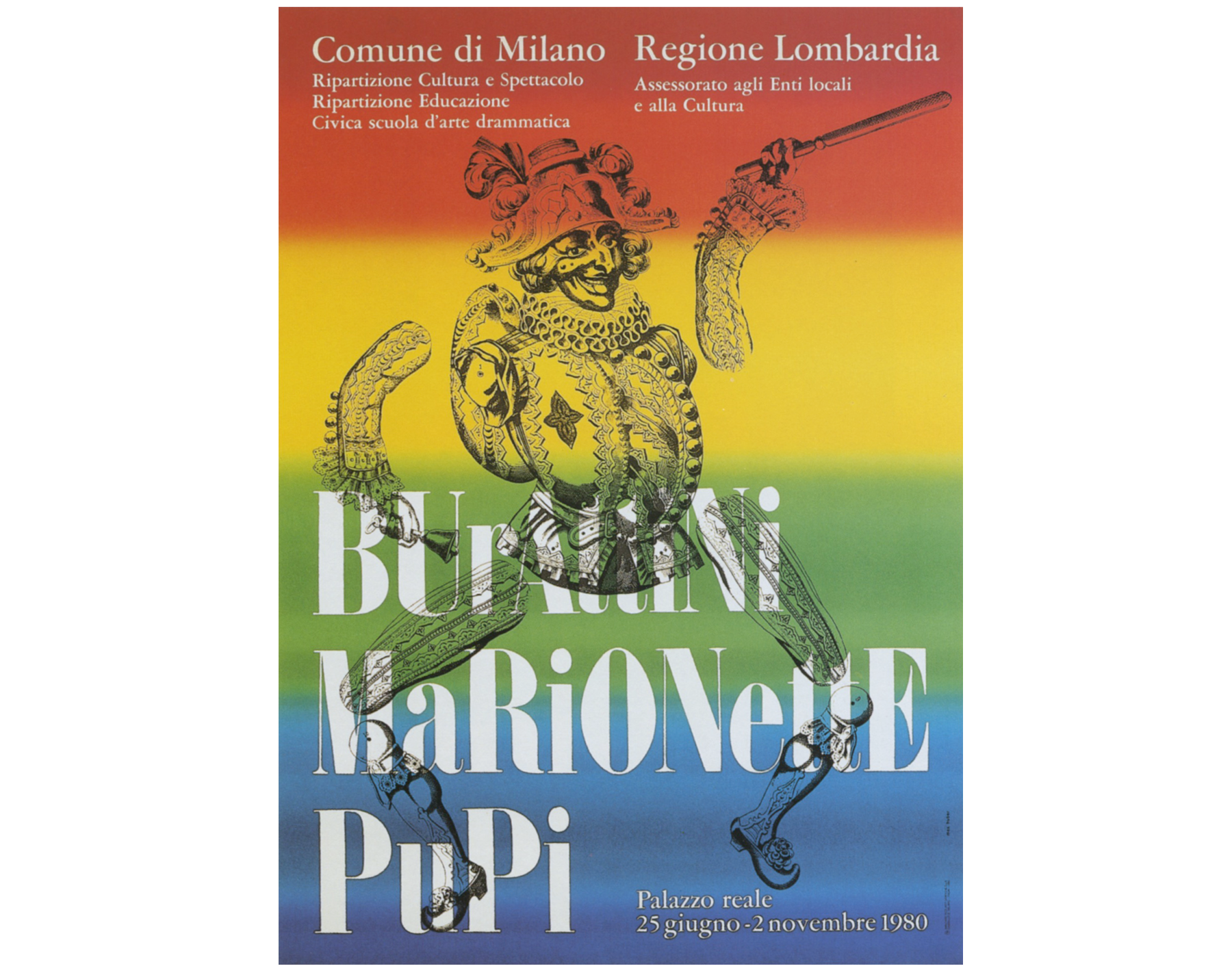
I place those elements using area names which allows me to change where they appear in my layout without altering their position in my HTML:
header {
grid-area: header; }

#banner {
grid-area: banner; }

main {
display: contents; }

main > p {
grid-area: main; }

ul {
display: block;
grid-area: data; }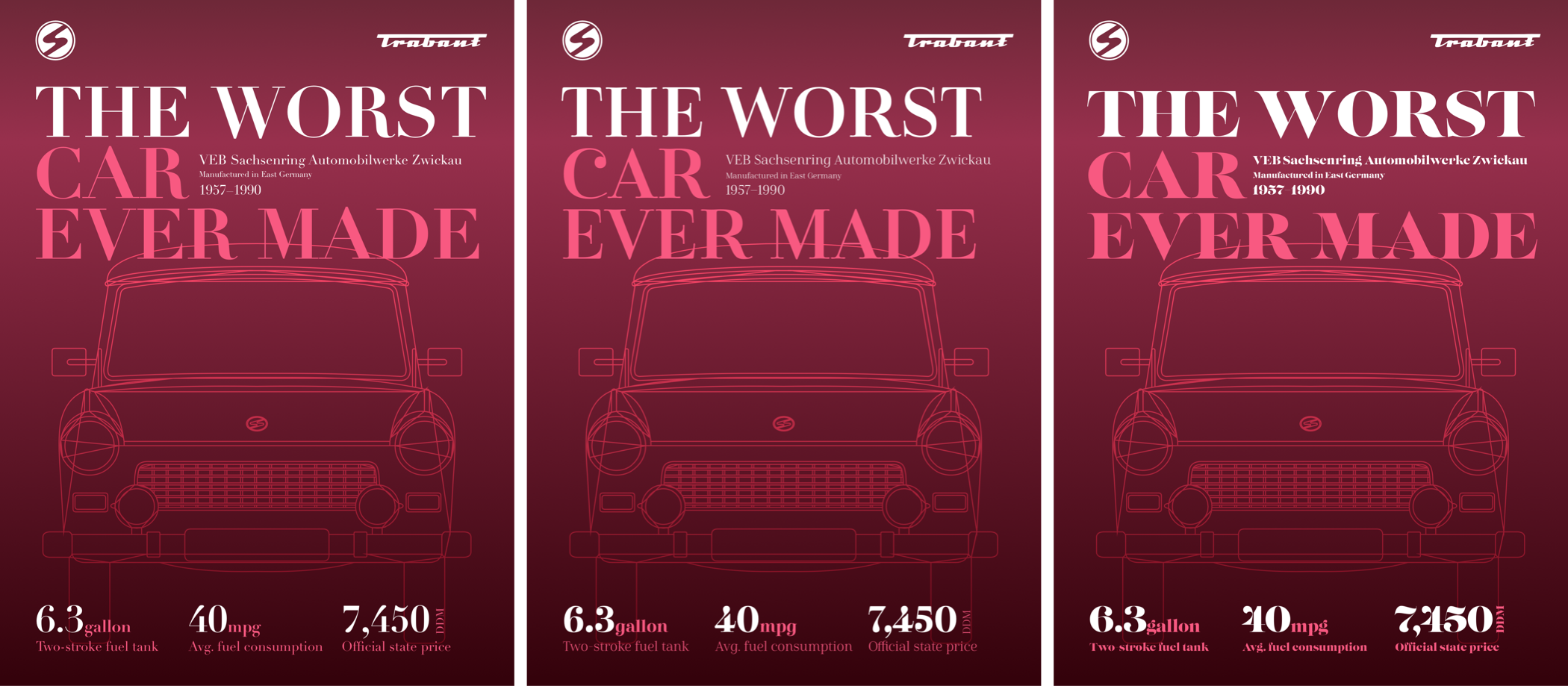
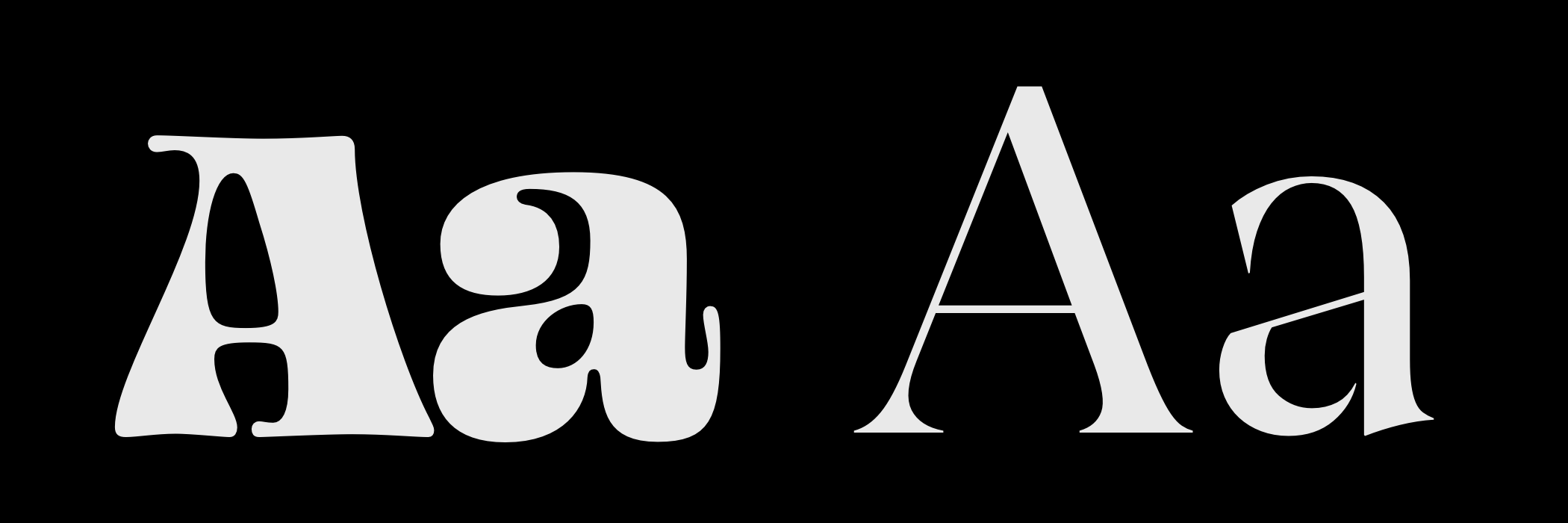
Spotting Slab Serif (Egyptian) Typefaces
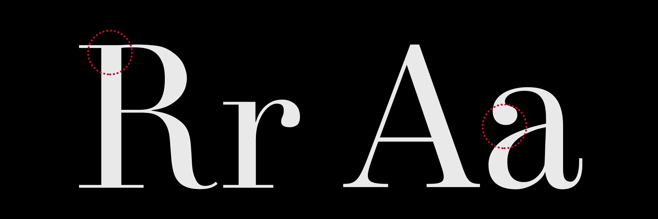
This final serif typeface classification first appeared in early 19th-century advertising posters and — with its blocky letterforms — was designed to capture attention. One defining feature of a Slab serif is an often unbracketed serif which meets the stem at a 90° angle.
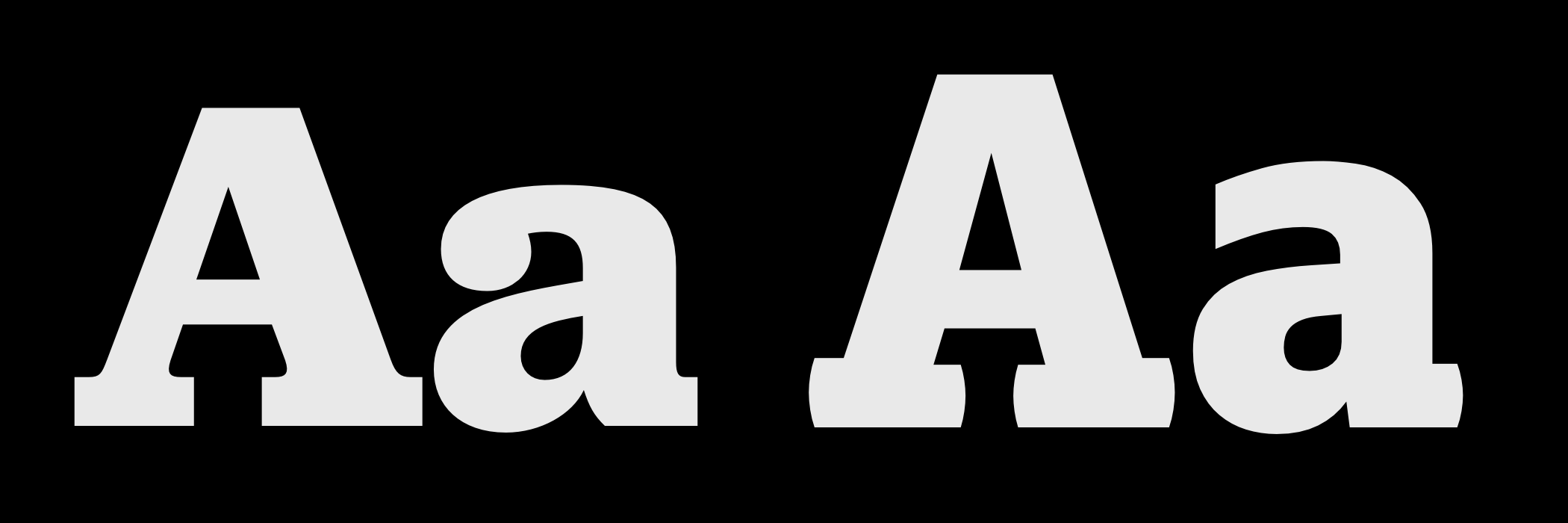
Clarendon isn’t just the name of a typeface but of a style of Slab serif typefaces. While the letterforms in many Slab serifs have an even line width, the Clarendon style breaks convention with a more pronounced difference between the thickest and thinnest strokes. Unlike other Slab serifs, Clarendon has curved brackets.
Archer’s ball terminals give it a distinctive look which is popular with designers in print and online. Sentinel, also by Hoefler & Co., was used by Barack Obama in his 2012 reelection campaign. Like Archer, it comes in a variety of weights and includes an italic.
I chose ITC Officina Serif by Erik Spiekermann and Ole Schäfer for my first book Transcending CSS, even though at the time I wasn’t well-versed in typography design. FF Unit Slab, also by Erik Spiekermann, comes in several weights, italics, and support for 107 different languages.
Dalton Maag is the type foundry whose fonts I use most often. I’ve chosen their Lexia for my most recent book covers, and I love the personality of its thickest Advertising weight, especially in italics. You should be familiar with Mokoko, also by Dalton Maag, as I chose it for the headlines and titles in this series.
While Barack Obama chose his Slab serif from Hoefler & Co., fellow democratic candidate Bernie Sanders chose Jubilat by Joshua Darden for his 2016 presidential campaign. Jubilat is one of the most versatile Slab serifs and comes in 11 weights with matching italics.
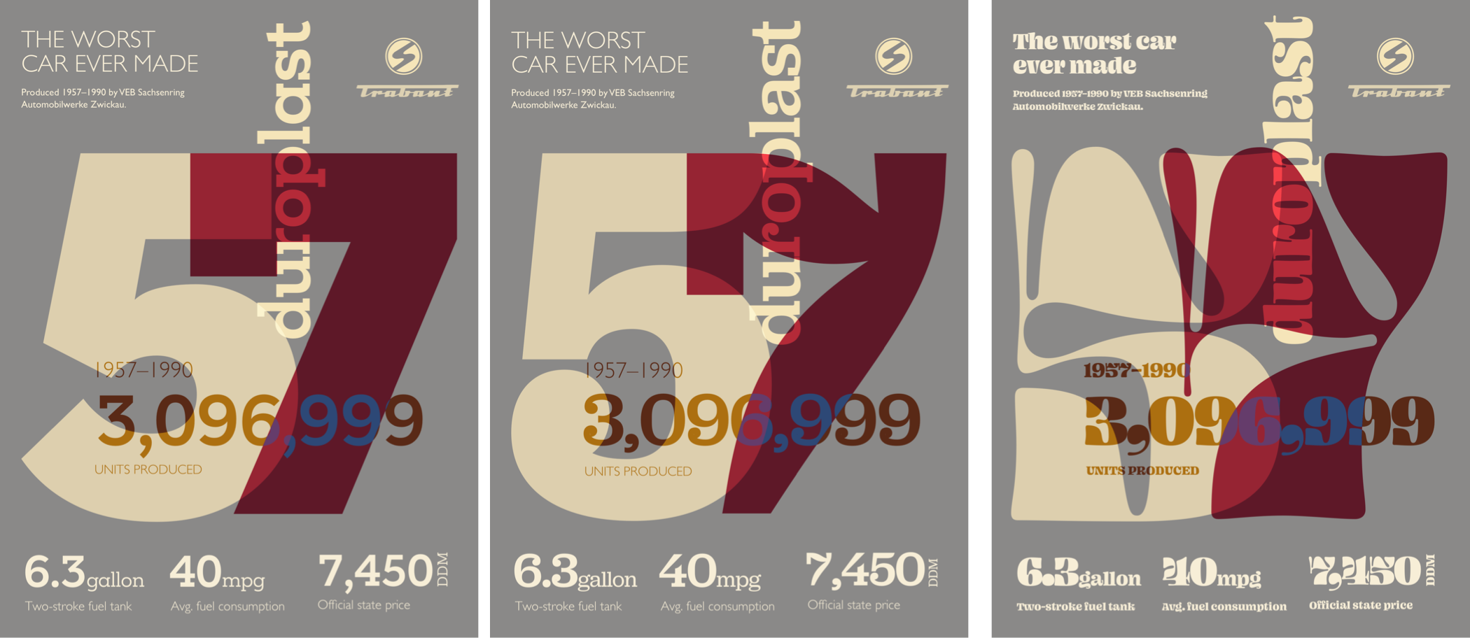
Slab Serifs Demand Attention
Developing my final design requires very few structural elements, despite its visual complexity. The elements I chose should seem familiar because I’ve used them already in several combinations.
The header again contains two SVG images, a banner division includes the headline and stand first paragraph, and an unordered list which displays Trabant specifications. This time, I also include two SVG elements. One for the massive 57 numerals, the second for the decorative text which follows a curved path:
<header>
<svg>…</svg>
<svg>…</svg>
</header>

<svg>…</svg>

<div id="banner">…</div>
<div id="content">…</div>

<ul>…</ul>

<div id="curve">
<svg>…</svg>
</div>
Bringing three of those elements together forms a graphic introduction to this design. I start with foundation styles which include color and introduce the slab serif typeface:
body {
background-color: #8a8988;
font-family: "slab";
color: #f7eed7; }
I limit the width of my header to 220px and centrally align its content:
header {
margin-bottom: 2rem;
width: 220px;
text-align: center; }
To give me accurate control over their appearance, and to enable them to scale to fit the width of any viewport, I developed my oversized numerals using SVG. This scalable graphic includes two paths and to ensure it communicates its content to everybody, I add an ARIA label and a title element to my SVG:
<svg xmlns="https://www.w3.org/2000/svg" viewBox="0 0 750 690" role="img" aria-label="1957. The year Trabants were first produced">
<title>The year 1957</title>
<path d="…"/>
<path d="…"/>
</svg>
The two numerals in this SVG overlap, so to add depth; I lower their opacity, then use a blend-mode to mix their colors:
body > svg path {
opacity: .75; }

body > svg path:nth-of-type(1) {
fill: #f5e3B4; }

body > svg path:nth-of-type(2) {
fill: #ba0e37;
mix-blend-mode: multiply; }
The final component in my introduction graphic is the vertical word “Duroplast,” the fibre-reinforced plastic used to make Trabant bodies. You can look for this element in my HTML, but you won’t find it, because I generate this content using a pseudo-element. I position the generated content, change its writing-mode to vertical, then rotate it by 180 degrees:
body {
position: relative; }

body:after {
content: "duroplast";
position: absolute;
top: 2rem;
right: 2rem;
font-size: 7rem;
transform: rotate(180deg);
writing-mode: vertical-rl; }
As this pseudo-element effectively follows the flow content, it appears above it in the stacking order, making it possible to blend it with other elements and add extra depth to this design:
body:after {
mix-blend-mode: overlay; }
The number of Trabants produced during its lifetime is developed using a lower-level heading, followed by two paragraphs:
<div id="content">
<h3>Units produced</h3>
<p>1957–1990</p>
<p>3,096,999</p>
</div>
The visual order of these elements is different from that HTML, and I use Flexbox to change their order within their parent division. First, I change the flex-direction from the default row to column:
#content {
display: flex;
flex-direction: column; }
Then, I use the order property to reorder the three elements, placing my headline last:
#content h3 {
order: 3;
font-weight: normal;
text-transform: uppercase; }
Finally, I increase the size of my second paragraph to match the list-item numbers below. This gives the impression this content and the unordered list which follows are part of the same element:
#content p:nth-of-type(2) {
font-size: 4.5rem; }
Space on small screens may be at a premium, but that doesn’t mean we can’t be bold with our typography. As screens become larger, there are even more opportunities to be adventurous with typographic designs.
I introduce layout to medium-size screens by applying grid values to the body element to create six symmetrical columns and four automatically sized rows:
@media (min-width: 48em) {

body {
display: grid;
grid-template-columns: repeat(6, 1fr);
grid-template-rows: repeat(4, auto); }
}
Then, I place my header and banner division into the first row using line numbers. My banner occupies the first three columns, while the header fills the last three:
header {
grid-column: 5 / -1;
grid-row: 1; }

#banner {
grid-column: 1 / 4;
grid-row: 1; }
I place the now enormous numerals onto my grid and lower their z-index value so they appear behind other elements in my layout:
body > svg {
grid-column: 1 / -1;
grid-row: 2 / 4;
z-index: -1; }
I replace the previous :after pseudo-class positioning with grid values and increase its font-size to fill more of the space available:
body:after {
position: static;
grid-column: 4;
grid-row: 1 / 3;
z-index: 1;
font-size: 10rem; }
Despite being built on a symmetrical grid, leaving some columns empty creates an unusual asymmetrical design:
#content {
grid-column: 2 / -1;
grid-row: 3;
mix-blend-mode: difference; }

ul {
grid-column: 1 / -1;
grid-row: 4 / -1; }
I then increase the size of my type overall to make a big impression on medium-size screens:
#content h3,
#content p {
color: #31609e; }

#content h3 {
font-size: 1.75rem; }

#content p:nth-of-type(1) {
font-size: 3rem; }

#content p:nth-of-type(2) {
font-size: 8rem; }
SVG Text On Path
One of the most exciting reasons to use SVG for rendering text is so it follows a path, a design device which isn’t possible using CSS alone. My curvy SVG includes a rounded path, plus a text element which contains my content. I enclose this text within an SVG textPath element and use its href attribute value to link it to the ID of the path above:
<div id="curve">
<svg viewBox="0 0 750 700" xmlns="https://www.w3.org/2000/svg">
<path id="curve-path" fill="none" stroke="none" d="…"/>

<text>
<textPath href="#curve-path">…</textPath>
</text>
</svg>
</div>
I don’t want this curve to appear on small screens, so I change its parent division’s display value to none in my foundation styles. Using a min-width media query, I then revert that value to block to reveal it for medium-size screens, placing it onto my grid and increasing its z-index value. This brings it forward in the stacking order:
#curve {
display: none; }

@media (min-width: 48em) {

#curve {
display: block;
grid-column: 1 / 6;
grid-row: 2 / 4;
z-index: 2;
transform: translateY(-1.5rem); }
}
With this text in place, I use familiar font-size and text-transform styles, followed by SVG fill and text-anchor properties which sets my text from the start of its path:
#curve text {
font-size: .889rem;
text-transform: uppercase;
fill: #fff;
text-anchor: start; }
My confident typography choices demand I’m also courageous with my choice of layout for larger screens. The six symmetrical columns and four rows I chose earlier offer the potential to place my elements in any number of ways.
With all my typography styles already defined, all that remains is to move my elements into new positions which place the header, banner division, and unordered list alongside my now gigantic numerals:
@media (min-width: 64em) {

body {
grid-column-gap: 2vw;
align-items: start; }

body > svg {
grid-column: 1 / 5;
grid-row: 2 / 5;
z-index: -1; }

header {
grid-column: 5 / -1;
grid-row: 1; }

#banner {
grid-column: 5 / -1;
grid-row: 2; }

#content {
grid-column: 1 / 4;
grid-row: 4; }

#curve {
grid-column: 1 / 5;
grid-row: 1 / 4; }

ul {
grid-column: 5 / -1;
grid-row: 3 / -1;
display: block; }
}
Read More From The Series
- Inspired Design Decisions: Avaunt Magazine
- Inspired Design Decisions: Pressing Matters
- Inspired Design Decisions: Ernest Journal
- Inspired Design Decisions: Alexey Brodovitch
- Inspired Design Decisions: Bea Feitler
- Inspired Design Decisions: Neville Brody
- Inspired Design Decisions: Otto Storch
- Inspired Design Decisions: Herb Lubalin
- Inspired Design Decisions: Giovanni Pintori
- Inspired Design Decisions: Emmett McBain
- Inspired Design Decisions: Bradbury Thompson
NB: Smashing membersSmashing members have access to a beautifully designed PDF of Andy’s Inspired Design Decisions magazine and full code examples from this article. You can buy this issue’s PDF and examples as well as every other issue directly from Andy’s website.
Further Reading
- It’s Time To Talk About “CSS5”
- What Saul Bass Can Teach Us About Web Design
- The Modern Guide For Making CSS Shapes
- Combining CSS :has() And HTML
 (ra, yk, il, mrn)

