Micro-Typography: How To Space And Kern Punctuation Marks And Other Symbols
Email Newsletter
Weekly tips on front-end & UX.
Trusted by 200,000+ folks.


This article is for anyone who works with typography, in any medium, and it is especially for those designers who are keen to give users the best reading experience possible.
Jeffrey Zeldman once said:
“90% of design is typography. And the other 90% is whitespace.”
You might be knowledgeable about typefaces; you might regularly modify the leading, tracking, and kerning of your fonts; you might optimize the file sizes of your web fonts — but is that all that can be done? For hundreds of years, typographers and typeface designers have been using white space in typography. In this article, I will discuss the spacing and kerning of punctuation marks and other symbols, looking at what people say about the effects of these adjustments. I will show you different ways to go about doing this work, the pitfalls, and how we might do it more accurately, quickly, and consistently.
This article will show you how to analyze typography in more detail, and how to better judge spacing and micro-typographic details, especially in typefaces designed for extended reading. You will learn a lot about how typefaces are built and given to you in its default state.
Typographers have a long history of not accepting what they are initially given, in order to achieve optimum performance for readers. There are also accessibility benefits from properly spacing punctuation marks and other symbols for different types of people (such as for aging readers and children around six years old). This article will advance your typographic skills, help you produce a better reading experience, improve your typesetting skills, and enable you to deliver effortless reading of a large volume of text on web pages or in code framework/API documentation.
What Spacing Are We Referring To?
Below is a simple example of what spacing looks, not applied and applied:
You might not be able to see much difference, but there is. Welcome to micro-typography. This article is somewhat of a how-to about the issues and problems. We’ll need to explore the issues both in print (how it has been done in the past) and on the web (how it can be done in the present). The past informs the present.
There are also other benefits to spacing punctuation marks and other symbols (though currently untested, with little evidence available). Have you considered people with vision impairments; the extra space given could be beneficial and add clarity, because the marks would not so squished against the next character. What about children around 6 years old, who are learning to read. Does the extra white space, and thus extra time and emphasis, lead to more awareness of these marks?
Why Space Punctuation Marks And Other Symbols?
You may remember letterpress typesetting or have done it yourself, where a vast range of space characters are used, as Marcin Wichary points out. The subject of spacing punctuation marks and other symbols in typography and typesetting has held my attention for some time. In high-end typographic design books and manuals by experts (for example, Detail in Typography by Jost Hochuli), it is widely regarded that spacing punctuation marks and miscellaneous symbols should be done and is good to do. This is somewhat debatable, though. Some people say that it is a waste of time and that 99% of users will not notice any difference. On the other hand, many expert typographers and typeface designers say it is a good thing to do, and I feel the extra time and emphasis given to marks, leads to better typographic communication.
Bruce Mau says this in his book, Life Style:
“Typographic design is the controlled release of information events in time. It operates on two temporal registers. The smallest is the shifting present tense of the reader. The largest is the sweep of historical time. Typography allows us to experience past and present simultaneously.
Every typographic decision — font, size, position, orientation, weight, colour, style — affects the reader’s speed of access, the rate at which the message is engaged by the nervous system.”
Bruce Mau says that people who design the reading experience are “shapers of space and time”. Furthermore, Peter Glaab says:
If the importance of a correctly punctuated sentence had seemed negligible to you, this will perk up your ears. Three arguments speak clearly for that:
- The text reads better.
- The text looks better.
- Correct orthography (the conventional spelling system of a language) enhances the value of a text.
Another analogy is timing and space in music. How could we say that empty and quiet spaces in music, or the contrast between loud (positive) and quiet (negative) sounds, do not matter? We cannot. These aspects are integral to it. White space is essential to so much design. Think about what information would look like without it? Erik Spiekermann once said:
You don’t actually design the black, you design the white: the space inside it and the space around it (in regards to typeface design).
The control of white space in typography, and much of graphic communication, is design. It is as important as the black (positive) values. The spacing of punctuation marks and other symbols works more in an unconscious manner, rather than being directly perceivable, but it does have an effect.
What White Spaces In Typography Can We Use?

How do we know what width of space to add? Personal expertise plays a lot into it. I couldn’t imagine the need to use a space larger than a ¼ em (a quarter space). In his book, The Elements Of Typographic Style, Robert Bringhurst says:
“Kern consistently and modestly or not at all.”
Roland Stieger notes:
“We do not always use the same spaces, because every typeface has a different kerning. GREP (standing for: globally search a regular expression and print) we use only for bigger amounts of texts. In short texts, we often do it by hand (manually). With some fonts I find a hair space is fine, sometimes I find a thin space better. It really depends on the typeface.”
What Punctuation Marks And Other Symbols Should We Add Spacing To?
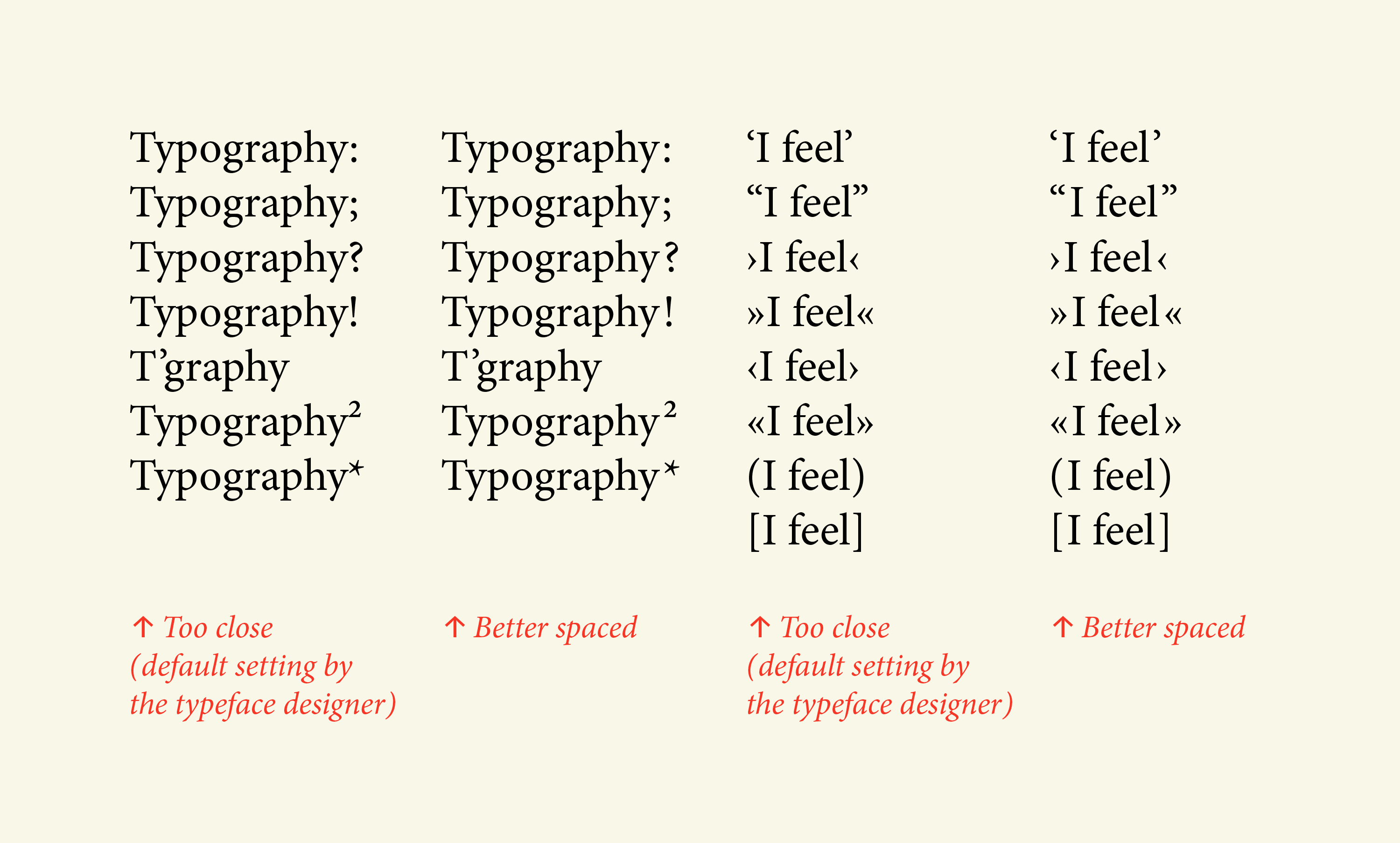
Typographers usually add space to the left side of the following marks:
: ; ” ’ ! ? / ) ] } * ¿ › » @ ® ™ ℓ ° ¡ ' " † + = ÷ - – —
And they usually add space to the right of these:
“ ‘ / ( [ { > ≥ < ≤ £ $ ¢ € ‹ « √ μ # @ + = ÷ - – —
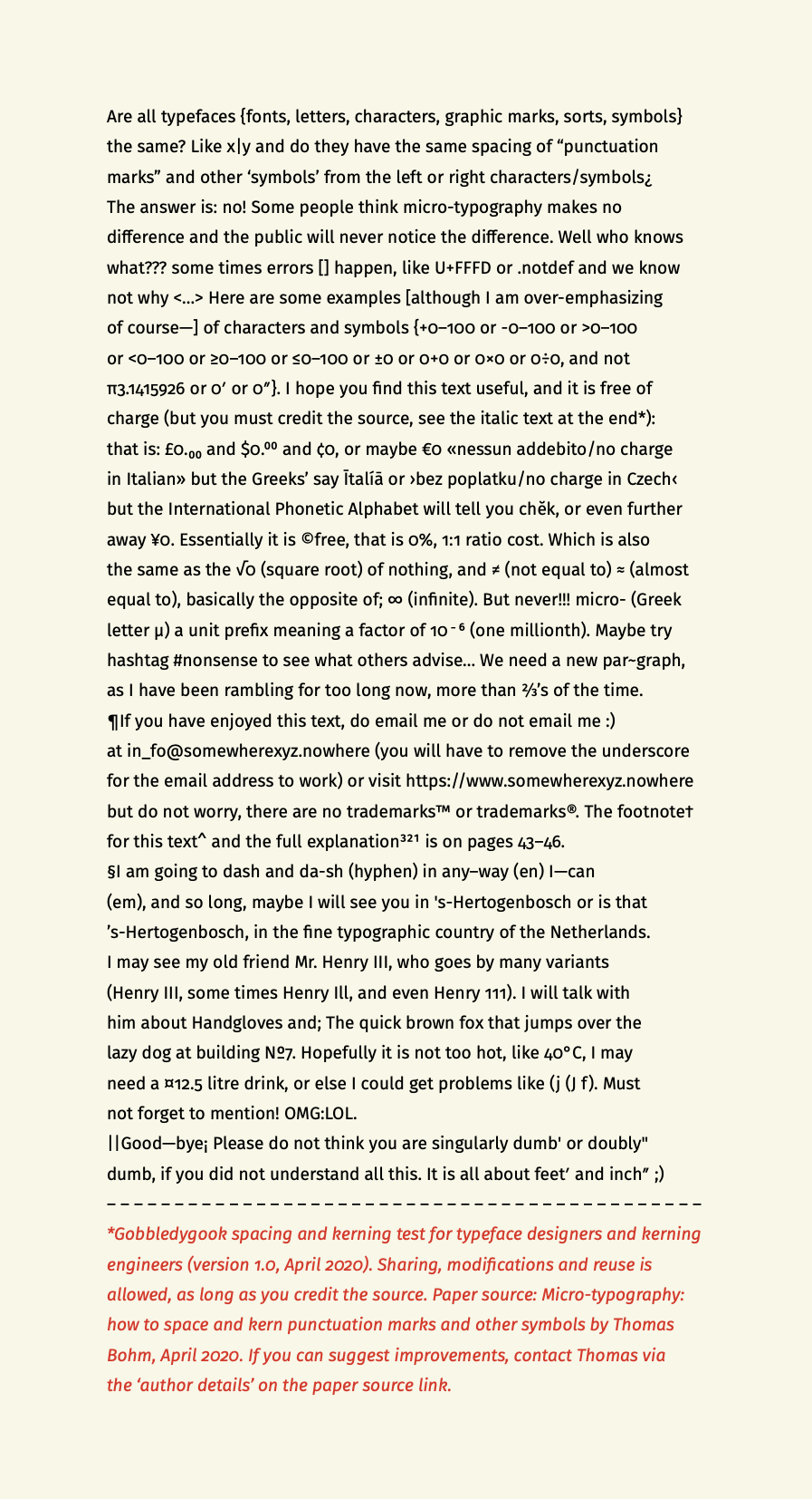
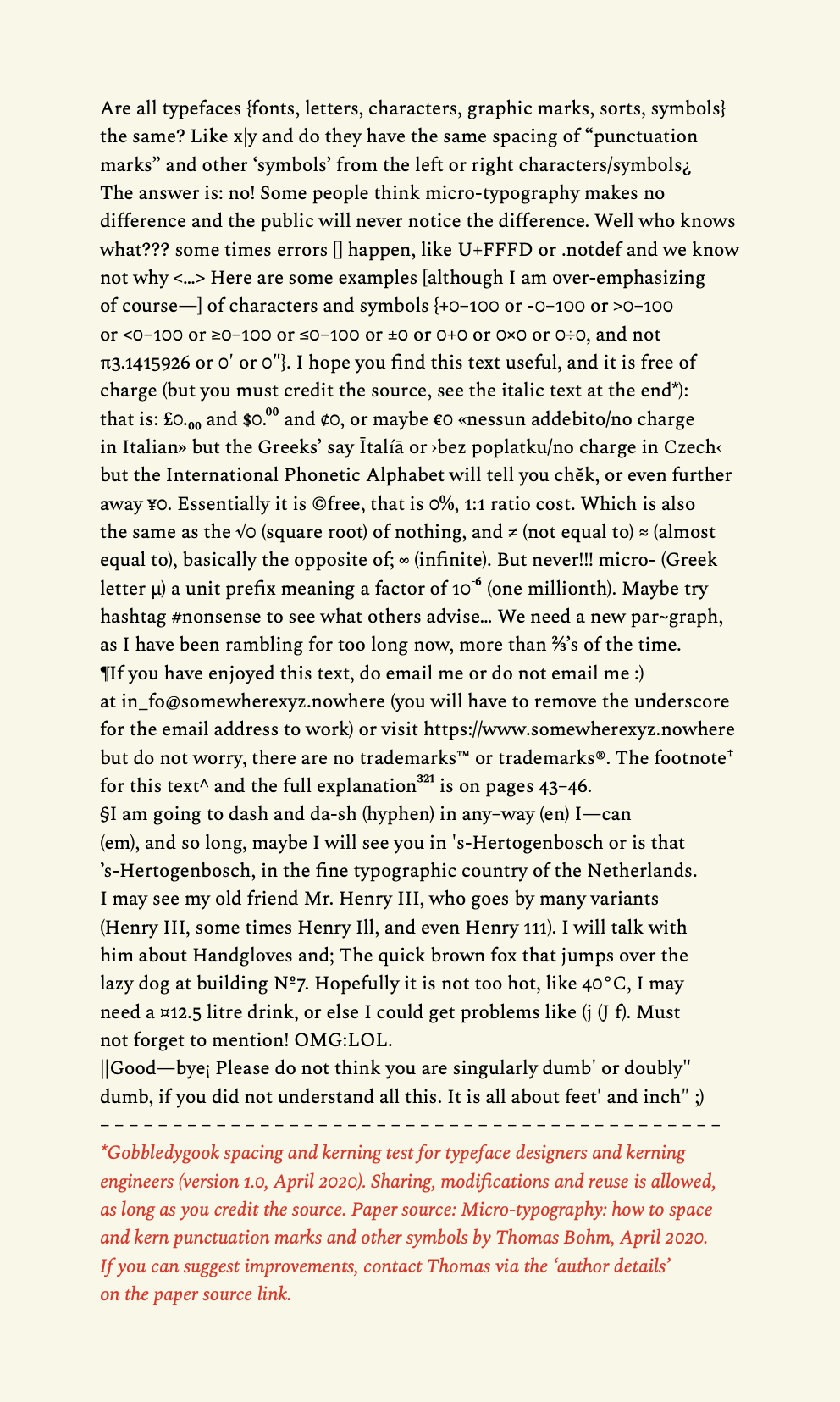
Upon further inspection of figure 3, we see that many more characters and symbols might need extra spacing, on the left or right side.
Figure 5: A real-time example of micro-typography. This interactive version of figure 4 allows you to change the spaces and see in real-time what has been adjusted. (View in a new window)
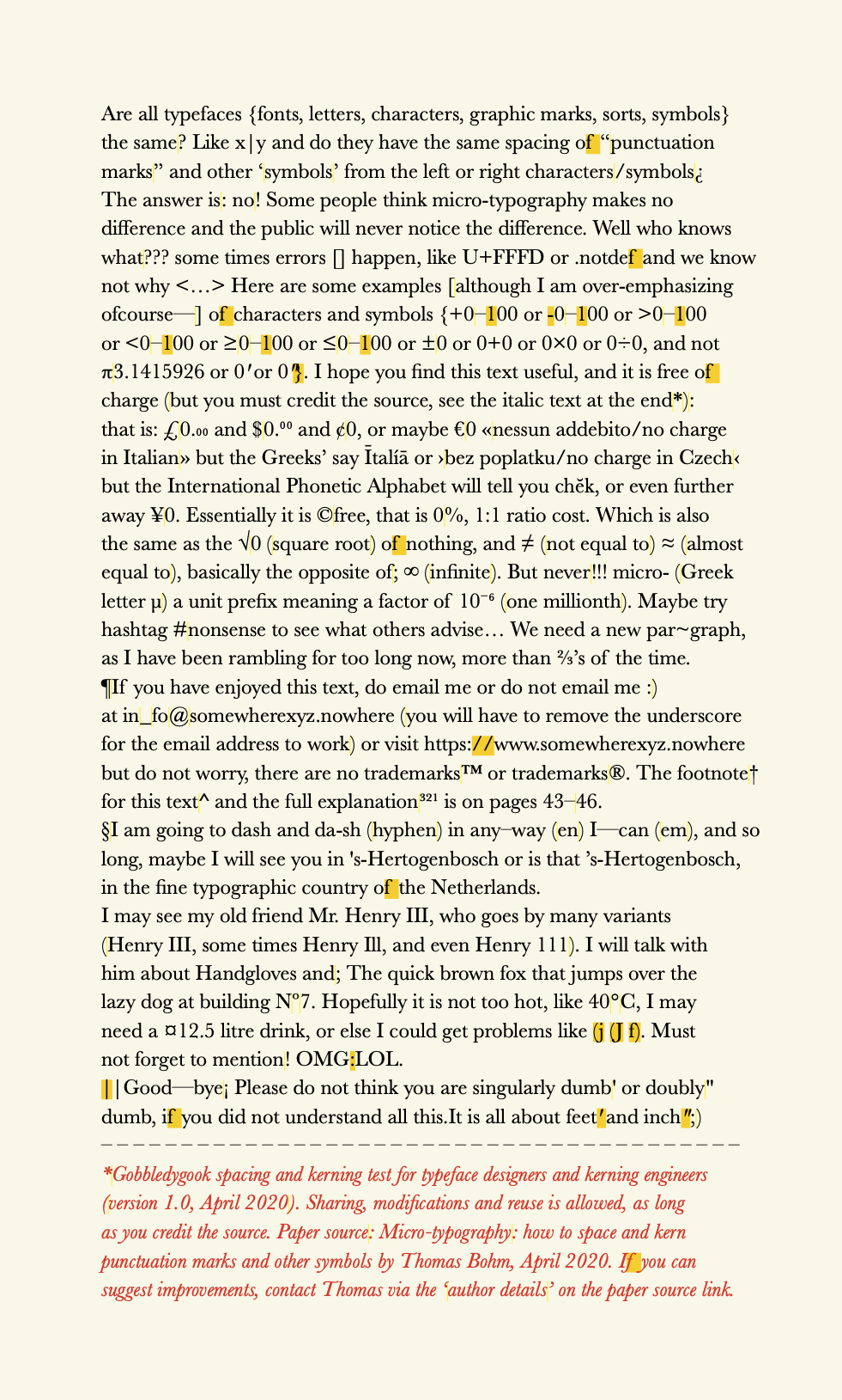
So, in figures 3 to 6, we have seen what the spacing of punctuation and other symbols looks like. It is clear to me that this extra spacing makes for better and smoother typographic communication. We also see that not enough has been done by the typeface designer to apply white space and kerning, because many punctuation marks and other symbols are almost flush with the left or right character.
Examples Of Default Punctuation And Symbol Spacing In Different Typefaces
Are all typefaces the same, and do they have the same spacing of punctuation marks and other symbols from the left and right? The answer is no. Below are some examples of typefaces with their default settings (no tracking or kerning applied within the figures). Notice the white space around marks and non-alphabetic characters.
“, ”, ‘, ’, : and ; by default. (Large preview)
In figure 7, we can see that the default tracking (the spacing of letters across lines) for Fira Sans Regular is a little tight. In figure 8, we can see that Spectral Regular, a serif typeface for extended reading, has quite a lot of tracking across lines by default. If we look at a typeface like FF Unit, it also has quite a lot of tracking across lines by default. Much less spacing of punctuation marks and other symbols is needed, because the tracking is already generous. If we go to an extreme, like in figure 9, which uses Fira Mono Regular, you can see that, because all characters take up the same width, they all align vertically, creating a lot of white space on the left and right sides; thus, the spacing of punctuation marks and other symbols is not relevant.
So, we can now start to see that properly spacing punctuation marks and other symbols is a good thing to do, that there is some benefit, and we can see roughly what marks and symbols to add space to. But what are the issues faced by real-world practical typographers whose clients do not have an unlimited budget?
The Current State Of Problems
Currently, addressing the issue is an ordeal and time-consuming. The problems can be summarized as follows:
- Spacing punctuation marks and other symbols takes too much time, via any method.
- Find-and-replace or GREP can produce a massive number of errors and is a solution just waiting to go wrong.
- Modifying the typeface’s built-in kerning values is not easy to do or a best practice.
- White space and kerning on web pages require (as of 2020) a lot of work to do and lacks technical support.
- White space and kerning in eBooks end up having to be deleted and stripped out before the books are exported, or else they produce problems and empty (tofu) boxes □.
- Modifying a typeface’s built-in sidebearing values is not easy to do or a best practice.
The Issues In More Detail
Spacing Punctuation Marks And Other Symbols Takes Too Much Time
For a 30-page A5 book, you can pretty much do what you like. Spacing and kerning can be done manually, with little time added to the total typesetting cost. What about a 300-page academic book? Manually adding spaces in Adobe InDesign or Quark would be too time-consuming. What about a website? If done in Adobe Dreamweaver, you could open up all individual pages and then add spacing characters, such as hair spaces and thin spaces (see figure 2). Some people and organisations are willing to pay extra for this typographic quality, but they are rare. Nicky Barneby, in TypoGraphic 59, outlines Penguin’s composition rules, set by Jan Tschichold in 1946. What we as typographers need is some way to add spacing to an agreed-upon list of characters and symbols, and that would take no more than 15 minutes to implement for a lengthy book or website. This would be the ideal solution, and this is my goal.
Find-And-Replace And GREP Is Just Waiting To Go Wrong
It is possible to add white space and to adjust kerning values using the find-and-replace option in software (Adobe InDesign, Quark, Microsoft Word, Adobe Dreamweaver).
You could manually find-and-replace, and find-and-replace, and so on. This would allow you to see what changes are occurring. But doing this for an entire book or website and for all character and symbol combinations would take days and would add massively to the overall time and cost of typesetting.
Alternatively, you could use GREP (globally search a regular expression and print), as Ralf Herrmann demonstrates for Adobe InDesign. However, there are issues with this. I am not prepared to do a mass find-and-replace without seeing what the find-and-replace is actually doing to the text. I suspect there are people who are comfortable clicking the “Change all” button, but I am not one of them. The risk only increases when you are working on typography for a real-world client, when mistakes and leaving it up to software could be disastrous.
Also, GREP is too technical for people who do not know how to code or who don’t know what code expressions are needed. And we would be heavily relying on the software knowing what we want (never a good idea). A lot can go wrong with changes that you do not see being done. Bram de Does (who some say has designed the world’s two most beautiful typefaces) puts it thus:
“I like to do manual things as much as possible.”
Another issue is that, if we use a single hair space throughout a book or website, what happens if we want to increase it to a thin space? Well, we could do a find-and-replace for all hair spaces, and change them all to thin spaces in one click. That might work, but it might not. What happens if somewhere we have used two hair spaces side by side? When we do a find-and-replace, those two hair spaces would become two thin spaces… Two thin spaces are much wider than two hair spaces. Things get messy and complex quickly. Find-and-replace is a solution just waiting to go wrong.
Modifying A Typeface’s Built-in Kerning Values?
Kerning basically refers to the changing of space between two letters or symbols. Letterspacing (also known as tracking) refers to the addition or reduction of space across letters and symbols, across a line or lines of text. Every typeface has built within it (and specified by the typeface designer) a table of letter combinations and kerning values. Robert Bringhurst, in his book The Elements of Typographic Style, suggests another solution:
“One way to refine the typography of a text is to work your way through it line by line, putting space in here, removing it there, and repositioning errant characters one by one. But if these refinements are made to the font itself, you will never need to make them again. They are done for good.”
What he is suggesting is that we edit the kerning values or sidebearings (more on those in a minute) within the typeface itself, opening the font in typeface design software, and making the changes for good. I would not recommend this, for two reasons:
- The importing options alone in typeface software are beyond an academic exercise and will result in problems if not done properly by an expert. Typefaces produced before around 2004 were simpler to import and much less complex than typefaces available today. Much less could go wrong, technically and technologically, with typefaces built around 2004. When we add variable-font settings and issues with importing and modifying typefaces, errors are guaranteed to happen.
- Many typeface licences would class adjustments to the built-in kerning values and sidebearings in the typeface file itself as modifications, which would not be allowed in the end-user licence agreement (EULA). Doing it to open-source typefaces might be slightly more allowable, as Richard Hendel suggests, although still not guaranteed.
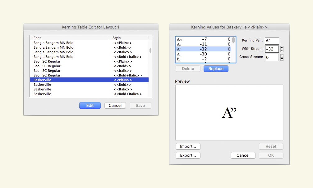
Furthermore, in Adobe InDesign, for example, if we take a character combination of A”, the A and closing quotation mark have a kerning value of -32. So, let’s say that we were going to add space to our selected list of marks using a +30 unit. For A”, which has a kerning value of -32, we could make that -2 for simplicities sake so it rounds to our +30 spacing unit. This is easy to numerically work out and to space in increments or decrements of 30 units. However, what happens if the value was originally -26. We can work out the math, but how quickly? And it could increase complexity.
Quark’s Kerning Table Editing Feature
For many years, surprisingly, Quark has had a kerning table editing option, something that Adobe InDesign does not offer. It allows you to select a typeface and single weight, and then input a kerning pair to modify and customise on top of, overriding the built-in kerning table. In the “Kerning Pair” box, you input two characters to kern. In the “With-Stream” box, you can increase or decrease the horizontal amount in increments of 10 units. And in the “Cross-Stream” box, you can increase or decrease the vertical amount (similar to a baseline shift) in increments of 10 units. The modified kerning pair and value are then applied throughout the Quark document. Quark’s kerning table editing is a very interesting feature and can save a lot of time. Your customisations can also be saved and exported. Great! Now we’re talking. This option is getting us closer to our ideal scenario.
White Space And Kerning On Web Pages Currently Requires A Lot Of Work And Lacks Technical Support
We could add spacing to punctuation marks and other symbols in two ways:
- We could use a range of white space characters, specifying the HTML or XML entity in the markup, as shown in figure 2 and as Yves Peters describes excellently.
- We could create two CSS classes, one for adding a unit of space to the left side, and one to the right side. Then, we would use a
spantag to apply it to a letter or symbol.
Both options above are possible, but when you have to do this for hundreds of web pages, it becomes daunting and unmanageable.
If we want to kern on the web officially, we are somewhat limited in options. There are basically two CSS options out of the box: font-kerning: normal, which says to use the typeface’s built-in kerning, and font-kerning: none, which says not to use the typeface’s built-in kerning. The Mozilla Developer Network documentation has an example. Hardly useful.
However, let’s go back to our example of the letter combination A”, which have a kerning value of -32. If we were to use a hair space throughout (rather than a kerning value), at least there would be little math to do, because all of the white space characters (essentially a glyph) have a fixed value. So, one of the upsides of white spaces is that they have a consistent width value, there really is no maths to work out.
White Space And Kerning In eBooks Produce Tofu Characters
Adding white spaces to text and entities such as non-breaking spaces and non-breaking hyphens can create problems when the document is exported to an eBook format. It can create empty (tofu) □ characters. These spaces are probably best removed (stripped out) before you export to an eBook or HTML. Moreover, kerning in eBooks can only be specified from the typeface’s built-in values and cannot be modified or overridden. Once again, all of this decreases our options.
Modifying A Typeface’s Built-in Sidebearing Values?
Sidebearings refer to the horizontal fixed space on either side of an individual character or symbol. Whereas kerning modifies the space between two letters and many different letter and symbol combinations, sidebearings are like fixed concrete blocks on the left and ride sides, and the width of the glyph. And when the value is set, it affects all instances of the letter or symbol where it is used, along with the kerning values applied on top of it. The spaces on either side are referred to as left sidebearing (LSB) and right sidebearing (RSB). These spaces ensure that characters sit beside one another with an even appearance. Essentially, it is the space to the left and right side of a character, before kerning is applied.
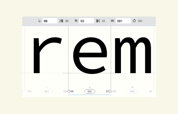
If you look back at figure 9 in this article, I used Fira Mono Regular for the text. If you scan down the text block, you’ll notice that all letters align vertically. The reason is that, essentially, all monospace typefaces have the same left and right sidebearings, or width bearing. (That is why it is called a monospace typeface — “mono”, as in singular). However, non-monospace typefaces have different left and right sidebearings; they span a character or symbol’s entire width. Good sidebearings can make the task of kerning a typeface easier. In Robert Bringhurst’s quote previously mentioned above, he basically says: If you fix it once, then it never needs fixing again. Perhaps, instead of adjusting the kerning, what we need to do is modify the sidebearing. Below is a screenshot from a panel in FontLab VI’s software Manual Metrics Editing.
This screenshot tells us a few things:
- The e (highlighted in the software) has a width bearing of
591units, which is shown by the black thin vertical line to the left and right of the e. - The left sidebearing of the e has
68units. - The right sidebearing of the e has
53units.
So, if we were to think about the spacing and kerning issues mentioned earlier, let’s consider the colon (:). We always want a bit more space on the left of the colon, so that it is a bit set away from any character to its left. In theory, we could edit the left sidebearing and say that we want a bit more space on the left:
68 units + 20 units = 88 units
Note: This might equate to the space provided by a hair space, for example.
Then, every time the character gets used, in combination with other characters, it will always have a bit more space on the left. Is that it? Are we done? Not quite.
Consider this text: 1:1. What happens, now that we have increased the default left sidebearing, it could look like 1 :1. What we might need to do is add a kerning pair value for a 1: combination (although I am not an expert, and my knowledge is slightly lacking in this area).
This article has gotten quite technical, and I have probably confused and bored you by now. But hold on: there are potentially easier and clearer options.
Possibly Better Solutions
White Space Edit For Print And Web
To clarify: Adding white spaces is basically adding a white space character (entity) as an alternative to adjusting kerning values.
What would a white space edit look like? Quark has a kerning table editing option; why doesn’t InDesign have one. What would it look like in CSS or via the syntax for OpenType features in CSS? What do we ideally need?
- The typographer would need to be able to define an agreed-upon preset list of punctuation marks and symbols to add space to.
- Having defined the preset list of punctuation marks and symbols to add space to, the user would then need to be able to specify which punctuation marks and symbols they want to add space to on the right side or left side.
- The user would then need to be able to specify problematic letter and symbol combinations; for example, to exclude adding space to text such as a URL:
https://www. We might reasonably add space to the left and right of a forward slash sign (/), but with a combination likehttps://, we would get a customized double space to the right of the first/and to the left of the second/, making it look like this:https:/ /. - When the user has done this, they would then need to be able to add a space that is user-definable, or a space value from, say, four options. For print:
25,50,75,100(measured1/1000 emin InDesign, relative to the typeface’s size). And for web, maybe:1px,2px,3px,4px. - The user would need to be able to apply this spacing to the style sheet in InDesign or Quark, and also in CSS. I am sure experts can think of better coding than what is below, but here is my amateurish attempt:
.class {
    font-feature-settings-space-characters-symbols-left-side: value,value,value,value; /* Characters and symbols could be copied into the horizontal list, or Unicode HTML entity values used as well */
    font-feature-settings-space-characters-symbols-right-side: value,value,value,value; /* Characters and symbols could be copied into the horizontal list, or Unicode HTML entity values used as well */
  font-feature-settings-space-characters-symbols-amount: value; /* Any range of measuring units could be used: px, em, rem */
  font-feature-settings-space-characters-symbols-problem-exclude-combinations: value,value,value,value; /* Letter and symbol combinations to not apply the above spacing to */
}
Or leave it to typeface designer to allow four options built into their typeface, via OpenType Feature File Specification rules:font-feature-settings-space-characters-symbols-amount-space: value; /* The user is allowed to define 1 of a range of 4 values: quarter 1/4, half 1/2, two-thirds 2/3, full 4/4 */
Note: I tried to pick up on the syntax for OpenType features in CSS. - In Adobe InDesign and a website’s CSS, a user needs some method to edit white space, overriding the built-in values in print and web fonts, applying it to a paragraph or character style sheet or as a selector in a CSS class.
Kerning Table Editing For Print And Web
To clarify: Kerning is the customization of space in between two letters or symbols. Kerning values are stored in a font file in a kerning table (kerning can also be applied and customized via software and stored within software). Kerning values override the three sidebearing values (left sidebearing, width bearing, and right sidebearing). Kerning can also be customised on top of the built-in kerning table through software like Adobe InDesign and Quark. Letterspacing (also known as tracking) is a consistent positive (+) or negative (-) space value applied across a whole line of text.
What would a kerning table edit in Adobe InDesign look like? Quark has one. What would it look like in CSS or in the syntax for OpenType features in CSS? What do we ideally need? Well, in InDesign, it could look something like figure 11 (previously), pushed a bit further. Kerning typically relates to the space between two characters. For the spacing of punctuation and other marks, we are interested in spacing, but how would we kern all instances of a character and a colon (:), like the following: a:, b:, c:? We would be doing it for a long time, because there are potentially thousands of combinations that use a colon. However, if we could specify one character in the kerning pair dialog box (as shown in figure 11), then maybe we could specify a character and just say we want +25 units on the left side. For a kerning table edit on the web, we could do something like what’s shown below (but, again, we really need some way to read a font’s built-in kerning values, because we have no idea what they are to begin with):
fontname kerningtable { /* Accesses the kerning table within the web font file. */
    font-feature-settings-kerning-table-edit: character character, -value or +value; /*
The user selects two characters to kern, and then specifies a negative or positive value in a measurement unit (px, em, etc.). */
    font-feature-settings-kerning-table-edit-direction: horizontal or vertical; /*
The user can specify whether they want the kerning to be horizontal or vertical. */
}
Sidebearing Edit For Print And Web
To clarify: Sidebearings differ from kerning because they act like bottom-level (non-overridable) concrete blocks, forming the width of all the individual letters and symbols. A sidebearing value affects all instances of the letter or symbol where it is used, and the kerning values are applied on top of it. So, a lowercase i has a narrower width sidebearing than a lowercase m, which is twice as wide as an i (for non-monospace typefaces in general).
What would a sidebearing edit in Adobe InDesign look like? What would it look like in CSS or via the syntax for OpenType features in CSS? What do we ideally need? Well, it would look much like the example given under the heading above for “White space edit for print and web”. We would need some way to read the built-in sidebearing. So, in figure 12, the left sidebearing is 68, the right sidebearing is 53, and the width is 591. In CSS, we would somehow need to obtain the three built-in values for any character or symbol, either from an official public source or from the font maker. Then, maybe we could override those values using CSS:
fontname character { /* Accesses the sidebearing values within the web font file. */
    font-feature-settings-sidebearing-for-what-character: character; /* The user can paste in the character or specify a decimal or HEX entity. */
    font-feature-settings-left-sidebearing: value; /* Value in px? */
    font-feature-settings-right-sidebearing: value; /* Value in px? */
    font-feature-settings-width-sidebearing: value; /* Value in px? */
    font-feature-settings-sidebearing-problem-exclude-combinations: value; /* Letter and symbol combinations to not apply the above spacing to */
}
Observations
If you have read this far and have not given up or gotten bored, then you are clearly a committed typographer.
Let’s conclude:
- Adding space characters (which are essentially character entities) of any kind, like hair spaces or thin spaces, in any software (Adobe InDesign, Quark, HTML) just leads to problems and results in a load of work.
- We need to be able to modify spacing via the actual kerning value, rather than via a white space character or entity.
- Typographers need to be able to override the built-in kerning table values in typefaces, then be able to apply custom kerning values via access to a kerning table editing feature.
- Users need to be able to apply spacing to punctuation marks and other select symbols, and apply custom kerning globally to a typeface (either a desktop or web font), via a paragraph or character style sheet in Adobe InDesign and CSS. We need to be able to do all of this in a print document or website in less than 15 minutes, and it needs to be easy enough for people with basic software knowledge to do.
What Might The Solution Look Like?
Should the OpenType Feature File Specification rules allow for the spacing of punctuation marks and other symbols, so that typeface designers can allow it via some kind of OpenType pre-built option within their typefaces before releasing them for sale? Should Adobe InDesign have some kind of built-in kerning table editing, like Quark has had for many years? Should CSS allow access to a typeface’s built-in kerning table, for custom values to override the designer’s values? Should typeface designers space punctuation marks and other symbols better and more generously? Do they not give this area enough attention?
Afterword
I hope you have found this article insightful and useful. I have not presented a perfect solution, but rather have covered potentially viable solutions, which I am happy to be developed and explored further. I am no expert in internal typeface kerning, technology, or new CSS properties. But I am sure we can do something about these hard-to-manage spacing problems that typographers and typesetters have been dealing with for so many hundreds of years across changing technological mediums. If you have any ideas, contact me by visiting the website linked in my “About the Author” page shown at the top of this article.
Thanks to Rachel Andrew (for advice and editing), Erik Spiekermann (for email support and further contacts), and Jost Hochuli and Roland Stieger (for support and feedback).
“I would love all those features, but I only know 1 or 2 other graphic designers who would use them. They don’t even use any of the OpenType features or Stylistic sets. I used the kerning table edit in Quark all the time, when setting different languages. Partly because I didn’t like some of the built-in kernings, partly because there were some missing, especially those after and before spaces. But most designers don’t even change the default word spaces in InDesign, let alone bother about more details. Sad, but ask other typeface designers and the few good typesetters out there: standards are low.”
— Erik Spiekermann (March 2020)
Further Reading
- “Syntax for OpenType Features in CSS”, Adobe (2020)
- “Rules of Composition,” Nicky Barneby (2002)
- The Elements of Typographic Style, Robert Bringhurst (2004)
- “Manual: Brackets”, Anya Danilova, type.today (2020)
- “Manual: The Dash”, Anya Danilova, type.today (2019)
- “eXtreme Type Terminology, Part 4: Numerals and Punctuation”, Paul Dean (2008)
- Beyond Selecting and Arranging Type, Charles Ellertson (2013)
- “Punc Rocks: The Typographer’s Guide to Punctuation”, James Felici (2009)
- “Punctuation (1): The Linguistic Side”, Lisa Fischbach (2017)
- “On Quotation Marks and Other Puzzling Punctuation”, Peter Glaab (2017)
- “Methods for Controlling Spacing in Web Typography”, Geoff Graham (2016)
- “Global Kerning Changes in InDesign through GREP Styles”, Ralf Herrmann (2016)
- Detail in Typography, Jost Hochuli (2008)
- Life Style, Bruce Mau (2005)
- InDesign Scripts, Peter Kahrel (2019)
- Lesetypografie and Book Typography, Robin Kinross (2007)
- “Character Design Standards: Punctuation for Latin 1”, Microsoft (2017)
- Book Designers From the Netherlands, Brigitte Schuster (2014)
- “Erik Spiekermann”, Design Within Reach (2020)
- “TypeTalk: Document-Wide Kerning”, Ilene Strizver (2009)
- “How to properly typeset all forms of punctuation used in English-language documents?”, Village (2012)
- “Find and Replace, GREP”, David Sudweeks (2013)
- “Adventures in Space: Spaces”, Yves Peters (2016)
- “Adventures in Space: Kerning”, Yves Peters (2016)
- “Space Yourself”, Marcin Wichary (2015)
- “Adding Half Spaces to Punctuation”, Allen Wyatt (2020)
- “The Year in Design”, Jeffrey Zeldman (2015)
- “font-kerning”, Mozilla Developer Network (2019)


