Styling Components In React

Email Newsletter
Weekly tips on front-end & UX.
Trusted by 182,000+ folks.
 Register for Free
 Custom Web Forms for Angular, React, & Vue. Your backend.


 Celebrating 10 million developers
Styling React components over the years has improved and become much easier with various techniques and strategies. In this tutorial, we’re going to learn how to style React components using four major styling strategies — with examples on how to use them. In the process, I will explain the cons and pros of these styling strategies, and by the end of this tutorial, you’ll know all about styling React components and how they work along with the various methods that can be used for styling these components.
Note: A basic understanding of ReactJS and CSS would be good to have for this tutorial.
What Does ‘Styling’ In React Applications Even Mean?
The reason you’ll style your React application is no different from that which you have in mind when styling other websites or web applications you have been working on. Styling in React applications describes how React components or elements are displayed on screen or any other media.
The whole essence of building frontend UIs with React is how flexible it is to build these UIs especially as components and also style them to give us a great look and experience. It is important to know that whatever styling strategy you may decide to use is still CSS — you are writing CSS like you’ve always done. The difference is that the strategies (which we’ll be looking at) help make the process easy because of the uniqueness of React.
Major Styling Strategies In React
There are various strategies to follow when planning to style React components, these strategies have also increased and evolved over the years. In this tutorial, we would be talking about the most popular and modern styling strategies, and how to use them to style our React components. These styling strategies include:
- CSS and SCSS Stylesheets
This involves using separate stylesheets like our conventional way of styling our HTML websites either with CSS or a CSS preprocessor called SASS. - CSS Modules
A CSS Module is a CSS file in which all class names and animation names are scoped locally by default. styled-components
styled-components is a library for React and React Native that allows you to use component-level styles in your application that are written with a mixture of JavaScript and CSS using a technique called CSS-in-JS.- JSS
JSS is an authoring tool for CSS which allows you to use JavaScript to describe styles in a declarative, conflict-free and reusable way. It can compile in the browser, server-side or at build time in Node.
In the next section of this tutorial, we are going to be talking about each of these strategies of styling with examples of their syntax.
1. CSS And SASS Stylesheets
CSS or SCSS Stylesheets is a styling strategy that involves the use of external CSS or SASS stylesheets that can be imported into your React components depending on where you need the styling to be applied.
For example, we have a SASS file of styles called Box.scss we need to use in a component called Box.js, below is the code for our SASS file.
// Box.scss
.Box {
  margin: 40px;
  border: 5px black;
}

.Box_content {
  font-size: 16px;
  text-align: center;
}
In order to make use of this styling inside our Box component all we need to do is import the SASS file directly into our Box.js component like so:
import React from 'react';
import './Box.css';

const Box = () => (
  <div className="Box">
    <p className="Box_content"> Styling React Components </p>
  </div>
);

export default Box;
After creating the styles and importing it into Box.js file, we can then set the className attribute to the match what we have in the stylesheet.
While using this strategy, you could also leverage on existing frameworks like; Bulma, Bootstrap, etc. These frameworks provide you with existing classes and components you could plug into your React application without styling every aspect of your application.
Benefits Of Using CSS And SASS Stylesheets
- It is much more popular than the rest of the styling strategies, so there is a ton of helpful resources when you run into a bug.
- Caching & Performance
Standard CSS files are easy for the browser to optimize for, caching the files locally for repeat visits, and ultimately giving performance wins. - Un-opinionated and Universal
CSS and SASS is universal and has no opinion on how you render your UI making it a great choice for teams that have legacy CSS and are migrating over to a new framework or rebuilding their website or product. - Quickly Iterate A New Design
You can very easily rip out the entire stylesheet and create a new one to refresh the look and feel of your app without digging through potentially hundreds of components. - CSS Frameworks
CSS frameworks come in handy if you are a new developer, or you want to quickly work on a prototype without diving deep into writing your own full-blown stylesheets. CSS frameworks will provide you with building blocks to get your idea off the ground. Some of these frameworks include, Bootstrap, Bulma, Semantic UI, Materialize.
Shortcomings Of Using CSS And SASS Stylesheets
- Readability
If not properly structured, a CSS or SASS stylesheet can become long and difficult to navigate through as the application becomes complex. - Legacy CSS Can Live On For Years
Most times these really large stylesheets can become so complex and long that cleaning up old, outdated or even unused styles can be a pain.
Note: “Sass has two syntaxes. The most commonly used syntax is known as “SCSS” (for “Sassy CSS”) and is a superset of CSS syntax. This means that every valid CSS stylesheet is valid SCSS as well. SCSS files use the extension .scss.
The second, older syntax is known as the indented syntax (or just “.sass”). Inspired by Haml’s terseness, it’s intended for people who prefer conciseness over similarity to CSS. Instead of brackets and semicolons, it uses the indentation of lines to specify blocks. Files in the indented syntax use the extension .sass.”
CSS Modules
A CSS Module is a CSS file in which all class names and animation names are scoped locally by default. When using CSS Modules, each React component is provided with its own CSS file, that is scoped to that file and component alone.
The beauty of CSS modules happens at build time when the local class names which can be super simple without conflict are mapped directly to the automatically-generated ones and are exported as a JS object literal to use within React.
We can make use of CSS Modules in our React applications by importing the file directly into the component file.
For example, the code below is an example of how to use a CSS module in a React Component.
//Box.css
 :local(.container) {
   margin: 40px;
   border: 5px dashed pink;
 }
 :local(.content) {
   font-size: 15px;
   text-align: center;
 }
:local(.className) is used when you use create-react-app boilerplate because of webpack configurations.
When using webpack, you can add the loader and also include the module to your webpack.config.js in other to make CSS modules work with Webpack.
test: /\.css$/,
loader: 'style!css-loader?modules&importLoaders=1&localIdentName=[name]__[local]___[hash:base64:5]'
}
In other to make use of this CSS Module inside our Box component we need to import the module file directly into our Box.js component and use the className instead of style prop to access the style like so:
import React from 'react';
import styles from './Box.css';

const Box = () => (
  <div className={styles.container}>
    <p className={styles.content}> Styling React Components </p>
  </div>
);

export default Box;
styles here is an object that contains the styles we created in Box.css. This object will contain the classes; container and content that maps to their respective styles. To make use of them, we assign the element’s className to the appropriate class we have in Box.css.
Benefits Of Using CSS Modules
- Modular and reusable CSS,
- No more styling conflicts,
- Explicit dependencies,
- Local scope,
- Clear dependencies,
- No Code duplication in case of SSR,
- No Additional costs in JS payload,
- Variables, Sharing variables in CSS and exposing it to JavaScript.
Shortcomings Of Using CSS Modules
- Extra build tools (e.g. webpack).
- Mixing CSS Modules and global CSS classes is cumbersome.
- When a
Referenceis made to an undefined CSS Module, it resolves to undefined without a warning. - Using the
stylesobject whenever constructing aclassNameis compulsory. - Only allows usage of
camelCaseCSS class names.
styled-components
styled-components is a library for React and React Native that allows you to use component-level styles in your application that are written with a mixture of JavaScript and CSS.
It was created with the same method of operation of CSS Modules, a way to write CSS that’s scoped to a single component, and not accessible to any other element in the page or even component.
styled-components allows React developers to write plain CSS in React components without having to worry about clashing of class names.
For example, if we need to implement styling in our Box.js file using styled components, we would first need to carry out the following steps:
- First, we need to install
styled-componentslibrary by runningnpm install styled-components --save. - We then need to import the styled component library into our component by writing
import styled from 'styled-components';. - Now we can create a variable by selecting a particular HTML element where we store our style keys.
- Then we use the name of our variable we created as a wrapper around our JSX elements.
The code below is an implementation of all the steps we mentioned above.
import React from 'react';
import styled from 'styled-components';

const Box = styled.div`
  margin: 40px;
  border: 5px black;
`;

const Content = styled.p`
  font-size: 16px;
  text-align: center;
`;

const Box = () => (
  <Box>
    <Content> Styling React Components </Content>
  </Box>
);

export default Box;
In the code above, we import the styled object from styled-components, which makes use of tagged template literals to style your component. We then create a variable that would hold our styling and also act as a wrapper around content, that’s why we have the <Box> and <Content> tags, in this variables, we assign it to the styled object plus the HTML element we want to style then followed by the accompanying styles for the HTML element. To use the variables we created for styling all we need to do is wrap our JSX or content in between them as tags.
Benefits Of Using styled-components
- Consistency
styled-componentsmake it easy for you to publish a React component to NPM. These components can be customised through props and/or extending viastyled(Component)and no clashing with CSS selectors. - Sass Syntax Out-Of-The-Box
You can get SASS trademark syntax out of the box without having to install or setup SASS or any extra build tool. - Dynamic Styling
You can make use of props to dynamically change the styles in any way that feels natural to anyone comfortable with React. - Theming
Using React’s Context API, styled-components offers aThemeContextthat can you can pass a theme object directly to, making it very accessible in any of your components, and by default can be interpolated into your styled definitions.
Shortcomings Of Using styled-components
- Learning Curve
Frontend developers that are already comfortable with writing traditional CSS will have to learn a different way of styling that is different from how traditional CSS is written. - Integration with Legacy CSS can be painful.
If you’re making use of a UI library like Material UI or even traditional CSS, integrating styled-components together with them can be confusing to locate and debug styles. - Performance
styled-components converts all of the style definitions in your React component into plain CSS at build time and the inject everything into the<style>tags in the head of yourindex.htmlfile. This affects performance in the sense that it is not only increasing the size of our HTML file which can have an impact on the load time, but there is also no way to chunk the output CSS either.
JSS
JSS is an authoring tool for CSS which allows you to use JavaScript to describe styles in a declarative, conflict-free and reusable way. It can compile in the browser, server-side or at build time in Node. JSS is a new styling strategy that hasn’t been adapted so much. It is framework agnostic and consists of multiple packages: the core, plugins, framework integrations and others.
JSS has third party API adapters that can be used to write JSS like styles but differently, these third party API adapters include:
- Styled-JSS
This is a styled-component API adapter. - Glamor-JSS
Glamor flavored CSS with JSS under the hood. - Aphrodite-JSS
Aphrodite like API.
React-JSS
React-JSS makes use of JSS with React using the new Hooks API. JSS and the default preset are already built into the library. According to the official React-JSS docs, the following are the benefits of using React-JSS instead of the core JSS library in your React components.
- Dynamic Theming
This allows context-based theme propagation and runtime updates. - Critical CSS Extraction
The only CSS from rendered components gets extracted. - Lazy Evaluation
Style Sheets are created when a component mounts and removed when it’s unmounted. - The static part of a Style Sheet will be shared between all elements.
- Function values and rules are updated automatically with any data you pass to
useStyles(data). You can pass props, state or anything from context for example.
The code below is an example of how React-JSS is used.
import React from 'react'
import {render} from 'react-dom'
import injectSheet, { ThemeProvider } from 'react-jss'
const styles = (theme) => ({
  wrapper: {
    padding: 40,
    background: theme.background,
    textAlign: 'center'
  },
  title: {
    font: {
      size: 40,
      weight: 900,
    },
    color: props => props.color
  },
  link: {
    color: theme.color,
    '&:hover': {
      opacity: 0.5
    }
  }
})
const Comp = ({ classes }) => (
  <div className={classes.wrapper}>
    <h1 className={classes.title}>Hello React-JSS!</h1>
    <a
      className={classes.link}
      href="https://cssinjs.org/react-jss"
      traget="_blank"
    >
      See docs
    </a>
  </div>
)
const StyledComp = injectSheet(styles)(Comp)
const theme = {
  background: '#aaa',
  color: '#24292e'
}
const App = () => (
  <ThemeProvider theme={theme}>
    <StyledComp color="red"/>
  </ThemeProvider>
)
render(<App />, document.getElementById("root"))
In the code above, which somewhat similar to using styled components, we import injectSheet and ThemeProvider from the react-jss library. The ThemeProvider is a High-Order component in React, which passes the theme object down the React tree by the use of context. It will contain the root theme of the component. While injectSheet is used for injecting the stylesheet we have created in this case styles into the main component.
const Comp = ({ classes }) => (
  <div className={classes.wrapper}>
    <h1 className={classes.title}>Hello React-JSS!</h1>
    <a
      className={classes.link}
      href="https://cssinjs.org/react-jss"
      traget="_blank"
    >
      See docs
    </a>
  </div>
)
The code above is the main React component that has not been injected with the styles object we have created, it contains the main code for our React component and it is going to be styled when we inject it with the styles object that we have created.
const StyledComp = injectSheet(styles)(Comp)The line of code above is injecting the styles we have created into the component we created it for using the injectSheet() function.
const theme = {
  background: '#aaa',
  color: '#24292e'
}
The code above holds the theme object that would be passed to the <ThemeProvider> HOC via context and it acts as the root theme of our component.
const App = () => (
  <ThemeProvider theme={theme}>
    <StyledComp color="red"/>
  </ThemeProvider>
)
In this portion of the code, what we are doing here is using the <ThemeProvider> HOC, we are rendering our component that we have injected the styled sheet we created into <StyledComp color= "red"/>.
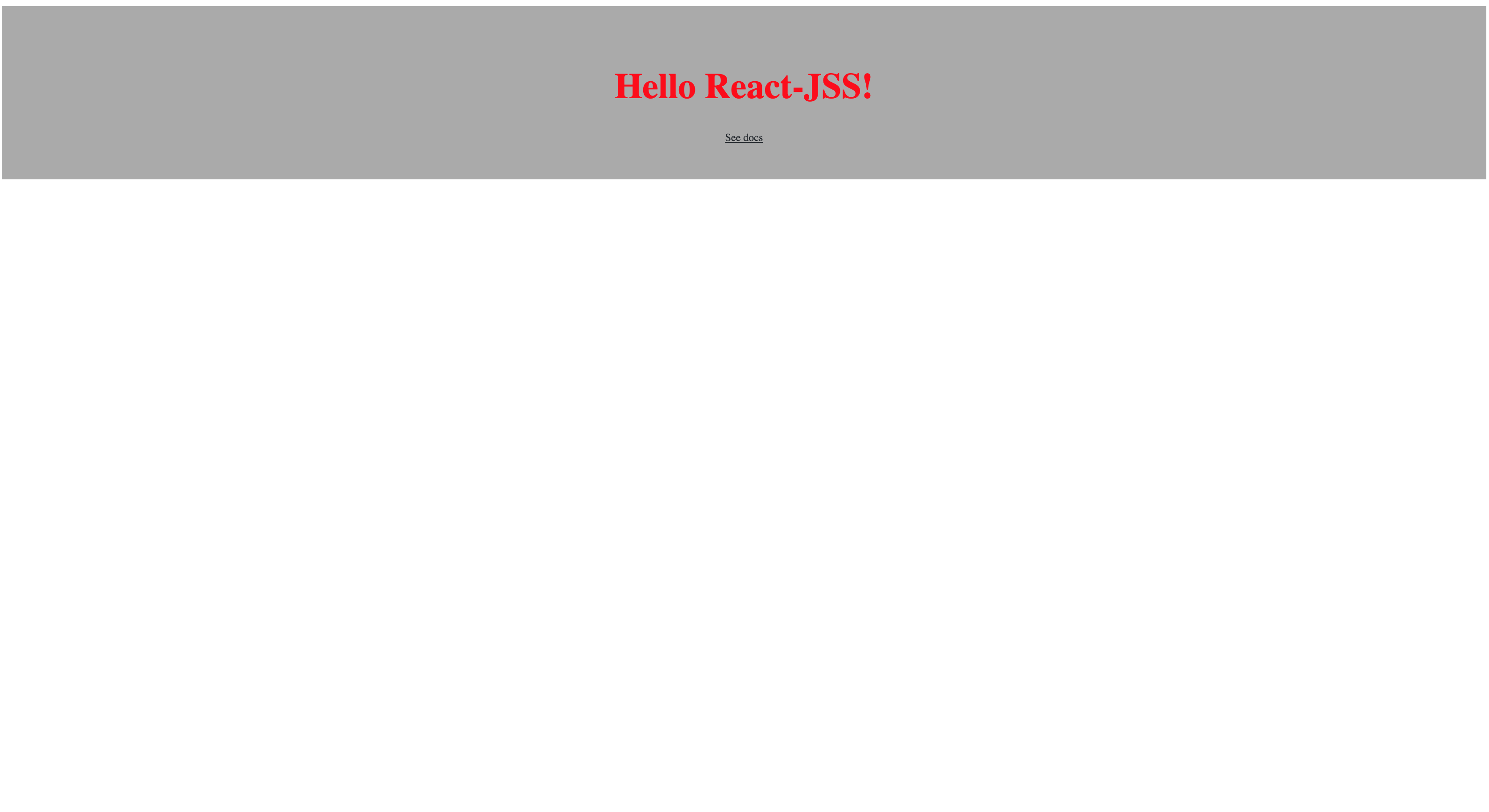
At the end of rendering, this is what will be displayed in your browser:
Benefits Of JSS
- Local Scoping
JSS supports local scoping, taking it to the next level by automating scoping, which leads to a high level of predictability. - Encapsulation
Encapsulation facilitates maintenance and eliminates errors, as you can modify all component-related code and style in the same place, without having to worry about unexpectedly changing other parts of the application. - Reusability
Components are reusable, so you only have to write them once, then you can run them everywhere while maintaining their styling too. - Dynamic Styling
You can make use of props to dynamically change the styles in any way that feels natural to anyone comfortable with React.
Shortcomings Of JSS
- Learning Curve
Learning JSS can be very tricky especially frontend developers that are already used to writing traditional CSS. - Extra Layer of Complexity
Putting a CSS-in-JS library into use adds an extra layer to your React application, which can sometimes be unnecessary. - Code Readability
Custom or Automatically generated selectors can be very difficult to read especially when using your browser devtools to debug.
Conclusion
Each of these has its advantages and disadvantages, and it all depends on your personal/company preference and the complexity of your application. Also, whatever styling strategy you may decide to use, it is still basically CSS. You can write CSS like you’ve always done, but React and other libraries offer solutions that can also help with styling.
I hope you enjoyed working through this tutorial. You could always read more on Styling React Components from the references below. If you have any questions, leave a comment below and I’ll be happy to reply to each and every single one.
Resources
- JSS (docs)
- “Styling In React,” Jacob Evans, V School
- “Styled Components,” Flavio Copes
- “Four Ways To Style React Components,” Agata Krzywda
- “CSS-in-JS 101: All You Need To Know ,” stereobooster, GitHub
- “Styled Components vs. CSS Stylesheets,” Luke Smetham, Stream.io
- “Best Practices For Styling React Components,” Chris Parker, Pluralsight
- “Styled Components vs. CSS Stylesheets,” Luke Smetham, Stream.io
Further Reading
- The Safest Way To Hide Your API Keys When Using React
- Converting Plain Text To Encoded HTML With Vanilla JavaScript
- A Simple Guide To Retrieval Augmented Generation Language Models
- The Best Of Pro Scheduler Libraries
 (ks, ra, yk, il, mrn)

