Is Your Website Stressing Out Visitors?

Email Newsletter
Weekly tips on front-end & UX.
Trusted by 200,000+ folks.


Stress is a nasty thing and many of us deal with it on a regular basis. Our jobs, school, homes, relationships, and even things going on around the world can trigger feelings of panic, unease, and depression. And those are just chronic stressors. Think about the small things that send your body into instant fight-or-flight mode on a daily basis (e.g. traffic jams, unhelpful customer service reps, getting sick when you have a big project due).
The last thing you want is for someone to visit one of the websites you’ve built, only to feel like they:
- Need to battle their way through it, or
- Leave immediately and never come back.
There are a variety of ways a website can cause stress and leave visitors wondering if their response should be to fight or flight. Slow loading times. Overwhelming navigations. Excessive 404 errors. You get the point. But the design itself could be a problem, too.
If your bounce rates are really high and performance isn’t an issue, then this is something you need to look into. Today, we’re going to look at some ways for web designers to take traditional stress-busting tips and apply them to websites.
How To De-stress Your Web Design
Most stress relief guides provide a similar set of tips. But how exactly do you apply something like “Get outside for fresh air” to a website?
Here are some ideas:
1. Draw From Nature
There’s a reason why stress relief articles always suggest that people get outside. There’s something about nature that’s very calming.
If you think about the way we live our lives today — always on, always connected, always trying to make a better life for ourselves — it’s the exact opposite of nature. That’s probably why we’re so attracted to its simplicity and healing qualities in times of stress.
Companies with “natural” initiatives (think REI or CLIF) can get away with using imagery containing nature scenes and drawing on the feel-good vibes associated with them.
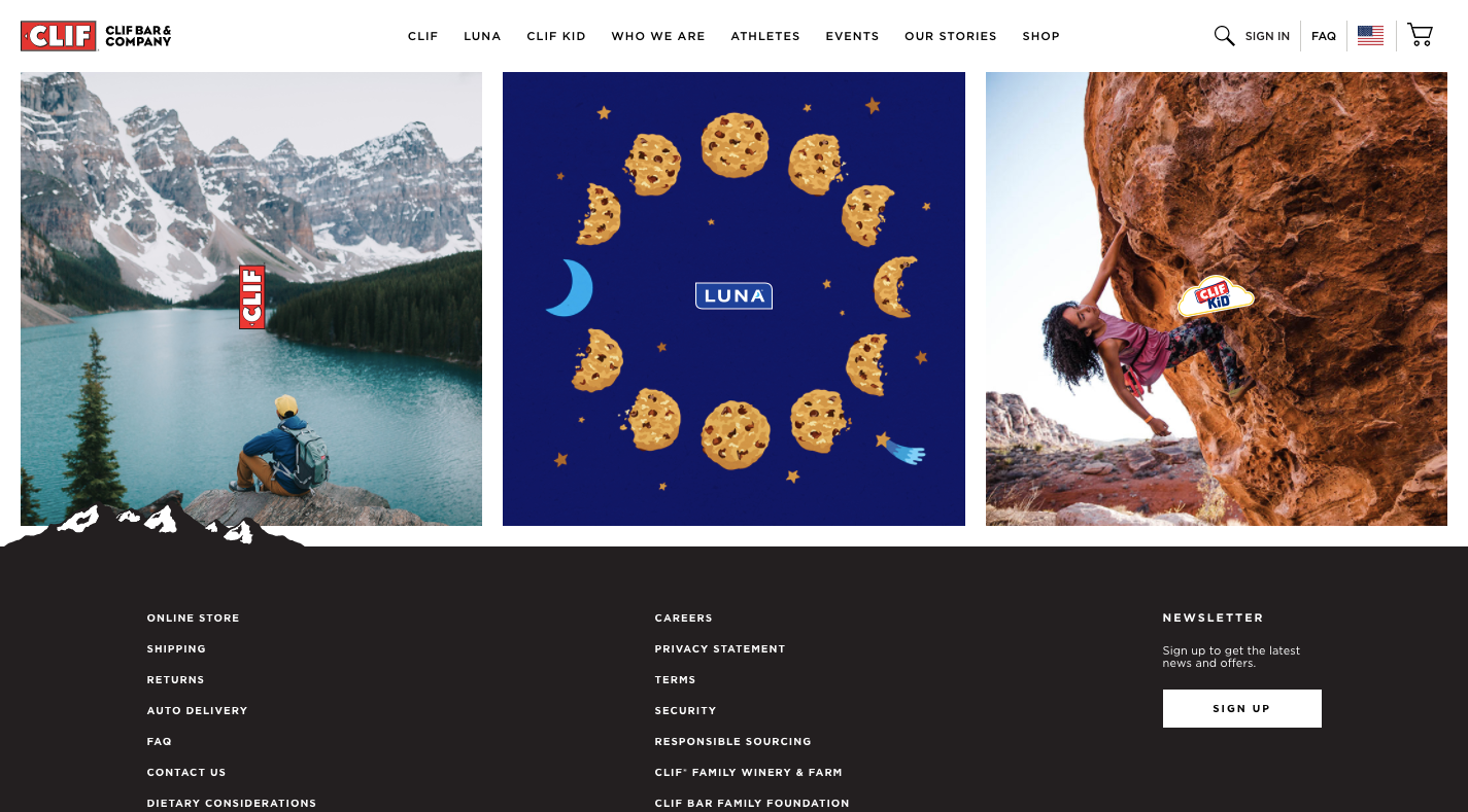
For other companies, however, you’re going to have to think outside the box as nature photographs won’t make sense for most.
Something I’d recommend instead is to look at your color palette.
One of the great things about spending time in nature is the abundance of color you’ll find. Look at any travel blog or social media account and you’ll find proof of this immediately. For example, this is a snapshot of recent photos shared by @adventurefervor:
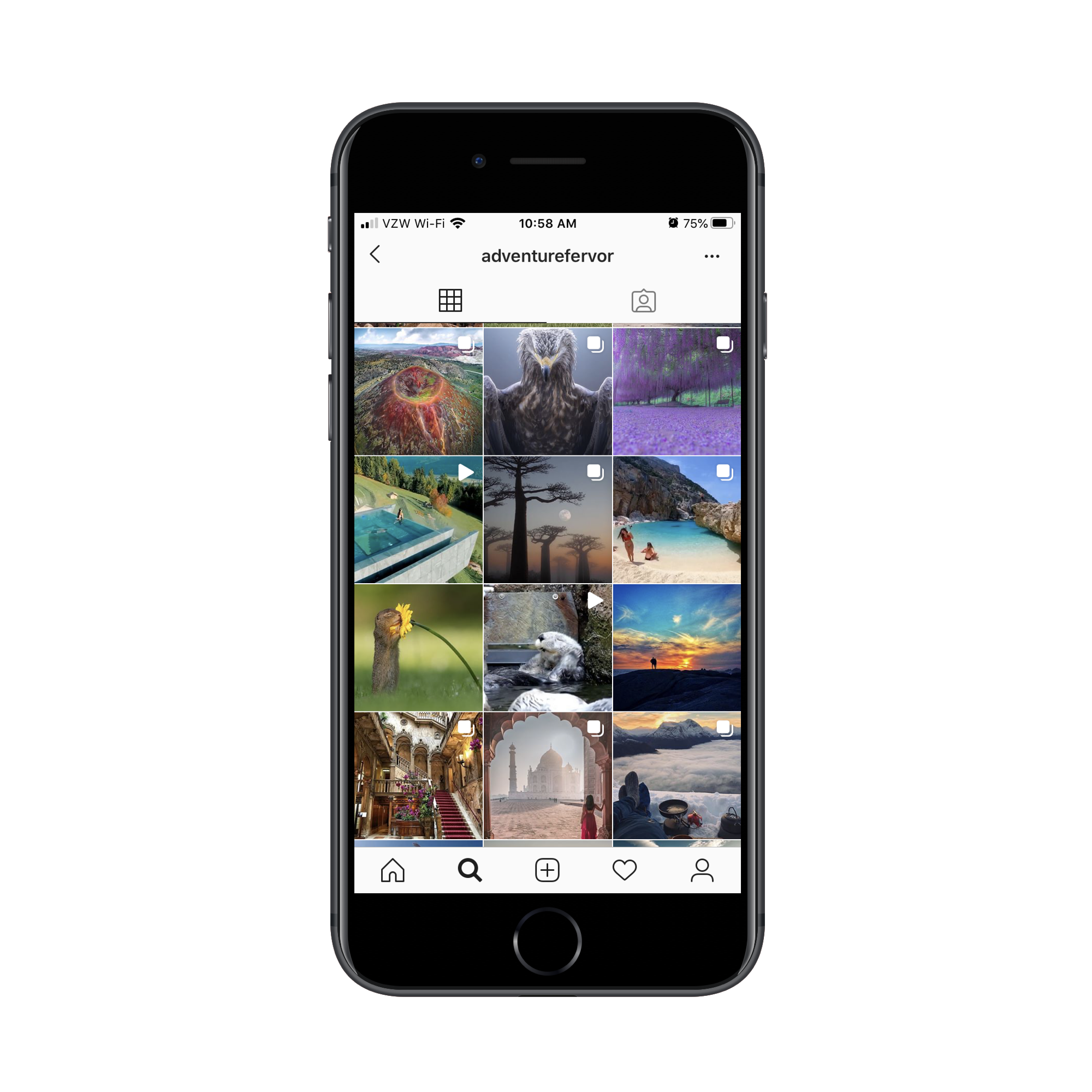
There is such a vast array of colors in nature that you could draw from.
That said, nature’s colors aren’t always peaceful or safe. Take, for instance, aposematism. This is the ability animals have to signal that there’s danger here — and they do it with color.
“The function of aposematism is to prevent attack, by warning potential predators that the prey animal has defenses such as being unpalatable or poisonous.”
The most commonly seen colors in aposematism are:
- Red,
- Yellow,
- Black,
- White.
Generally, when these colors are used, it’s in high contrast to the surrounding colors and scenery, so it’s not like the actual appearance of red or black is alarming. It has to do with the context.
What I’d recommend is that you take a look at your website and note if there are any colors sending the wrong signals.
Does a dark mode-like design seem too ominous for the lighter personality of the brand? Are red accents reminiscent of blood against the stark white background? Does the bright yellow coloring feel out of place?
Bear Grylls’s website, for example, feels a bit edgy and unnerving:
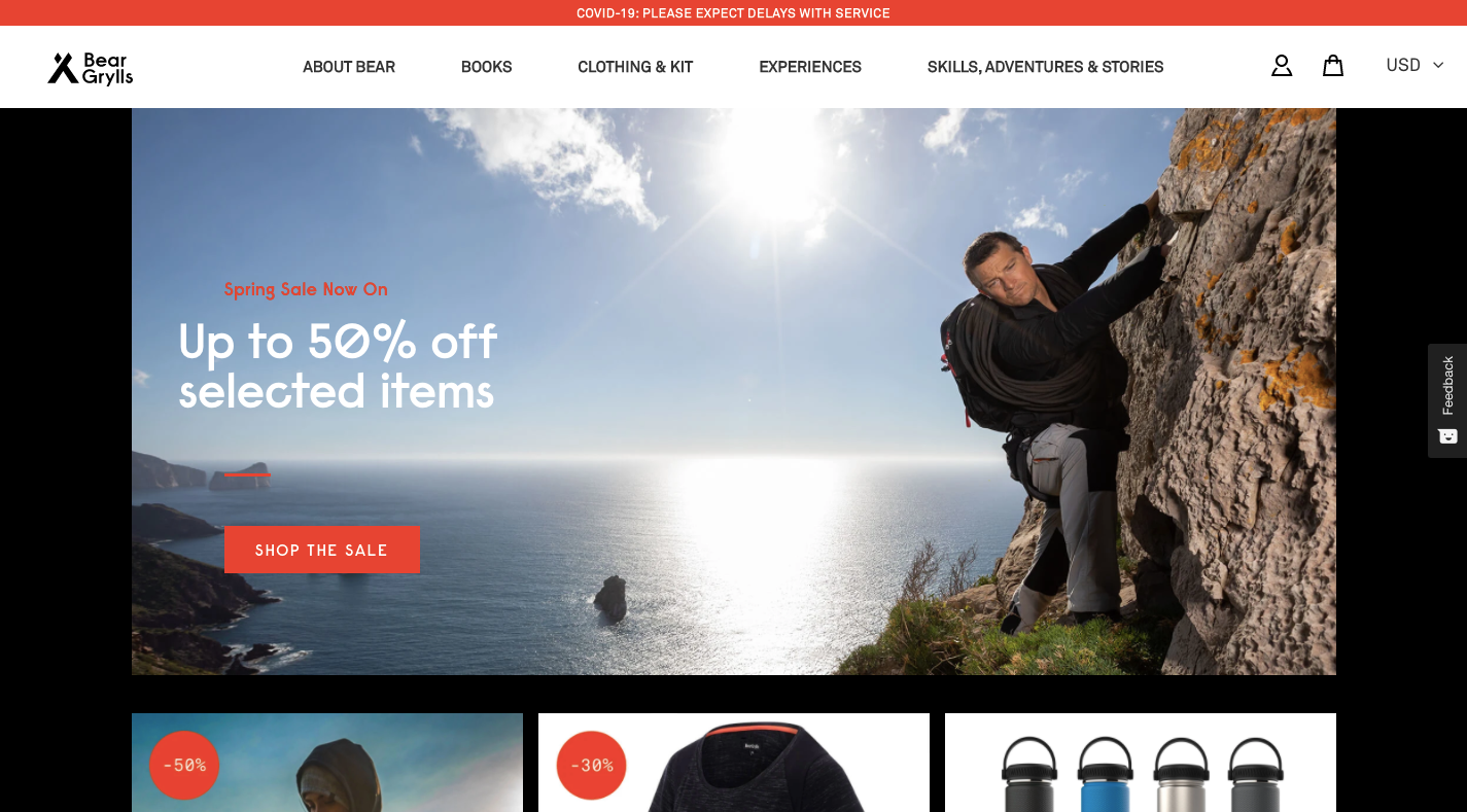
I suspect the web designer went out of their way to imbue the website with the sharp black and red accent colors that appear here. Bear Grylls doesn’t run some feel-good travel show. He’s always putting himself (and others) in life-or-death situations. So, in this case, the aposematism-inspired color palette is a good choice.
For your website, though, I highly doubt you want your visitors to associate the brand with danger or death. So, spend some time studying nature photography (the stuff that makes you feel good) as well as reading up on color psychology to fix the signals your website is sending to visitors.
2. Create A Predictable Rhythm
Yoga is one of those activities often recommended for people experiencing stress. As the Mayo Clinic explains:
“Yoga brings together physical and mental disciplines that may help you achieve peacefulness of body and mind. This can help you relax and manage stress and anxiety.”
At the core of yoga, is a composite of physical poses and steady breathing. If you’ve ever practiced it before, you know how good it feels when you get into the rhythm of it. Breathing in… and breathing out.
Yoga isn’t the only mindfulness practice that draws on steady breathing to calm the nerves.
If you’ve ever used a meditation app like Calm before, you’re familiar with breath exercises
As you focus on breathing in, holding that breath and releasing, your body and mind relax. Breathing exercises also help people calm hyperventilation and other erratic breathing patterns that get the heart rate up and send the mind racing.
So, how does this correlate to your website? Well, what we need to do is identify elements and interactions that feel unpredictable and shocking — ones that make visitors feel as if they have no control over the experience, like they can’t slow down and take it one bit at a time.
Rhythm and repetition play an important role in this, but you know this already. That’s why button shapes and colors are designed consistently site-wide. That’s why you choose no more than two or three fonts to establish a rhythm and dictate hierarchy in your content. That’s why you build mobile-first websites within a grid (even if the design sometimes appears asymmetrical).
The thing is, when new design patterns or elements become popular, it’s easy for these good and calming practices to go out the window.
Take, for instance, websites that use scroll-triggered animations like Unleashed.
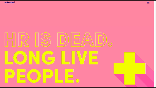
While it’s certainly an attractive website and one that’s going to stand out from the competition, it presents an uneven experience from start to finish. Visitors are more likely to focus on the surprises that wait for them around the corner instead of on reading the content on the site (which is difficult with the way it’s presented).
This website is all about building anticipation; not value.
If you look at the Smashing Magazine, for example, the design still has the opportunity to “surprise” visitors every now and again:
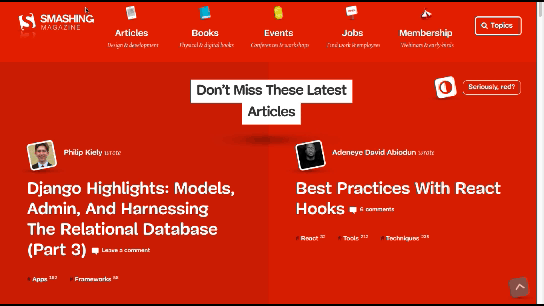
The big difference here is that hover-triggered animations don’t have to come at the expense of the predictability of the design or your visitors’ comfort levels.
Just be mindful of this. While it might seem like trying something new is what your site needs to stand out, don’t forget that you’re designing primarily for the user experience. And if users aren’t responding well to the creative choices you’ve made, it’s time to bring back a more stable rhythm to it.
3. Remove The Excess Noise
For a long time now, researchers have studied and reported on the damaging and stress-inducing effects environmental noise can have on people.
“Babisch established the modern noise reaction model, postulating an ‘indirect pathway,’ in which disturbance of sleep, communication and activity by low-level noise exposure causes changes of emotional and cognitive parameters and annoyance, followed by chronic stress reactions and adverse health effects.”
That’s no surprise to anyone who’s lived in a major city or visited one before. They’re polluted with sounds of people honking and shouting, loud buses or trains passing by, construction workers chipping away at the streets and buildings. At a certain point, it eventually gets to be too much.
This is one of the reasons why white noise machines, nature sounds and classical music are a popular means of drowning out the excess noise in our environments. They take all of the harshness and overwhelming nature of our surroundings and mute it or, at the very least, turn it down to a minimum.
When a website is designed with too much “noise”, a similar solution is needed.
But how do we define noise on websites? It’s not as though we all have auto-playing music on them anymore (at least, I hope not).
The big thing is to look for things that don’t belong there. If your design is overcrowded, remove the elements that contribute little to the user experience and conversion rate.
For example, how frequently do people engage with your live chat window? If it’s not happening frequently or the interactions aren’t meaningful, just get rid of it. The same goes for other non-essential elements. Banner ads. Auto-play on videos. Exit-intent pop-ups.
Is the interruption to the user’s experience really worth it?
Let’s use Neil Patel’s website as an example:
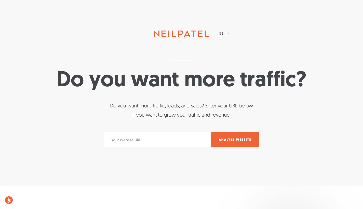
When visitors enter the home page, they’re asked: “Do you want more traffic?”
Let’s say the answer to that is “no” because the visitor has come here to read more about marketing and SEO on the blog. However, the top of the blog page again asks them the same question:
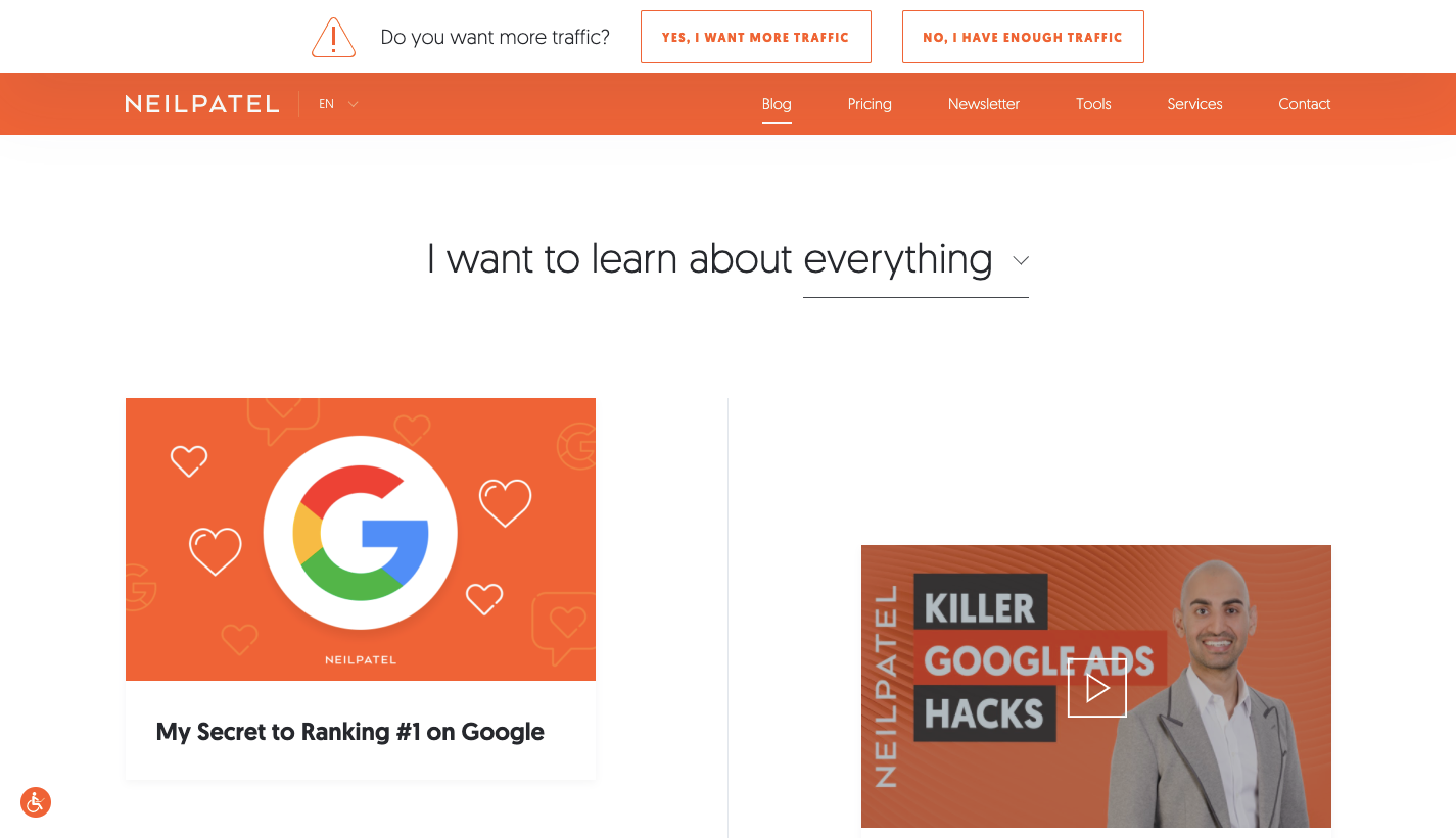
Logic would dictate that clicking “No, I have enough traffic” would remove the banner from view since no “X” is available to dismiss it. Instead, visitors who click it are taken away from the blog and returned to the home page to start the loop all over again.
This type of website friction is no different than an environmental noise or irritant — kind of like a child asking “But why?” over and over again until you give them the answer they want. Eventually, visitors are going to get fed up with the pressure to convert and leave for good (maybe not in Patel’s case, but definitely on a website for lesser-known brands).
If you notice your visitors ignoring the noise you’ve placed before them on the website, don’t try and jam it down their throats even further. Just get rid of it.
Wrapping Up
“
They’re either going to suffer through the experience and be left with a sour taste in their mouth… or they’re going to immediately bounce off the site and be left with a sour taste in their mouth.
If you want to remove the stress from your web design, look to traditional stress relief activities to iron out the issues. If you can turn your website into a relaxing and welcoming environment — while still pushing all the right buttons to drive visitors to conversion — you’ll lower your bounce rates as well as visitors’ stress levels.
Further Reading
- Getting To The Bottom Of Minimum WCAG-Conformant Interactive Element Size
- What Vitruvius Can Teach Us About Web Design
- How To Improve Your Microcopy: UX Writing Tips For Non-UX Writers
- The Scent Of UX: The Unrealized Potential Of Olfactory Design


