Modern CSS Techniques To Improve Legibility

Email Newsletter
Weekly tips on front-end & UX.
Trusted by 200,000+ folks.


We can read in many ways, and there are many different types of readers, each with their own needs, skills, language, and, above all, habits. Reading a novel at home is different from reading it on the train, just as reading a newspaper is different from browsing its online version. Reading, like any other activity, requires practice for someone to become fast and efficient. Basically, we read better those things that we are used to reading the most.
Which aspects should we take into consideration when designing and developing for reading? How can we create accessible, comfortable, inclusive experiences for all readers, including the most challenged and those affected by dyslexia?
Articles On Accessibility
At Smashing, we believe a good website is an accessible website, one which is available to everyone, no matter how they browse the web. We’ve highlighted just some of the many articles that we’re sure will help you create more accessible sites and web apps. Explore more articles →
Spaces, Words, Sentences, And Paragraphs
Units
On a web page, many units are available for us to adjust the font size of text. Understanding which unit to use is essential to setting the structure of a whole reading section. The reflowable nature of the web requires us to consider several aspects, such as the size of the viewport and the user’s reading preferences.
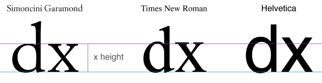
For this reason, the most suitable choices are generally em and rem, which are font-specific units. For example, setting the margins between paragraphs using ems helps to preserve the vertical rhythm as the text size changes. However, this can be a problem when a serif font is alternated with a sans-serif within a section. In fact, at the same font size, fonts can appear optically very different. Traditionally, the height of the lowercase “x” character (the x-height) is the reference for determining the apparent size of a character.
Using the font-size-adjust rule, we can, therefore, optically render fonts of the same size, because the property will match the heights of the lowercase letters. Unfortunately, this property is currently available only in Firefox and in Chrome and Edge behind a flag, but it can be used as progressive enhancement using the @support check:
@supports (font-size-adjust: 1;) {
    article {
        font-size-adjust: 0.5;
    }
}
It also helps with the swap from the fallback font to the one loaded remotely (for example, using Google Fonts).
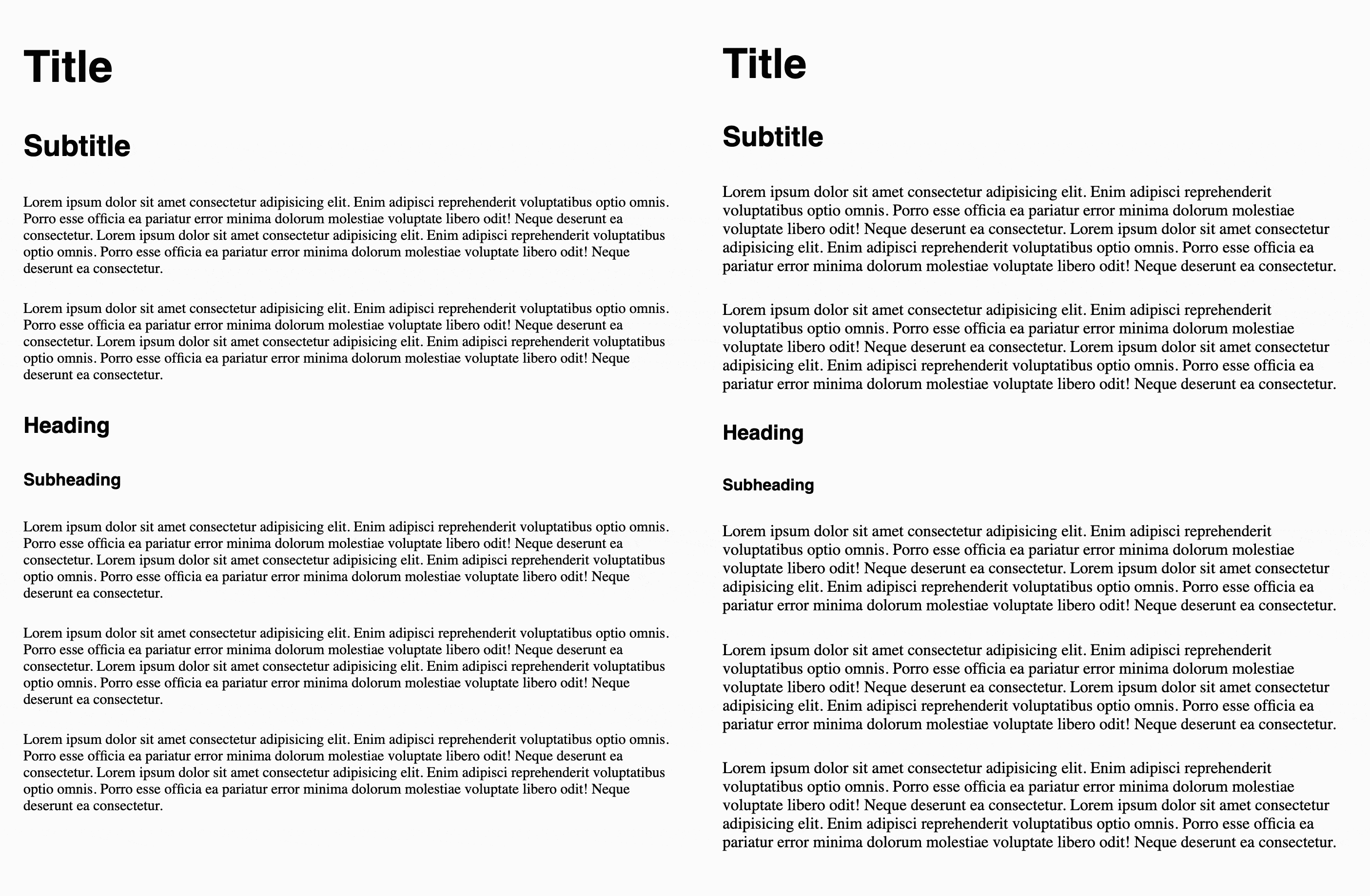
font-size-adjust to make the swap more comfortable. (Large preview)Optimal Line Height
"We think typography is black and white. Typography is really white [...] It is the space between the blacks that really makes it."
— Massimo Vignelli, Helvetica, 2007
Because typography is more a matter of “whites” than ”blacks”, when we apply this notion to the design of a website or web application, we must take into account special features such as line height, margins between paragraphs, and line breaks.
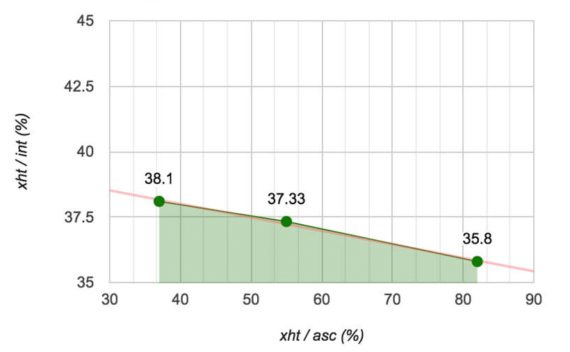
Setting the font size by relying on the x-height helps with optimizing the line height. The default line height in browsers is 1.2 (a unitless value is relative to the font size), which is the optimal value for Times New Roman but not for other fonts. We must also consider that line spacing does not grow linearly with the font size and that it depends on various factors like the type of the text. By testing some common fonts for long-form reading, combined with sizes from 8 to 14 points, we were able to deduce that, on paper, the ratio between the x-height and the optimal line spacing is 37.6.
Compared to reading on paper, screen reading generally requires more spacing between lines. Therefore, we should adjust the ratio to 32 for digital environments. In CSS, this empirical value can be translated into the following rule:
p {
    line-height: calc(1ex / 0.32);
}
In the right reading contexts, this rule sets an optimal line height for both serif and sans-serif fonts, even when typographical tools are not available or when a user has set a font that overwrites the one chosen by the designer.
Define The Scale
Now that we have adjusted the font size and used the ex unit to calculate the line height, we need to define the typographical scale in order to correctly set the spacing between paragraphs and to provide a good rhythm to the reading. As said before, line spacing does not grow linearly but varies according to the type of text. For titles with a large font size, for example, we should consider a higher ratio for the line height.
article h1 {
    font-size: 2.5em;
    line-height: calc(1ex / 0.42);
    margin: calc(1ex / 0.42) 0;
}

article h2 {
    font-size: 2em;
    line-height: calc(1ex / 0.42);
    margin: calc(1ex / 0.42) 0;
}

article h3 {
    font-size: 1.75em;
    line-height: calc(1ex / 0.38);
    margin: calc(1ex / 0.38) 0;
}

article h4 {
    font-size: 1.5em;
    line-height: calc(1ex / 0.37);
    margin: calc(1ex / 0.37) 0;
}

article p {
    font-size: 1em;
    line-height: calc(1ex / 0.32);
    margin: calc(1ex / 0.32) 0;
}
Letter And Word Spacing
When working on legibility, we must also consider readers who are challenged, such as those with dyslexia and learning disabilities. Developmental dyslexia affects reading, and discussion and research regarding the causes are still ongoing. It is important to make use of scientific studies to understand the effects that visual and typographic variables have on reading.
For example, in a study that my company followed (“Testing Text Readability of Dyslexia-Friendly Fonts”), there was clear evidence that the glyph shapes of high-legibility fonts do not really assist reading, but wider spacing between characters (tracking) does. This finding was confirmed by another study on the effectiveness of increased spacing (“How the Visual Aspects Can Be Crucial in Reading Acquisition: The Intriguing Case of Crowding and Developmental Dyslexia”).
These studies suggest that we should exploit the dynamism and responsiveness of web pages by offering more effective tools, such as controls for handling spacing. A common technique when enlarging the size of characters is to adjust the spacing between letters and words through CSS properties such as letter-spacing and word-spacing.
See the Pen Letter and word spacing by Edoardo Cavazza.
The problem with this is that letter-spacing acts unconditionally and breaks the tracking of the font, leading the page to render nonoptimal spaces.
Alternatively, we can use variable fonts to gain more control over font rendering. Font designers can parameterize spacing in a variable and non-linear way, and can determine how the weight and shape of a glyph can better adapt to the habits of the reader. In the following example, using the Amstelvar font, we are able to increase the optical size as well as spacing and contrast, as intended by the designer.
See the Pen The optical size in variable fonts by Edoardo Cavazza.
The Web.dev article “Introduction to Variable Fonts on the Web” has more detail on what variable fonts are and how to use them. And check out the Variable Fonts tool to see how they work.
Width And Alignment
To optimize reading flow, we also have to work on the width of the paragraph, which is the number of characters and spaces on a line. While reading, our eye focuses on about eight letters in a foveatio (i.e. the operation that is activated when we look at an object), and it is able to handle only a few consecutive repetitions. Therefore, line breaks are crucial: The moment of moving one’s focus from the end of a line to the beginning of the next is one of the most complex operations in reading and must be facilitated by keeping the right number of characters per type of text. For a basic paragraph, a common length is about 60 to 70 characters per line. This value can be easily set with the ch unit by assigning a width to the paragraph:
p {
    width: 60ch;
    max-width: 100%;
}
Justification also plays an important role in reading across lines. Hyphenation support for languages is not always optimal in the various browsers; therefore, it must be checked. In any case, avoid justified text in the absence of hyphenation because the horizontal spacing that would be created would be an obstacle to reading.
/* The browser correctly supports hyphenation */
p[lang="en"] {
    text-align: justify;
    hyphens: auto;
}

/* The browser does NOT correctly support hyphenation */
p[lang="it"] {
    text-align: left;
    hyphens: none;
}
Manual hyphenation can be used for languages that do not have native support. There are several algorithms (both server- and client-side) that can inject the ‐ entity within words, to instruct browsers where the token can be broken. This character would be invisible, unless it is located at the end of the line, whereupon it would render as a hyphen. To activate this behavior, we need to set the hyphens: manual CSS rule.
Foreground Contrast
The contrast of characters and words with the background is fundamental to legibility. The WCAG has defined guidelines and constraints for different standards (A, AA, AAA) governing the contrast between text and background. Contrast can be calculated with different tools, both for design and development environments. Keep in mind that automated validators are support tools and do not guarantee the same quality as a real test.
By using CSS variables and a calc statement, we can dynamically calculate the color that offers the best contrast with the background. In this way, we can offer the user different types of contrast (sepia, light gray, night mode, etc.), by converting the whole theme according to the background color.
article {
    --red: 230;
    --green: 230;
    --blue: 230;
    --aa-brightness: calc((
        (var(--red) * 299) +
        (var(--green) * 587) +
        (var(--blue) * 114)
    ) / 1000;
    --aa-brightness: calc((
    (var(--red) * 299) +
    (var(--green) * 587) +
    (var(--blue) * 114)
) / 1000);


    --aa-color: calc((var(--aa-brightness) - 128) * -1000);
    background: rgb(var(--red), var(--green), var(--blue));
    color: rgb(var(--aa-color), var(--aa-color), var(--aa-color));
}
See the Pen Automatic text contrast by Edoardo Cavazza.
In addition, with the introduction and cross-browser support of the prefer-color-scheme media query, it becomes even easier to manage the switch from light to dark theme, according to user preference.
@media (prefers-color-scheme: dark) {
    article {
        --red: 30;
        --green: 30;
        --blue: 30;
    }
}
Going Forward
Designing and developing for optimal reading require a lot of knowledge and the work of many professionals. The more this knowledge is spread across the team, the better off users will be. Below are some points to lead us to good results.
For Designers
- Consider semantic structure as being part of the project, rather than a technical detail;
- Document layout and font metrics, especially the why’s and how’s of your choices. They will help developers to correctly implement the design;
- Reduce typographic variables as much as possible (fewer families, styles, and variants).
For Developers
- Learn the principles of typography in order to understand the design decisions made and how to implement them;
- Use units relative to font size to implement responsive layouts (paddings, margins, gaps) that scale to user preferences;
- Avoid unrestrained manipulation of font metrics. Legibility might suffer when font constraints are not respected.
For Teams
- Read and understand the principles of the WCAG;
- Consider inclusion and accessibility as part of the project (rather than separate issues).
Reading is a complex activity. Despite the many resources on web typography and the academic papers that identify areas for improvements, there is no magical recipe for achieving good legibility. The number of variables to consider might seem overwhelming, but many of them are manageable.
We can set the optimal line height of a paragraph using the ex unit, as well as set a paragraph’s width using the ch unit, in order to respect the user’s preferred browser settings for font size and family. We can use variable fonts to adjust the spacing between letters and words, and we can manipulate the stroke of glyphs to increase contrast, helping readers with visual impairments and dyslexia. We can even automatically adjust text contrast using CSS variables, giving the user their preferred theme.
All of these help us to build a dynamic web page whose legibility is optimized according to the user’s needs and preferences. Finally, given that every little implementation or technological detail can make a huge difference, it is still essential to test users’ reading performance using the final artifact.
Related Resources
- “Testing Text Readability Of Dyslexia-Friendly Fonts,” Galliussi, Perondi, Chia, Gerbino, Bernardis (2020)
- “How The Visual Aspects Can Be Crucial In Reading Acquisition: The Intriguing Case Of Crowding And Developmental Dyslexia,” Gori, Facoetti (2015)
Further Reading
- Modern CSS Layouts: You Might Not Need A Framework For That
- Generating Unique Random Numbers In JavaScript Using Sets
- A Designer’s Accessibility Advocacy Toolkit
- Mobile Accessibility Barriers For Assistive Technology Users
 (ra, yk, al, il, mrn)

