Information And Information Architecture: The BIG Picture

Email Newsletter
Weekly tips on front-end & UX.
Trusted by 182,000+ folks.

 Custom Web Forms for Angular, React, & Vue. Your backend.


 Celebrating 10 million developers
We are living in a world exploding with information, but how do we find what is relevant to us at the time that we need it? I believe that good information architecture is key to helping us navigate through the mountains of data and information we have created for ourselves.
In this article, we will first describe what information architecture is, why it’s important, and approaches to effective implementation. Then we explore ideas around the broader view of the information age, how we use information, and how it impacts our world and our lives. These insights are designed to help you to understand the bigger picture, which enables us to grasp the value that good information architecture delivers to help our information-overloaded lives.
What Is Information Architecture And Why Is It Important?
“Information architecture is the practice of deciding how to arrange the parts of something to be understandable.”
— The Information Architecture Institute
From a user experience perspective, this really means understanding how your users think, what problems they are trying to solve, and then presenting information in a logical way that makes sense from within this context.
Whether it is a website, a software application or a smartphone app, it’s about first designing the structure of how your information is organized, and then translating this into a logical navigation hierarchy that makes sense to the users who will be accessing it. In this world where we can sometimes feel as though we are drowning in data, information architecture provides us with a logical way of organizing this data to make it easier to locate.
Here are some other reasons why good information architecture is important:
For The User
- It reduces cognitive load.
Too much information on a screen with no clear pathway can make it difficult for a user to focus. Too many options can lead to choice deferral where a user chooses not to make a decision at all. - It speeds up the process of finding the right information.
This is the opposite of choice deferral, where the user is able to easily locate what they are looking for with clear navigation choices. - It can keep the user focussed on the task they are trying to achieve.
If the task a user is engaging in is easy to follow without additional non-contextual navigation elements, it’s less likely they will be distracted. - It makes it easier to analyze and understand information by the addition of context.
Providing a visual navigation path of exactly where the user is within a website can provide more context for the content they are viewing. For example, during an online bank account application, displaying the total number of steps in the process and visually indicating exactly which step you are at, and what the next steps may involve gives context to the flow. - Reduces frustration and contacting support.
If it is clear to the user where they can find what they need, there is no need to request help. For example, if a customer has received a purchased item that is faulty, without obvious instruction on how to rectify the situation, they may call the customer support center.
Below are a couple of examples helping to illustrate the points about the user.
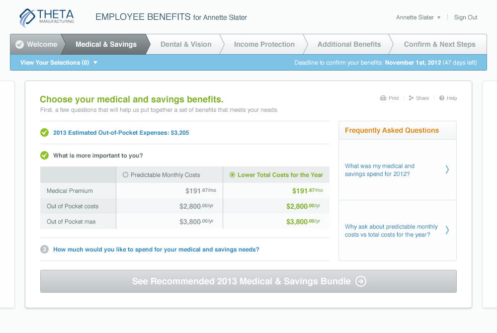
The example above demonstrates:
- The use of a “wizard” style application form and illustrates many of the points above.
- Clear navigation steps across the top of the page providing context as to where the user is in the process.
- Simple choices to guide the user.
- Contextual information links in the form of FAQs relating to the step the user is at.
- Navigation button at the bottom of the page giving specific instructions for the next step.
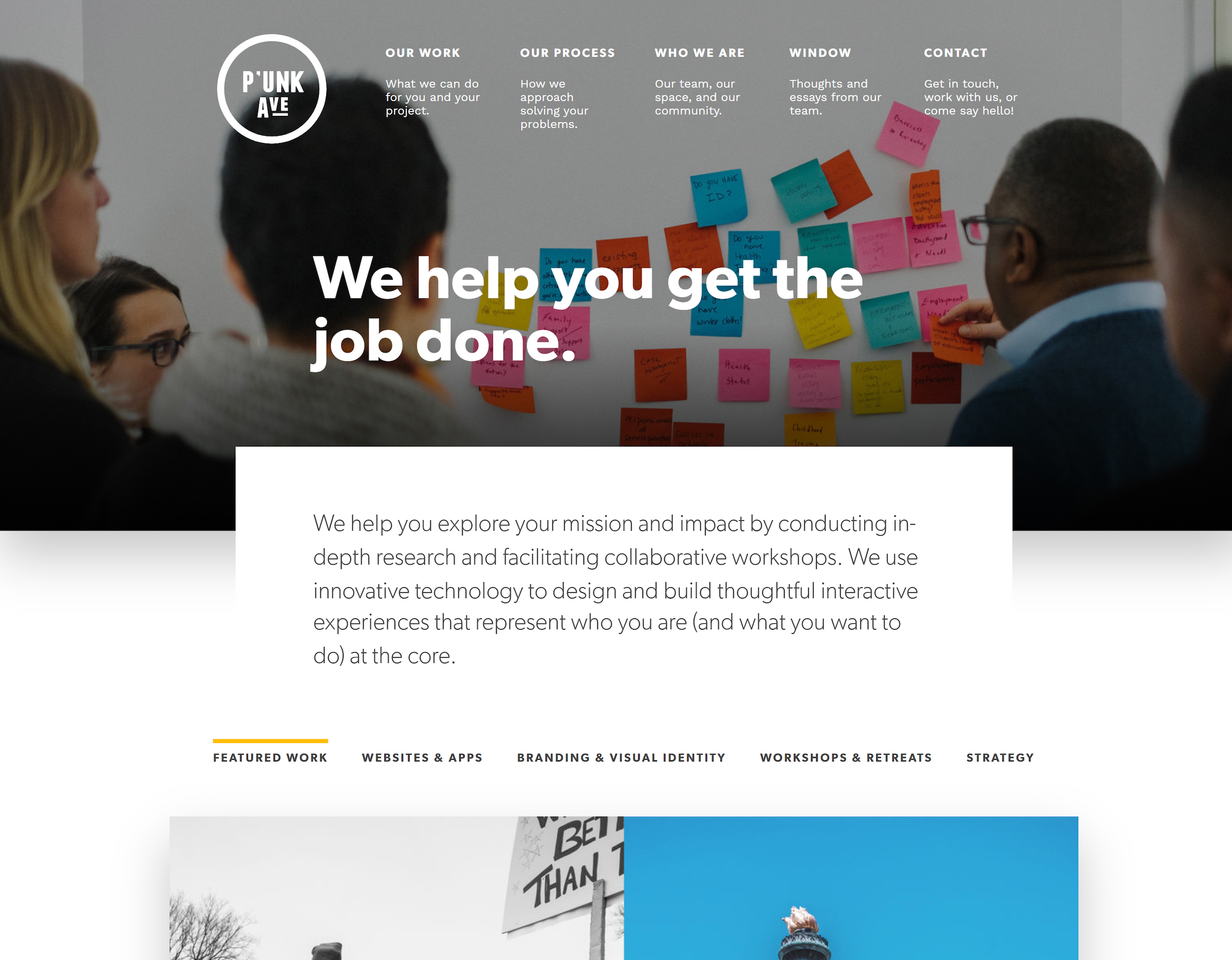
The website example above, Punk Avenue shows another example of clear main navigation, with a brief summary of what you will find on each page. Below that is a series of tabs that keep you on the same page and visually indicate what information you are viewing.
For A Business
- Keeps customers on their website for longer.
Research shows that visitors to a website will often leave within 10-20 seconds, but with a clear purpose, you can engage your visitors for a longer period. Although good design and messaging help to present the site’s value proposition, a well-designed navigation display can also contribute to demonstrate what kind of information supports this value proposition. - Increases the chance of customer conversion.
If your site visitor can find what they want via the navigation, and there are simple and minimal steps provided on how to acquire it, the chances of conversion are far higher than a site design that is unable to direct the user to the right information. - Reduces risk of customers going to a competitor.
If a visitor to your site can easily find what they are looking for through effective navigation and good design, chances are they’ll stay there rather than move onto the next Google search result. - Reduces duplication of information (by design).
Good information architecture can ensure that the same or similar content is not replicated. Understanding and documenting the content structure, particularly on information-heavy sites, can prevent these potential issues. - Better ROI through efficient use of the platform.
The investment spent on ensuring that the information architecture on your site is effective and makes sense to your users is a compelling way to increase your customer conversions and the income derived from those sales. - Reduces cost of support when a user can’t find something.
As described earlier, creating an unnecessary load on the customer support team is an additional cost that can be avoided by a site that functions well and provides assistance for customers when they need it.
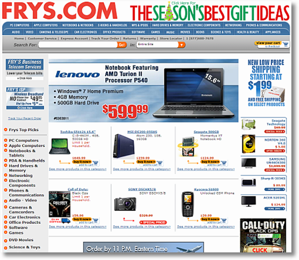
The example below helps to illustrate some of the points above about business.
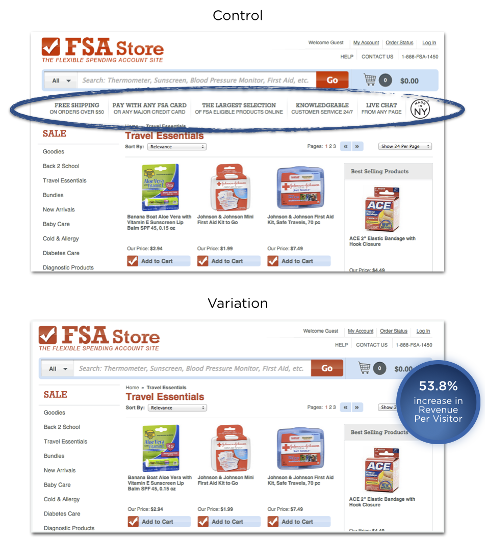
The example above demonstrates how poor navigation displays can impact customer conversion. This case study shows an increase in customer revenue by 53.8%. The additional information in-between the search bar and the products was removed which also served to move the product display closer to the top of the page. The vertical information that was removed created the effect of what may have been perceived as a superfluous navigation bar, or maybe just information that was not considered relevant for a user in their product search.
When thinking about designing the information architecture for your website or app, efficient site navigation is crucial.
“
If your website is content-heavy, you may also consider the use of site search. Let’s explore some research around site search vs navigation.
Search Vs Navigation
In 1997, Jakob Neilson conducted a study that showed over 50% of website users would use the search function over site navigation. In 2012, econsultancy.com reported that 30% of website visitors to e-commerce sites will use the site search, while a Kiss metrics study found that 40% of users preferred using search. In 2010, Gerry Mcgovern’s study demonstrated 30% of users preferring search.
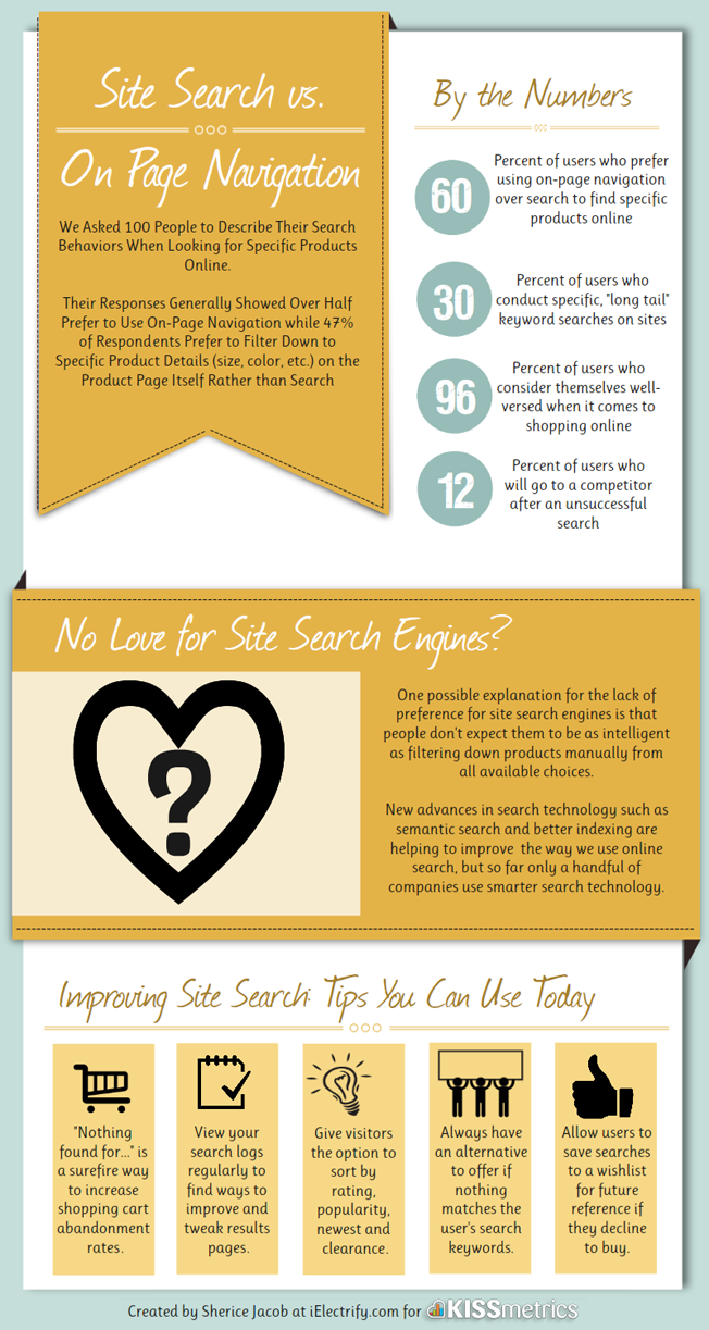
Although the relationship between these findings may seem elusive, one thing is clear; and that is that users will use both site search and site navigation to find information, in varying proportions.
In order to provide the best user experience for your customers, you may need to consider integrating a site search, in conjunction with an effective and well-designed site navigation if your website has a complex structure and large amounts of information.
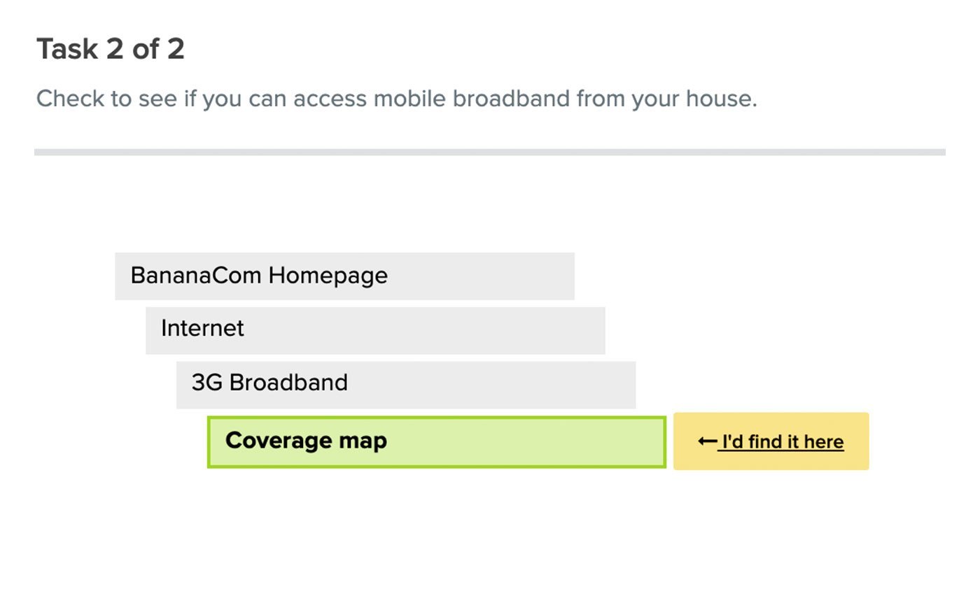
Here is a practical example of where a site search would be useful for site visitors. Let’s say you visit a website that sells cleaning and health products, and you were looking to buy some antibacterial hand wash. There are two categories you can see, “Body Washing Products” and “Skin Cleansers”. Which one do you choose?
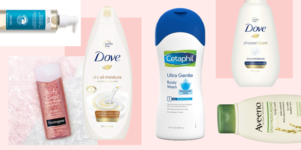
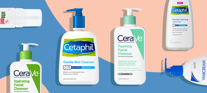
And if you were to browse these categories that may have products listed alphabetically, there may be a large list to scan through. Below are some similar phrases that could be used, depending on what any individual’s idea of antibacterial hand wash could also be called:
- hand sanitizer
- sanitizing soap
- hand disinfectant
- disinfectant hand wash
- hand sterilizer
- hygienic soap
- antiseptic handwash
If you are looking for “hygienic soap”, it may take you a while to scan the list to find the “antibacterial hand wash”. As it is difficult to cater to all possible synonym variations in the navigation structure of a site, a well-designed site search can allow users to search for these variations, by adding what we call metatags to each piece of content. For example, the “antibacterial hand wash” product could have additional hidden information or tags that include all the terms listed above, allowing users to search for any of these and return search results that match.
The Politico website below uses both navigation and a search function. It demonstrates an example of a content-heavy site that groups the information into categories making it easier to find topics. The site utilizes a “megamenu” which is accessed from the top left corner of the page. This is a common way to provide a menu of options with categories and subcategories that can be used for those visitors that want to browse content, and the search function can be used to locate a specific piece of information.
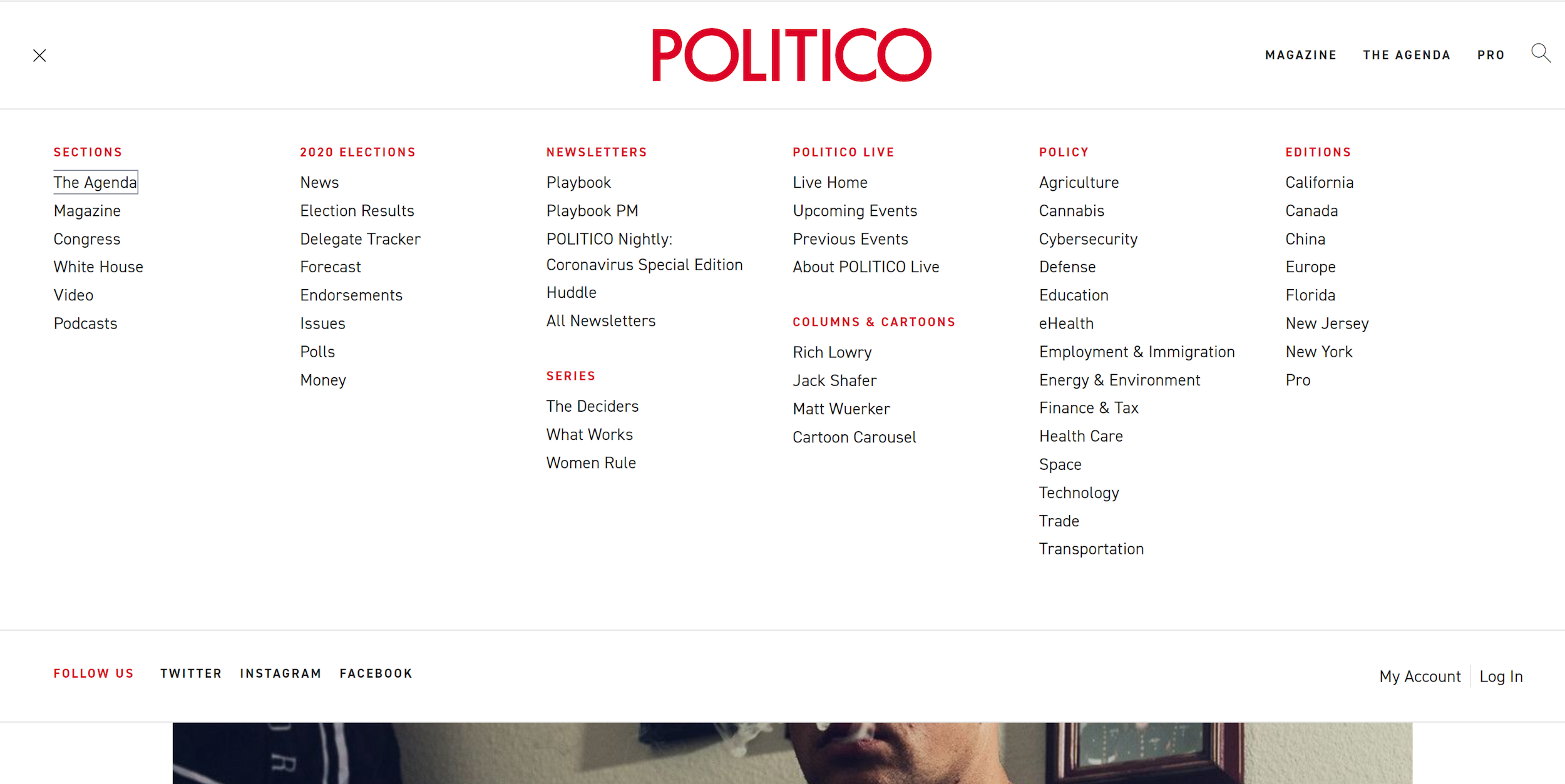
According to research from measuringu.com, about 14% of users will start with a search and the rest will start by browsing through the navigation options.
Good And Bad Information Architecture Examples
Let’s review some website examples demonstrating good and bad uses of information architecture. Great navigation is a reflection of well-designed information architecture that considers the target audience’s needs.
Useful Navigation
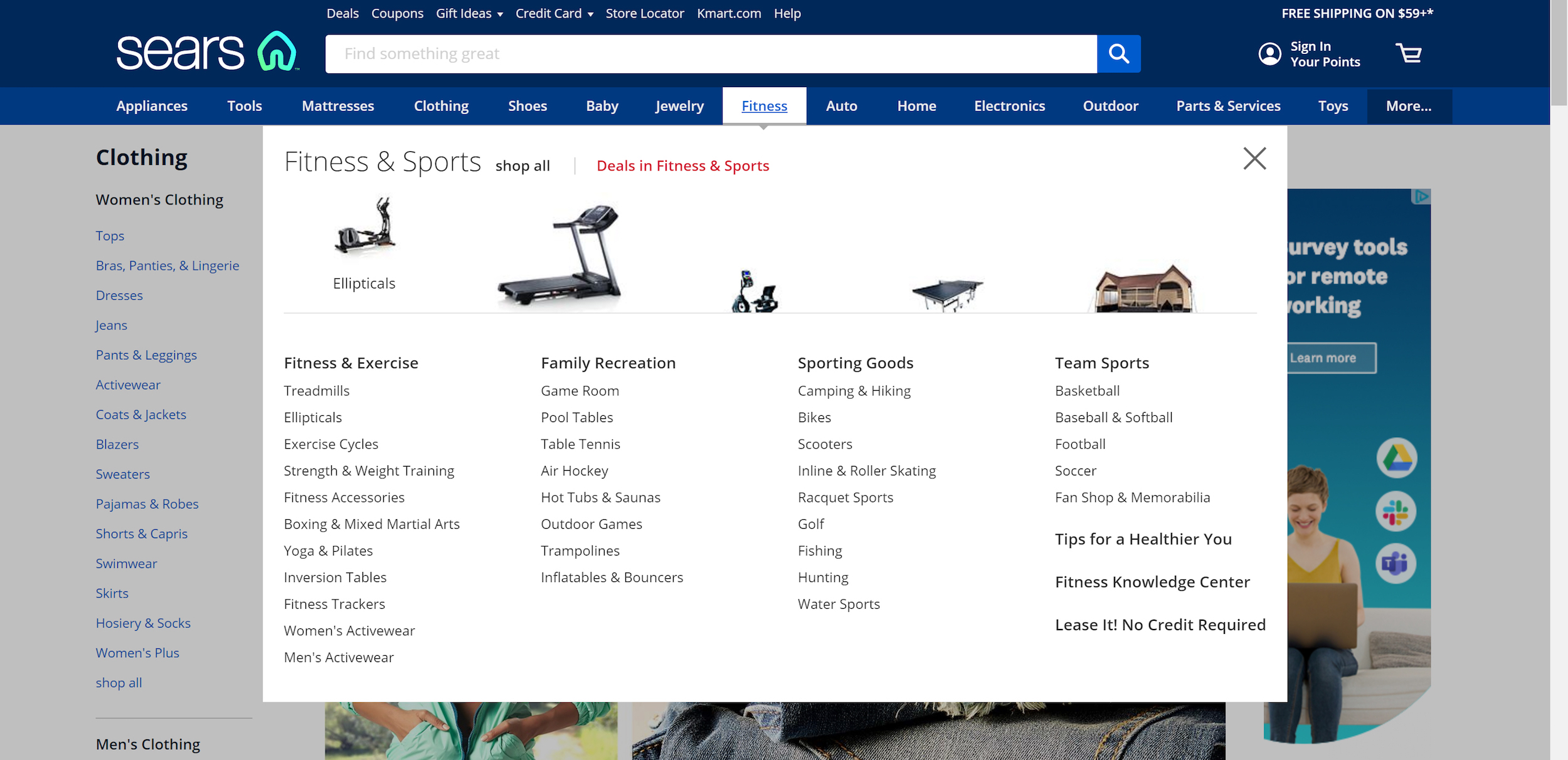
This Sears website makes good use of mega drop-down menus. These help to provide navigation options to sub-categories that are clearly grouped. It also uses images to provide much faster cognition for the user.
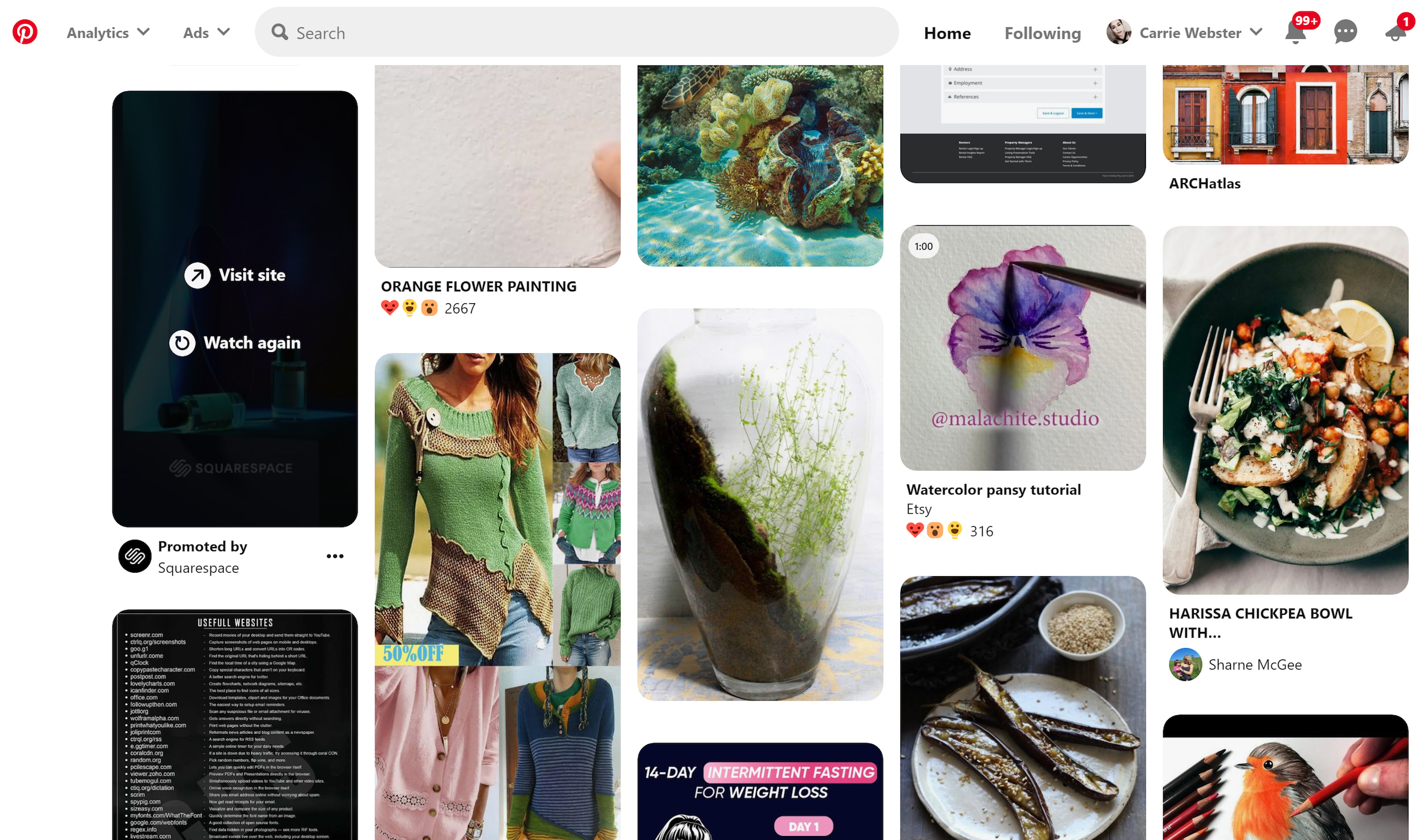
Visual Navigation Driven By Search
Pinterest demonstrates a useful way to present visual user-generated content based on search terms. The search is the navigation. This works well based on the sheer amount of content available on the site, which would make it difficult to provide a simple navigation system based on categories.
Overwhelming Navigation
This website example is complete information overload with bad use of white space and way too many choices. It doesn’t help that the design of the website is cramped making it hard to identify all the options available.
How Do You Get It Right?
Here is a brief list of considerations and processes to use when you are designing the information architecture for a product or service.
- First understand your user’s needs and what tasks they are trying to achieve.
You can conduct user interviews to really understand what problems your product or service is solving. From here, think about how they might interact with your website and what pathways they could take to achieve their objectives. - Try to create a hierarchy with minimal sub-levels.
If you can achieve this, then the user can access any information on your site with a maximum of two clicks.
- Don’t use jargon in the navigation language.
Understand the language of your audience. Test with your users to ensure they understand the correct meaning of the language used. - Don’t rely on images or icons alone as a navigation tool.
There are very few universally understood icons, such as Help, Error, and Print, and these may differ culturally.

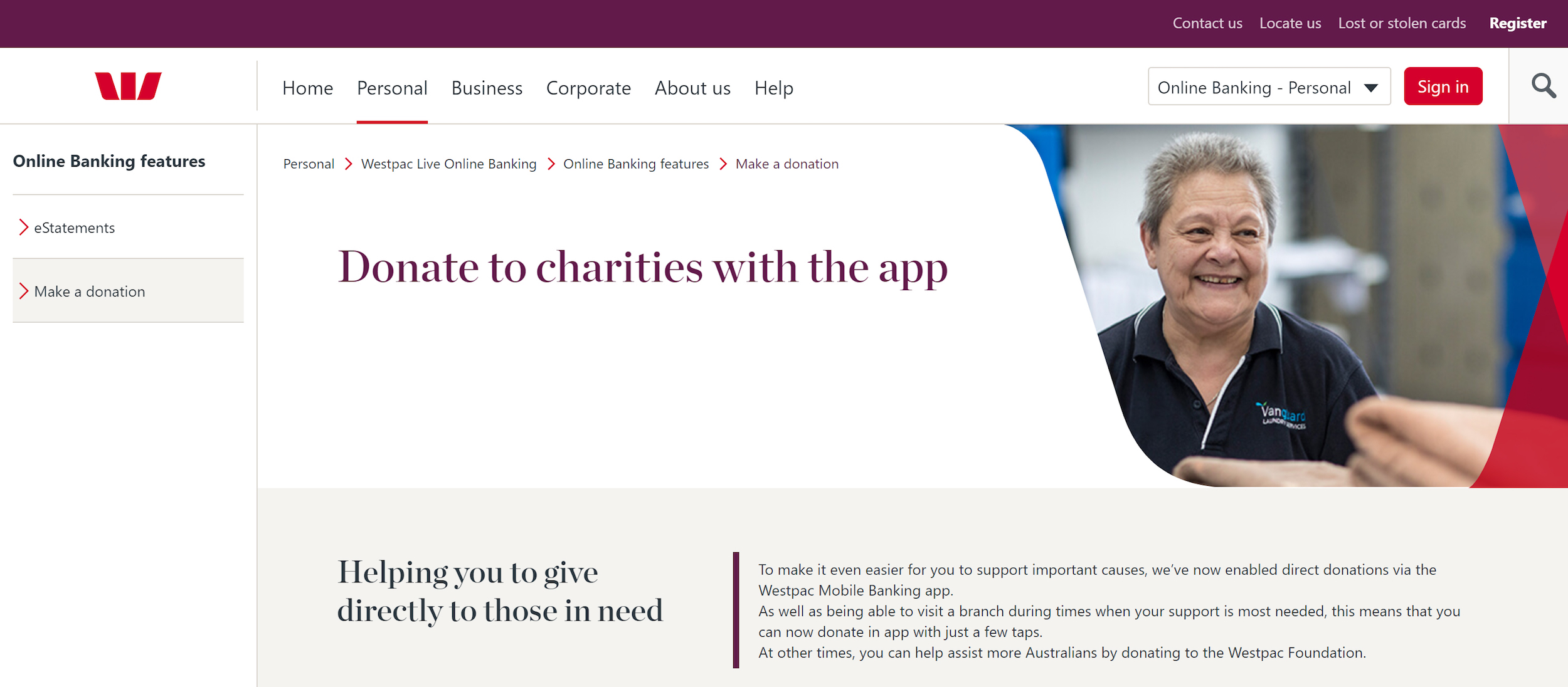
- Always indicate to the user exactly where they are within the site so they can easily navigate back to a previous page. Breadcrumb navigation is one example of how to do this effectively as shown in the example below. It can sit below the main navigation showing you each page you have clicked on with the current location displaying as the last on the right.
- Use design to create distinct visual differences between the hierarchy levels.
For example, a top-level hierarchy heading may be displayed with a larger font size. These visual differences can guide the user’s eye to more important information first. It can also be the job of the visual designer to help differentiate these areas.
Methods To Test Your Navigation
Card Sorting
Write out the name of each information section on paper, and have participants sort cards containing all your navigation sections into groups that make sense to them. Try doing this same sort with at least five participants so you can start to identify patterns and preferences for the categories and subcategories that are created. This is called an open card sort. A closed card sort can be used if you decide to have predetermined top-level categories that the participants place the cards under based on what makes sense to them.

Recommended reading: Card Sorting Beginner’s Guide: Improving Your Information Architecture
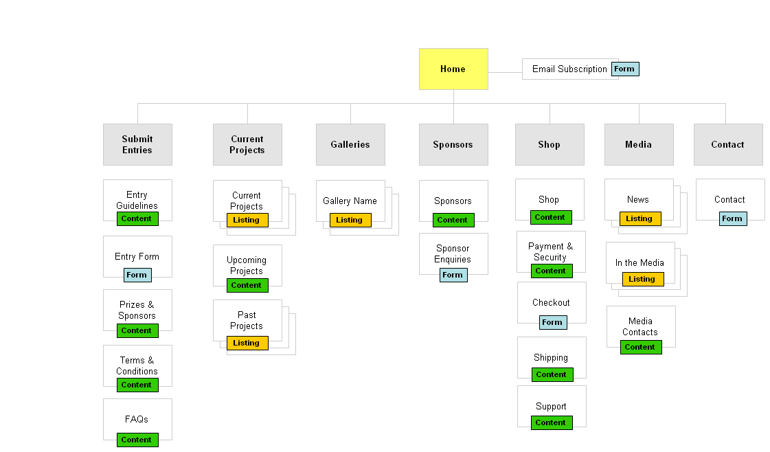
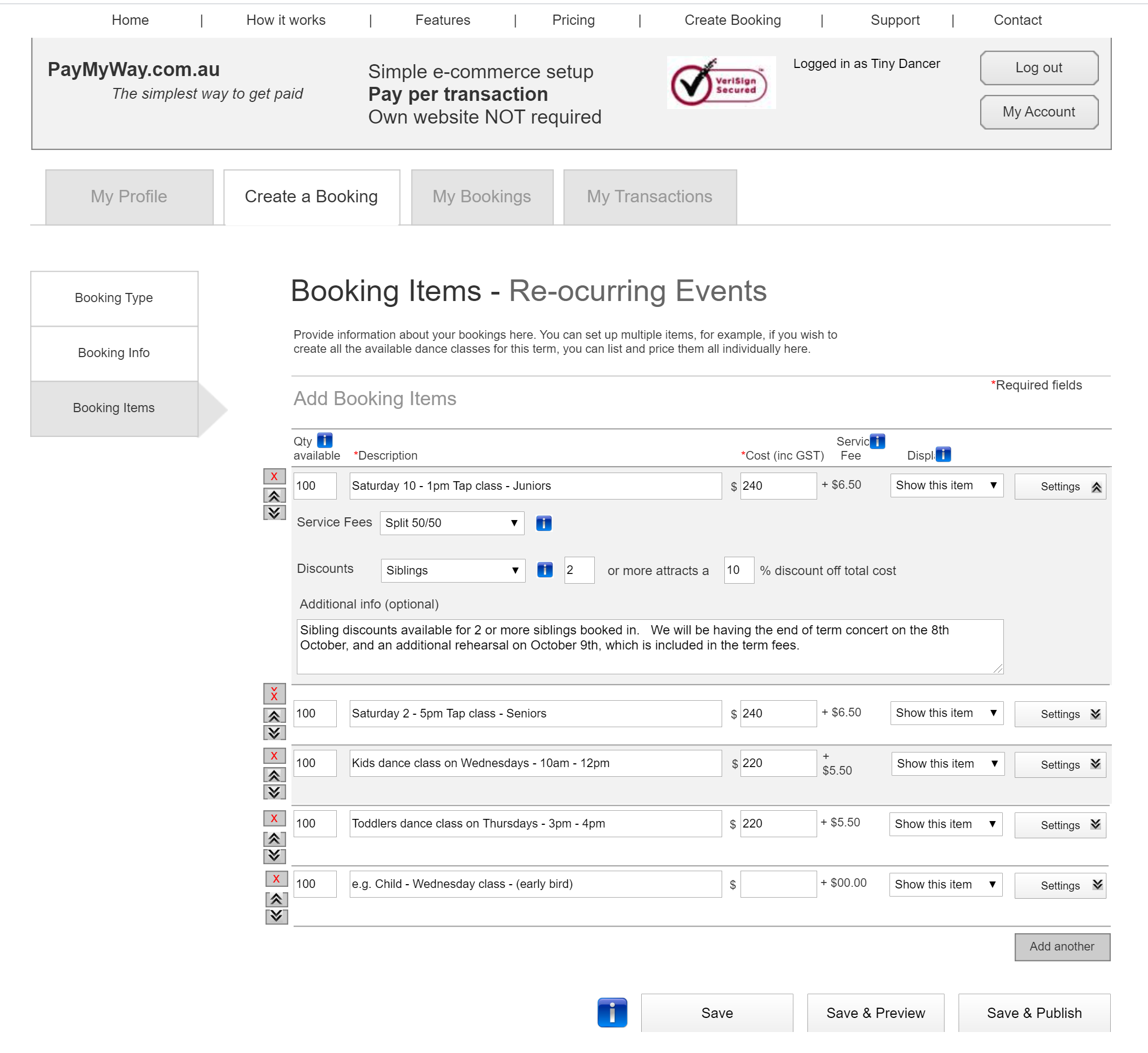
Scenario Testing
By using a wireframe or prototype, ask participants to complete a specific task by navigating through the site. You can use a clickable wireframe to test this by observing how clear it is for a user to carry out the activity. An example task (refer to the wireframe below) might be to register on the website and then make a booking for a single event and publish it.
Tools
Treejack is a tool that allows you to validate your navigation structure. It asks the participants to indicate where they would look to find specific information and provides you with insightful actions.
Free Keyword Tools
You can use free tools to help to identify commonly used search terms that can help with language choice in your navigation. For example, answerthepublic.com is a free site that allows you to enter a search term to see what other related search terms are being used.
We’ve covered the basics of information architecture, and now it’s time to move onto the bigger picture, the Information Age. Understanding context around the massive amounts of data and information we are surrounded by can help to shape your outlook as a UX designer, as it has helped inform the direction and approach to my own design practice.
The Information Age
We live in a time where our access to information is unprecedented. It is instantaneous, it is global, it is everywhere, it is the Internet. News stories are broadcast as they unfold, communication with friends and family in other parts of the world has never been easier, and Google has become our personal library of virtually limitless topics. Information is king and queen.
Key Facts About Information
- 90% of the world’s data has been created in the past 2 years.
- The amount of data in the world doubles every two years.
- If all the data in our world was stored on 128G iPad tablets, they would create a stack going from the Earth to the Moon 6.6 times!
- Only 37% of all data is considered “useful”. And of that 37%, a much smaller percentage is actually analyzed.
- 33 percent of managers feel that information overload was impacting their health.
- 66 percent of managers reported increased conflict with teammates as well as reduced job satisfaction.
And finally, let’s examine how information can be used and abused in this age of information.
“
The Power Of Information
“With power comes great responsibility.”
This famous quote is often attributed to Uncle Ben from Spiderman. We can think of this in reference to how powerful information can be, but when in the wrong hands, there is an opportunity to abuse this power. Below is my perspective on how the power of information can manifest in our world, and why it is both a precious and dangerous commodity.
“Information Is Power”
Internet activist, Aaron Swartz, took his life in 2013 at the age of 26. Aaron was the original creator of Reddit, and among many achievements, his untimely death occurred when he was fighting felony charges for illegally accessing and downloading academic information. He wrote a manifesto that called for activists to “liberate” information secured by corporations, and campaigned against Internet censorship.
We recognize that information alone is useless if no one can find it. And then once it is made available, it needs to be acted upon. On a large scale, information can be shared to protect public health and safety, to help governments to create better policies and to empower individuals to live better lives. It can also be used for propaganda purposes for political gain, to create fear for the purpose of control, and to instill beliefs for the sole purpose of financial profit.
Information Can Change World Events In An Instant
How quickly have governments pivoted and changed their approach to the COVID-19 pandemic based on new information? Not to mention the release of conflicting information from alternate sources that has also created mass confusion.
An example of this pivot was seen in Australia, when our Prime Minister announced non-elective surgery would be suspended from March 26, but just hours later, it was moved to April 1st after the health minister met with the private hospital sector that afternoon. This was due to the updated information received that would see the stand-down of medical staff, even as hospitals prepared for a surge in COVID-19 cases.
Dangers Of Misinformation
In current times, examples: “Fake news” claims, presidential tweets, and allegations of misinformation coming from China around the COVID19 pandemic. Donald Trump who is attributed with the reference to “Fake News”, now more generally attributes incorrect news reporting to journalists and media outlets such as CNN.
Unfounded “conspiracy theories” are another example of ways to link seemingly related information points that have no solid relationship evidence. For example:
- Allegations that the Coronavirus was created in a lab in Wuhan, China, currently has no evidence to support it.
- There are also stories circulating that 5G is somehow connected to Coronavirus.
- Bill Gates is responsible for the pandemic.
- US Army Reservist Maatje Benassi has been accused of being patient zero in the COVID-19 pandemic by bringing the virus to Wuhan in 2019 in collusion with the US Government.
Information Security
In 2018, it was revealed Facebook was exposed to a massive security breach after hackers exploited a vulnerability to access user’s personal data. The impact of the access to this kind of personal information could have ramifications for those individuals impacted for years to come.
In July 2017, shortly after I left employment at Equifax (no connection whatsoever!), a data breach impacting over 147 million people occurred in the US. The data exposed included Social Security numbers, birth dates, and some credit card details. After spending $1.4 billion on security upgrades, it is still resolving ongoing class actions from consumers that were impacted.
The importance of protecting privacy and personal data has become increasingly important throughout the world. 132 of 194 countries currently have legislation in place to protect the sharing of personal information without consent, and the data and privacy of individuals. In 2017-18 there was a 10% rise in the number of countries enacting data privacy laws.
Based on the examples above, it is clear that information in itself doesn’t discriminate for good or for evil. That’s why it is so important to validate data sources and analyze information before taking it on board.
Conclusion
We have reviewed how we use information, the power it yields, the sheer volume of data we have created, the impacts of information overload, and how information architecture can be used to organize and structure this information for those seeking it. There is no denying that in this age of Information why it is so important to focus on information architecture as a solid foundation for delivering the right information to your customers to make their lives easier.
Further Reading
- Is Your Website Stressing Out Visitors?
- What Vitruvius Can Teach Us About Web Design
- Readability Algorithms Should Be Tools, Not Targets
- Designing The Words: Why Copy Is A Design Issue


