Is Redesigning Your Mobile App A Bad Idea?

Email Newsletter
Weekly tips on front-end & UX.
Trusted by 182,000+ folks.
 Custom Web Forms for Angular, React, & Vue. Your backend.
 Celebrating 10 million developers


I’m all for updating and upgrading mobile apps. I think if you’re not constantly looking at ways to improve the user experience, it’s just too easy to fall behind.
That said, a redesign should be done for the right reasons.
If it’s an existing app that’s already popular with users, any changes made to the design or content should be done in very small, incremental, strategic chunks through A/B testing.
If your app is experiencing serious issues with user acquisition or retention, then a redesign is probably necessary. Just be careful. You could end up making things even worse than they were before.
Let’s take a look at some recent redesign fails and review the lessons we can all learn from them.
Lesson #1: Never Mess With A Classic Interface (Scrabble GO)
Scrabble is one of the most profitable board games of all time, so it’s no surprise that EA decided to turn it into a mobile app. And it was well-received.
However, that all changed in early 2020 when the app was sold to Scopely and it was redesigned as an ugly, confusing and overwhelming mess of its former self.
Let me introduce you to Scrabble GO as it stands today.
The splash screen introducing gamers into the app looks nice. Considering how classically simply and beautiful the board game is, this is a good sign. Until this happens:
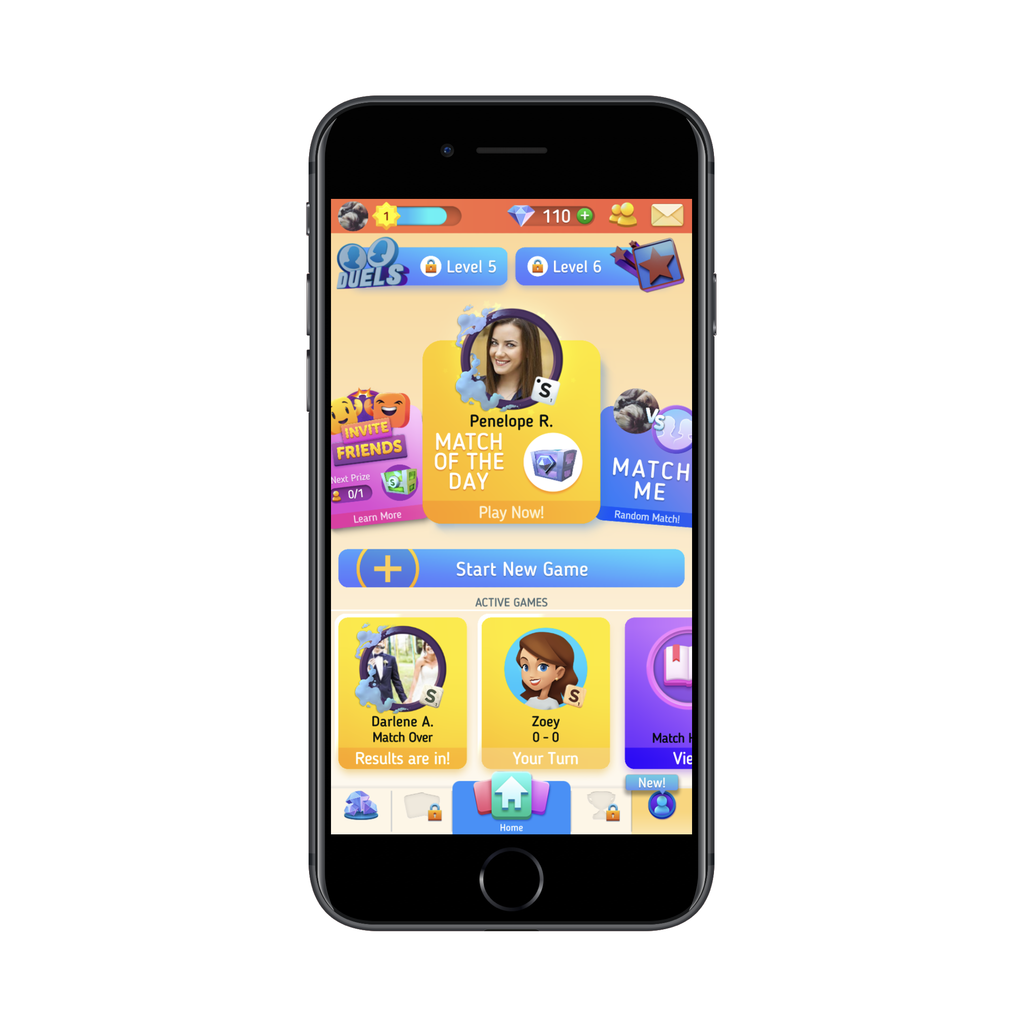
I don’t even know where to start with this, but I’m going to try:
- The colors are way over-the-top and there are too many.
- Since “Start New Game” is the primary action users want to take, it should be the only button in that color, but “Level 5” and “Level 6” distract from it.
- The interface is so cluttered that it’s hard to focus on any particular part of it.
- There’s no sense of control or priority within the design.
- The navigation has gated pages! And I’m not sure what that icon on the left is supposed to be… gems and rewards? Why then is there a gem counter in the top banner?
Beyond the UI of the homescreen, the UI and UX within the game board have been altered, too.
Take, for instance, this plea from @lageerdes on Twitter:
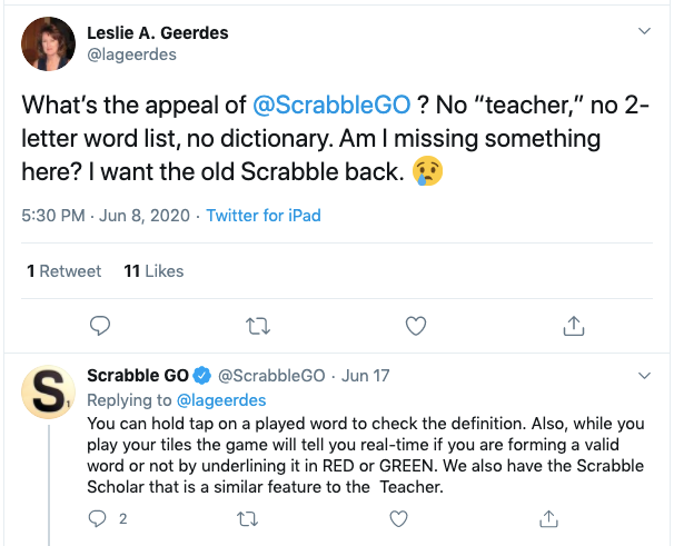
It took Scrabble GO over a week to tell @lageerdes something that could’ve easily been spelled out in a game FAQ or Settings page. These aren’t the only classic features that the new app has either complicated or done away with.
Now, Scopely took note of the negative comments from users and promised to revamp the app accordingly (which was promising). But rather than revert back to the old and much-loved design, it just added a new mode:
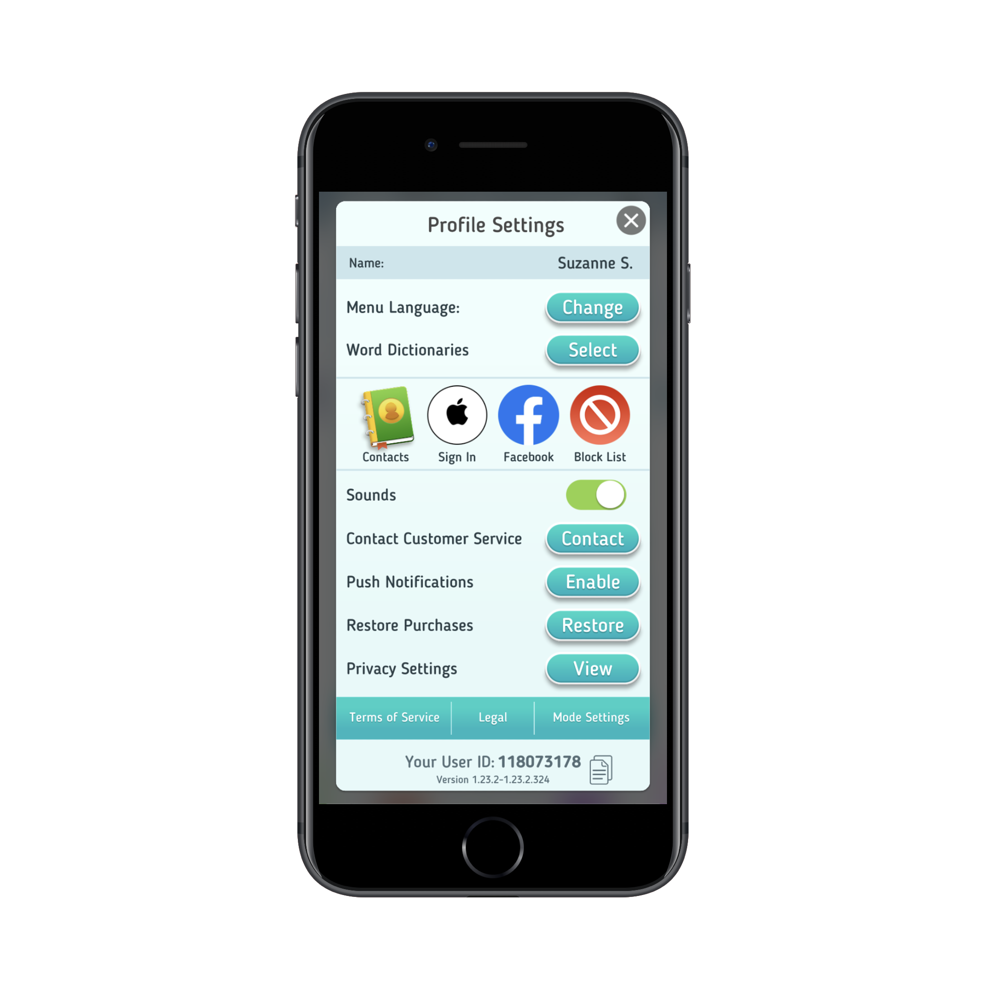
You’d think that the mode switcher would be more prominently displayed — like in the menu bar. Instead, it’s buried under the “Profile Settings” tab and there’s no indication anywhere in the app that the classic mode even exists.
Sadly, classic mode isn’t much of an improvement (classic is on the right):
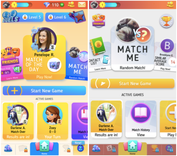
The colors are toned down, some of the elements in the top-half have been cut out or minimized, but it doesn’t address any of the users’ issues with the app or game play.
Worse, many users are reporting the app crashes on them, as this complaint from Twitter user @monicamhere demonstrates:
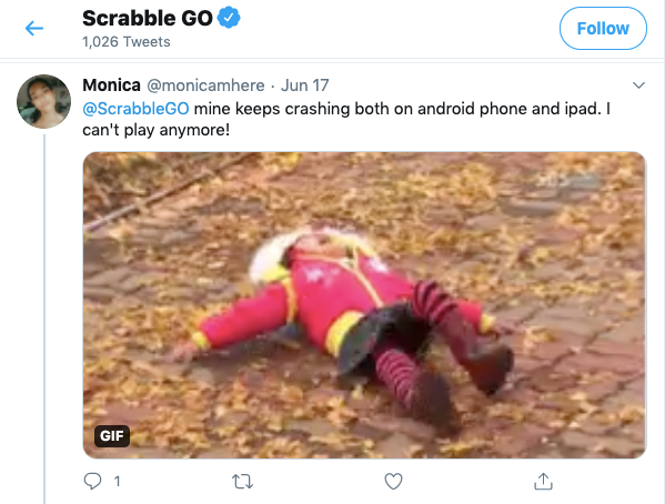
I suspect this is happening because the developers jammed a second overloaded mode into the app rather than simply refine the existing one based on user feedback.
So, what’s the lesson here?
- For starters, don’t mess with a classic.
The old mobile app closely resembled the physical board game and it was a huge part of its appeal. When you throw out an old design for something (seemingly) more trendy, you run the risk of alienating once-loyal users. - Also, if it ain’t broke, don’t fix it.
Previously, the app was very easy to use and came with all the features and functionality users were familiar with from the board game. Now, they’re left with a non-intuitive and distracting mess. - If your users are telling you to ditch the redesign, listen to them.
Who are you building this app for? Yourself or the users who are going to play with it and put money into your pocket?
Listen to what your users have to say. It’s valuable feedback that could make a world of difference in the user experience.
Lesson #2: Never Mislead Users At Checkout (Instacart)
This is an interesting case because the people who objected to this particular Instacart UI update weren’t its primary users.
Here’s why the change was an issue:
Users go onto the Instacart website or mobile app and do their grocery shopping from the local store of their choice. It’s a pretty neat concept:

Users quickly search for items and add them to their virtual shopping cart. In many cases, they have the option to either do curbside pickup or have the groceries delivered to their front doorstep. Either way, a dedicated “shopper” picks out the items and bags them up.
When the user is done shopping, they get a chance to review their cart and make final changes before checking out.
On the checkout page, users get to pick when they want their order fulfilled. Beneath this section, they find a high-level summary of their charges:
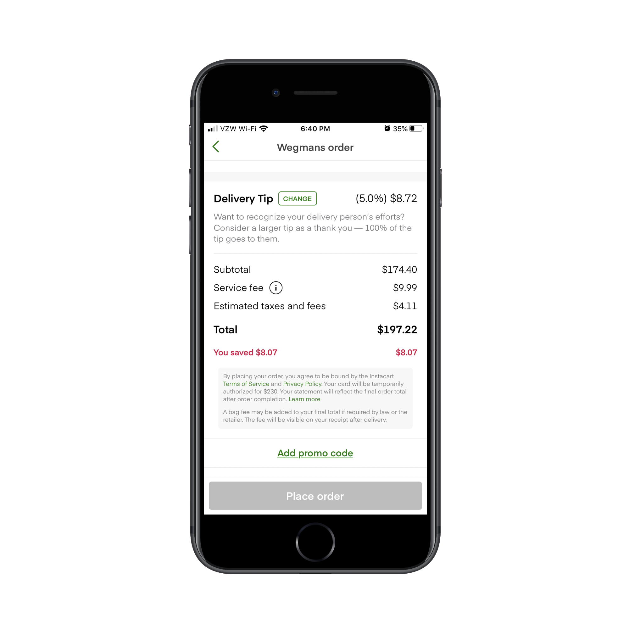
At first glance, this all appears pretty-straightforward.
- The cost of their cart is $174.40, which they already knew.
- There’s a service fee of $9.99.
- Sales tax is $4.11.
- And the total is $197.22.
But before all that is a section called “Delivery Tip”. This is where Instacart’s shoppers take issue.
They argued that this is a dark pattern. And it is. Let me explain:
The first thing that’s wrong is that the Delivery Tip isn’t included with the rest of the line items. If it’s part of the calculation, it should be present down there and not separated out in its own section.
The second thing that’s wrong is that the tip is automatically set at 5% or $2.00. This was the shoppers’ biggest grievance at the time. They believed that because the “(5.0%)” in the delivery tip line wasn’t there in 2018, users might’ve seen the amount and thought “That seems reasonable enough” and left it at that. Whereas if you spell out the percentage, users may be inclined to leave more money.
For users who take the time to read through their charges and realize that they can leave a larger tip, this is what the tip update page looks like for small orders:
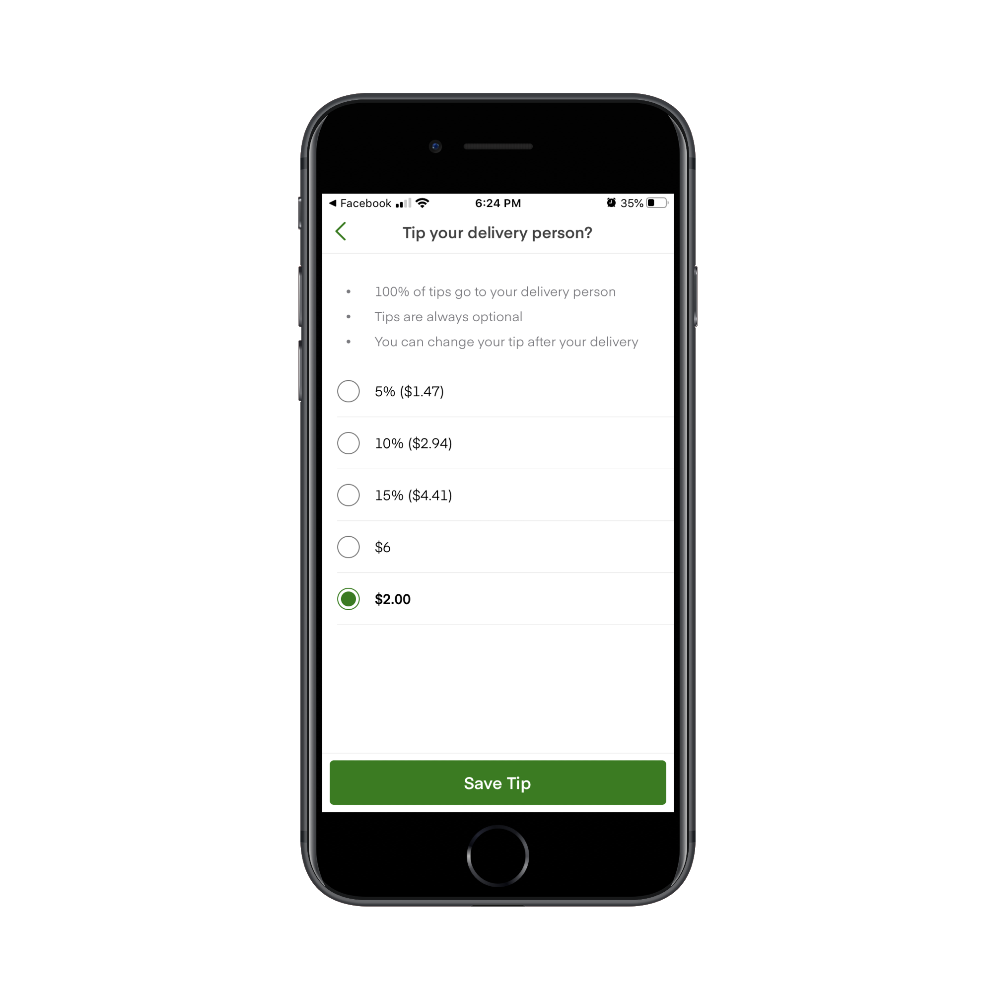
It’s oddly organized as the pre-selected amount sits at the very bottom of the page. And then there’s a random $6 tip included as if the app creators didn’t want to calculate what 20% would be.
That’s not how the tip is presented to users with larger orders though:
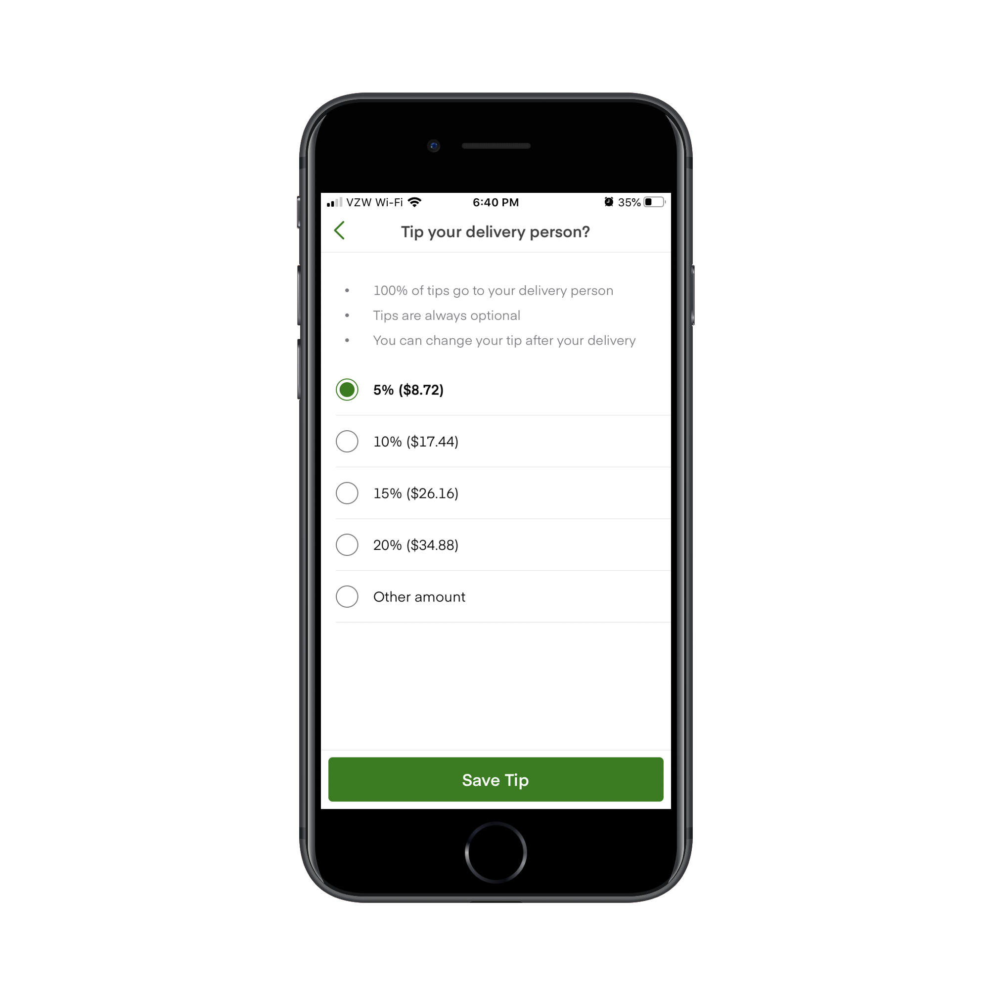
It’s a strange choice to present users with a different tip page layout. It’s also strange that this one includes an open field to input a custom tip (under “Other amount”) when it’s not available on smaller orders.
If Instacart wants to avoid angering its shoppers and users, there needs to be more transparency about what’s going on and they need to fix the checkout page.
Dark patterns have no place in app design and especially not at checkout.
“
If you’re building an app that provide users with delivery, pickup or personal shopper services (which is becoming increasingly more common), I’d recommend designing your checkout page like Grubhub’s:
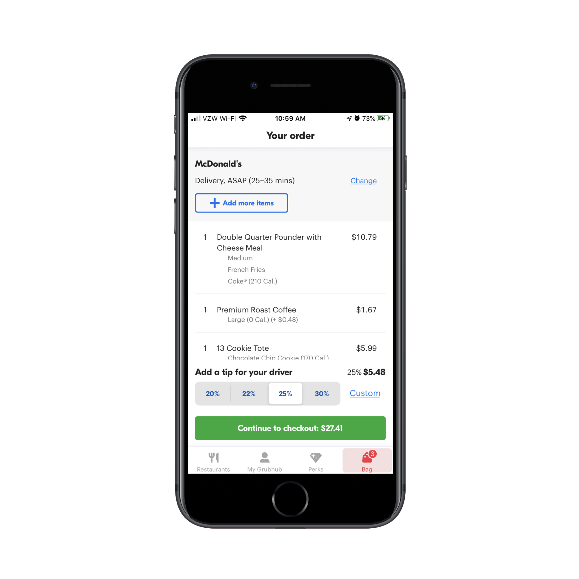
Users not only get a chance to see their items at the time of checkout, but the tip line is not deceptively designed or hidden. It sticks right there to the bottom of the page.
What’s more, tips are displayed as percentage amounts instead of random dollars. For U.S. consumers that are used to tipping 20% for good service, this is a much better way to ensure they leave a worthwhile tip for service workers rather than assume the dollar amount is okay.
And if they want to leave more or less, they can use the “Custom” option to input their own value.
Lesson #3: Never Waver In Your Decision To Roll Back (YouTube)
When the majority of your users speak up and say, “I really don’t like this new feature/update/design”, commit to whatever choice you make.
If you agree that the new feature sucks, then roll it back. And keep it that way.
If you don’t agree, then tweak it or just give it time until users get back on your side.
Just don’t flip-flop.
Here’s what happened when YouTube switched things up on its users… and then switched them again:
In 2019, YouTube tested hiding its comments section beneath this icon:
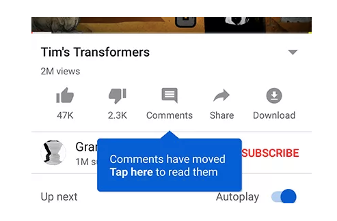
Before this test, comments appeared at the very bottom of the app, beneath the “Up next” video recommendations. With this update, however, they were moved behind this new button. Users would only see comments if they clicked it.
The response to the redesign clearly wasn’t positive as YouTube rolled back the update.
In 2020, YouTube decided to play around with the comments section again. Unlike the 2019 update, though, YouTube’s committed to this one (so far).
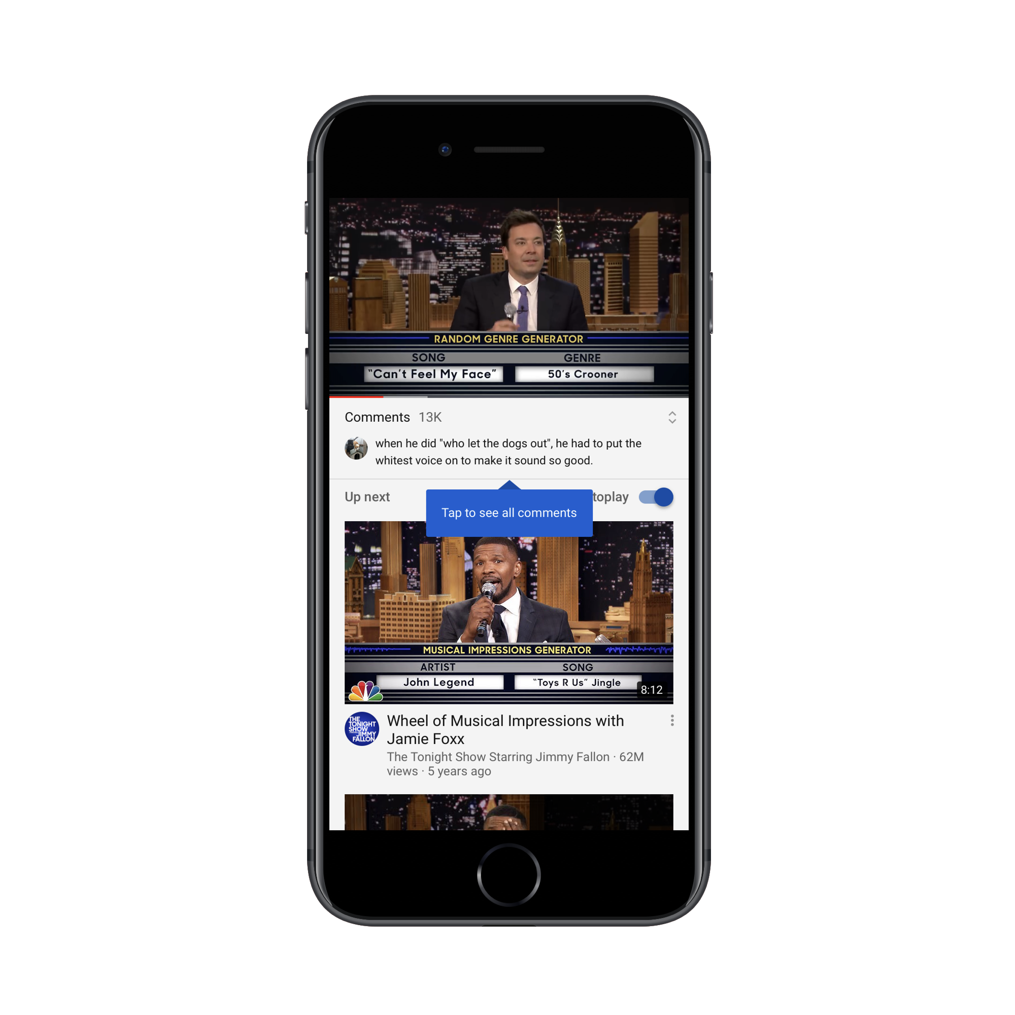
Here’s where the comments appear now:
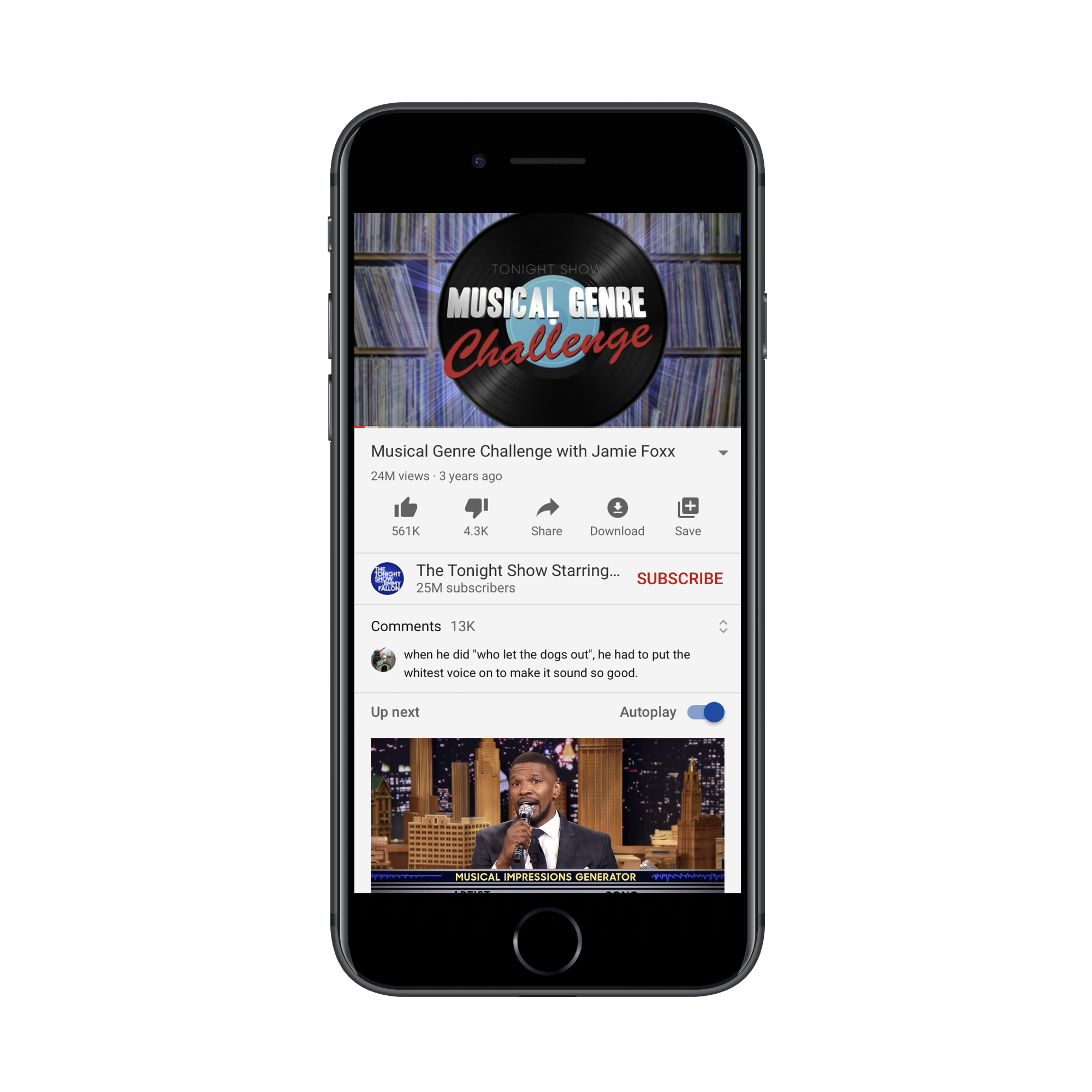
They’re sandwiched between the “Subscribe” bar and the “Up next” section.
If YouTube users go looking for the comments section in the old spot, they’re going to find this message now:
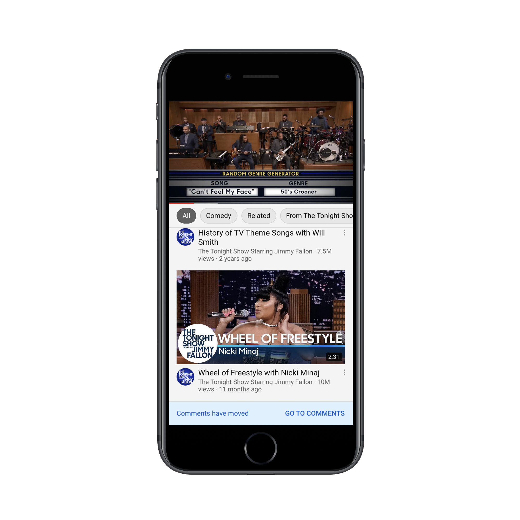
This is a nice touch. Think about how many times you’ve had to redesign something in an app or on a website, but had no way of letting regular users know about it. Not only does this tell them there’s been a change, but “Go To Comments” takes them there.
With this tooltip, YouTube doesn’t assume that users will zero in on the new section right away. It shows them where it is:
I actually think this is a good redesign. YouTube might be a place for some users to mindlessly watch video after video, but it’s a social media platform as well. By hiding the comments section under a button or tucking them into the bottom of the page, does that really encourage socialization? Of course not.
That said, users aren’t responding well to this change either, as Digital Information World reports. From what I can tell, the backlash is due to Google/YouTube disrupting the familiarity users have with the app’s layout. There’s really nothing here that suggests friction or disruption in their experience. It’s not even like the new section gets in the way or impedes users from binge-watching videos.
This is a tricky one because I don’t believe that YouTube should roll this update back.
There must be something in YouTube’s data that’s telling it that the bottom of the app is a bad place for comments, which is why it’s taking another stab at a redesign. It might be low engagement rates or people expressing annoyance at having to scroll so much to find them.
As such, I think this is a case for a mobile app developer not to listen to its users. And, in order to restore their trust and satisfaction, YouTube will need to hold firm to its decision this time.
Is A Mobile App Redesign The Best Idea For You?
Honestly, it’s impossible to please everyone. However, your goal should be to please, at the very least, most of your users.
So, if you’re planning to redesign your app, I’d suggest taking the safe approach and A/B testing it first to see what kind of feedback you get.
That way, you’ll only push out data-backed updates that improve the overall user experience. And you won’t have to deal with rolling back the app or the negative press you get from media outlets, social media comments, or app store reviews.
Further Reading
- Redesigning A Digital Interior Design Shop (A Case Study)
- How To Design Mobile Apps For One-Hand Usage
- Visual Design Language: The Building Blocks Of Design
- Bottom Navigation Pattern On Mobile Web Pages: A Better Alternative?
 (ra, yk, il)

