How To Help Your Clients Get More Backlinks Through Design

Email Newsletter
Weekly tips on front-end & UX.
Trusted by 182,000+ folks.

 Custom Web Forms for Angular, React, & Vue. Your backend.


 Celebrating 10 million developers
There are certain truths when it comes to what helps a website rank in search. Google wants to see:
- Mobile-first design
- Fast page speeds
- Top-notch security
- User-friendly navigation
- Trustworthiness and expertise
… among other things. It also wants to see high-authority websites link back to your website.
And if your clients aren’t obsessed with getting backlinks right now, just wait and see. They’re highly coveted and some businesses will go to great lengths to get them.
Obviously, the quality of the content has to be there if it’s going to be share-worthy. However, the way a page looks can also make or break whether someone decides to share a link to it.
You might not think this is something you can help with as a web designer, but you definitely can. And this post will provide you with a number of tips on how to contribute to this great quest for backlinks.
How To Design Sites That High-Authority Sources Want To Link To
The quality of a backlinked page can reflect on the quality and reputation of the linking website, so authoritative sites have to be incredibly choosy about who they give backlinks to.
The content needs to be reputable and valuable. That’s non-negotiable. But the design has to be top-of-the-line, too.
Let’s take a look at some ways in which you can help your clients’ websites be seen as trustworthy sources worth linking to.
Tip #1: Visualize Data Whenever Possible
In my line of work, one of the most common reasons I link to other websites is to cite data that they discovered or own. I do this to strengthen my points as well as to lend credibility to the arguments I’m making.
That said, there usually isn’t just one organization doing research on the topics I’m interested in, which means I need to figure out which site is worth linking to. And that often comes down to how well they’ve visually depicted the data.
To be clear, I’m not just referring to statistical data. This also pertains to things like breakdowns of processes. Like if I’m researching how various companies handle a given task and a website has a great visual depiction of their workflow, I may be more inclined to link to that page since it’s more valuable.
Let me show you an example.
Let’s say I’m writing an article about why people uninstall mobile apps. I don’t just want to cite a random list of what I think are the reasons for something like this. I know that the evidence exists, so I go searching for sources that can back me up.
In my research on the subject, I find two credible sources that present similar sets of findings. This article appeared on Forbes:
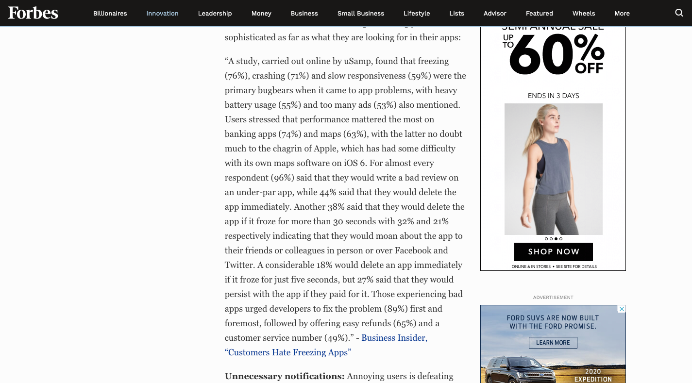
And this blog post and infographic was published by CleverTap:

Let’s say that the two surveys both have a large pool of respondents and the research was done recently. In that case, I’d turn my attention to the way in which the findings are presented.
There are a number of reasons why I’d choose CleverTap over Forbes any day.
For one, CleverTap translated its findings into a user-friendly format. We’ve known for years that infographics get more engagement and shares than plain text content. Sharing and linking are two different kinds of engagement, but we usually do them for the same reason:
We trust the source or find some value in the content and want others to discover it as well.
So, because CleverTap presented this beautiful breakdown of its findings, it’s enabled me to more quickly and effectively identify the facts I’m looking for, more so than the run-on paragraphs on the Forbes site. With Forbes’ presentation of the data, I’d basically have to copy-and-paste the content into my own document and do some formatting of my own to try and figure out what’s going on.
“
So, that’s reason number one. CleverTap shows extra care and consideration for the data that’s being presented as well as an understanding of the audience who needs to read it.
Reason number two is that Forbes’s page is littered with ads. When one disappears, another two appear in its place. It’s distracting and I don’t believe in sending people to a website that so blatantly prioritizes its profits over its content. Again, linked-to websites can have an impact on the linking website’s reputation, so this is something to consider when you design your own.
The last reason I’d link to CleverTap’s page over Forbes’ is because visually designed data saves me the trouble of having to create graphics on my own. It’s not like I can’t cite the data as is, but why should I? I know that it’s easier for my readers to find key data points and understand them when I call them out visually.
Plus, I’m already giving the linked website credit for their work, so I am more than happy to provide a companion branded image. It lends even more credibility to my source.
Tip #2: Make Lengthy Pages Easier To Scan
I have clients who constantly come to me and say, “I need you to write a 2,000-word article so I can rank #1 on Google.”
This is one of those SEO myths that’s part fact and part fiction. Here’s why:
Google’s John Mueller is often asked on Twitter to confirm various assumptions we have about SEO (since Google itself is so tight-lipped about it). And that’s when we get useful gems like this:
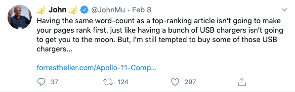
That’s what I tell my clients, but without the snark obviously. It’s not about hitting a target number of words that will magically make a web page rank. All you need to do is match the search intent and then unpack the topic as fully as needed.
That said, there is data from Backlinko that confirms that longer pages do rank higher in search…
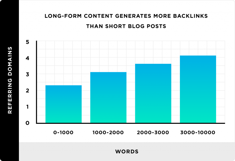
But it’s not the sheer volume of words that lends to a lengthy web page’s rank. It’s because longer content tends to be more authoritative which makes it more link-worthy.
Interesting, right?
So, knowing this, you should do everything in your power to make a lengthy piece of content (any linkable page, really — including informational pages and the home page) super easy to scan, read and link to. Because even the most engaged reader is apt to miss important details or give up part of the way through if you don’t design the page the right way.
For the purposes of this example, I’m going to show you two examples of long blog posts that are top-ranked for “how to price a saas product”.
ProfitWell handles it well enough and has 93 external followed links to show for it, according to MozBar. These are backlinks that pass SEO value onto Google, which is how a website ranks higher thanks to its backlink profile.
All I probably need to do is show you what the above-the-fold looks like to demonstrate why this article hasn’t been linked to nearly as much as one of its competitors. Here it is:
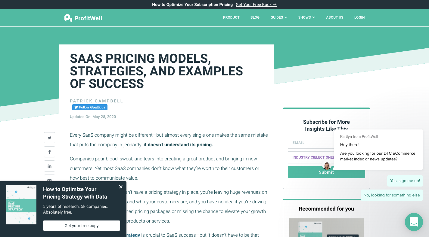
In terms of overall design, ProfitWell has a great website. It’s even done a fantastic job laying out the post so it’s easy to scan through and read.
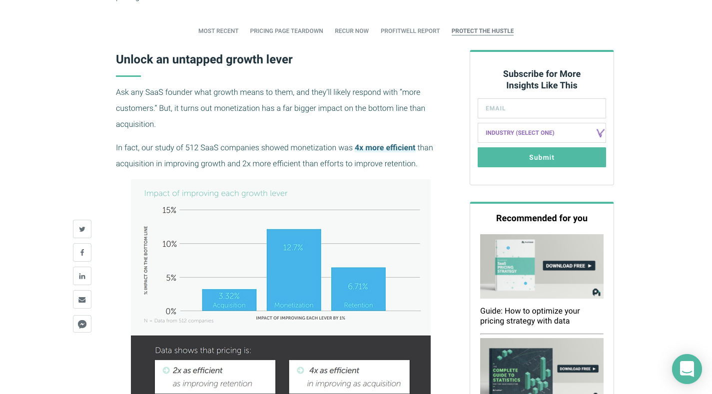
In just this screenshot alone you can see how effectively the designer has worked their magic on the page, including text enhancements like:
- Header tags,
- Bolded and highlighted hyperlinks,
- Data visualizations,
- Short sentence and paragraph structures,
- Bulleted and numbered lists.
However, it has a number of things working against it, which is what I believe has cost it backlinks.
One is the overwhelming amount of distractions: the cumbersome sidebar, the sticky social share bar, the chat widget that needs to be dismissed and a lead gen pop-up that adheres to the bottom-left corner at times. Secondly, this is a long article. If people want to read it in full — especially on mobile — it’s going to take a lot of scrolling to get all the way through it.
Now let me show you how Cobloom’s page design is likely why it has 159 external followed links.
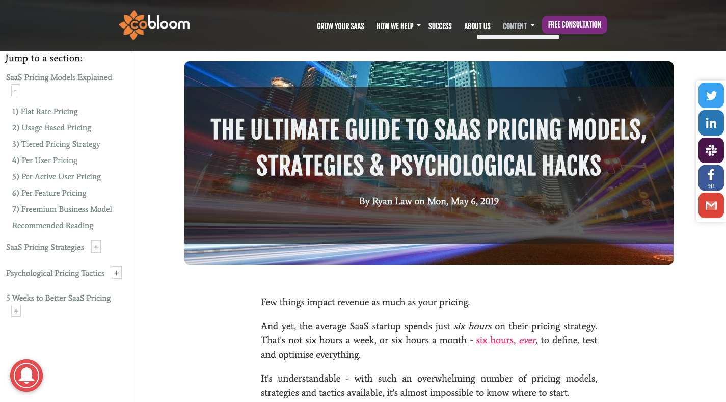
This looks fantastic, right? There are three sticky elements always present:
- The sticky table of contents on the left,
- The chat widget which is part of the ToC bar,
- The social share widget.
But the sticky parts of the page never compromise the content:
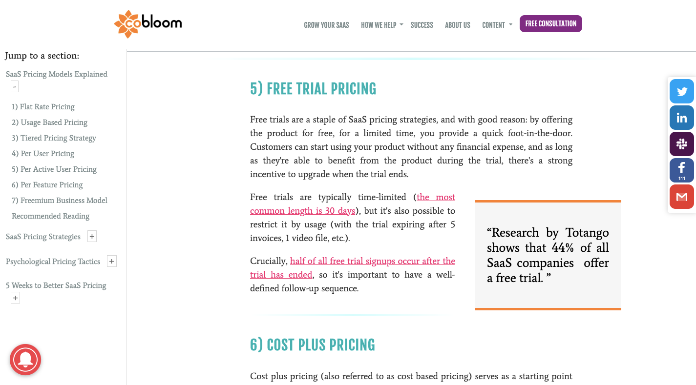
In fact, the table of contents on the left makes the page easier to read (among other design choices that have been made). Readers can click on the section that they’re interested in without having to bother with scrolling down the page.
The only thing I’d say this page falls short on is the mobile experience. The table of contents isn’t present and the page feels a little wobbly, as if the horizontal dimensions weren’t properly sized. So, in terms of this being a link-worthy page on mobile, I’d say it’s not when compared to ProfitWell’s super mobile-friendly post.
But that’s a good lesson for you to take away from this. Use your sticky elements on mobile wisely. Rather than disrupt a post with a chat widget or a lead gen promotional bar, place the table of contents beneath it and let it serve as a secondary “navigation” for lengthier pages.
Tip #3: “Design” Each Page’s Metadata
As a writer, I spend a lot of time looking for the right links to place within my content. Which means a good chunk of my day is spent on Google, social media and Feedly trying to hunt down the perfect sources.
Can you guess how I narrow down my options to ensure that I always share or link to the best content for my website visitors or social connections? I use the page’s metadata to help me decide.
I’m not the only one who cares about the external “image” of a web page either. There’s plenty of research that points to attractive social media content getting more shares than those that aren’t.
So, in addition to designing pages to look more trustworthy and user-friendly, I’d suggest designing your metadata to make it look more carefully groomed. If you’ve taken the time to create a buttoned-up micro-image of the page, people looking for sources for their authoritative websites are more likely to give yours a closer look.
As such, there are a couple things I’d recommend you do to increase the likelihood that this happens:
The first thing is to ensure that the page’s metadata appears complete in search.
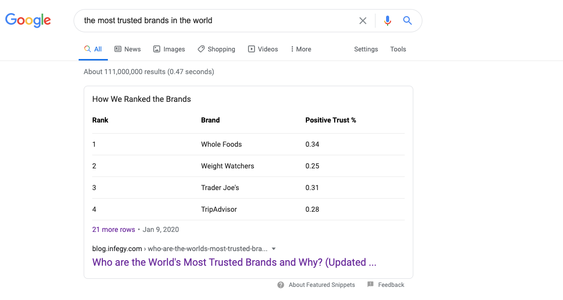
For instance, here’s what comes up when I search Google for “the most trusted brands in the world”:
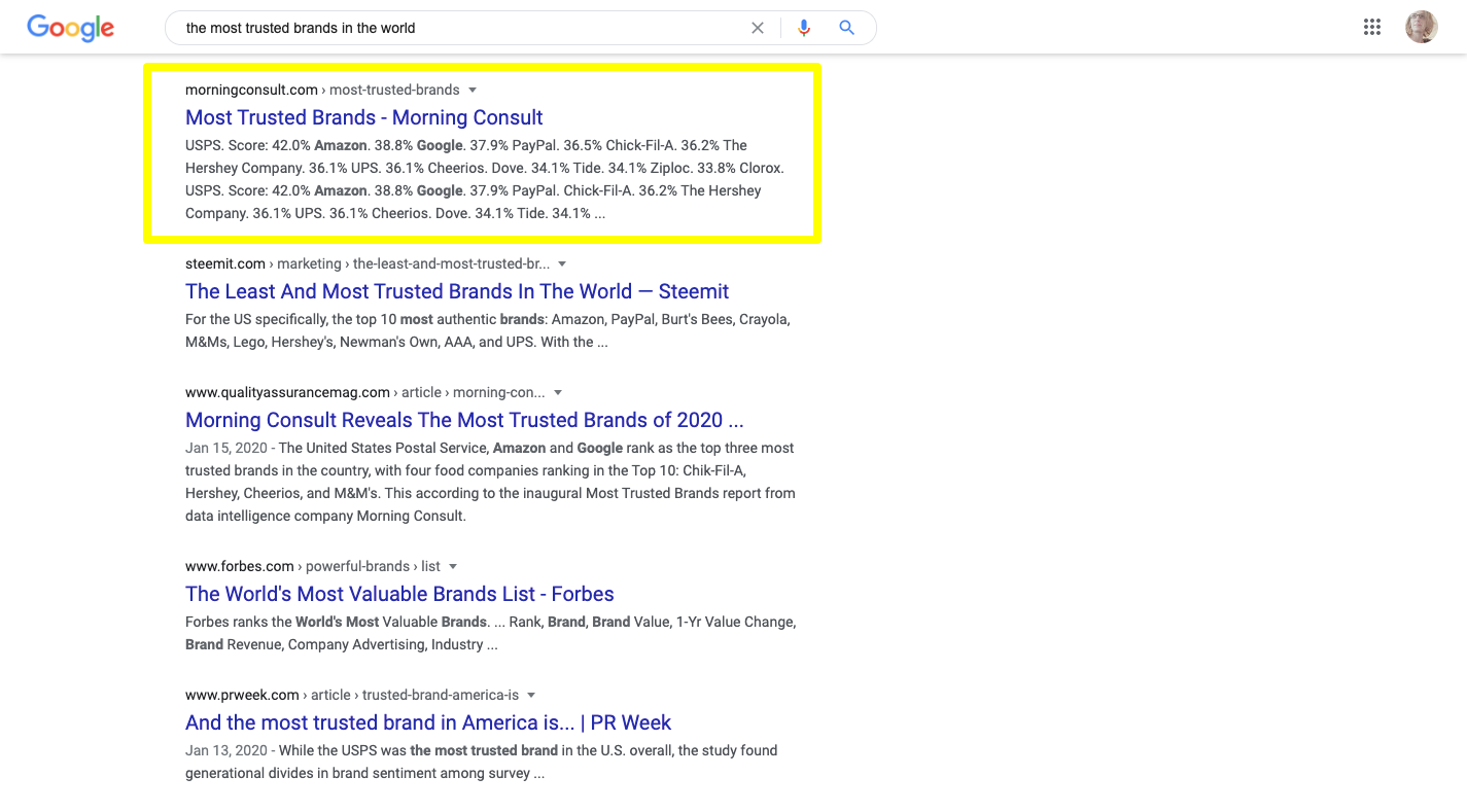
For the most part, the meta titles are all fine as you can see them in full or, at the very least, get the gist of what the page is about and how it answers the search’s intent.
The descriptions aren’t that great, though, as some are nonsensical and some are incomplete. Both qualities demonstrate that the people behind the site didn’t care enough to write a helpful description for it. Authoritative figures are going to care about stuff like this.
One reason why is because it makes it harder for them to figure out which sites to look deeper into. It’s a pain having to review every top-ranking page because no details are provided to help weed out the so-so from the great. Also, if metadata isn’t filled in, the page might not look all that great when shared on social media, again requiring the sharer to do more work and clean it up.
Let me show you an example:
This is what MozBar reports to me from the Morning Consult page that ranks #2 for this search query:
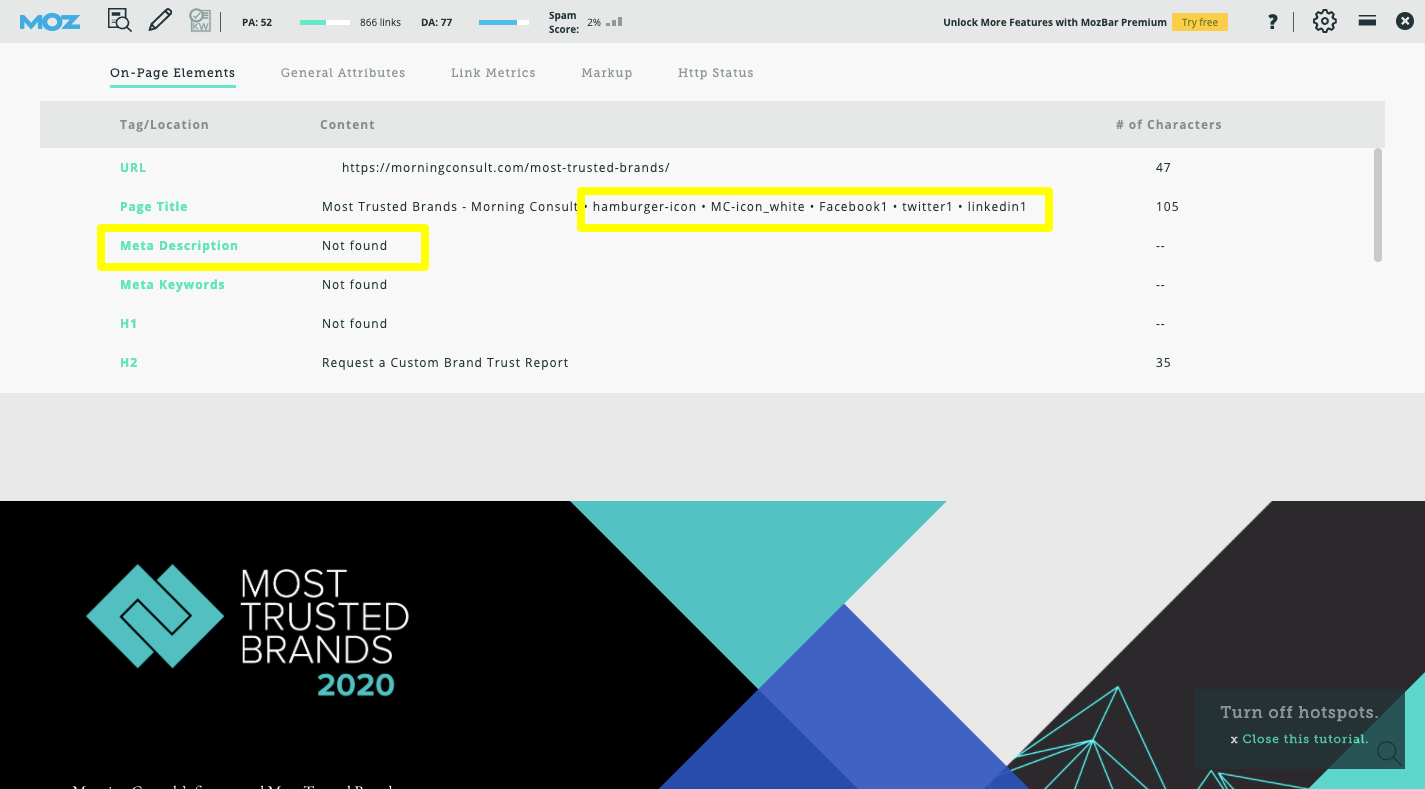
The page title includes a bunch of icons that thankfully don’t appear in search results. The meta description, however, doesn’t exist. This is why when Google tried to retrieve a description about the page, it created this mess from the report’s findings:
“USPS. Score: 42.0% Amazon. 38.8% Google. 37.9% PayPal. 36.5% Chick-Fil-A. 36.2% The Hershey Company. 36.1% UPS. 36.1% Cheerios. Dove. 34.1% Tide. 34.1% Ziploc. 33.8% Clorox. USPS. Score: 42.0% Amazon. 38.8% Google. 37.9% PayPal. Chick-Fil-A. 36.2% The Hershey Company. 36.1% UPS. 36.1% Cheerios. Dove. 34.1% Tide. 34.1% ...”
That might be enough to keep someone from clicking into the site, believing that if the metadata is this messy, the page is too.
As for the shareability piece, the lack of metadata causes issues, too. Here’s what this page looks like on Facebook, LinkedIn and Twitter (in that order):
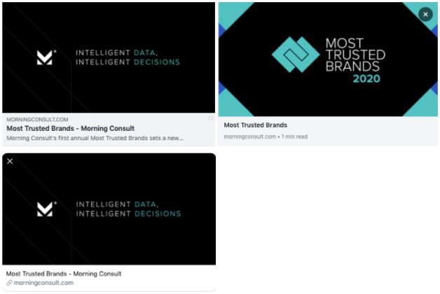
Two of the shares pull in the brand logo and tagline, but not the featured image of the page. Two of the shares show no description at all while the other shows a snippet of the first sentence on the page.
Again, this lack of attention to detail ends up creating more work for the sharer, which might be reason enough for them not to share it. Or not to share anything from that website again.
One last thing you can do to make your pages look more link-worthy in search is to use schema markup. The #1 page (from Infegy) for “the most trusted brands in the world” did a good job of this (in addition to writing their metadata). The results look great:
If I needed this data for an article I was writing today, I’d probably end up focusing most of my efforts on this piece since it’s clear that the page and its metadata were so carefully built by its creators.
To recap: There are three things you should pay attention to when setting up link-worthy pages of your site for search:
- Include complete SEO metadata.
- Attach a featured image to the page that’s relevant and descriptive.
- Use schema markup whenever possible.
Wrapping Up
You might not be too concerned with backlinks, but the owners of your websites certainly are or will be once they catch wind of the power they wield in Google. While a lot of the linkability of a page does depend on the quality of the content, certain design choices you make can affect it as well. So, add these strategies to your SEO-friendly design processes and help your clients claim those highly coveted top-ranking spots.
Further Reading
- The End Of The Free Tier
- Getting To The Bottom Of Minimum WCAG-Conformant Interactive Element Size
- A Guide To Attracting Clients To Your Agency
- Adding Search To Your Site In 15 Minutes


